Amber B Design Studio

Interior Design & Decoration for the South Florida region

  • Home
  • About
  • Services
  • Portfolio
  • Blog
  • Press
  • Contact

Project Classic Living Reveal {The Dining Room}

April 21, 2016 by Amber Filed Under: #projectclassicliving, amber b design, design, dining room, interior design, local clients


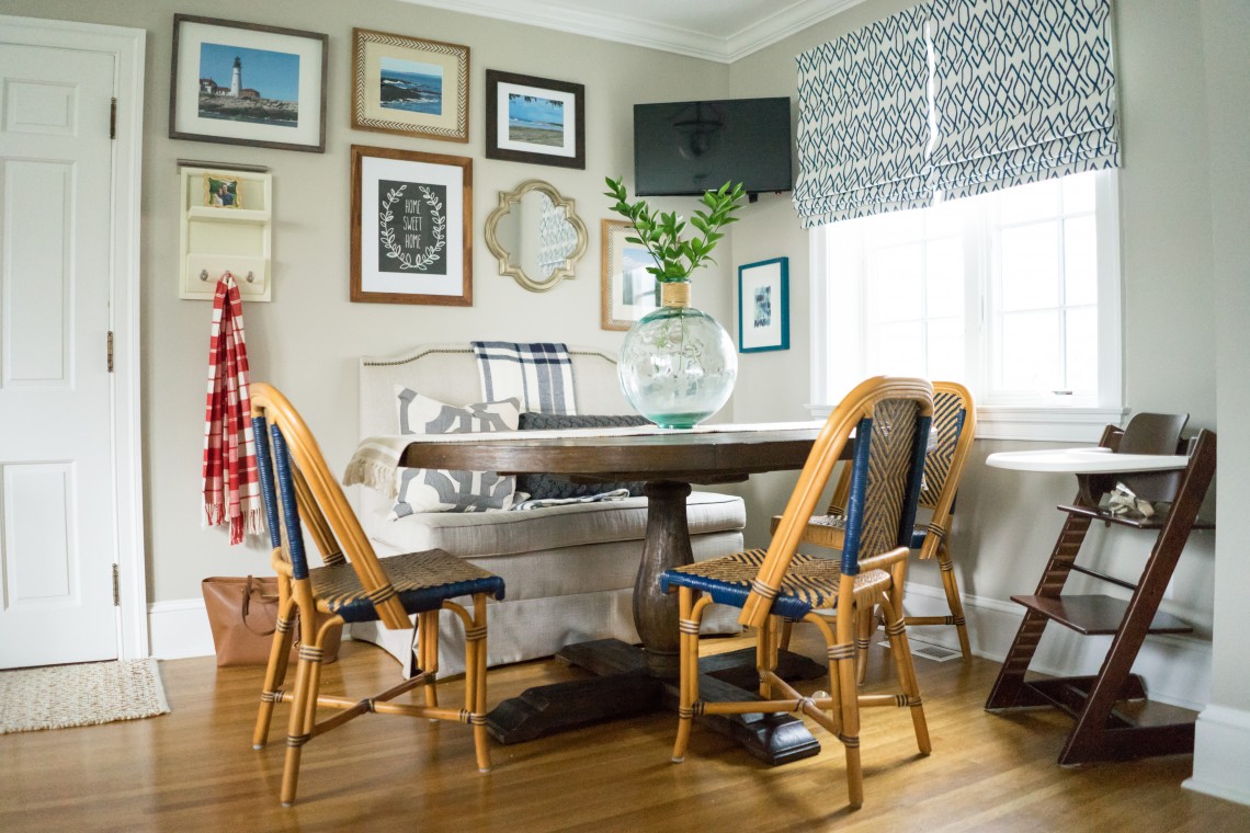
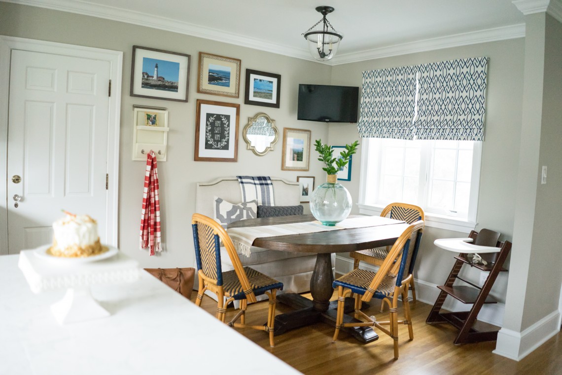
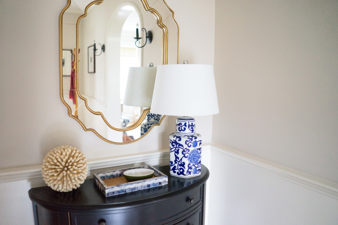
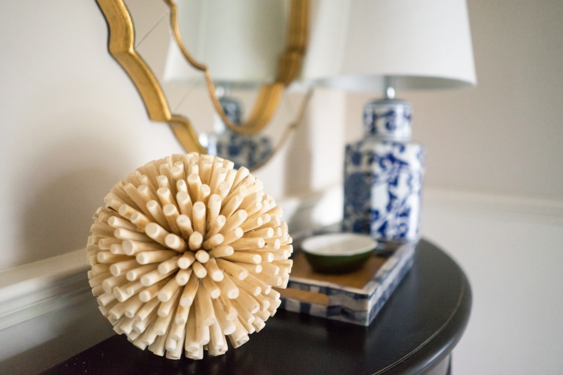
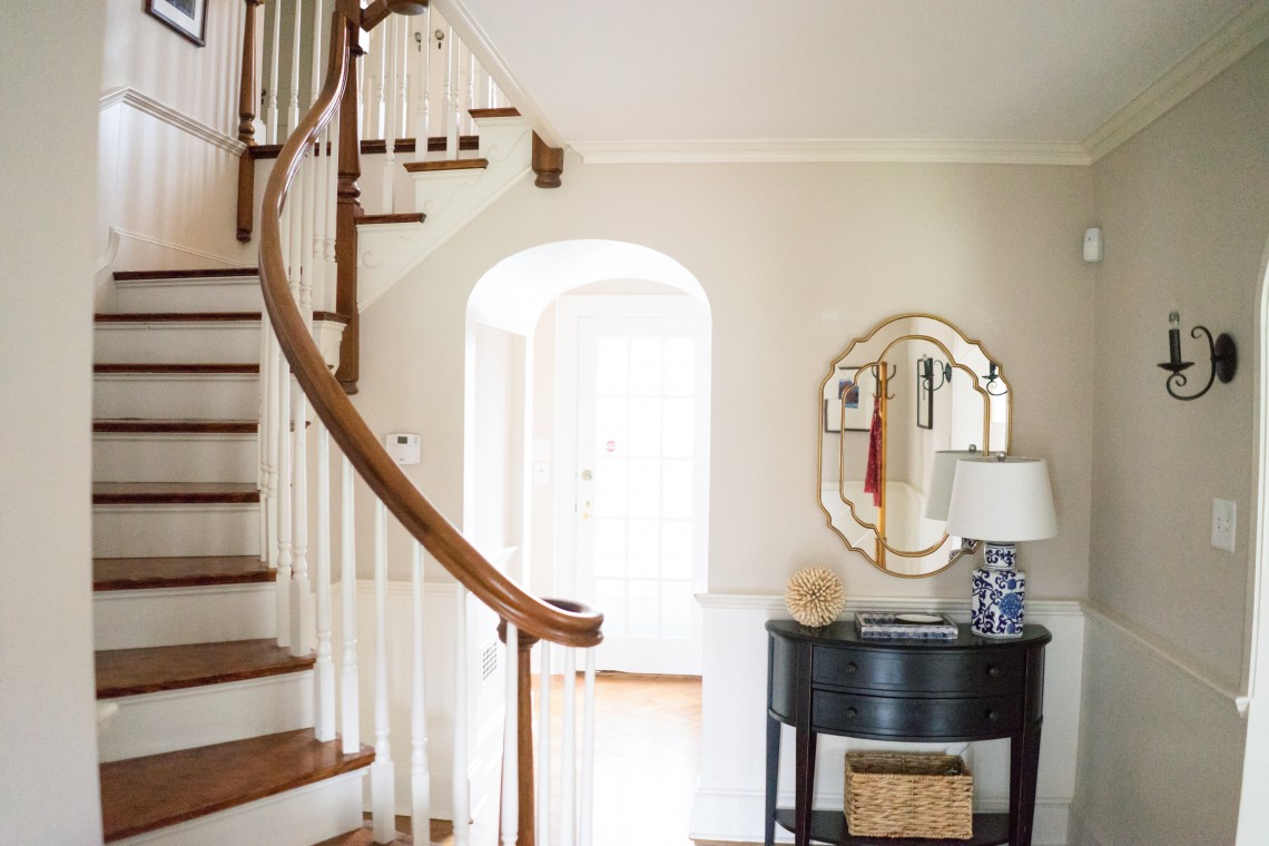
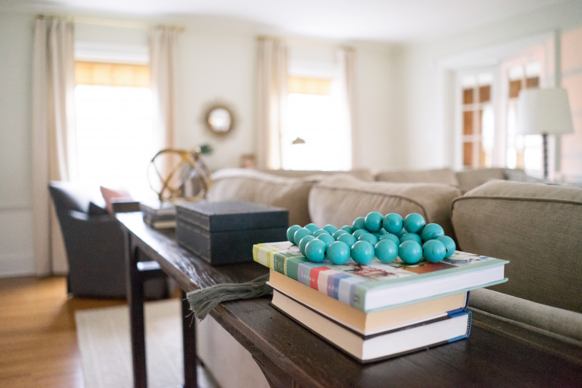
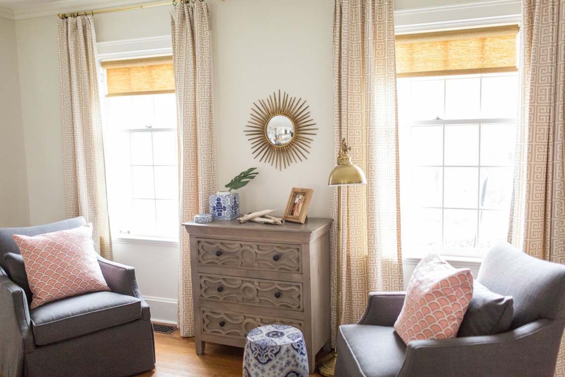
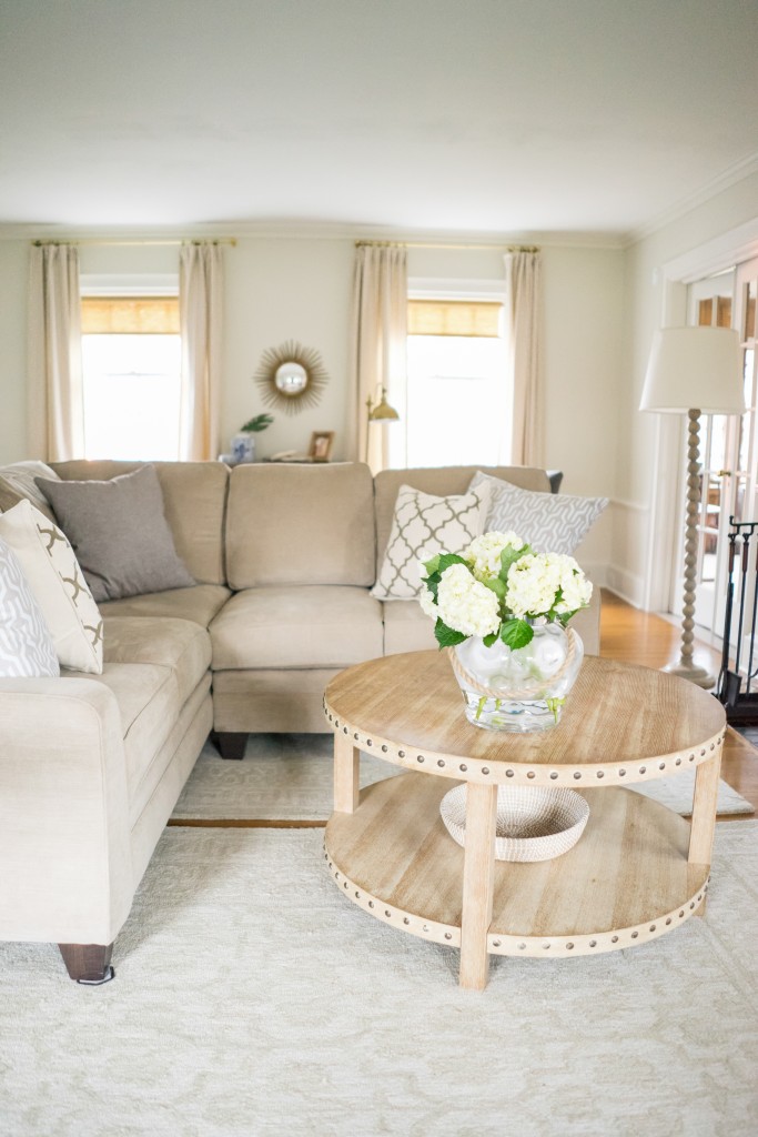
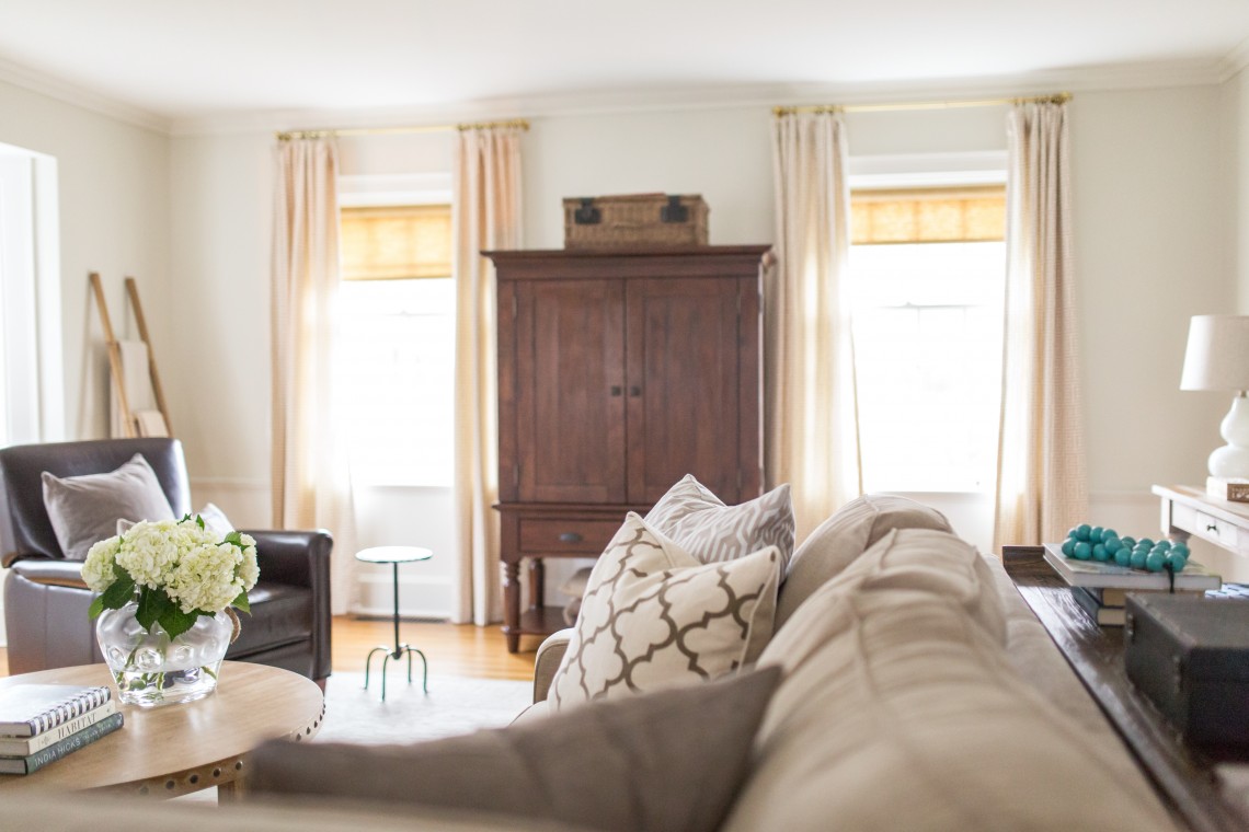
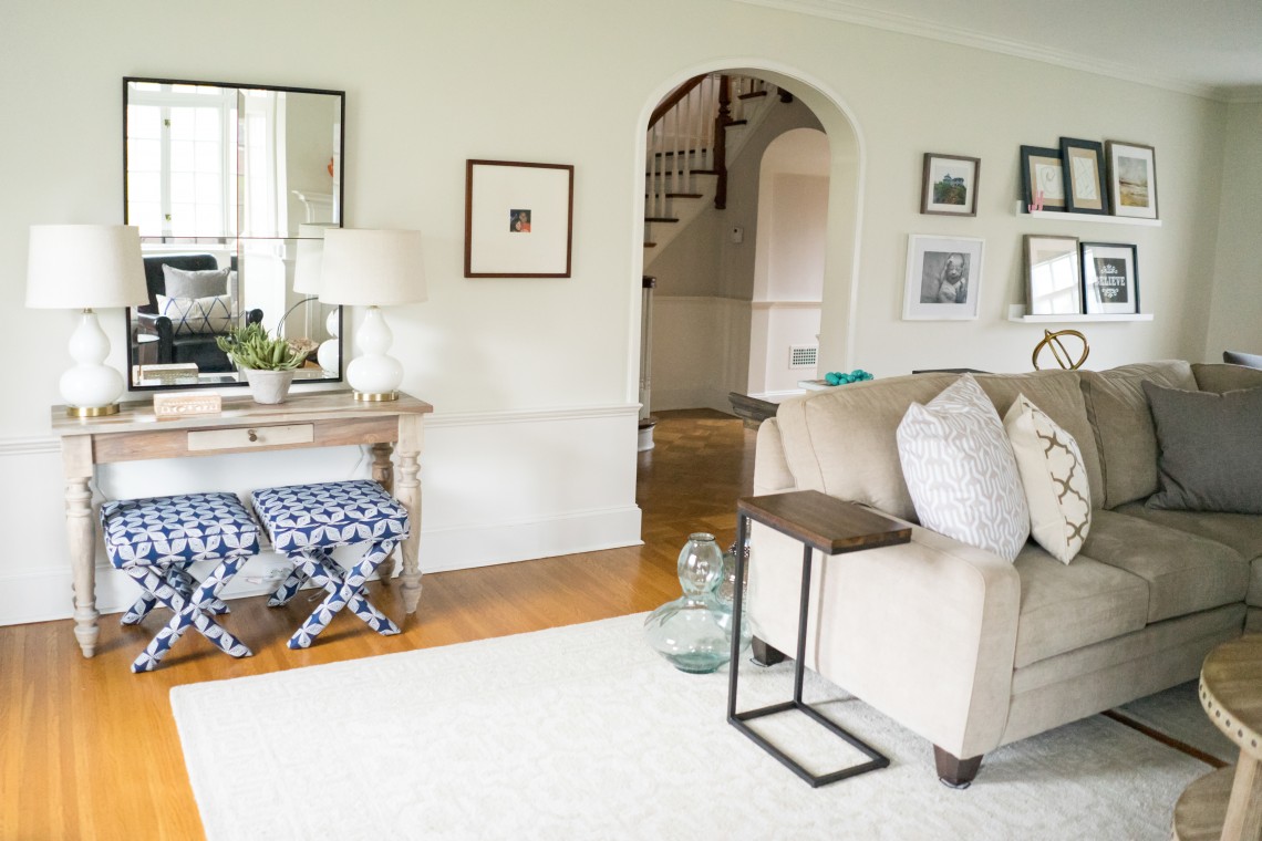
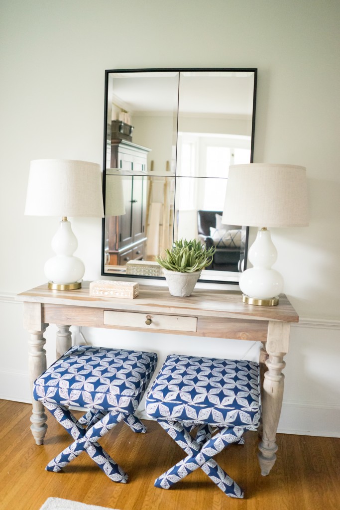
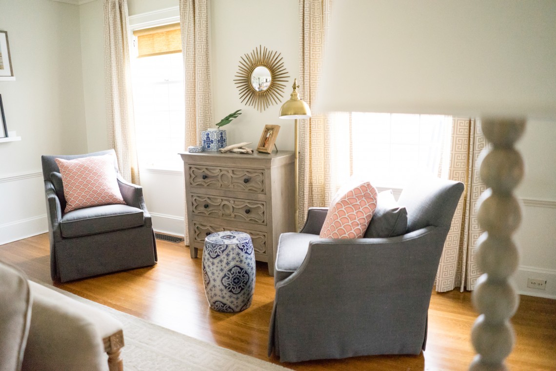
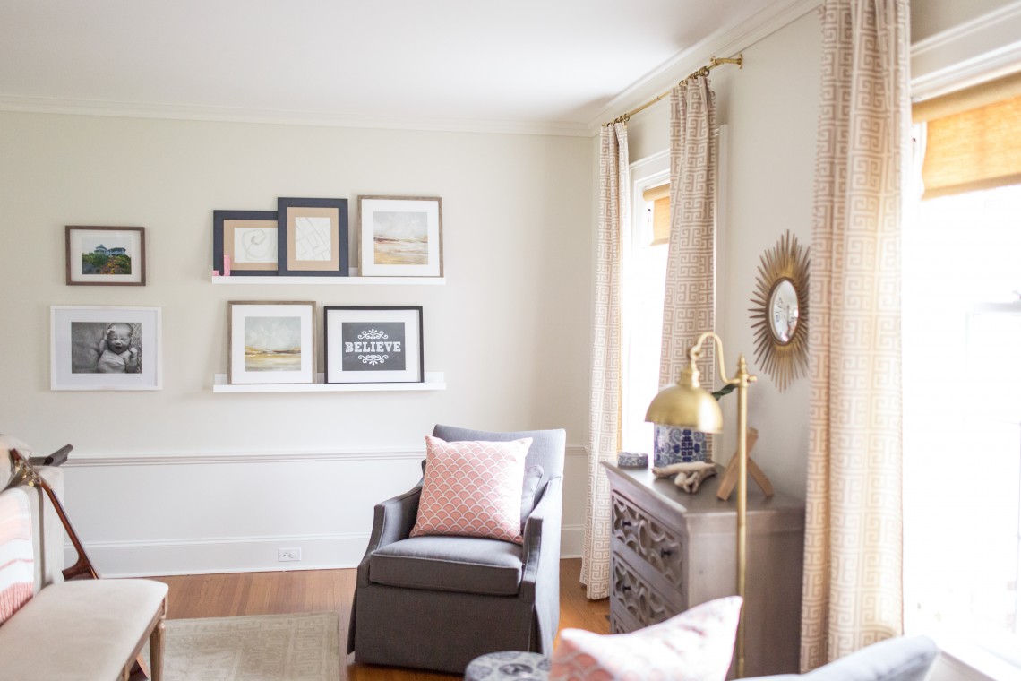
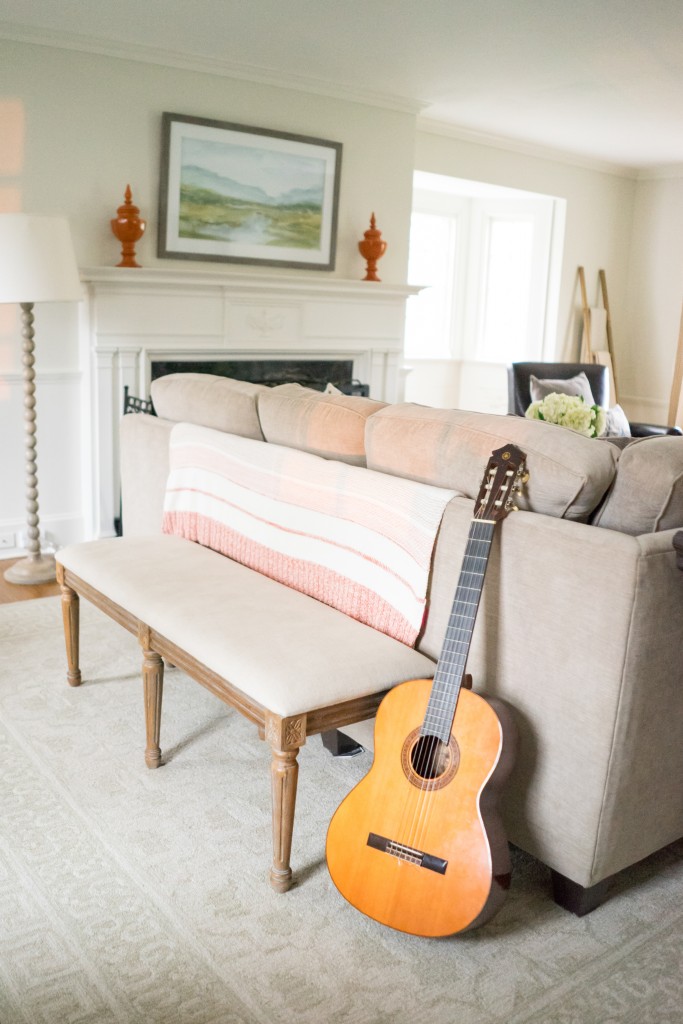
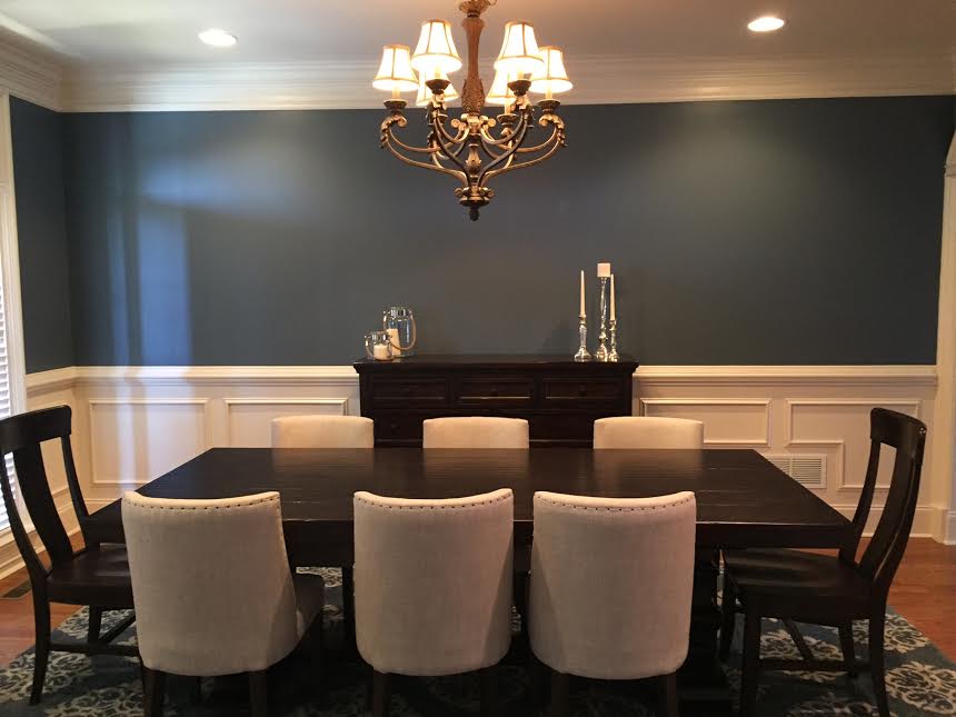
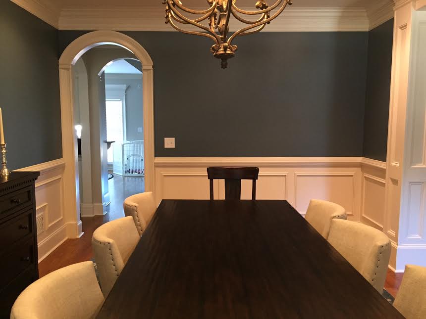
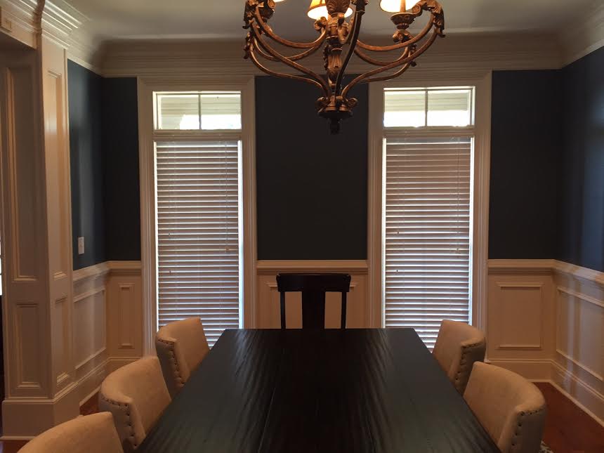
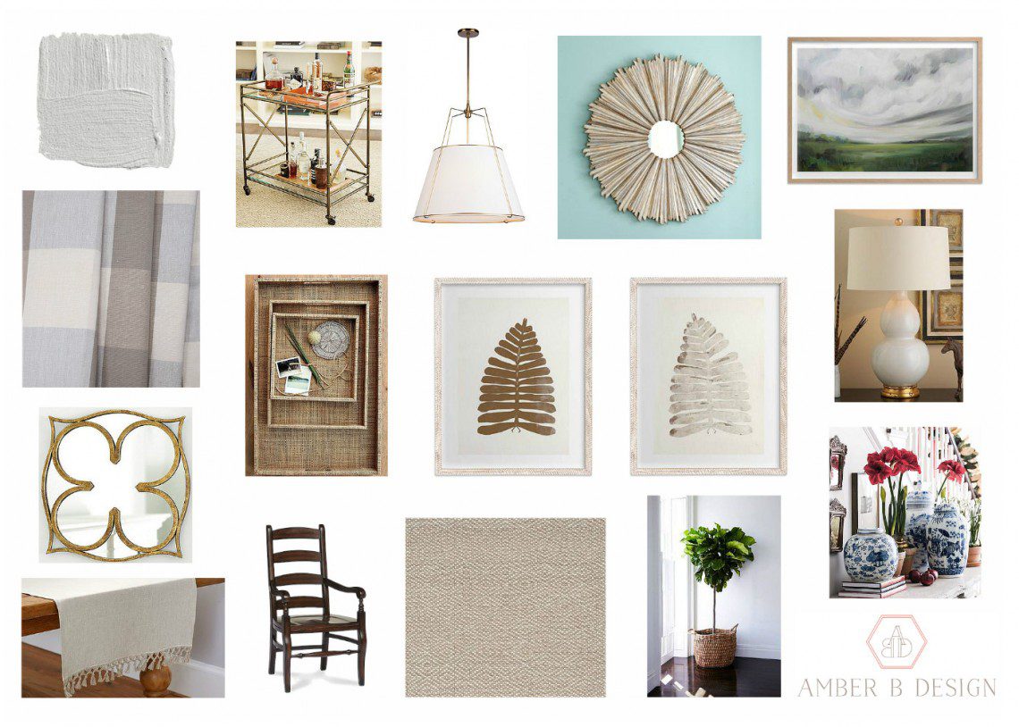
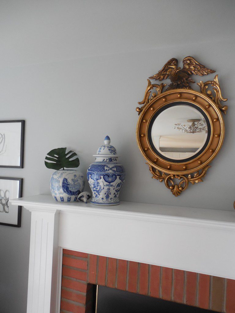
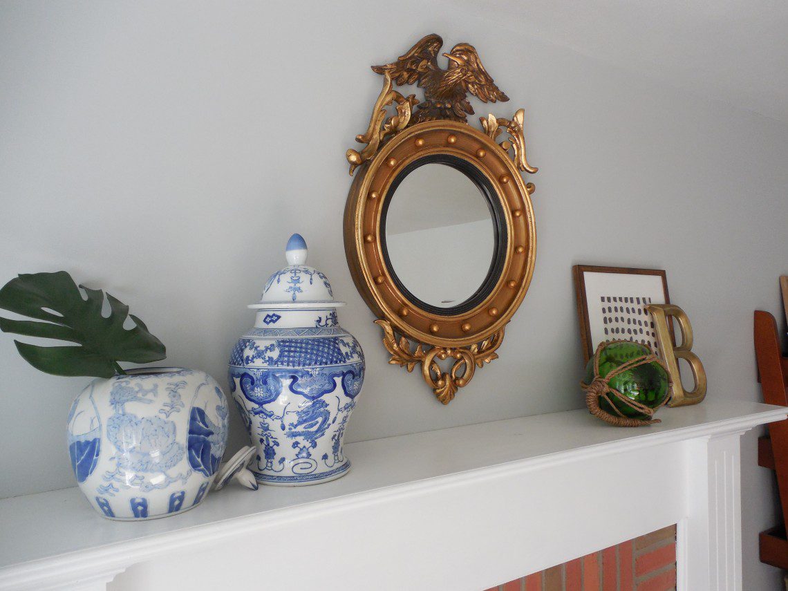
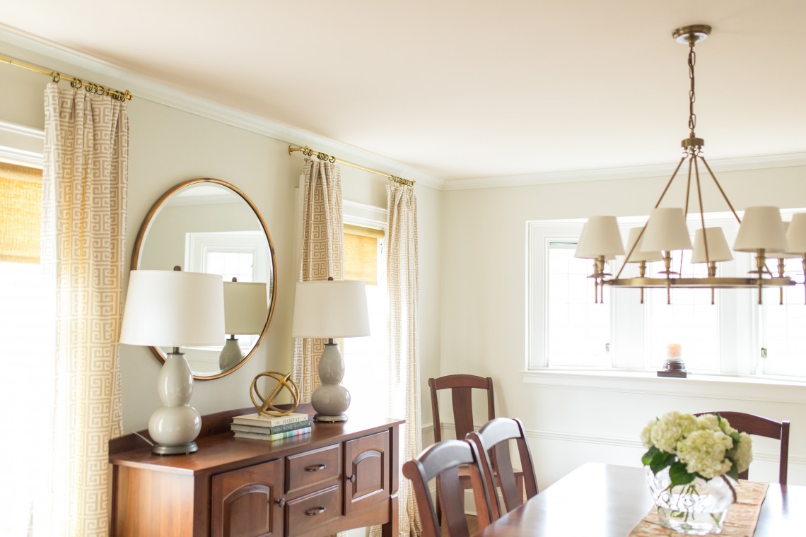
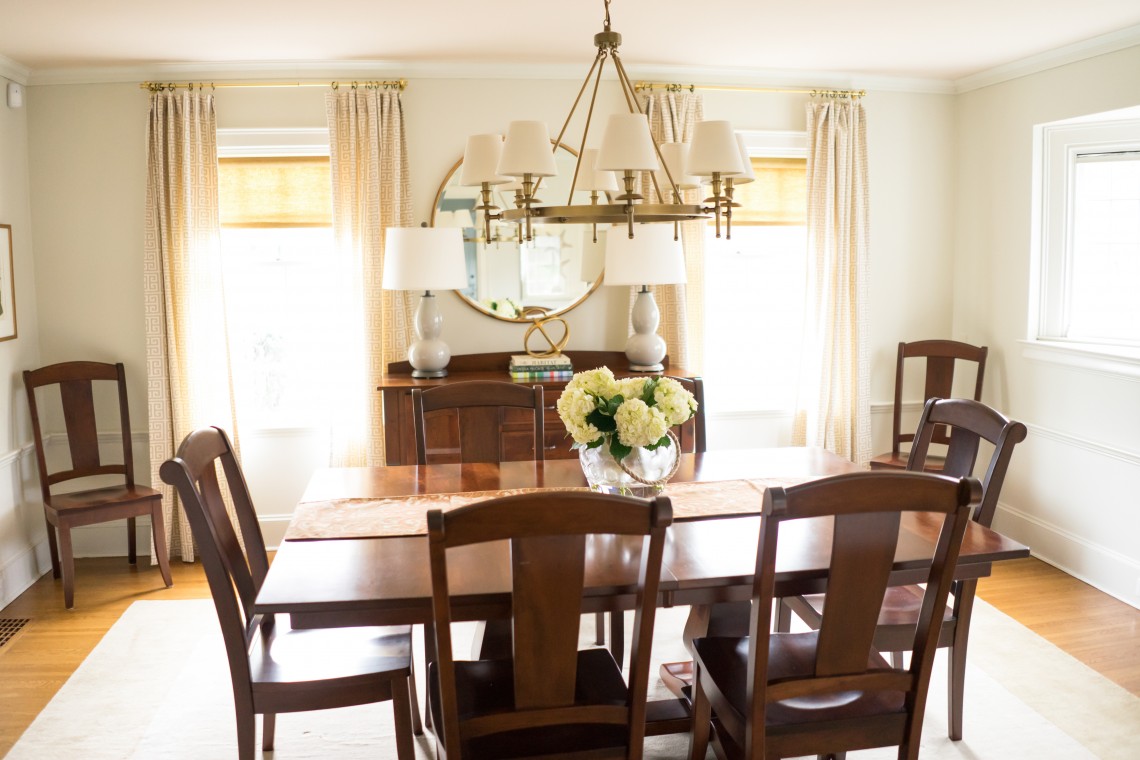
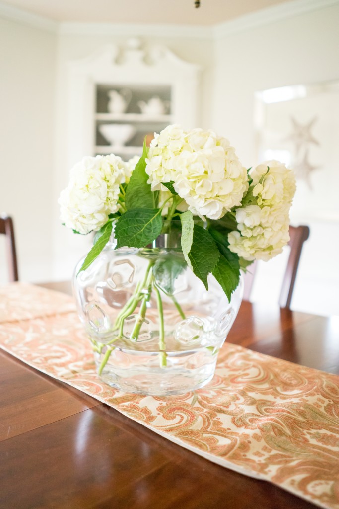
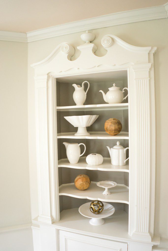
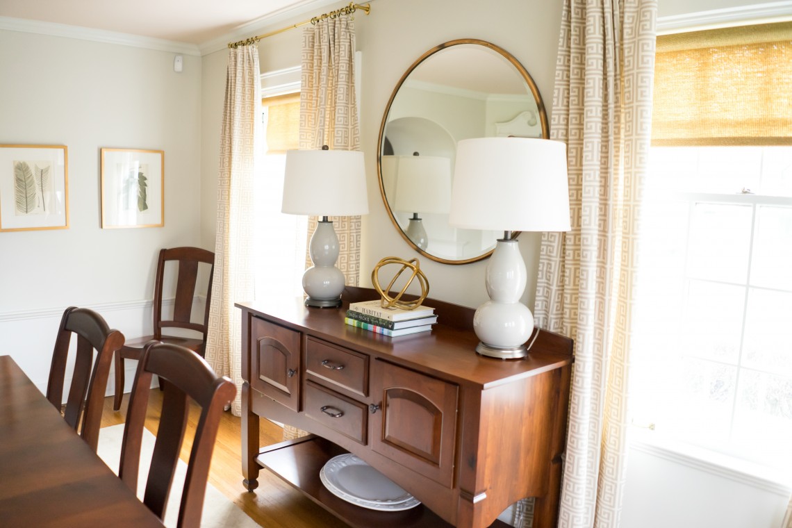
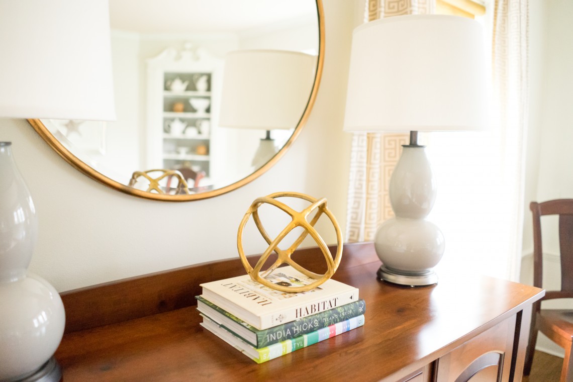
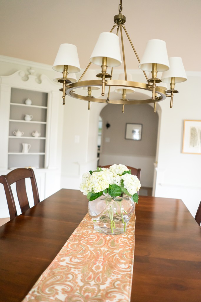
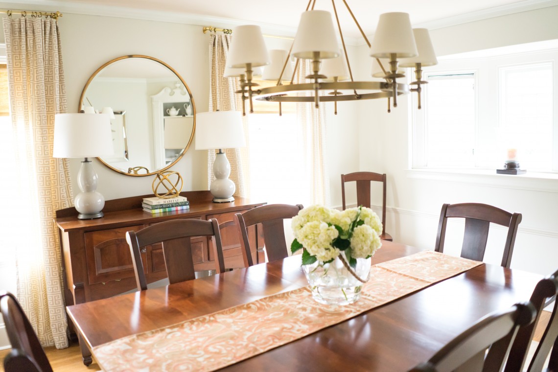
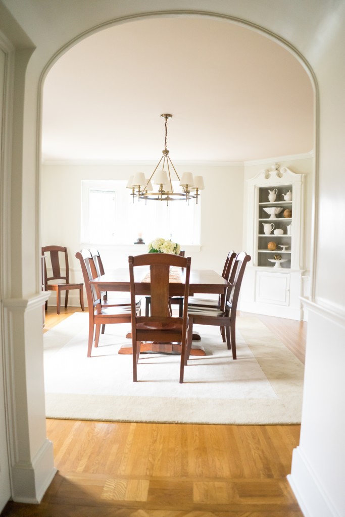
Today is another reveal day! To catch up on all things Project Classic Living, visit HERE. We are now moving on to the dining room! I planned to have this space flow with the rest of the home, but it is a bit of a diversion. It doesn’t have any of my signature blue in it, but the drapes are the same fabric seen in the living room. I went soft and neutral in this room and layered on the textures. Don’t forget to look at that pink ceiling! It’s a subtle pink, but one that brings a soft glow to the room. We kept all of my client’s existing dining furniture and buffet. The rest is new! In the future, we plan to add upholstered end chairs to the table and a sleek brass bar cart. Enjoy the abundant pictures, by the super talented Sarah Heppell Photography.


A dining room table with chairs and lamps on it.


A dining room table with chairs and flowers in the center.


A white cabinet with many different types of dishes on it.


A dining room table with two lamps on it


A dining room table with flowers in the center.


A dining room table with flowers in the center.


A dining room with a table and chairs in it

Images by Sarah Heppell Photography

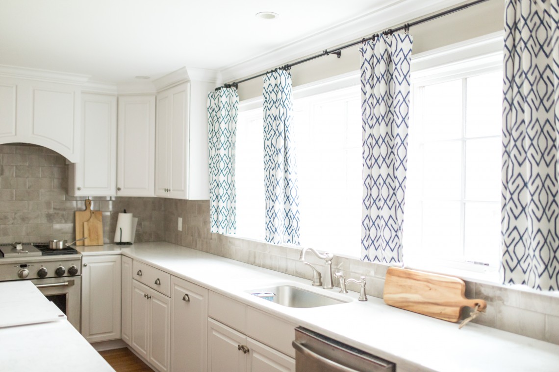
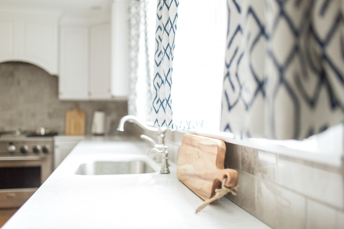
Drapes made by Windows by Melissa, Drapery Fabric by Tonic Living

Thank you for stopping by! I hope you enjoyed today’s stop on the tour. Up tomorrow… we finish with the nursery and bathroom!

Project Classic Living Reveal {The Kitchen}

April 20, 2016 by Amber Filed Under: #projectclassickitchen, #projectclassicliving, amber b design, design, interior design, kitchen, local clients


Welcome back to another reveal day! This is such a fun week!! Today’s post is all about the kitchen. To catch up on all things Project Classic Living related, visit HERE. The kitchen was the second room we worked on together, after the nursery. I wish I could take credit- but the gorgeous white cabinetry, counters, backsplash, lighting and overall layout were already finished when I started working on the space. The gorgeous wall color {BM Revere Pewter} was also chosen, so the bones were perfect to work with. My clients did a fantastic job selecting all of the finishes and this 1930’s home has an unbelievable before and after for this space. The contractor did an outstanding job making this space light, bright and modern, while also keeping with the classic style and character of this home. I came in for the window treatments, gallery wall, accessories and dining area furniture. For this space, we wanted an overall casual, relaxed dining feel. The more formal dining area is in the next room, so we kept this space laid back for everyday use. And of course, the wonderful Sarah Heppell put her magic photography stamp on this room, too. Let’s take a look!


A dining room table with four chairs in it


A dining room with a table and chairs, and pictures on the wall.


A kitchen with white cabinets and black and blue curtains


A kitchen counter with a cutting board and sink.


A cake on top of a white pedestal.


A kitchen with white cabinets and wooden floors


A clock hanging on the wall in a kitchen.


A plant in a vase on the table


A kitchen with white cabinets and a stove.


A dining room with a table and chairs in it


All images by Sarah Heppell Photography

I hope you enjoyed the kitchen tour! The gorgeous drapes and shades were made by Windows By Melissa and the fabric was found in my local work room. Tomorrow’s reveal will be… the Dining Room! {You do get a little peek of the dining room in one of the kitchen shots!!}


Project Classic Living Reveal {The Foyer}

April 19, 2016 by Amber Filed Under: #projectclassicliving, amber b design, design, foyer, interior design, local clients


I am excited to show the second room from Project Classic Living… The Foyer! At some point, I will make sure to show before and after pictures of every room. But I’m just too excited to get to the afters. ๐Ÿ™‚ My clients had a chest of drawers and mirror that were no longer their style. They were looking to freshen things up and have the room styles flow together as one. Here is the completed foyer, all photographed again by the very talented Sarah Heppell Photography. And of course, there’s a little blue to tie every space together!


A foyer with a mirror and a table in it


A lamp sitting on top of a table next to a mirror.


A close up of a candle stick on a table


A foyer with a table and mirror in it


A staircase with wood treads and white risers.


A staircase with many pictures on the wall


A white door with two framed pictures hanging on the wall.


A staircase with many pictures on the wall

images all by Sarah Heppell 

I hope you enjoyed this room. Up tomorrow… the kitchen!

Project Classic Living Reveal {The Living Room}

April 18, 2016 by Amber Filed Under: #projectclassicliving, amber b design, design, interior design, local clients


I am thrilled to be here today, to reveal the after photos of Project Classic Living! My clients and I have been working together for over a year and a half. We started on the nursery and have moved from there to the living room, foyer, kitchen, dining room and bathroom. Today, I will be revealing the living room. This is a very long space, at about 25 feet in length. We optimized comfy seating with a sectional and also separated the room into two seating zones. When my clients have guests over, the chairs can be moved around to accommodate about 9, comfortably! I hope you like a lot of pictures, because there were too many great ones not to share. And I owe that to my photographer extraordinaire, Sarah Heppell. It was a very cloudy day and she was able to make it look like a sun filled day! Here we go…

A living room with a couch and fireplace


A table with books and other items on it


A living room with a chair and fireplace


A living room with a fireplace and a couch


A living room with a couch and flowers in the vase


A living room with two windows and a dresser


A living room with a couch and table


A vase of flowers on top of a wooden table.


A living room with a couch and a table


A living room with two windows and a couch


A living room with white walls and furniture.


A table with two blue and white stools in front of a mirror.


A living room with two chairs and a dresser


A living room with a chair and a window


A guitar sitting on top of a bench in front of a couch.

all images by Sarah Heppell Photography

I can’t thank Sarah enough for her fantastic photography skills in making this room shine! I am so happy with the way this project has turned out. In time, the space behind the leather chair will be a built in window seat with pretty pillows and window treatments. The window treatments here are done by Windows by Melissa and the fabric was from Tonic Living. I love how light and bright this room feels. Thank you for taking a peek into this project! Make sure to check back all week for more reveals! Up tomorrow… the foyer!

E – Design {The Kid’s Rooms}

April 7, 2016 by Amber Filed Under: amber b design, design, e-decorating, e-design, interior design, kids and design


I mentioned in a previous post this week, that I had some new e-design projects to show! My client and I have been working on her basement and living room, but have also completed her son’s and daughter’s rooms as well. Kids rooms are so much fun to design. As a mom of two kiddos myself, I know it has to be fun, whimsical, meet their style and definitely have loads of function. There should be room for storage to corral all of those toys! But who said that the toy storage can’t be functional and super stylish?!? In a kid’s space, it’s all about having fun with color and taking it up a notch, so it still works with the rest of the house, but has its own unique flair. Up first, her son’s room! Her son loves outer space, snow boarding and the color red. His mom wasn’t too sure about using too much red, which I agreed, so we were creative and used it in small doses.

The Design Plan

A collage of pictures and furniture items.


My client’s son desperately wanted a bunk bed and we found this affordable option that we plan to paint a deep navy blue. {Hale Navy by Benjamin Moore, to be exact.} The green you see at the top of the board will be the walls and is Raleigh Green, also by BM. The red will show up in the bookcase, throw blankets and in a subtle way through the art. Toy storage can definitely be fun and colorful and I just love the idea of this red bookcase filled with books and woven baskets! The plaid rug on the board is a favorite of mine and is the Cooper Jute Rug in Navy by Dash and Albert. I used it in Project Vintage Gem and I can attest to its durability and soft jute material.

Project Vintage Gem

A living room with brick walls and a table

Photo by Sarah Heppell Photography

Next up, is the daughter’s room. She is transitioning out of a crib and this sweet, whimsical space will grow with her.

The Design Plan

A collage of different types of furniture and accessories.

Her space will have the entire color scheme shown in the round lights, changing pad cover and pillow fabric. The string of lights is so cool and is found HERE. With this site, you can customize the colors and length. I plan to have this installed above the dresser and around art that my client already has for the space. The stunning floral fabric is from my favorite go to source for fabric, Tonic Living. It is their Eastern Charm, Hibiscus fabric and it is gorgeous in person. That will be a huge throw pillow for the neutral bed. Green will play a role in this space, like the red did for the boy room. The same bookcase will be in a bright green for this room and I also replicated that color in the table lamp. Her bed will have a trundle component, so it has the same effect of a bunk bed, but can be tucked away when not in use. I have used the cloud like pendant in other rooms and I love that it is so versatile!

Aren’t kids rooms so much fun?!? 

Completed E-Design {The Basement}

April 5, 2016 by Amber Filed Under: amber b design, basement, e-decorating, e-design, kids and design, personal design style


It is always fun to put together a design that both myself and the home owner love. As I constructed this basement plan in particular, I kept thinking, Wow, this is so them! I hope they feel the same way. Lucky for me, they did! This past year, I have worked with my long distance clients on their family room and children’s rooms. We have now moved on to their basement, which will do triple duty: play area for the kids, extra living space and a guest room. To save space and make this usable as a guest room, we chose a modular sofa that is a sleeper/sectional. My clients also wanted to go bolder with fun accent colors and make this room their style, but a more loud, eclectic version of their style. Here is the design plan I came up with…

The Design Plan


I just cannot wait to see this plan come together! I love the color mix from the pillows, throw blankets and accessories. The art print on the top of the board brings all of these colors together. I took inspiration from this fun, eclectic living space designed by the talented sister duo, Kirsten Kelli.

Inspiration

A living room with couches and chairs, tables and lamps.

Design By

What a fun jumping off point! I love that the base of this inspiration room is neutral, but the accessories are bold and don’t take themselves too seriously. It is a fresh, modern and eclectic space, which is what we were going for in the basement. To remind you of the family room design I did for my clients, I used the same fun colors that they enjoy, but in a more neutral way…

They wanted the upstairs to stay neutral and calm and take a more eclectic, bold approach in the basement. I will make sure to show any and all after pictures here! I will also reveal the kid’s room designs soon, too. Have a great day!

Completed E-Design {The Dining Room}

March 14, 2016 by Amber Filed Under: amber b design, design, e-decorating, e-design, personal design style


Today, I am excited to share a recently completed e-design project. I worked on a dining room design and my client was keeping some of the furniture and mainly needed help with the final accessories and pulling the room together. Here is the before pictures of the space…

Before…

A dining room table with chairs and a chandelier.


A dining room table with six chairs and a chandelier.


Isn’t this space absolutely stunning?!? I love all of the architectural details and molding. My client wanted to bring a more relaxed vibe into the room and make it a bit less formal. The moldings already take the room to a rather formal look, so I suggested lightening up the walls dramatically and adding some key accessories that will help make the space feel more casual and laid back, which is how the family lives in their home. My client definitely wanted to change out the chandelier to better fit their more simplistic style and I agreed. Here is the design plan I came up with…

The Design Plan

A collage of pictures with different types of furniture.


I am so excited that my client is thrilled with the design plan and is already in full swing with the changes. We are lightening up the walls, because although that deep navy is beautiful, it helps make the room feel formal. So we are replacing it with Horizon by Benjamin Moore, which is a very pale blue/gray. The new pendant from Rejuventation is the showstopper in the room. And the new textiles, including the four inch buffalo check fabric from Tonic Living will add a traditional, casual blend to the space. That fabric will be the new drapery panels and I can’t wait to see that transformation! We will replace the end chairs with similar options, yet with arms. I think the arm chairs will work better with the long table and overall scale of the space. Over the buffet, there will be a neutral vignette with an oversized driftwood sunburst mirror, gourd lamps and botanical prints. Here is a peek at the buffet vignette…

The Buffet Wall…

A dresser with two lamps and three pictures

A black and white logo of the letters b and d

I am excited to show some progress and after photos soon. And thank you all for your sweet comments about my mantel series post! It was a fun week and I was glad to be a part of it.

Project Design Now Reveal!!

March 11, 2016 by Amber Filed Under: accessories and vignettes, amber b design, amber b design at home, before and after, blog, design, mantle, personal design style


The time is here… the reveal of two different spring mantels for Project Design!! You may have seen several of us bloggers hinting on social media {#ProjectDesignNow} about our spring mantels. We have styled them two ways and today is reveal day!! I want to thank Mary Ann of Classic Casual Home and Cindy of Rough Luxe Lifestyle for including me in this fabulous group!


A gray circle with the words project design in it.


Our mantel is located in our family room and it’s always fun to make some changes and switch it up every now and then. Here is a full look at Option 1…

Spring Mantel Option 1…

A close up of a clock on the wall


A close up of a clock on the wall


A close up of a clock on the wall


A living room with brown couches and fireplace


A living room with a couch and fireplace

All Photos above by Sarah Heppell Photography

For mantel option 1, I went with a mixture of vintage and new and meaningful pieces with modern accessories. Starting from the right side, the “B” signifies the first letter in our last name. That is placed in front of a special print from the etsy shop, Pretty Smitten. The print says Be Smitten Every Day. I love its message and that pretty rose quartz background! I like to layer and add texture on mantels, so this beaded jar adds some interesting pattern and is unique. I also like to add round shapes to a mantel, so the clock was an old Target find and does just that. The mini windsor bench holds a special place in my heart, as I found it at an antique market when Mike and I lived in Germany. I will never part with it! And good old Zeus is next to the windsor bench. My kids named him and he is a great find from Target. I often put real ferns and small plants inside, but today- it’s one of the faux succulents that Target carries. {I am seeing a pattern here, that I shop at Target often!} ๐Ÿ™‚

Spring Mantel Option 2…

A fireplace with a mirror above it and a bench in front of the fire place.

A mirror sitting on top of a mantle.

A mirror sitting on top of a mantle.

A mirror and some vases on top of a mantle.

A green ball and some gold letters on top of a white mantle.

A blue and white vase sitting on top of a table.

A mirror, vase and other objects are on the mantle.

For mantel option 2, I also went with a mix of vintage and new. Starting with the right side again, I included the same “B” accessory from the first mantel. That is the only thing I kept for this option. I layered it in front of a spotted print I found at Target. I was so glad I scooped that up when I did, as about a week later, it was gone! I have always loved a hint of animal print somewhere, and this reminded me of cheetah spots. I found a green glass buoy from Home Goods. I like that it reminds me of the water and spring and summer activities. The rope detail adds some texture and interest. The ’round’ element that I love to add to mantels is now seen in both the buoy and this Federal mirror, which was a Christmas gift from my mom. It is the Ken Fulk Federal mirror from Pottery Barn and I love the vintage vibe it brings to the space. Not to mention that stunning aged brass! Adding a mirror to the mantel has been fun, as it reflects our ceiling pendant. The blue and white urns were antique shop finds. I decided to put a faux palm leaf from Pottery Barn inside the smaller urn, to bring a touch of nature to the mantel. I could also switch it out for fresh flowers, if I could remember to keep fresh water inside!

So there you have it! My spring mantel styled two ways! Which option would you choose???

Here are some tips to changing up your mantel for spring, or any time of the year:

Mantel Styling Tips

Add meaningful pieces and a mix of vintage and new to bring a collected over time style to your mantel

Layer pieces in front of each other and stand back every now and then to access what you have and what you need to add

Add different shapes, such as a round mirror, clock and mix that with a square or rectangle frame

I hope this got you ready to add some spring touches to your mantel! Now it’s the fun part… let’s check out the amazing bloggers who have transformed their mantels! They are such a talented group of ladies and I have been thrilled to be a part of this with them. Show these ladies some love:

ciao! newport beach
classic • casual • home
Dimples and Tangles
Garden Home and Party
Katiedid
Lisa Mende Design
Lucy Williams Interiors
Rough Luxe Lifestyle
The Pink Pagoda

A gray circle with the words project design in it.

E – Design {Recreating the Master Bedroom}

March 4, 2016 by Amber Filed Under: amber b design, design, e-decorating, e-design, interior design, personal design style


A while back, I created a master bedroom e-design for a client combining modern with traditional, chic with rustic and fun colors, such as lavender and emerald green. When my clients moved, they wanted to use as much of the design elements as possible for the new bedroom. We had to make a few small changes, so I thought it would be fun to compare the designs and see how items can transition from one home to the next.

The Original Design Plan

A collage of different types of furniture and accessories.


Dresser & Gallery Wall

A white dresser with a mirror and a lamp

Original Floor Plan

A bedroom with a bed, dresser and tv.

Do you remember when I wrote the post on this bedroom being photographed? To refresh your memory, here it is all complete, with photos by Danielle Benham…

A bedroom with a bed, dresser and tv.


A bedroom with a bed, pillows and a window.


A bedroom with a bed, dresser and mirror.

All after photos by Danielle Benham

The new master bedroom has a much different layout, so we made some changes to the furniture placement. Originally, the desk was a second night stand. With the new house, there is not enough room next to the bed for this wide desk, so we included the same second night stand, which was luckily still available. The desk will fit in the space, but in a small reading nook. I think it will be really pretty, as it will face out to a wall of windows! The tall second dresser will not fit in this space, so I suggested adding it in the closet. Here is the new design:

New Design Plan

A collage of different types of furniture and accessories.

The Floor Plan

A bedroom with a bed, dresser and tv.

Won’t that reading/desk nook be fabulous?!? There is so much natural light in this space. I can’t wait to see it all come together! We are going with the same wall color, Halo by Benjamin Moore, which she loved. We kept the bedding, but included a different pillow option, to switch things up. We had to select a new chandelier, and I love this Stiletto option from Shades of Light. The woven x benches will now go at the foot of the bed, as opposed to on either side of the dresser. All in all, we were able to work with almost everything the way it was. And that’s a refreshing thing to realize!

Make sure to come back next week for a fun blogger series I am excited to be a part of!

Why This Works & Bridge Street Segment

February 24, 2016 by Amber Filed Under: #projectvintagegem, amber b design, design, interior design, local clients, personal design style, why works series


Welcome back to another installment of Why This Works… a weekly series where I show a designed space and dissect the details, to explain why the designer chose what he/she chose and why it works! Today’s space is a project I designed last year for a local client. I speak about it often on this blog, because it was such a fun project to work on. This project is also near and dear because I love the true talent that shines through in Sarah Heppell’s photography skills! She truly made this space shine with these after photos. As you may already know, I named this project Vintage Gem, because of the gorgeous architecture of the apartment and the details they left in tact during the renovation of the building. Also, my client loves a mix of vintage and new, so the name was a great fit. In past blog posts, I never truly dissected the details of this space and explained why certain pieces were chosen and why. So let’s do that here, today!


A living room with brick walls and a table


A living room with brick walls and a large painting


A living room with a couch and chairs in it

Amber B Design, Photos by Sarah Heppell

When I walked into this space for the first time, I was immediately struck with the gorgeous brick walls and stunning high ceilings. It is a compact space with a combined living and ding area, but the high ceilings and architectural details make up for that. I wanted to compliment those details and not compete, by selecting light and neutral furnishings that allowed the apartment’s details to be the main focal point. The furniture and accessories were the supporting cast. Another trick I like to use is to select a few large, oversized accessories, as opposed to several small pieces. It’s a great visual trick that allows your eye to be drawn up to appreciate the room, giving the illusion of more square footage. When I installed the large blue table lamps and floral art work on the buffet, your eye was brought up instead of down and the space appeared larger. You could admire the brick more, even though we added pieces in front of it. Also, the dramatic wall clock was added behind the sectional. Upon first glance, it’s massive size could appear too large for some. But this clock instantly pushed the walls back and made the room feel bigger. I like to tell clients that if an accessory piece appears too big, it’s probably just right. It can take time to train your eye to like larger accessories. Luckily, my client was right on board and also thought the space felt bigger. In this room, I also wanted to use a mix of different wood stains and metal finishes. Especially with this vintage style, our goal was to create a space that looked as if it had been collected over time and not to match too much. So, the light stained buffet is near the dark stained dining table. Brass candle sticks on the buffet are near a bronze side table and pewter base coffee table. My trick for mixing metals, is to stay within the same ‘shine’ family. In this room, I wouldn’t have brought in a shiny chrome. All of the metals are buffed and matte, which is why they can work together. I like to separate the mattes from the shiny. And last but not least, I like to add various textures and fabrics into a space to create a layered depth. The jute, natural fiber area rug is paired with a leather chair, linen sofa and cotton pillow covers. That will add layers and depth to a space, making it feel warm and collected.

So that’s a little sneak peek into why I chose what I did for this space! I was thrilled to be able to talk about this design today with Sistina Giordano from Bridge Street. She is always wonderful to chat with and it was a fun segment. To see the video clip, visit HERE!! Thank you so much to Sistina and the entire News Channel 9 team for having me!

  • « Previous Page
  • 1
  • …
  • 3
  • 4
  • 5
  • 6
  • 7
  • 8
  • Next Page »
Welcome!

Hi, I'm Amber... a wife, mom and interior decorator. I am the writer of Simple Dwellings and the designer behind Amber B Design. Blog topics are all things design, with the occasional DIY attempt! Thanks for stopping by Read more...

  • Bloglovin
  • Email
  • Instagram
  • Pinterest
  • Twitter

Blog Posts, Straight to Your Inbox

Popular Projects

A dining room with white walls and wooden table.
A black door with white curtains and a red chair
A staircase with black and white chevron pattern on the steps.

Blog Love

  • Addison’s Wonderland
  • A Thoughtful Place
  • Alison Giese Interiors
  • Amber Interiors
  • Bailey McCarthy
  • Caitlin Wilson
  • Chris Loves Julia
  • Classic Casual Home
  • Cottage and Vine
  • Design Indulgence
  • Dwell by Cheryl
  • Eddie Ross
  • Elements of Style
  • Emily A Clark
  • Emily Henderson
  • Gallery No Eight
  • Hi Sugarplum
  • House of Jade
  • Jana Bek
  • Juniper Home
  • Kate Marker Interiors
  • Lucy Williams
  • Monika Hibbs
  • Our Fifth House
  • Pencil and Paper Co
  • Rachel Parcell
  • Rambling Renovators
  • Pure Style Home
  • Sita Montgomery
  • Studio Mcgee
  • The Makerista
  • The White Buffalo Styling Co
  • the Zhush
  • Traci Zeller
  • Young House Love

Copyright Amber B Design © 2025 ยท Design by Britt Douglas


Loading Comments...