Amber B Design Studio

Interior Design & Decoration for the South Florida region

  • Home
  • About
  • Services
  • Portfolio
  • Blog
  • Press
  • Contact

The One Room Challenge Updates!

October 31, 2015 by Amber Filed Under: amber b design, design, one room challenge, personal design style


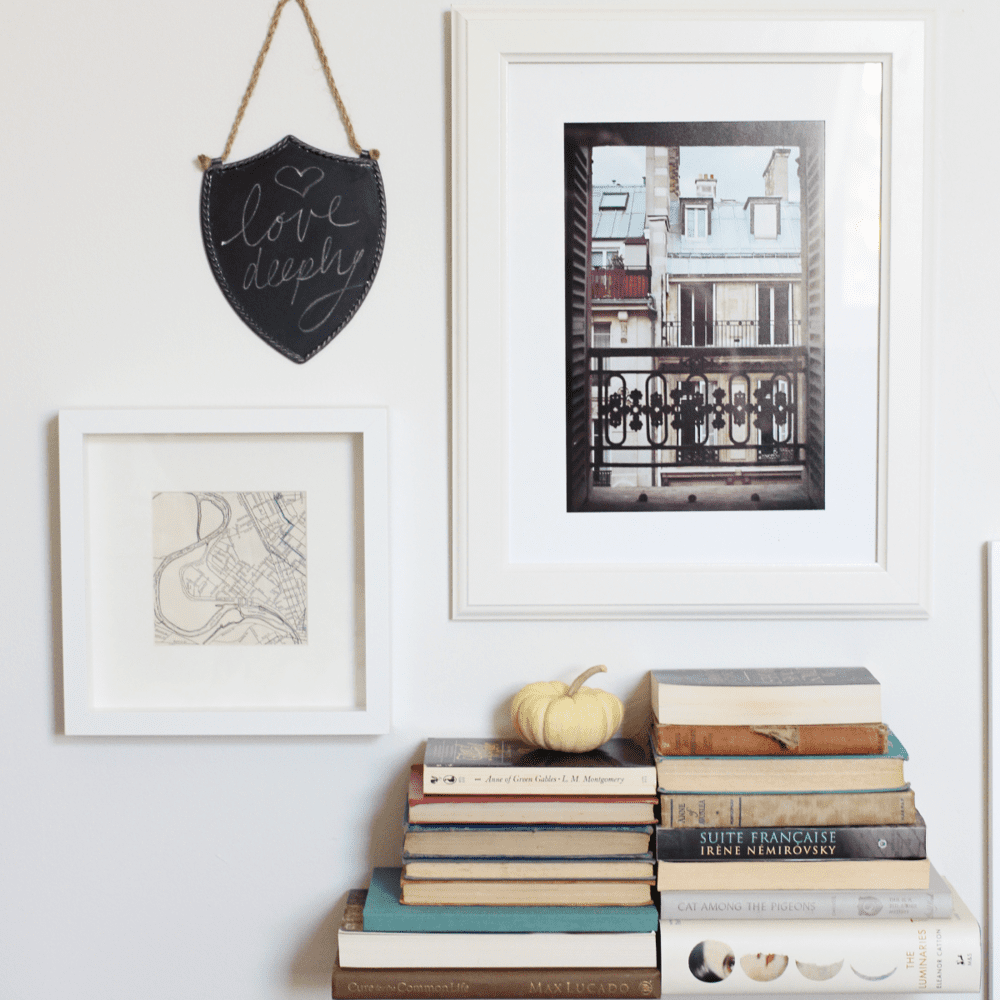
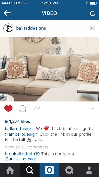
Happy weekend! I just wanted to check in and update you on how Britt is doing with the One Room Challenge! To catch you up to speed if you are new, Britt is the amazing graphic designer who brought so much style to my site and she has asked me to help her design her master bedroom space for the One Room Challenge. We are in the thick of it and about half way there!! She has added more to her gorgeous gallery wall…


A white plate with a flower on it hanging from the wall.


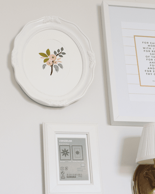
In this above picture, she did a trick that I also like to use in gallery wall installs. She hung the frame without the print, to see if she liked the layout and arrangement. Even if clients are not sure what prints to put in their frames yet, I like to at least hang the frames and begin the process. Then, if we like the arrangement, we know what size prints to be on the lookout for.


A white plate with a flower on it hanging from the wall.

images via

Britt just added the chalkboard shield and I love the depth it brings to the wall. To see more about Britt’s ORC journey, visit her latest post HERE. And to keep up with all things One Room Challenge related, visit the founder’s blog… Linda, from Calling it Home.

Why This Works

October 28, 2015 by Amber Filed Under: design, personal design style, why works series


Happy Wednesday! I am back for another installment of Why This Works. Today’s space is a living room seen in Better Homes and Gardens. I thought this space really spoke to what I was discussing in my last post and you’ll soon see why!


image via

In my last post, I talked about using several colors in a room and how to make that work. If you have a common thread for all of those colors to come together, then you can sprinkle each color around the room and it will make sense. In this space, the color palette is brought together in the beautiful Chiang Mai dragon ottoman. The raspberry colored side table, peacock art, bright blue throw and pillow and the magenta geometric pillow, all are tied in with that ottoman. The bright hues are then balanced with the neutral seating, wall color and area rug. The black window trim makes you stop and take notice and then the calm white walls tone down the window trim. Touches of nature are brought in with the tall fiddle leaf fig plant and vase of fresh flowers. There is so much crazy good balance and proportion going on in this room! The light area rug is a great opposite to the dark, warm wood floors and leather club chair. The woven basket tray on the colorful ottoman makes the room feel relaxed, as to not take itself too seriously. And the ceiling fan, although not the most amazing accent, shows that the room is also lived in and functional.

What are your thoughts???

Creating an Eclectic, yet Pulled Together Design

October 26, 2015 by Amber Filed Under: #projectvintagegem, amber b design, design, personal design style


I have always said that I appreciate so many different design styles and believe they can exist together. Mid century can work with bohemian, traditional can work with modern, etc. A space can have a few different styles together and as long as they are carried by a common thread, they work. I try to use art, area rugs or pillow fabrics to pull a color scheme together and have it make sense. Then, the colors found in those accessories can be sprinkled around the room.


A living room with blue and white pillows on the couch.

via

This space above, in the home of Mandy Kellogg Rye, has a blend of modern, traditional, coastal and bohemian and works so well! The ice skating art work pulls together the reds and blues to make it all look cohesive.

A living room with blue and white pillows on the couch.

via

This dining room, above, was designed by Lindsay Speace and is anything but predictable. That’s what I love so much about it! This modern light fixture, in a traditional space, takes it to another level! The white chairs bring a coastal vibe and help to brighten up the space. Large scale items, like this pendant, always makes a room dramatic and stops you in your tracks.

So if you don’t have one particular style, that’s ok! I think it’s more fun to mix it up and find things that truly speak to you and how you live. When you do that, you really feel at home. And if you want to bring a color into a space but don’t already have it in there, bring an art piece or accessory in with all of the colors, to help tie it together and make sense. A good rule of thumb, is if a color can be replicated at least three times in a room, it becomes meaningful to that design.

In other news, I am over the moon thrilled to be featured on the Ballard Designs instagram page! Project Vintage Gem was featured in a flipagram, where they showed six different images from the project. Thank you so much, Ballard! It was definitely a pinch me moment!!

A picture of a living room with beige furniture.

Have a great day!

Why This Works

October 21, 2015 by Amber Filed Under: design, personal design style, why works series


Welcome back to another Why This Works post, where I highlight a designed space and discuss why I think it’s amazing! Today, I am showing a cozy eating nook in a stunning kitchen. Take a look…

image via

Not only do the white cabinetry, subway tile and warm wood floors get me, but that banquette just makes you want to linger for days! I have been using banquettes in my designs lately and if you have a spot for it, it’s the perfect way to bring warmth into the kitchen. This image was found on Midwest Living, for one of their articles about this same topic. When the upholstery is done in an easy to clean fabric, it becomes not only beautiful, but very functional. I also love the pairing of the bistro chairs and metal top table. It provides just the right amount of balance and a collected over time style that I love. I also love the cafe curtains and the softness they bring to the windows. The fresh fruit and flowers provides just the right amount of color to the space, making it a cheery and warm kitchen. The warm butcher block island counter brings a nice balance to the white stone counters on the perimeters. The touches of metal shown in the chandelier and nailhead range brings another texture to the room and makes me want to see more!

What are your thoughts?

A big thank you to blog friend, Emily A Clark, for including me in The Saturday Six series this past weekend. I read her blog every day and I was so excited for the opportunity! My family knew right away, as I yelled, come here, come here! look at this! from the computer room. To check out the post, visit here. You will definitely want to see what else is on the list!

Make sure to come back tomorrow, for a fun announcement!! Eeeeek!!

Why This Works

October 14, 2015 by Amber Filed Under: design, personal design style, why works series


Welcome back to my Wednesday series, Why This Works, where I highlight a designed space and talk about why {I think} it’s amazing. Today, it’s the former living room of interior designer, Lauren Liess. She has recently moved and is blogging about her new home’s renovations HERE. This space featured today, also underwent a major renovation to make it reflect her and her family. This space is warm, inviting and definitely Lauren’s signature style…

A living room with two couches and a fireplace.

image via

The earth tones and blending of modern with vintage, gets me right away. I love using warm colors in design and then balancing that with clean, crisp and modern elements. I think it’s such a great combination! The warm leather chairs and patterned rug is paired with a crisp white slipcovered sofa and modern acrylic coffee table, to achieve that collected over time style that Lauren loves and I always appreciate. She loves to use natural elements, so it is very fitting to see her home styled with botanical inspired fabrics from her fabric line and fresh greenery on the table. The warm wood beams on the ceiling pair so well with the modern brass sputnik chandelier and clean lined windows. Although ceiling beams can appear traditional in origin, Lauren has installed them with a thin, more clean beam style. The books on the coffee table, tray with beads and fresh greenery all invite you to stay and linger for a while. I cannot wait to see what she comes up with for her new home! It will be nothing short of amazing. Her new book is also out this week. I hope to show you a picture soon, with how I have styled my table with her new book!

What are your thoughts on this space?

New Local Design #projectbedroomrefresh

October 9, 2015 by Amber Filed Under: #projectbedroomrefresh, amber b design, ballarddesigns, design, local clients, personal design style


Happy Friday!! I am excited to share with you a new project that I am working on. I have called this one #projectbedroomrefresh. If you follow along on instagram {AmberBDesign}, then you will also see sneak peeks of the project there! I met my new clients about a month ago, when they contacted me to help with the upstairs bedrooms. The rooms have not had any design attention for some time and they wanted them to feel stylish, updated and most importantly, complete for their guests. I proposed bedding, window treatments and accessory options. We are also working on their master bedroom and giving that space a complete overhaul. They will be keeping the bed, dresser and night stands, but everything else will be transformed in their room. I am excited to see it all come together. Below are my ideas for the two guest rooms and the master bedroom…

A picture of some materials and instructions for making curtains.

This is the design plan for the guest bedroom in the back of the house. The tone on tone leaf patterned fabric will be the drapes! The bedding will stay soft and crisp, while color will come in through the throw pillows. The herringbone rug in the back of the design layout, will be the new hallway stair runner. I just love how that pattern will look as you walk up the stairs.

A table with some fabric samples and a plan

The above design is for the other guest room. My clients love a traditional design aesthetic, so when I found this plaid fabric from Tonic Living, I knew they would love it! I will then balance that traditional with some modern, which also happens to be a favorite style of mine. I am thrilled that my clients are on board with that mix up. I think it will bring so much depth and interest to the rooms. The drapes will be in the neutral, Greek key fabric, also from Tonic Living. I have used this fabric in another client’s home and it is a stunning print for curtains!

A table with some furniture and fabric samples

And last but not least, is the master bedroom. This is a rather large room, so we luckily have space for a small seating area. We will add pattern and color to this room with the four inch buffalo check fabric for the drapes. I am so excited for that one!! With two windows in the room, there will be four panels in this gorgeous, on trend but traditional print. We will modernize that classic buffalo check with some CWD pillows and a stunning Ming dragon lumbar pillow. And it wouldn’t be an Amber B Design project without a little antique brass thrown into the mix! Each space has a little touch of brass to give it that collected over time style. When my clients renovated their kitchen a while back, they ended up using a couple of different metal finishes. I told them they were on trend, without even realizing it!

If you have read my blog for a while, you may notice that these presentations look different than past design presentations of mine. I have decided to go in a different direction, with how I show my clients the ideas. I used to present with large boards, where the images were smaller, but fit all in one place. Now, I have larger swatches of fabric, paired with smaller presentation papers. I now show vignettes and group them by sections of the room. I am really pleased with the new format and believe it will be easier to organize for both myself and my clients. With any business, self reflection and constant editing are important. I was talking with a good design friend of mine and her advice is always invaluable to me. I know with my own business, I am constantly looking and reevaluating to see what works best. So far, I am happy with this new change!

I look forward to updating you on this project as it moves along. And to follow along more often, you can check in on instagram {AmberBDesign} Have a great weekend!!

Why This Works

October 7, 2015 by Amber Filed Under: design, personal design style, why works series


Welcome back to a Wednesday series I used to write and finally bringing back! Why This Works is a weekly series where I select a room and describe why {I think} it works! Make sure to check back every Wednesday {or every Wednesday I get my act together to write the post} to see what space is next on the list! Up today, a lovely, stylish, stops you in your tracks master bedroom! This is the bedroom of talented designer Erin Gates, from Elements of Style blog.

A bedroom with a bed, nightstand and window.

This space doesn’t need much explanation of why it works. I was immediately smitten with it when I saw it. I love it when master bedrooms have that calm, serene vibe. It makes you feel as if you are on a vacation, right in your own home. I love the crisp white bordered duvet and shams and the way it balances so well with the warm wood bed. I always fall for a four poster bed of any kind and this has the ability to be transformed, just by adding fabric to the posts. The neutral bedding and area rug allows for bold, patterned drapes. But when they are done in neutral, almost tone on tone colors, the large print paisley fabric still reads calming. I also love symmetry in bedrooms and the pair of night stands and bedside lamps does just that. But then, Erin balances that with a whimsical, asymmetrical art piece above the bed. {And by the way, if you are a reader of her blog, she bought those sunburst art sculptures at Target!!} A love a great high/low design story! Lets also discuss the way the drapery panels and shades are hung on the walls. High and wide is the important topic for this installation. Erin hung the drapery rods and shades higher and wider than the window frame, drawing your eye up and giving the illusion of more space and a larger window. I love that trick and think it’s so important in any space! I just presented to clients yesterday, where we discussed this same topic. We will be installing both the shades and drapery rods as high as we can on the wall. It’s such a great visual trick. And last but not least, nightstand styling would not be complete without a formula similar to Erin’s… small stacks of books, sculptural accessories and personal mementos/picture frames. And of course, a fresh vase of flowers!

So what do you think? Does this space work for you? Erin also has a NY Times best selling book out and it also happens to be the first design book I have read from cover to cover! Check out her blog and read about her book HERE.

I Am Speechless…

January 7, 2015 by Amber Filed Under: design, personal design style


Happy new year! I hope everyone feels refreshed, energized and excited for the opportunities a new year brings. We had a nice, long break from school and I have to say, the house feels a bit too quiet. It was such a relaxing break and I miss the little fam. But I am ready to jump back into working and see what 2015 has in store! I am thrilled to be writing my first post of the new year about my blog friend Sue, from her popular blog, the Zhush. Her new Connecticut home was featured on Domaine yesterday and is a stunning interpretation of Sue’s chic, coastal style. Sue worked along with designer Lauren Muse of Muse Interiors to make this house a home. Nicole Cohen from the blog Sketch 42 captured the home’s character with her amazing photography. Let’s take a look!

{I spy a Target Threshold ottoman above!!}

I love Sue’s effortless and chic style! Enjoy your gorgeous new home with your family, Sue!
Home of: Sue De Chiara
Designed in collaboration with: Muse Interiors
Photography by: Nicole Cohen
Seen on: Domaine

A Local Client’s Family Room {Making Great Progress}

November 7, 2014 by Amber Filed Under: design, family room, interior design, personal design style


I have been working with a local client who I am happy to also call a good friend. We have been plugging away on her family room, making it a space that has a blend of traditional with modern. She has been a joy to work with so far, because she truly gets as excited as I do about design and it feels like a girl’s day out when we meet to discuss the progress in her space. Here are some before pictures of the room to show you where we began…

Before…


We will be working with the main furniture pieces in the room, such as the Pottery Barn sectional and storage cabinet. Since we are keeping these warm furniture pieces, I immediately thought we should cool down the walls with a color that balances all of the warm elements. I chose Revere Pewter by Benjamin Moore and she loved the idea. The walls in this family room are daunting… they slant up to a dramatic height and painting this room is a huge undertaking. My clients realized it needed to be done to transform the space, but I also totally understood the hesitancy of the project. Luckily, the tried and true Revere Pewter was a winner and my clients could not be happier with the result! This tall wall in the photo above needed some architectural interest to help visually bring that wall down to feel more cozy. I suggested adding board and batten to this wall (up 3/4 of the wall) and painting that a dark gray/brown shade. I selected Equestrian Gray, also by Benjamin Moore. Here is the design board I initially presented to my client…

The Design Board…


And here is the amazing progress of this room so far…

Progress…


We changed the color palette a bit for the accessory pillows, but for the most part, the rest of the plan stayed the same. We also replaced the curtain rods with brass options and purchased longer drapes, so the rods could be installed much higher than the windows. That visually brought your eye up, making the windows feel grander and in better fitting with the height of the room. Love that trick! Our plan moving forward is to replace the slipcovered chair and ottoman with a leather club chair/ottoman, place console tables behind the sectional, add ceiling beams to warm up the tall ceilings and install a fireplace/mantel where the TV is currently. We will also accessorize the walls and shelves, but the transformation is already coming along so well, that I had to share!

Thank you so much to my amazing client and friend for allowing me to share the progress here on the blog. I look forward to sharing more, as the room design unfolds! 

Before and After {E Design Client Progress}

October 7, 2014 by Amber Filed Under: design, e-decorating, e-design, interior design, personal design style


I always enjoy getting progress and after photos in my inbox! Truly makes my day. I have some updates to show you on two e-design projects that wrapped up this past year. First up, is a client who has a mid century modern, eclectic, bohemian style. She wanted that reflected in her living room, which is the space directly off of the foyer. Here is where the room started…

Before


I love the character in my client’s home. We kept the gorgeous rug, but replaced everything you see here with new pieces. We felt the furniture was a bit oversized for the space and my client wanted a more streamlined, cleaner look for the room. Here is the design board I came up with for this space…

The Design Plan


She is almost done implementing the design plan! Today, I am showing you a sneak peek of the left corner of the room, where the table and chairs are shown in the pictures.

After in Progress


I just love the way the table lamps bring that eclectic, collected style to the room. I also love the way the gourd lamp compliments the art print above the desk. The room is lighter and brighter and I can’t wait to show you more, soon!

My next e-design client was looking to completely transform her living room and foyer. We replaced almost everything in the room and the end result is pretty dramatic. Here is where the room started…

Before


And here is the design plan I came up with for the spaces…

Design Plan


Today, I am showing you a sneak peek of the fireplace wall and the nooks beside the fireplace.

After


The DIY inverted arrows print she made turned out beautiful! I love the way the mirrors add a dramatic focal point and reflect the light around the room. The biggest impact for this space is the lighter paint color on the walls. What a difference! I also think a huge impact is the newly painted fireplace mantel. Painting over the wood stained mantel instantly modernized the room and this whole wall. I promise a full reveal of this space soon!

Great job to my amazing, wonderful clients! Thank you for letting me share your beautiful spaces with my readers. If you are looking to make your home better reflect your style, contact me at [email protected] for more info.! I am currently booking for January 2015.

  • « Previous Page
  • 1
  • 2
  • 3
  • 4
  • 5
  • 6
  • …
  • 14
  • Next Page »
Welcome!

Hi, I'm Amber... a wife, mom and interior decorator. I am the writer of Simple Dwellings and the designer behind Amber B Design. Blog topics are all things design, with the occasional DIY attempt! Thanks for stopping by Read more...

  • Bloglovin
  • Email
  • Instagram
  • Pinterest
  • Twitter

Blog Posts, Straight to Your Inbox

Popular Projects

A dining room with white walls and wooden table.
A black door with white curtains and a red chair
A staircase with black and white chevron pattern on the steps.

Blog Love

  • Addison’s Wonderland
  • A Thoughtful Place
  • Alison Giese Interiors
  • Amber Interiors
  • Bailey McCarthy
  • Caitlin Wilson
  • Chris Loves Julia
  • Classic Casual Home
  • Cottage and Vine
  • Design Indulgence
  • Dwell by Cheryl
  • Eddie Ross
  • Elements of Style
  • Emily A Clark
  • Emily Henderson
  • Gallery No Eight
  • Hi Sugarplum
  • House of Jade
  • Jana Bek
  • Juniper Home
  • Kate Marker Interiors
  • Lucy Williams
  • Monika Hibbs
  • Our Fifth House
  • Pencil and Paper Co
  • Rachel Parcell
  • Rambling Renovators
  • Pure Style Home
  • Sita Montgomery
  • Studio Mcgee
  • The Makerista
  • The White Buffalo Styling Co
  • the Zhush
  • Traci Zeller
  • Young House Love

Copyright Amber B Design © 2025 ยท Design by Britt Douglas


Loading Comments...