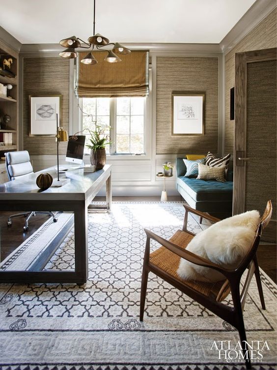
Welcome back to another installment of Why This Works… a series where I show a designed space and talk about why I love it! I have been a long time admirer of Ashley Whittaker’s fresh take on traditional design. She has a unique talent for mixing patterns and gives a room a polished look while still bringing a casual, family friendly approach. This living space below, is right up my alley! Enjoy!
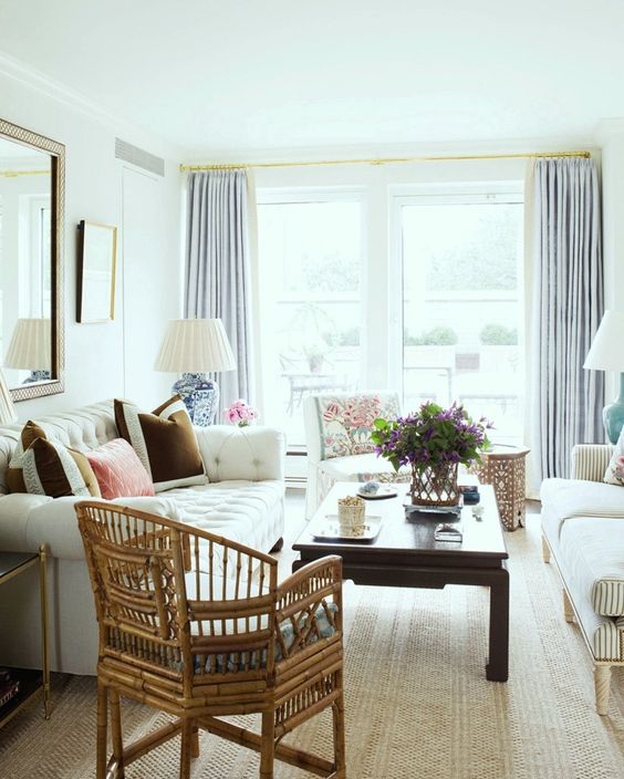
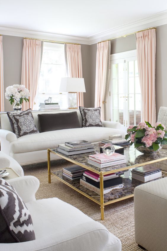
This space is both modern and traditional, which I love. The tufted sofa, pleated drapes and empire lamp shades all read formal, yet the natural weave area rug and rattan side chair allow the space to feel laid back and casual. I love how the coffee table works for all sides of the seating, making the room feel so warm and cozy. Seating always looks great when it can be gathered and brought close together, making an intimate arrangement for conversation. Most of the furniture is neutral and light, allowing the bursts of warm color to come in through the pillows. Cool colors are brought in through the drapes and lamp bases, creating that balance. I am also a huge fan of brass accents and that is seen in the curtain rod, side table and wall art. The finishing touch??? A vase of fresh flowers, which also has some added texture with a rope detail on the outside of the vase. Overall, this space works!
What are your thoughts???
Make sure to come back tomorrow, to see some fun e-design projects!

 Design by
  Design by
  via
via