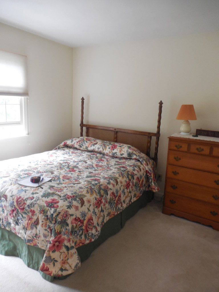
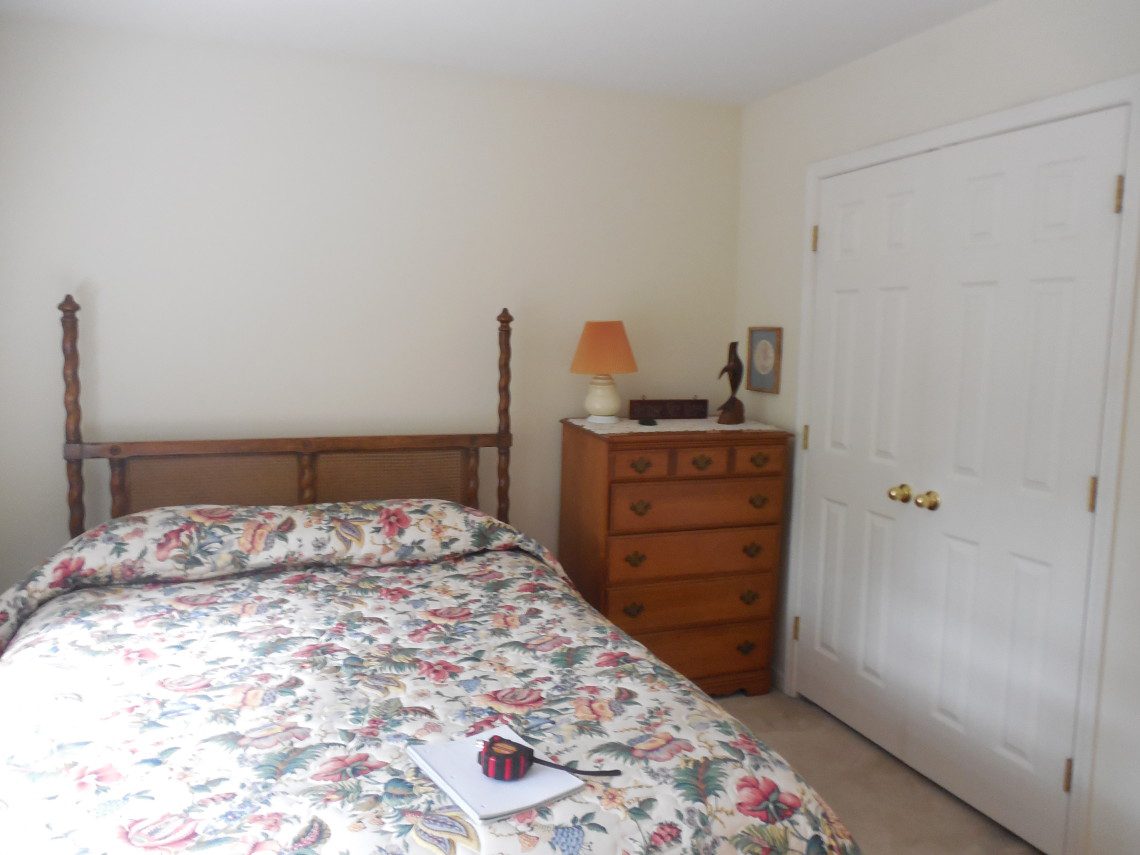
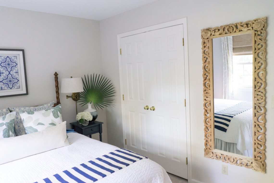
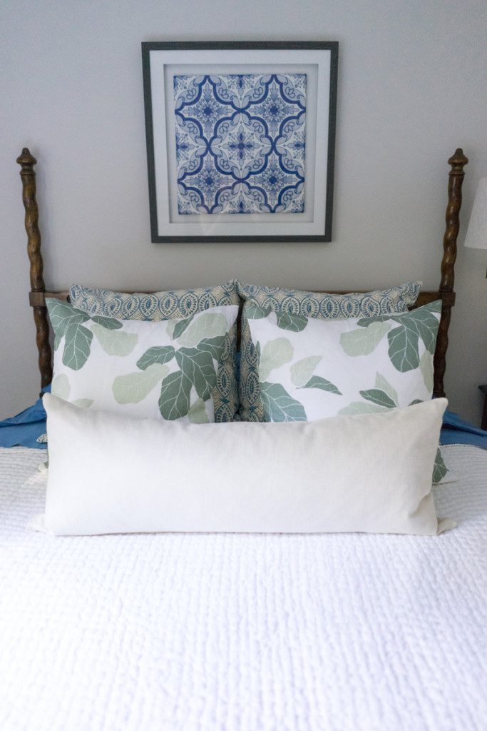
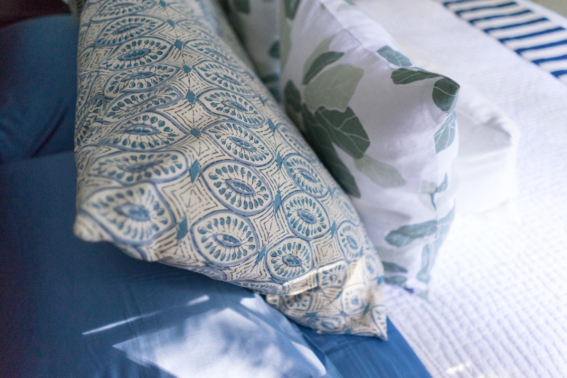
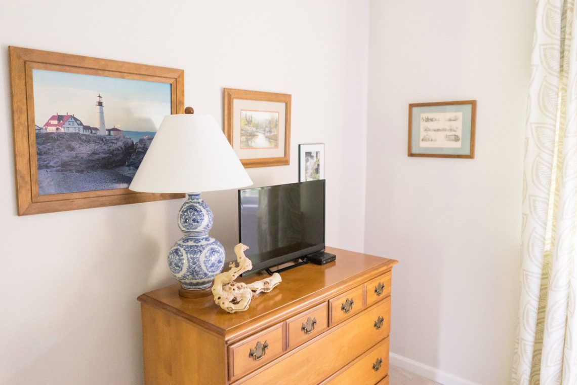
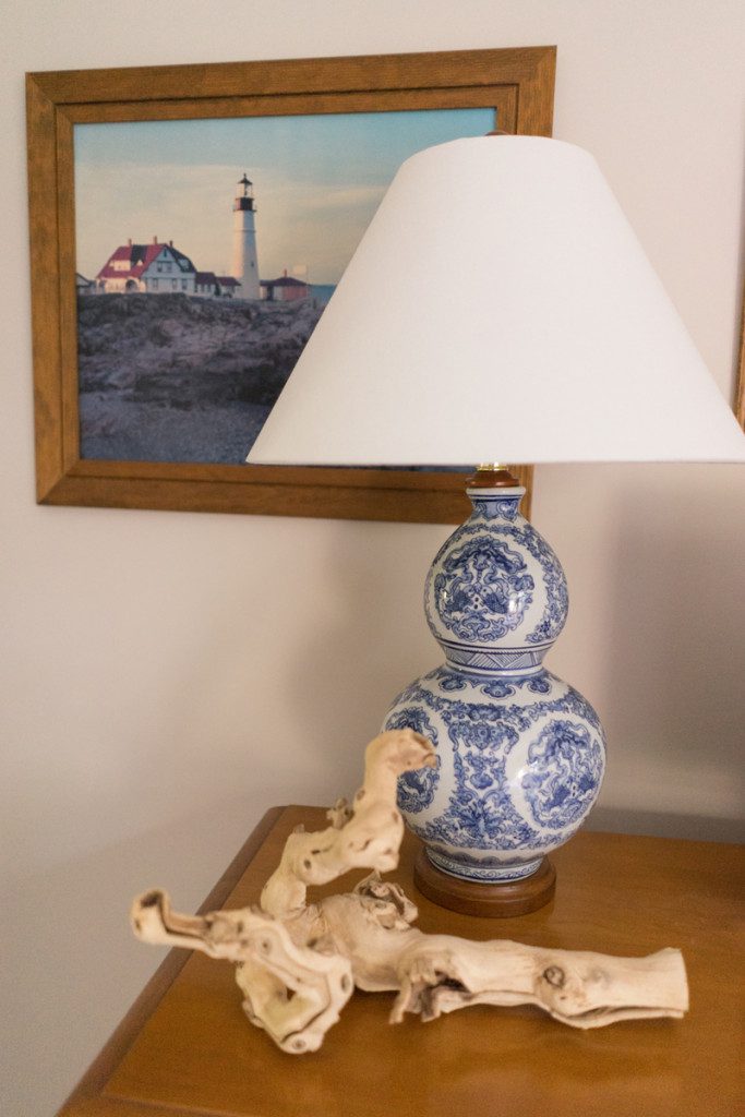
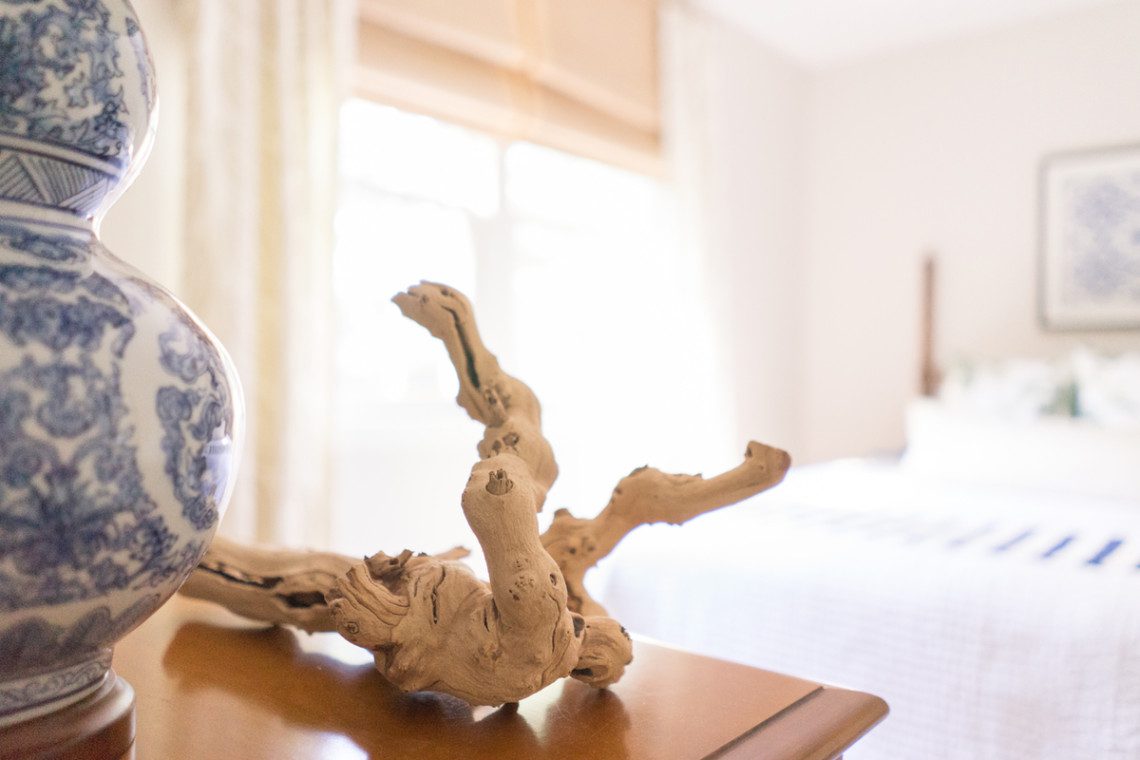
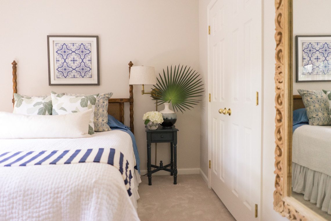
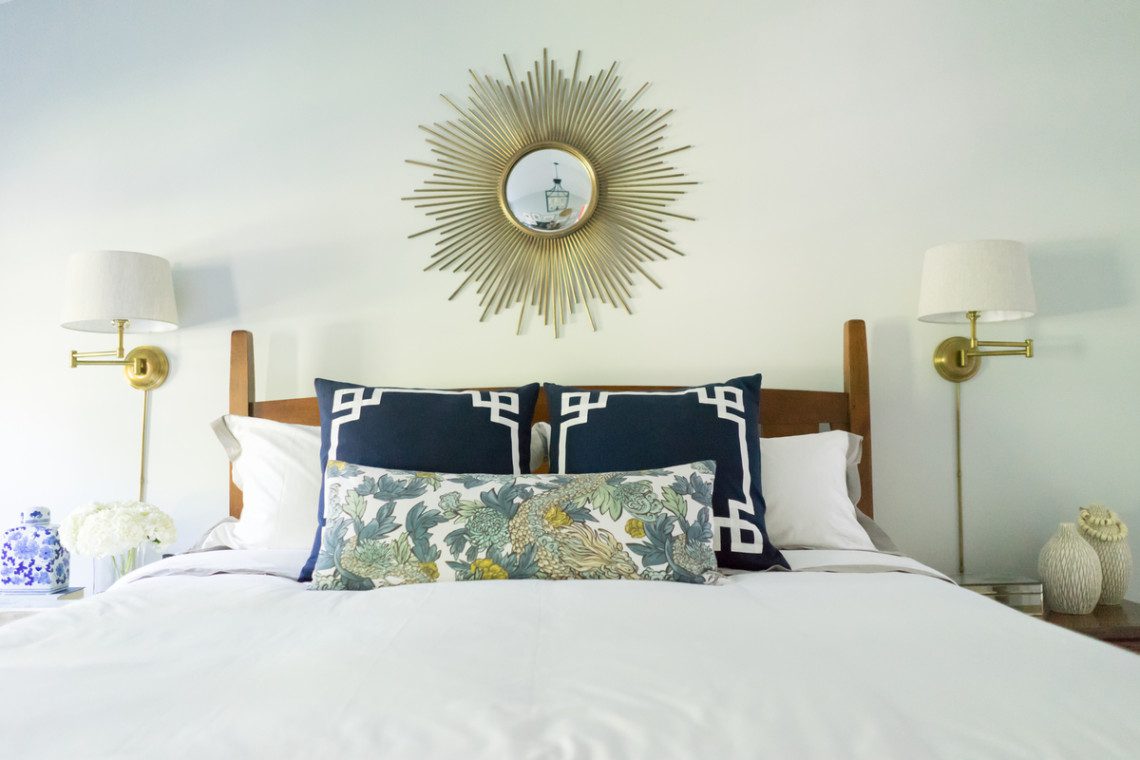
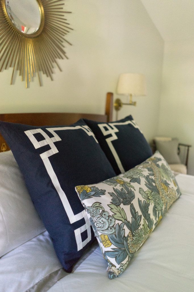
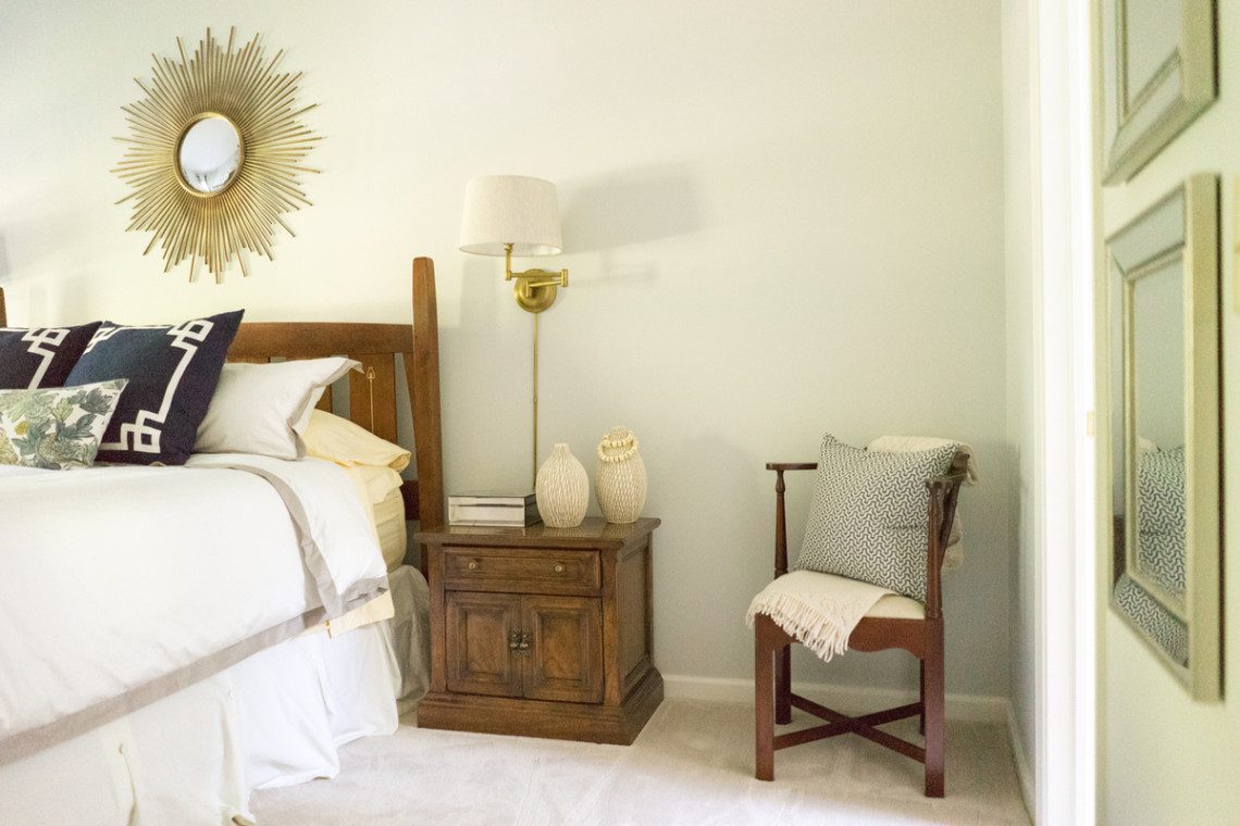
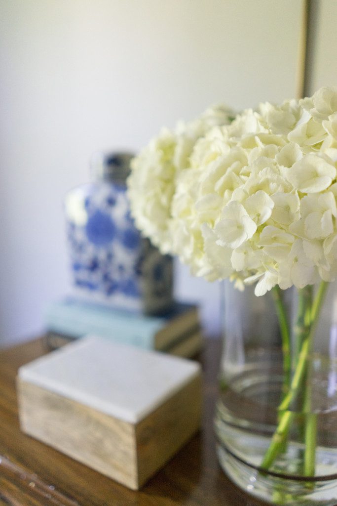
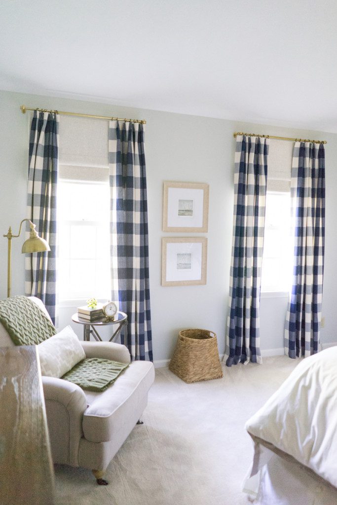
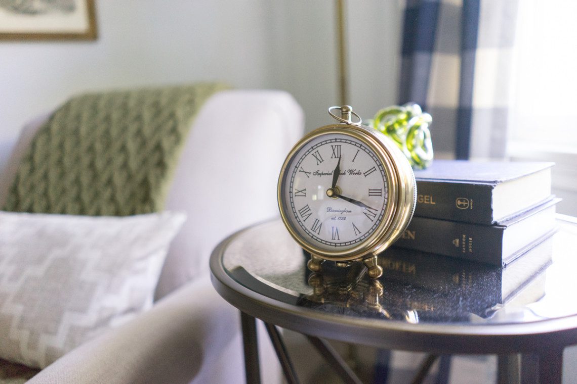
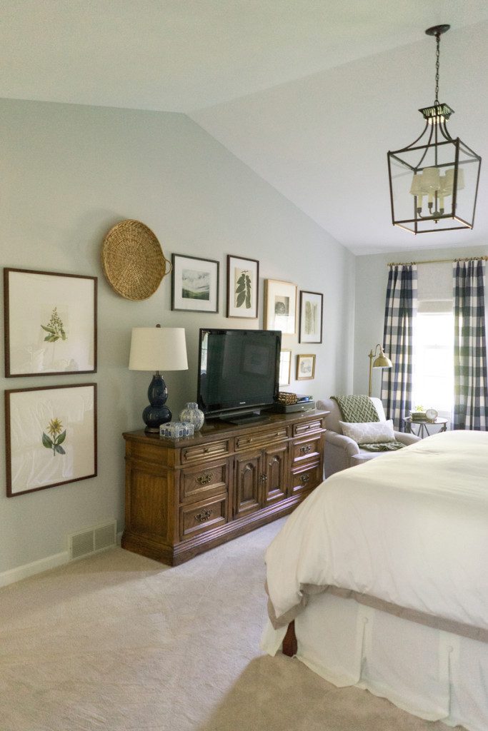
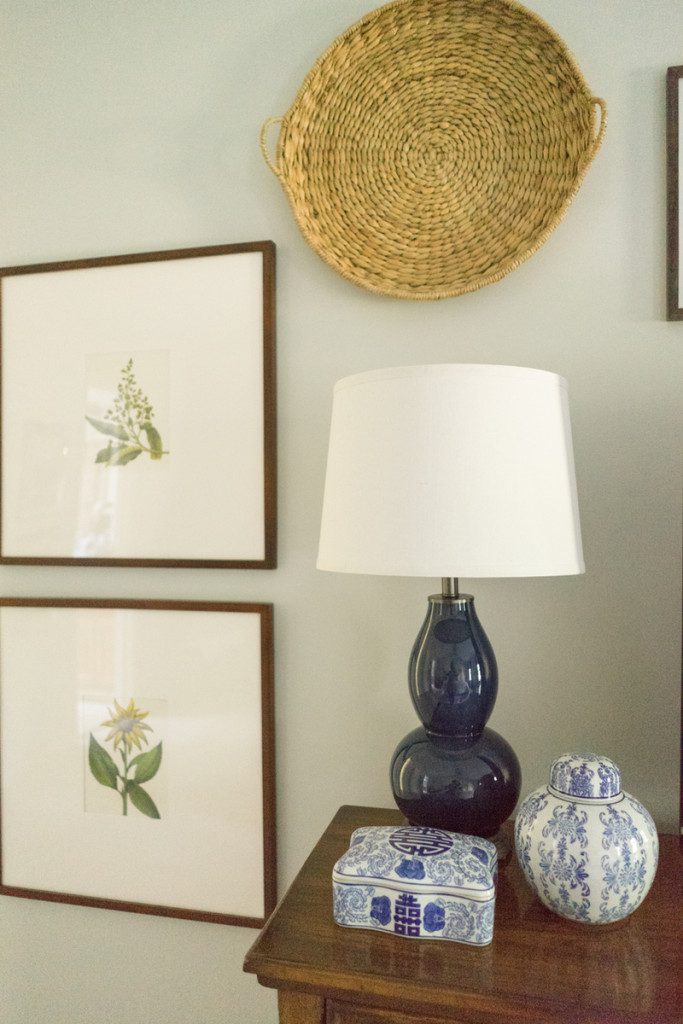
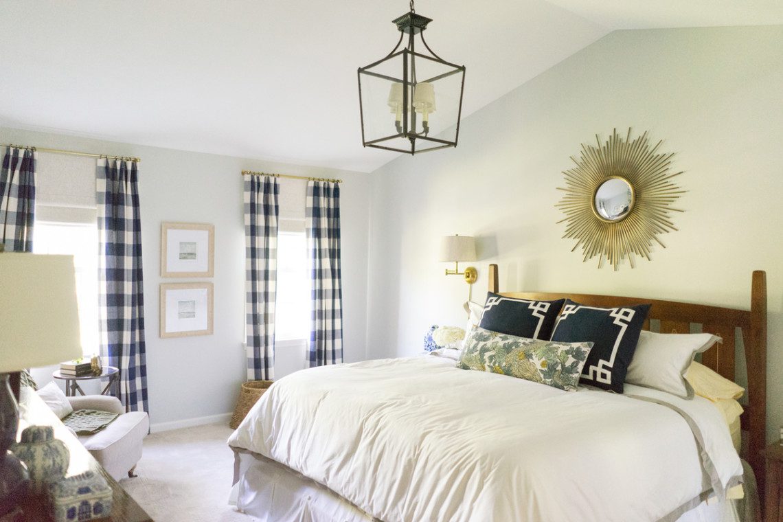
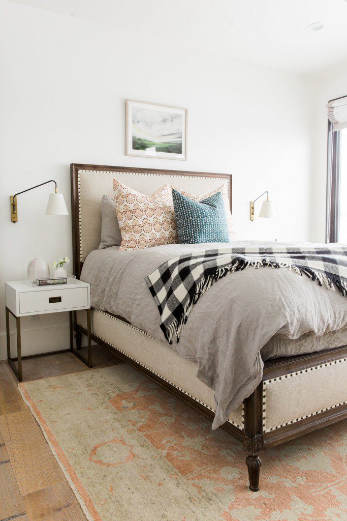
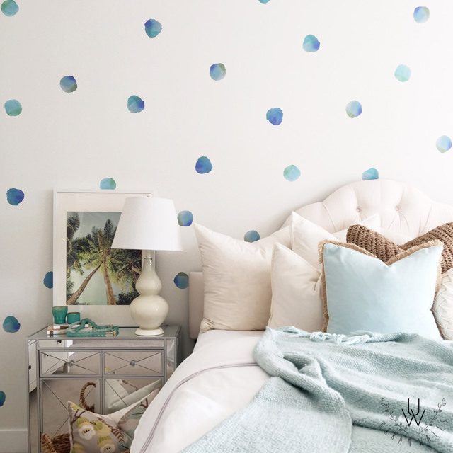
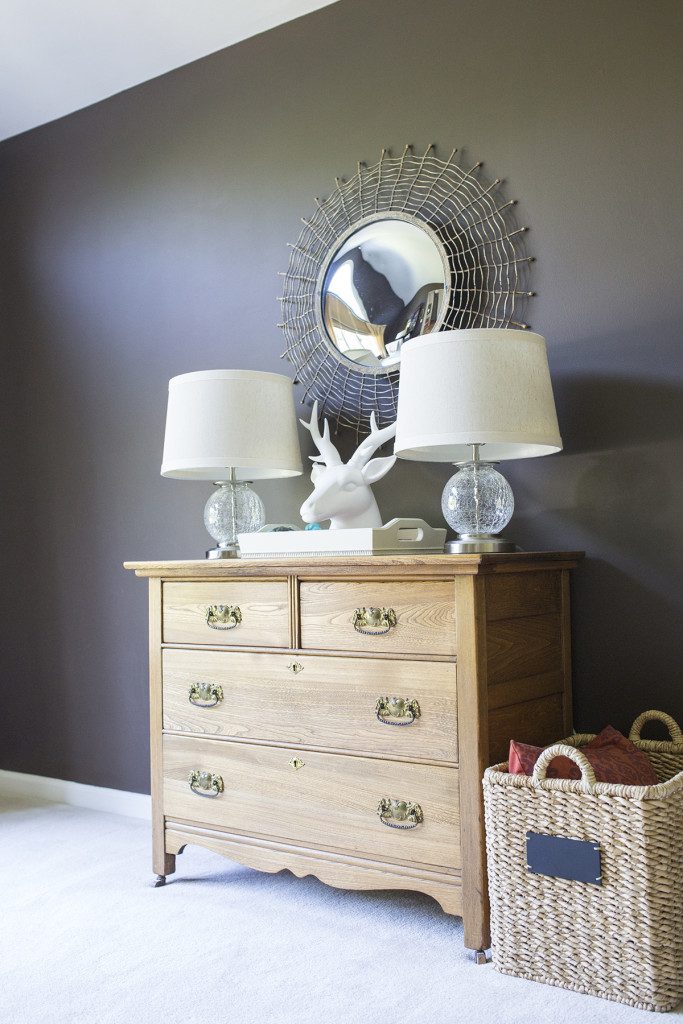
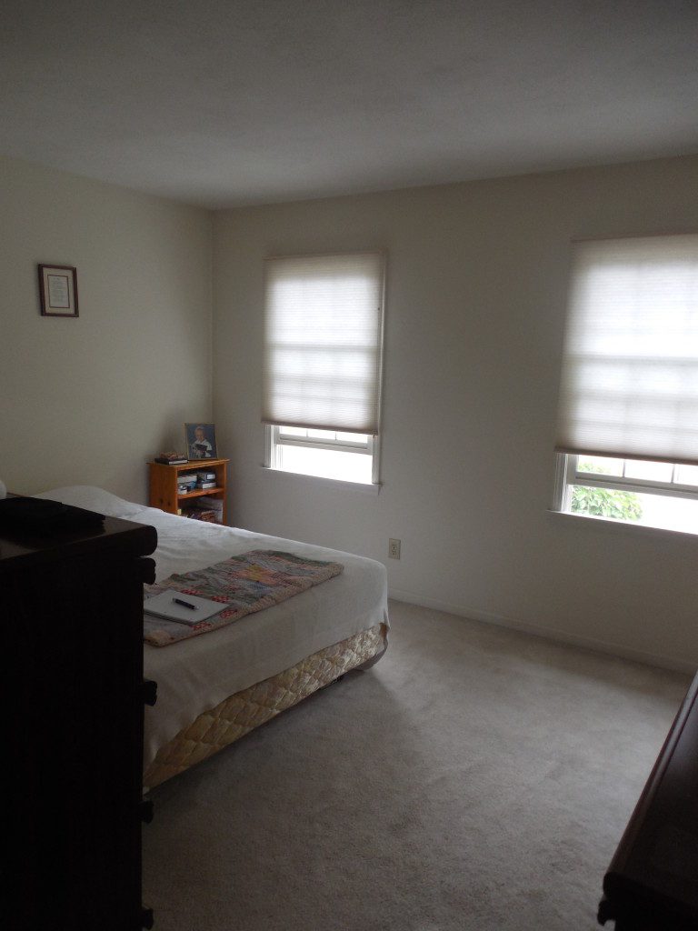
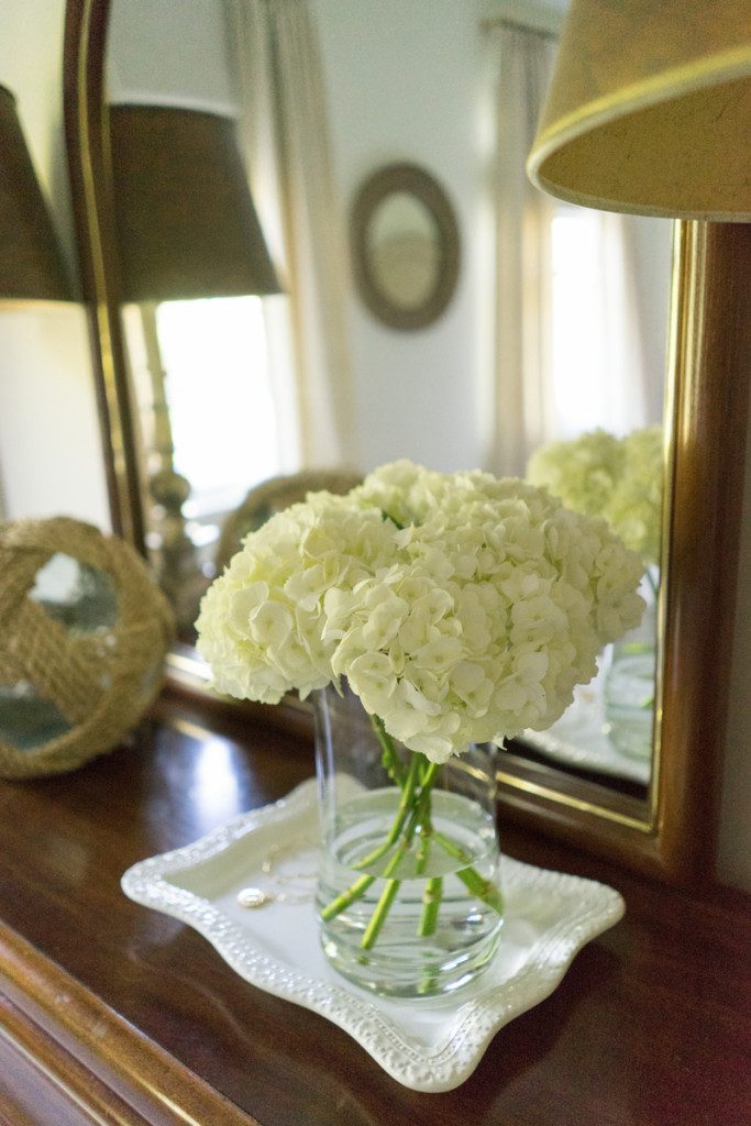
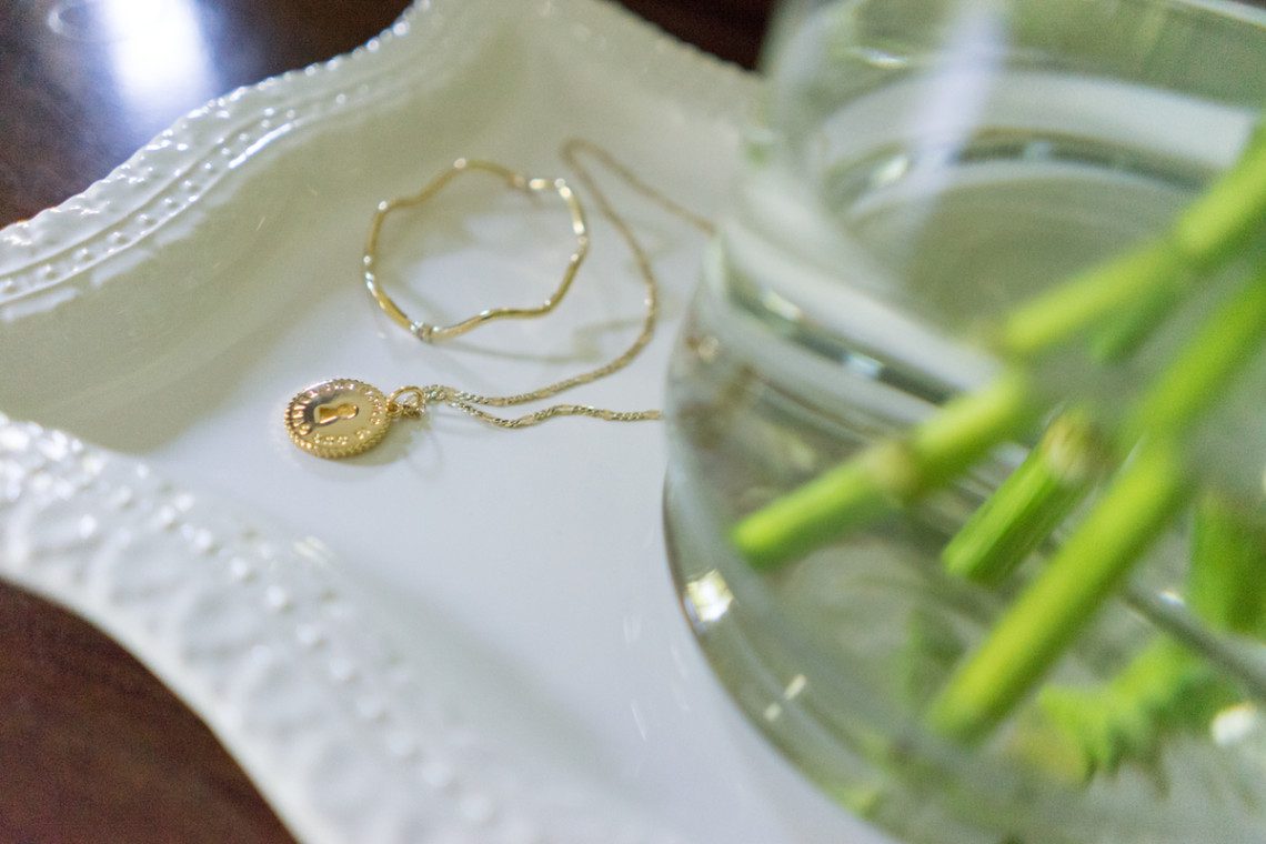
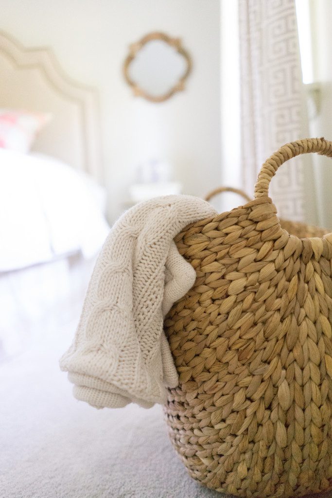
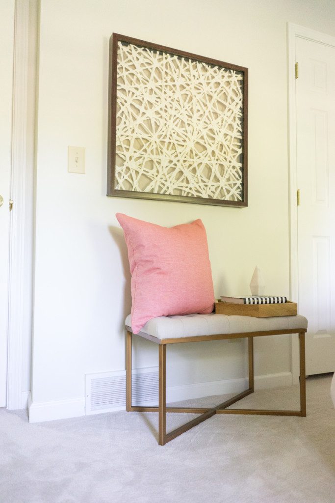
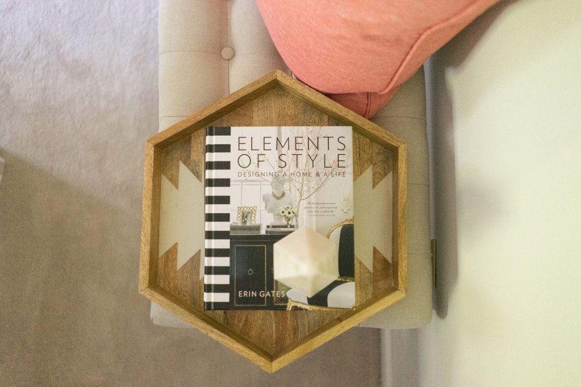
Happy Monday! I hope you had a great weekend. Ours was packed with fun family events and finishing up our Christmas decorating. I am ready to show you the final reveal for Project Bedroom Refresh! Up today… the front guest room. My clients were wonderful to work with. It was a blast for us all to see the three rooms take shape. And the final icing on the cake was seeing Sarah work her photography magic. There is something so rewarding and exciting about seeing the finished designs through her lens. We worked with my clients dresser and table lamps. We refreshed the space with a new wall color, headboard and accessories. On Friday, I mentioned that there would be a bit of a change in this space and not incorporate all of the same colors. I went without the blue in here, but you’ll notice the neutrals and even some buffalo check, helps to tie the three rooms together. So let’s get right to it! Here is the room when we began…
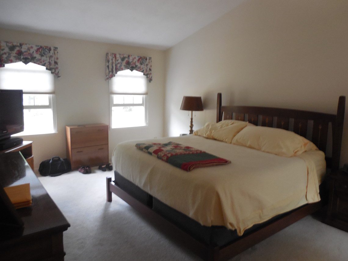
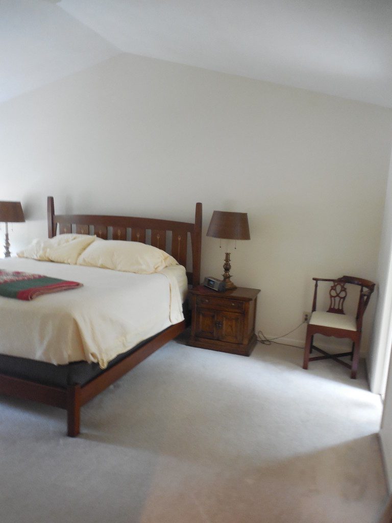
Before
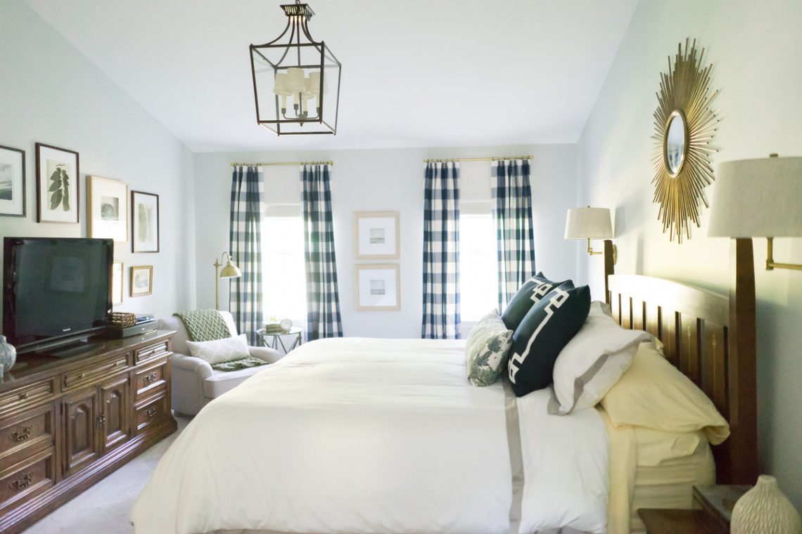
And here it is now…
After
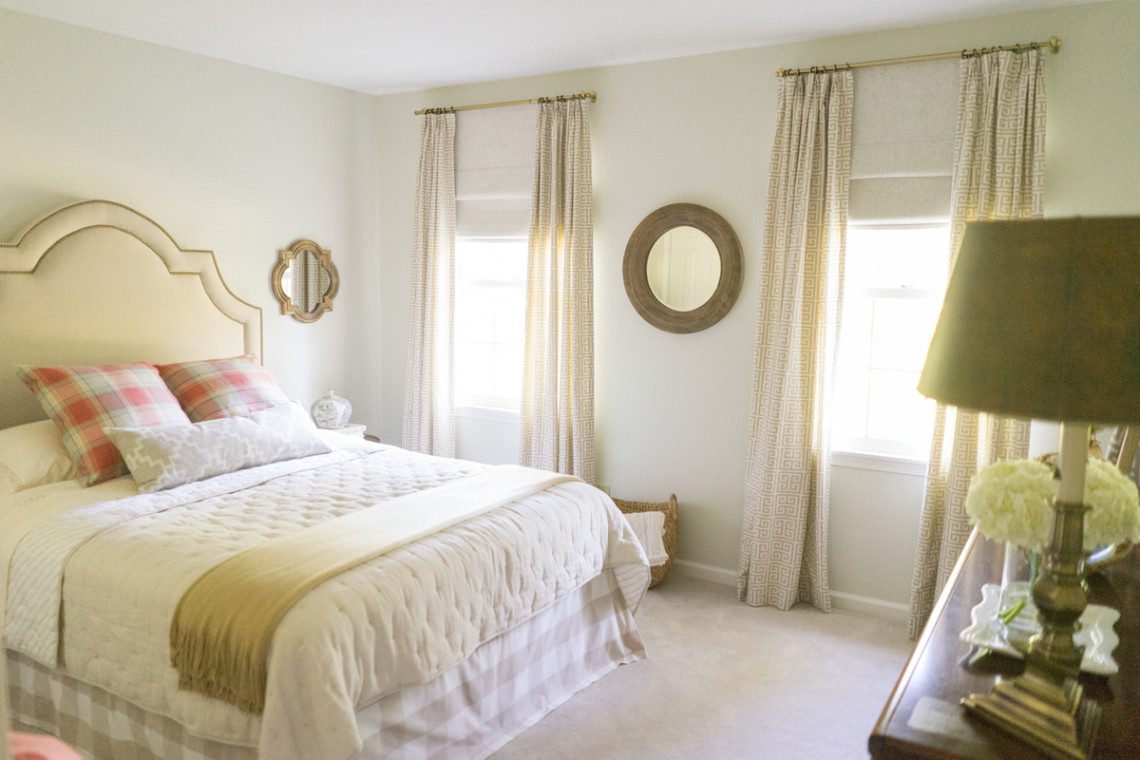
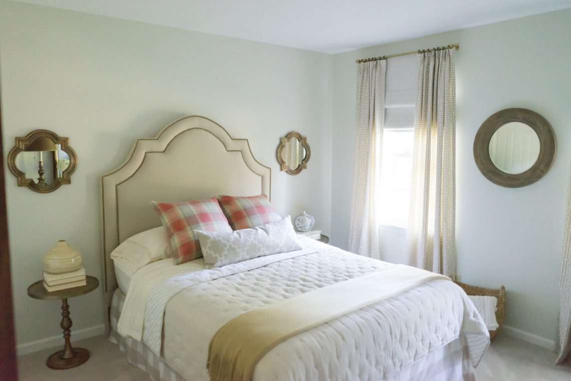
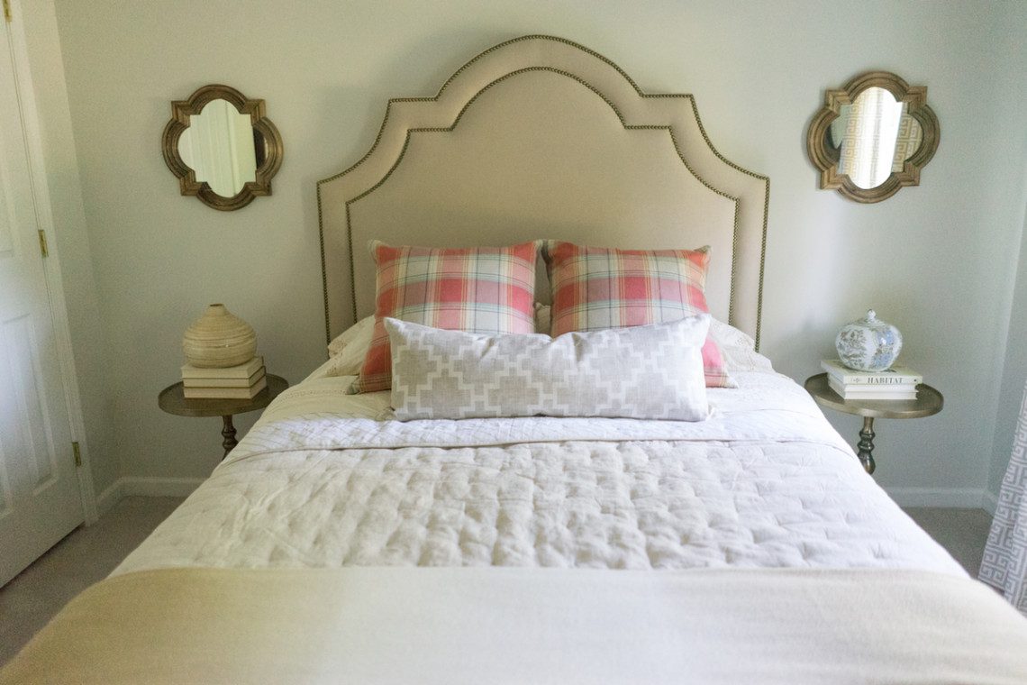
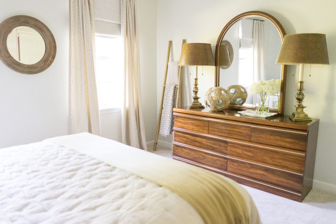
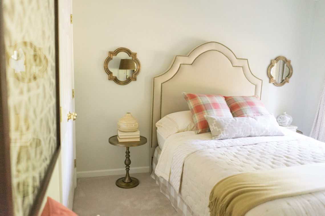
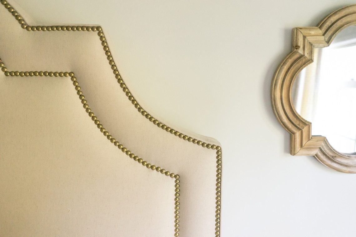
All After Photos by Sarah Heppell Photography
I hope you enjoyed the tour of Project Bedroom Refresh! I have more exciting projects to show you after the New Year!! Stay tuned later this week, to see some snippets of our home for the holidays.