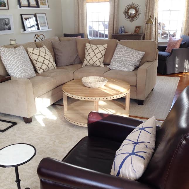
Welcome back to another post of Why This Works… where I highlight a designed space and talk about why I love it so! You may have already seen the gorgeous Michigan home of Michelle Adams… known for her work in Lonny.com and Domino. She decided to leave the fast paced NYC life and move closer to family, in Ann Arbor, Michigan. She completely renovated a 1920’s colonial home and I love every new detail! Today, I highlight the living area…
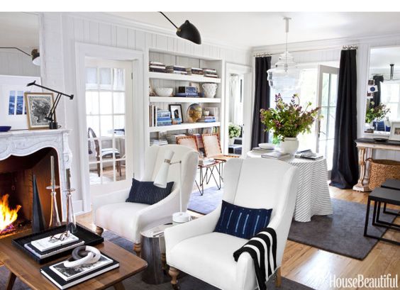
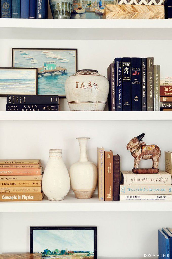
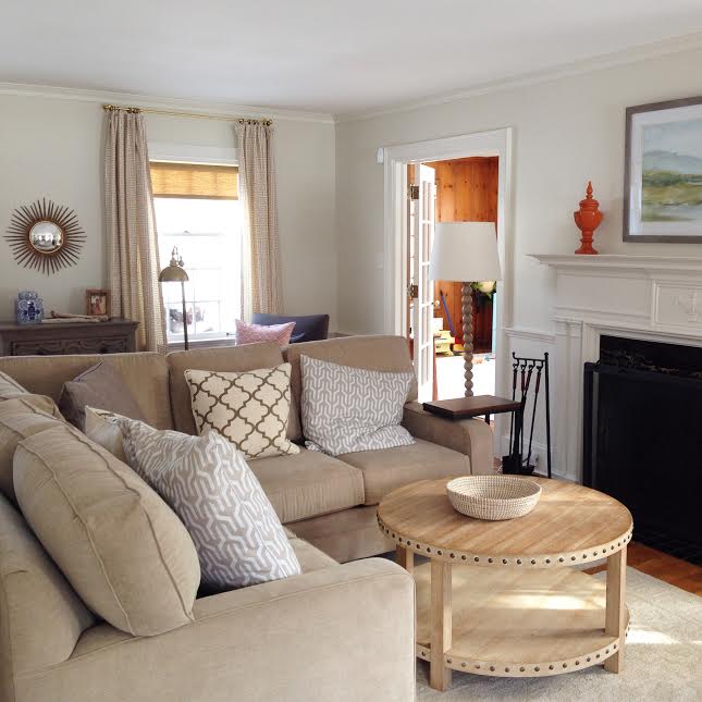
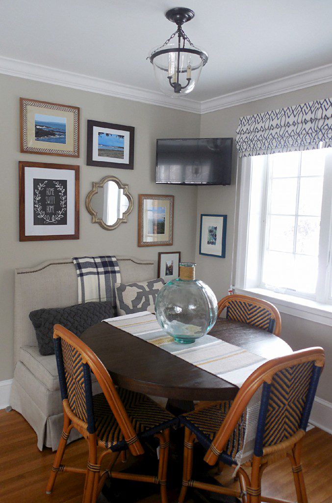
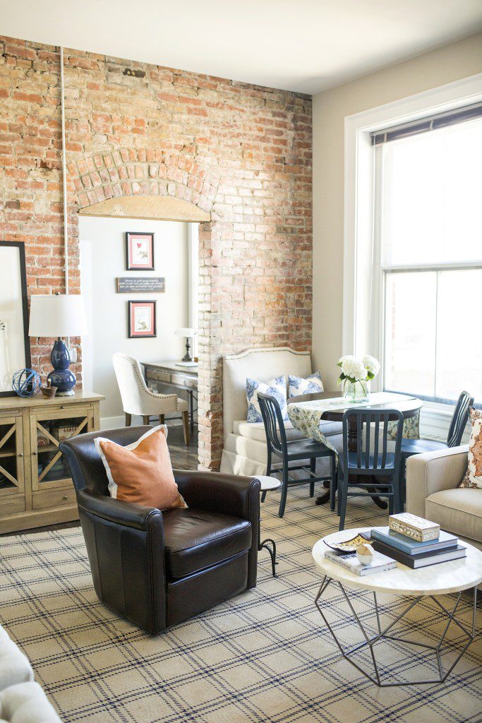
The casual and stylish way she designed her home is so inspiring! It feels warm, lived in and ultra chic, which can be a hard combination to achieve all together. I love that she mixed navy and black. Those colors do go together and I love using them in design. Funny thing- as I’m typing this, I’m also wearing a navy/black striped shirt! And not even planned. 😉 The roaring fire is beautiful and framed inside a gorgeous carrara marble mantel that she had installed. It instantly adds charm to the space and takes her back to what she loved most about her visits to Europe. She also made a great decision to remove the windows at the back of the living area and replace them with French doors. The change allows more light in and is great for functional purposes, out to her new patio. The glass chandelier makes a dramatic statement, yet doesn’t impede your view to the outdoors. The skirted table is adorned with coffee table books and a vase with a beautiful flower arrangement. I always love the casual and stylish look of skirted tables. {They can also be great for concealing storage pieces, if needed!} The open bookshelves show a collection of accessories, books and framed pictures, which I think is the perfect trio when shelf styling! This room has a mix of light and deep colors, warm woods with modern accents and woven baskets and leather chairs for texture. It is that balance and mix that I always appreciate. Michelle loves so many different design styles and it is evident in her accessories collection in her home. That’s what makes a home feel as though it has been curated and collected over time and definitely tells a story. To see her entire home and read the House Beautiful feature, visit HERE.
What are your thoughts???
Make sure to stop by later this week, where I show my completed bonus room e-design! Also, thank you so much to Houzz for naming me Best of Houzz 2016. I am fortunate to have this award for the past two years. Thank you!!
