Amber B Design Studio

Interior Design & Decoration for the South Florida region

  • Home
  • About
  • Services
  • Portfolio
  • Blog
  • Press
  • Contact

Why This Works

October 30, 2019 by Amber Filed Under: design, interior design, why works series

Happy Wednesday! Welcome back to another installment of Why This Works… where I show a designed space and discuss why I think it works and is great design. Today’s home is gorgeous all the way around… it’s the 2019 Southern Living Idea Home. The site for this year’s home is Crane Island, in Amelia Island, Florida. The home was designed by the super talented Heather Chadduck. Every corner of this home exudes that coastal, laid back charm.

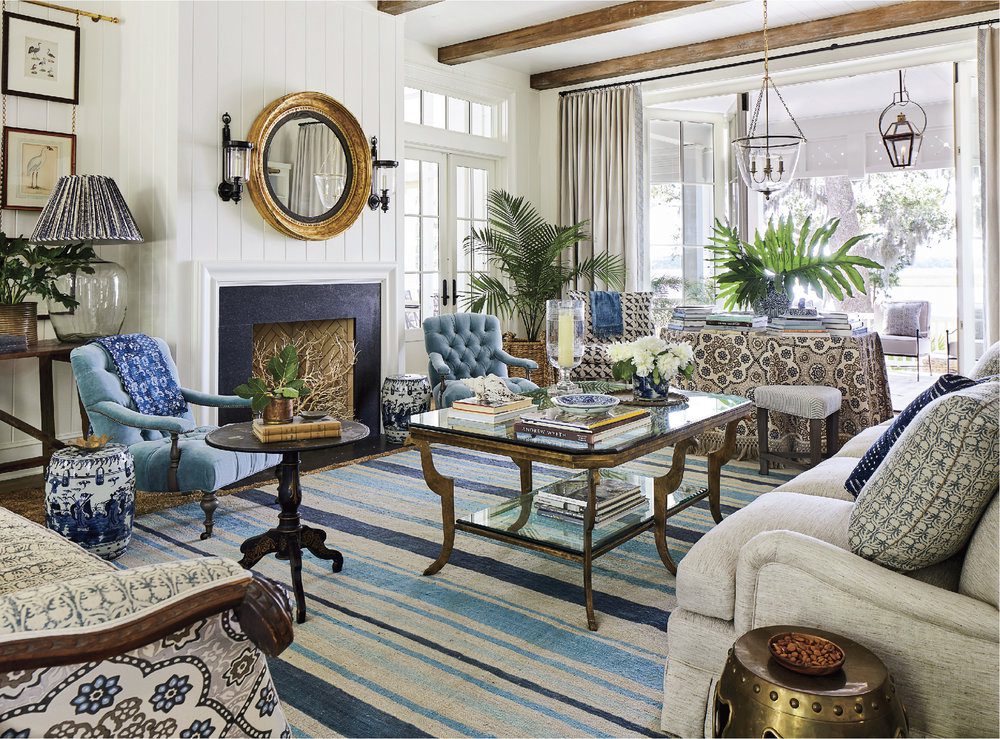
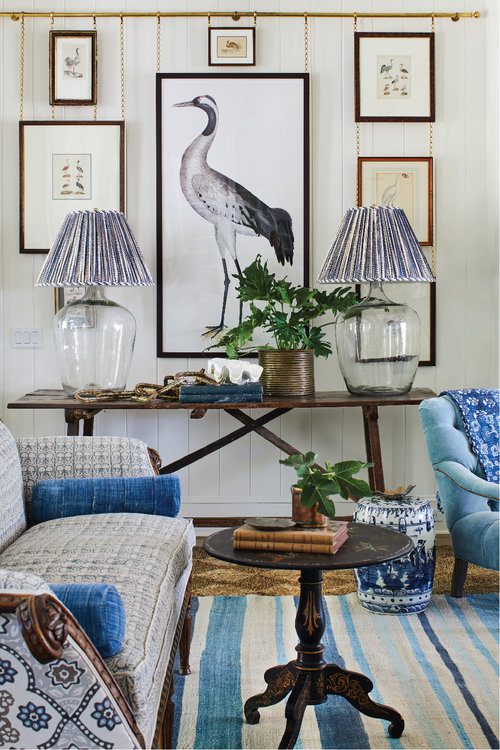
The living room in this home makes you want to linger and spend time for hours! The textures used in the first layer woven area rug and plant basket contrasts nicely with the colorful patterns and fabrics used on the furniture and striped rug. I love when different metal finishes are used in a space, because it gives that collected over time look to a room. The aged brass mirror and coffee table mix with the hurricane sconces and lantern pendants. Different wood tones are also brought in through the console table and ceiling beams, adding more character to this new build. There are subtle coastal touches, which I love in an island home. That is seen through the bird art, coral accessory and palm leaves. Small scale patterns mix well with bold, oversized prints, giving a balanced approach to the textiles. Now, we look into the foyer and see the continuation of the laid back, coastal style…

Interior Design by Heather Chadduck Interiors

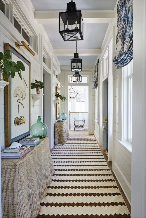
I love that this space is so well thought out and designed. Always remember the power of a well designed foyer, too! Often, this space can be overlooked and the focus can be more on the living spaces. But this area is often seen and used just as much… so attention to detail is important here, as well. I love that Heather has the ceiling painted blue! It draws your eye up and is a great way to bring in a color from a nearby room. The textures, patterns and coastal influence continue in this foyer, with the woven consoles, lantern pendants and beautiful bird art. Overall, these spaces and this whole home work!! What are your thoughts? To see all of the rooms in this gorgeous Idea House, visit Heather’s site, HERE.

Why This Works

October 23, 2019 by Amber Filed Under: design, inspiration, interior design, why works series

If you’ve been following this blog for a while, you may remember the blog series I used to write on Wednesdays, titled: Why This Works. Basically, I select a room I have found that I absolutely love and I break down the reasons why I think it works. Over the past few years, I have really gravitated toward a clean, modern/traditional aesthetic. I love bright, open spaces that feel warm and welcoming. So, I think this living room designed by the super talented Bria Hammel, is a great space to kick start this series again!

All above designed by Bria Hammel Interiors

Am I right that this space is stunning? Ok, let’s break down why I think it works! The light and bright walls really allow the colorful furniture and accessories to take center stage. The wood beams are able to stand out and they are complimented by the gorgeous storage cabinets on either side of the fireplace. The natural woven area rug really grounds the space, while also bringing in a great dose of texture. The plants help to bring the outdoors in, while also introducing green to the room. Both the lantern pendant and the beautiful windows help to draw your eye up, giving the illusion of more space. The patterns in this room also work so well together. The subtle ticking stripe of the sofa is complimented by pillows that have a larger, more oversized pattern. The mantel art and accessories are simple, yet create a great graphic impact. I always love the look of a floating console behind a sofa, especially when you can work in a pair of lamps. The addition of the floor lamp and pendant allow different light sources in the room, which is a great way to bring that collected over time style to a space. So as always, Bria knocked it out of the park on this one! You can connect with her on her web site HERE as well as get her look with her on line SHOP Brooke and Lou. I hoped you liked the return of Why This Works. I hope to get back into this series more often!!

Why This Works

July 13, 2016 by Amber Filed Under: design, personal design style, why works series


Welcome back to another Why This Works post… a series where I show a designed space and talk about why it works so well! This living space is designed by Collins Interiors and is the perfect coastal inspired design to show in the summer! Enjoy…


A living room with blue and white furniture

image via

What immediately gets me is this laid back, classic, coastal space that exudes warmth and personality! It is stylish and traditional, but has this fun, spirited and modern appeal as well. I love the neutral backdrop mixed in with the colorful art and furniture. Without having the gorgeous patterned chair, periwinkle blue velvet sofa and lively art work, this room would look completely different. The light walls, neutral rug and white drapes create a great balance with the whimsical accents. I love mixing wood and metal in a room and the different side tables bring a casual feel that allows this space to feel warm and inviting. And the nearby room?!? Wow! I love the black window trim and white beams. It’s all in the details!

Overall, this space works! What are your thoughts???

Why This Works

May 11, 2016 by Amber Filed Under: design, interior design, living room, personal design style, why works series


Welcome back to another installment of Why This Works… a series where I show a designed space and talk about why it works so well. Today’s living room is all about a mix of traditional, classic design with a dose of modern fun. This stunning space was seen on One Kings Lane and it was love at first sight. Take a look!


A living room with a couch and table

image via

I love this space! What first gets me is the balance of formal with casual. The formality is definitely shown in the symmetry of the roman shades and table lamps. The furniture reads more traditional and then you are met with the gorgeous modern accessories, that take this room to the next level. The antelope rug is a favorite of mine and it works so well in this space, against the light furnishings. I am also a huge fan of oversized accessories and believe that a few, well chosen larger pieces works better than several smaller options. The large wall art, pillows, lamps and even the fresh flowers, allows your eye to look around the room and gives the illusion of more space. While the space is dressy, the large coffee table brings a functional aspect to the room. There is plenty of room for drinks, snacks and to rest your feet. Overall, this space works!!

What are your thoughts??? I will be back tomorrow with the final before and after from Project Classic Living… the Bathroom!


Why This Works

April 6, 2016 by Amber Filed Under: design, personal design style, why works series


Welcome back to another installment of Why This Works… a series where I show a designed space and talk about why I love it! I have been a long time admirer of Ashley Whittaker’s fresh take on traditional design. She has a unique talent for mixing patterns and gives a room a polished look while still bringing a casual, family friendly approach. This living space below, is right up my alley! Enjoy!


A living room with white walls and furniture.

Design By

This space is both modern and traditional, which I love. The tufted sofa, pleated drapes and empire lamp shades all read formal, yet the natural weave area rug and rattan side chair allow the space to feel laid back and casual. I love how the coffee table works for all sides of the seating, making the room feel so warm and cozy. Seating always looks great when it can be gathered and brought close together, making an intimate arrangement for conversation. Most of the furniture is neutral and light, allowing the bursts of warm color to come in through the pillows. Cool colors are brought in through the drapes and lamp bases, creating that balance. I am also a huge fan of brass accents and that is seen in the curtain rod, side table and wall art. The finishing touch??? A vase of fresh flowers, which also has some added texture with a rope detail on the outside of the vase. Overall, this space works!

What are your thoughts???

Make sure to come back tomorrow, to see some fun e-design projects!

Why This Works

March 23, 2016 by Amber Filed Under: design, interior design, personal design style, why works series


Welcome back to another installment of Why This Works… a series where I highlight a designed space and talk about what I love! Today’s office space was designed by Brian Watford and featured in Atlanta Homes and Lifestyles. Take a look!


A dining room table with plates and napkins on it

image via

We are currently thinking about what do to our office space, so this is obviously great inspiration! I am immediately drawn to the grass cloth walls, as it instantly adds texture and warmth. The colors are soothing and include a blend of warm and cool, which is a nice balance. All of the textures in the space, from the rug to the pillows, to the leather desk chair to the woven side chair- all add depth and interest. The mixture of metals is also taking part, with the brass table lamp and ceiling fixture, to the chrome base of the desk chair. The brass wall frames have beautiful modern art in them, which I love! The room’s door has a stunning wood grain to it, which appears to be replicated in the desk base. I also love that the roman shade has a band detail, making it feel more custom. The shade is also installed as high as possible, which is one of my most favorite tricks in making a space feel larger. And I absolutely love the camel colors with that stunning teal settee. Overall, this space works!

What are your thoughts?!?

Why This Works

March 2, 2016 by Amber Filed Under: design, dining room, interior design, personal design style, why works series


Welcome back to another installment of Why This Works… a series where I show a designed space and talk about why it works so well. Today is interior designer Caitlin Moran’s gorgeous, eclectic, bohemian inspired dining room. This image below was taken from her feature in Lonny and is a true show stopper. Take a look!


A dining room table with plates and napkins on it

image via

I have always been a fan of neutral spaces with pops of color and this room does that to perfection. The color comes through in the abstract wall art, the area rug and table setting. This style of seating has really grown on me lately and I love it! The low profile works so well for this modern look and the rustic simplicity from the table is a great balance. And let’s talk about that statement chandelier for a minute! I have written in past posts about using lighting that almost seems too oversized for a space. When it seems too large, it is actually just right! And I love the texture this fixture brings into the room. I am also a huge fan of layering rugs to add depth and interest. {And in this space, color and pattern, too!} It is a wonderful way to make a rug that would be considered too small, work so well. I love the mixture of the window treatments, with the sheers and patterned panels. They provide function and style, which is a win win in my eyes! The wall sconce is large enough to be functional, but doesn’t compete with the art work and chandelier. And a vase of fresh flowers is the best way to complete any room! All in all, this space works!

What are your thoughts???

{The fact that I have two back to back posts of Why This Works is not lost on me! Sorry for the lack of posts lately! I will be back soon to share some completed e-designs.}  ๐Ÿ™‚

Why This Works & Bridge Street Segment

February 24, 2016 by Amber Filed Under: #projectvintagegem, amber b design, design, interior design, local clients, personal design style, why works series


Welcome back to another installment of Why This Works… a weekly series where I show a designed space and dissect the details, to explain why the designer chose what he/she chose and why it works! Today’s space is a project I designed last year for a local client. I speak about it often on this blog, because it was such a fun project to work on. This project is also near and dear because I love the true talent that shines through in Sarah Heppell’s photography skills! She truly made this space shine with these after photos. As you may already know, I named this project Vintage Gem, because of the gorgeous architecture of the apartment and the details they left in tact during the renovation of the building. Also, my client loves a mix of vintage and new, so the name was a great fit. In past blog posts, I never truly dissected the details of this space and explained why certain pieces were chosen and why. So let’s do that here, today!


A living room with brick walls and a table


A living room with brick walls and a large painting


A living room with a couch and chairs in it

Amber B Design, Photos by Sarah Heppell

When I walked into this space for the first time, I was immediately struck with the gorgeous brick walls and stunning high ceilings. It is a compact space with a combined living and ding area, but the high ceilings and architectural details make up for that. I wanted to compliment those details and not compete, by selecting light and neutral furnishings that allowed the apartment’s details to be the main focal point. The furniture and accessories were the supporting cast. Another trick I like to use is to select a few large, oversized accessories, as opposed to several small pieces. It’s a great visual trick that allows your eye to be drawn up to appreciate the room, giving the illusion of more square footage. When I installed the large blue table lamps and floral art work on the buffet, your eye was brought up instead of down and the space appeared larger. You could admire the brick more, even though we added pieces in front of it. Also, the dramatic wall clock was added behind the sectional. Upon first glance, it’s massive size could appear too large for some. But this clock instantly pushed the walls back and made the room feel bigger. I like to tell clients that if an accessory piece appears too big, it’s probably just right. It can take time to train your eye to like larger accessories. Luckily, my client was right on board and also thought the space felt bigger. In this room, I also wanted to use a mix of different wood stains and metal finishes. Especially with this vintage style, our goal was to create a space that looked as if it had been collected over time and not to match too much. So, the light stained buffet is near the dark stained dining table. Brass candle sticks on the buffet are near a bronze side table and pewter base coffee table. My trick for mixing metals, is to stay within the same ‘shine’ family. In this room, I wouldn’t have brought in a shiny chrome. All of the metals are buffed and matte, which is why they can work together. I like to separate the mattes from the shiny. And last but not least, I like to add various textures and fabrics into a space to create a layered depth. The jute, natural fiber area rug is paired with a leather chair, linen sofa and cotton pillow covers. That will add layers and depth to a space, making it feel warm and collected.

So that’s a little sneak peek into why I chose what I did for this space! I was thrilled to be able to talk about this design today with Sistina Giordano from Bridge Street. She is always wonderful to chat with and it was a fun segment. To see the video clip, visit HERE!! Thank you so much to Sistina and the entire News Channel 9 team for having me!

Why This Works

February 4, 2016 by Amber Filed Under: interior design, personal design style, why works series


Welcome back to another Why This Works series post! I am sorry this is a day late. I have been working on a fun local client install, that I can’t wait to share. We are almost finished with the master bedroom and I have been giving little sneak peeks at the progress on instagram {amberbdesign}. More info to come, soon! On to today’s room… this living room was found on line, at Better Homes and Gardens. It is the home of the blogger at An Urban Cottage and it has the perfect blend of modern and traditional. There are so many things that work in this room. Take a look!

A living room with two couches and a table

via

What first strikes me is the warmth and charm that this space has. I love the taupes, grays, blues and greens that can be found in the room. The added texture with the natural fiber rug brings that welcoming vibe into the space. It has that traditional charm, with the plaid chair fabric and the convex mirrors, yet also brings in a modern style, with the graphic wall art, ikat pillow and streamlined sofa. The glass coffee table allows you to feel as though the room is larger and it visually does not take up any space. You can tell there are meaningful pieces added in this room, with the vase full of paint brushes,the antique fan and distressed boxes. Adding personal mementos and accessories with a story bring that warmth to a room that is so inviting. And to top it all off- my favorite way to bring a cozy atmosphere to any room… fresh flowers!! For me, this space works.

What are your thoughts?!?

Why This Works

January 27, 2016 by Amber Filed Under: design, personal design style, why works series


Welcome back to another post of Why This Works… where I highlight a designed space and talk about why I love it so! You may have already seen the gorgeous Michigan home of Michelle Adams… known for her work in Lonny.com and Domino. She decided to leave the fast paced NYC life and move closer to family, in Ann Arbor, Michigan. She completely renovated a 1920’s colonial home and I love every new detail! Today, I highlight the living area…

A living room with white furniture and black accents.

as seen in…

The casual and stylish way she designed her home is so inspiring! It feels warm, lived in and ultra chic, which can be a hard combination to achieve all together. I love that she mixed navy and black. Those colors do go together and I love using them in design. Funny thing- as I’m typing this, I’m also wearing a navy/black striped shirt! And not even planned. ๐Ÿ˜‰ The roaring fire is beautiful and framed inside a gorgeous carrara marble mantel that she had installed. It instantly adds charm to the space and takes her back to what she loved most about her visits to Europe. She also made a great decision to remove the windows at the back of the living area and replace them with French doors. The change allows more light in and is great for functional purposes, out to her new patio. The glass chandelier makes a dramatic statement, yet doesn’t impede your view to the outdoors. The skirted table is adorned with coffee table books and a vase with a beautiful flower arrangement. I always love the casual and stylish look of skirted tables. {They can also be great for concealing storage pieces, if needed!} The open bookshelves show a collection of accessories, books and framed pictures, which I think is the perfect trio when shelf styling! This room has a mix of light and deep colors, warm woods with modern accents and woven baskets and leather chairs for texture. It is that balance and mix that I always appreciate. Michelle loves so many different design styles and it is evident in her accessories collection in her home. That’s what makes a home feel as though it has been curated and collected over time and definitely tells a story. To see her entire home and read the House Beautiful feature, visit HERE.

What are your thoughts???

Make sure to stop by later this week, where I show my completed bonus room e-design! Also, thank you so much to Houzz for naming me Best of Houzz 2016. I am fortunate to have this award for the past two years. Thank you!!

  • 1
  • 2
  • 3
  • …
  • 7
  • Next Page »
Welcome!

Hi, I'm Amber... a wife, mom and interior decorator. I am the writer of Simple Dwellings and the designer behind Amber B Design. Blog topics are all things design, with the occasional DIY attempt! Thanks for stopping by Read more...

  • Bloglovin
  • Email
  • Instagram
  • Pinterest
  • Twitter

Blog Posts, Straight to Your Inbox

Popular Projects

A dining room with white walls and wooden table.
A black door with white curtains and a red chair
A staircase with black and white chevron pattern on the steps.

Blog Love

  • Addison’s Wonderland
  • A Thoughtful Place
  • Alison Giese Interiors
  • Amber Interiors
  • Bailey McCarthy
  • Caitlin Wilson
  • Chris Loves Julia
  • Classic Casual Home
  • Cottage and Vine
  • Design Indulgence
  • Dwell by Cheryl
  • Eddie Ross
  • Elements of Style
  • Emily A Clark
  • Emily Henderson
  • Gallery No Eight
  • Hi Sugarplum
  • House of Jade
  • Jana Bek
  • Juniper Home
  • Kate Marker Interiors
  • Lucy Williams
  • Monika Hibbs
  • Our Fifth House
  • Pencil and Paper Co
  • Rachel Parcell
  • Rambling Renovators
  • Pure Style Home
  • Sita Montgomery
  • Studio Mcgee
  • The Makerista
  • The White Buffalo Styling Co
  • the Zhush
  • Traci Zeller
  • Young House Love

Copyright Amber B Design © 2025 ยท Design by Britt Douglas


Loading Comments...