Amber B Design Studio

Interior Design & Decoration for the South Florida region

  • Home
  • About
  • Services
  • Portfolio
  • Blog
  • Press
  • Contact

Why This Works

February 4, 2016 by Amber Filed Under: interior design, personal design style, why works series


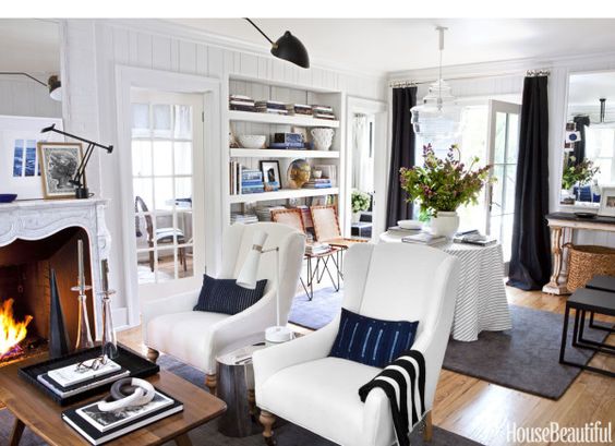
Welcome back to another Why This Works series post! I am sorry this is a day late. I have been working on a fun local client install, that I can’t wait to share. We are almost finished with the master bedroom and I have been giving little sneak peeks at the progress on instagram {amberbdesign}. More info to come, soon! On to today’s room… this living room was found on line, at Better Homes and Gardens. It is the home of the blogger at An Urban Cottage and it has the perfect blend of modern and traditional. There are so many things that work in this room. Take a look!

A living room with two couches and a table

via

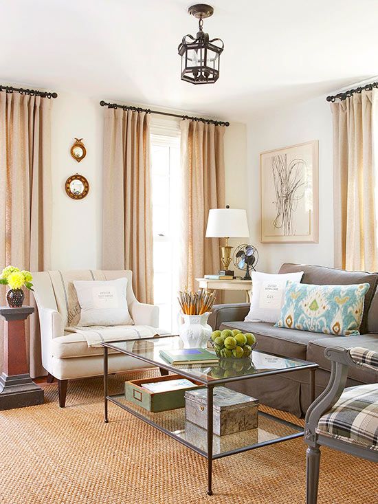
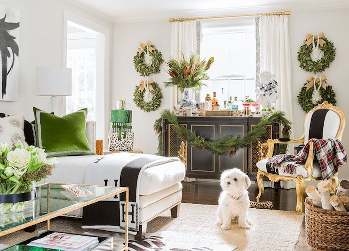
What first strikes me is the warmth and charm that this space has. I love the taupes, grays, blues and greens that can be found in the room. The added texture with the natural fiber rug brings that welcoming vibe into the space. It has that traditional charm, with the plaid chair fabric and the convex mirrors, yet also brings in a modern style, with the graphic wall art, ikat pillow and streamlined sofa. The glass coffee table allows you to feel as though the room is larger and it visually does not take up any space. You can tell there are meaningful pieces added in this room, with the vase full of paint brushes,the antique fan and distressed boxes. Adding personal mementos and accessories with a story bring that warmth to a room that is so inviting. And to top it all off- my favorite way to bring a cozy atmosphere to any room… fresh flowers!! For me, this space works.

What are your thoughts?!?

What Do You Love About Your Home?

February 1, 2016 by Amber Filed Under: amber b design, family room, guest post, kids and design, personal design style


I love that question, because it gives us the opportunity to really think about what we already LOVE about our home. So often, it’s easier to think about the to do lists and the ongoing thoughts of what we want to change, instead of realizing what we already have in front of us. My friend Lisa, from the blog Shine Your Light, asked me to participate in her weekly series called Shine Home Love. I was asked to choose a favorite spot in my home and talk about why I love it! Stop by her blog to see what room I chose and why. Here’s a hint…

I love our hand written wall with an inspirational quote for our kids…

A room with white walls and a window.

And I also love our slip covered chair from the good old college days!

A white blanket is folded on top of the couch.

Stop by Lisa’s blog HERE to read the post!

Why This Works

January 27, 2016 by Amber Filed Under: design, personal design style, why works series


Welcome back to another post of Why This Works… where I highlight a designed space and talk about why I love it so! You may have already seen the gorgeous Michigan home of Michelle Adams… known for her work in Lonny.com and Domino. She decided to leave the fast paced NYC life and move closer to family, in Ann Arbor, Michigan. She completely renovated a 1920’s colonial home and I love every new detail! Today, I highlight the living area…

A living room with white furniture and black accents.

as seen in…

The casual and stylish way she designed her home is so inspiring! It feels warm, lived in and ultra chic, which can be a hard combination to achieve all together. I love that she mixed navy and black. Those colors do go together and I love using them in design. Funny thing- as I’m typing this, I’m also wearing a navy/black striped shirt! And not even planned. ๐Ÿ˜‰ The roaring fire is beautiful and framed inside a gorgeous carrara marble mantel that she had installed. It instantly adds charm to the space and takes her back to what she loved most about her visits to Europe. She also made a great decision to remove the windows at the back of the living area and replace them with French doors. The change allows more light in and is great for functional purposes, out to her new patio. The glass chandelier makes a dramatic statement, yet doesn’t impede your view to the outdoors. The skirted table is adorned with coffee table books and a vase with a beautiful flower arrangement. I always love the casual and stylish look of skirted tables. {They can also be great for concealing storage pieces, if needed!} The open bookshelves show a collection of accessories, books and framed pictures, which I think is the perfect trio when shelf styling! This room has a mix of light and deep colors, warm woods with modern accents and woven baskets and leather chairs for texture. It is that balance and mix that I always appreciate. Michelle loves so many different design styles and it is evident in her accessories collection in her home. That’s what makes a home feel as though it has been curated and collected over time and definitely tells a story. To see her entire home and read the House Beautiful feature, visit HERE.

What are your thoughts???

Make sure to stop by later this week, where I show my completed bonus room e-design! Also, thank you so much to Houzz for naming me Best of Houzz 2016. I am fortunate to have this award for the past two years. Thank you!!

Oversized Accessories

January 22, 2016 by Amber Filed Under: accessories, design, personal design style


In my previous post, I mentioned that I like using large, oversized accessories in a room. If you think they make a space look smaller, it actually does the opposite. Even in a compact sized room, a large art print, dramatic vases, urns and even an oversized lamp can make a space feel larger than it is. I love that visual trick! For large art pieces on the wall, it allows your eye to look up, giving the illusion of a taller space.  If it seems too huge at first glance, it’s perfect! A good rule of thumb is to try it out for a few days. It will take some time for your eye to adjust to the change. Now, I’m not saying that every piece in the room should be ginormous {using a word my daughter often says!} but 1-3 key pieces can make all the difference. Here are some examples of this trick…

A living room with two chairs and a table

Lauren Liess

I love the framed tree print, above, from designer Lauren Liess. It instantly draws your eye up and makes you take notice of the room’s height. This can still be done in a room with lower ceilings, because it will do the same trick. One print can often give more impact than a grouping of smaller prints.

A dining room with white chairs and a table

Ashley Goforth

The dining room, above, designed by Ashley Goforth, is stunning. The oversized pendant and even the tall dining chairs makes this room shine!

A bedroom with white furniture and yellow sheets.

Amber B Design // Photo by Sarah Heppell

The master bedroom I designed for Project Vintage Gem needed a tall mirror above the dresser! The high ceilings would have made a small mirror feel lost in the room.

A white table with four chairs around it

Studio McGee

I always love the work of Studio McGee, and this chandelier above the kitchen’s eating area almost takes up the whole width of the table. And I love that!!

A large painting of flowers on the wall above a wooden cabinet.

Amber B Design // Photo by Sarah Heppell

The dining room buffet from Project Vintage Gem fits into a small studio apartment, but the ceiling height made the space feel much larger. I decided to go big with the floral art print and also add a pair of oversized gourd lamps to work with the tall ceiling height.

A living room with a couch and pillows

Amber B Design // Photo by Sarah Heppell

In this same project, the living room was also part of the space. I added a huge wall clock in between the windows. It did this cool visual trick of pushing the walls back, making the room feel bigger.

I am definitely a fan of adding large accessories to a space. What are your thoughts?

Why This Works

January 20, 2016 by Amber Filed Under: design, personal design style, why works series


Welcome back to another installment of Why This Works… where I show a designed space and talk about why it’s amazing. Today, I am featuring interior designer Thomas O’Brien, who has always been known for his classic, laid back style. I am always drawn to his designs, because they are so livable and real. Today’s guest bedroom he designed for a designer showhouse was featured in Veranda magazine and exudes that casual, classic style that I love!


A bedroom with four poster bed and white walls.

image via

This room has that perfect blend of comfortable and stylish. I am always drawn to a four poster bed of any kind and I love that this deep wood stained finish balances so well with the light carpet and ceiling molding. The linen covered walls have that small pattern that also mixes so well with the neutral bedding. I am also a fan of pattern on pattern and it works so well here, with the walls and headboard, because it’s a mix of small and large patterns. If the headboard had a small print design too, it wouldn’t work as well. I always love an animal nod of some kind and this oversized feather print is dramatic and restrained at the same time. A perfect way to approach oversized art/accessories in your home? If it looks too big upon first glance, then it’s perfect! Large art and accessories takes some time to get used to, but makes such a wonderful impact in any room. I also love a good asymmetrical balance when done right and this art print does not have a matching piece on the other side, but rather uses the printed linen covered walls and tall table lamp as its counter balance. A small table lamp is then placed in front of the feather art, so there’s functional lighting, but doesn’t compete with the print. The tufted arm chair and bedside flowers add that feminine touch to the classic, masculine blue the room exudes. Overall, this room works for me!

What are your thoughts???

Why This Works

January 6, 2016 by Amber Filed Under: design, personal design style, why works series


Welcome back to another edition of Why This Works… a weekly series where I show a designed space and discuss why it’s great. Today, it’s all about one particular aspect in design and that’s styling shelves. In the new year, I hope to organize much better and these well kept shelves are making me think just that! This Pasadena home was featured in Domaine and is designed by LA design firm, Burnham Design. Take a look!

A shelf with books and vases on it

image via

What I love most about these shelves is the effortless way they appear to be styled. They definitely have that collected over time vibe, which I love. These accessories look as if they have a history and meaning to the homeowners. I love when shelves are a mix of books, art and sculptural accessories and these have all three! Bookshelves have much more depth and interest when there is layering going on… it can even give the illusion of a deeper shelf. To achieve this layering effect at home, start with an empty bookshelf and slowly add a couple of books and accessories at a time. Step back every now and then, snap some pictures and evaluate how you would like to go further. That’s what I always like to do when styling shelves. It does take some time and patience, but the reward is a treat for the eyes! Here, you get a glimpse of the top shelf with bone inlay boxes, neutral book covers and art prints. The next shelf has books laid both vertically and horizontally, with an everyday vase used as a bookend. I love thinking outside the box and using non traditional book ends. The books are subtly organized in a color block format, keeping similar hues together. Pieces collected from travels adorns the shelves and memories can instantly be remembered when those accessories are out on display. Book shelves are used for much more than just books and this design shows that to perfection!

What are your thoughts?!?

Why This Works

December 2, 2015 by Amber Filed Under: design, personal design style, why works series


Welcome back to another week of Why This Works… a series where I show a designed space and discuss why it’s amazing. Today’s room is a showstopper, in my opinion. It was designed by Bailey McCarthy, from the popular blog, Peppermint Bliss. She designed this master bedroom and every room in this year’s Coastal Living Cinnamon Shore Showhouse in Port Arkansas, Texas. This space exudes warmth and charm. Take a look!


A bedroom with two windows and a bed

A table with some gold lamps and pictures on it

A bedroom with two windows and a bedall images via

Where to begin? I love all of the color in this room, but the muted tones allow the space to remain calm and serene. Our bed is very similar to this four poster option, but with a much more overdone wood stain finish. This beautiful paint color is giving me an idea!! I love this shade of blue and I think it brings a modern touch to an otherwise traditional bed frame. I also love that the nightstands have a different finish from the bed. It brings a collected over time style that is so beautiful. The nightstands and lamps bring that symmetrical look that I love, but the warm wood finish against the blue bed adds an unexpected, whimsical touch.  I love all of the pattern going on in this room and the muted colors allows for it all to remain calm and perfect for a bedroom atmosphere. The south western style rug from Dash and Albert {great rug source!!} is a great piece for this Texas master bedroom. The patterned drapes, rug and chairs each bring their own thoughtful, unique style and also creates a casual, warm vibe. You know that I love to mix metals! I loved seeing the brass chandelier and bedside lamps paired with a pewter curtain rod. I also love to add a subtle animal touch in any room and I love that Bailey did that with the longhorn art print {seen best in image 2} on the left bedside table. And it wouldn’t be Bailey’s signature style without some amazing bedding that is subtle, gorgeous and whimsical. The camo bolster pillow is so unexpected and fun. Her own line of bedding can be found at her site, Biscuit.

What are your thoughts???

Make sure to check back here on Friday, for some exciting news!!

Why This Works – Holiday Edition!

November 18, 2015 by Amber Filed Under: design, personal design style, why works series


Welcome back to my Why This Works series, where I show a designed room and discuss why I think it’s perfection! This home would make the list on any day, but I’m excited to show it all decked out for the Holidays! {This is also motivation to get me going on some shopping and decorating!} Erin Gates, Boston Interior Designer and author of the best selling book, Elements of Style, posted about her holiday decorated living room a couple of years back. It still works so well today!


A dog sitting in the middle of a room.


Erin’s dog Oliver, also in the shot! I really think pets love the spot light. My design project HERE showcases my client’s cat taking center stage and loving every minute!


A dog sitting in the middle of a room.

images via

What’s not to love about this cheerful space? I love mixing pattern on pattern and Erin does this so well with the striped Bergere chair and plaid throw blanket. The greenery looks amazing with her black and white decor, making it stand out that much more. I love seeing wreaths and holiday accents in unexpected places and I love that Erin hangs her wreaths on the wall, with her antler display. The gold accents she already has in the room, with the curtain rods and chair, work so well with the Christmas ornaments and holiday decor. I love the flower arrangement she includes on the coffee table. It’s understated, elegant and has the perfect color scheme for the occasion. One of my most favorite features is the woven basket with birch logs. My mom likes to add birch logs in her home and they look so cozy in any space. I also love the bust from the second image, with the black and white plaid bow. No detail is left out, including wrapped packages in the left corner, with a festive green and gorgeous animal print!

What are your thoughts? Does this room get you in the holiday spirit?!?

Wowed by the One Room Challenge

November 12, 2015 by Amber Filed Under: design, one room challenge, personal design style


Do I have a beauty of a room to show you, today!! In case you haven’t heard of it before, the One Room Challenge participants had their reveals yesterday! This 6 week design overhaul idea is the work of Linda, from the blog Calling it Home. Twenty participants are given 6 weeks to completely transform a space and write on the adventures each week. Today, I am featuring the living room makeover of Cassie, from her blog Hi Sugarplum. Cassie teamed up with designer Kristin, from The Hunted Interior and created this amazing after…


A living room with a couch and table


A living room with yellow curtains and purple rug.

via

Amazing, right? There is so much to love about this space. I love the bold use of color, how cheerful this room is and how well it fits Cassie’s style. If you read her blog, you know that this room exudes her!! There is a wonderful pairing of meaningful pieces mixed with new design. I love it all!

The One Room Challenge also has a linking party, in which readers could participate and make over their own space! They have their reveals today, so make sure to check that out. This year, I helped out my friend, Britt and we transformed her master bedroom. You may know from my past posts, that Britt designed my new web site. So I was thrilled for the opportunity to work together, on this challenge. She is giving her partial reveal today, so be sure to check it out!


A gold jewelry stand with many different necklaces.

via

Once more items arrive, she will make the final room update. So far, I love this image and how she has beautifully styled her dresser! She has been working so hard and has great style, all on her own. Thank you so much, Britt, for believing in me to help with this challenge and the sweet things you said on your blog. It means the world to me- more than you know! ๐Ÿ™‚ To see how the partnership began and our design ideas along the way, visit my past posts HERE.

Why This Works

November 4, 2015 by Amber Filed Under: design, personal design style, why works series


Welcome back to another installment of Why This Works, a series where I show a designed space and discuss why I think it’s amazing! Next up is Joy’s office studio, from the ever popular blog, Oh Joy! She had worked for years from her own home and decided it was time to have her own studio space. She enlisted the help of Emily Henderson, who created design magic with a colorful and inspiring space. Enjoy!


A living room with many pictures on the wall

image via

Now if that is not a fun and cheerful space to work, I don’t know what is! And although this space was designed a couple of years ago, it still feels so current and spot on. It is a bit of a diversion from my regular style that I blog about here, but that is what I find so intriguing. For a work space, play room or studio, this would be a great way to feel energized and inspired! I have had a thing lately for green velvet sofas, so I might be drawn to this space for that! I also love the dramatic gallery wall. What a great way to draw your eye up and give the illusion of more space. When hanging art, try taking full advantage of the entire wall. Art no longer has to be only at eye level! The white walls and neutral painted floors allows for color in the furniture and accessories. The art is playful and whimsical, which I bet Joy’s daughters love! I could definitely be inspired on a daily basis in this room. Emily designed a gem in this space!

What are your thoughts?

  • « Previous Page
  • 1
  • 2
  • 3
  • 4
  • 5
  • …
  • 14
  • Next Page »
Welcome!

Hi, I'm Amber... a wife, mom and interior decorator. I am the writer of Simple Dwellings and the designer behind Amber B Design. Blog topics are all things design, with the occasional DIY attempt! Thanks for stopping by Read more...

  • Bloglovin
  • Email
  • Instagram
  • Pinterest
  • Twitter

Blog Posts, Straight to Your Inbox

Popular Projects

A dining room with white walls and wooden table.
A black door with white curtains and a red chair
A staircase with black and white chevron pattern on the steps.

Blog Love

  • Addison’s Wonderland
  • A Thoughtful Place
  • Alison Giese Interiors
  • Amber Interiors
  • Bailey McCarthy
  • Caitlin Wilson
  • Chris Loves Julia
  • Classic Casual Home
  • Cottage and Vine
  • Design Indulgence
  • Dwell by Cheryl
  • Eddie Ross
  • Elements of Style
  • Emily A Clark
  • Emily Henderson
  • Gallery No Eight
  • Hi Sugarplum
  • House of Jade
  • Jana Bek
  • Juniper Home
  • Kate Marker Interiors
  • Lucy Williams
  • Monika Hibbs
  • Our Fifth House
  • Pencil and Paper Co
  • Rachel Parcell
  • Rambling Renovators
  • Pure Style Home
  • Sita Montgomery
  • Studio Mcgee
  • The Makerista
  • The White Buffalo Styling Co
  • the Zhush
  • Traci Zeller
  • Young House Love

Copyright Amber B Design © 2025 ยท Design by Britt Douglas


Loading Comments...