Amber B Design Studio

Interior Design & Decoration for the South Florida region

  • Home
  • About
  • Services
  • Portfolio
  • Blog
  • Press
  • Contact

Love the Look: Double Islands

March 23, 2021 by Amber Filed Under: amber b design, design, design services, e-decorating, e-design, kitchen

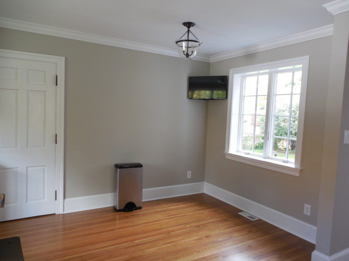
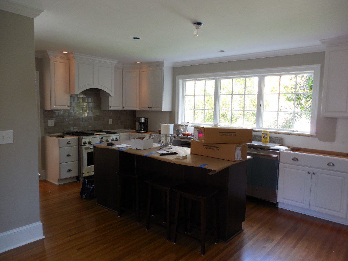
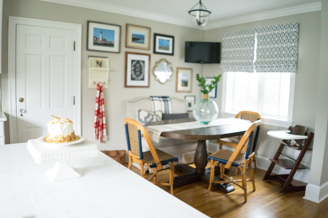
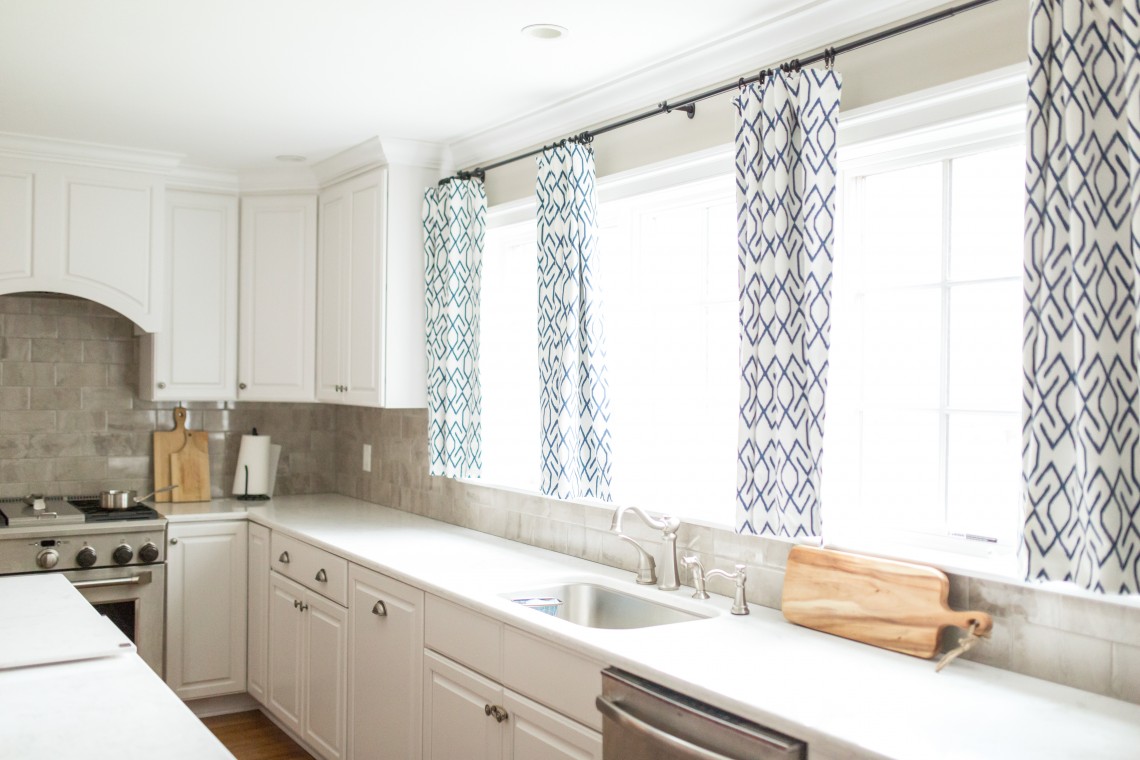
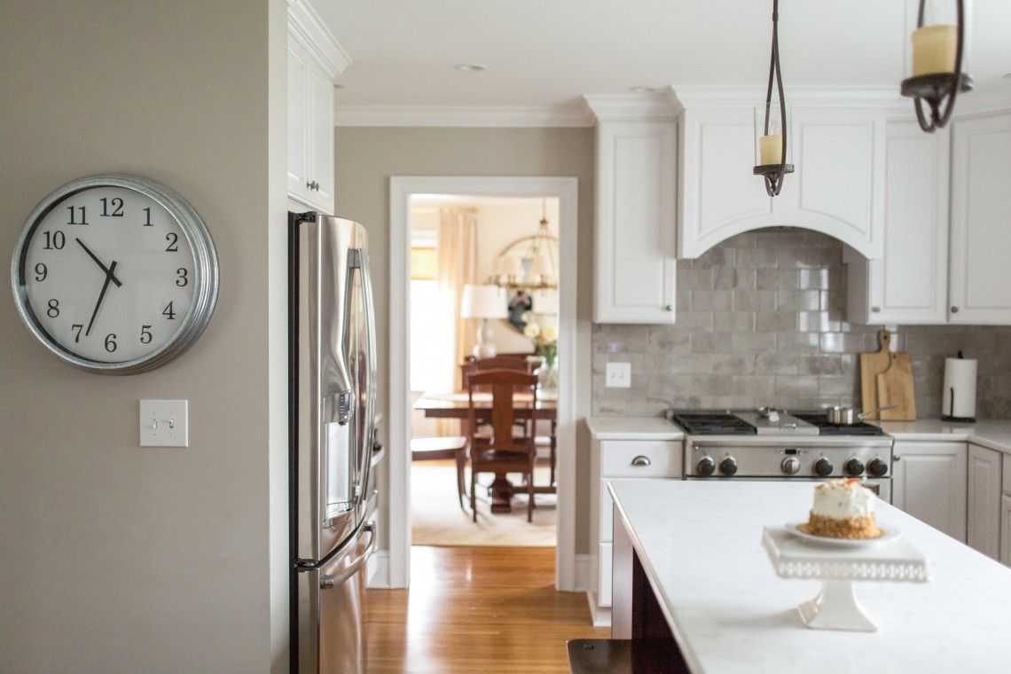
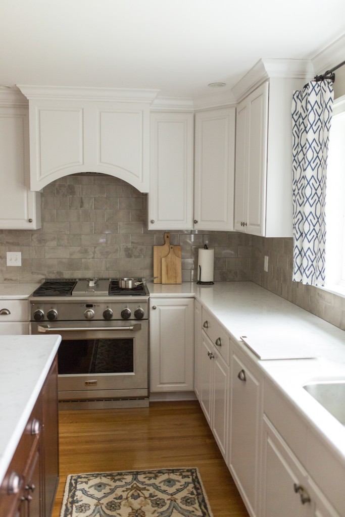
I hope you all are off to a great week! I am excited to share that for this past year, I have been working remotely on a new home build in New York. I have worked with these amazing clients in the past and they are currently in the process of building their dream home. When we looked at the kitchen layout, the builder suggested an island that had an oblong, non symmetrical shape. While it filled the space well, it made it tricky for pendant placement. I also love a symmetrical design whenever I can, so I knew I wanted to reconfigure the island layout. We had some extra room in the kitchen to work with, so I presented my clients with the idea of either a small sitting area in the kitchen or a double island.

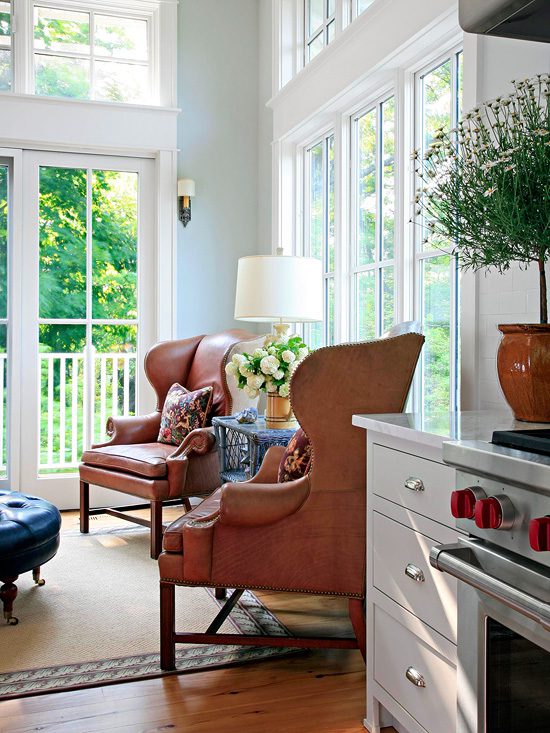
Small sitting area in kitchen: Inspiration

Image via Better Homes and Gardens

Double Island: Inspiration

Image via House of Jade Interiors

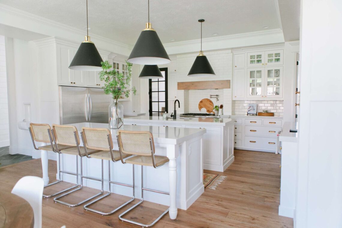
I honestly loved the look of both approaches, but they decided they did not need an additional lounging area in their kitchen. So a double island it is and I couldn’t be happier! This option will function so well for their family and how they will use their new home. The island closest to the range will be the work island and main prep space. The island after that will serve as the eating and hang out spot, with pretty counter stools for sitting. The functioning layout will be similar to the inspiration image above, but we will do pendants above the work island and recessed above the sitting island. I couldn’t be happier with the way the kitchen will look. We have selected most of the finishes and cabinet design and I can’t wait to see it all come together. The main cabinetry will be a creamy white shaker and the island will be a deep walnut stain. The marble like quartz will go on all of the counters, tying the spaces together. Except the bar area… that will be its own gem and I can’t wait to share more about that niche of the kitchen soon.

If you also live outside of Florida, my e-design option works best and can be such a cohesive, stream lined process! So much can still be achieved remotely, even an entire new build! Stop by my design services page to get started. I look forward to hearing from you!

Before and After: Project Classic Living {The Kitchen}

May 6, 2016 by Amber Filed Under: #projectclassickitchen, #projectclassicliving, amber b design, ballarddesigns, before and after, design, kitchen


Welcome back to the before and after series from Project Classic Living. Up today… the Kitchen! As I have mentioned in previous posts, the kitchen was already beautifully renovated when I came into this space. The gorgeous white cabinetry, quartz counters, back splash and lighting was already chosen. I came in for the window treatments, dining area furniture and wall accessories. All of the after pictures taken by the wonderful Sarah Heppell. Here is the kitchen when I started…

Before

A room with a tv and a trash can


A room with a door open and a window.


A kitchen with a lot of counter space and boxes

{I had forgotten that the kitchen counters were not in yet, when I started with the design plan. But they had already picked out a gorgeous quartz counter that resembles marble. Perfect choice!!}

After

A dining room table with four chairs in it

A dining room with a table and chairs in it

A plant in a vase on the table

A clock hanging on the wall in a kitchen.

A kitchen with white cabinets and wooden floors

A kitchen with white cabinets and black and blue curtains

A kitchen counter with a cutting board and sink.

After photos by Sarah Heppell

And one more quick comparison…

Before

A room with a tv and a trash can

After

A dining room with a table and chairs, and pictures on the wall.

I love that this kitchen eating area has a relaxed vibe, to balance out the more formal feel in the dining room. Which, by the way, is the next room to show!

Happy Mother’s Day to all moms out there, especially to my wonderful, amazing mom! Thank you to my sweet, wonderfully awesome kids for giving me the amazing privilege of being their mom! ๐Ÿ™‚ Have a great weekend!

Project Classic Living Reveal {The Kitchen}

April 20, 2016 by Amber Filed Under: #projectclassickitchen, #projectclassicliving, amber b design, design, interior design, kitchen, local clients


Welcome back to another reveal day! This is such a fun week!! Today’s post is all about the kitchen. To catch up on all things Project Classic Living related, visit HERE. The kitchen was the second room we worked on together, after the nursery. I wish I could take credit- but the gorgeous white cabinetry, counters, backsplash, lighting and overall layout were already finished when I started working on the space. The gorgeous wall color {BM Revere Pewter} was also chosen, so the bones were perfect to work with. My clients did a fantastic job selecting all of the finishes and this 1930’s home has an unbelievable before and after for this space. The contractor did an outstanding job making this space light, bright and modern, while also keeping with the classic style and character of this home. I came in for the window treatments, gallery wall, accessories and dining area furniture. For this space, we wanted an overall casual, relaxed dining feel. The more formal dining area is in the next room, so we kept this space laid back for everyday use. And of course, the wonderful Sarah Heppell put her magic photography stamp on this room, too. Let’s take a look!


A dining room table with four chairs in it


A dining room with a table and chairs, and pictures on the wall.


A kitchen with white cabinets and black and blue curtains


A kitchen counter with a cutting board and sink.


A cake on top of a white pedestal.


A kitchen with white cabinets and wooden floors


A clock hanging on the wall in a kitchen.


A plant in a vase on the table


A kitchen with white cabinets and a stove.


A dining room with a table and chairs in it


All images by Sarah Heppell Photography

I hope you enjoyed the kitchen tour! The gorgeous drapes and shades were made by Windows By Melissa and the fabric was found in my local work room. Tomorrow’s reveal will be… the Dining Room! {You do get a little peek of the dining room in one of the kitchen shots!!}


E-Design Boards Reveal!!

April 21, 2015 by Amber Filed Under: amber b design, dining room, e-decorating, e-design, interior design, kitchen


I wanted to check in and show you the latest e-design boards I created for a lovely out of state client. My client heard about me from her sister, who I have worked with locally for #projectdelicatenursery #projectclassickitchen and #projectclassicliving. Having referrals from clients is one of my favorite parts of my job, because it makes my day that they want to recommend me to others, especially their own family members! And just like my local client, her sister was just as sweet and wonderful to work with. My new clients wanted to pull together their beautiful kitchen and dining room renovation with the finishing touches… new accessories and art. I also suggested some new lighting and a few key furniture pieces that will enhance their already amazing renovation. Here are some pictures of the kitchen…

The Kitchen


Gorgeous, right?!? And here is the design board I came up with for this space…

We will be doing two oversized, framed art pieces, hung side by side, on the long wall by the kitchen table. They will either be the fern prints, driftwood prints {both on the left of the board} or the charcoal botanical prints {bottom right of the board}. Which art pieces would you choose? Here are some pictures of the dining room…

The Dining Room


We will be working with most of the things you see in these pictures. And here is the design board I came up with for this space…

I just love that CWT buffalo check pillow! That was suggested to go on the upholstered head chairs. It will be a modern take on a traditional pattern, which is perfect for this dining room. The gorgeous furniture in this space is antique and was refinished with love from my client’s father. I love the charm and personal connection this furniture has in the room. Since the head chairs were bought after and are not part of the collection, I thought it would be the perfect opportunity to bring some upholstered pieces into the room. The upholstered head chairs will bring a softness to the space and be a nice compliment to the wood furniture. The bamboo mirror will go above the buffet, with a pair of fun table lamps flanking the mirror. My client will be deciding on art that will go on either side of the buffet lamps and above the extra chairs. I suggested to either go with the blue watercolors that are shown on the bottom of the board or a pair of floral vase prints, which is shown in the center of the board. Which would you choose for the dining room?

I will update you on the progress of these spaces, as we move forward!

An Update on #projectclassickitchen !!

March 4, 2015 by Amber Filed Under: #projectclassickitchen, amber b design, before and after, design, interior design, kitchen, local clients


I am sorry for the long absence on the blog! Time got away from me, but I am happy to return with a local client project update. You may have remembered a post I wrote HERE about #projectclassickitchen. It was a local client project that I was so thrilled to be a part of. The project got its name because my clients contacted me after remodeling their gorgeous traditional and classic kitchen. They live in a 1930’s Georgian brick colonial and the finishes they chose totally work with the era of the home. I was hired to complete the space with: breakfast nook furnishings, wall accessories and window treatments. I recently went over to the house, since we are working on some other rooms on the first floor and decided to snap even more pictures of the kitchen. When I was there last, the drapes had not arrived yet and there were some other items that needed to be hung on the walls. Here is the space now…

And just for fun, let’s do a before and after of the breakfast nook…

Before


After


I can’t wait to show you the design process for the rest of the rooms we are working on!

Before and After: A Mini Reveal of #projectclassickitchen !!

December 21, 2014 by Amber Filed Under: #projectclassickitchen, central new york design, interior design, kitchen, local clients


I am thrilled to reveal a local project I have been working on! I first started working with these clients with #projectdelicatenursery and we have since began working on other areas of their home. I am so fortunate that my clients found me… they have been wonderful to work with. They just completed a major renovation of their gorgeous kitchen and needed my help with dining furniture, wall accessories and just pulling the eating area together. Let’s get right to the pictures!! Here is the dining area after the renovation and before we started working together on the space…

Before


In these before pictures, the kitchen renovation was almost complete. They were just waiting on the counters to arrive and some finishing touches. The kitchen area is now complete and is fabulous! They can also check the eating area off their list of finishing touches!

After


To say that I am thrilled with the space would be an understatement! I am so lucky to have trusting clients that allowed me to show them an eclectic mix of furnishings for the space and try something that was a little out of their comfort zone. Luckily, they loved it all when it was complete and my client said she was just speechless when she saw the reveal! That truly made my day!  ๐Ÿ™‚ We went with an upholstered banquette that has a very durable, family friendly fabric. The brass nailhead trim is the icing on the cake! My clients had a wonderful collection of photos from their travels, which made the gallery wall meaningful and special to them. We are waiting on a few elements, before this room has the full reveal. The wall space to the left of the gallery wall will have a message station. That will hold mail, keys and even has a small shelf for a pretty picture frame. That is why the gallery wall might look like it stops too early right now. Don’t worry… more to come! The windows will be dressed in roman shades in this fabric…

They are on their way as we speak and I cannot wait to see them in the room! The wall to the opposite of the dining nook (near the fridge) will have this old school style clock…

And the before and after {because I know we all love them} just one more time…

Before


After


Thank you so much to my amazing clients for allowing me to share their home here on my blog. ๐Ÿ™‚
If you would like to work together, I am now booking for the spring! Please e-mail at [email protected] for more information

Happy Holidays!!

How Do You Like Your Kitchens??

April 9, 2014 by Amber Filed Under: design, kitchen, painting, personal design style


My favorite look is an all white kitchen… white cabinets, some sort of white stone for the counters and some sort of white tile backsplash. {Or, the same white stone carried up as the backsplash… dreamy!!} But as our design tastes tend to change over time, I have also recently had my eye on the look of painted cabinetry in soft, muted colors. Taupe/gray cabinets with that same white stone lends depth and charm. Here is a round up of some great kitchens, where they have done just that!

via

via

via

via

Mix it up with bold contrast…

via
Black and white…

via
Now, one might argue that these kitchens are gorgeous already. I mean, look at them??? Is that really how mine would look if I painted my cabinets? So, I thought it would be fun to also include an amazing before and after of a kitchen that changed their builder grade cabinets from a stained finish to a wow gray! Julia, from the blog Hooked on Houses, showed us this…
Before…

After…

To see the chosen cabinet color and more photos, visit HERE.
So… how do you like your cabinets???

One Door at a Time

August 8, 2013 by Amber Filed Under: black doors, design, kitchen


There’s nothing like having a blog with recorded posts to remind me about my very slow progress with projects! A long while back, I painted our interior foyer door black and vowed that I would do the rest of the interior doors, one at a time. Well…. flash forward a little over a year, and I have painted one more! I hope I’m not the only one who moves at a snail’s pace with my home! The best time for me to paint is at night. The house is quiet and I can concentrate on what I’m doing. But, it’s also not the best lighting! So, it probably takes me even longer, because I want to make sure I get in every crevice so that I don’t have to take the paint brush back out the next day to fix what I have missed. I literally had a flash light to the door to catch any missed spots! And anytime you are painting a very dark color over a light one, there’s always the need for at least 2-3 coats. OK, so with all of my complaining, you can now see why I waited a year to do a second door. ๐Ÿ™‚ I chose to paint our kitchen door next, which goes into our newly finished basement. After all that work, here she is…

I am really happy with how it turned out! As with the foyer, I went with Dragon’s Breath by Benjamin Moore. It’s a muddy gray/brown/black color that is so soft and neutral. I like the way it pops against our builder grade faux brass door knobs, making them feel more current. The paint is in a semi gloss finish, which will clean up nicely and gives a fun, shiny style to the door.

Hopefully, you won’t have to wait a year + to see the next door!  ๐Ÿ™‚

{Before and After Shots} More is Definitely Better

February 5, 2013 by Amber Filed Under: design, kitchen, personal design style


Do you remember my post HERE about the floppy curtain dilemma? If you read that post, you’ll know that I tried to save money and not buy as many curtain rod rings for our drapery panels in the kitchen. Big mistake! I ended up with a droopy mess that looked like this…

Before

I am usually in the less is more camp, but not with this project! More is definitely better. I used a whopping 17 curtain rings for these 54″ panels! Even though my arms were getting tired reaching to clip them all, I am so happy with how they turned out!

After

I can’t believe I went from 7 rings to 17 per panel! I actually did these drapes differently than my living room and dining room panels.  With those rooms, I just went with a certain number of rings and hung them up while evenly spacing them out. This time, I started with the outside of each panel and used them as I wanted. If I needed more, I just popped some on the rod from the other side. {Instead of looking at this as making so many mistakes before finally getting it right, I like to think of it as just getting better with age. Ha!} I have the same drapes in our family room, so it looks like I’ll be headed back to buy more rings… again! Ugh… it never ends. But, at least I know now how to tackle this problem. Here’s a run down:

* Start with the outside part of the panels when using the rings.

* Work your way across, pinching the back of the panels as you go and clipping the rings to the back of the panels.

* More is definitelty better when it comes to drapery rod rings! Clip every two inches, or so.

Have you entered the amazing Kimberly Blok Art giveaway?? Today’s the last day to enter. The winner will be drawn tomorrow. Enter HERE!!

Our Kitchen and Family Room – Before and Afters Revealed!

February 7, 2012 by Amber Filed Under: family room, kitchen


I finally did some styling and took some pictures of our rooms with the new paint color! I am really happy with the way it came out and am loving the lighter color. I went with Benjamin Moore’s Alaskan Husky in an eggshell finish. Our ceilings were already painted Horizon, which is one shade lighter on the swatch. The colors are both very light shades of a blue/gray. With the ceiling already painted, I knew the color would go- but it is a pretty dramatic change for us!

Kitchen Before:

And the Kitchen After:

Family Room Before:

And the Family Room After:

The spaces truly feel so different with a new paint color. Even the same accessories look new again! I will show more shots of the spaces soon, along with my no hassle painting tips!

  • 1
  • 2
  • Next Page »
Welcome!

Hi, I'm Amber... a wife, mom and interior decorator. I am the writer of Simple Dwellings and the designer behind Amber B Design. Blog topics are all things design, with the occasional DIY attempt! Thanks for stopping by Read more...

  • Bloglovin
  • Email
  • Instagram
  • Pinterest
  • Twitter

Blog Posts, Straight to Your Inbox

Popular Projects

A dining room with white walls and wooden table.
A black door with white curtains and a red chair
A staircase with black and white chevron pattern on the steps.

Blog Love

  • Addison’s Wonderland
  • A Thoughtful Place
  • Alison Giese Interiors
  • Amber Interiors
  • Bailey McCarthy
  • Caitlin Wilson
  • Chris Loves Julia
  • Classic Casual Home
  • Cottage and Vine
  • Design Indulgence
  • Dwell by Cheryl
  • Eddie Ross
  • Elements of Style
  • Emily A Clark
  • Emily Henderson
  • Gallery No Eight
  • Hi Sugarplum
  • House of Jade
  • Jana Bek
  • Juniper Home
  • Kate Marker Interiors
  • Lucy Williams
  • Monika Hibbs
  • Our Fifth House
  • Pencil and Paper Co
  • Rachel Parcell
  • Rambling Renovators
  • Pure Style Home
  • Sita Montgomery
  • Studio Mcgee
  • The Makerista
  • The White Buffalo Styling Co
  • the Zhush
  • Traci Zeller
  • Young House Love

Copyright Amber B Design © 2025 ยท Design by Britt Douglas


Loading Comments...