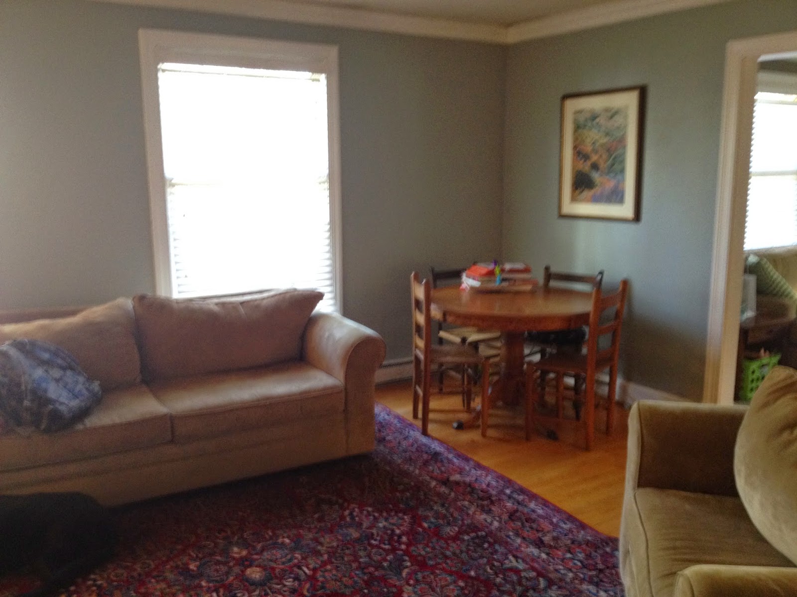
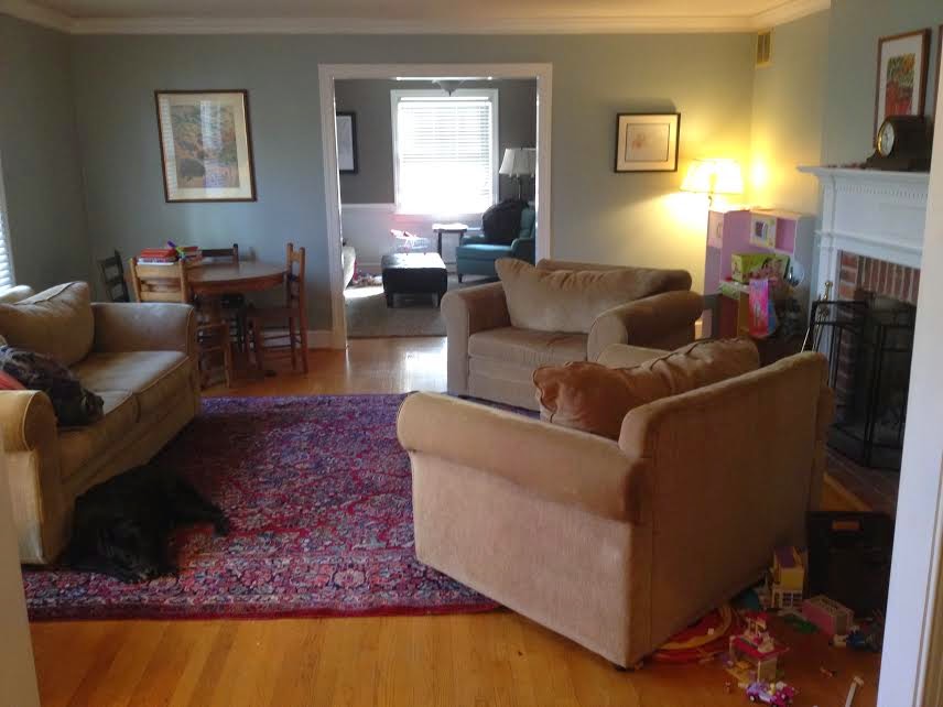
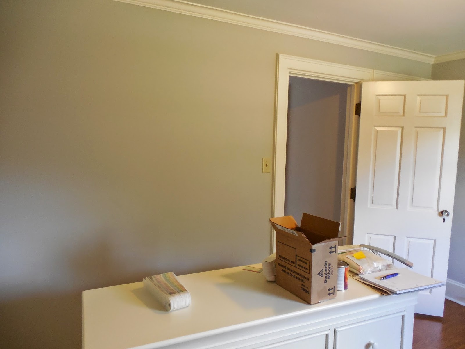
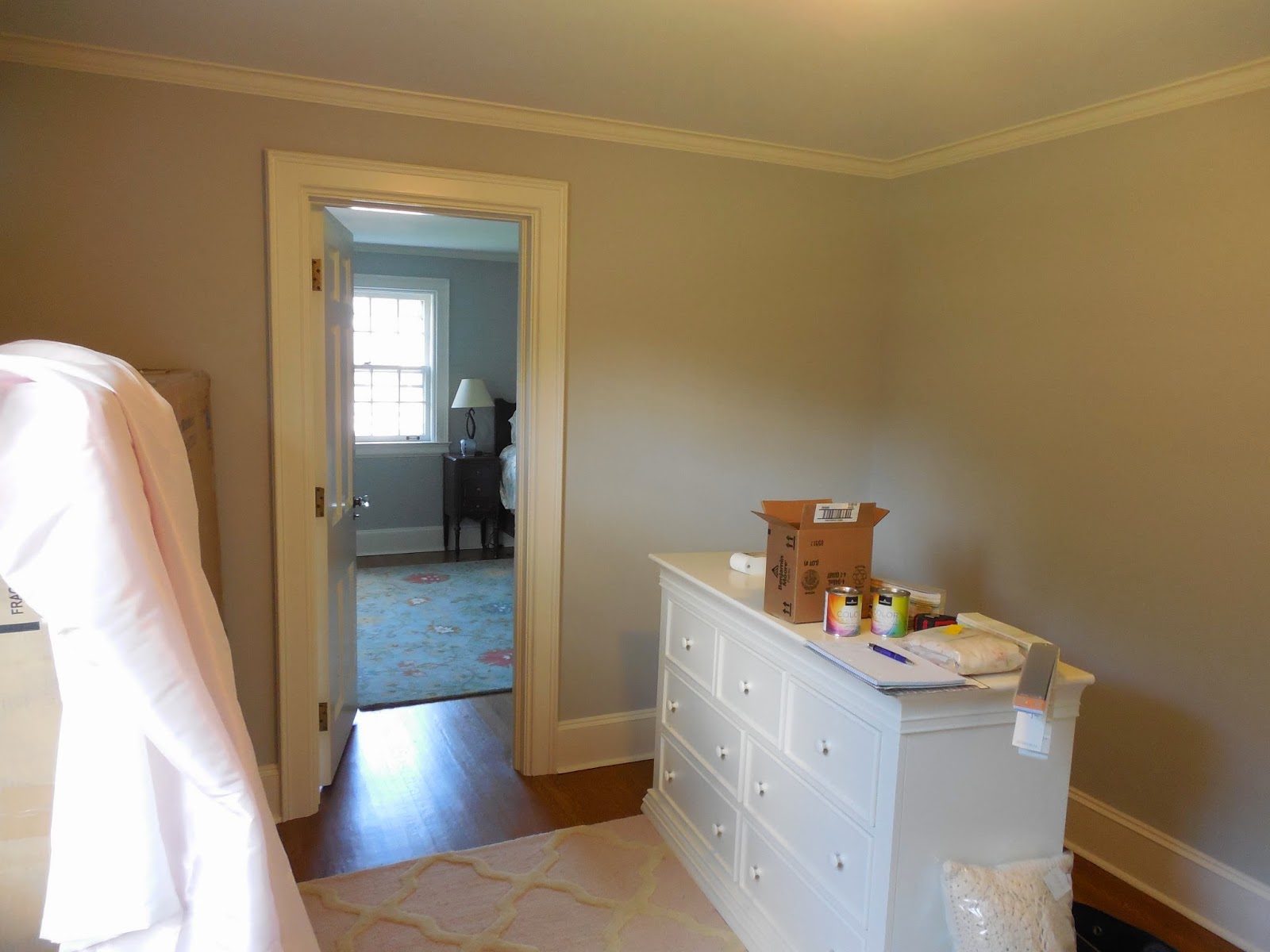
I am so excited to share my latest client reveal! I have been working on a girl’s nursery with a wonderful local client. She lives in a gorgeous 1930’s home and the room has a lot of great potential. The space has beautiful hardwood floors, glass door knobs and loads of character. My client did a great job purchasing the area rug, dresser and crib before we met. I came in to make suggestions on wall color, accessories and the rest of the furnishings. Here is the room before we started…
Before


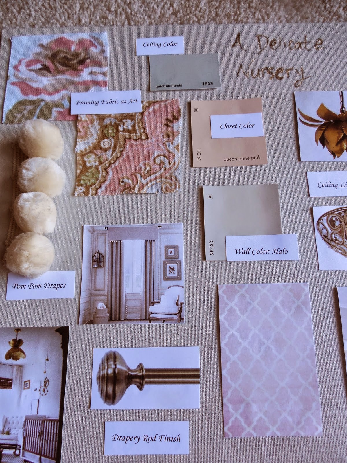
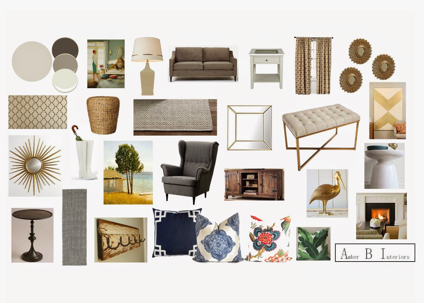
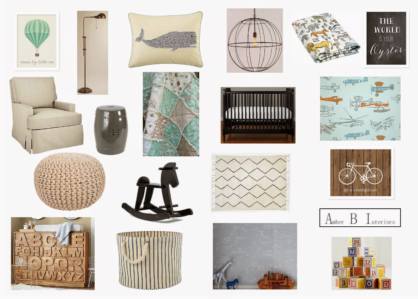
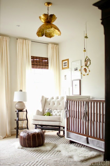
We immediately started talking about wall color and how we wanted to lighten it up and give the nursery a warm glow that feels cozy and inviting. She wanted the space to feel soft and delicate and a room her soon to be daughter can grow with. We met a couple of weeks later and I presented her with the design plan…
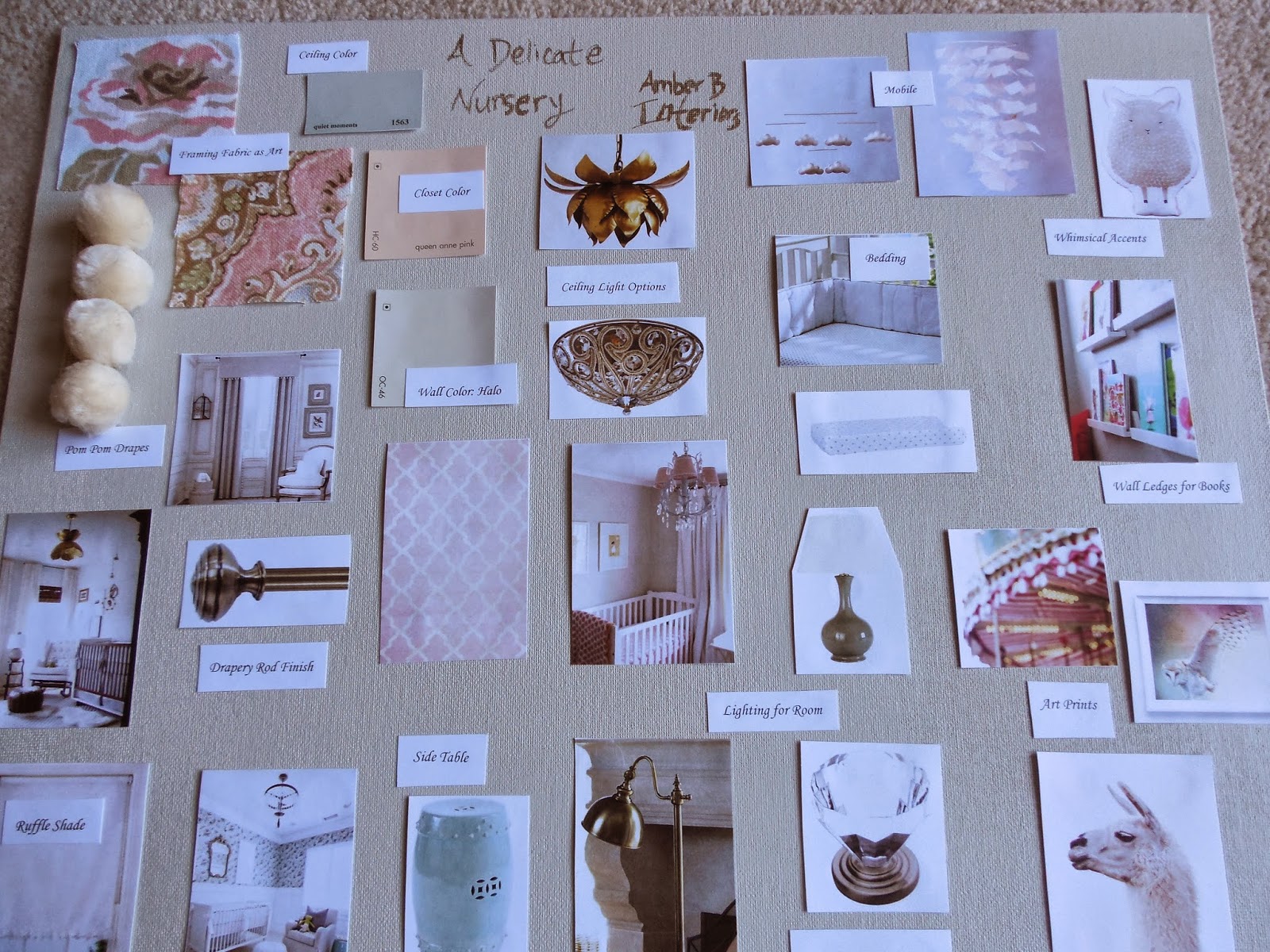
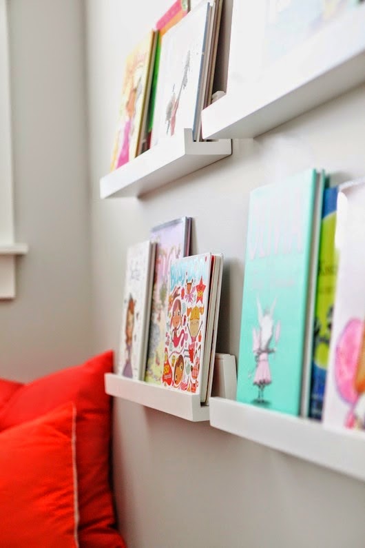
The Design Plan