Amber B Design Studio

Interior Design & Decoration for the South Florida region

  • Home
  • About
  • Services
  • Portfolio
  • Blog
  • Press
  • Contact

Transitioning Into Spring With Pottery Barn

March 3, 2017 by Amber Filed Under: amber b design, Bridge Street, design, interior design, personal design style


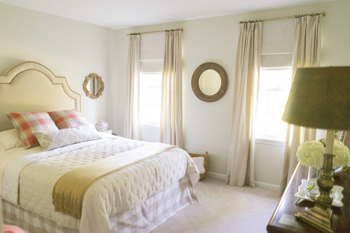
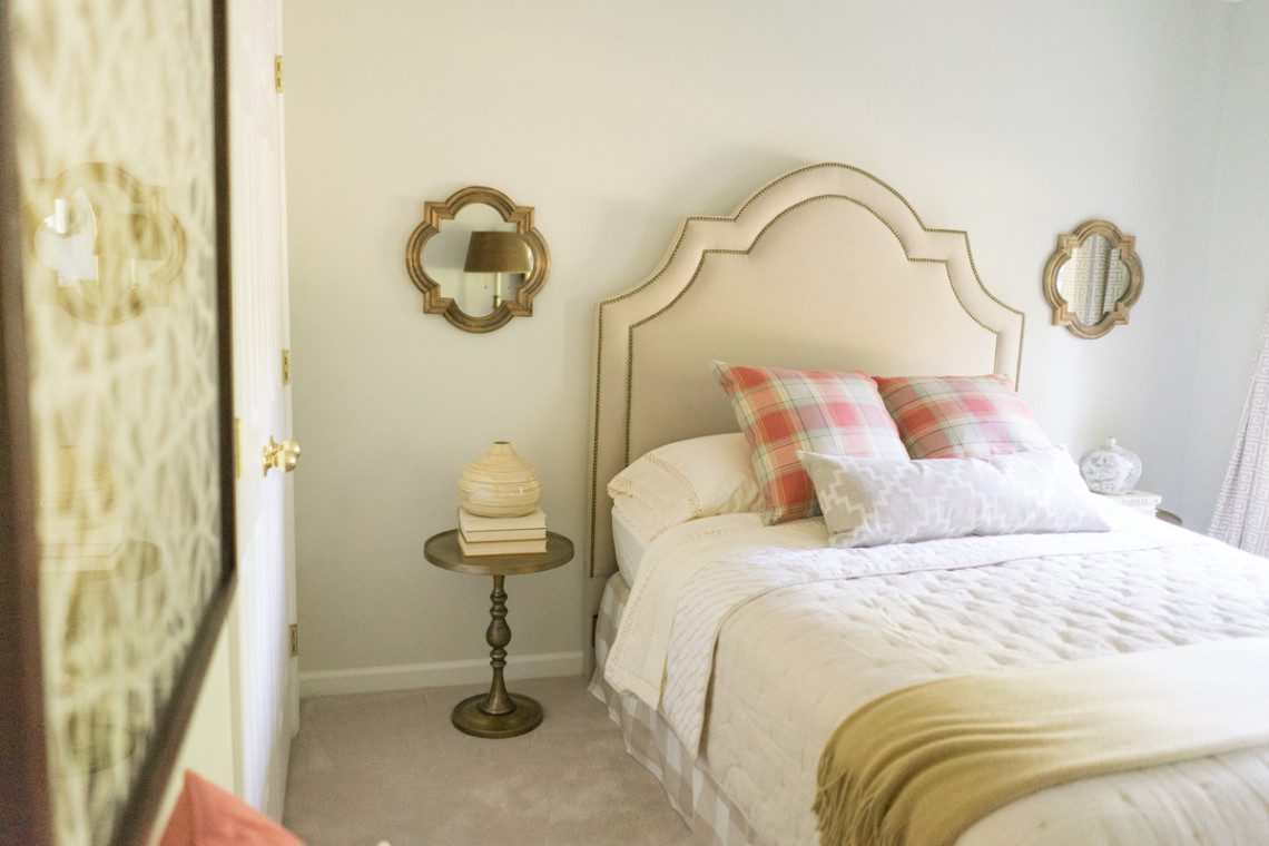
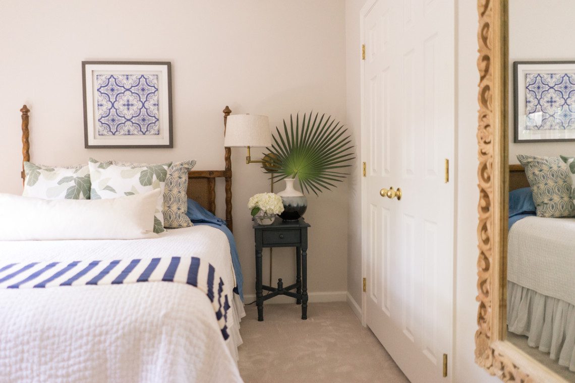
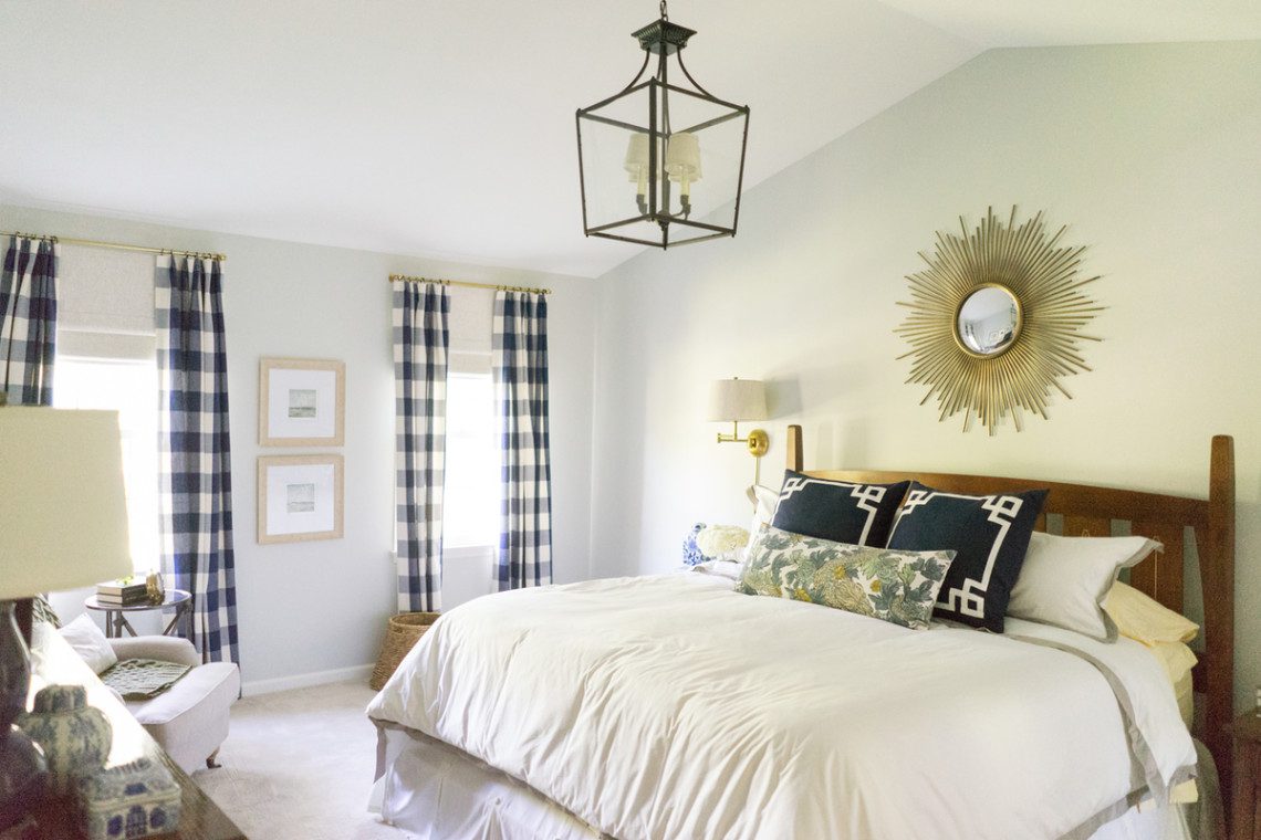
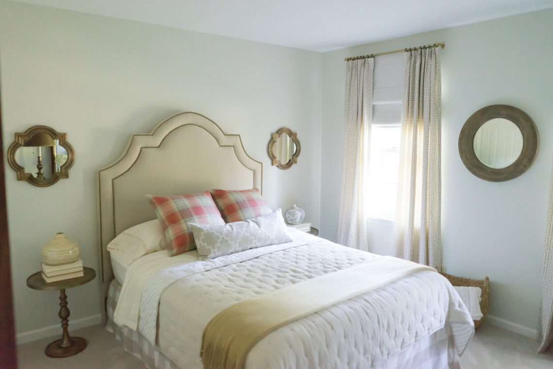
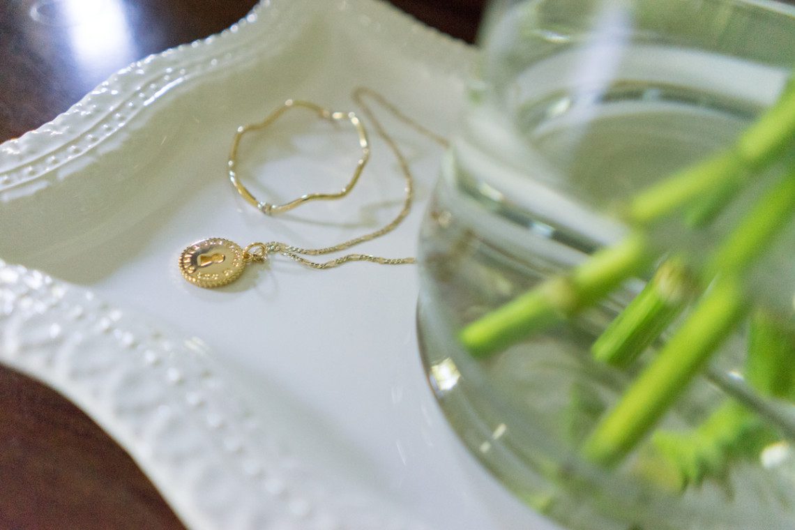
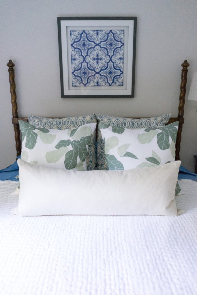
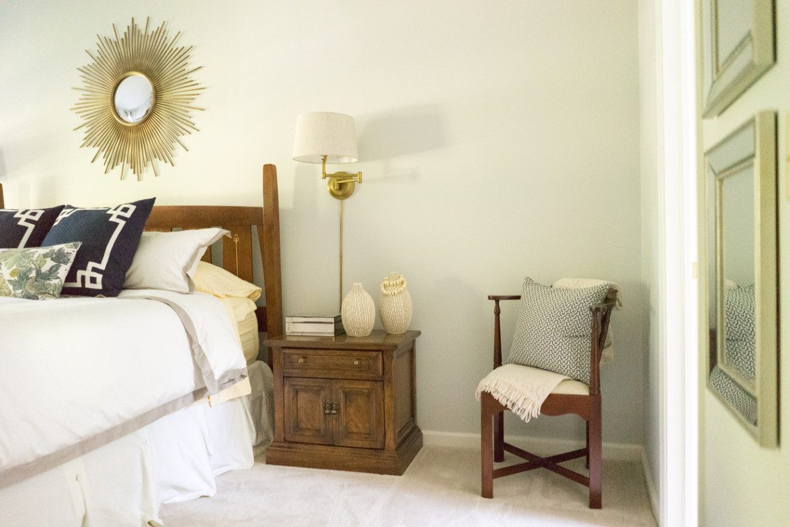
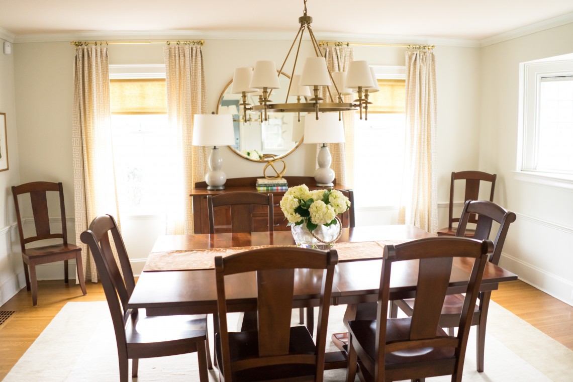
We are finally in the month of spring and although it is still freezing outside, I am inching towards adding spring accessories to my home. {Maybe if I just start slow and add some linens, cottons and coral branches, I can wish the warm weather to get here for good!!} I teamed up with our local Pottery Barn store and brought some of their beautiful accessories to News Channel 9’s Bridge Street. I did a segment with Sistina and TeNesha about slowly transitioning your living space and bringing some light and bright fabrics, beach inspired accents and various textures to get ready for spring. If you live in New York, it will still be necessary to leave out the velvet pillows and cozy cable knit blankets for some time, but at least you can start to get your space ready! My jumping off point for adding some color was found in this embroidered pillow…


Pillow

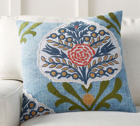
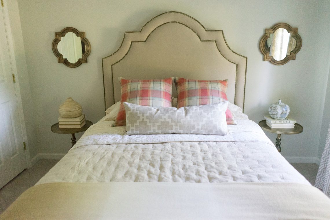
I love using at least one accessory to help tie in the room’s color palette. Sometimes, that is done with the area rug, art, or in this case- the pillow! This pretty applique option allows you to go so many different directions with the room’s color story. Its lightweight cotton fabric makes it perfect for spring and summer months. Since we are in a slow transition and still need those heavier weight fabrics around, I also showed how you can pair this with velvet pillows. Anytime a room has various metals, wood finishes and fabric materials, it gives the space depth and dimension. Adding velvet with cotton did just that…

 Pillow

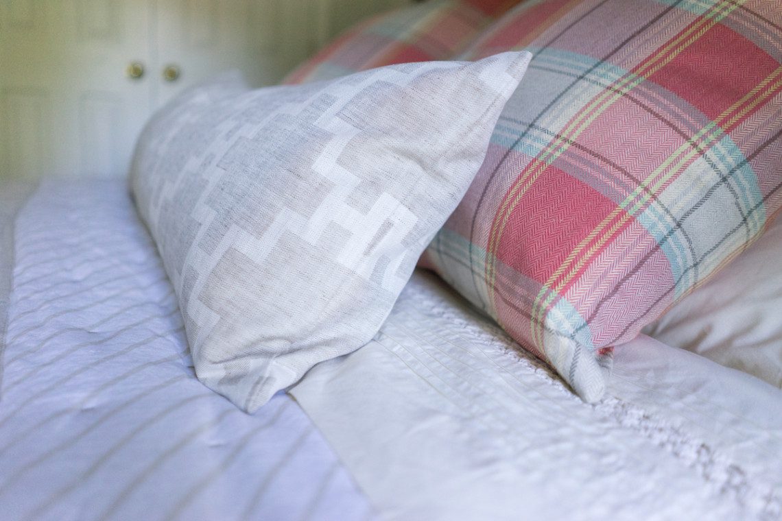
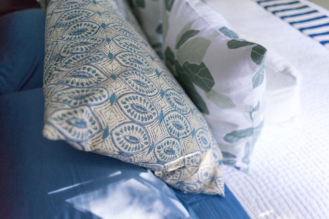
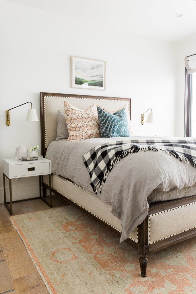
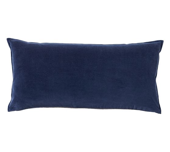
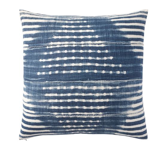
I love the way this solid lumbar brings out the dark blue in the colorful pillow. I am also all for mixing different print pillows and various shades of the same color. This Shibori indigo print pillow has a cool, eclectic tie dyed design. It gives a nice ombre effect, which I love…

Pillow

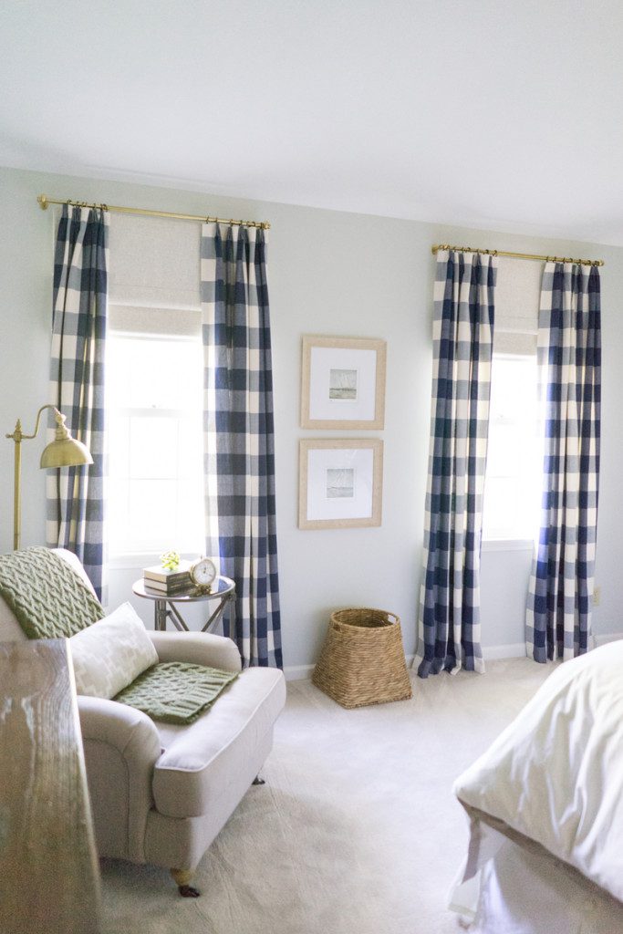
I also love a pretty buffalo check print and this pillow also made the cut…

Pillow

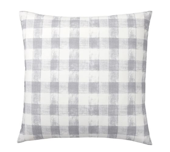
I think it gives a modern look in the gray and white color way. And after the pillows are set, it’s time to add texture…

Baskets

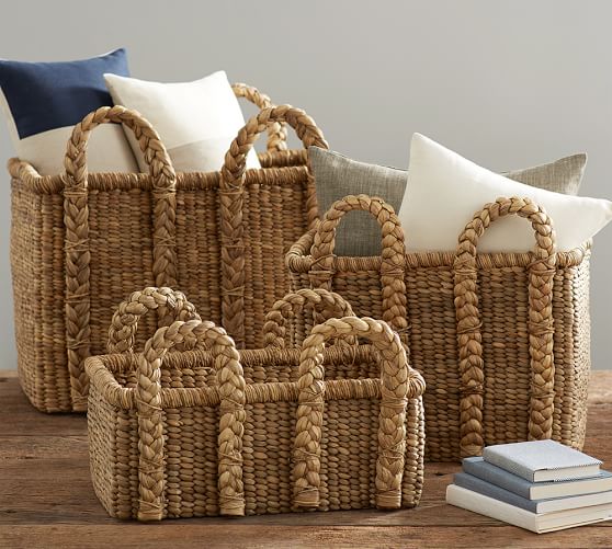
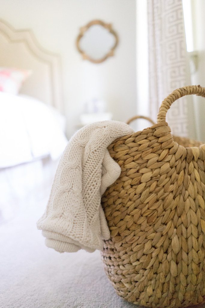
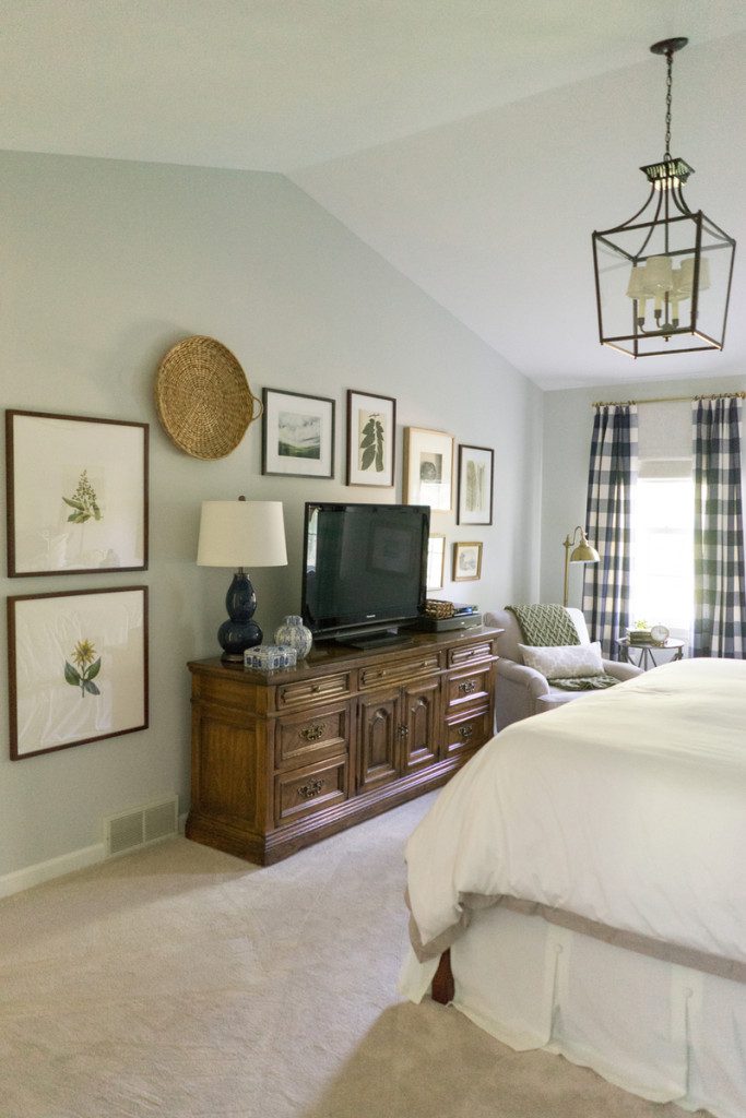
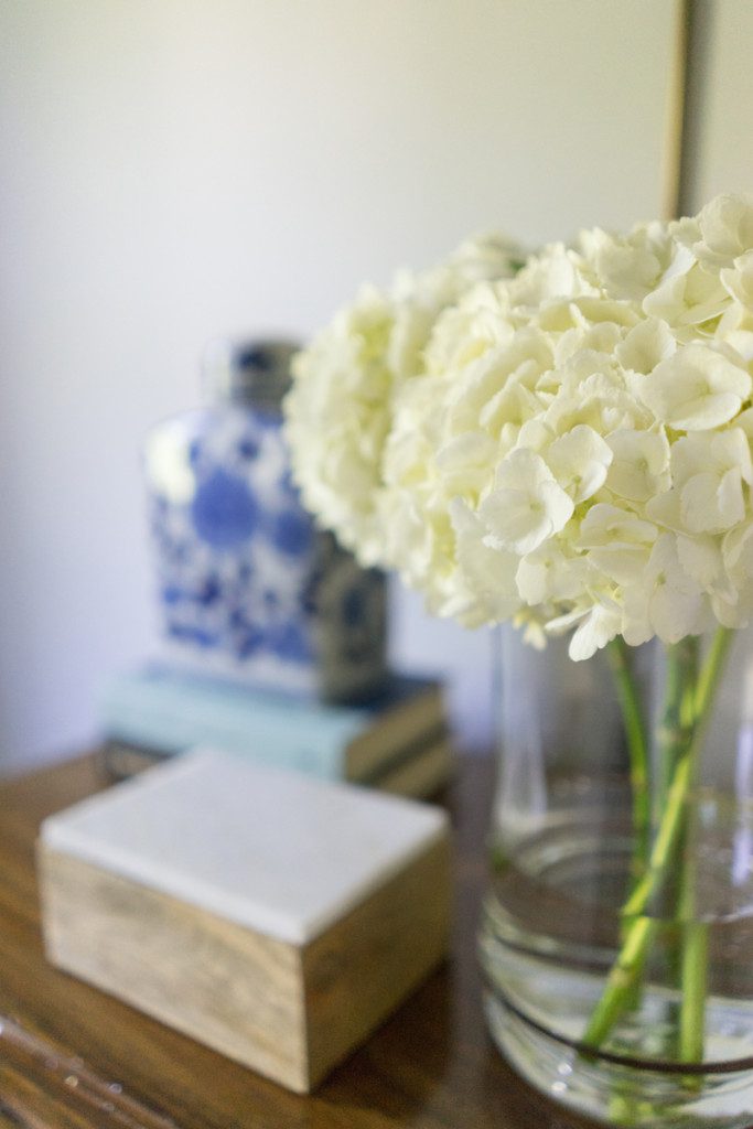
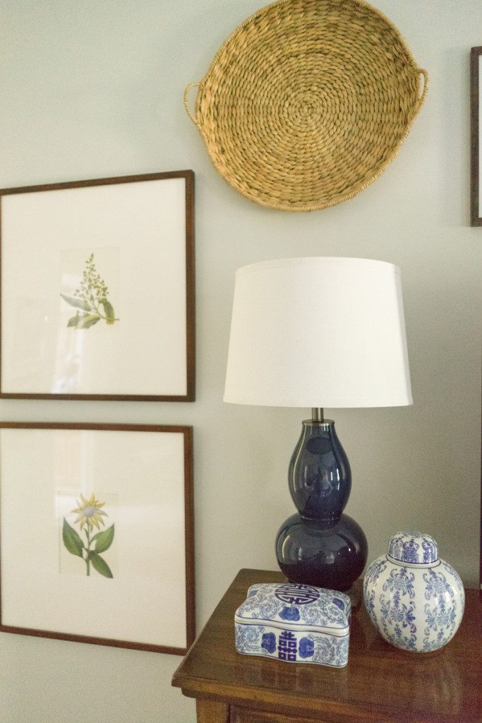
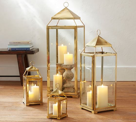
These beachcomber baskets are the perfect addition for any living space. They are great for extra pillows, blankets and books. Adding different metal finishes in a room gives a layered look. I brought a small brass lantern for the studio’s table. I think it’s also is a great accessory for the warm months ahead…

Lanterns

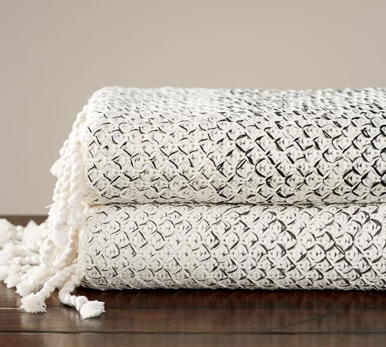
And since it still feels like winter here, I definitely brought along a cozy throw blanket. Actually, blankets like this are perfect for chilly summer nights, too…

Throw Blanket

If you know me and my design style, I love to mix it up and use several different shopping sources within each room I design. I think it brings a collected over time style to your home. Today though, it was all about some fun new accessories from Pottery Barn. And I had a blast seeing how well their products work together to bring a layered, complete look. Thank you so much to my local Pottery Barn for helping me put together this segment. I truly appreciate it! Anytime I get to chat design with Sistina and TeNesha on Bridge Street, it’s a great day! They are amazing. Until next time, Bridge Street! And if you missed today’s segment, you can catch it HERE.

Guest Room 2 Source List {Project Bedroom Refresh}

January 31, 2017 by Amber Filed Under: #projectbedroomrefresh, amber b design, design, guest room, interior design, sarah heppell photography


Today is the final installment from the source list series in Project Bedroom Refresh. This was such a fun project with amazing clients! I always love to see the completed product after the initial vision and hard work. There’s nothing like it. And seeing it through the lens of talented photographer Sarah Heppell is such a treat! This is the front guest room in their home. This was a bit of a diversion from the other two bedrooms, in that blue wasn’t a main color {or a color at all!} But that’s ok. You don’t have to have all of the same colors throughout your home, in every room. It is important to take a couple of similar elements, to tie the spaces together. We did that here with texture, earth tones and an overall neutral palette. We also added the buffalo check print again, but just in a different colorway. Enjoy!


// drapes // roman shades & curtain rods // round mirror – Hobby Lobby // bedskirt // quilt // sheets //

// headboard // side tables // throw pillows // vases & throw – Home Goods // mirrors – Hobby Lobby //

// woven basket – Target // throw //

// tufted ottoman, tray & marble gem – Target // pillow & art – Home Goods // design book //

I hope you enjoyed the tour through this design process. It’s also fun for me to look back and see the various stores and sources that go into a room design. It helps to bring a collected over time feel to a space. Have a wonderful day!

Guest Room 1 Source List {Project Bedroom Refresh}

January 18, 2017 by Amber Filed Under: #projectbedroomrefresh, amber b design, design, guest room, interior design, sarah heppell photography


I am excited to continue on with the source lists for Project Bedroom Refresh. Up today, is the back guest room. I also went with more blue in this space and the design definitely has a coastal edge. The amazingly talented Sarah Heppell took all of the after photos. Enjoy!


                          // wall color // quilt // palm leaf // palm pillows // blue & cream pillows // sconces //bedskirt // mirror, art above bed, sheets, vase and night stand – home goods // headboard – client piece //

// lamp & driftwood branch – Home Goods //

// dresser & lighthouse print – clients pieces //

drapes // roman shades & curtain rod // striped throw – Home Goods //

The next and final source list for this project will be the front guest room! Have a great day!

Master Bedroom Source List {Project Bedroom Refresh}

January 11, 2017 by Amber Filed Under: #projectbedroomrefresh, amber b design, design, interior design, sarah heppell photography


With a new year, comes new blog posts! I have made it a goal of mine to write more on this blog. I love having this little space on the web and it’s fun to look back at past projects! As promised, I am going to look back on Project Bedroom Refresh and give a complete source list for products in each room. First up, is the master bedroom. My clients have always had a traditional design aesthetic and were looking to bring an updated, fresh take on that for the bedrooms. That style is right up my alley, as I love a great blend of modern with traditional. And the beautiful after photography is all by the very talented, Sarah Heppell Photography.


bed mirror // greek key pillows // dragon lumbar pillow // duvet and shams // sconces // drapes // linen shades // wall color // curtain rods // sheets – Home Goods

chandelier // bedskirt // oversized wall frames // navy gourd lamp // wall basket //  wall art – Minted, free printables & Home Goods

brass floor lamp // woven basket // armchair // lumbar pillow // side table // wall art – Home Goods

I hope you liked the look back at this project! Up next, will be the source lists for the guest rooms!

Project Bedroom Refresh… The Final Reveal

December 12, 2016 by Amber Filed Under: #projectbedroomrefresh, amber b design, before and after, design, guest room, interior design, local clients, sarah heppell photography


Happy Monday! I hope you had a great weekend. Ours was packed with fun family events and finishing up our Christmas decorating. I am ready to show you the final reveal for Project Bedroom Refresh! Up today… the front guest room. My clients were wonderful to work with. It was a blast for us all to see the three rooms take shape. And the final icing on the cake was seeing Sarah work her photography magic. There is something so rewarding and exciting about seeing the finished designs through her lens. We worked with my clients dresser and table lamps. We refreshed the space with a new wall color, headboard and accessories. On Friday, I mentioned that there would be a bit of a change in this space and not incorporate all of the same colors. I went without the blue in here, but you’ll notice the neutrals and even some buffalo check, helps to tie the three rooms together. So let’s get right to it! Here is the room when we began…

Before

And here it is now…

After


All After Photos by Sarah Heppell Photography

I hope you enjoyed the tour of Project Bedroom Refresh! I have more exciting projects to show you after the New Year!! Stay tuned later this week, to see some snippets of our home for the holidays.


Project Bedroom Refresh… The Reveal Part 2

December 9, 2016 by Amber Filed Under: #projectbedroomrefresh, amber b design, before and after, design, guest room, interior design, sarah heppell photography


Welcome back to another reveal day for Project Bedroom Refresh! Today, it’s all about the back guest room. I carried in the same shades of blue from the master bedroom, to tie the two spaces together. My client’s home has blue and neutrals throughout, so this brought some continuity to the overall design. And like yesterday, the wonderfully talented Sarah Heppell Photography took the gorgeous after photos! Here is where the room began…

Before


We kept the headboard and one dresser for the space. We also used some of my client’s art work for the walls. And here it is now…

After


All After photos by Sarah Heppell Photography

My clients really love the laid back coastal vibe this room has and how it ties in well with their master bedroom. On Monday, I’ll be back for Part 3 and the final reveal… the front guest room! The third room will be a bit of a diversion with the color story, but it will be tied together through fabric patterns and an overall neutral design. Stay tuned!


Project Bedroom Refresh… The Reveal Part 1

December 8, 2016 by Amber Filed Under: #projectbedroomrefresh, amber b design, central new york design, design, interior design, local clients, sarah heppell photography


It is like Christmas came early around here… it’s reveal day!! I love being able to see a project from beginning to end. And once my favorite photographer, Sarah, puts her magical stamp on the project, it’s ready to reveal! I have loved working with Sarah on several design projects. She shows every room in its best possible way. So let’s get right to it! First up, will be the master bedroom. My clients wanted to update their bedroom, as well as their two guest rooms. They hadn’t been decorated in some time and they were looking for a major change. They like a traditional style and were ready to infuse some modern design to the mix, as well. Here is where the master bedroom started…

Before


We kept most of the furniture for this room and gave it a design update. And here is where we are now…

After


All after photos by Sarah Heppell Photography

I hope you enjoyed day 1 of the Project Bedroom Refresh Reveal! Up tomorrow… the back guest room. Have a great day!


Tried and True Design Elements

October 27, 2016 by Amber Filed Under: #projectclassicliving, #projectvintagegem, amber b design, design, interior design, kids and design, personal design style, sarah heppell photography


Over the years, I have noticed definite solid design decisions that are always in style. There are some elements in particular, that stand the test of time and become classic must haves for almost any home. As I have been getting completed designs photographed or even when I talk to clients about potential new projects, I have found some recurring topics and accessories discussed time and time again. I have rounded up some of my favorites for you today!

Warm Gray Walls

A dining room with a table and chairs, a mirror and a window.Project Classic Living, Sarah Heppell Photography

Whether they have a tinge of green or blue coming through, a soft gray base wall color is a great jumping off point in a space. It allows the colors and patterns to come through in the accessories or also allows the showstopper to be in the ceiling color or the lighting.

Gourd Table Lamps

Project Vintage Gem, Sarah Heppell Photography

A table with two blue and white stools in front of a mirror.Project Classic Living, Sarah Heppell Photography

Oh my goodness, my love for gourd lamps runs deep! I have even been known to use this style of lamp in more than one room in a design project. I love oversized table lamps with large shades. This style allows you to bring either a neutral or bold base color to the lamp. It also has a nice sculptural shape to it, which helps to bring interest and dimension to a room.

Patterned Rugs

A living room with brick walls and a tableProject Vintage Gem, Sarah Heppell Photography

{There’s another gourd lamp!!} Patterned rugs are a great way to bring an artistic touch to a room. It can bring color and texture to the mix, while also reinforcing your color palette. In this loft space I designed, the blue plaid rug brought in more of the favorite color and also softened the room and design.

Built In Shelving

Design by Studio McGee

Whether this is achieved with a furniture piece or actually built in to the home, the look of custom shelving always takes your room to the next level. I am currently {and always, for that matter} loving the look of white built ins with either a color or grasscloth added to the back of the unit. #beauty

What design elements do you love and feel will always work, even through ever changing design trends?!?

The Interiors and Fashion Connection

October 6, 2016 by Amber Filed Under: amber b design, Bridge Street, design, fashion trends, interior design, personal design style


I have always been a huge fan of fashion and I believe it has a strong connection with interior design. Today, I had the privilege of going live on News Channel 9’s Bridge Street with the super talented Jackie of The Small Town Stylist. She is a stylist in the area and we had fun with our back to back segments about fashion and interiors and their influence on each other. I am so glad to have met her. I feel like we have a lot in common and it’s always great to be able to meet and connect with like minded, local entrepreneurs in your area. When I have clients that are unsure about what colors to include in their space, I often ask them what hues they enjoy wearing. More often than not, the colors we choose for our clothing have a direct effect on what draws us in for interiors. {It’s probably no surprise to you that I love to wear navy, gray, black and white with pops of color. I like to keep my outfits neutral and add some color here and there, in small doses.} The same goes with the interiors in my own home and most that I design for clients!


A living room with a table and chair, lamp, picture and china cabinet.


A living room with two chairs and a dresser


A living room with a couch and chairs in it


All above images designed by me and Photographed by Sarah Heppell

Currently, I am all about buffalo check, plaid, gold, navy and dark green. I also love black and white to help anchor a space. And trends between fashion and interiors also happen to have a strong connection.


A bedroom with a bed, nightstand and lamps.

Design by Studio McGee

A woman wearing a vest and plaid shirt.

image via

It was fun to do this experiment and see how similar fashion is with interiors! Head on over to Jackie’s web site to get some great fashion tips! To see what gorgeous looks she brought to the show today, check out her segment HERE. And tune into Bridge Street HERE to see the interiors connection.

Lighting Tips in Your Home

September 9, 2016 by Amber Filed Under: #projectclassicliving, amber b design, design, interior design, living room, sarah heppell photography


An eclectic, collected over time style is popular, but can be tricky to pull off when making most of your purchases at once. You instantly want the look of having a space that has evolved, but how do you do that with lighting that has to be purchased all at the same time?!? That’s the topic we’ll cover today. My favorite trick is mixing finishes when purchasing lighting. Just because one lamp is brass, does not mean that they all have to be that way… even in the same room. You can mix metal finishes with wood and with lamps that have a painted base. And you can also mix different metal finishes within that space. I love doing that!

A living room with a couch and table

Photo by Sarah Heppell

When I designed the living room for Project Classic Living, you can see the the wood spool floor lamp by the fireplace, in the same room with the antique brass floor lamp near the windows. Mixing wood and metal in a room brings an eclectic, collected over time feel to the space. These two lamps also have different styles and shade types. That’s important to think about, as well. The metal apothecary style lamp works in a small area where task reading is done. And the oversized drum shade on the wood lamp base brings a softness to the room with its fabric shade and is great for overall lighting.

A table with two blue and white stools in front of a mirror.

Photo by Sarah Heppell

In this same room, I went with a pair of lamps for this console, to bring symmetry to the space, which was not done with the other two floor lamps. I like to mix symmetrical and asymmetrical in one room, for that contrast and balance. These fabric shades work well against the wood table, while the base has a brass detail that ties in with the apothecary floor lamp. I also love the look of having floor lamps in the same room with table lamps. For me, it’s never all floor or all table.

A foyer with a mirror and a table in it

Photo by Sarah Heppell

In the foyer of the same home, I have mixed wall sconces with table lighting. The sconces were already there when the project began and adding the blue and white ceramic table lamp brought color and additional lighting to the table surface.

A dining room table with chairs and flowers in the center.

Photo by Sarah Heppell

In the dining room of the same home, I loved adding a pair of lamps to the buffet. It creates a great mix with the overhead chandelier. In this space, there was a lot of wood with the floors and furniture. So, I went with a brass chandelier with soft linen shades and then paired that with painted gourd lamp bases with a similar soft shade. All of the lighting in this room really pops against the other features, which was our goal.

So for a quick recap of fun tips for your home’s lighting, here is the breakdown…

-Mix your finishes and shade styles {task lighting vs. overall room lighting}

-Mix symmetrical with asymmetrical and floor lamps with table lamps

-Mix sconces with table lamps {great for a foyer}

-Mix overhead chandeliers with table lamps in a dining space

I hope these lighting tips helped! If you have any to add, please leave them in the comments! Happy Friday!!

  • « Previous Page
  • 1
  • 2
  • 3
  • 4
  • 5
  • …
  • 10
  • Next Page »
Welcome!

Hi, I'm Amber... a wife, mom and interior decorator. I am the writer of Simple Dwellings and the designer behind Amber B Design. Blog topics are all things design, with the occasional DIY attempt! Thanks for stopping by Read more...

  • Bloglovin
  • Email
  • Instagram
  • Pinterest
  • Twitter

Blog Posts, Straight to Your Inbox

Popular Projects

A dining room with white walls and wooden table.
A black door with white curtains and a red chair
A staircase with black and white chevron pattern on the steps.

Blog Love

  • Addison’s Wonderland
  • A Thoughtful Place
  • Alison Giese Interiors
  • Amber Interiors
  • Bailey McCarthy
  • Caitlin Wilson
  • Chris Loves Julia
  • Classic Casual Home
  • Cottage and Vine
  • Design Indulgence
  • Dwell by Cheryl
  • Eddie Ross
  • Elements of Style
  • Emily A Clark
  • Emily Henderson
  • Gallery No Eight
  • Hi Sugarplum
  • House of Jade
  • Jana Bek
  • Juniper Home
  • Kate Marker Interiors
  • Lucy Williams
  • Monika Hibbs
  • Our Fifth House
  • Pencil and Paper Co
  • Rachel Parcell
  • Rambling Renovators
  • Pure Style Home
  • Sita Montgomery
  • Studio Mcgee
  • The Makerista
  • The White Buffalo Styling Co
  • the Zhush
  • Traci Zeller
  • Young House Love

Copyright Amber B Design © 2025 ยท Design by Britt Douglas


Loading Comments...