If you’ve been following this blog for a while, you may remember the blog series I used to write on Wednesdays, titled: Why This Works. Basically, I select a room I have found that I absolutely love and I break down the reasons why I think it works. Over the past few years, I have really gravitated toward a clean, modern/traditional aesthetic. I love bright, open spaces that feel warm and welcoming. So, I think this living room designed by the super talented Bria Hammel, is a great space to kick start this series again!
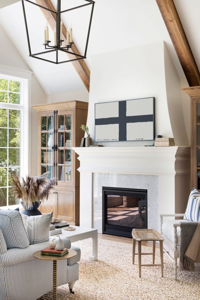
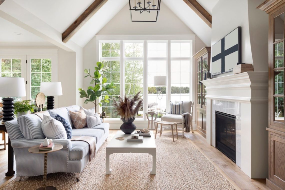
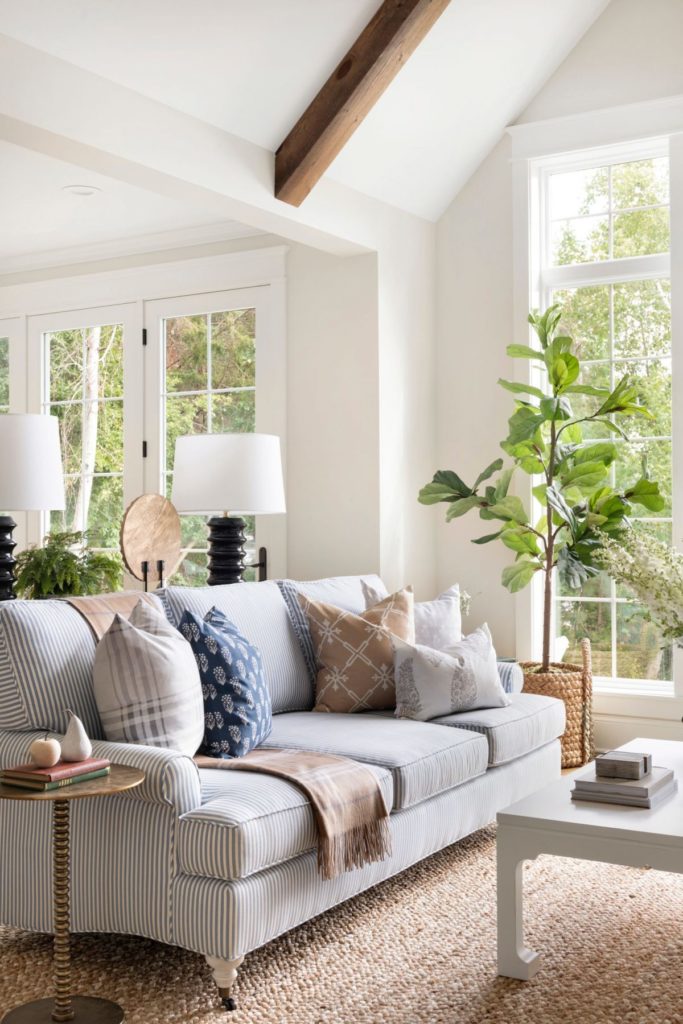
Am I right that this space is stunning? Ok, let’s break down why I think it works! The light and bright walls really allow the colorful furniture and accessories to take center stage. The wood beams are able to stand out and they are complimented by the gorgeous storage cabinets on either side of the fireplace. The natural woven area rug really grounds the space, while also bringing in a great dose of texture. The plants help to bring the outdoors in, while also introducing green to the room. Both the lantern pendant and the beautiful windows help to draw your eye up, giving the illusion of more space. The patterns in this room also work so well together. The subtle ticking stripe of the sofa is complimented by pillows that have a larger, more oversized pattern. The mantel art and accessories are simple, yet create a great graphic impact. I always love the look of a floating console behind a sofa, especially when you can work in a pair of lamps. The addition of the floor lamp and pendant allow different light sources in the room, which is a great way to bring that collected over time style to a space. So as always, Bria knocked it out of the park on this one! You can connect with her on her web site HERE as well as get her look with her on line SHOP Brooke and Lou. I hoped you liked the return of Why This Works. I hope to get back into this series more often!!
