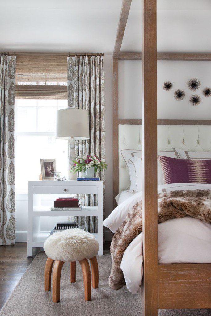
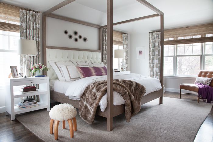
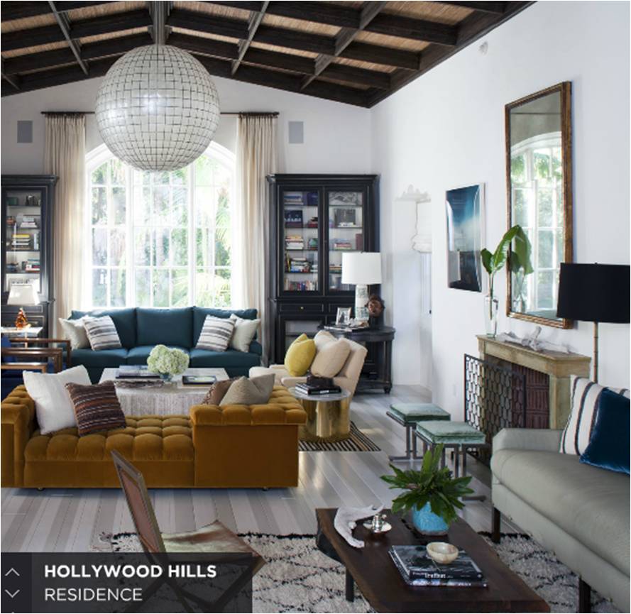
Welcome back to another installment of Why This Works…Â where I show a designed space and talk about why it’s amazing. Today, I am featuring interior designer Thomas O’Brien, who has always been known for his classic, laid back style. I am always drawn to his designs, because they are so livable and real. Today’s guest bedroom he designed for a designer showhouse was featured in Veranda magazine and exudes that casual, classic style that I love!
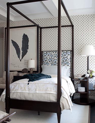
image via
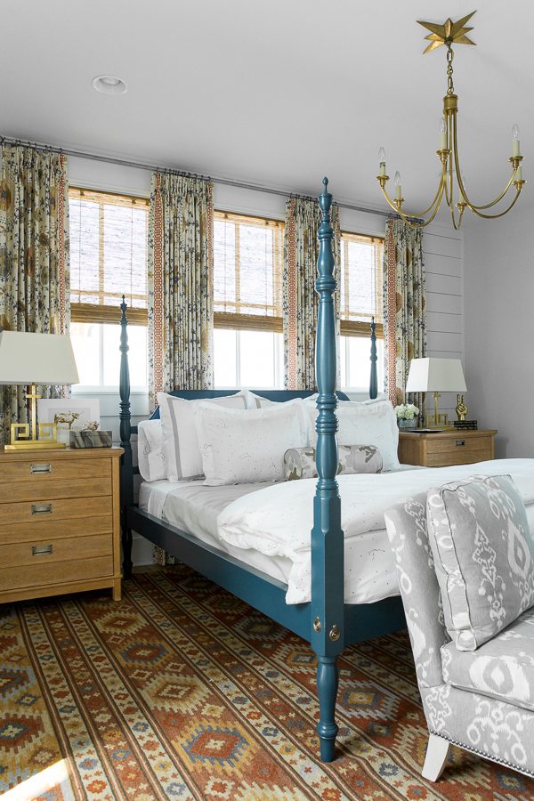
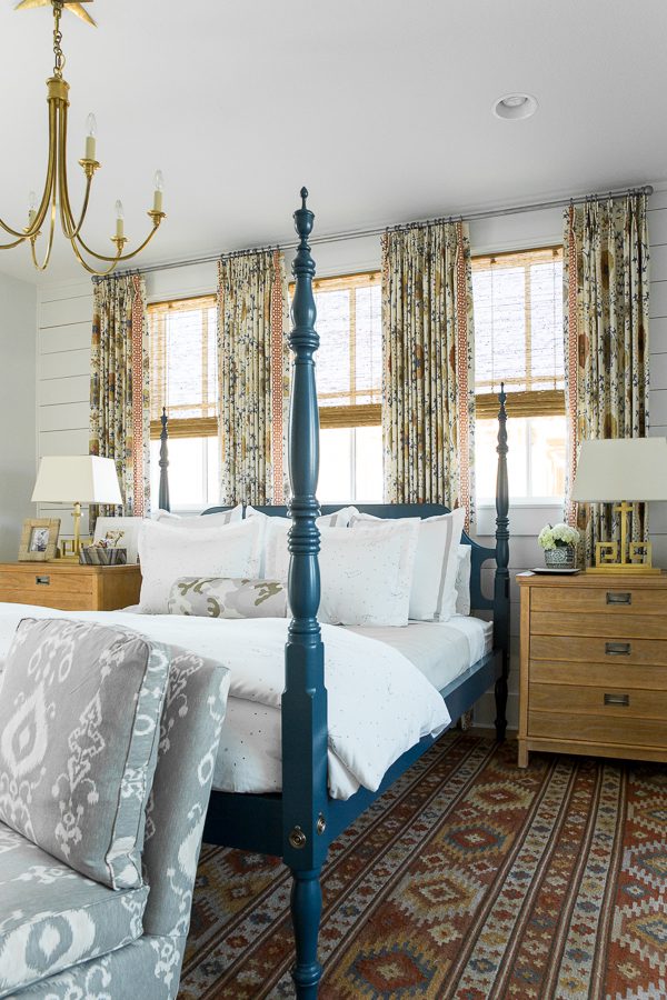
This room has that perfect blend of comfortable and stylish. I am always drawn to a four poster bed of any kind and I love that this deep wood stained finish balances so well with the light carpet and ceiling molding. The linen covered walls have that small pattern that also mixes so well with the neutral bedding. I am also a fan of pattern on pattern and it works so well here, with the walls and headboard, because it’s a mix of small and large patterns. If the headboard had a small print design too, it wouldn’t work as well. I always love an animal nod of some kind and this oversized feather print is dramatic and restrained at the same time. A perfect way to approach oversized art/accessories in your home? If it looks too big upon first glance, then it’s perfect! Large art and accessories takes some time to get used to, but makes such a wonderful impact in any room. I also love a good asymmetrical balance when done right and this art print does not have a matching piece on the other side, but rather uses the printed linen covered walls and tall table lamp as its counter balance. A small table lamp is then placed in front of the feather art, so there’s functional lighting, but doesn’t compete with the print. The tufted arm chair and bedside flowers add that feminine touch to the classic, masculine blue the room exudes. Overall, this room works for me!
What are your thoughts???