Amber B Design Studio

Interior Design & Decoration for the South Florida region

  • Home
  • About
  • Services
  • Portfolio
  • Blog
  • Press
  • Contact

E-Design Before and After {A Client’s Gallery Wall}

July 23, 2014 by Amber Filed Under: before and after, e-decorating, e-design, gallery walls, interior design, living room


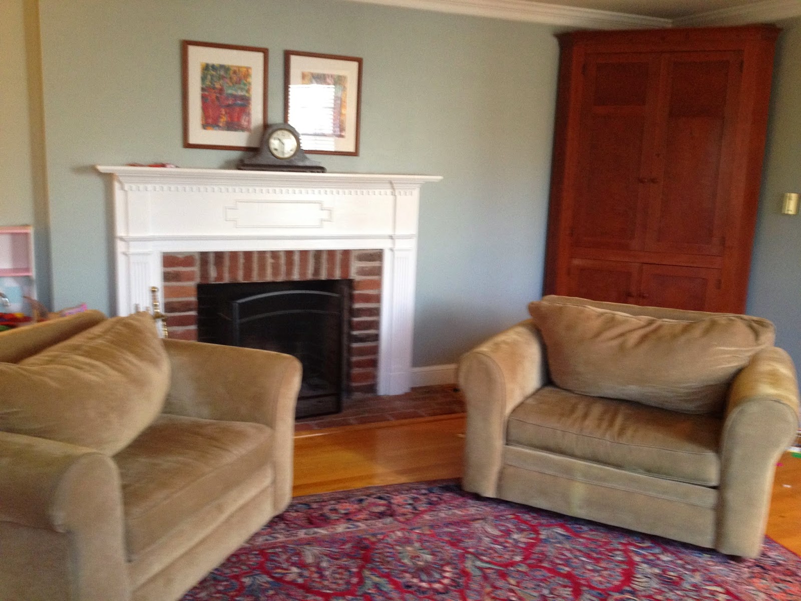
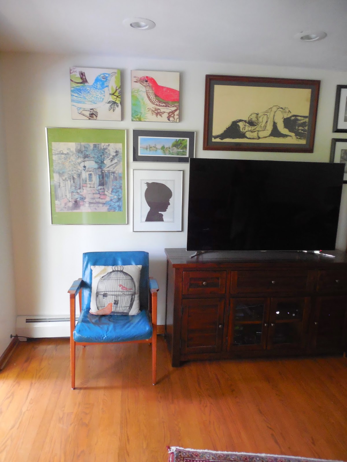
You may have read some of my previous posts about my love for gallery walls… especially asymmetrical layouts around a television. Not only does it allow you to bring in color and pattern to a space, it’s also a great trick of the eye to help conceal the TV. One of my wonderful e-design clients recently completed an arrangement on her media wall and I can’t wait to show you the impact it made! Here is the before picture of the television wall…

Before…


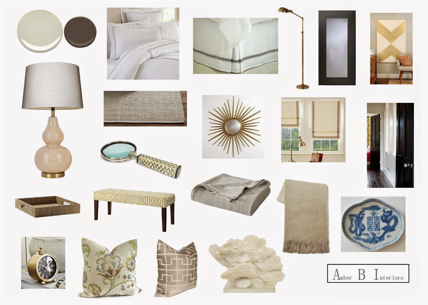
Here is the design plan I came up with for the whole space…

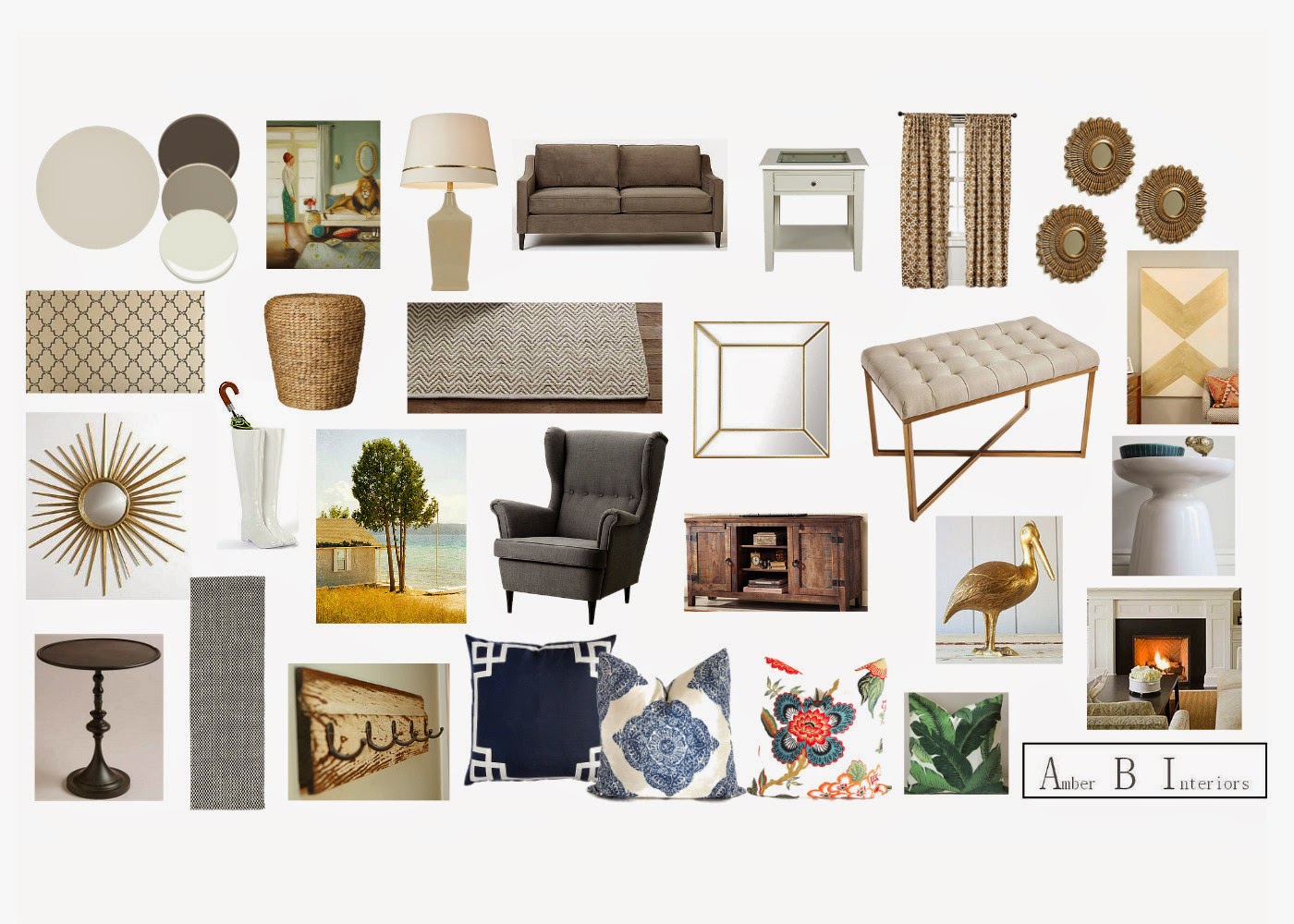
And here is the media wall mock up I made for the gallery wall…

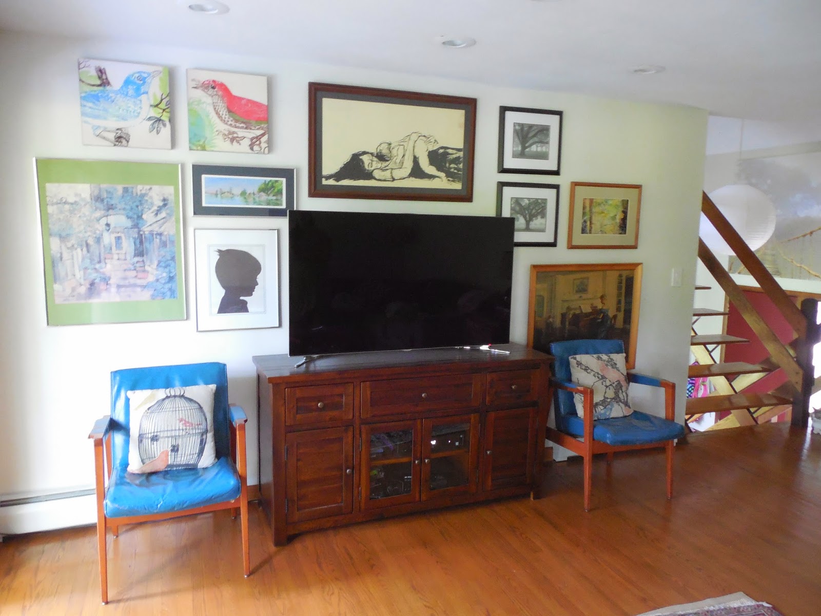
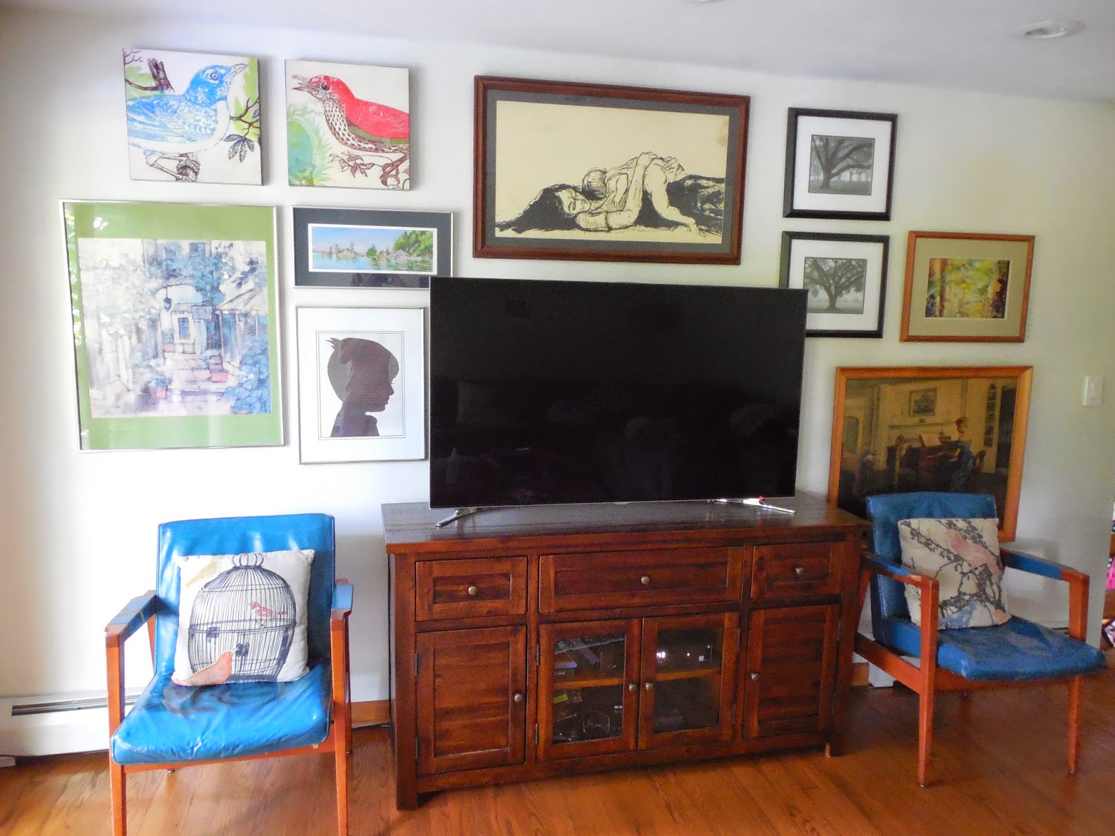
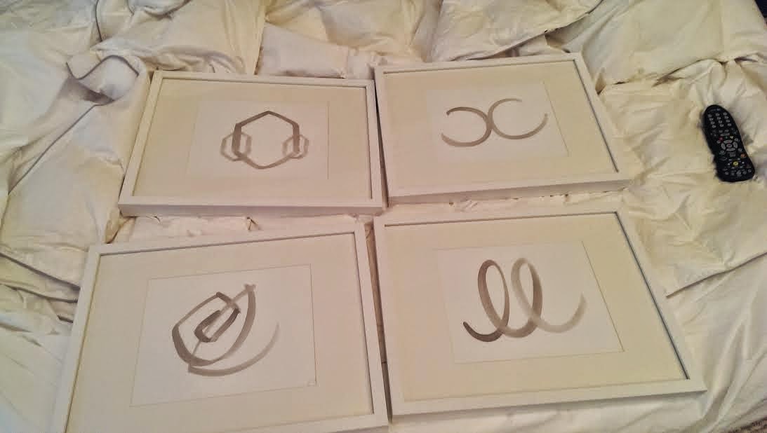
We incorporated her taxidermy art and her lamp, but added some fun new art pieces and a hint of brass in the mirrors. Here is the after…

After


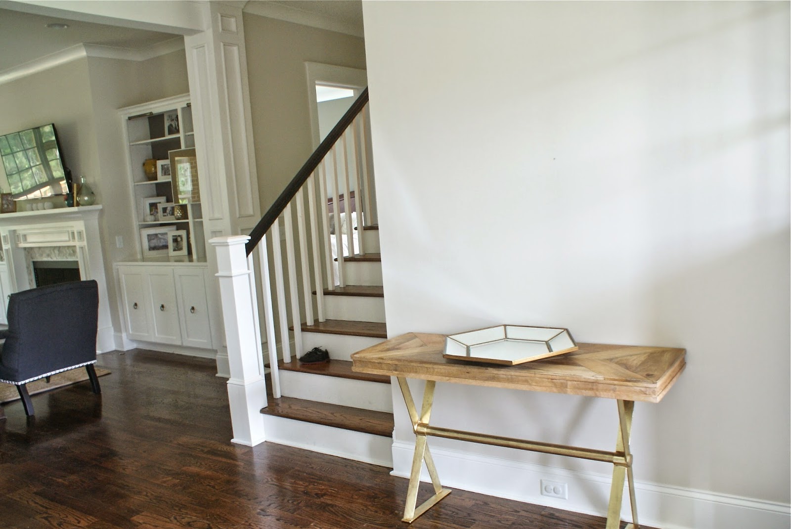
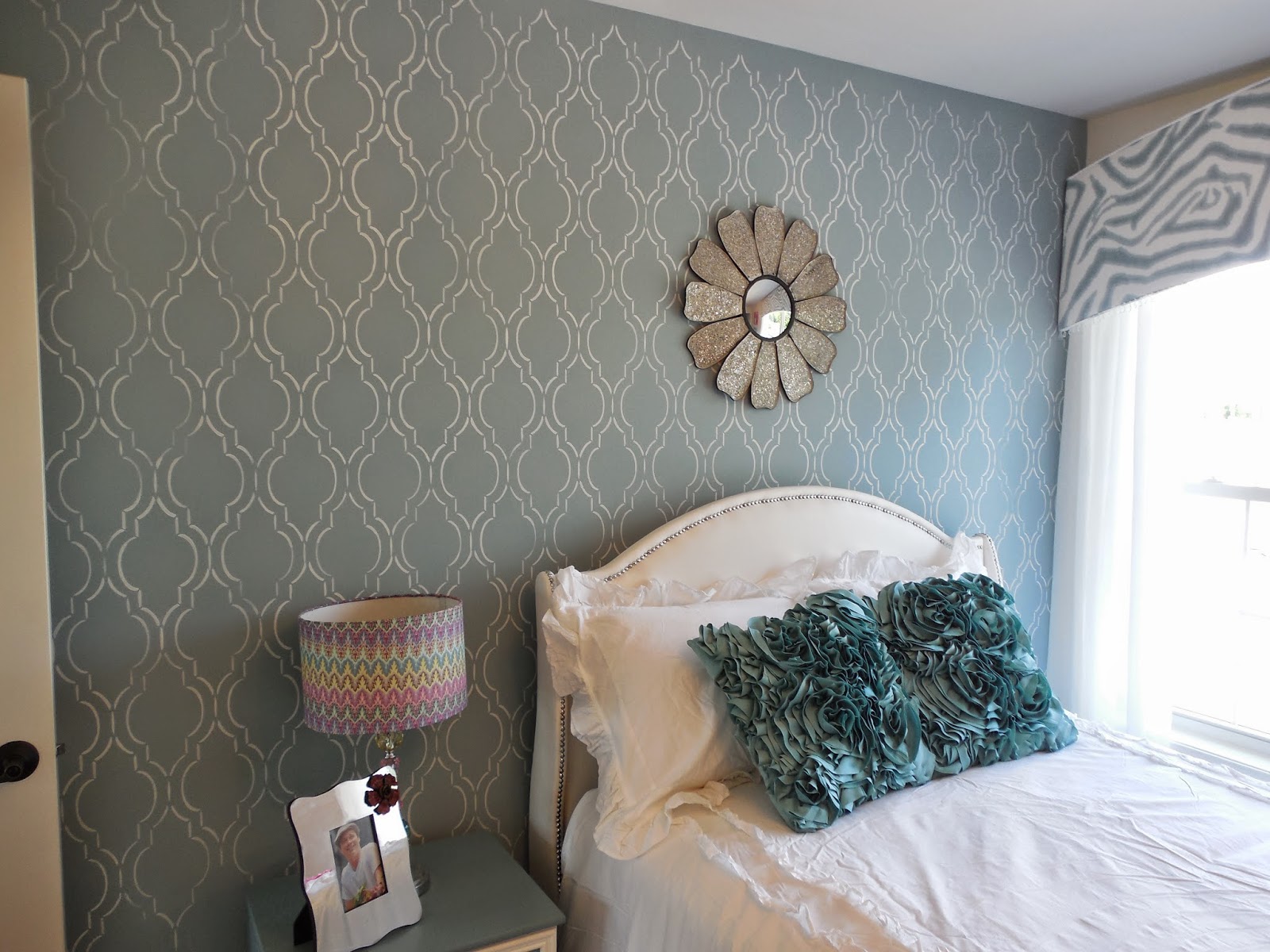
I am so proud of the progress she has made!! You can even see a glimpse into her foyer on the left, with the gorgeous wall stencil. The boot umbrella stand, shown on the right side of the last picture, will go in the foyer. She is almost finished with the spaces, so there will be another reveal coming in the future. Thank you so much to my amazing client for allowing me to share these pictures here. She always has the sweetest things to say and it has been my pleasure helping her enjoy her spaces that much more! We also recently wrapped up her kitchen and dining space, so more designs to show, soon.

Before and After Updates {A Client’s Living Room}

July 16, 2014 by Amber Filed Under: before and after, design, e-decorating, e-design, interior design, personal design style


I have some wonderful updates of a client project to show you today! A little while back, an e-design client contacted me to help bring a more eclectic, bohemian style to her living room. This space is directly off of the foyer and is the space they gather when entertaining and spending time with their family. We kept some of her current furniture pieces and accessories, but added many new pieces to finish the look. I showed you the design plan a few posts back, but here is a refresher..

The Design Plan

Here is her reading nook {the top left corner of the room} before…

Reading Nook Before


And here is the after…

After


I love the new light wall color and the way her chair and bookcase fit into the design plan. The corner gallery wall is fun for a space like this. It adds depth to this side of the room, giving the illusion of more space. The woven ottoman adds interesting texture and is a great way to break up all of the upholstery pieces seen in the seating.

She also made progress on the fireplace mantel. Here is the before…

Before


And here is the after…

After


The mirror and waterscape vases bring a more eclectic, unique vibe to the room, which was exactly what she was looking for. The room had great bones, but it was more traditional in style than she wanted. We removed the oversized chairs and replaced them with more streamlined, modern seating. I can’t wait to show you more progress to come!

Thanks to my amazing client for allowing me to share these sneak peeks and her great progress!

The Foyer is Almost Done… You’ve Gotta See This!

July 3, 2014 by Amber Filed Under: before and after, e-decorating, e-design, foyer, interior design, personal design style


I am so thrilled to show you this {almost} reveal, that I couldn’t wait until all of the pieces were in place. My client and blog friend, Anne, moved into her newly built home and is doing a fabulous job making it her own. The finishes and pieces she has chosen so far have made this house an incredible work of art. She contacted me to help her put finishing touches on the foyer, dining room and living room. I originally wrote about the foyer here, but let’s re cap…

Here is Anne’s foyer before…


Stunning, right?!? Here is the design plan I came up with to add a touch of modern glamour to the space and complete the look…

The Design Plan…


And here is the {almost} reveal of the foyer…


That stencil is seriously everything!! Anne did an amazing job with that project. It adds fun texture and pattern to the space and is a great way to introduce the home’s style as you enter through the front door. The Beach print from Furbish brings together the home’s color palette and is a whimsical accessory to the foyer. Here is a close up of the amazing print…

Sandwiches on the Beach
We will still add a couple of accessories and an ottoman for putting on/taking off shoes. But I just had to show you the progress. Amazing job, Anne! Thanks for letting me share your gorgeous space!

A Peek Inside My Friend’s Home

July 2, 2014 by Amber Filed Under: design, interior design, personal design style


I have a treat for you today! Inspiration is everywhere and I am always intrigued with how others decide to decorate their home. What personal mementos are important to them, how design styles shape the way they live and just an overall curiosity for how people decorate. My good friend Deanna, is no stranger to great design. Ever since we met a few years back, I have loved her sense of style… both in fashion and interiors. Our kids are the same age and great friends, so I am lucky we get to see each other often and chat design. And when I approached her about taking a few pictures of her gallery wall for the blog, I was so excited she said yes! Deanna has created a large gallery wall of meaningful art around her television, blending the TV into the art wall, tricking the eye into seeing more than just the television. Her vision for her mid century modern home is amazing. The furniture pieces and art she has collected along the way are fun, eclectic and work so well with the character of her home. So without further adieu, let’s let the pictures do the talking…

The colorful foliage picture above the piano portrait was left by the original homeowners of the house. It is an artist’s abstract interpretation of the home’s backyard. 

I always tell Deanna this one is my favorite! How could you not fall in love with this art piece? 

In this image, you can see a glimpse into the foyer. I have always loved that oversized paper light fixture. She recently painted the inside of the front door red and found the bridge art print when shopping at IKEA. The scale is perfect for that wall!

The silhouette print was actually a school project made by her son! The bird prints are from Target.

One last snapshot of this stunning gallery wall!

Deanna tackled this gallery wall project in a very thoughtful way. Let’s take her ideas point by point, so you can recreate this look…
1. Mixing symmetry with asymmetry. Deanna used symmetry with the vintage chairs sitting on either side of the television, but then juxtaposed that look with an asymmetrical gallery wall of art. 
2. Mixing large and small prints and using the whole wall to hang the art. Don’t be afraid to go floor to ceiling with art! It doesn’t always have to be at eye level. She used various sized pieces to fill in the wall and arranged them in a way that was aesthetically pleasing to look at. Just take it one art piece at a time and step back every now and then to see where you need to fill in the gaps. Once Deanna hung all of the pieces, it actually made the space feel larger and the wall looked taller than before. It’s a great illusion! 
3. Not every inch of the art piece has to be shown. Covering a portion with a piece of furniture or object is a great layering technique. Deanna did that when she placed some of her piano portrait a few inches behind the chair. 
4. To achieve this eclectic look, mix up your frame finishes and combine store bought prints with vintage, collected pieces. There is a time and a place for the same frame finishes and that might be when you are doing a symmetrical gallery wall. For this look, mix it up!
5. Use meaningful art! So many of these pieces tell a story, which is exactly how your home should be! Being surrounded by meaningful memories, such as the silhouette made by her son, is priceless.
6. Shop around your home when creating your gallery wall. Deanna actually had all of these prints in her home already, but on a different wall. Arranging them around the television makes them feel like new art pieces! 
Thank you so much, Deanna, for letting me crash your beautiful house and show it here on the blog!   

E-Design – A Client’s Foyer

June 26, 2014 by Amber Filed Under: e-decorating, e-design, foyer, interior design, stencil


I love it when I am working with a client that loves design and gets just as excited about the project as I do! One of my recent e-design clients who is also a blog friend, has contacted me to help her pull together the foyer, dining room and living room. In my last post, I shared the plans and progress of the dining room. My friend and client, Anne, has an open floor plan on the first level and we are making choices that all work well together and create continuity and flow. The color palette will remain the same for all spaces… mixing grays, blues and corals for a modern and fun design! Here is a snapshot of the foyer we are working with…

Her Foyer Before


As you can see, we are already working with a stunning space. This girl knows design very well! We will keep the pretty wall color, rug and chandelier. Anne recently bought the console and already had the hexagon mirror. We are incorporating it all into the plan. Here is what I came up with to bring this space together…

The Design Plan


We will add a stencil to that one wall, create a fun gallery wall using her mirror, add an ottoman for putting on and taking off shoes and include some chic accessories to the top of the console. I cannot wait to see the space come together and that stencil up on the wall. It is already a stunning space!!

Make sure to check back next week, as we move onto the living room! The ‘before pictures’ are gorgeous on their own!

E-Design – A Client’s Dining Room

June 20, 2014 by Amber Filed Under: dining room, e-decorating, e-design, interior design


I am excited to share this e-design project with you today! I was asked by a great blog friend to help put some finishing touches on her dining room, foyer and living room. Today, I will share the design for the dining room. My blog friend Anne, has moved into this gorgeous newly built home and has already done an amazing job selecting finishes and furniture for every space. I am so envious of her stunning chandelier in the dining room, which you’ll see later on in the post! Her style is a blend of modern/traditional with a bohemian/glam flair. I love mixing design styles and absolutely love this combination. My client already had the dining table, credenza, chandelier and rug. Here is what I came up with to finish the space…

The Design Plan


I love to mix up the seating in a dining room, making the head chairs more substantial and stately. The wing chairs paired with clear acrylic side chairs is a fun, unique combo that Anne loved! I also thought it would be fun to add a bar cart on casters. That way, she can easily bring the cart to the kitchen and back into the dining area when entertaining. Here is the style board I came up with for the bar cart…

Bar Cart Styling


The accessories on the right side will go on the top shelf. The bottom shelf with have a blue/green demijohn filled with wine corks. They can add to it as they entertain and use it as a fun way to remember happy gatherings! It is also a subtle way to incorporate more texture in the space. The inspiration image shown on the left of the board can be found here and is a great example of the vision for this zone. Here is the progress Anne has made so far…

Progress


Isn’t that Meurice chandelier stunning?!? It requires a whopping 30 bulbs that will soon be added to the fixture. I know the Ming Dragon fabric will be so amazing on those windows! I love the way the acrylic chairs look around her table and cannot wait to see this space come together. Great work, Anne!

Next week, I will show you the plans for the foyer and living room. You won’t want to miss this gorgeous home tour!

2014’s Parade of Homes in Central New York!

June 11, 2014 by Amber Filed Under: design, interior design, parade of homes


Every year, my mom and I go off for the day and attend Central New York’s Parade of Homes. It is an annual event with a collection of newly built homes, all decked out and decorated by local interior designers. The event has been featuring about 8 homes in recent years, but this year, it has 12 homes! We loved that there was more to see. So, we put on our most comfortable shoes and went out for the afternoon to the Town of Clay, where the Parade is held this year. It did not disappoint! There is something so amazing about a brand new home. All of the finishes are custom, the paint colors and floors are all fresh and new. It’s like opening a present on Christmas!! So without further adieu, let’s take a look at my favorite highlights of the Parade…

The Ashfield by Miller Custom Homes


This home had a calm, serene color palette. And who doesn’t fall in love with white kitchen cabinetry?!? I loved the lanterns above the kitchen island and the stenciled wall in one of the bedrooms. Stencils were seen throughout the homes in the Parade this year. Each very thoughtful and unique!

The Timbercrest by Sciuga Custom Builders


This home had me at hello with its soft, buttery yellow siding and the entire exterior design. I also loved the pebble stone fireplace surround in the living room. Such a chic, rustic touch. And then the custom banquette in the kitchen! How smart and creative is that built in bench?!? I loved that the interior designer took it one step further with the stripes down the center. Such a thoughtful touch. The bench also doubles as storage for additional kitchen towels and utensils. So smart!

The Madison by Mark Antony Homes


His homes never disappoint and are always the classic, chic homes of the Parade. I loved this great room vibe with the kitchen and family room. The designer used the same paint color in most of the first floor, keeping a continuous flow throughout the spaces. I loved the details on the dining chairs and the gray finish of the trellis table. The kitchen is huge and even features a custom window seat, which I loved! The fireplace is simple and elegant and I loved the deep hearth for baskets!

The Chardonnay by Pigliavento Builders

{This mirror is also a TV!! So cool!}

This home above was designed by my friend, Taylor. She did thoughtful, creative touches in the children’s spaces. Love the vintage look in both of these kid bedrooms!

The Glenwyke by Smolen Homes


This was one of the smallest homes at the Parade at about 2400 square feet. But bigger doesn’t always mean better and the builder and designer did a great job with thoughtful touches and precise details. The beams in the great room brought the spaces together and made this home shine! I loved the banquette that was tucked away in the kitchen. The cabinetry was beautiful and made this area so bright and energetic. I also loved the modern soaking tub with its sleek shape. And the boy’s bedroom was so cool with a full map on one wall! That would be a fun space for any child to hang out! 
The Brittany by Signature Crest Builders


Lighting can make or break a room and I thought the pendants over the kitchen island were fabulous! I also loved the locker style system for the mud room. Sneakers and sports equipment can easily be tucked away in the bottom compartment!
So there you have it… my review and favorite moments of this year’s Parade of Homes! If you haven’t stopped in yet, not to worry! It will be running until June 22nd. To learn more about the Parade of Homes before you head out, visit HERE.
Thank you so much to this year’s sponsors for gifting tickets for me and my mom to the Parade of Homes this year! We had a blast.

Before and {Almost} After – A Client’s Master Bedroom

June 1, 2014 by Amber Filed Under: before and after, e-decorating, e-design, interior design


I am so thrilled to share with you the progress of my e-design client’s master bedroom. When she came to me, she was looking to start fresh, with a completely new space and design concept. She was looking for a more modern master bedroom that was serene and relaxing… a space that feels warm and inviting! She also wanted to incorporate purple, green and gold as accents. Here is the space before…

Before

Here is the design board and floor plan rendering I came up with…

The Plan


My super amazing client got to work right away, adding color, warmth and bringing the plan into action!

Progress


Inspiring, right? She is doing a fabulous job with this room! It’s hard to believe it’s the same space. There are still some key furniture pieces going into the room, like a gray desk for the left side of the bed, a patterned chair for the seating area and the addition of a TV/Dresser zone, which will go opposite the bed. The tabletops will also get new accessories to help make the space feel cohesive and finished. All of those elements will bring more color and pattern to the space, helping to ground the dark bed in the room. There is nothing more warm for a master bedroom than adding an upholstered bed. This charcoal linen fabric with the wing back design and nailhead trim makes me so happy! There are so many other light and neutral elements in the room, that this dark bed anchors the space and pops against the new light wall color. I also love how the chandelier looks in the space! There was a ceiling fan there before and this new lighting makes the room, in my opinion! The four art pieces shown directly above, will go around the television, making the TV act as part of the art. Here is the style board I designed for the presentation, to show my client where everything in this zone will be placed…

Media Style Board


I cannot wait to show you the room when it’s finished. Great job to my client for all of her tremendous work! Also, thank you to her for allowing me to share these progress photos. ๐Ÿ™‚

Would you love to work together to make your house a home? I am now accepting new clients for the fall! To learn more, visit my design services page at the top of my blog.

I’m Back! And a #projecteclectic e-design!

May 22, 2014 by Amber Filed Under: #projecteclectic, e-decorating, e-design, interior design, personal design style


I haven’t written in a while and happy to be back, sharing a recently finished e-design project. Our life has been crazy busy lately, but in the most wonderful of ways. May turned out to be the fastest month on record. Time truly does fly by when you’re having fun. We had family visiting and there are a lot of great design projects in the works. So, the blog took a back seat for a while. I hope some of you are still out there!!  ๐Ÿ™‚ I had some thoughtful readers and friends e-mailing and wondering if I was ok and if I will post soon. I am more than ok and ready to share some design work. Let’s get right to it! I just wrapped up an e-design project that I will call #projecteclectic. My client loves mid century modern and a bohemian style. She loves neutrals and color, with fun texture and pattern. She wanted her living room to reflect that style, while also be a space that is fun and comfortable for the whole family. Here is the design I came up with…

The Design Plan


The Floor Plan


We only made a few changes to the overall plan and she loves it!! I think the space reflects them and how they live with their family. I cannot wait to see the space come together!

I plan to continue to post about client projects and I will definitely write when there is something exciting and new to share. It might not be every day or even every few days, but I am still out here. ๐Ÿ™‚

E-Design Project {Accessory Board}

April 29, 2014 by Amber Filed Under: design, e-decorating, e-design, interior design


I recently finished a master bedroom project with an e-design client. She already had most of the furniture pieces in the space, but was looking to change things up by adding new bedding, pillows, accessories and just an overall updated look. My accessory design package is called This and That and it’s a great design package if most of the pieces are staying in the space, but you want a little refresh. She loves the plan and I can’t wait to see the after photos…

The Design Plan


The updates are soft and neutral, which is just what my client was after. The sunburst mirror shown in the middle of the board is the suggested accessory for the wall space over the bed. I have this exact mirror above my bed and the scale is great! At 30″ in diameter, it will be the perfect dimensions to replace her smaller mirror that is currently in that spot. Neutral doesn’t have to mean boring… as long as the soft, muted colors have different textures and color variations, neutral can be chic and perfect for a serene master bedroom. I will be including her comments to me about the design board on my design services page in the testimonials section, because it truly made my day. And if anyone is on the fence about e-design, her comment might help those curious to know what it’s all about! Here’s what my client had to say about the experience…

Seriously,  all I needed was a stack of books and I no longer hate my bedside table.  You are so talented.  I loved all the ideas and they are so me – probably why I picked you. 

You went way beyond my goal and gave me even more than I expected.

You met and exceeded my expectations.  I am so happy with the way the room is going.

Thank you so much to my client for these special words! When she referred to her nightstand, she was planning on having me source a different one, since she wasn’t sure it worked in the space. I asked her to try it out with some new accessories and keep the nightstand. Instead of paying a few hundred dollars for a new furniture piece, I wanted to use what she had and just improve upon it with new accent pieces and books. Luckily, she went for the idea, saving money in the long run. I am so thrilled that she enjoyed the process so much!

If you would like to refresh your home and add that touch of something special, I have client openings for June!

  • « Previous Page
  • 1
  • …
  • 7
  • 8
  • 9
  • 10
  • Next Page »
Welcome!

Hi, I'm Amber... a wife, mom and interior decorator. I am the writer of Simple Dwellings and the designer behind Amber B Design. Blog topics are all things design, with the occasional DIY attempt! Thanks for stopping by Read more...

  • Bloglovin
  • Email
  • Instagram
  • Pinterest
  • Twitter

Blog Posts, Straight to Your Inbox

Popular Projects

A dining room with white walls and wooden table.
A black door with white curtains and a red chair
A staircase with black and white chevron pattern on the steps.

Blog Love

  • Addison’s Wonderland
  • A Thoughtful Place
  • Alison Giese Interiors
  • Amber Interiors
  • Bailey McCarthy
  • Caitlin Wilson
  • Chris Loves Julia
  • Classic Casual Home
  • Cottage and Vine
  • Design Indulgence
  • Dwell by Cheryl
  • Eddie Ross
  • Elements of Style
  • Emily A Clark
  • Emily Henderson
  • Gallery No Eight
  • Hi Sugarplum
  • House of Jade
  • Jana Bek
  • Juniper Home
  • Kate Marker Interiors
  • Lucy Williams
  • Monika Hibbs
  • Our Fifth House
  • Pencil and Paper Co
  • Rachel Parcell
  • Rambling Renovators
  • Pure Style Home
  • Sita Montgomery
  • Studio Mcgee
  • The Makerista
  • The White Buffalo Styling Co
  • the Zhush
  • Traci Zeller
  • Young House Love

Copyright Amber B Design © 2025 ยท Design by Britt Douglas