Amber B Design Studio

Interior Design & Decoration for the South Florida region

  • Home
  • About
  • Services
  • Portfolio
  • Blog
  • Press
  • Contact

Progress on the Wine Cellar Project!!

March 15, 2015 by Amber Filed Under: amber b design, design, e-decorating, e-design, interior design


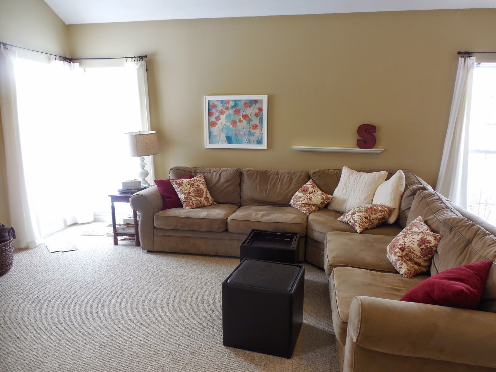
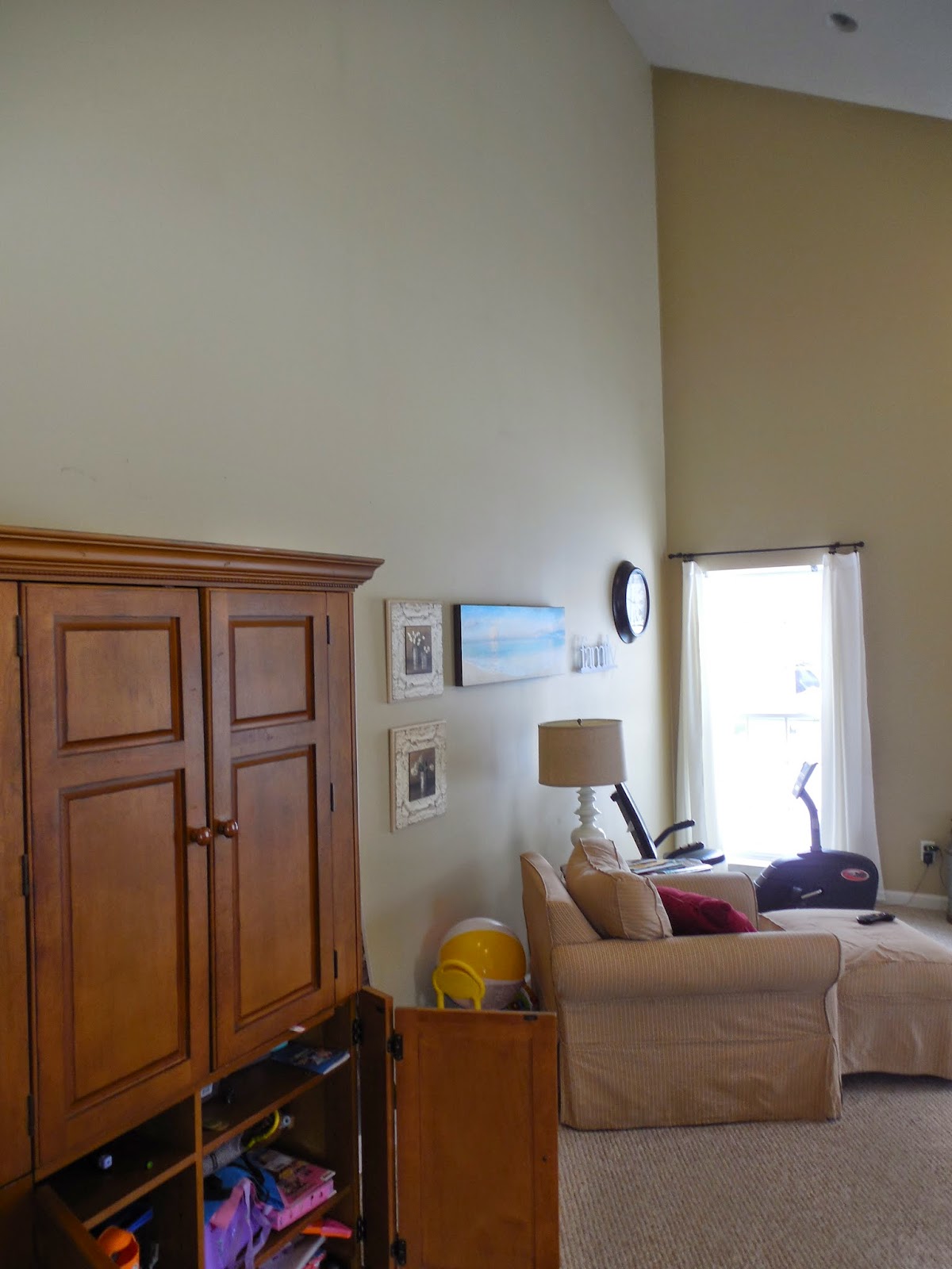
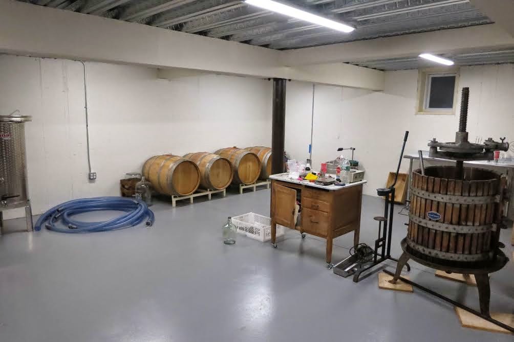
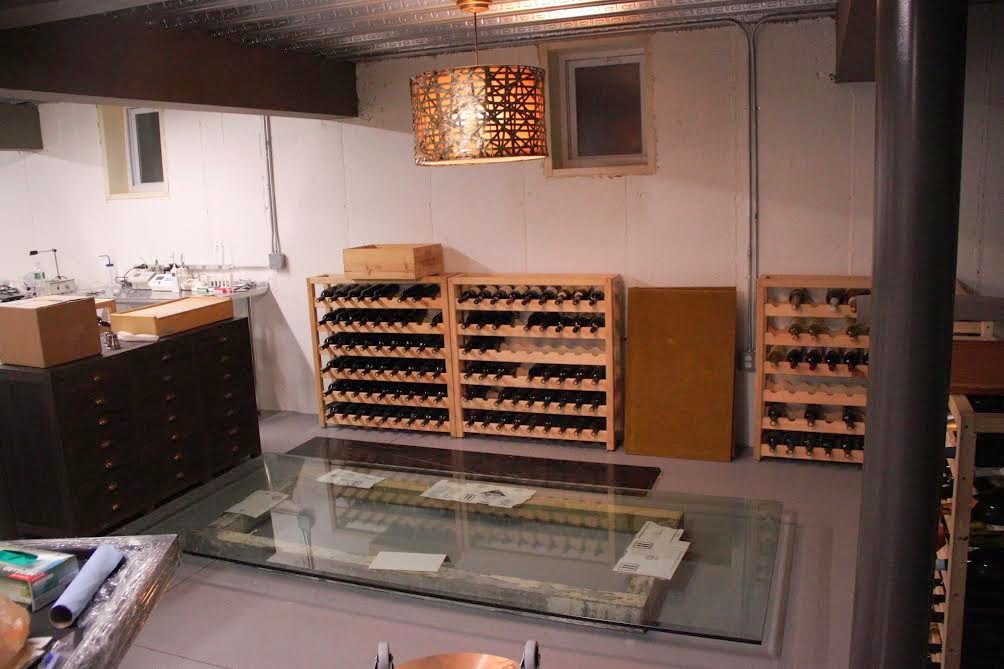
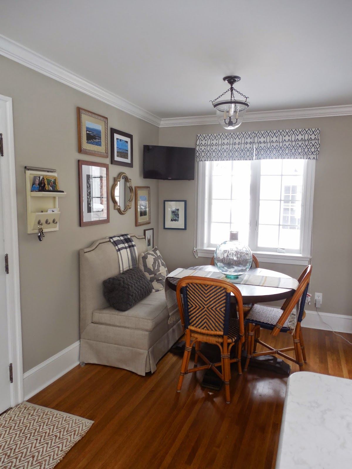
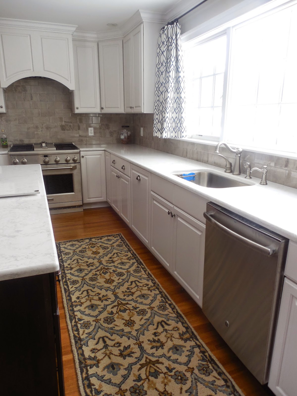
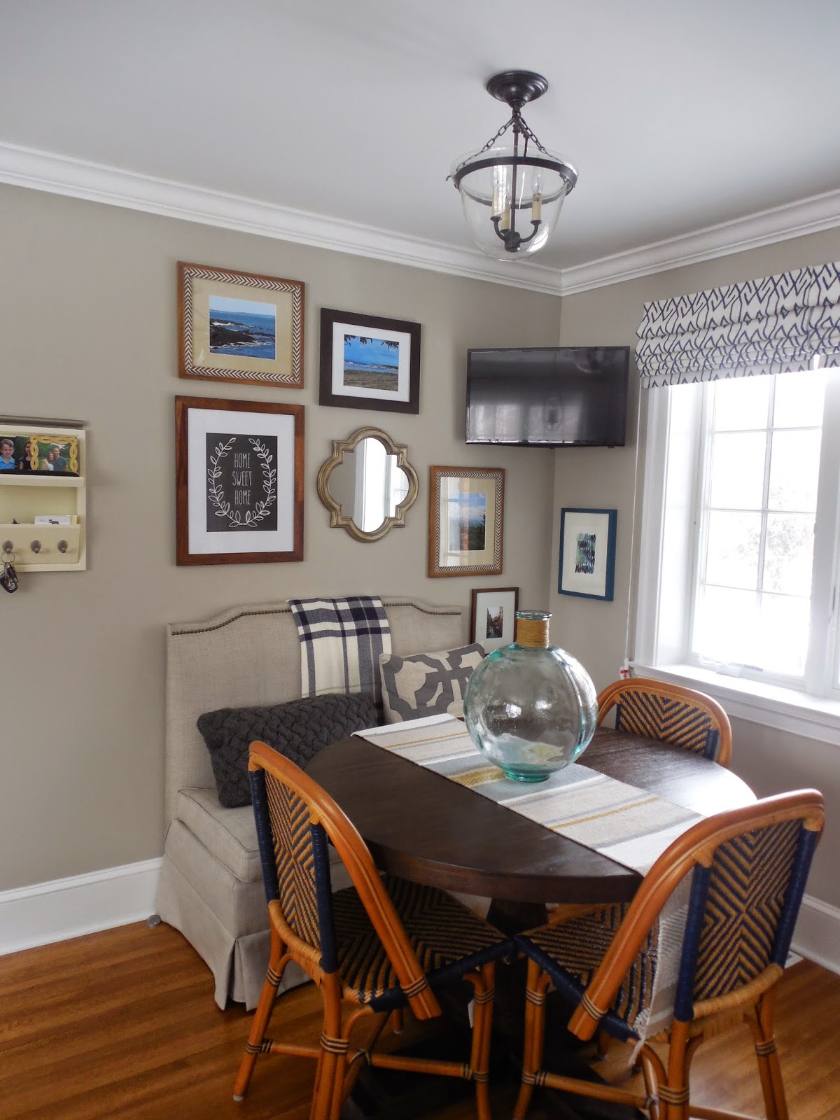
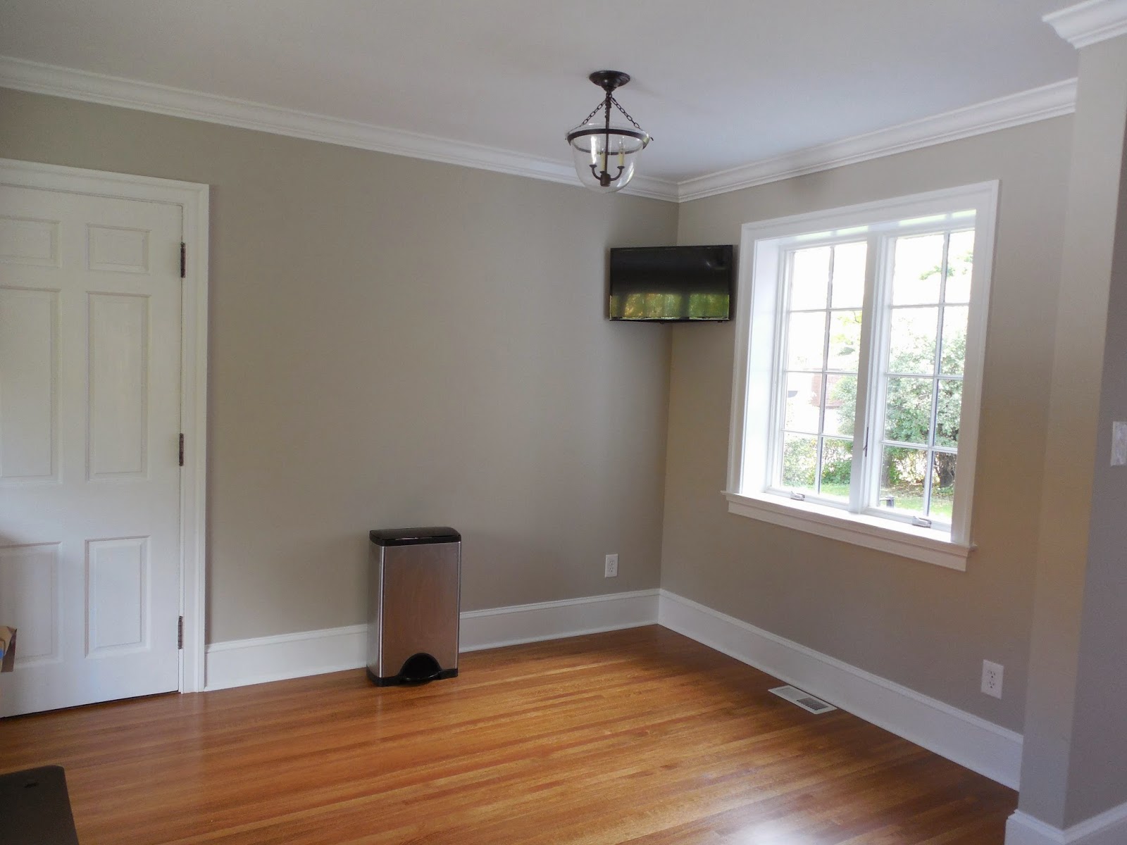
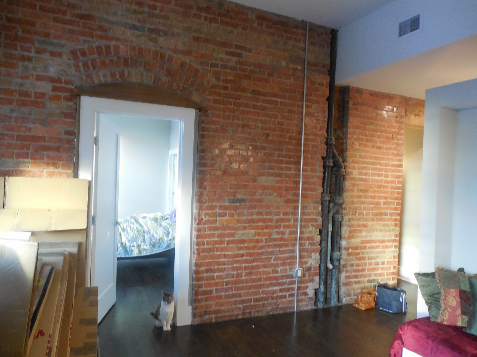
A little while back, you may have remembered my post here where I hinted at my first commercial e-design project… a wine cellar in Long Island, NY! This wonderful couple that I am working with, has embarked on this amazing journey to start their own business in the wine making industry! I look forward to giving you a full reveal of their business and facility in the future, but today- I have a crazy cool sneak peek for you. We primarily worked on the wine tasting area, which shares a large space with the actual wine production facility. I think it is so special and unique that customers will be able to get a glimpse into the actual business of wine making, while sampling the delicious wines they offer. We wanted to make all spaces flow together and maintain an open concept, but also have the ability to close off the production areas when needed. The area is a renovated cellar in a small town on the North Shore of Long Island. It’s a quaint town outside of those windows and we wanted to keep the natural light throughout. Here are some before pictures of the cellar…

Before


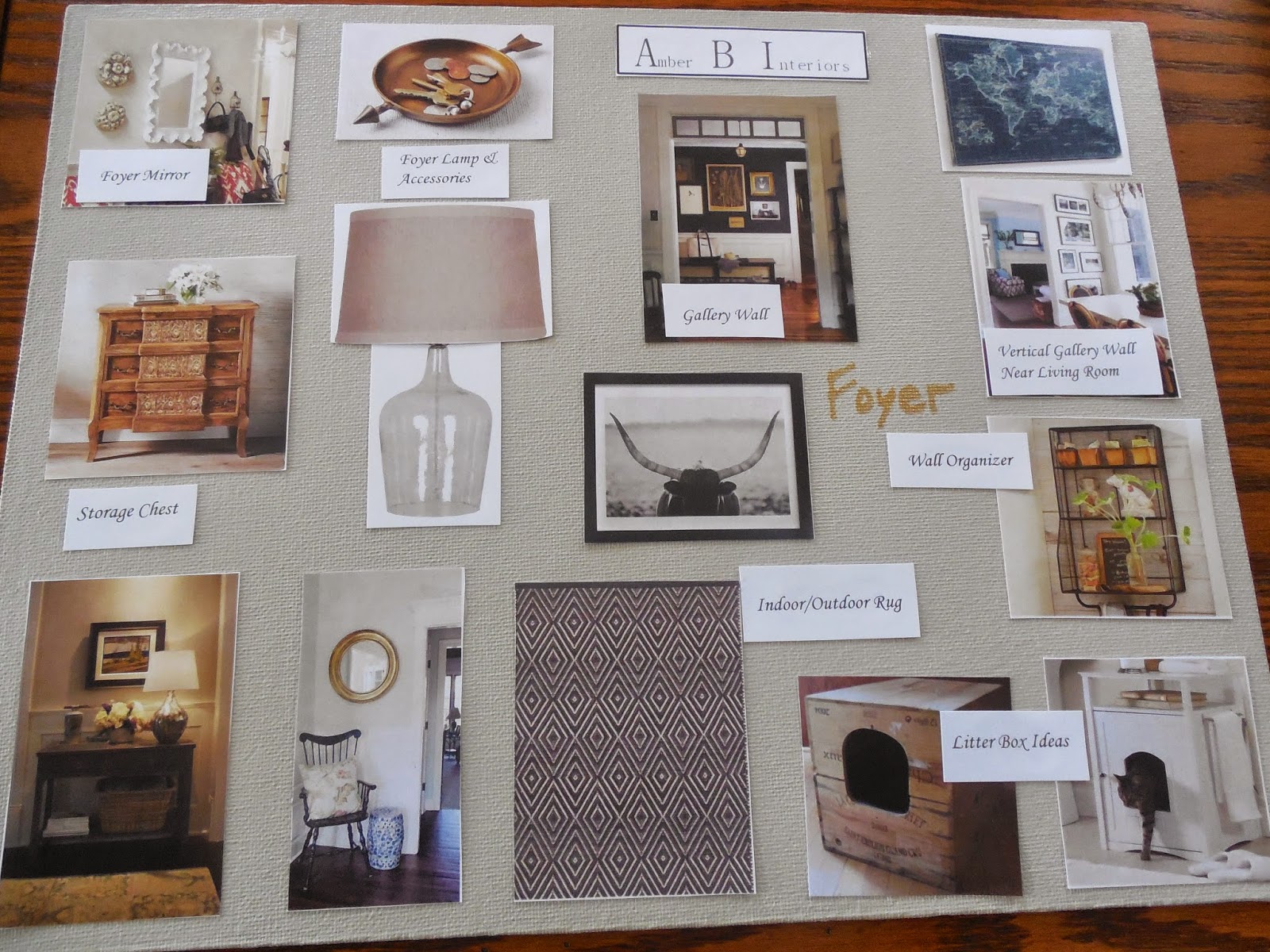
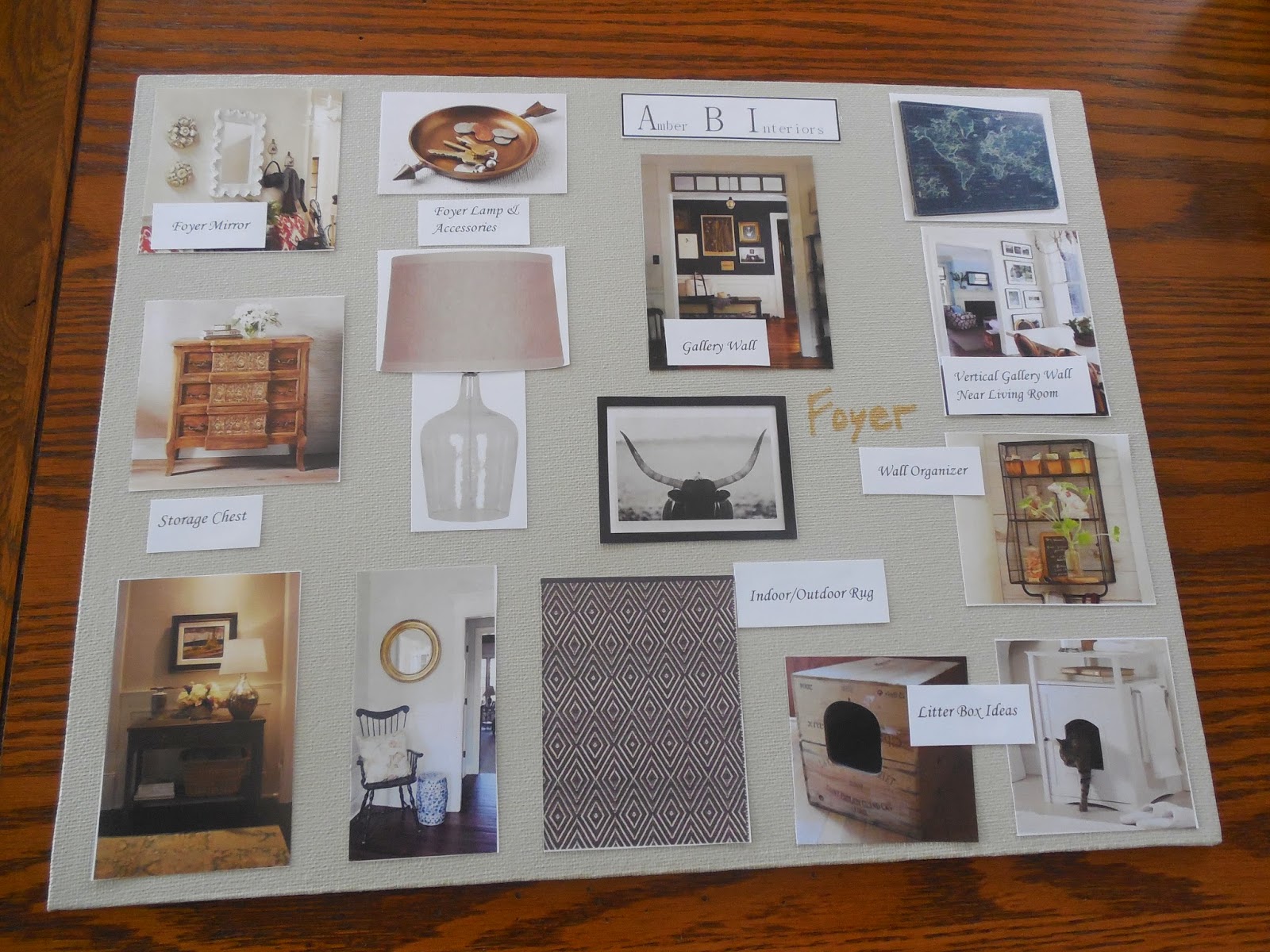
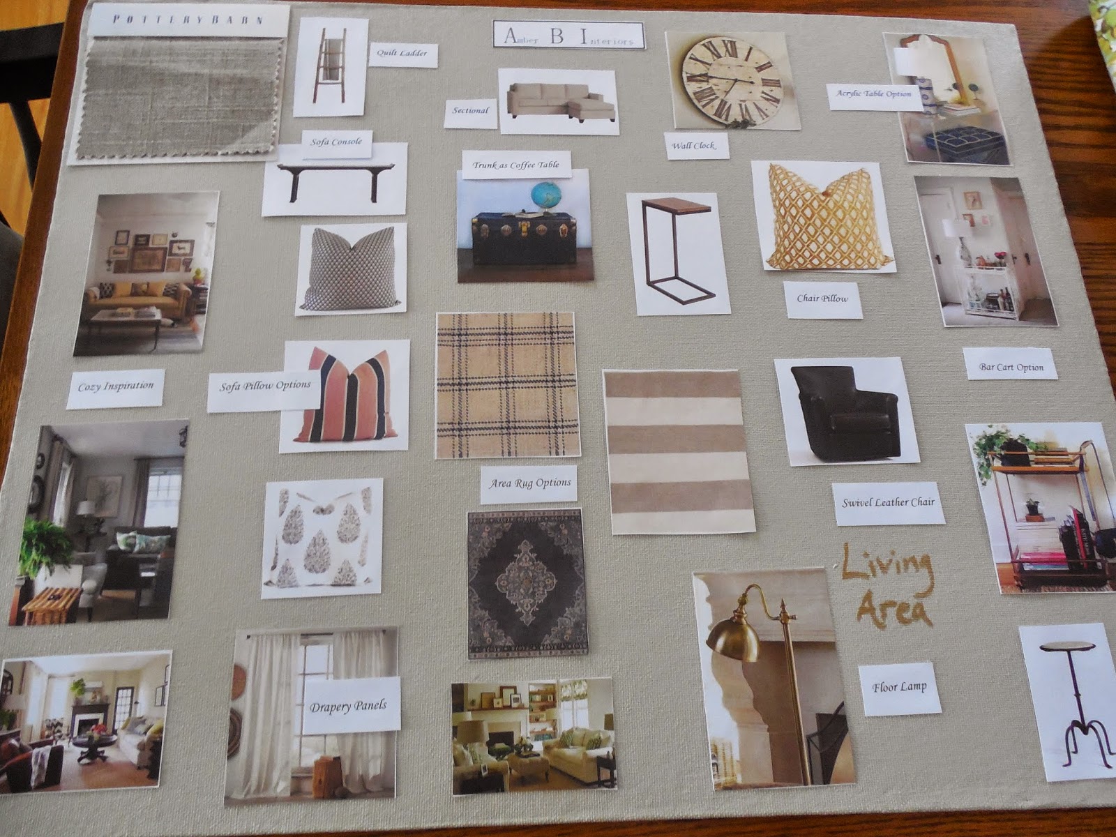
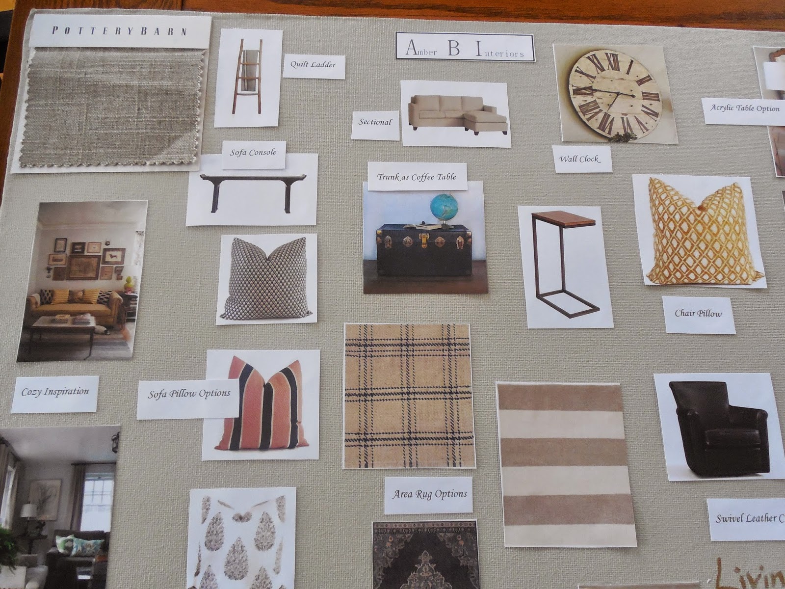
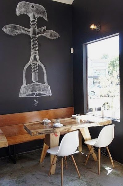
My clients wanted to keep a neutral color palette of whites, blacks and grays. Here is the design board I came up with…

They were on board with the plans and got right to work with the design ideas. I am so proud of their progress. The sneak peek I am about to show you is of the wine tasting room, which is pictured in the first before pic, above.

Amazing Progress


Spectacular progress, right?!? We added the new indoor/outdoor rug under the table and the chic bar cart on the right. I love the way the brass from the bar cart adds a chic quality to the space. The wine racks on the right (which the husband made) have been painted, reinforced and stacked on top of each other for a dramatic area for wine display. The concrete wall in the back has been covered with board and batten and painted the same dark color as the wine racks. The best thing about this paint is that it is covered in a chalkboard finish. Now, they can write their wine names directly on the racks and board and batten! When they want to move wines around, they can easily wipe off the chalk and start over. The small window also blends right into the design! At first glance, I didn’t even notice it was still there, yet helps bring in natural light. They hung their antique windows above the buffet on the left and two gourd lamps will sit on the buffet, for soft task lighting. Hanging the antique windows there, helps to conceal some of the wine barrels and necessary equipment. The chandelier will be replaced with the black fixture you see in the top center of the design board. They have made such stunning progress so far and it is a real treat to be a part of this journey with them! I cannot wait to see their business grow and thrive! Here is a before and in progress comparison again, of this wine tasting room.

Before


In Progress


I look forward to showing more, as my clients complete the space. A big thank you to my clients for allowing me to share the progress of their journey!

An Update on #projectclassickitchen !!

March 4, 2015 by Amber Filed Under: #projectclassickitchen, amber b design, before and after, design, interior design, kitchen, local clients


I am sorry for the long absence on the blog! Time got away from me, but I am happy to return with a local client project update. You may have remembered a post I wrote HERE about #projectclassickitchen. It was a local client project that I was so thrilled to be a part of. The project got its name because my clients contacted me after remodeling their gorgeous traditional and classic kitchen. They live in a 1930’s Georgian brick colonial and the finishes they chose totally work with the era of the home. I was hired to complete the space with: breakfast nook furnishings, wall accessories and window treatments. I recently went over to the house, since we are working on some other rooms on the first floor and decided to snap even more pictures of the kitchen. When I was there last, the drapes had not arrived yet and there were some other items that needed to be hung on the walls. Here is the space now…

And just for fun, let’s do a before and after of the breakfast nook…

Before


After


I can’t wait to show you the design process for the rest of the rooms we are working on!

The Design Plans for #projectvintagegem

February 4, 2015 by Amber Filed Under: #projectvintagegem, design, interior design, local clients


I am excited to show you the design plans for #projectvintagegem. My client is very happy with the ideas and ordering items has already begun! With this project, we are working on her foyer, living/dining room and master bedroom. To recap, my client is looking for a home that has a vintage, collected style. She loves mixing woods with metals for an industrial look, which is a perfect style for her historic building with exposed brick walls. Here are the plans, via Amber B Design style…

The Foyer


The Living Room


The Dining Room


The Master Bedroom


I am so excited to see this project through to completion! It has been my pleasure coming up with these design plans and I just love the charm and character of this building. I promise to report the progress along the way!

If you would like to work together, either locally or through e-design, I have openings beginning in April!

What is Happening Around Here…

January 23, 2015 by Amber Filed Under: #projectvintagegem, blog, design, design services, e-decorating, e-design, local clients


Sorry for the lack of posts as of late! I have been happily plugging away on some design projects that I can’t wait to share with you! There is something about this time of year that is so optimistic. The Holiday decorations have been put away, routines are back again and I feel energized to get more accomplished. That’s a great feeling, isn’t it?!? This is always the time of year I start to organize and make changes, both in the decor of my home and in business. If you have stuck around here for quite some time {thanks Mom!}, you may realize that I have had more business name changes than Puff Daddy. Well, maybe it’s the same number of changes. Let’s count… First, there was Puff Daddy, then Puffy, then P Diddy and now- just Diddy. Ok, so he has had four. He does have me beat by one. I went from Simple Dwellings Interiors, to Amber B Interiors and now officially… Amber B Design! I have always wanted to use the name Design for the business. It’s not a big change from Amber B Interiors, but it makes me happy. The links on my sidebar might be broken for a bit, but should be up and running soon. I think I might keep the blog name as Simple Dwellings, since that name does have a special place in my heart and has been around since the beginning. But all of my social media accounts {for the most part} have changed to Amber B Design.

Great, now that’s out of the way… let’s talk design projects. I am currently working on a local design project that I refer to as #projectvintagegem. The apartments in this building have such character and charm. My client has just moved into this apartment, hence the boxes.

Before

Oh, my client’s precious cat!! I am also working on my first commercial project, which is a wine tasting room that is part of their production facility. Here is some inspiration to show you the direction we are headed with that…

Inspiration

via 

via
It has been a real challenge to push my creativity further with this commercial project. But, I have learned so much and am grateful to have that opportunity to bring myself out of that comfort zone.
In March, I am ecstatic to be working again with a wonderful client. Room by room, she is renovating her 1930’s Georgian Brick colonial. We first completed her daughter’s sweet, delicate nursery…

more on the nursery here
And then we moved onto her eating area in the kitchen…

more on the kitchen here
There is still a full reveal coming soon, since this spot in the kitchen is only about 90% complete. One of the rooms we will be tackling in March is their sun room. Currently, the walls, windows and all trim are wood stained. That look won’t stay that way for long. Here is my inspiration for that space…
via

via
Deep blue walls were made for her space! For some reason, when a design idea hits me that I know will work so well, I just want to sing in an operatic voice. Is that just me?!? Probably should have kept that one to myself. Needless to say, I can’t wait to show you that reveal. 
Thanks for checking back in! 

I Am Speechless…

January 7, 2015 by Amber Filed Under: design, personal design style


Happy new year! I hope everyone feels refreshed, energized and excited for the opportunities a new year brings. We had a nice, long break from school and I have to say, the house feels a bit too quiet. It was such a relaxing break and I miss the little fam. But I am ready to jump back into working and see what 2015 has in store! I am thrilled to be writing my first post of the new year about my blog friend Sue, from her popular blog, the Zhush. Her new Connecticut home was featured on Domaine yesterday and is a stunning interpretation of Sue’s chic, coastal style. Sue worked along with designer Lauren Muse of Muse Interiors to make this house a home. Nicole Cohen from the blog Sketch 42 captured the home’s character with her amazing photography. Let’s take a look!

{I spy a Target Threshold ottoman above!!}

I love Sue’s effortless and chic style! Enjoy your gorgeous new home with your family, Sue!
Home of: Sue De Chiara
Designed in collaboration with: Muse Interiors
Photography by: Nicole Cohen
Seen on: Domaine

Our Holiday Home Tour

December 24, 2014 by Amber Filed Under: design, holiday


I have finally put together a little Holiday home tour for the blog. Better late than never, right? This year’s tour has more little snippets of our home, instead of full room reveals. Less is sometimes more, I guess! Let’s get right to it, starting with our tree…

We also have a wreath on most windows, but my camera skills are not very good when taking pictures into the sunlight. Our fridge is full of sweet treats and festive food and we are ready for this year’s Holiday season!

Wishing you a safe and Happy Holiday!!

Featured in Chatelaine

November 21, 2014 by Amber Filed Under: chevron, design, foyer, magazine feature, mom's inspiration


I am excited to announce that my mom’s popular stair redo has become even more famous, with international notoriety! My mom’s chevron painted stairs that I first blogged about HERE was part of an article Chatelaine put together for how to style your staircase. Chatelaine is a leading Canadian lifestyle magazine and web site. Here it is on their amazing web site…

Congratulations, mom! Her stunning stair transformation first made major publication news when it was featured in Woman’s World magazine. If you missed that, I blogged about it HERE. I just keep telling her she’s going to need to start a blog of her own with these great projects! If you want to see more stylish ways to transform your stairs, make sure you check out the article!

Shelf Styling is a Process

November 20, 2014 by Amber Filed Under: design, family room, interior design, local clients, shelf styling, styling


I recently stopped over my client’s house to begin styling her shelves in her family room. I wrote about the progress of her room in this post and after this most recent visit, we both feel that the finish point is near! And that’s definitely an exciting thing to see. All of the room’s elements have been on the design board and it is now so rewarding to get to see the results in action. Shelf styling is definitely a process, though. Every designer approaches it differently, but for me, I have some tried and true methods when I work…

1. Start from scratch. The shelves should start with a clean slate, i.e. empty. My client was amazing and already spread out everything she had, so we could see what we had to work with. That’s so refreshing and helpful, so you can get right to it.

Where we started…

Today, I styled the shelves seen behind the sectional. There is my empty slate.

2. Find all of the hard cover books you can use and remove the book jackets. You will be amazed at how they all of a sudden look like bound collector’s books.

3. Before placing items on the shelves, I hung a trio of sunburst mirrors on the wall. I made sure I did that first, so I had the mirrors right where I wanted. Then, I styled around them. Hanging mirrors on the walls behind your shelves gives the furniture piece depth and interest. You could also hang small pieces of artwork or family photos.

4. Start placing the items on the shelves to see how they will work together. This can be a long process. And it may even change from today to the next styling visit. I like to take pictures and study them, to see if the shelves are how I like them. This can involve a lot of editing, but it is really worth it and the true fun part of the room!

This was how I had the shelves styled in phase one…

Like I said earlier, the three mirrors were hung first. I then started styling around them. But this first phase seemed a bit too cluttered to us. I made a few more changes…

This was how I had the shelves styled in phase two…

I removed some of the books on the top shelf, but the globe still didn’t look right in that spot and it all felt cluttered and busy.

And this was how I styled the shelves in the final phase…

5. Editing, editing and more editing! I think it is almost impossible to get it 100% right the first time. Stepping back to see the changes you have made is a great way to finalize your shelves.

Do you like the changes? I moved the globe to the top shelf, removed some of the glass bottles and added a blue and white bowl to the small stack of blue books. We are both excited about the transformation of these shelves. And we were happy to be able to use so much of what my client already had! I know adding those personal items will be meaningful to the overall design. We are now on the lookout for two more storage bins for the bottom left shelves. I won’t necessarily match them, but find coordinating bins in a similar size. We will also add another detail to the wall space next to the globe. This room has a very high angled slope to its ceiling, so we will add a wall clock to visually draw your eye up and to also help make that tall wall feel useful.

So stay tuned… we will be having much more fun in this space in the coming months! 

In Love With… Sarah Style

November 16, 2014 by Amber Filed Under: blog review, design, interior design, sarah richardson


I have been a long time fan of the design work of Sarah Richardson. I was thrilled to be able to meet her and tour her Toronto design studio last fall. She has that perfect blend of traditional with modern, new with vintage. It is always a treat to watch her television shows and see what projects her and her team are up to next. So when Anneliese from Simon and Schuster Canada contacted me about receiving a copy of Sarah’s new book, Sarah Style, I jumped at the chance.

I have loved going through this book page by page and studying the rooms she has designed. I also really like the way this book is written… Sarah takes us through the book by room type, showing various ways to make each space in your home unique and personal to your style. I also love the tips along the way, giving us a glimpse into her thought process when she designs a room. I was even surprised to find out that some of the spaces I have long admired were her designs. She is literally a design genius! Let’s take a glimpse into the decorating goodness you will find in this book…

all designs via
Amazing, right?!? And these images just scratch the surface. There is so much more in the book, including foyers, bathrooms and kid’s spaces! To order your copy, visit HERE.
Thank you so much to Anneliese and the people over at Simon and Schuster Canada for this book!

A Local Client’s Family Room {Making Great Progress}

November 7, 2014 by Amber Filed Under: design, family room, interior design, personal design style


I have been working with a local client who I am happy to also call a good friend. We have been plugging away on her family room, making it a space that has a blend of traditional with modern. She has been a joy to work with so far, because she truly gets as excited as I do about design and it feels like a girl’s day out when we meet to discuss the progress in her space. Here are some before pictures of the room to show you where we began…

Before…


We will be working with the main furniture pieces in the room, such as the Pottery Barn sectional and storage cabinet. Since we are keeping these warm furniture pieces, I immediately thought we should cool down the walls with a color that balances all of the warm elements. I chose Revere Pewter by Benjamin Moore and she loved the idea. The walls in this family room are daunting… they slant up to a dramatic height and painting this room is a huge undertaking. My clients realized it needed to be done to transform the space, but I also totally understood the hesitancy of the project. Luckily, the tried and true Revere Pewter was a winner and my clients could not be happier with the result! This tall wall in the photo above needed some architectural interest to help visually bring that wall down to feel more cozy. I suggested adding board and batten to this wall (up 3/4 of the wall) and painting that a dark gray/brown shade. I selected Equestrian Gray, also by Benjamin Moore. Here is the design board I initially presented to my client…

The Design Board…


And here is the amazing progress of this room so far…

Progress…


We changed the color palette a bit for the accessory pillows, but for the most part, the rest of the plan stayed the same. We also replaced the curtain rods with brass options and purchased longer drapes, so the rods could be installed much higher than the windows. That visually brought your eye up, making the windows feel grander and in better fitting with the height of the room. Love that trick! Our plan moving forward is to replace the slipcovered chair and ottoman with a leather club chair/ottoman, place console tables behind the sectional, add ceiling beams to warm up the tall ceilings and install a fireplace/mantel where the TV is currently. We will also accessorize the walls and shelves, but the transformation is already coming along so well, that I had to share!

Thank you so much to my amazing client and friend for allowing me to share the progress here on the blog. I look forward to sharing more, as the room design unfolds! 

  • « Previous Page
  • 1
  • …
  • 7
  • 8
  • 9
  • 10
  • 11
  • …
  • 26
  • Next Page »
Welcome!

Hi, I'm Amber... a wife, mom and interior decorator. I am the writer of Simple Dwellings and the designer behind Amber B Design. Blog topics are all things design, with the occasional DIY attempt! Thanks for stopping by Read more...

  • Bloglovin
  • Email
  • Instagram
  • Pinterest
  • Twitter

Blog Posts, Straight to Your Inbox

Popular Projects

A dining room with white walls and wooden table.
A black door with white curtains and a red chair
A staircase with black and white chevron pattern on the steps.

Blog Love

  • Addison’s Wonderland
  • A Thoughtful Place
  • Alison Giese Interiors
  • Amber Interiors
  • Bailey McCarthy
  • Caitlin Wilson
  • Chris Loves Julia
  • Classic Casual Home
  • Cottage and Vine
  • Design Indulgence
  • Dwell by Cheryl
  • Eddie Ross
  • Elements of Style
  • Emily A Clark
  • Emily Henderson
  • Gallery No Eight
  • Hi Sugarplum
  • House of Jade
  • Jana Bek
  • Juniper Home
  • Kate Marker Interiors
  • Lucy Williams
  • Monika Hibbs
  • Our Fifth House
  • Pencil and Paper Co
  • Rachel Parcell
  • Rambling Renovators
  • Pure Style Home
  • Sita Montgomery
  • Studio Mcgee
  • The Makerista
  • The White Buffalo Styling Co
  • the Zhush
  • Traci Zeller
  • Young House Love

Copyright Amber B Design © 2025 ยท Design by Britt Douglas