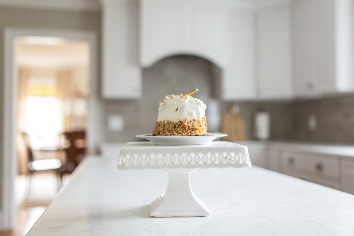
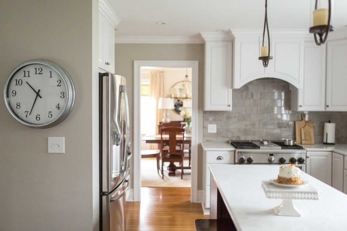
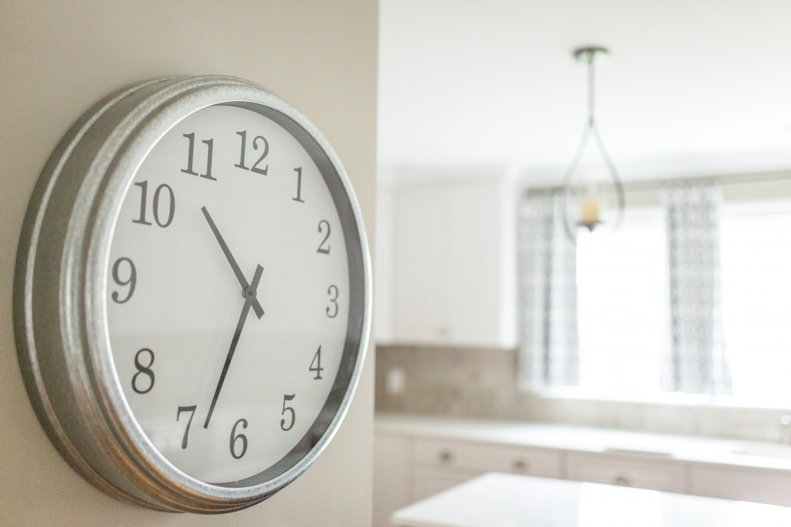
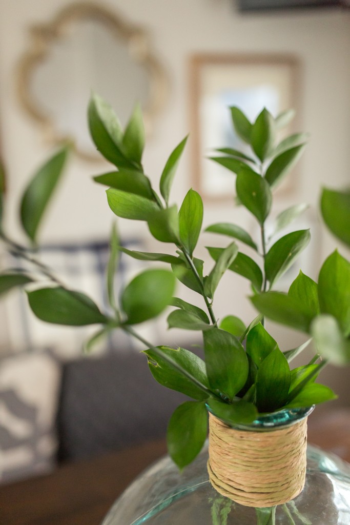
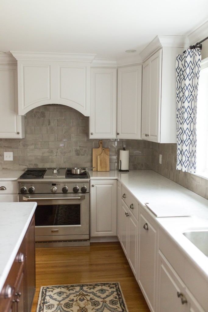
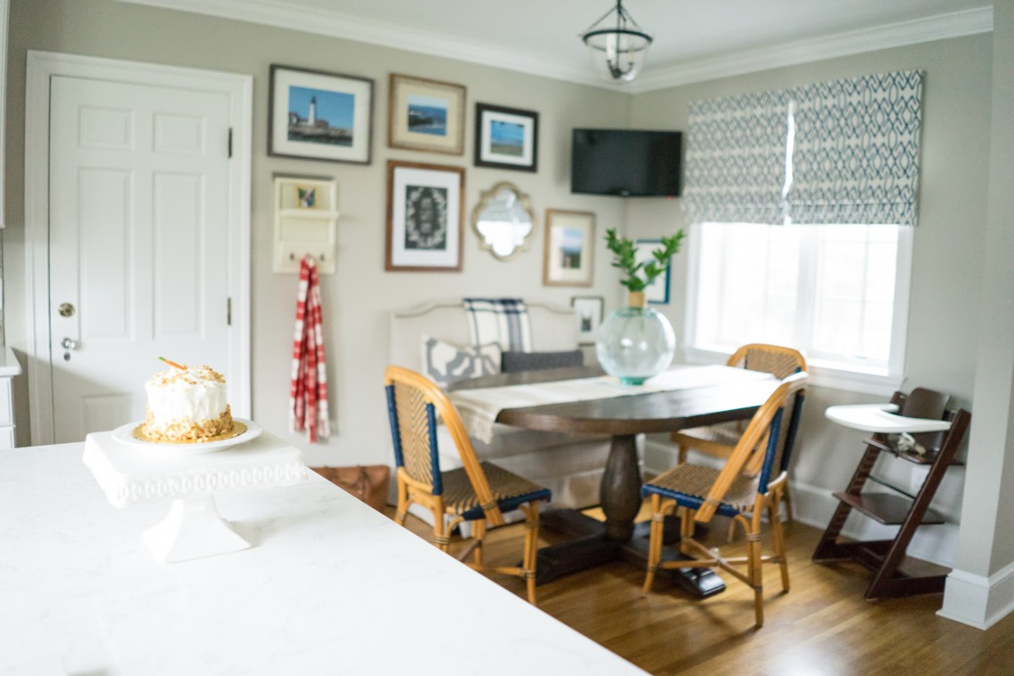
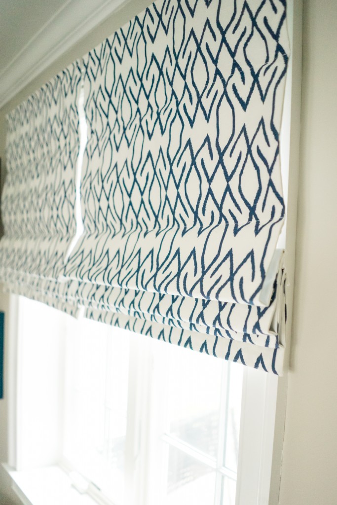
Welcome back to another reveal day! This is such a fun week!! Today’s post is all about the kitchen. To catch up on all things Project Classic Living related, visit HERE. The kitchen was the second room we worked on together, after the nursery. I wish I could take credit- but the gorgeous white cabinetry, counters, backsplash, lighting and overall layout were already finished when I started working on the space. The gorgeous wall color {BM Revere Pewter} was also chosen, so the bones were perfect to work with. My clients did a fantastic job selecting all of the finishes and this 1930’s home has an unbelievable before and after for this space. The contractor did an outstanding job making this space light, bright and modern, while also keeping with the classic style and character of this home. I came in for the window treatments, gallery wall, accessories and dining area furniture. For this space, we wanted an overall casual, relaxed dining feel. The more formal dining area is in the next room, so we kept this space laid back for everyday use. And of course, the wonderful Sarah Heppell put her magic photography stamp on this room, too. Let’s take a look!
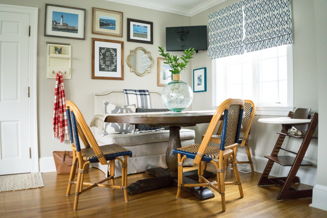
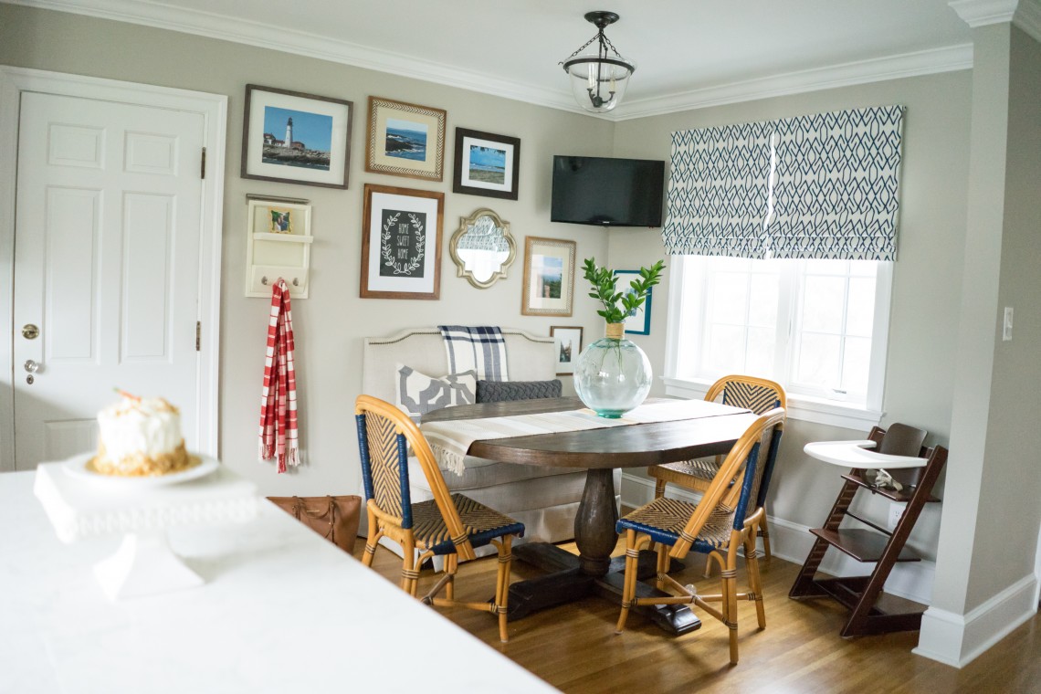
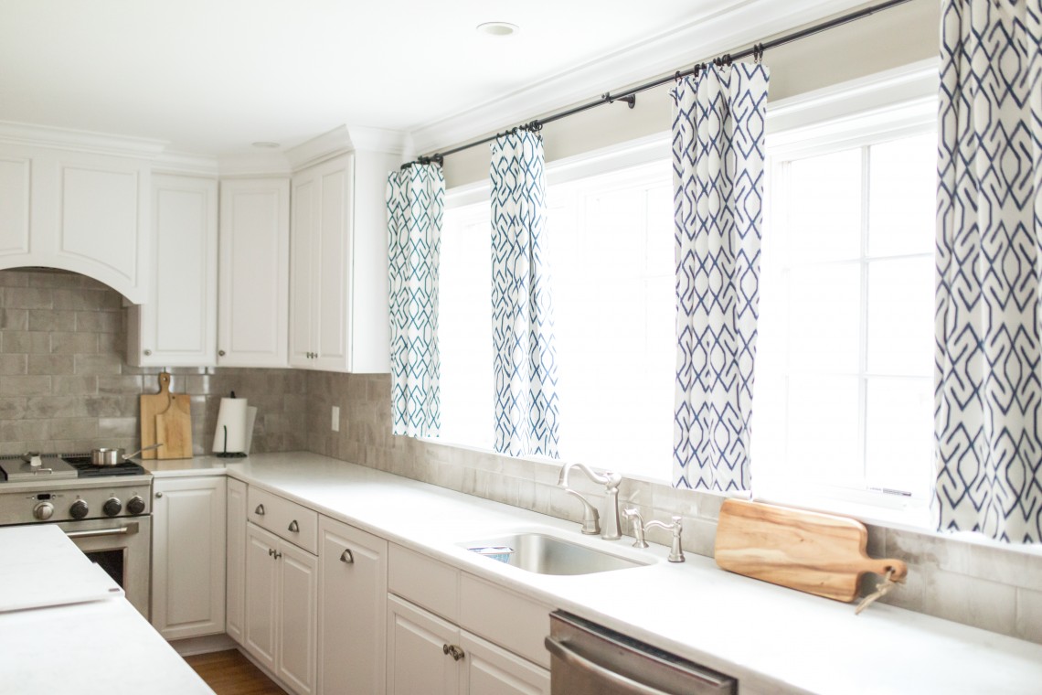
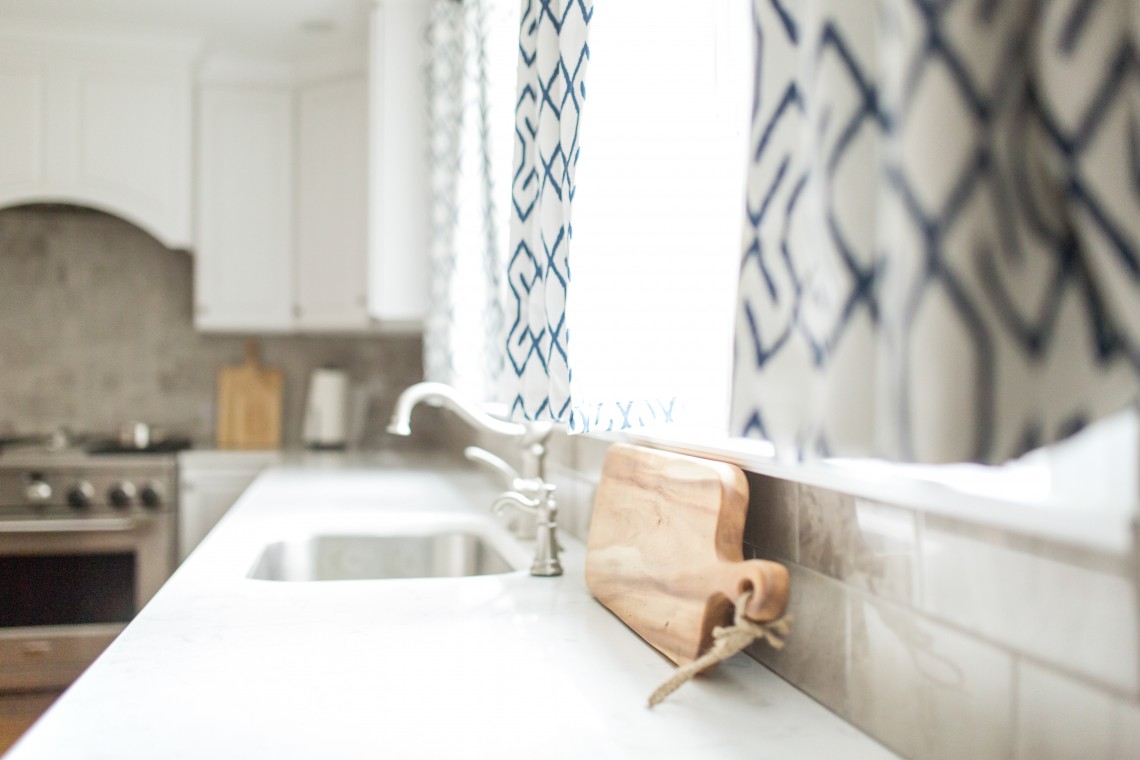
All images by Sarah Heppell Photography
I hope you enjoyed the kitchen tour! The gorgeous drapes and shades were made by Windows By Melissa and the fabric was found in my local work room. Tomorrow’s reveal will be… the Dining Room! {You do get a little peek of the dining room in one of the kitchen shots!!}
This space is unbelievable! So beautiful, sophisticated, fancy, casual and relaxing all at once! Such perfection- everything from the window treatments, mix of chairs, bench and table! The gallery wall – so personal. You can tell the people that live here love each other and love this space! Wish I had the words to say how much I love this space.
Thank you so much, Kathleen! I am thrilled that the family’s fun personality shows through in the design. 🙂