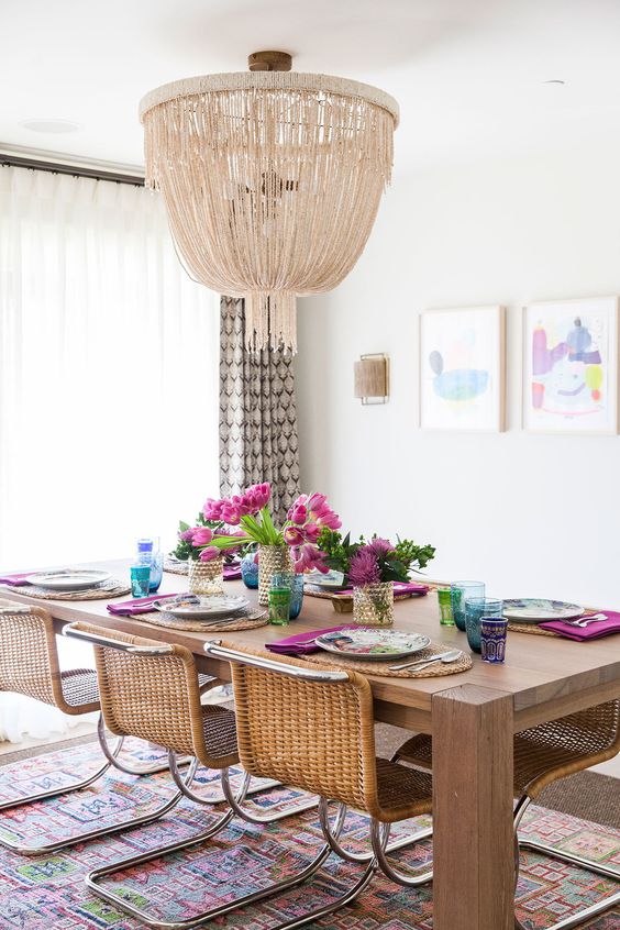
Welcome back to another installment of Why This Works… a series where I show a designed space and talk about why it works so well. Today is interior designer Caitlin Moran’s gorgeous, eclectic, bohemian inspired dining room. This image below was taken from her feature in Lonny and is a true show stopper. Take a look!

I have always been a fan of neutral spaces with pops of color and this room does that to perfection. The color comes through in the abstract wall art, the area rug and table setting. This style of seating has really grown on me lately and I love it! The low profile works so well for this modern look and the rustic simplicity from the table is a great balance. And let’s talk about that statement chandelier for a minute! I have written in past posts about using lighting that almost seems too oversized for a space. When it seems too large, it is actually just right! And I love the texture this fixture brings into the room. I am also a huge fan of layering rugs to add depth and interest. {And in this space, color and pattern, too!} It is a wonderful way to make a rug that would be considered too small, work so well. I love the mixture of the window treatments, with the sheers and patterned panels. They provide function and style, which is a win win in my eyes! The wall sconce is large enough to be functional, but doesn’t compete with the art work and chandelier. And a vase of fresh flowers is the best way to complete any room! All in all, this space works!
What are your thoughts???
{The fact that I have two back to back posts of Why This Works is not lost on me! Sorry for the lack of posts lately! I will be back soon to share some completed e-designs.} Â 🙂