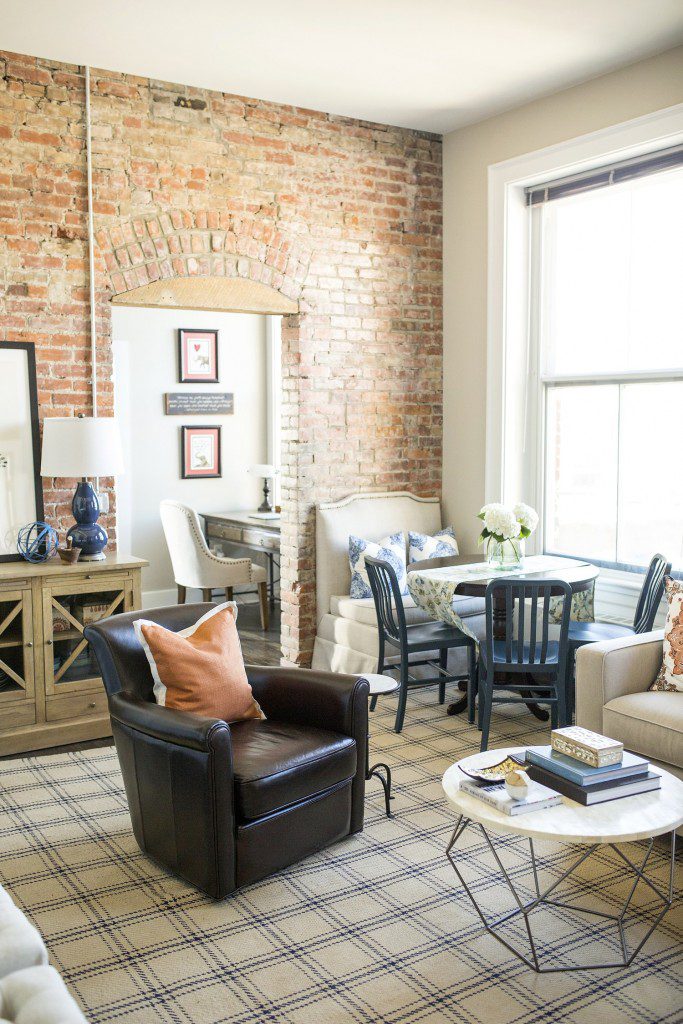
Welcome back to another installment of Why This Works… a weekly series where I show a designed space and dissect the details, to explain why the designer chose what he/she chose and why it works! Today’s space is a project I designed last year for a local client. I speak about it often on this blog, because it was such a fun project to work on. This project is also near and dear because I love the true talent that shines through in Sarah Heppell’s photography skills! She truly made this space shine with these after photos. As you may already know, I named this project Vintage Gem, because of the gorgeous architecture of the apartment and the details they left in tact during the renovation of the building. Also, my client loves a mix of vintage and new, so the name was a great fit. In past blog posts, I never truly dissected the details of this space and explained why certain pieces were chosen and why. So let’s do that here, today!


Amber B Design, Photos by Sarah Heppell
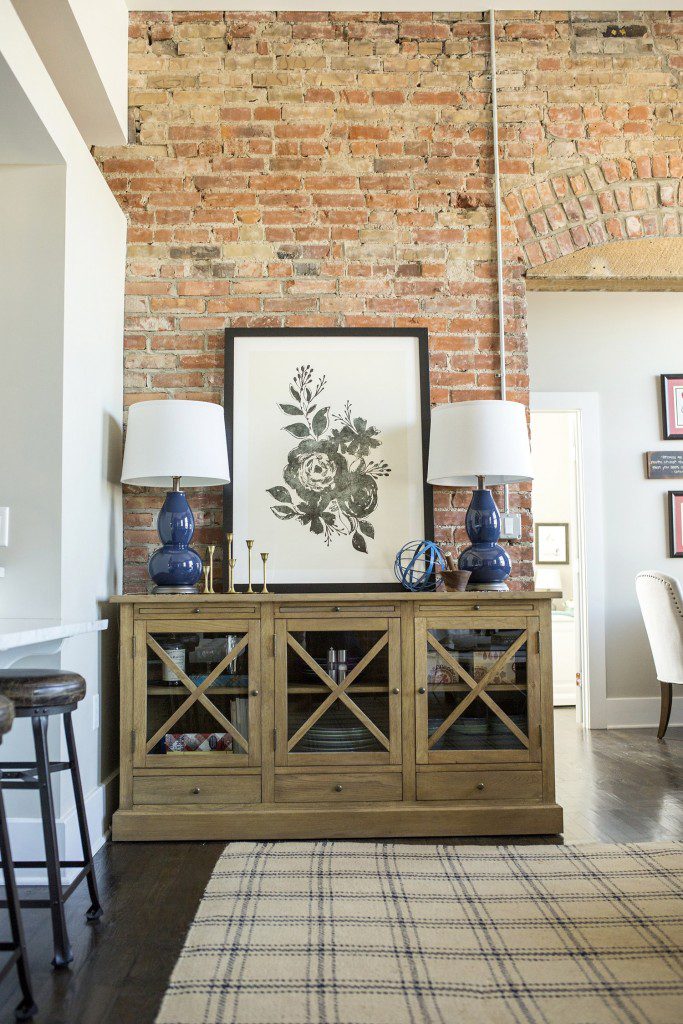
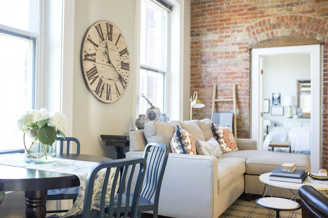
When I walked into this space for the first time, I was immediately struck with the gorgeous brick walls and stunning high ceilings. It is a compact space with a combined living and ding area, but the high ceilings and architectural details make up for that. I wanted to compliment those details and not compete, by selecting light and neutral furnishings that allowed the apartment’s details to be the main focal point. The furniture and accessories were the supporting cast. Another trick I like to use is to select a few large, oversized accessories, as opposed to several small pieces. It’s a great visual trick that allows your eye to be drawn up to appreciate the room, giving the illusion of more square footage. When I installed the large blue table lamps and floral art work on the buffet, your eye was brought up instead of down and the space appeared larger. You could admire the brick more, even though we added pieces in front of it. Also, the dramatic wall clock was added behind the sectional. Upon first glance, it’s massive size could appear too large for some. But this clock instantly pushed the walls back and made the room feel bigger. I like to tell clients that if an accessory piece appears too big, it’s probably just right. It can take time to train your eye to like larger accessories. Luckily, my client was right on board and also thought the space felt bigger. In this room, I also wanted to use a mix of different wood stains and metal finishes. Especially with this vintage style, our goal was to create a space that looked as if it had been collected over time and not to match too much. So, the light stained buffet is near the dark stained dining table. Brass candle sticks on the buffet are near a bronze side table and pewter base coffee table. My trick for mixing metals, is to stay within the same ‘shine’ family. In this room, I wouldn’t have brought in a shiny chrome. All of the metals are buffed and matte, which is why they can work together. I like to separate the mattes from the shiny. And last but not least, I like to add various textures and fabrics into a space to create a layered depth. The jute, natural fiber area rug is paired with a leather chair, linen sofa and cotton pillow covers. That will add layers and depth to a space, making it feel warm and collected.
So that’s a little sneak peek into why I chose what I did for this space! I was thrilled to be able to talk about this design today with Sistina Giordano from Bridge Street. She is always wonderful to chat with and it was a fun segment. To see the video clip, visit HERE!! Thank you so much to Sistina and the entire News Channel 9 team for having me!
Beautiful space!
Thank you so much Dawn! I’m glad you like it! 🙂 It was such a fun project to be a part of.
Great insight. Thank you for details. It is good to know what were the designer thinking.
Thank you so much, Charlotte! I’m glad you like the series. 🙂