Amber B Design Studio

Interior Design & Decoration for the South Florida region

  • Home
  • About
  • Services
  • Portfolio
  • Blog
  • Press
  • Contact

Shelf Styling is a Process

November 20, 2014 by Amber Filed Under: design, family room, interior design, local clients, shelf styling, styling


I recently stopped over my client’s house to begin styling her shelves in her family room. I wrote about the progress of her room in this post and after this most recent visit, we both feel that the finish point is near! And that’s definitely an exciting thing to see. All of the room’s elements have been on the design board and it is now so rewarding to get to see the results in action. Shelf styling is definitely a process, though. Every designer approaches it differently, but for me, I have some tried and true methods when I work…

1. Start from scratch. The shelves should start with a clean slate, i.e. empty. My client was amazing and already spread out everything she had, so we could see what we had to work with. That’s so refreshing and helpful, so you can get right to it.
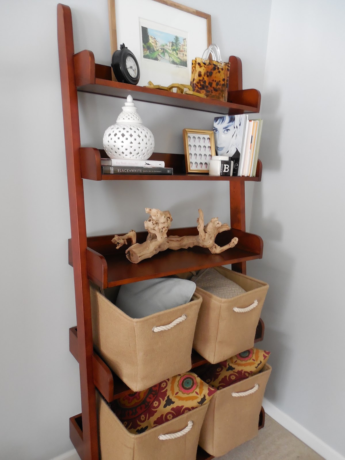
Where we started…

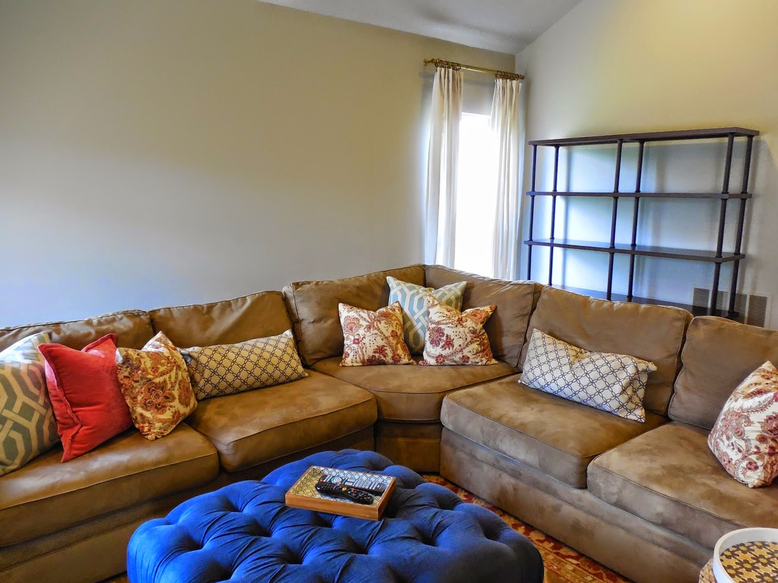
Today, I styled the shelves seen behind the sectional. There is my empty slate.

2. Find all of the hard cover books you can use and remove the book jackets. You will be amazed at how they all of a sudden look like bound collector’s books.

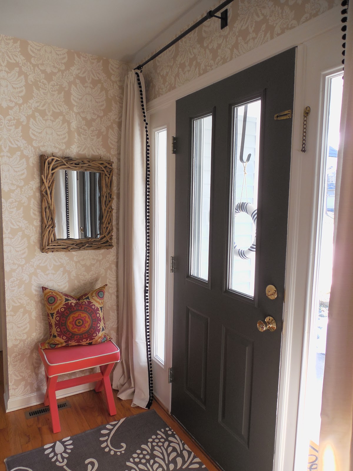
3. Before placing items on the shelves, I hung a trio of sunburst mirrors on the wall. I made sure I did that first, so I had the mirrors right where I wanted. Then, I styled around them. Hanging mirrors on the walls behind your shelves gives the furniture piece depth and interest. You could also hang small pieces of artwork or family photos.

4. Start placing the items on the shelves to see how they will work together. This can be a long process. And it may even change from today to the next styling visit. I like to take pictures and study them, to see if the shelves are how I like them. This can involve a lot of editing, but it is really worth it and the true fun part of the room!

This was how I had the shelves styled in phase one…

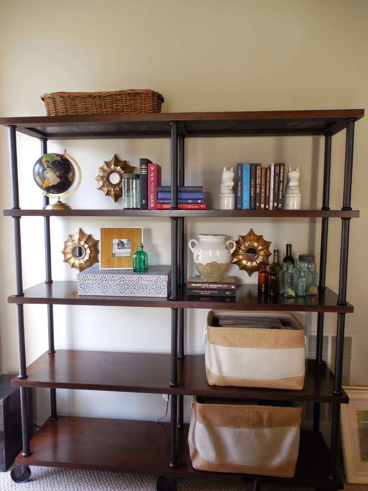
Like I said earlier, the three mirrors were hung first. I then started styling around them. But this first phase seemed a bit too cluttered to us. I made a few more changes…

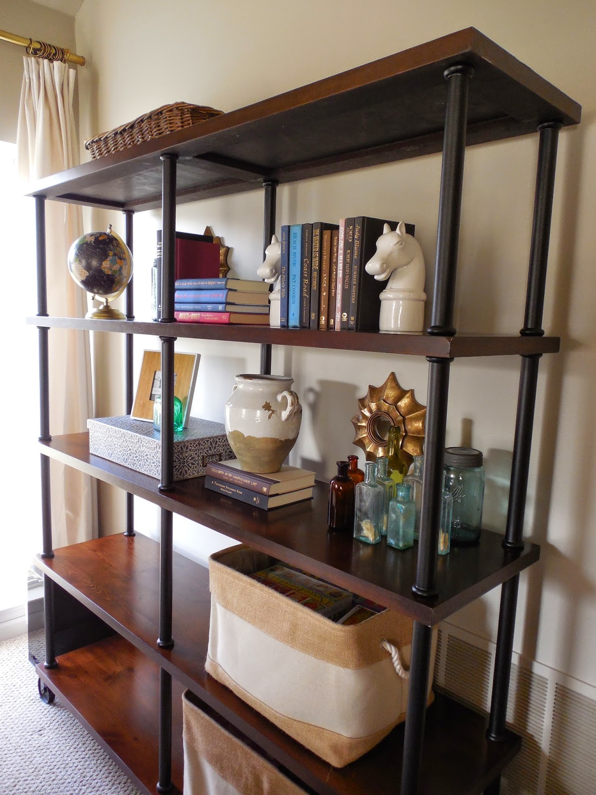
This was how I had the shelves styled in phase two…

I removed some of the books on the top shelf, but the globe still didn’t look right in that spot and it all felt cluttered and busy.

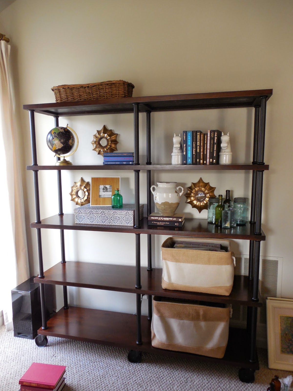
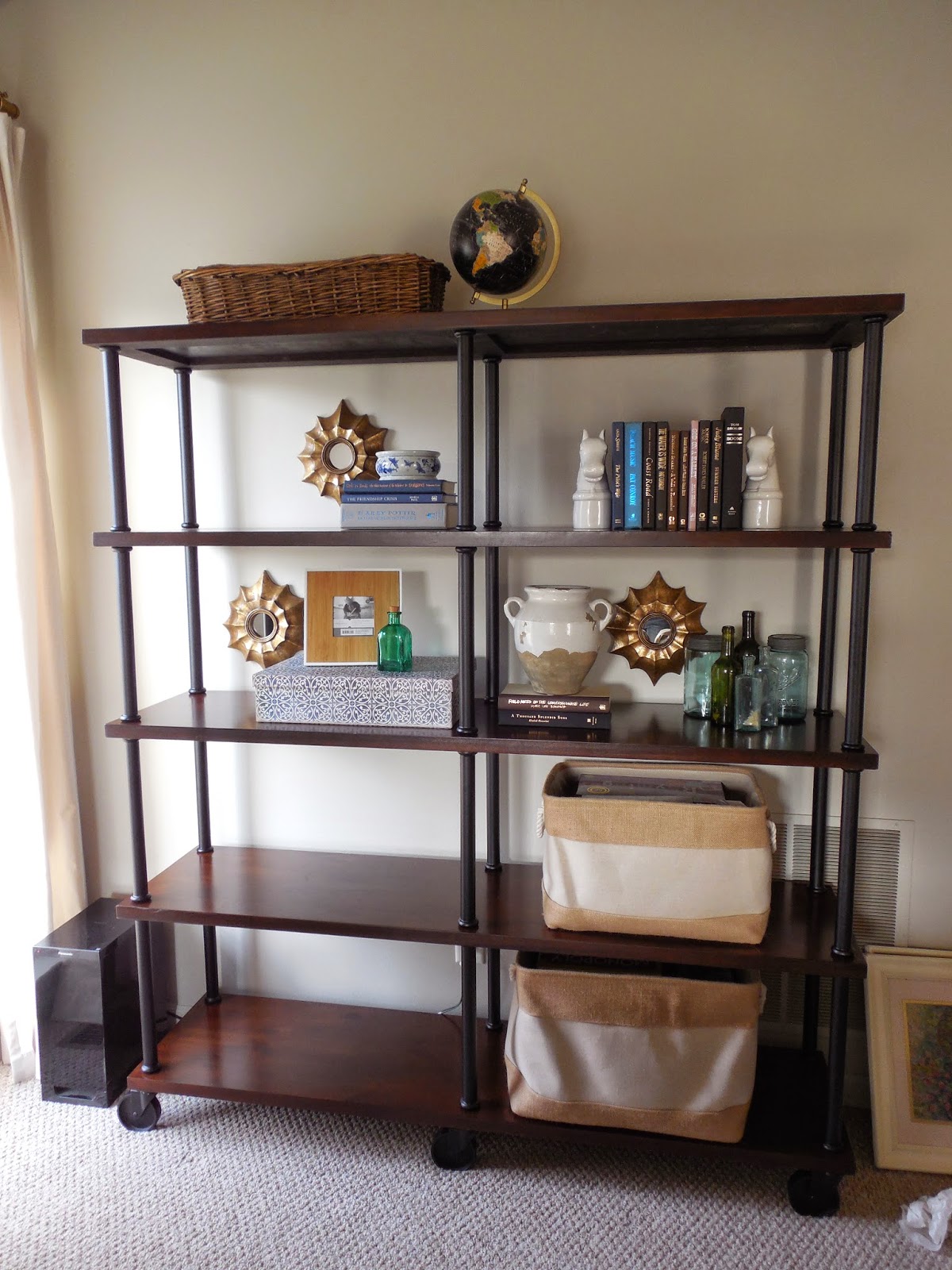
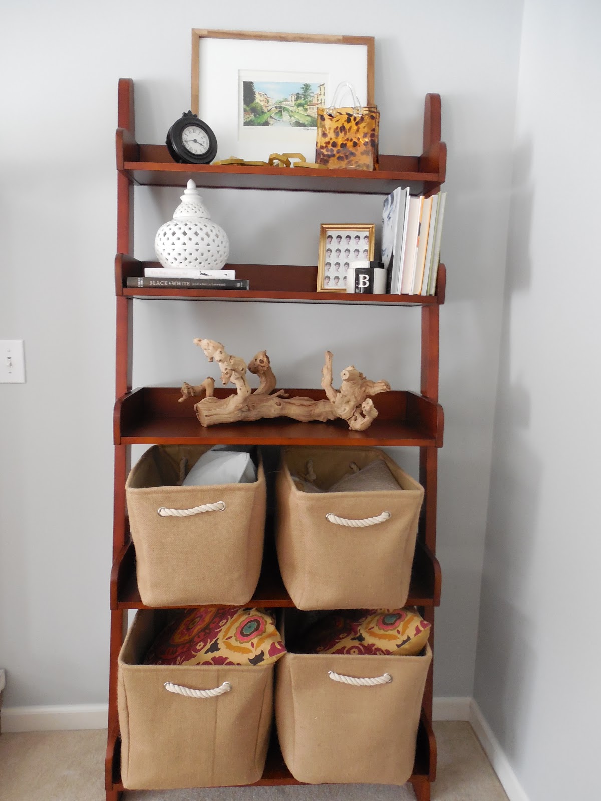
And this was how I styled the shelves in the final phase…

5. Editing, editing and more editing! I think it is almost impossible to get it 100% right the first time. Stepping back to see the changes you have made is a great way to finalize your shelves.

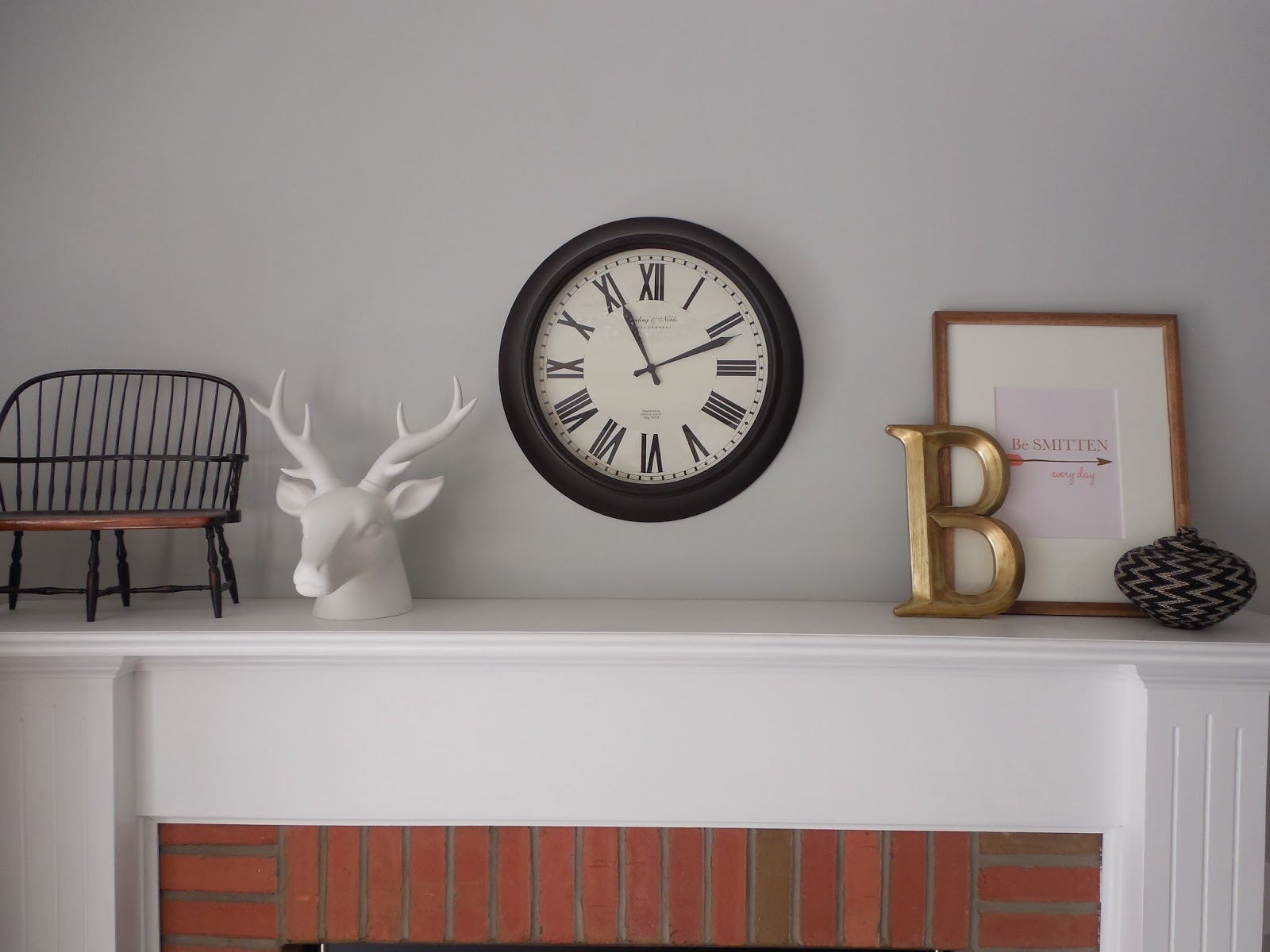
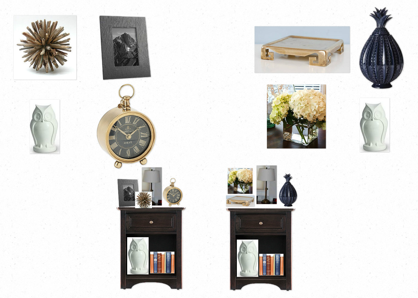
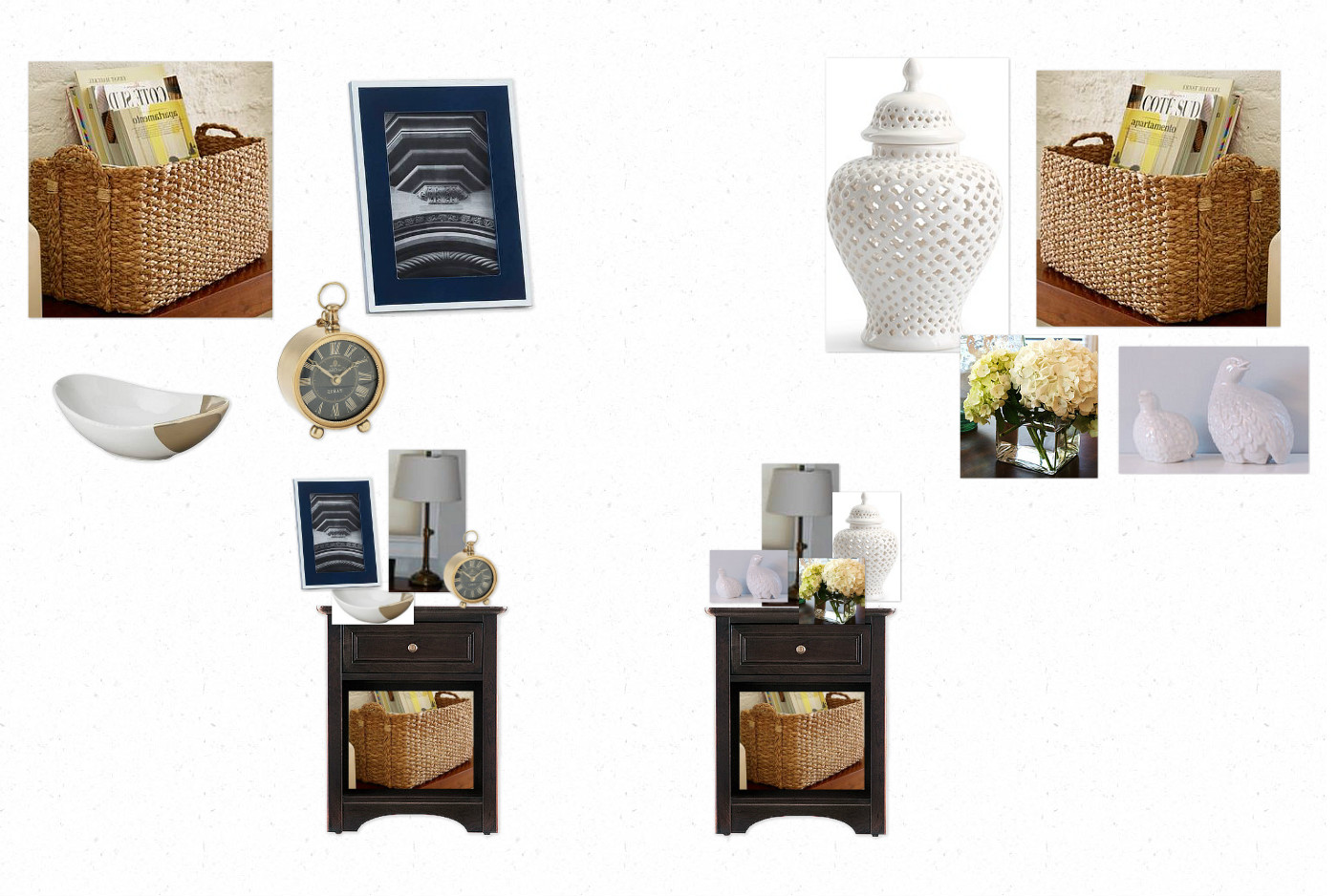
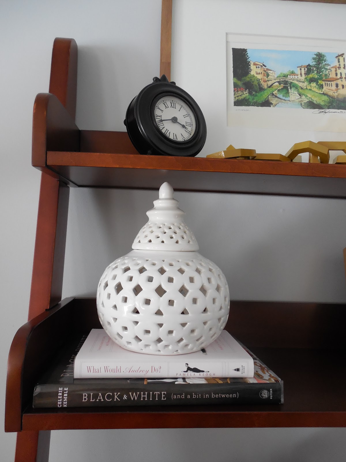
Do you like the changes? I moved the globe to the top shelf, removed some of the glass bottles and added a blue and white bowl to the small stack of blue books. We are both excited about the transformation of these shelves. And we were happy to be able to use so much of what my client already had! I know adding those personal items will be meaningful to the overall design. We are now on the lookout for two more storage bins for the bottom left shelves. I won’t necessarily match them, but find coordinating bins in a similar size. We will also add another detail to the wall space next to the globe. This room has a very high angled slope to its ceiling, so we will add a wall clock to visually draw your eye up and to also help make that tall wall feel useful.

So stay tuned… we will be having much more fun in this space in the coming months! 

A New ‘Smitten’ Print in My Family Room!

August 29, 2013 by Amber Filed Under: art, design, family room, mantle, personal design style, styling


I am super excited to show you an amazing new print that graces my family room mantel! I was recently contacted by a representative from Pretty Smitten, an on line stationary, home and gift shop to preview one of their gorgeous prints from their new art print line. I jumped at the chance, since I have already loved and admired their chic patterns, personalized notepads and monogrammed gifts. It was a tough decision, since they are all so fun, but this is the print I chose…

shop here
And here it is, all styled up in my family room…

The orange, coral, pink and brown from this print works so well with the room’s color scheme. I chose a driftwood style frame to balance against the chic look in the print. This room has a bit of a rustic touch, so I thought it created a nice balance. The frame has an 8×10 opening, which is a perfect size for this print. Overall, I am totally smitten with my new art piece! I already have my eye on some other great prints from her shop! If you haven’t checked out the site yet, stop over to see all of the gorgeous options at an amazing price point. Owner and creator, Elizabeth Johnson founded her shop as a creative outlet after the birth of her son. Her business quickly grew to include more gift items and after the birth of her two girls, Pretty Smitten continues to expand. This new print line is a beautiful addition to her creative, chic style! Her shop also includes trays, phone cases, personalized placemats and trays, just to name a few! 
Start your shopping HERE and have fun!

Just Some Updates…

April 7, 2013 by Amber Filed Under: before and after, design, foyer, living room, personal design style, styling


I purchased the curtain tie backs for the foyer panels and hope to have that installed today! But I do have some new updates to show you for now… I finally put a down filled insert into the foyer pillow. I can’t say enough about how important it is to use down filled inserts whenever you can! I am guilty of this too, but have seen the error of my ways. I was being lazy and cheap, thinking I could just throw a poly filled insert in and be done with it. I thought I was saving money, when actually, they’re about the same price! Jo Ann Fabrics sells 20″ poly filled inserts for about $18 when not on sale. That’s exactly what I paid at Pottery Barn for the down filled! The look is so much better and more inviting! Here is the pillow with a poly fill…

Before

And here is the same pillow, but with the down filling…

After

 
So much better! I also want to add how much better a photo can look with proper natural lighting. It brightens up the space and looks so much more cheerful when you can take pictures on bright, sunny days.

While at Pottery Barn picking up the insert and curtain tie backs, I came upon this lovely turquoise accessory. I have had my eye on this for a while, but didn’t want to pay full price. When I saw it on sale a while back, I still wasn’t convinced. Then, I thought it was sold out for a while, until I hunted and found a bunch on clearance for $13! It was meant to be and proudly sits in our living room…

The coral that was once there is now on our secretary desk in the same room. I needed something to fill this space in between our lamps, and this pop of color was the perfect choice. I pulled this color from our suzani print pillows in the foyer. Sprinkling the same palette throughout the home unifies the spaces. It also makes it easier to move accessories from room to room when you are bored with the current location!

Have you made any new updates to get you ready for spring??

{E-Design} Adding the Accessories

March 27, 2013 by Amber Filed Under: design, e-decorating, e-design, personal design style, styling


As I’ve written in past posts, putting a room together is really all about the accessories. I recently wrapped up an e-design project where the client had the main furniture pieces for her master bedroom, but just needed to add the fun details. We started with her nightstands. I wanted to create a his and hers side, to make the space feel more meaningful and work with their own personal styles. Here are the options I gave…

Option 1

Option 2

Both options include a vase of fresh flowers, because I think that’s a great way to bring warmth and personality to any space. Both options also include whimsical, rustic and glam elements, to create both a masculine and feminine style. Adding accessories that are unique and fun take a space to the next level. You can find great vintage accessories like these from this great shop.

Next up, we chose blankets for the foot of the bed. I gave options that were both serene and calming and those infused with color. Here is the board I presented…

I also threw in a great pillow option for good measure, because you can never go wrong with this textile line.

We also styled the dresser. Here are the two options I presented…

The room is already beautiful, so we wanted to accentuate that by adding texture and unique accessories.

She is thrilled with the boards and has already started the fun accessory shopping!

Styling Tips and Tricks

March 19, 2013 by Amber Filed Under: design, e-decorating, e-design, personal design style, shelf styling, styling


When putting together e-design boards for my clients or decorating my own home, my focus is always on the accessories. They are the icing on the cake and take a space to the next level. The accessories are usually what gets noticed when company is over and can be a great way to show your personal design style. They are also great when updating a room on a budget, because amazing accessories can draw your eye away from an old sofa or outdated furniture. Here are my tips and tricks for styling!

Layering is Key
When thinking about shelves, art can lean on the shelf while smaller accessories sit in front. Layering your accessories adds depth and dimension to your shelves. And they actually make your shelves look bigger!

Our Family Room
Balance and Texture
When restyling your shelves, it’s best to take everything off and start fresh. {Which is also the time I dust the shelves!} Shop around your home for unique finds with different shapes and textures. I always tell clients to pair something flat with something sculptural and the everyday with something unique. A tried and true styling trick is to pair a stack of books with a pretty sculptural piece on top!

Source: bstylewise.blogspot.com via Amber on Pinterest

The picture above also shows how you can color code your books to give that rainbow effect. It’s a great trick when you have so many colorful books. All of a sudden, it’s well put together and thoughtful!

Turn Your Books Around
If you want to give your shelves a more neutral look, turn your books around so the pages show! It’s a subtle look and creates a softer, more subdued feel in the room.

via
Line the Back of Your Shelves
To bring texture and another color or pattern to your shelves, line the back with pretty paper! You could go as easy as attaching craft/wrapping paper with double stick tape or line the back with wallpaper. You could also paint the back of the shelves, like the image below. If the back of the shelves were the wall color in this room, the accessories would not stand out as much.
Source: google.com via Amber on Pinterest
via
Mix Tall and Small Pieces
This is a great way to get that layered, collected over time look to your shelves. Pairing tall vases with small accessory pieces adds more depth and looks great!
via
I am in the process of choosing something fun to line the back of my secretary shelves. Since this is an antique piece and I love the wood’s finish, I don’t want to paint or permanently cover the back in any way. I am thinking of using some type of paper and attaching it with double stick tape. Any thoughts on color or pattern?
Our Living Room
I saw a faux bois paper that might work. Also, if you have any other better suggestions instead of using double stick tape, I’m all ears! Whatever you think is best to preserve the wood.

{Before and After} Shelf Styling in Our Family Room

February 25, 2013 by Amber Filed Under: design, personal design style, shelf styling, styling


As we all know, a house is never done. There are accessories to move around and things to change. I’m ok with that, since I don’t like an accessory in one spot for long. I am always moving things from room to room and shopping around my home for changes. Here are some recent changes I made to our family room shelves…

Before

And here are the changes…

After

To keep it real, I actually didn’t just ‘shop around my home’ for all of these accessories. I’ve been doing some store shopping, lately! But, half of the things are from other areas in my home!  ๐Ÿ™‚ Starting with the top shelf, I swapped out two smaller prints for one large print. I like that it draws your eye up, which gives the illusion of more space. It’s a print from Italy that we had in another part of our home. The tortoise shell vase just switched sides and the chain accessory was from Target. It’s from the Nate Berkus line and it’s now on clearance!

For the second shelf, I brought in books from other parts of the home and also used some that we already had on this bookshelf. The clock was just moved to the top shelf. The ‘B’ candle jar was from our mantel and the Audrey Hepburn frame was from our dining room. I just found the white ginger jar at TJ Maxx for $12.99!

For the third shelf, the white tray and coral now sit on a dresser in the living room. If you follow me on instagram {AmberBInteriors}, then you know I just scooped up this grapewood branch at Pier 1 Imports. I had been eyeing it for a while and decided to go for it. I’m so happy I did, as it’s large enough to have a shelf of its own. You can pick one up HERE.

For the fourth and fifth shelves, I found these amazing baskets at TJ Maxx. The fabric has great texture and adds a casual/ rustic quality to the room. They can fit everything from pillows and blankets to board games.

One more before…

Before

And After…

After

To give you an idea of where this shelf is in our family room, here’s a little snapshot..
I wrote about the striped art prints on the fireplace HERE. I chose the green striped wrapping paper, because I liked how it worked with the Italy print from the top shelf.
Have you found any great deals lately… from shopping at a store, or your own home??  ๐Ÿ™‚

7 Table Styling Tips

November 14, 2012 by Amber Filed Under: e-decorating, e-design, personal design style, styling


If you are anything like me, your coffee and end tables are not always styled to perfection. Life gets in the way- newspapers, magazines and just about anything can take over! Just before you’re about to upload house photos on pinterest, share on your blog or get ready to entertain, check out my fast and fun styling tips!

1. Pair the simple with the unexpected. A stack of books looks unique with a magnifying glass, or a treasure on top!

Source: flourishdesignandstyle.blogspot.com via Amber on Pinterest

2. Bring everyday items together with sculptural pieces. Here are more books! They are the best first layer to any table. When something sculptural is placed on top, it instantly adds texture and interest.

Source: theglitterguide.com via Amber on Pinterest

3. Fresh flowers- one can never go wrong with that!

Source: bdgstyle.blogspot.com via Amber on Pinterest

4. Whimsical Bookends! These can be placed on a console or even a large coffee table. Your favorite book will always be nearby, while also looking stylish in the meantime!

Source: westelm.com via Amber on Pinterest

5. Baskets! They are a great way to add texture to a space while also a perfect spot for storage and small books.

Source: kerrisdaledesign.com via Amber on Pinterest

6. Small frames filled with the ones you love! That is always the best accessory. (Check out the side tables, not Uma and John!)  ๐Ÿ™‚

Source: housetohome.co.uk via Amber on Pinterest

7. Place a bowl of found treasures on a table. It can be nature inspired or something that reminds you of a fun outing!

Source: southernliving.com via Amber on Pinterest
Do you have a favorite styling tip that is not on this list?? Please share!

How Do I Love Nate??

November 11, 2012 by Amber Filed Under: design, great deal, great design, personal design style, styling


Let me Count the Ways…

1. Cream Tortoise Shell

2. Brass Urchin

3. Chevron Urn

4. Round Lacquer Tray

5. Aztec Diamond Bath Rug

Accessories heaven, in my book! Check out all of the amazing collections from Nate Berkus HERE.

What are you eyeing from the new collection?

Paying Attention to Details and Sending Big Thank – You’s!

April 18, 2012 by Amber Filed Under: design, styling


Thank you all so much for your sweet comments on yesterday’s post. It truly means a lot to me! The recurring theme in your comments was to follow your heart and do what really feels right. I completely agree and am thankful for that extra boost of confidence. ๐Ÿ™‚ I definitely look forward with what’s to come!

And now back to more design chat! The details and accessories in a space are so important. I know I have discussed this before, but when I see amazing rooms, it’s often the little details that make me take the most notice. Here are some more beautiful rooms where the details count!

Source: centsationalgirl.com via Simple on Pinterest
Source: designsponge.com via Simple on Pinterest
Source: littlegreennotebook.blogspot.ca via Simple on Pinterest
Source: blog.lonnymag.com via Simple on Pinterest
Source: paloma81.blogspot.com via Simple on Pinterest
Source: melodysblog.tumblr.com via Simple on Pinterest

I love the eclectic mix of styles in these spaces. Pairing traditional pieces with modern, rustic with contemporary and bohemian with chic all work so well. It makes me want to go shopping around my house and create new vignettes!

Welcome!

Hi, I'm Amber... a wife, mom and interior decorator. I am the writer of Simple Dwellings and the designer behind Amber B Design. Blog topics are all things design, with the occasional DIY attempt! Thanks for stopping by Read more...

  • Bloglovin
  • Email
  • Instagram
  • Pinterest
  • Twitter

Blog Posts, Straight to Your Inbox

Popular Projects

A dining room with white walls and wooden table.
A black door with white curtains and a red chair
A staircase with black and white chevron pattern on the steps.

Blog Love

  • Addison’s Wonderland
  • A Thoughtful Place
  • Alison Giese Interiors
  • Amber Interiors
  • Bailey McCarthy
  • Caitlin Wilson
  • Chris Loves Julia
  • Classic Casual Home
  • Cottage and Vine
  • Design Indulgence
  • Dwell by Cheryl
  • Eddie Ross
  • Elements of Style
  • Emily A Clark
  • Emily Henderson
  • Gallery No Eight
  • Hi Sugarplum
  • House of Jade
  • Jana Bek
  • Juniper Home
  • Kate Marker Interiors
  • Lucy Williams
  • Monika Hibbs
  • Our Fifth House
  • Pencil and Paper Co
  • Rachel Parcell
  • Rambling Renovators
  • Pure Style Home
  • Sita Montgomery
  • Studio Mcgee
  • The Makerista
  • The White Buffalo Styling Co
  • the Zhush
  • Traci Zeller
  • Young House Love

Copyright Amber B Design © 2025 ยท Design by Britt Douglas