Amber B Design Studio

Interior Design & Decoration for the South Florida region

  • Home
  • About
  • Services
  • Portfolio
  • Blog
  • Press
  • Contact

My Statement Chair With One Kings Lane

January 22, 2014 by Amber Filed Under: chair love, design, one kings lane, personal design style, this piece has history


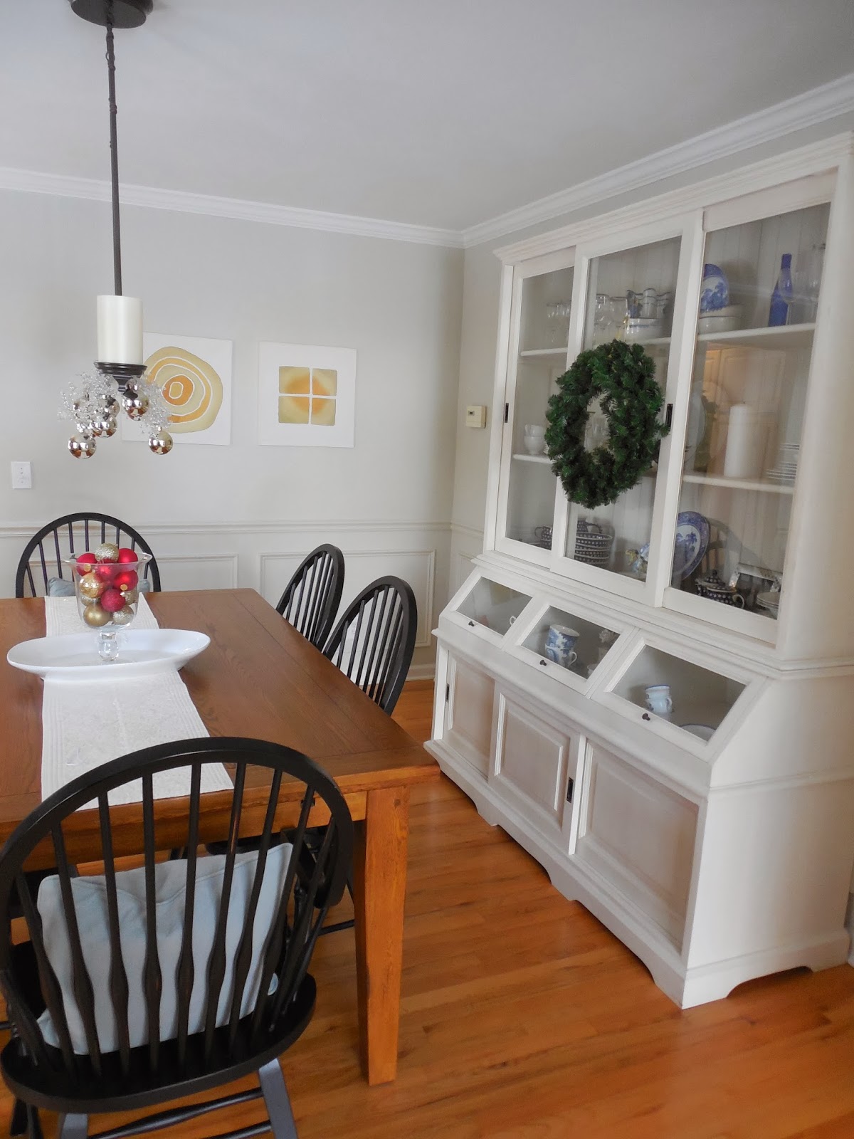
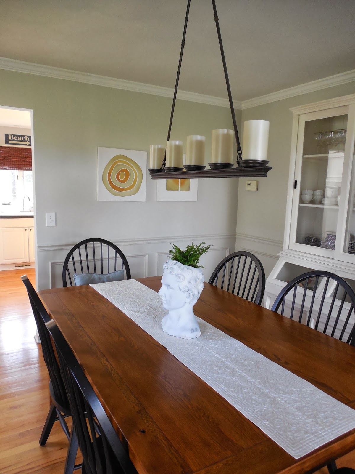
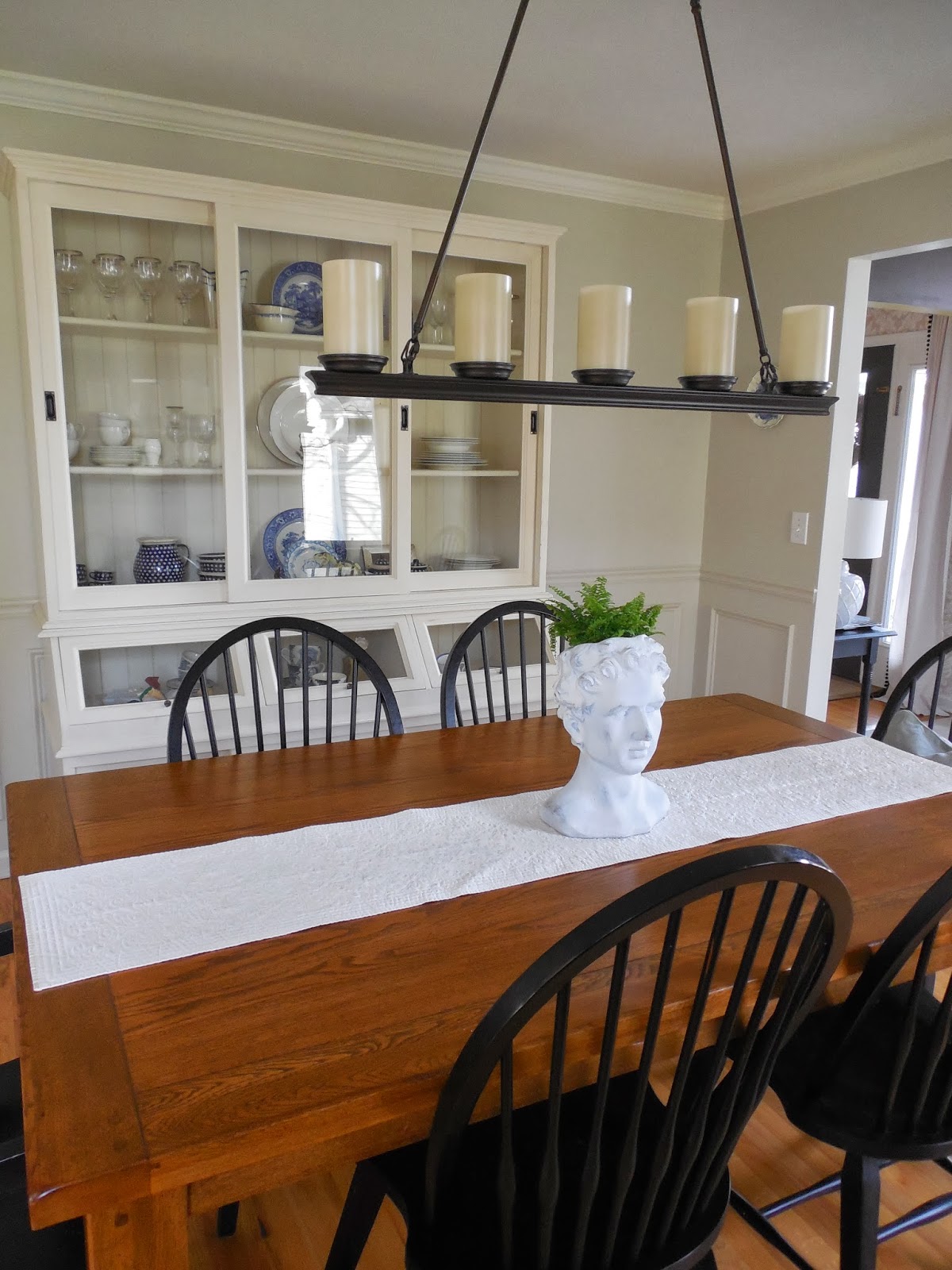
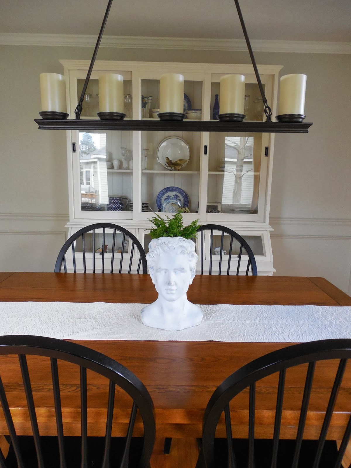
I was thrilled when a representative from One Kings Lane reached out to me to discuss the topic of statement chairs. This was right up my alley, since I have always considered myself a chair person. I love and appreciate so many different styles and when antique or market shopping, I always make a straight line to the furniture! This amazing site features a home decor resource guide that introduces you to the history of statement chairs from any design era you can imagine!  I have decided to show one of my favorite chairs in our house… the timeless and classic Windsor chair. My chair is a modern version and is a reproduction, but its homespun, traditional quality still shines through. During the height of the more ornate furniture designs, like Baroque, England introduced this humble and classic piece that is still so popular today.

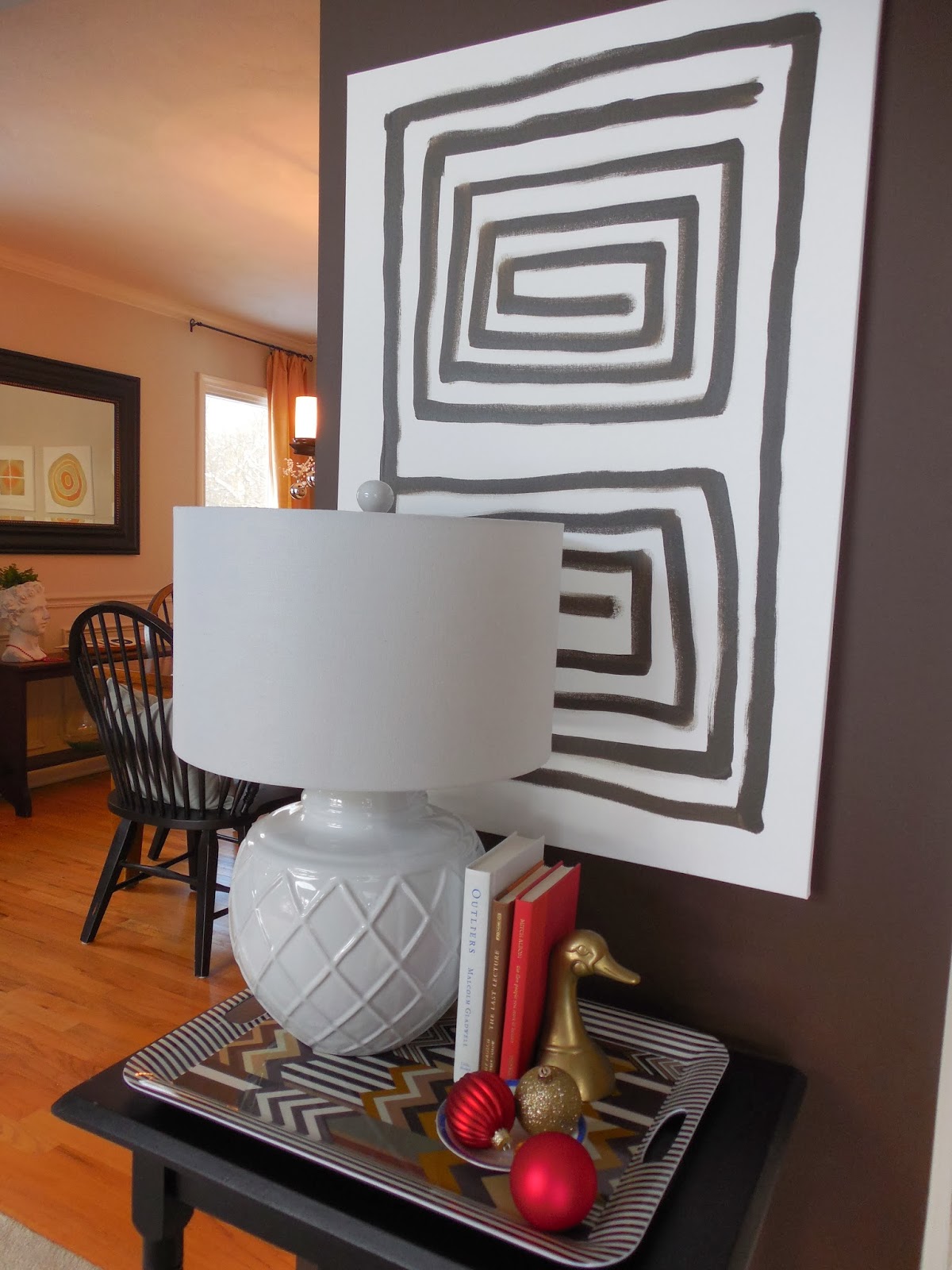
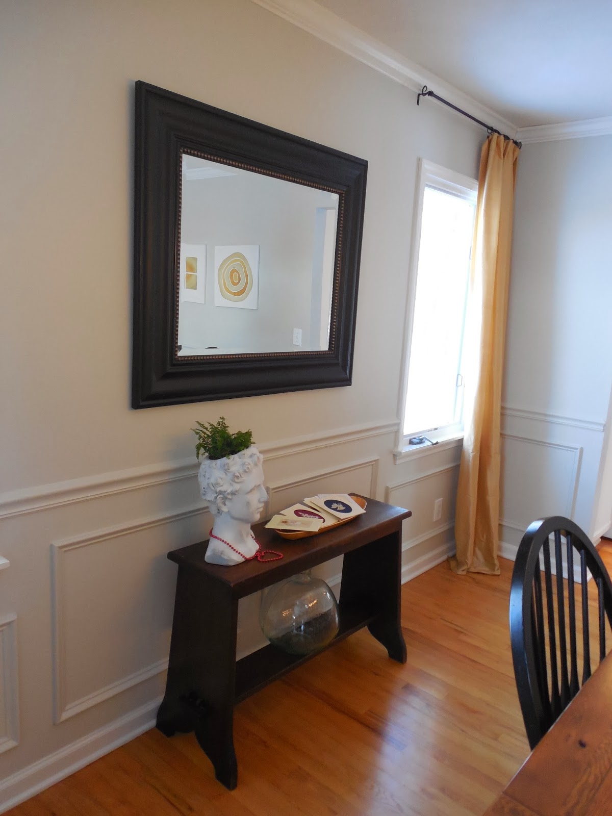
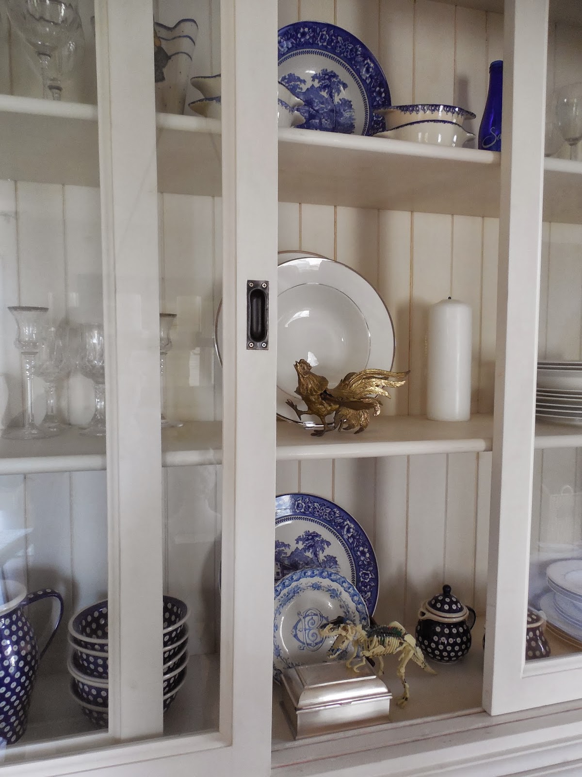
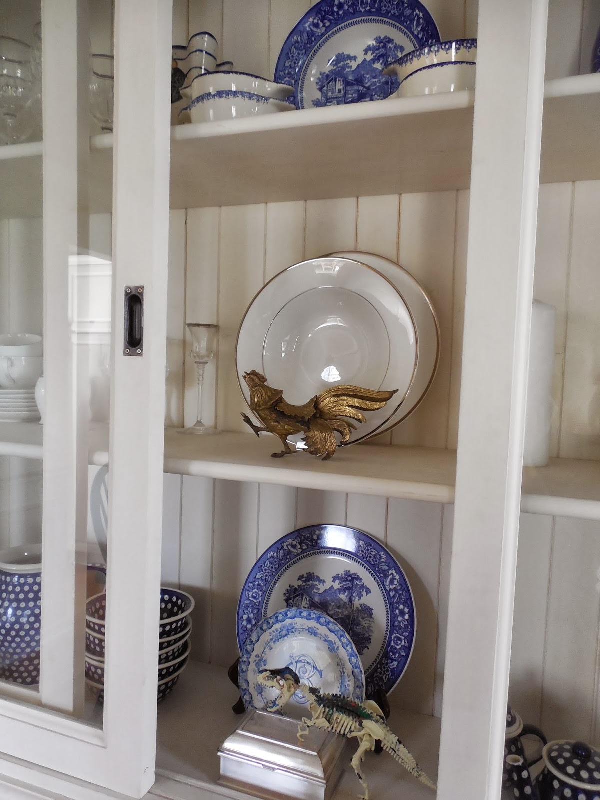
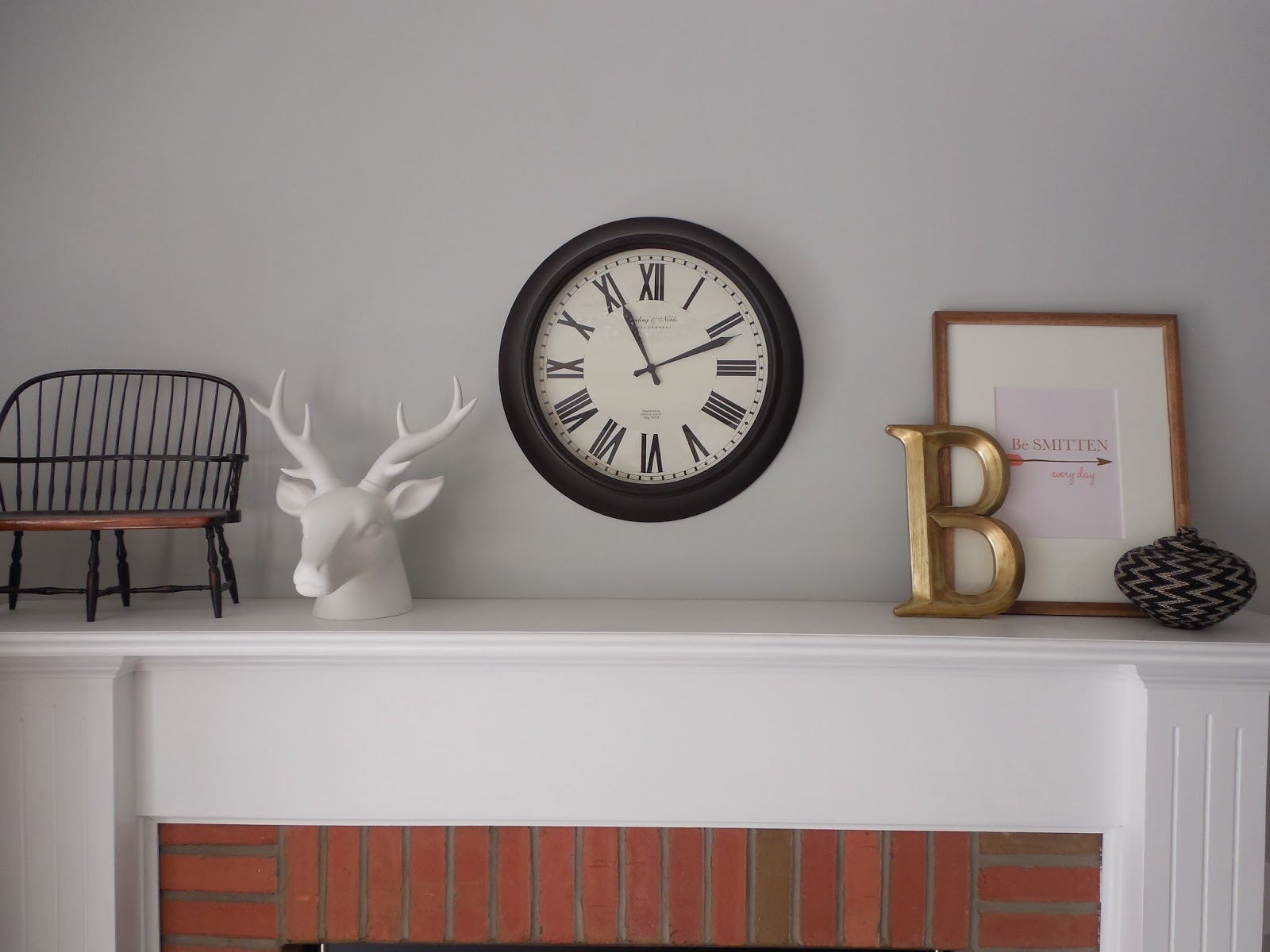
Rather than being a centerpiece in the room, it is an accent and is part of our dining room set. I think what I love most about a Windsor chair is the ability to mix it with modern decor, to give it a fresh, new take on a classic piece. Although it’s a timeless shape routed in tradition and simplicity, it can also appear more modern against a table with clean lines. I paired our Windsor chairs with modern pieces, by adding a clean lined hutch and dining table to the room and also by bringing in contemporary art and accessories. I have often thought the chairs would look amazing if painted a bright color. {Maybe a rich teal/blue color!}

The most important thing to do with any furniture in your home, is to have fun with it and make it your own! Thanks to One Kings Lane for including me in this series and reminding me about one of my favorite furniture pieces in our home!

Our 2013 Holiday Home Tour

December 13, 2013 by Amber Filed Under: design, holiday, personal design style


There is a reason that there’s a popular song called, It’s the Most Wonderful Time of the Year… I love the holiday season and getting the house festive and ready. Although it can be a stressful, busy time of year, I am trying to forget all of that as much as possible and focus on the fun of the season. So, kick back and enjoy our holiday touches this year…

Handmade cards given by my grandmother every year, sit out on display 

Even our head planter got in on the fun with a festive necklace! 

There I go again, with ornaments on every spot but the tree! (We actually have a lot on the tree, too!) 

As you can see, I love using ornaments in unexpected places. They work on chandeliers, hurricane vases, trays and even a small china plate. I have also used them as place card settings, applying the guest’s name on the ornament with a paint pen! The best part of that idea?? The guest can take the ornament home as a memento of the occasion! I also love to hang wreaths anywhere a clear command hook will take them! Command hooks are a life saver around the holidays, because they are not permanent and will not ruin your walls, glass or any surface when they are removed. I’m sure I will be back soon with more holiday touches. I even add new vignettes a few days before Christmas. Somebody stop me!  ๐Ÿ˜‰

There is still time to enter the giveaway for the $50 gift card to True Value Hardware and a free Pattern with Pattern Pod. Enter HERE!!

{E-Design Project} The Living Room

December 6, 2013 by Amber Filed Under: design, e-decorating, e-design, living room, personal design style


I just completed a living room e-design project for a client I have been working with for a while. I seriously love what I do and I get a little sad when projects are over, because I truly have so much fun with my clients! With this particular client, we seem to often be on the same wavelength… we bounce ideas off of each other and it’s a refreshing, fun collaboration when we work together! We made some changes and new additions to the previous living room design and I’m excited to show you the plan, today…

The Design Plan


Some of the items on the board, the client already owned, so I wanted to present the plan in a way that showed her pieces with the new ideas. I think they work well together! I am really excited about the idea of lacquering a secretary desk in a deep navy color. I am also giddy about the eclectic mix of pillows and patterns. As long as there is a common color within the fabrics, you can mix totally different prints in the same room and pull it off well! I think it will bring an eclectic, collected over time feel to the space. My client will also choose a Persian style rug to layer over a jute rug. The suggested three options are to the right of the board. Layering rugs is also another great way to bring a collected feel to a room. It’s a perfect way to mix neutrals with some pattern. You can also use the top rug as the main piece that brings the room’s color palette together or use a complimentary color that works with some of the elements in the room.

If you would like to work together on making your house a home, visit HERE. I am currently accepting new clients for February 2014.

A Holiday Re Cap, Sneak Peek of Our Office & A New E – Design Project

December 4, 2013 by Amber Filed Under: design, e-decorating, e-design, holiday, paint colors, personal design style


Phew… it seems like a very long time since I have written a post! I wanted to catch you up on a few things that have kept me busy these last couple of weeks. First up, we had a lovely Thanksgiving over at my mom’s house. It’s one of her favorite holidays to host and as always, she did a fantastic job…

The pretty dotted place cards come with a marker that allows you to erase and write again, so you can always change up the names for each party! The kids and I have started a tradition a few years back, where we make the apple pie and bring it to the holiday meal!

That might have been our best pie, yet! I have also been busy painting our office. It still had the builder grade white paint that wasn’t durable at all. I decided to paint it Halo, by Benjamin Moore. It’s such a gorgeous light gray/green color and is also what we used in our dining room!

If you follow me on instagram (amberbinteriors), then you may have seen these photos already…

After about a week of looking at the newly painted walls, I finally mustered up the courage to put new nail holes in them! I decided to install a full wall gallery wall in the office. It’s amazing how tall a room looks when covering a wall, head to toe in art. You might think that it clutters a room, when it actually has the opposite effect. I also just finished working on a client’s office space. My client uses her office to sew, draw sketches and create! She loves neutral grays infused with bright pops of color. This is the result…

She wanted a huge craft table in the space, so I found a way to create one to mimic the inspiration table in the middle of the design board. By using white Ikea expedit cubes and a white laminate counter, a custom craft table will come to life! There will also be a fun gallery wall in her space, as well…

I love the way Audrey Hepburn’s scarf ties the room’s color palette together. And I think that turquoise Chanel print will fit very well in this room!

So, that sums up two weeks, in a nutshell! I hope I have not lost most of you with my sporadic posting lately. I have been having a hard time creating a consistent schedule on the blog, over the last couple of months. I know we all go through a bit of a blog drought from time to time. But I am excited to be back in full swing this month, with lots of holiday ideas to share!

How I Add Whimsy to Our Home

November 13, 2013 by Amber Filed Under: dining room, personal design style, plants, tablescapes


We are a quirky family… we laugh, we’re sarcastic and don’t take ourselves too seriously. So when it comes to decorating our home and adding personal touches, I want to reflect our true personalities. I think it’s fun to have fun with your home… if that makes any sense! Adding personal moments that show your true self, makes your home unique and more meaningful. So when I saw this quirky little planter guy at Target, I knew it was meant to be in our home. I showed this new family addition first, on instagram. This was after he just arrived in our home…

via
And since he is actually a planter, he needed some greenery up on top. So here he is, all styled and ready for his blog debut…

I found a 4″ fern plant at my local grocery store. Hopefully, the fern grows a bit, so he has bangs, like me!  ๐Ÿ™‚ Speaking of personal touches, our china cabinet has a mixture of wedding china, pottery and the kid’s craft projects! I thought it would be fun to add sculptural art pieces they have made, so it can also have a proper display spot for everyone to see…
The dinosaur on the bottom shelf was built and painted by one of my kiddos, a few years back. It’s one of those projects that is pretty fragile, so it stays behind glass as a fun, meaningful accessory! 
How about you… do you have hints of personality and quirkiness in your home?? Do tell!

{E-Design} My Client’s Gallery Wall Plan

November 7, 2013 by Amber Filed Under: design, e-decorating, e-design, gallery walls, personal design style


Thank you all for your comments on my post about mixing up your gallery wall frames! There is no definite right or wrong answer on the topic… it’s really a personal preference. I have also been trying to mix it up around here, and have been pleasantly surprised with the eclectic results! So for my client’s television wall, we decided to go for it and install a unique, asymmetrical gallery wall around her TV. Here is the plan…

The Plan


I think I might copy this look in our own house! We started with a blank slate in my client’s living room and her goal was to make it a relaxing, fun place to spend time with her family. She wanted an industrial, farmhouse feel to her home and I think this gallery wall achieves that. I mixed in some vintage fabric with a touch of brass and plaids to give it that rustic, lodge aesthetic. The gorgeous tufted chairs help to frame out the vignette, but also can be moved into the seating arrangement, when guests arrive! Although the plan doesn’t quite show it here, the suggestion was to mix up the frames with wood, metal and black/white frames for a collected look. I can’t wait to see the actual vignette installed!

Mixing Up Frame Finishes on Your Gallery Wall

November 4, 2013 by Amber Filed Under: design, e-decorating, e-design, gallery walls, personal design style


I was recently discussing this topic with a client for her gallery walls in her living room. In her space, we will be adding a couple of art/photo collections on her walls and I suggested to mix it up with different frames for a collected look. I thought it would be a great topic to bring up here on the blog, because I feel there are times when matching frames are necessary and other times when mixing it up is just right!

When to Mix Up Your Frames

via
via
via
When you have an eclectic space and you are trying to fill it with art in an asymmetrical way, mismatched frames are great! Or like the last above image, filling a corner wall with framed pieces looks great when the frames are mismatched.
via
via
When art is hung around a television in an asymmetrical way, mismatched frames are great! For my client, this is what we’re going to try and I can’t wait to see the result! There are also times, however, when I think matching frames are necessary. For this client, for example, we are also working with matching frames in another collection in the space. 
When to Match Your Frames

via
via
via
Matching frames are key when you are doing a symmetrical wall arrangement and would like a clean, simple look to your wall.  A collection of similar photos and scale, like the gallery wall directly above, gives continuity to the art.
I mentioned earlier that we will doing a mixture of matching and mismatching frame collections in my client’s living room. I also feel it’s important to blend the two in one space, as opposed to having every arrangement symmetrical or every arrangement with the same frame finish. We will be doing a symmetrical gallery wall of family photos, that will be hung in a grid like pattern. For this, we will be using the same frame to bring a neat, orderly look to the arrangement. When there is a blend of the two styles, it makes the space unique and personal! 
So that’s what is on my mind this Monday morning!
How about you… do you like to match or mismatch your frames? Are you a symmetry person or like a little asymmetry when hanging art?? Do tell!!

{The First Layer} A Client E – Design Project

September 3, 2013 by Amber Filed Under: design, e-decorating, e-design, personal design style


Over the summer, I worked with a client to develop her great room into something better suited for her and her family. They love their home and so do I, but it needed to be lighter and brighter with some modern touches. Most of their interior, including the ceiling, walls and floors are wood. We needed to add some contrast and take away some of that wood overload, so that you can truly appreciate the home and its beauty. Let’s take a look at the plan…

The Plan 

This client wanted to just start with the first layer… before we even get into the furniture and accessories, she wanted to lay the initial groundwork and choose the wall color, ceiling color, floor stain, drapery panels and wood stove. They have the space for a wood burning stove, which I thought was so much fun! I got to work, selecting a more modern stove, darker stain for the floors and a lighter color palette for the walls. This board ended up looking more like some of the inspiration boards I do for clients when I want to get a feel for their style. This board helps lay the groundwork for what’s to come in the future. I chose to include interiors that spoke to their style, showed texture, layering and an overall warmth, which they were craving for their home. I proposed they paint the wood walls the top left color on the board and the window trim would be the smoky black color. The fireplace trim would be the creamy color to the right, which compliments without competing with the walls. {Just to explain, I am not against keeping some of the wood walls in their original form, throughout the rest of the home. In some spaces, I am all for staining the wood walls a darker color and working with what you have. But for this particular area, we were looking to lighten the walls. In future rooms, I can picture bedrooms or the entry way with dark stained wood walls. It would be very rustic chic!} I suggested they choose a gray toned brick around the wood stove and lay that out in a herringbone pattern. It would be a chic, subtle way to add texture. The stove surround would be a black stone and would anchor that side of the room. Owning and caring for dogs is their passion, so the brass bookends on the top right of the board gives a glimpse into future accessory pieces. The gorgeous interior on the center right side of the board was designed by Lauren and gives a great example for how we can add layering and texture to their home. I was so excited that my client loved the design! It actually made my week when she wrote and said…

The part that is so special, so validating, so meaningful, really has turned out to be your ability to see the heart & guts of our home.  — you and I are a terrific match. I was absolutely elated to go through the pictures and read your advice.

Wow, that’s really what it’s all about! I truly love what I do and when I have the opportunity to work with such special people, it makes it all worth while. I can’t wait to see how this space comes together. ๐Ÿ™‚

To help create a space together that you love, click HERE to get started!


A New ‘Smitten’ Print in My Family Room!

August 29, 2013 by Amber Filed Under: art, design, family room, mantle, personal design style, styling


I am super excited to show you an amazing new print that graces my family room mantel! I was recently contacted by a representative from Pretty Smitten, an on line stationary, home and gift shop to preview one of their gorgeous prints from their new art print line. I jumped at the chance, since I have already loved and admired their chic patterns, personalized notepads and monogrammed gifts. It was a tough decision, since they are all so fun, but this is the print I chose…

shop here
And here it is, all styled up in my family room…

The orange, coral, pink and brown from this print works so well with the room’s color scheme. I chose a driftwood style frame to balance against the chic look in the print. This room has a bit of a rustic touch, so I thought it created a nice balance. The frame has an 8×10 opening, which is a perfect size for this print. Overall, I am totally smitten with my new art piece! I already have my eye on some other great prints from her shop! If you haven’t checked out the site yet, stop over to see all of the gorgeous options at an amazing price point. Owner and creator, Elizabeth Johnson founded her shop as a creative outlet after the birth of her son. Her business quickly grew to include more gift items and after the birth of her two girls, Pretty Smitten continues to expand. This new print line is a beautiful addition to her creative, chic style! Her shop also includes trays, phone cases, personalized placemats and trays, just to name a few! 
Start your shopping HERE and have fun!

Some Pinspiration For You…

August 18, 2013 by Amber Filed Under: design, personal design style, pinterest


I have been on pinterest quite a bit lately, pinning my heart away! Every time I’m on there, I am all over the map… pinning images of beautiful bathrooms, kitchens, living rooms, ideas for clients, etc. I thought I would share some of my favorites lately! Enjoy!

Clean and simple, but so chic. I could repaint my dining chairs!

via
This dining room is soft, a bit feminine and has those gorgeous wishbone style chairs!
via
Back to back sofas would be cool in a large space! It can separate the rooms into different zones for different purposes. This room also has my favorite color palette and is designed by the very talented Christina Murphy!
via

Love this wallpaper… have to use it somewhere!
via
This kitchen is pretty much perfection in my eyes. And notice how they mix metals… brass lanterns paired with chrome faucets?!? Don’t be afraid to try and mix your metals!
via

I love this color palette and space! And notice how there is nothing on the wall above the bed? With a pretty wallpaper like this, it’s not needed!
via

A great way to style around the TV!
via
Yep, all over the map! But at least with it all on my boards, it’s organized chaos!  ; ) Follow me HERE to see some my latest favorites.

  • « Previous Page
  • 1
  • …
  • 5
  • 6
  • 7
  • 8
  • 9
  • …
  • 14
  • Next Page »
Welcome!

Hi, I'm Amber... a wife, mom and interior decorator. I am the writer of Simple Dwellings and the designer behind Amber B Design. Blog topics are all things design, with the occasional DIY attempt! Thanks for stopping by Read more...

  • Bloglovin
  • Email
  • Instagram
  • Pinterest
  • Twitter

Blog Posts, Straight to Your Inbox

Popular Projects

A dining room with white walls and wooden table.
A black door with white curtains and a red chair
A staircase with black and white chevron pattern on the steps.

Blog Love

  • Addison’s Wonderland
  • A Thoughtful Place
  • Alison Giese Interiors
  • Amber Interiors
  • Bailey McCarthy
  • Caitlin Wilson
  • Chris Loves Julia
  • Classic Casual Home
  • Cottage and Vine
  • Design Indulgence
  • Dwell by Cheryl
  • Eddie Ross
  • Elements of Style
  • Emily A Clark
  • Emily Henderson
  • Gallery No Eight
  • Hi Sugarplum
  • House of Jade
  • Jana Bek
  • Juniper Home
  • Kate Marker Interiors
  • Lucy Williams
  • Monika Hibbs
  • Our Fifth House
  • Pencil and Paper Co
  • Rachel Parcell
  • Rambling Renovators
  • Pure Style Home
  • Sita Montgomery
  • Studio Mcgee
  • The Makerista
  • The White Buffalo Styling Co
  • the Zhush
  • Traci Zeller
  • Young House Love

Copyright Amber B Design © 2025 ยท Design by Britt Douglas