Amber B Design Studio

Interior Design & Decoration for the South Florida region

  • Home
  • About
  • Services
  • Portfolio
  • Blog
  • Press
  • Contact

Mixing Metals and Wood Finishes

July 31, 2012 by Amber Filed Under: design, e-decorating, e-design, personal design style, style


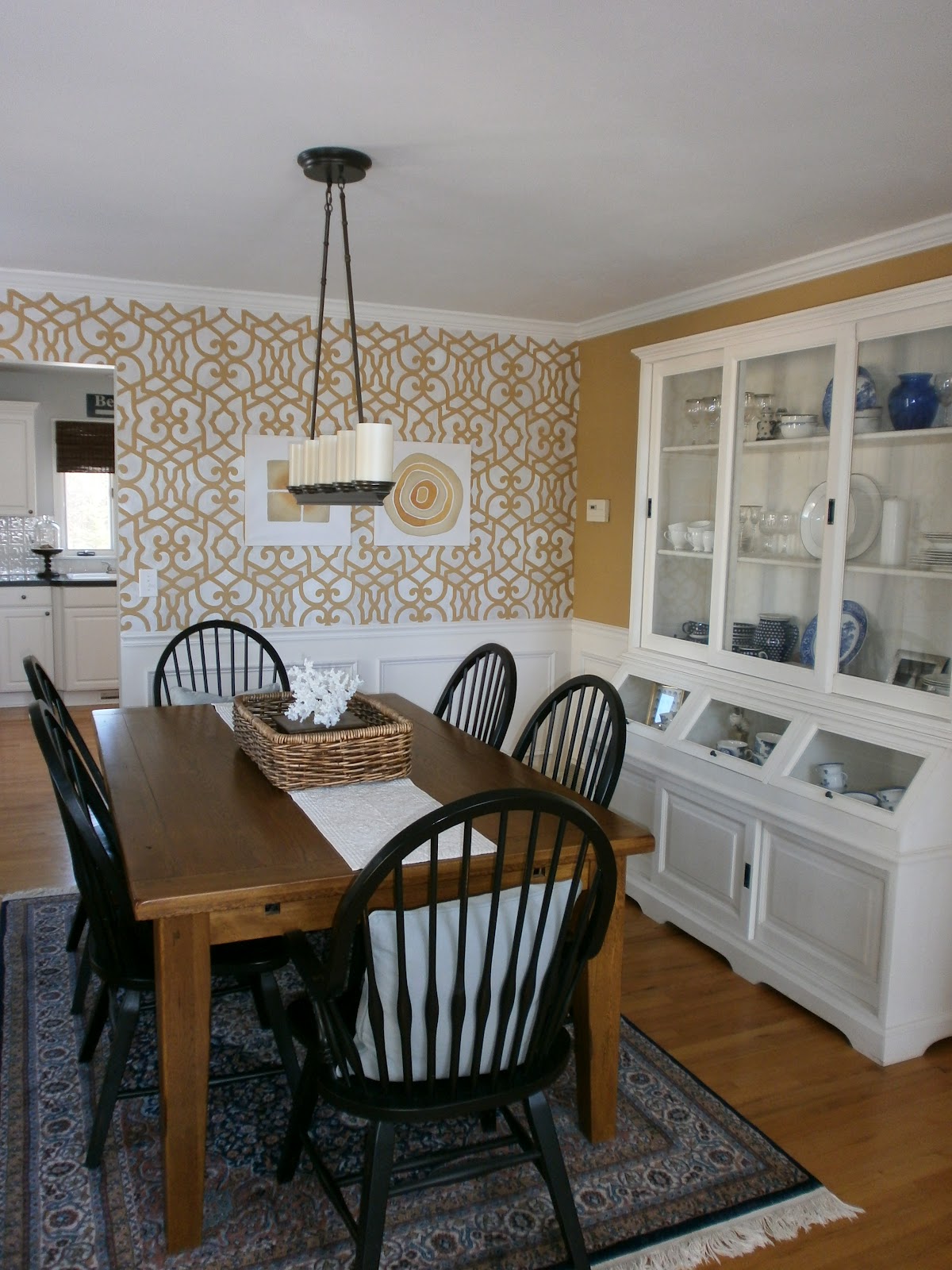
I am putting a living room design together for a client and we’re going for a modern, mid century look. I love the idea of mixing metals and wood finishes in a space and plan on doing that here! I think sometimes, people may be afraid to mix metals in a room, thinking they all have to match. If you have a chrome lamp, that doesn’t necessarily mean every metal has to also be in chrome. Why not mix it up with a little gold for an eclectic look?? The same goes for your wood finishes. I love seeing light and dark woods in the same room, just like when mixing design styles. You can really take an everything goes approach, within reason. Here are some great examples of mixing things up…

Light woods with Dark…

Source: architecturaldigest.com via Amber on Pinterest
Source: houseofturquoise.com via Amber on Pinterest

Mixing Metals…

Source: apartment34.blogspot.com via Amber on Pinterest

Source: lampsplus.com via http://pinterest.com/jamiejojoyal/ on Pinterest


Try it out! You’ll be surpised that it actually goes together!

Adding Coastal Charm for Summer

July 17, 2012 by Amber Filed Under: beach inspired, design, flowers, summer


I love to make changes around our home seasonally… it just awakens the space and gets you ready for the season. We are well into summer now, so I thought I would show you some changes around our home. Better late than never, right??  ๐Ÿ™‚

A Nautical Inspired Wreath

This wreath was made with a craft store wreath form, ivory yarn and striped ribbon. I hung it on our door with some twine, for a nautical touch. This second image was taken in June, when we still had our cottage roses in bloom. They last for such a short time… I miss them! You can see a glimpse of the wreath from here. (To tell the truth, I showed this picture so I can see those roses again!)
Framed Sailboats

We actually keep this print up all year, but you can easily swap out images for different seasons. This picture was taken on a trip to Boston. I had it printed in black and white at Wal Mart and framed it in this floating frame from Target. I just suggested this frame in black for a client. It’s a great piece, because you can still see the wallpaper and it can hold any image up to 11×13! This picture is an 8×10.
A Touch of Coral and a Beach Sign in the Background

And a newer picture, without the rug:

Coral is fun to add to any space. It looks great printed on a pillow or as sculptural art on your table or shelf. This coral is from Pottery Barn, and I am constantly changing its home! Actually, it’s not on the dining table anymore! More on that later… 
As I was writing this post, I realized the beach sign above our kitchen window also showed in the image. Another way to incorporate a summer look!
Let’s take one more close up of those roses. See you again next year, cottage roses!

Even if you’re landlocked, you can easily bring some coastal charm to your home! Clipping a few of these blooms and bringing them into your home is another great way to add some summer charm to your space.

What are your favorite summer decor additions??

One Door Down…

July 1, 2012 by Amber Filed Under: design, foyer, painting tips


I am excited to show you a recent change we made in our foyer! I have been thinking about painting our interior doors black for quite a while. I love this look and believe it can work with many different design styles. It sounds like a dramatic change, but truly adds depth and character to any space. There are some blog posts, images on pinterest or magazines that just help me make decisions and go for it! (Does that ever happen to you too?) I am very confident when making decisions for client spaces but sometimes indecisive when it comes to my own home. When I recently saw Emily’s post from her blog, A Well Dressed Home, I knew that I had found the right color for our doors. I immediately got to work and here is the after…

After…

The paint color is Dragon’s Breath by Benjamin Moore, and I am in love. It’s a muddy, gray/black that shows very soft in person. I went with an eggshell finish to avoid a very glossy look. I knew when going with a dark color, the glossier it gets, the more imperfections it shows. This door did have some dents, but doesn’t show at all with this finish. I also like the way the brass knob and locks show against the black. A useful tip when painting doors, is to use a fine tip artist brush when going around molding and window openings. It allowed me to get into the crevices without a lot of clean up and painter’s tape! I know we all love a little before and after, so let’s take you back to how it looked before…

Before…

And after…

Sorry about the lighting on some of these pictures. The sunshine changes everything! Besides the door color, a lot has changed since the ‘before’ shot. We have replaced the coat rack with a bench, pillow and driftwood mirror. Our fun ceramic horse is on display and we replaced the ceiling fixture with a more dramatic drum shade light. I have also decided to take out the sheers on the door’s windows for good. I think it updates the entrance a bit more.

So like I said in the title of the post… one door down! I plan on painting most of our interior doors this color and also move on to finishing our railings.

Is there a design idea you’ve been wanting to try but haven’t?
What’s holding you back?
Are you looking to make changes to your space and have a home that reflects you and your style? Click on the ‘design services’ link at the top of my blog to get started!

Going Rugless

June 18, 2012 by Amber Filed Under: design, rugs


We have really been embracing the rugless look in our dining room. You get to see more of the wood floor, makes for easy clean up and gives the illusion of a bigger room. Our dining room is about 12×11, so it’s great to have the appearance of more space. Since we took out the rug this summer, my husband has commented how much he likes the look! I will have to ease him into the idea of a rug in the future, because I always like to change things up. For now, this look is a keeper. So I thought it would be fun to see some beautiful dining rooms with the same idea!

Source: decorpad.com via Amber on Pinterest
Source: itsoverflowing.com via Amber on Pinterest
Source: Uploaded by user via Amber on Pinterest
Source: dwellerswithoutdecorators.blogspot.com via Amber on Pinterest
Source: housebeautiful.com via Amber on Pinterest

Eventually, I would like this rug look…

Source: coastalliving.com via Amber on Pinterest
Are you/are you not rugless??
And thank you all so much for your comments about my dining room and what to do about the stenciled wall! Since I take a while to get projects done around here, I will live with it as is for a little while. But don’t worry, if the wall gets painted over, I have plans to bring it back (just with another background color!)
Stay tuned…

Little Dining Room Update

June 12, 2012 by Amber Filed Under: design


A little while ago, I had a rug dilemma conversation on the blog. Your feedback was all amazing and am leaning towards the jute rug. It’s just one of those versatile rugs that can go anywhere. I tend to tire out of prints and styles easily, so this will be a timeless classic for a long while. In the meantime, I will follow my blog friend Holly’s advice and try the space without a rug! It’s a great decision, because there’s no need to stress over spills! Here’s a little before and after.

Before: With the Rug

After: Without the Rug

I have been thinking a lot about this space- there may be some drastic changes to come! These last two images remind me that there is a lot of honey tones in this room. I might go a little crazy and paint these walls. (I know- what about the stencil?) I just did this stencil last winter, but it might be painted over soon. Call me crazy, but summer brings out the DIY project fever! When that is done, I will revisit the rug dilemma once again.

Are you like me and occasionally take a ‘tour of your house’, looking for new ideas to try??

My Top Must Haves for Summer

June 11, 2012 by Amber Filed Under: art, design, driftwood, summer


Lately, I have been thinking about summer wardrobe additions and things I would also like to do around the home. So, I thought it would be fun to compile a list of 7 Must Haves for the summer! In the home as well as in fashion, it’s fun to switch things up with the seasons and make adjustments here and there. I had fun putting this together! (Now I just have to go out and make this happen!)

Let’s start with the #1 item and work our way through!

#1- A new summer bag! This tote bag is from a new (to me) on line shop that I found, called Rosanna Inc. She sells items for the home as well as these amazing tote bags. These bags would be perfect for everyday shopping or a beach trip! The price is great, too! Shop this bag here.

#2- Driftwood. I love driftwood anything- mirrors, frames, pieces for your mantle. Last winter, I found my driftwood mirror, and I love it! I found this piece on etsy from the shop, The Moss Woodshop. The piece also comes with a wire elk sculpture mounted on top. Driftwood in the home reminds me of being at the beach!

#3- Paint your walls a new color! I love this benjamin moore color, Titanium. I plan to use this color on some walls very soon! A fresh new color on the wall gives a whole new look to your space, and why not go light with a beautiful gray/blue that reminds you of the summer sky!

#4- Switch out your pillows with fun, vibrant colors for summer! I love this Schumacher print made by etsy seller Woody Liana. It’s a 20″ pillow cover, which is great for curling up on the sofa! When you switch out your pillow covers seasonally, it feels like you have a completely new room!

#5- Add a bright, new watercolor print to your gallery wall! This beautiful painting of a Kate Spade Clutch by etsy seller Laura Trevey would be a great addition to your walls or shelf! And the colors definitely remind me of summer. Shop this watercolor here.

#6- Add a new pouf in a cheerful color! I have previously mentioned here that I want to incorporate coral in our living room. What better way than with this coral rope pouf from Privet House for Target. I have seen this in the store, and it would be a great addition to any room for extra seating or a place to put up your feet.

#7- And last but not least, is this new (to me) etsy seller that makes scarves, necklaces and headbands out of recycled t-shirts! Of course, I chose the coral one!  ๐Ÿ™‚ I love the creativity and the amazing price! The name of the etsy shop is Day Old Tee. Get this necklace here.

I could go on and on with different summer must haves. I left so many great ideas out! (I might have to come up with another list soon!)

What’s on your summer must have list??

Color Palette Crush

June 5, 2012 by Amber Filed Under: coral, design


You know the saying A home is never finished…

For me, that will forever be a quote to live by, because I always fall in love with new things! I just shouldn’t walk into homegoods anymore. I come out with way too many new ideas. In our living and dining rooms, our current color palette is soft golds and creams, deep browns and blue grays. After a recent trip to homegoods, I want to add one more color… coral! This bright burst of color would look amazing against grays, golds and browns and would be a great summer edition! I can picture it now-

I already have these similar (or exact) colors in our two rooms, but lacking the second color at the moment. These paint samples are all from Benjamin Moore and are as follows: Titanium, Golden Gate, Decatur Buff and Mink. Our living room is painted Mink, and our dining room is similar to Decatur Buff. Our throw pillows on the dining chairs are a similar color to Titanium. I started on this coral tangent when I saw a coral table runner in a linen fabric. Then, I started to see beautiful pillows with all of these colors in them, and I started to go crazy with ideas! I started to imagine a new wall color, pillows and a table runner. Somebody stop me!! Here are some great examples of this color combination:

Source: bhg.com via Amber on Pinterest

Source: paloma81.blogspot.com via Amber on Pinterest

Source: grosgrainfabulous.blogspot.com via Amber on Pinterest

And a little dining room update to share… our rug is no longer there, and we love the look without one! More updated photos to come and a shout out to my blog friend Holly for the idea!  ๐Ÿ™‚

What’s your current color palette crush???

Time to Get Outside!

May 21, 2012 by Amber Filed Under: design, outdoor, summer


The weather here has been beautiful lately, (which explains my lack of posts last week) and I definitely have outdoor spaces on my brain! We have a patio in our backyard with pavers, and we got our table and chairs all cleaned and ready for the warm weather. I love when the umbrella is open, the sun is shining and butterflies are flying by…….. it’s the little things that make me happy. So here are some beautiful outdoor spaces to inspire. Enjoy!

Source: resistingadulthood.com via Simple on Pinterest
Source: seven-nation-army0.blogspot.com via Simple on Pinterest
Source: houseandhome.com via Simple on Pinterest
Source: miss-design.com via Simple on Pinterest
Source: flickr.com via Simple on Pinterest
Source: chiccoastalliving.blogspot.com via Simple on Pinterest
Source: housebeautiful.com via Simple on Pinterest

That last image is my favorite! Isn’t it so dreamy?? I think I am particularly drawn to smaller outdoor spaces. To me, they feel very intimate, cozy and achievable. Even with a tiny bit of space, most of these outdoor looks can be imitated. I love when an outdoor space feels like an extension of the home- complete with lanterns, rugs and pillows. There are so many great outdoor fabrics on the market. Shopping for your outdoor space can be just as fun as the interior of your home!

What is your outdoor space like???

How Much is Too Much??

May 15, 2012 by Amber Filed Under: design, personal design style


I need all of your advice! I recently fell in love with a new rug for our dining room, but need all of your expert opinions! With the pattern we already have on the wall, is this too much in the space?

This is the new Saybrook rug from Ballard Designs and I would choose the black/gold on the bottom right side. It’s a beautiful indoor/outdoor rug that would be perfect for high traffic areas in the home. Before I go any further, let me remind you of our dining room and the one stenciled wall, already providing lots of pattern in the space:

Our stenciled wall is on the one wall only, while the rest is the soft gold color. (And our drapery is a subtle stripe, adding a bit more pattern.) But when I saw this rug, it reminded me of an extension of the wall pattern and worked well with the furniture/colors in the space. Before seeing the Ballard rug, I thought I would opt for this neutral jute rug from Pottery Barn:

This is their color bound jute rug in honey. So, I’m torn and need your advice!

How much is too much when considering pattern in one space?
Would they compliment or compete? Do tell!

Paying Attention to Details and Sending Big Thank – You’s!

April 18, 2012 by Amber Filed Under: design, styling


Thank you all so much for your sweet comments on yesterday’s post. It truly means a lot to me! The recurring theme in your comments was to follow your heart and do what really feels right. I completely agree and am thankful for that extra boost of confidence. ๐Ÿ™‚ I definitely look forward with what’s to come!

And now back to more design chat! The details and accessories in a space are so important. I know I have discussed this before, but when I see amazing rooms, it’s often the little details that make me take the most notice. Here are some more beautiful rooms where the details count!

Source: centsationalgirl.com via Simple on Pinterest
Source: designsponge.com via Simple on Pinterest
Source: littlegreennotebook.blogspot.ca via Simple on Pinterest
Source: blog.lonnymag.com via Simple on Pinterest
Source: paloma81.blogspot.com via Simple on Pinterest
Source: melodysblog.tumblr.com via Simple on Pinterest

I love the eclectic mix of styles in these spaces. Pairing traditional pieces with modern, rustic with contemporary and bohemian with chic all work so well. It makes me want to go shopping around my house and create new vignettes!

  • « Previous Page
  • 1
  • …
  • 23
  • 24
  • 25
  • 26
  • Next Page »
Welcome!

Hi, I'm Amber... a wife, mom and interior decorator. I am the writer of Simple Dwellings and the designer behind Amber B Design. Blog topics are all things design, with the occasional DIY attempt! Thanks for stopping by Read more...

  • Bloglovin
  • Email
  • Instagram
  • Pinterest
  • Twitter

Blog Posts, Straight to Your Inbox

Popular Projects

A dining room with white walls and wooden table.
A black door with white curtains and a red chair
A staircase with black and white chevron pattern on the steps.

Blog Love

  • Addison’s Wonderland
  • A Thoughtful Place
  • Alison Giese Interiors
  • Amber Interiors
  • Bailey McCarthy
  • Caitlin Wilson
  • Chris Loves Julia
  • Classic Casual Home
  • Cottage and Vine
  • Design Indulgence
  • Dwell by Cheryl
  • Eddie Ross
  • Elements of Style
  • Emily A Clark
  • Emily Henderson
  • Gallery No Eight
  • Hi Sugarplum
  • House of Jade
  • Jana Bek
  • Juniper Home
  • Kate Marker Interiors
  • Lucy Williams
  • Monika Hibbs
  • Our Fifth House
  • Pencil and Paper Co
  • Rachel Parcell
  • Rambling Renovators
  • Pure Style Home
  • Sita Montgomery
  • Studio Mcgee
  • The Makerista
  • The White Buffalo Styling Co
  • the Zhush
  • Traci Zeller
  • Young House Love

Copyright Amber B Design © 2025 ยท Design by Britt Douglas