Amber B Design Studio

Interior Design & Decoration for the South Florida region

  • Home
  • About
  • Services
  • Portfolio
  • Blog
  • Press
  • Contact

{DIY} Backing Shelves With Wrapping Paper

March 25, 2013 by Amber Filed Under: design, DIY, shelf styling, style


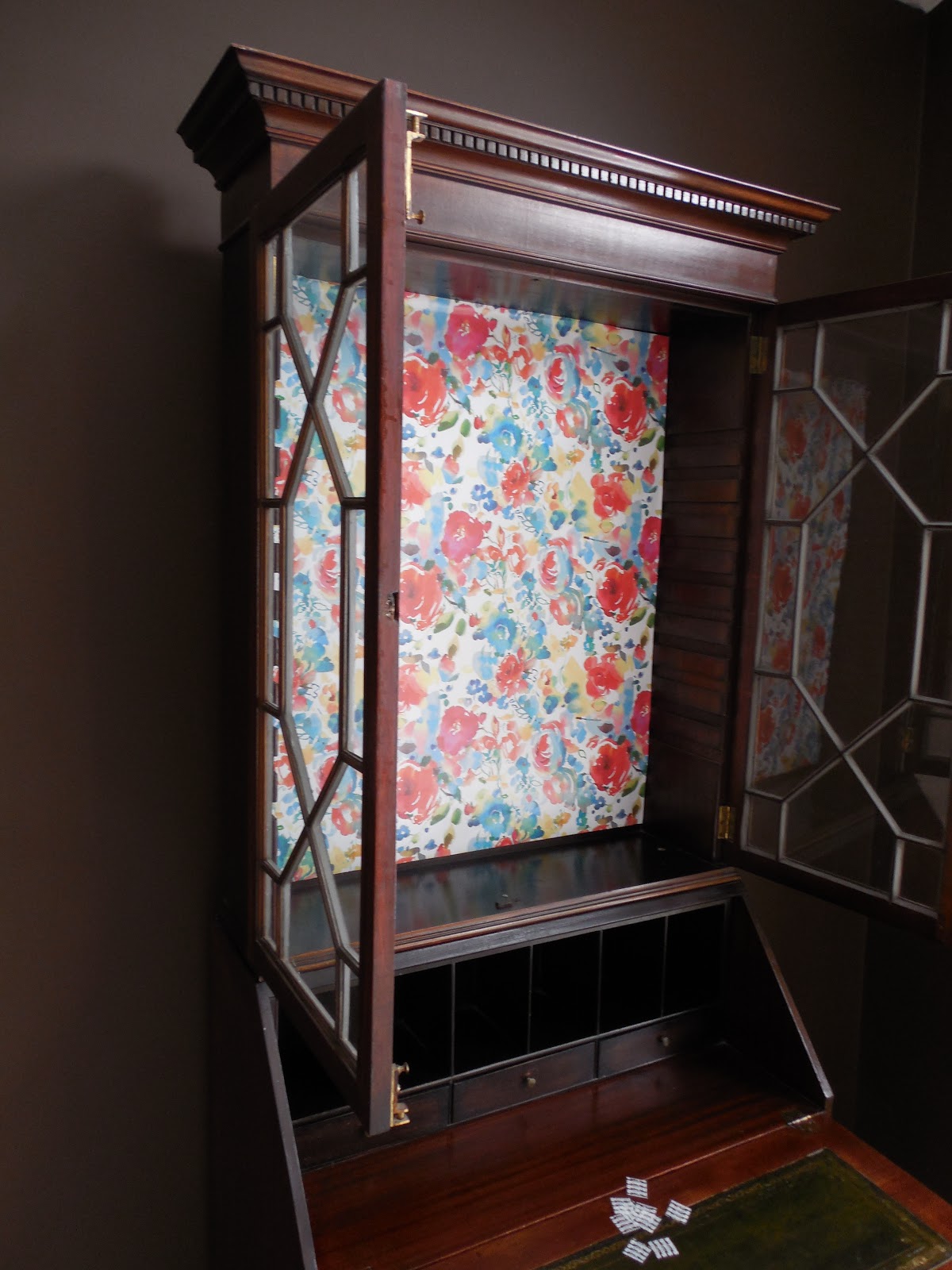
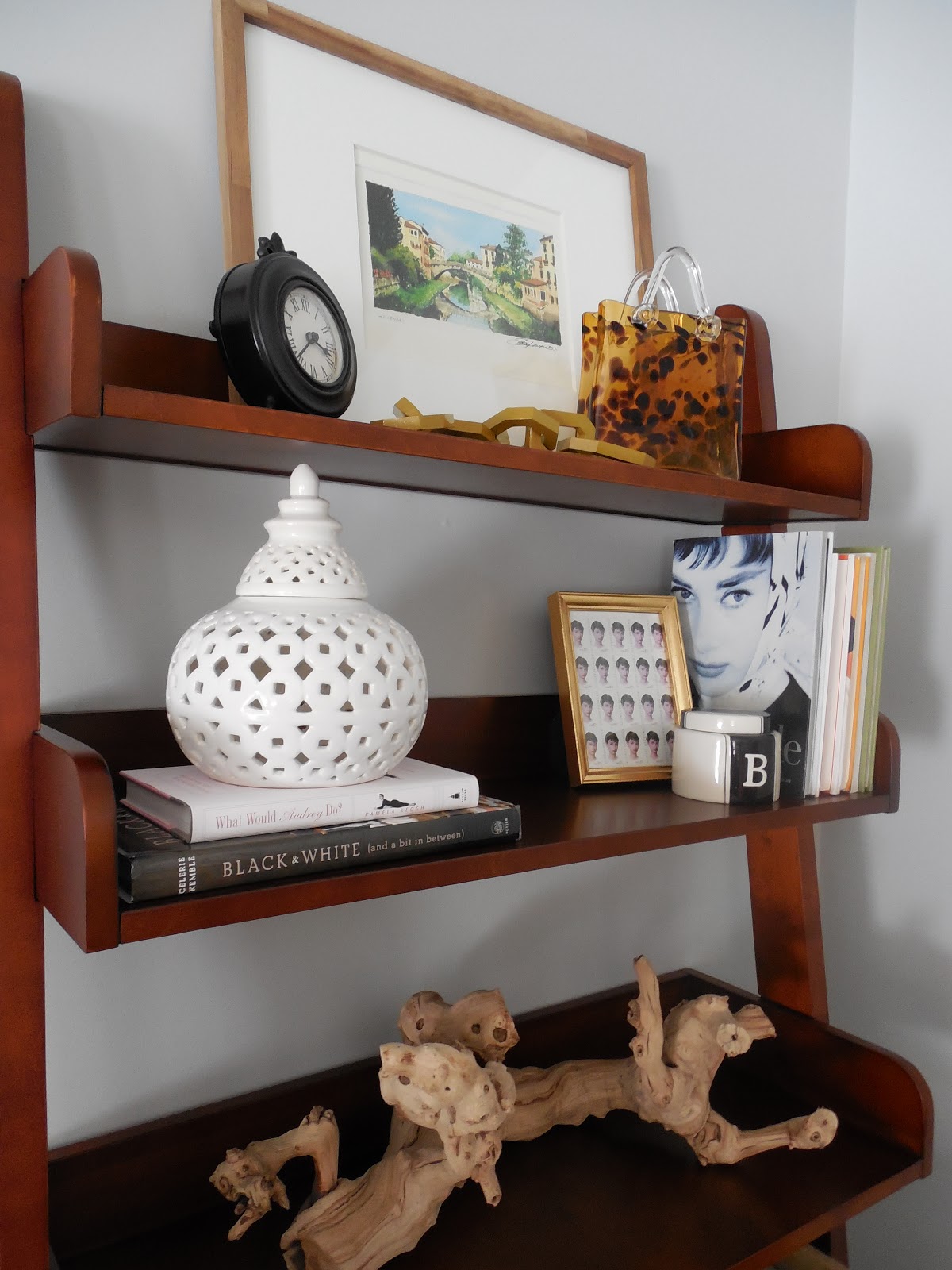
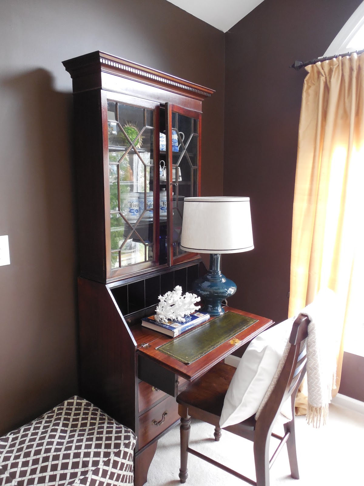
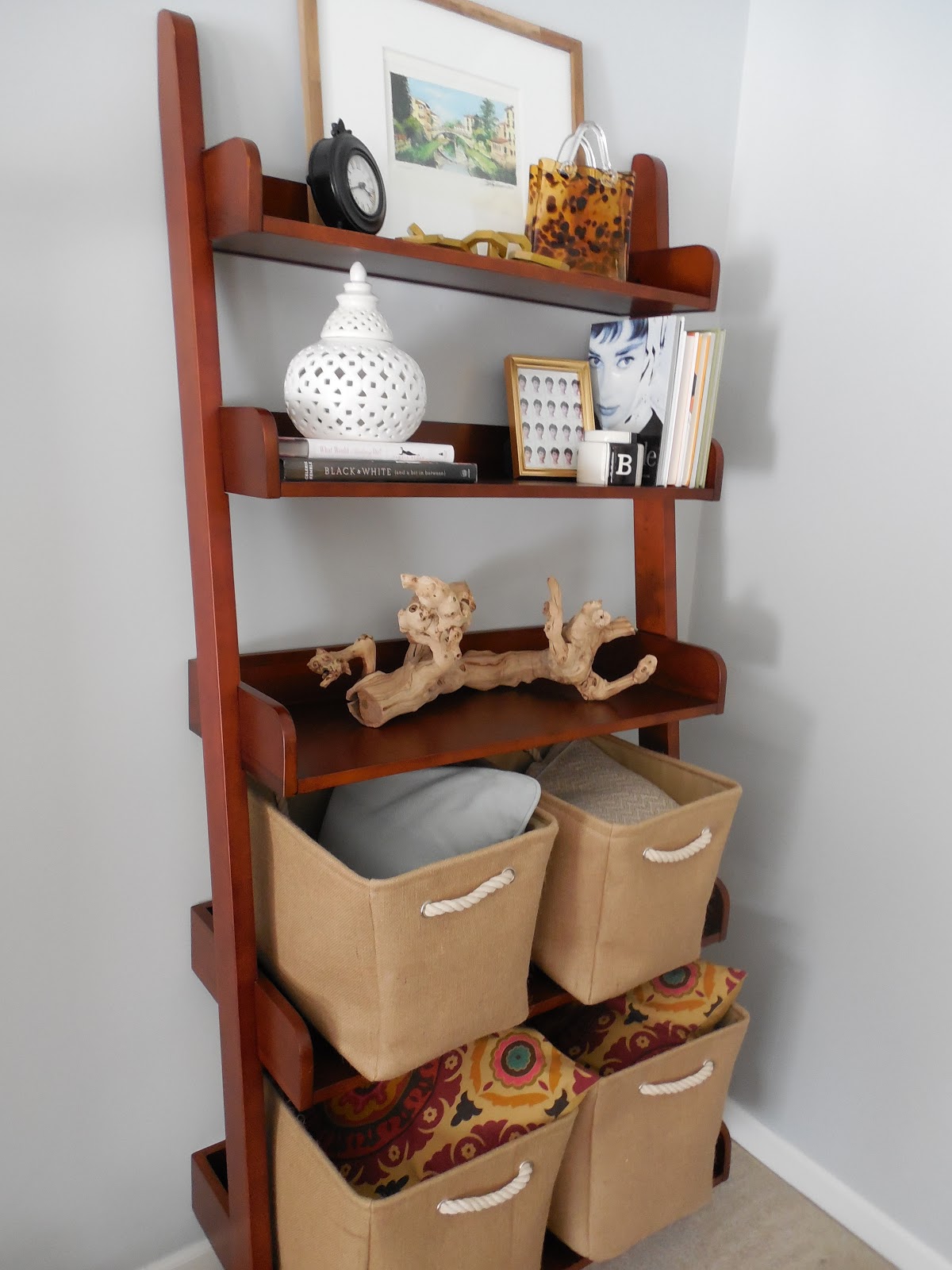
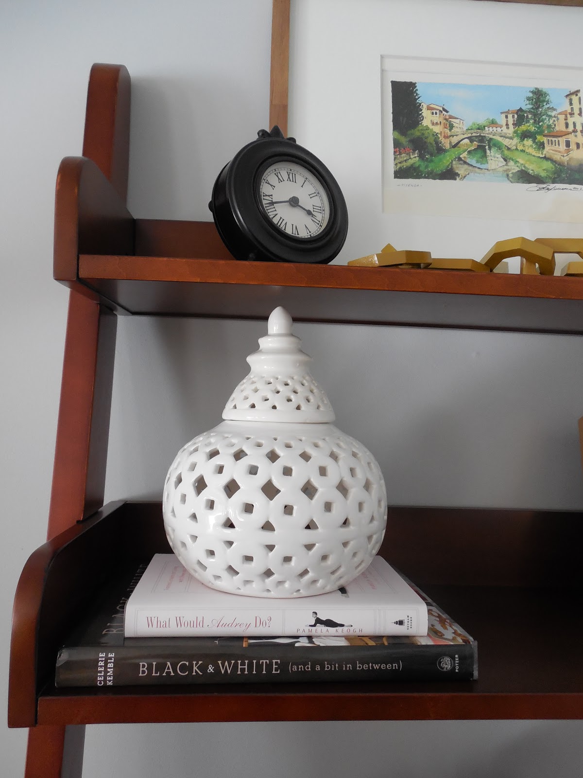
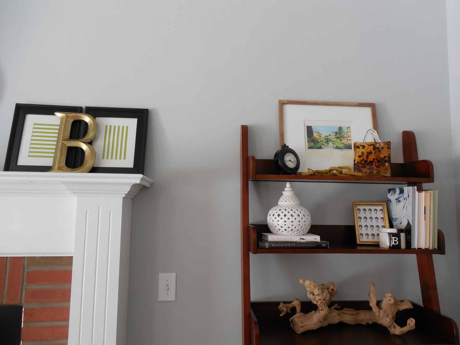
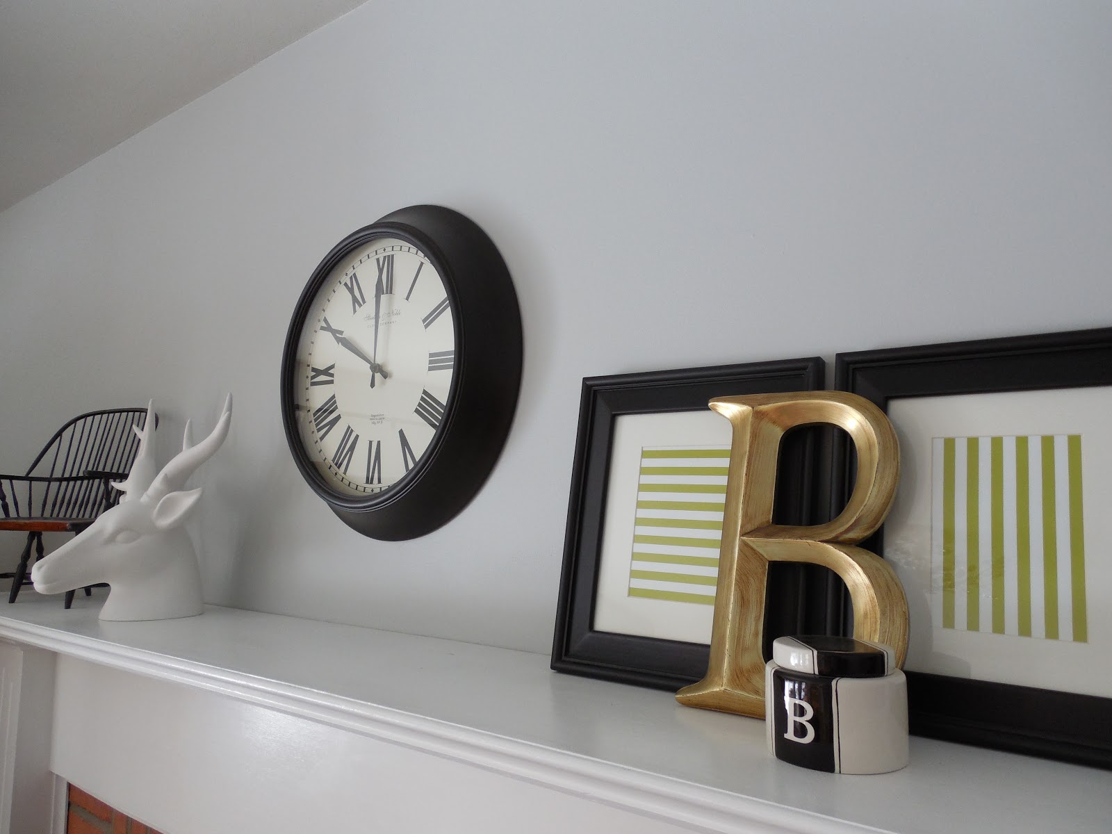
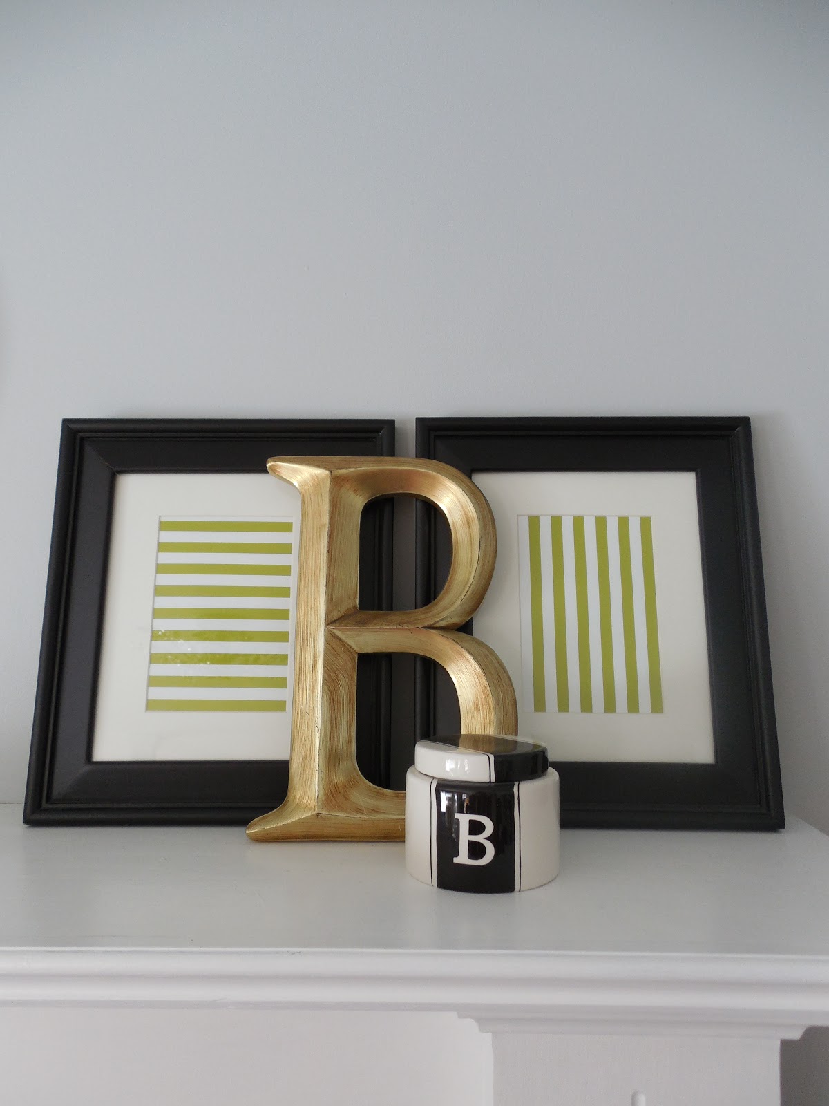
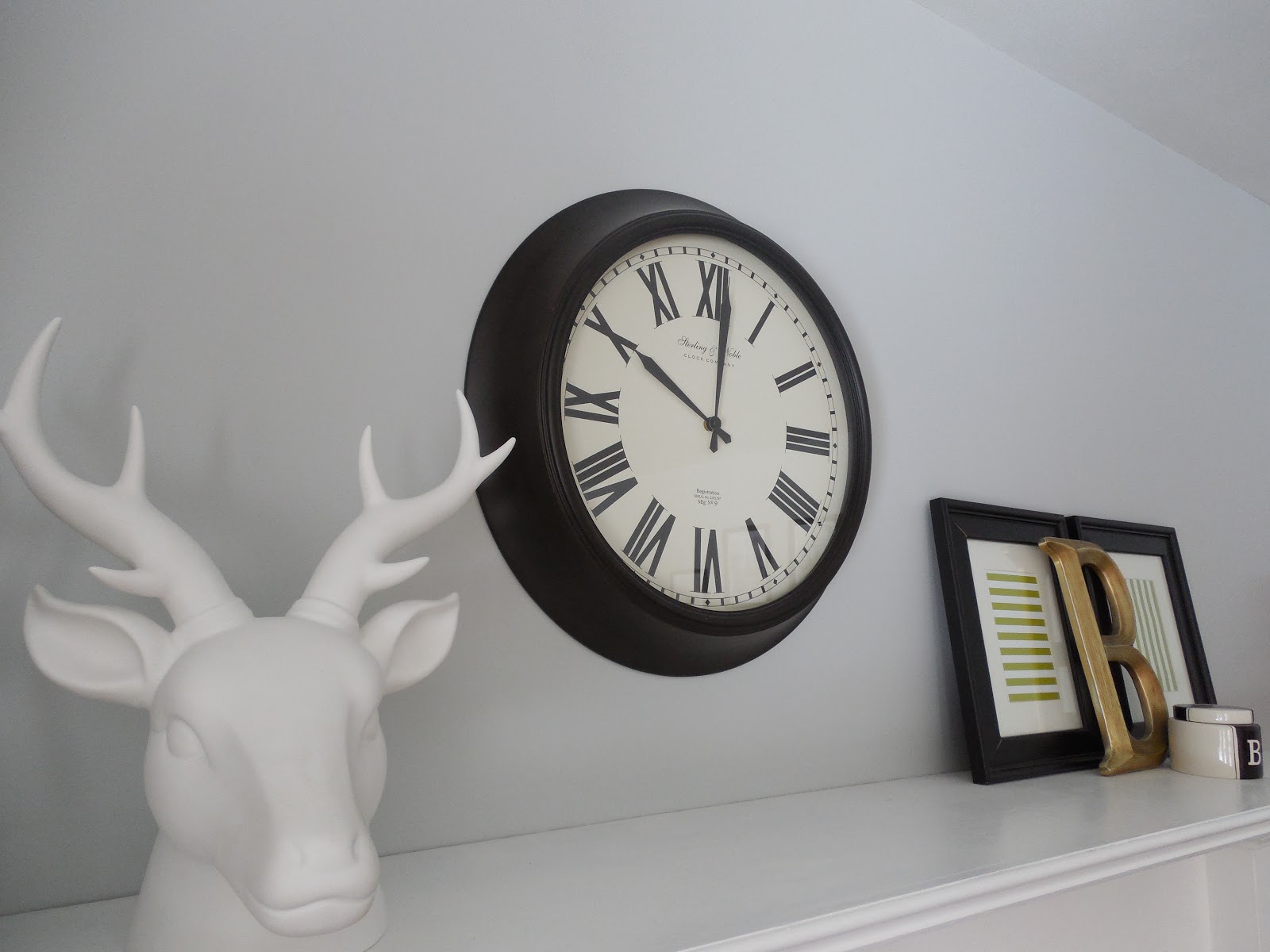
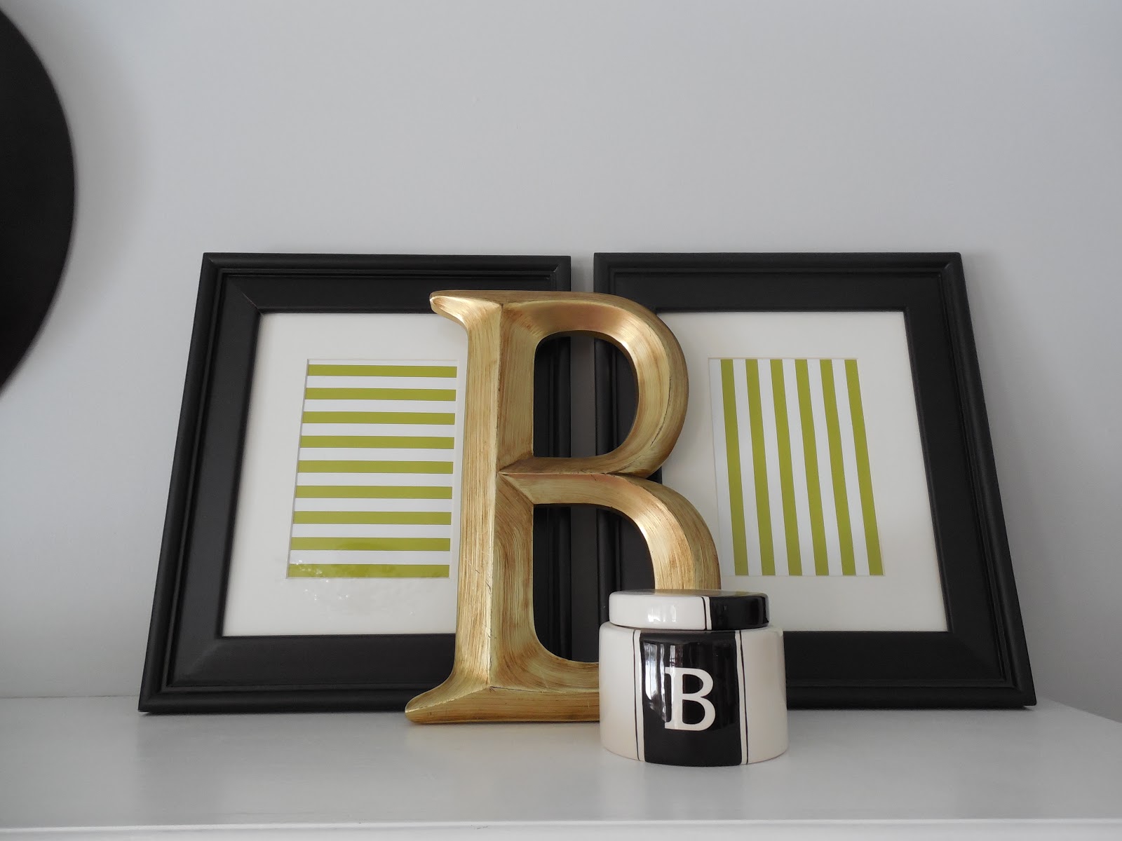
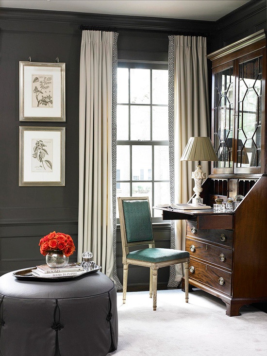
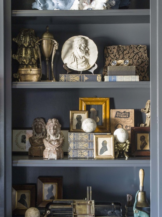
In my last post, I mentioned that I was looking for a floral paper to use for the back of my secretary shelves. After reading Emily’s suggestion to try a bright floral, I knew this would be a great option for the room. The wood is a very dark mahogany which I love, but the accessories were getting lost in the space.

Before the Paper

I didn’t want to choose anything permanent, because I didn’t want to ruin the wood finish on the antique piece. How can I make this paper removeable without compromising the wood underneath? Blog friend Pam suggested using double stick removeable poster tape. I went to Jo Ann fabrics, and did just that! While I was out, I thought I might browse through their fabrics to see if I could find something to line the back of the shelves with. I did find some great fabrics, but didn’t want to spend $20-$40 on something that I might want to switch out later. {By the way, did you know that Jo Ann Fabrics now sells an HGTV line of fabrics? They are pricey, but beautiful! I think I’ll wait for a great sale!} So back to the drawing board. I left with the tape and decided to go into Target, since they usually have pretty cool wrapping paper. And there it was- a beautiful vintage looking wrapping paper for $3.99! I immediately loved it and decided this was the one! And if I didn’t love it on the desk, at least it would be great for wrapping presents. Here is the paper and tape I found…

The Materials

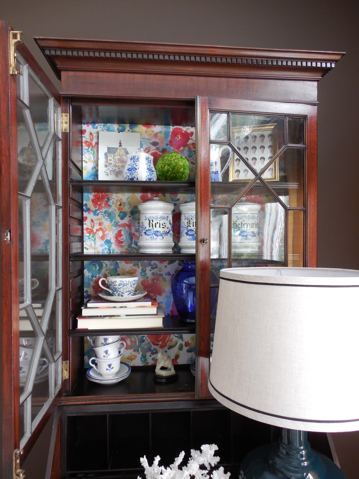
Since this paper has a white background, I knew it would brighten up the dark wood and make a difference in how the accessories stand out. Luckily, the shelves slide right out, so it was easy to place one large piece of paper on the back of the shelves. Here is the process..

Without the Shelves

I needed about a 2×3 piece of paper for this project. I cut it to size and made minor adjustments to the paper before attaching the tape to the back of the desk. I placed about 9 pieces of double stick tape to the back of the desk, making sure I got the corners and the center. When the shelves are put back into place, I knew that would also hold it well.

Attaching the Tape

Those little square pieces you see are the double stick tape. It was great to work with, because if I didn’t get the paper in the exact spot I wanted, it was easy to remove and start over. {Which happened about 3 times!} Here is the paper all ready and wating for the shelves…

Paper is Up

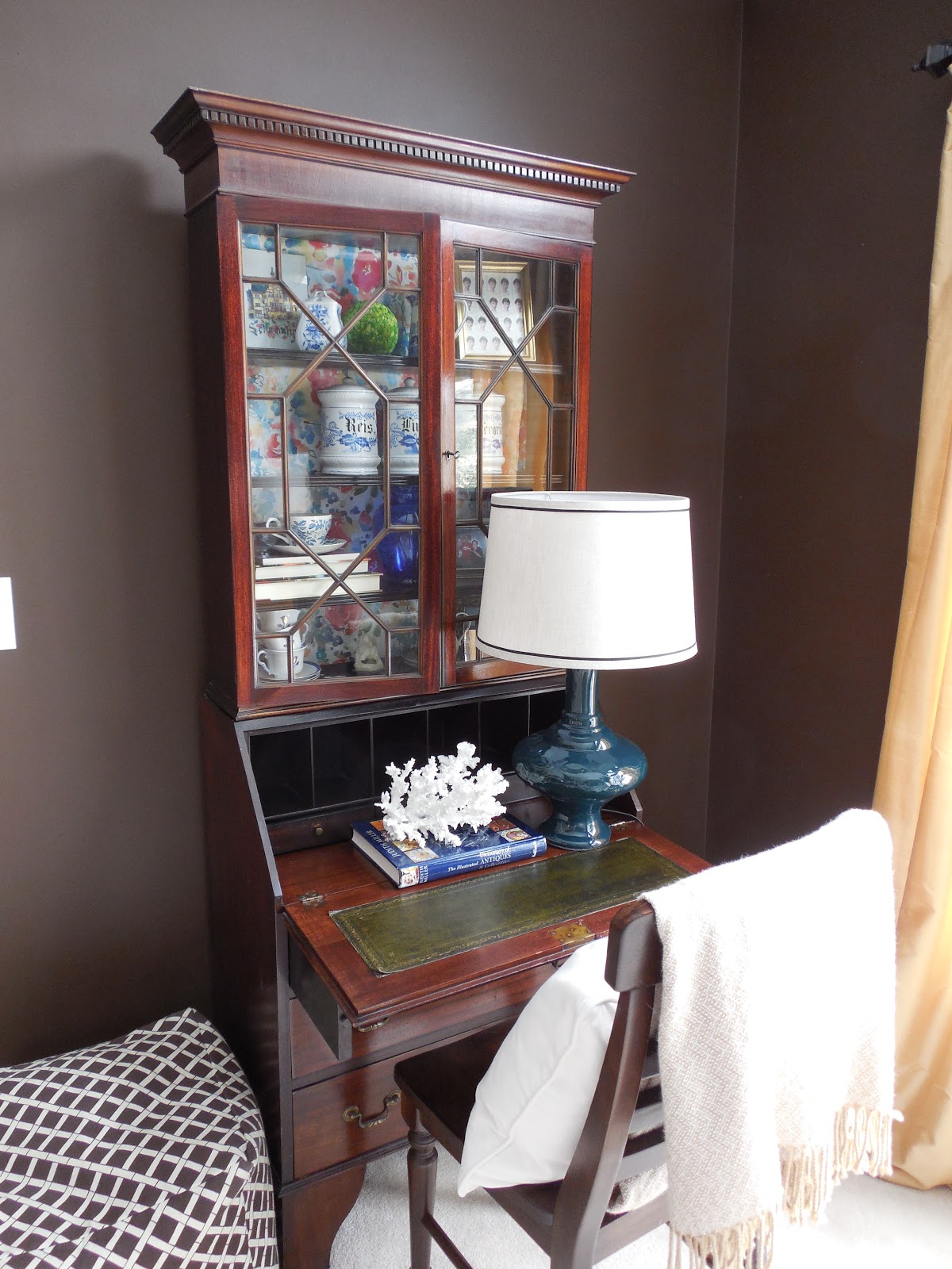
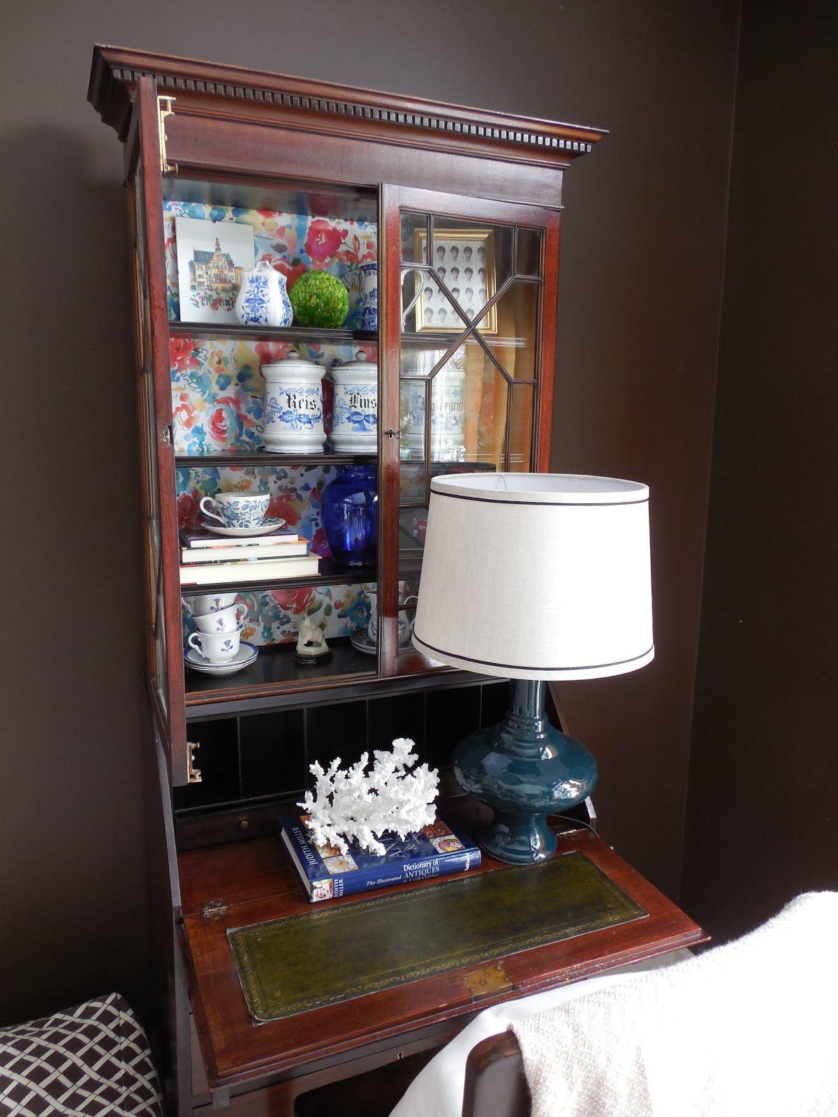
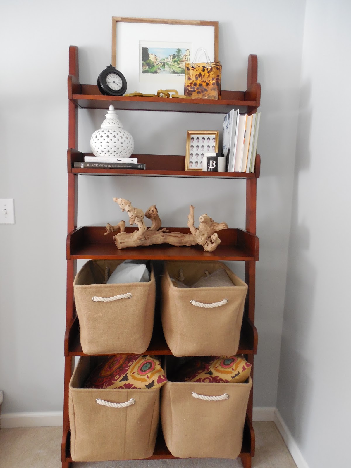
And here is the desk with the shelves installed…

Shelves Are In

And now it’s time for the accessories! I have been changing the styling since the paper went up, so I may even edit it some more. Theare are many options for shelf placement in this desk, so I can always adjust that later on. But here are the afters for now…
After


I have been having fun with this new change. What I love most, is that it’s versatile and can easily be changed when I come across a new paper or fabric that I love! All of the accessories were already in my home. I just shopped around my house and changed things up a bit. I only spent $3.99 on the wrapping paper! Just to recap, here is another before, without the paper…
Before
And After
Have you ever tried to use wrapping paper for projects that don’t include wrapping presents??

{Trendspotting} Whimsical Design

March 22, 2013 by Amber Filed Under: design, flowers, personal design style, wallpaper


If you follow me on instagram {AmberBInteriors}, then you know we just got about 6 more inches of snow last night! Really?? I am definitely ready for spring. So even if we don’t have spring weather here yet, I can think about warm days through design ideas. The new trend in interiors is leaning more towards whimsical florals. I love the sweet, inviting charm of flowers in any form. Here are some great ways to splash some whimsical design into your home…

via
Not many people can pull off florals as well as Bailey!
via
via
via
via
Flowers can also be incorporated in just the accessories, like the two images above. The above living room is awakened with vases of fresh flowers!
 ï»¿Our foyer
Have you embraced the floral trend?? Large or small doses?
When I presented my dilemma HERE about what to line the back of my secretary shelves with, blog friend Emily suggested in her comments to find a bright floral paper to brighten up the dark wood. I love the idea and I’m on the hunt! 

Styling Tips and Tricks

March 19, 2013 by Amber Filed Under: design, e-decorating, e-design, personal design style, shelf styling, styling


When putting together e-design boards for my clients or decorating my own home, my focus is always on the accessories. They are the icing on the cake and take a space to the next level. The accessories are usually what gets noticed when company is over and can be a great way to show your personal design style. They are also great when updating a room on a budget, because amazing accessories can draw your eye away from an old sofa or outdated furniture. Here are my tips and tricks for styling!

Layering is Key
When thinking about shelves, art can lean on the shelf while smaller accessories sit in front. Layering your accessories adds depth and dimension to your shelves. And they actually make your shelves look bigger!

Our Family Room
Balance and Texture
When restyling your shelves, it’s best to take everything off and start fresh. {Which is also the time I dust the shelves!} Shop around your home for unique finds with different shapes and textures. I always tell clients to pair something flat with something sculptural and the everyday with something unique. A tried and true styling trick is to pair a stack of books with a pretty sculptural piece on top!

Source: bstylewise.blogspot.com via Amber on Pinterest

The picture above also shows how you can color code your books to give that rainbow effect. It’s a great trick when you have so many colorful books. All of a sudden, it’s well put together and thoughtful!

Turn Your Books Around
If you want to give your shelves a more neutral look, turn your books around so the pages show! It’s a subtle look and creates a softer, more subdued feel in the room.

via
Line the Back of Your Shelves
To bring texture and another color or pattern to your shelves, line the back with pretty paper! You could go as easy as attaching craft/wrapping paper with double stick tape or line the back with wallpaper. You could also paint the back of the shelves, like the image below. If the back of the shelves were the wall color in this room, the accessories would not stand out as much.
Source: google.com via Amber on Pinterest
via
Mix Tall and Small Pieces
This is a great way to get that layered, collected over time look to your shelves. Pairing tall vases with small accessory pieces adds more depth and looks great!
via
I am in the process of choosing something fun to line the back of my secretary shelves. Since this is an antique piece and I love the wood’s finish, I don’t want to paint or permanently cover the back in any way. I am thinking of using some type of paper and attaching it with double stick tape. Any thoughts on color or pattern?
Our Living Room
I saw a faux bois paper that might work. Also, if you have any other better suggestions instead of using double stick tape, I’m all ears! Whatever you think is best to preserve the wood.

Some Pins I Am Loving

March 12, 2013 by Amber Filed Under: design, inspiration, personal design style, pinterest, style


I have been pinning like crazy on pinterest! There is so much great inspiration out there, so I thought I would put together a little collection of my recent finds, ideas I want to try and all time favorites.

Here we go…

via

If there’s space in your living room, I love the idea of adding a console behind the sofa that doubles as a desk. Even better, using inexpensive materials to achieve the look. This looks like they used plumbing pipes to make the desk legs. I hope to make bookshelves with a similar look for our home. More on that later…

via
In the right space, I love dark, moody walls. It looks like this bedroom gets a lot of natural light and has a great balance of creamy white, to tone down the dark walls. I will go moody and dark in our office this spring. This color to be exact!
via
I have admired industrial style chairs like these for a while! Nicole’s dining room is fabulous, and there are so many amazing elements in this room. I love the balance of the metal with the wood. This is the plan for our kitchen someday!
via
This bedroom is both stunning and casual! I love symmetry in bedroom design, and this styling has it down to perfection! I am doing some similar styling for a client’s bedroom, and this is great inspiration. I am also loving bird art at the moment, and these whimsical framed prints are beautiful in this space.
via
How sweet is the above image?!? I used a similar idea for a client’s dining room table, and I might just have to do this myself. When my mom and I head out to the antique fest this summer, I will be on the hunt for vintage glasses and vases to recreate this look! It’s simple, can be inexpensive, and you can use greenery from your yard! I feel a new dining table centerpiece coming on!
So that’s my inspiration for the week! Any great finds lately??

{A Client’s Before and After} The Keeping Room

February 28, 2013 by Amber Filed Under: design, e-decorating, e-design, personal design style


You are in for a treat today! Yesterday, I opened up my inbox and saw an amazing collection of after photos from a recent e-design project. The project was for a keeping room, directly off of the client’s kitchen. They use this space as a main gathering area and it needs to be a functional, casual and stylish place for this fun family. My client loves splashes of color and wanted to give it a chic, modern edge. Here is a before picture of the room:

Before

 The space is already gorgeous to begin with! I love all of the natural light and vaulted ceilings. Here is the design board I came up with:

My client already had the chevron rug and chiang mai pillows. We also kept the existing wall color, television and media console. We switched out the seating, added new side tables, colorful accessories and art. And here are the afters…

After

My client is over the moon excited, and I am so thrilled with that! She did a wonderful job putting the space together and had great attention to detail when placing the accessories. I chose art and accessories that had colors pulled from the chiang mai pillows. I like how the pops of color are just sprinkled throughout the room, keeping the overall space neutral and airy like the rest of her home. With the color only in the accessories, the client is able to switch things out over time, when new favorite colors emerge. Also, she can move things from room to room to change things up, since this space flows with the rest of her home.

We are now working on her basement, which is coming along great! With e-design, you aren’t able to see the space in person, so it is so wonderful when you can see the vision come together. And this client has become like a friend, and I love it when that happens! I truly get to work with such amazing people, and for that I am so grateful. A big thank you to her for letting me share these pictures!

Next up, I will show you the DIY art project she created for the basement!

{Before and After} Shelf Styling in Our Family Room

February 25, 2013 by Amber Filed Under: design, personal design style, shelf styling, styling


As we all know, a house is never done. There are accessories to move around and things to change. I’m ok with that, since I don’t like an accessory in one spot for long. I am always moving things from room to room and shopping around my home for changes. Here are some recent changes I made to our family room shelves…

Before

And here are the changes…

After

To keep it real, I actually didn’t just ‘shop around my home’ for all of these accessories. I’ve been doing some store shopping, lately! But, half of the things are from other areas in my home!  ๐Ÿ™‚ Starting with the top shelf, I swapped out two smaller prints for one large print. I like that it draws your eye up, which gives the illusion of more space. It’s a print from Italy that we had in another part of our home. The tortoise shell vase just switched sides and the chain accessory was from Target. It’s from the Nate Berkus line and it’s now on clearance!

For the second shelf, I brought in books from other parts of the home and also used some that we already had on this bookshelf. The clock was just moved to the top shelf. The ‘B’ candle jar was from our mantel and the Audrey Hepburn frame was from our dining room. I just found the white ginger jar at TJ Maxx for $12.99!

For the third shelf, the white tray and coral now sit on a dresser in the living room. If you follow me on instagram {AmberBInteriors}, then you know I just scooped up this grapewood branch at Pier 1 Imports. I had been eyeing it for a while and decided to go for it. I’m so happy I did, as it’s large enough to have a shelf of its own. You can pick one up HERE.

For the fourth and fifth shelves, I found these amazing baskets at TJ Maxx. The fabric has great texture and adds a casual/ rustic quality to the room. They can fit everything from pillows and blankets to board games.

One more before…

Before

And After…

After

To give you an idea of where this shelf is in our family room, here’s a little snapshot..
I wrote about the striped art prints on the fireplace HERE. I chose the green striped wrapping paper, because I liked how it worked with the Italy print from the top shelf.
Have you found any great deals lately… from shopping at a store, or your own home??  ๐Ÿ™‚

{Trendspotting} Mixing Metals

February 24, 2013 by Amber Filed Under: design, design theories, personal design style


In my latest i village feature, I was asked to name a big design trend happening in 2013. It didn’t take me long to think about mixing metal finishes for a room. To achieve a layered, eclectic look in a space, a brushed nickel lamp base can sit near a brass accessory, without worry. Just like it’s fun to mix jewlery with gold and silver in one outfit, the same can be done with your space. I’ve always been in the thought to ‘include the things you love’ in your home. If you absolutely love it, then it works! Here are some spaces that achieve a layered, collected look by mixing metals and forgetting the design rules.

Bronze with Chrome

Source: houzz.com via Napolitano on Pinterest

Iron and Brass

Source: houzz.com via Tina on Pinterest

Bronze and Brass

Source: simpledwellings.blogspot.com via Shannon on Pinterest

Stainless Steel and Bronze

Source: houzz.com via Baldwin on Pinterest

Brass and Chrome

Source: houzz.com via Mary Kyryk, Interior Decorator on Pinterest

When you see specific examples, you realize that it’s not so obvious. These spaces just look layered, well balanced and personal to the homeowner.

Have you mixed your metals lately??
Will you be watching the Oscars tonight? I always get excited to see what everyone’s wearing. Isn’t that why we all watch??

What is the A La Carte Option All About?

February 21, 2013 by Amber Filed Under: design, e-decorating, e-design


When I show you my recent design work, I realized that I don’t usually include an a la carte board. If you were to choose an A La Carte Design package, that could include drapery selection, sofa pillows, gallery wall ideas, just to name a few. It’s priced per room and is a great way to have design services for one particular item. My most recent client was looking for matching table lamps for one of her rooms. With this design option, I presented a board with three choices, all fitting within budget and style.

{click on board to make larger}

For this particular board, I also included a few styling ideas to give the client a design vision for the tables.

This design package would also work for:

-Resale Styling Tips
-Paint Color Selection
-Area Rug Ideas

Visit my Design Services links either at the top of my blog or on my sidebar, and scroll to the bottom to see this design package!

And thank you to the Room Mates Decor blog for featuring my mom’s amazing chevron stairs! Stop by and check it out here.

DIY: Wrapping Paper Art

February 17, 2013 by Amber Filed Under: design, DIY, great deal, project


As I was in TJ Maxx the other day, {my favorite brick and mortar store} I came across pretty striped wrapping paper. While some may just view it as great paper for wrapping presents, I had other plans! Our fireplace mantel still had frames with Christmas paper inside, so I thought I should switch that out fairly soon. {I know… Christmas was over long ago!} Here is our mantel, starting to get ready for spring…

All I did was open the frame and cut the wrapping paper to size! I decided to use the same paper for both frames, but change the direction of the stripes to make it look a bit different. I still have a ton of paper left for wrapping presents for any holiday! The green would work for any age and gender! {I could even save it for Christmas presents for next year. Imagine this paper with a big red bow!}

Since I already had the matted frames, that’s two pieces of art for $3.99! Not bad.

Have you finished any inexpensive decor projects lately??
Do tell… I will include them in a new post!

Dark, Moody Rooms

February 8, 2013 by Amber Filed Under: design, e-decorating, e-design, paint colors, personal design style


I recently wrapped up an e-design project where we went super dark with the master bedroom walls. The chosen color was Graphite by Benjamin Moore, and it’s gorgeous!

Since this client has a ton of natural light in this space, it was just the moodiness we needed without it being too much. Just picture this color with ivory and brass accents! Here is Graphite in other amazing rooms found via pinterest…

via
via
via
And here is the Master Bedroom e-design board I created for this client…
{Click on board to make larger}
Can’t wait to see it all come together! How about you… have you painted any walls super dark??

  • « Previous Page
  • 1
  • …
  • 19
  • 20
  • 21
  • 22
  • 23
  • …
  • 26
  • Next Page »
Welcome!

Hi, I'm Amber... a wife, mom and interior decorator. I am the writer of Simple Dwellings and the designer behind Amber B Design. Blog topics are all things design, with the occasional DIY attempt! Thanks for stopping by Read more...

  • Bloglovin
  • Email
  • Instagram
  • Pinterest
  • Twitter

Blog Posts, Straight to Your Inbox

Popular Projects

A dining room with white walls and wooden table.
A black door with white curtains and a red chair
A staircase with black and white chevron pattern on the steps.

Blog Love

  • Addison’s Wonderland
  • A Thoughtful Place
  • Alison Giese Interiors
  • Amber Interiors
  • Bailey McCarthy
  • Caitlin Wilson
  • Chris Loves Julia
  • Classic Casual Home
  • Cottage and Vine
  • Design Indulgence
  • Dwell by Cheryl
  • Eddie Ross
  • Elements of Style
  • Emily A Clark
  • Emily Henderson
  • Gallery No Eight
  • Hi Sugarplum
  • House of Jade
  • Jana Bek
  • Juniper Home
  • Kate Marker Interiors
  • Lucy Williams
  • Monika Hibbs
  • Our Fifth House
  • Pencil and Paper Co
  • Rachel Parcell
  • Rambling Renovators
  • Pure Style Home
  • Sita Montgomery
  • Studio Mcgee
  • The Makerista
  • The White Buffalo Styling Co
  • the Zhush
  • Traci Zeller
  • Young House Love

Copyright Amber B Design © 2025 ยท Design by Britt Douglas