Amber B Design Studio

Interior Design & Decoration for the South Florida region

  • Home
  • About
  • Services
  • Portfolio
  • Blog
  • Press
  • Contact

{Before and After} E-Design Gallery Wall

April 19, 2013 by Amber Filed Under: before and after, design, e-decorating, e-design, gallery walls


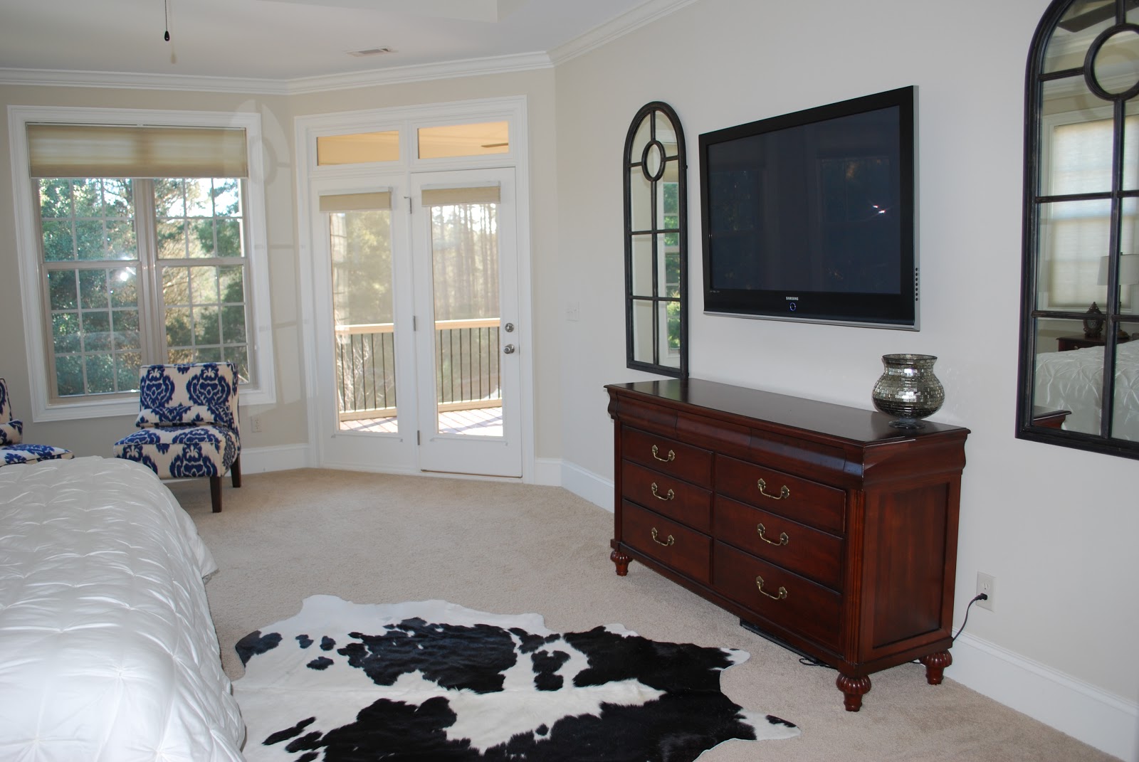
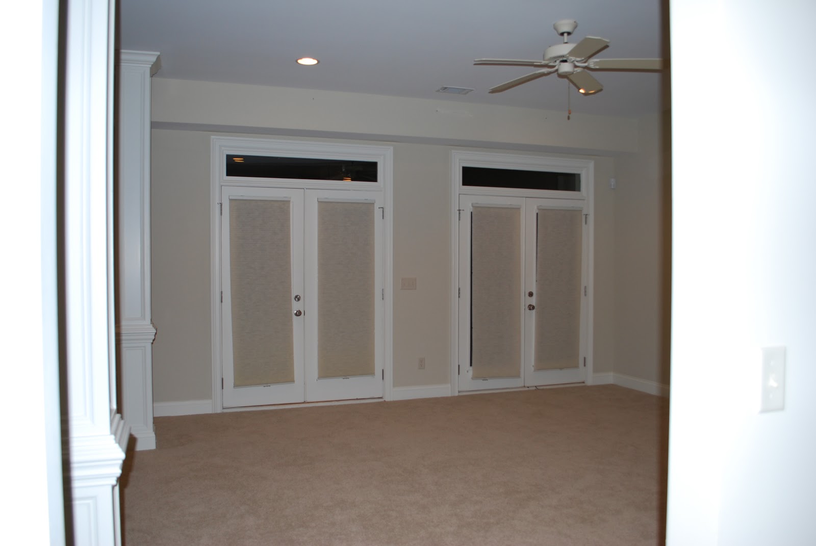
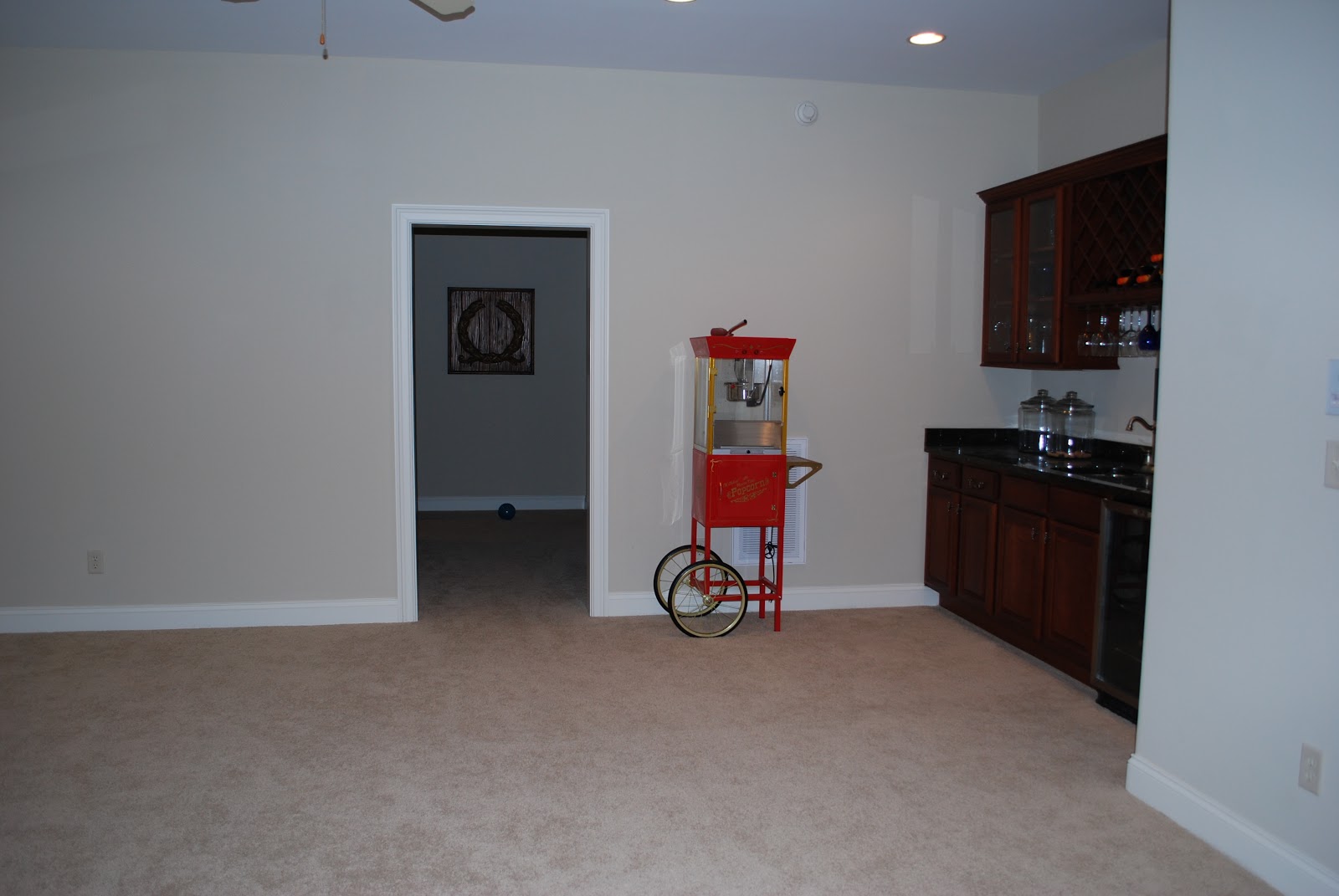
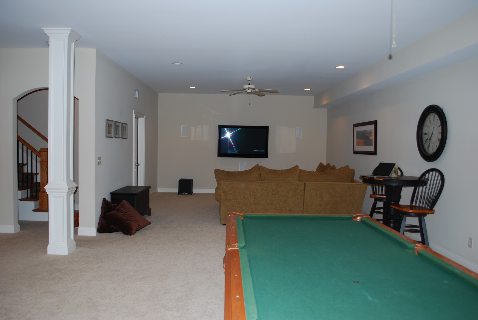
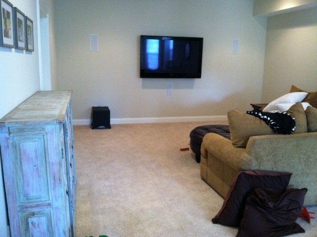
I have really been in the before and after mood when it comes to my recent posts. I think we all love to see how a space can come together, especially when you’re able to see where it began. My client wanted to add some modern elements to her beautifully finished basement. She already had the television and most furniture pieces, but wanted to make the space truly complete.

Before

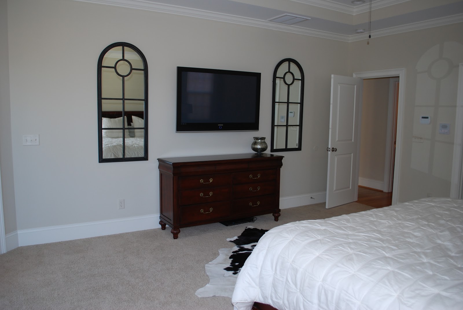
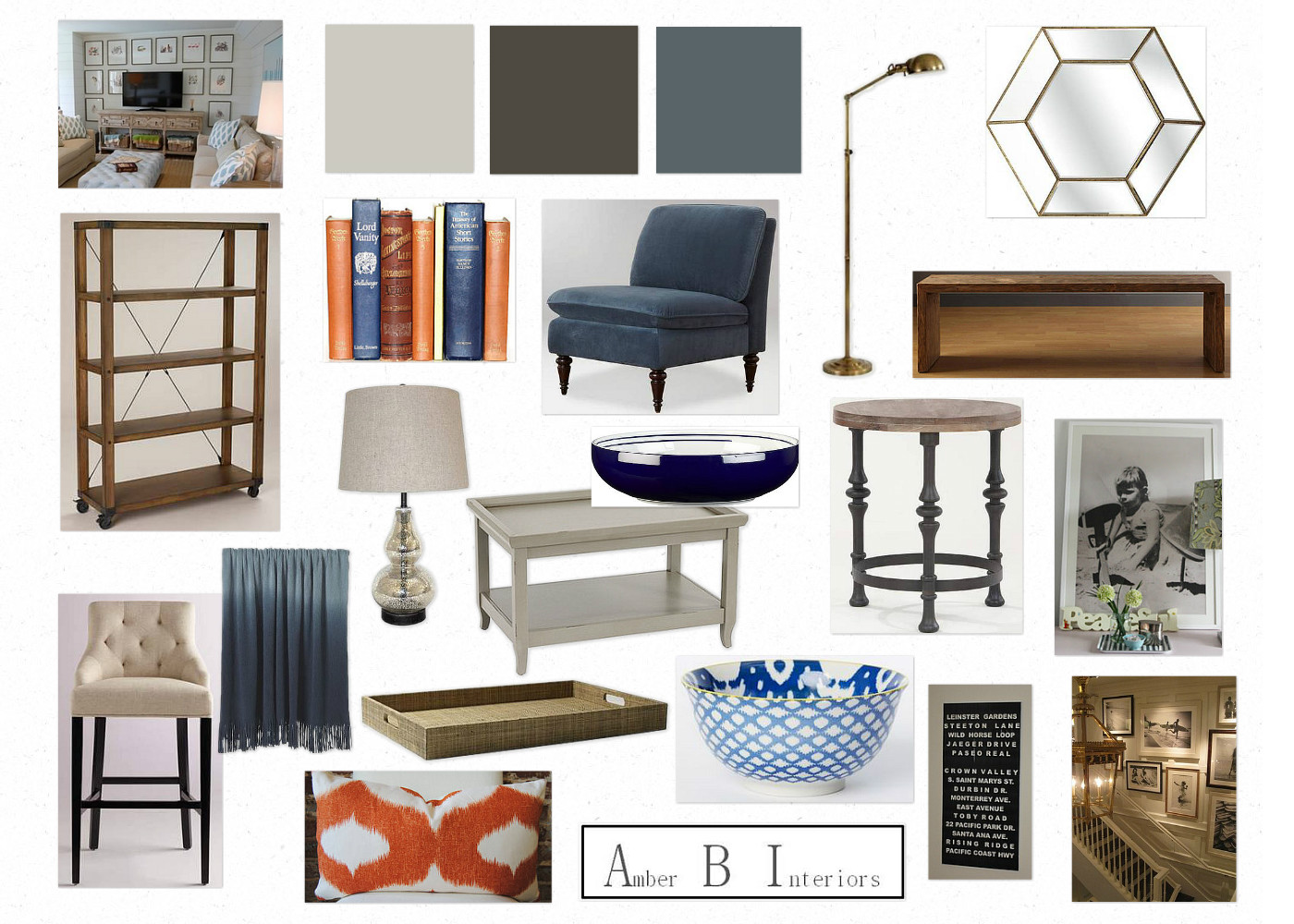
When I saw her TV wall, I immediately thought of surrounding it with a symmetrical gallery wall of framed art. Here are the inspiration images I used…

Inspiration

Source: centsationalgirl.com via Amber B Interiors on Pinterest
Source: hookedonhouses.net via Amber B Interiors on Pinterest

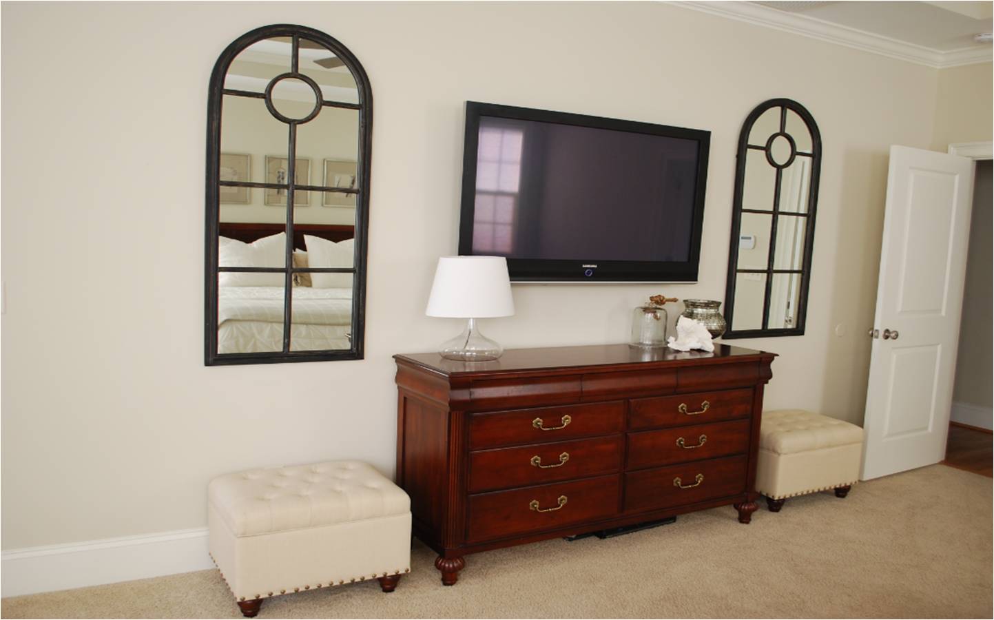
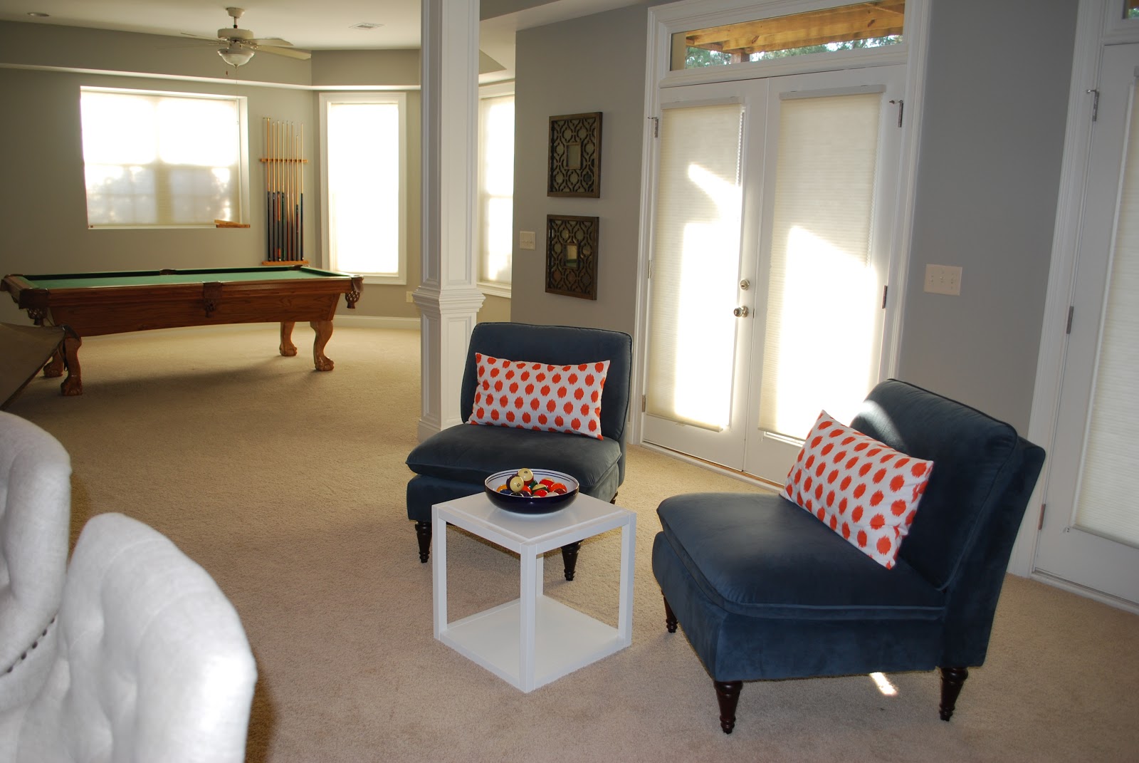
My client did an amazing job hanging this symmetrical gallery wall. I love great symmetry! Here are the afters…
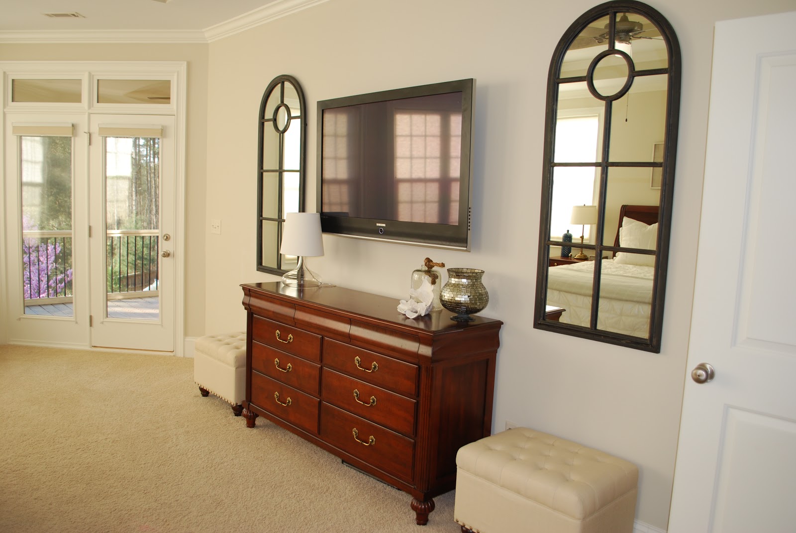
After

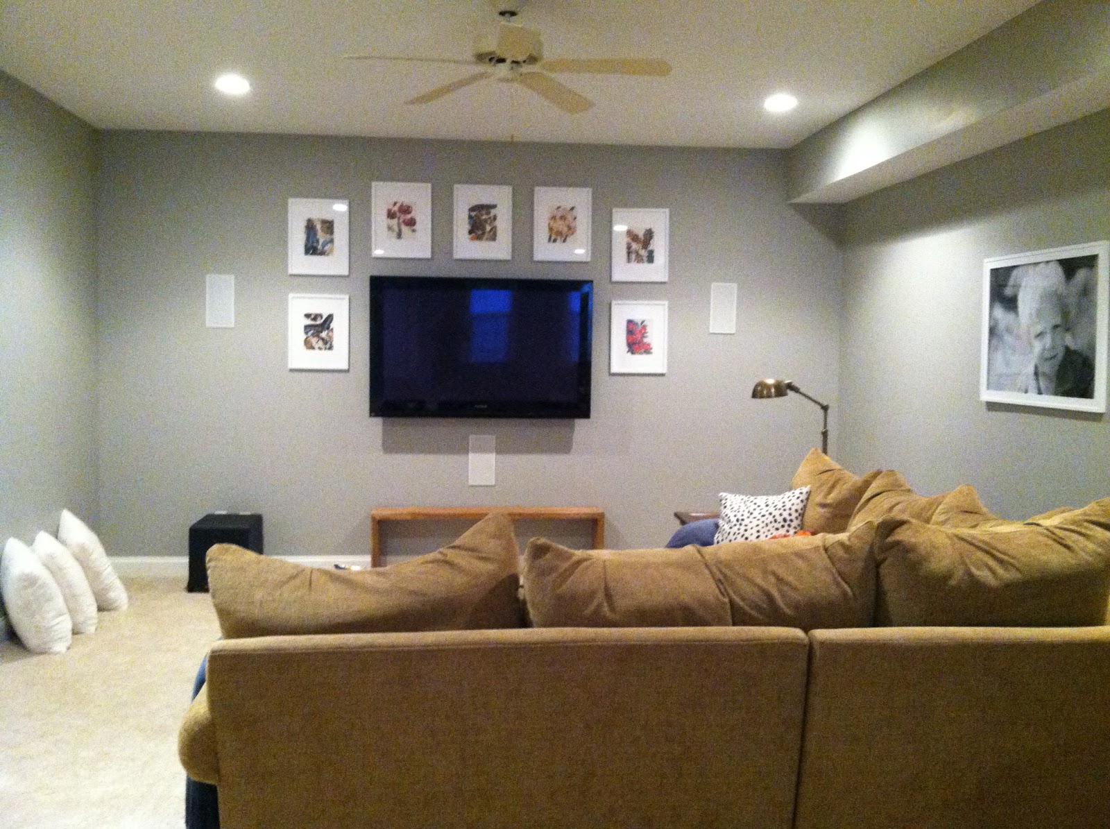
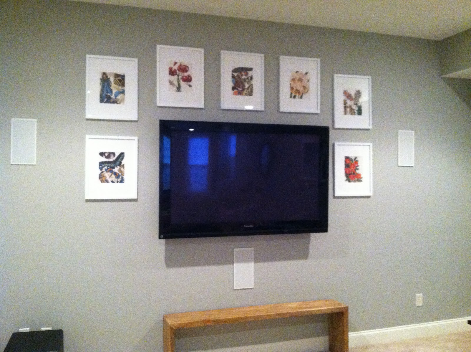
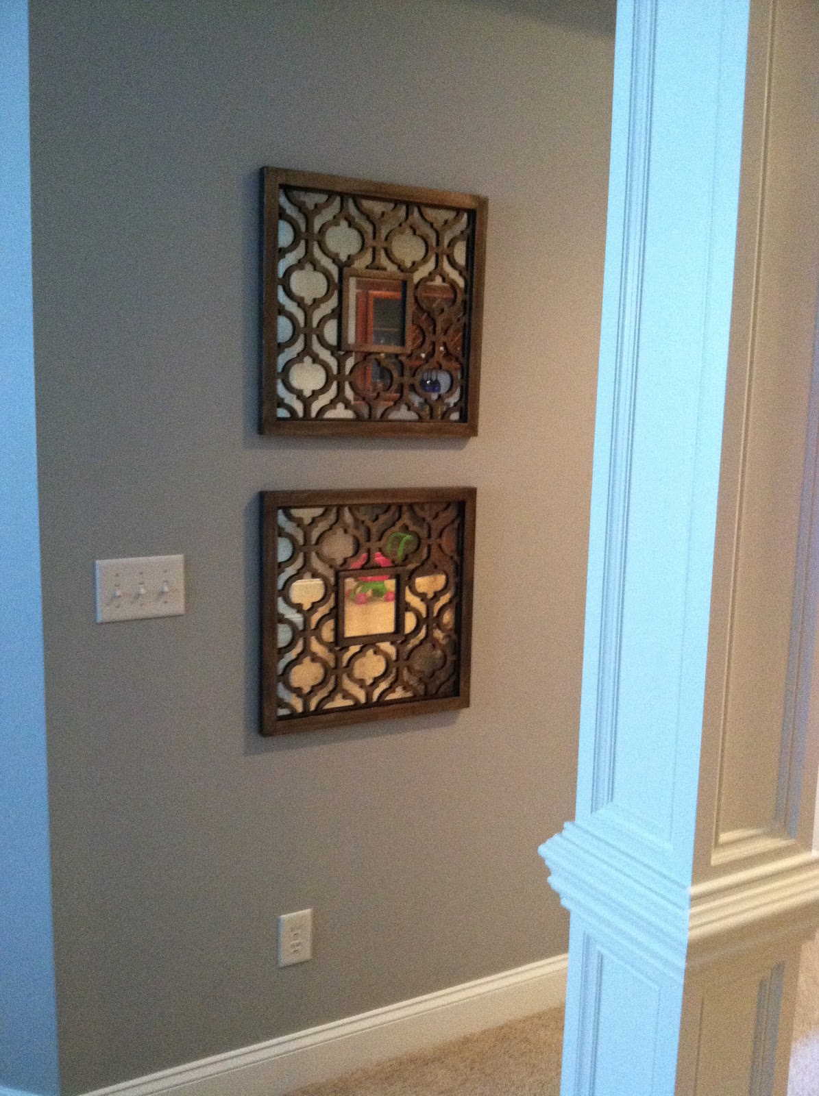
The new bench can be pulled out for additional seating when needed and also helps fill this space when not in use. The framed botanical prints are actually from a wonderful coffee table book. I suggested that she use the prints she liked best and that best matched the color scheme for the room. Over time, this gallery wall can also continue to grow with more botanical prints and make the art extend towards the floor. I think the new art wall does a great job taking your eye away from the built in wall speakers. My client is so happy with the results and glad that she hung the gallery wall. I am so happy that it worked out!

If you would like to work together to create a space you love, visit my design services page to get started! I am currently booking clients for the summer and even have a couple of spots open in May.

Picture Outtakes from Woman’s World Magazine Feature

April 18, 2013 by Amber Filed Under: chevron, design, foyer, magazine feature, mom's inspiration


When Woman’s World magazine contacted me about including my mom’s stairs in a spring feature, they asked if I could reshoot the pictures to include yellow flowers. The article was about a black + white + yellow color scheme and we were missing the cheery yellow color. So after picking up pretty yellow spider mums from a local florist, I went crazy taking a bunch of pictures and trying out a few different pots and vases. I wanted to make sure they had plenty of options to choose from! The editor mentioned choosing a fairly neutral pot, so the stairs and color scheme would take center stage.

First, let’s look at the picture that did make the cut…

And here is a sampling of the many, many pictures I took over the course of two days…

See- I told you I gave plenty of options! You would be shocked to know how many other pictures there are, too! Sometimes, you only get one chance to make a good impression, so you might as well go for it and do the best you can. It’s so fun being able to share this magazine experience with my mom, since we have loved design together for so long. A huge thanks to the hubby for surprising me with a new camera a few days before, which made this all so much fun! I loved trying out the new camera, as you can tell. ๐Ÿ™‚ To see my post about the magazine feature, go here.

{Before and After} A Master Bedroom E-Design Project

April 16, 2013 by Amber Filed Under: before and after, design, e-decorating, e-design, personal design style


As I’ve said before, I love getting after shots of completed e-design projects. These pictures are great to share, since this room is already so beautiful to begin with. This e-design client was looking to add some texture and pattern to her master bedroom. She already had all of the main furniture pieces. I just came in to help add some fun accessories. Here is her space before…

Before…

First, we added some driftwood art for the wall space above the bed. I originally posted about that part of the room here. The art took us in a coastal, masculine, rustic, chic direction, which is a great style for a master bedroom retreat. Here are the afters…

After…

My client is so happy with the space and I love the calm, serene feel the new accessories bring. She did a great job bringing the design vision together. The ottomans beside the dresser are so versatile… when my client wants a change, she can easily move them to the foot of the bed or use them as foot rests with her ikat chairs. I actually cannot take any credit for the last image (ikat chairs vignette). My client already had the ikat chairs and shell and they made the tree stump table themselves! I love the texture it brings to the room. She did a great job taking the pictures, because the mirrors above the dresser beautifully reflects the other side of the room. Thanks so much to my client for allowing me to share these pictures!

A Woman’s World Magazine Feature!

April 12, 2013 by Amber Filed Under: chevron, design, foyer, magazine feature, mom's inspiration


I have to pinch myself a bit to actually believe this just happened, but I’m mentioned in this week’s issue of Woman’s World Magazine!! It is all just so surreal.

I’ll back up a bit and explain how this all came to be. It all started when we were at my mom’s house over Christmas. She had just completed these amazing chevron stairs, and I wanted to write a blog post about it. I posted about it here {on Christmas Eve} and used the pictures my brother had taken with his phone. The pictures started to move around pinterest, which is how the magazine’s home decorating editor found out about this project. Jodi Kahn, the amazing editor I worked with, reached out to me and asked if they could include my mom’s stairs in a spring issue about a black + white + yellow color scheme. The only problem was the original pictures had beautiful poinsetta plants on the stairs, which is a winter flower. They were looking for a spring look. So they asked if I wouldn’t mind taking the pictures again with some bright yellow flowers. I got right to it and found some gorgeous spider mums at a local florist. {My first ‘photo shoot’!} We tried out a few different vases/planters, and they chose to include the milk vases you see above, for the magazine. {They were a great find at Target, by the way!}

I would like to give a huge thank you to my mom for allowing us into her home  and giving the go ahead for this project to be included in a national magazine! And a huge thank you to Jodi Kahn, the home decorating editor for Woman’s World, who was so great to work with!

I will be back soon with a gallery of picture outtakes from my ‘photo shoot’!

{E-Design Before and After} The Basement

April 11, 2013 by Amber Filed Under: before and after, design, e-decorating, e-design


You are all in for a treat today! I have the most amazing clients ever and was happily surprised to see loads of after photos in my inbox this week! First up, I will show some beautiful pictures of a basement e-design I worked on over the winter. This client has done a tremendous job putting her spaces together and she has been such a joy to work with. Her basement is a great space and gets loads of natural light. Since the basement is such a large space, I will show just the bar/seating area today. Before contacting me, they already had plans to add a bar to this side of the basement. My client had great ideas for this zone and we worked together to select the bar stools and paint color for the bar. I also helped add some color and finishing touches to give the rooms a modern edge. Here are some before shots of the space…

Before

The existing pillows on her sofa {from the other side of the basement} had pretty shades of blue, orange and green, so I wanted to carry that color scheme into the rest of the basement. Here is the design board I came up with…

The Plan

We made minor adjustments here and there but kept the overall concept the same. There are pieces from this design board that you will see later, since I am only focusing on the bar/seating area today.

So without further adieu, here are the afters…

After

I am so excited for this client! She has done a wonderful job putting it all together. The contractors building the bar also made this space shine! I love the way it turned out, and I’m pretty sure my clients love it too!  ๐Ÿ™‚ To see my last post about this project with progress photos, go here.

Just Some Updates…

April 7, 2013 by Amber Filed Under: before and after, design, foyer, living room, personal design style, styling


I purchased the curtain tie backs for the foyer panels and hope to have that installed today! But I do have some new updates to show you for now… I finally put a down filled insert into the foyer pillow. I can’t say enough about how important it is to use down filled inserts whenever you can! I am guilty of this too, but have seen the error of my ways. I was being lazy and cheap, thinking I could just throw a poly filled insert in and be done with it. I thought I was saving money, when actually, they’re about the same price! Jo Ann Fabrics sells 20″ poly filled inserts for about $18 when not on sale. That’s exactly what I paid at Pottery Barn for the down filled! The look is so much better and more inviting! Here is the pillow with a poly fill…

Before

And here is the same pillow, but with the down filling…

After

 
So much better! I also want to add how much better a photo can look with proper natural lighting. It brightens up the space and looks so much more cheerful when you can take pictures on bright, sunny days.

While at Pottery Barn picking up the insert and curtain tie backs, I came upon this lovely turquoise accessory. I have had my eye on this for a while, but didn’t want to pay full price. When I saw it on sale a while back, I still wasn’t convinced. Then, I thought it was sold out for a while, until I hunted and found a bunch on clearance for $13! It was meant to be and proudly sits in our living room…

The coral that was once there is now on our secretary desk in the same room. I needed something to fill this space in between our lamps, and this pop of color was the perfect choice. I pulled this color from our suzani print pillows in the foyer. Sprinkling the same palette throughout the home unifies the spaces. It also makes it easier to move accessories from room to room when you are bored with the current location!

Have you made any new updates to get you ready for spring??

{Before and After} An X Bench is a Better Fit

April 4, 2013 by Amber Filed Under: before and after, design, DIY, foyer, personal design style, project


I recently posted about my pom pom fringe curtains, and as I was looking at the pictures, I noticed the bench was now a bit too long. Well, I actually noticed it when seeing it in front of me, but the pictures drove the point home even more. It was time for the bench to go somewhere else in the house and this spot needed a smaller seat. Here is what the foyer looked like about two days ago…

Before

The curtains were being pushed to the side by the bench. Once we install the tiebacks for the drapery panels, I think it would be that much more apparent. I love the bench and its new home. It is now in the guest room, where it be a great spot to place towels, small suitcases, etc. And here is the new option…

After

I have had my eye on this X bench for a while. It was finally on clearance at Target, and I scooped up the last one! Originally on sale for $69 and I bought it for $41!! I love their Threshold line of accessories and small furniture pieces. Yet again, Target is brining their ‘A’ game! The seat is actually much deeper than the black bench, so it will be much more comfortable when taking off shoes. We will actually use this one! And if I ever feel the need to move it around, X benches are one of those versatile pieces that will work anywhere. I love seeing two under a console and at the foot of the bed. Since I have only one, it will also work great as a side table, with the additon of a small tray. You may have noticed that I also switched out the pillow for the suzani print. I brought up this conversation on instagram, and my blog friend Holly liked the suzani option here better. I would have to agree, so here it is! In my last post about my master bedroom, I mentioned that if you keep a fairly consistent color scheme throughout your home, you will easily be able to switch out accessories from room to room. I was mainly referring to this pillow. Since I have had this suzani print pillow, I have been pulling colors from it and sprinkling it throughout the home. This new bench has the same coral color as in the pillow, the living room wall color has the same brown, the secretary desk lamp has the same turquoise, etc. This way, I can easily shop around my home without worry if it will work in each room.

Still to do… add the curtain tie backs and replace the polyester pillow insert with a down filled option. Always a better alternative! Oh yeah, and paint the stair railing black! And that door in the last picture, too. So much to do, so little time!

New Touches in Our Master Bedroom

April 3, 2013 by Amber Filed Under: design, personal design style


I am always moving things around and shopping within my own home. When you keep your color scheme fairly neutral and similar throughout the home, it’s easy to move items from room to room and still make it work. I try to use a color scheme of blue grays, creams, browns with pops of coral to make every accessory versatile. There are always variations of the colors, but it all ends up making sense and creates some flow.

I am a huge fan of mixing metals. If you look closely, you can see three different metals in just this last picture. The silver jewelry box that sits on the right side nightstand is close to the bronze swing arm sconces, which are near the gold mirror. If you gather elements that you love, it just makes sense and brings a collected feel to the room. The sunburst mirror has actually been in this room for a while, but I’ve never shown the after photos on the blog. It was a steal at Home Depot and can be found here. The zebra print lumbar pillows were in other rooms in our home, but I think I like them together in this space. They are a Waverly fabric and can be found on a great sale here. In the second picture, you can see the side of the new quilt we found. It has this pretty orange color and I love the subtle batik chevron pattern in the fabric. This is a great blanket and comes in several different colorways. I think I need the gray one, too! It can be found here.

I have big plans for this space this summer, that involves a paint sprayer. That’s right… I want to try and paint this bed! I also would like to find a second nightstand for the left side of the bed (not matching). Currently, we have a suit stand that we found in Germany. Not very practical for books and magazines. Since this room will undergo some big changes this summer, do you like to see the in between process, or would you rather I just wait to show the finished product? Since a home is never really finished, you might have to wait a long time. {Especially, the way I work on my home!}  ๐Ÿ™‚ I would love to hear your thoughts! And if you have any experience painting large pieces of furniture, I’m all ears!!

{Before and In Progress} Curtains Are on the Sidelights!

March 31, 2013 by Amber Filed Under: before and after, design, foyer


A while back, I mentioned that I wanted to add a decorative option to cover our sidelights. When we first moved in, we had stationary sidelight panels, but that didn’t give us the option to move them during the day. I wanted a more modern approach for covering these windows, that would also be moveable and let the light in. When I came across these inspiration photos, I knew this would work for us…

Source: jonesdesigncompany.com via Amber B Interiors on Pinterest
Source: southernliving.com via Amber B Interiors on Pinterest

Adding drapery panels was such a clever and stylish way to add privacy. My walls are wallpapered and busy, so I knew I didn’t want patterned drapery panels. I decided to try my own take on this project! Here is the before shot of our foyer…

Before

And here are the afters in progress, with the curtaind rod and panels…

After

I say in progress, because I still plan on installing some sort of tie backs for the panels. I ended up using the same panels that are in our kitchen and family room, but I added pom pom fringe for a special, fun touch. The curtain panels are from Target and are the Farrah Curtain Panels in Cream. They can be found here. I ordered the panels in size 54×95 so I could hang the rod high and near the ceiling. I think it helps to draw your eye up and create more space when you can mount your curtain rod as high as possible. I will be back next week for a full tutorial on adding the pom pom fringe!

To all who are celebrating Easter tomorrow, have a wonderful, special day!! We plan to do just that!

{E-Design} Adding the Accessories

March 27, 2013 by Amber Filed Under: design, e-decorating, e-design, personal design style, styling


As I’ve written in past posts, putting a room together is really all about the accessories. I recently wrapped up an e-design project where the client had the main furniture pieces for her master bedroom, but just needed to add the fun details. We started with her nightstands. I wanted to create a his and hers side, to make the space feel more meaningful and work with their own personal styles. Here are the options I gave…

Option 1

Option 2

Both options include a vase of fresh flowers, because I think that’s a great way to bring warmth and personality to any space. Both options also include whimsical, rustic and glam elements, to create both a masculine and feminine style. Adding accessories that are unique and fun take a space to the next level. You can find great vintage accessories like these from this great shop.

Next up, we chose blankets for the foot of the bed. I gave options that were both serene and calming and those infused with color. Here is the board I presented…

I also threw in a great pillow option for good measure, because you can never go wrong with this textile line.

We also styled the dresser. Here are the two options I presented…

The room is already beautiful, so we wanted to accentuate that by adding texture and unique accessories.

She is thrilled with the boards and has already started the fun accessory shopping!

  • « Previous Page
  • 1
  • …
  • 18
  • 19
  • 20
  • 21
  • 22
  • …
  • 26
  • Next Page »
Welcome!

Hi, I'm Amber... a wife, mom and interior decorator. I am the writer of Simple Dwellings and the designer behind Amber B Design. Blog topics are all things design, with the occasional DIY attempt! Thanks for stopping by Read more...

  • Bloglovin
  • Email
  • Instagram
  • Pinterest
  • Twitter

Blog Posts, Straight to Your Inbox

Popular Projects

A dining room with white walls and wooden table.
A black door with white curtains and a red chair
A staircase with black and white chevron pattern on the steps.

Blog Love

  • Addison’s Wonderland
  • A Thoughtful Place
  • Alison Giese Interiors
  • Amber Interiors
  • Bailey McCarthy
  • Caitlin Wilson
  • Chris Loves Julia
  • Classic Casual Home
  • Cottage and Vine
  • Design Indulgence
  • Dwell by Cheryl
  • Eddie Ross
  • Elements of Style
  • Emily A Clark
  • Emily Henderson
  • Gallery No Eight
  • Hi Sugarplum
  • House of Jade
  • Jana Bek
  • Juniper Home
  • Kate Marker Interiors
  • Lucy Williams
  • Monika Hibbs
  • Our Fifth House
  • Pencil and Paper Co
  • Rachel Parcell
  • Rambling Renovators
  • Pure Style Home
  • Sita Montgomery
  • Studio Mcgee
  • The Makerista
  • The White Buffalo Styling Co
  • the Zhush
  • Traci Zeller
  • Young House Love

Copyright Amber B Design © 2025 ยท Design by Britt Douglas