Amber B Design Studio

Interior Design & Decoration for the South Florida region

  • Home
  • About
  • Services
  • Portfolio
  • Blog
  • Press
  • Contact

The Beginnings of a Reading Nook

September 18, 2013 by Amber Filed Under: basement, design, kids and design, shelf styling


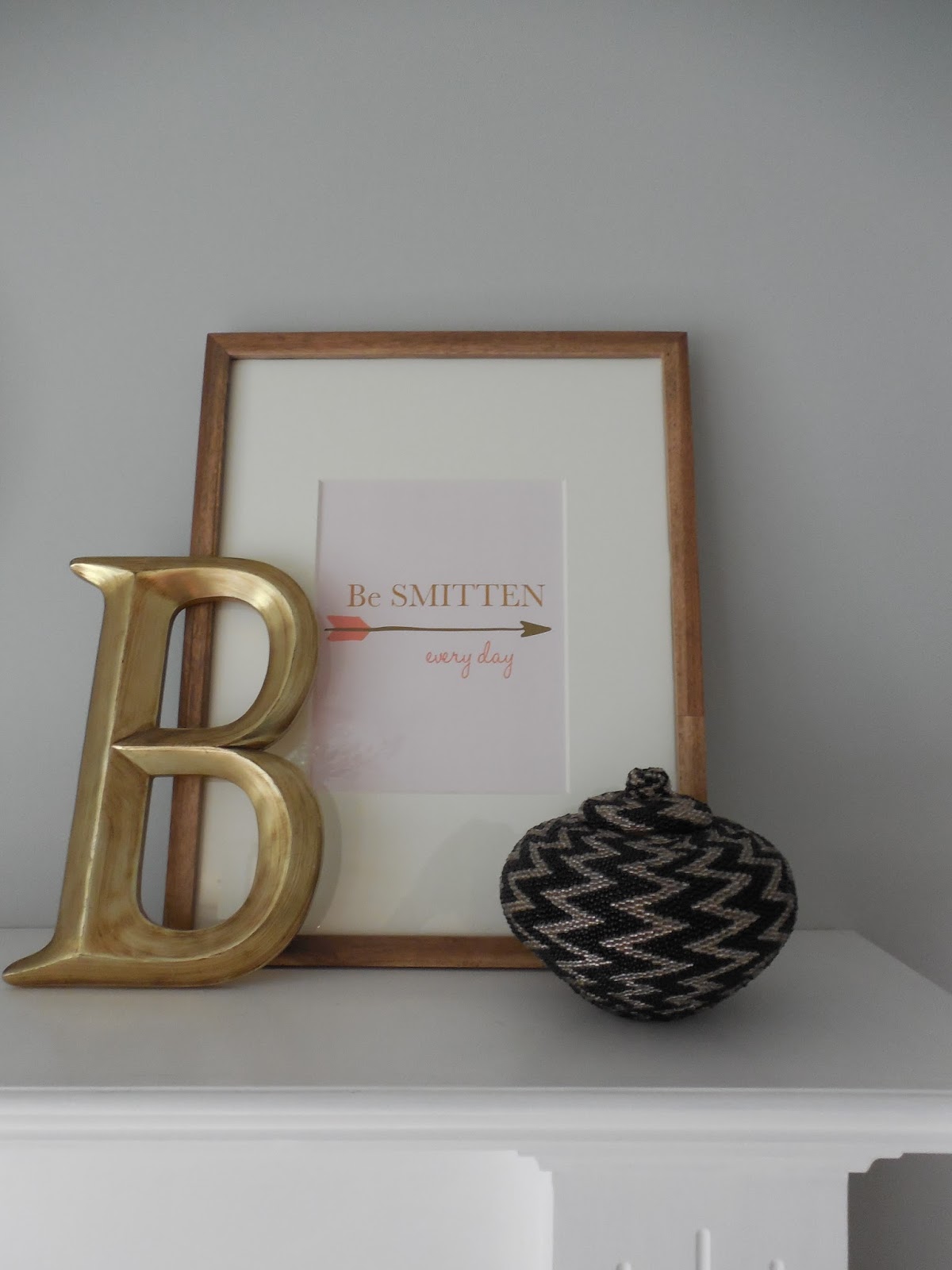
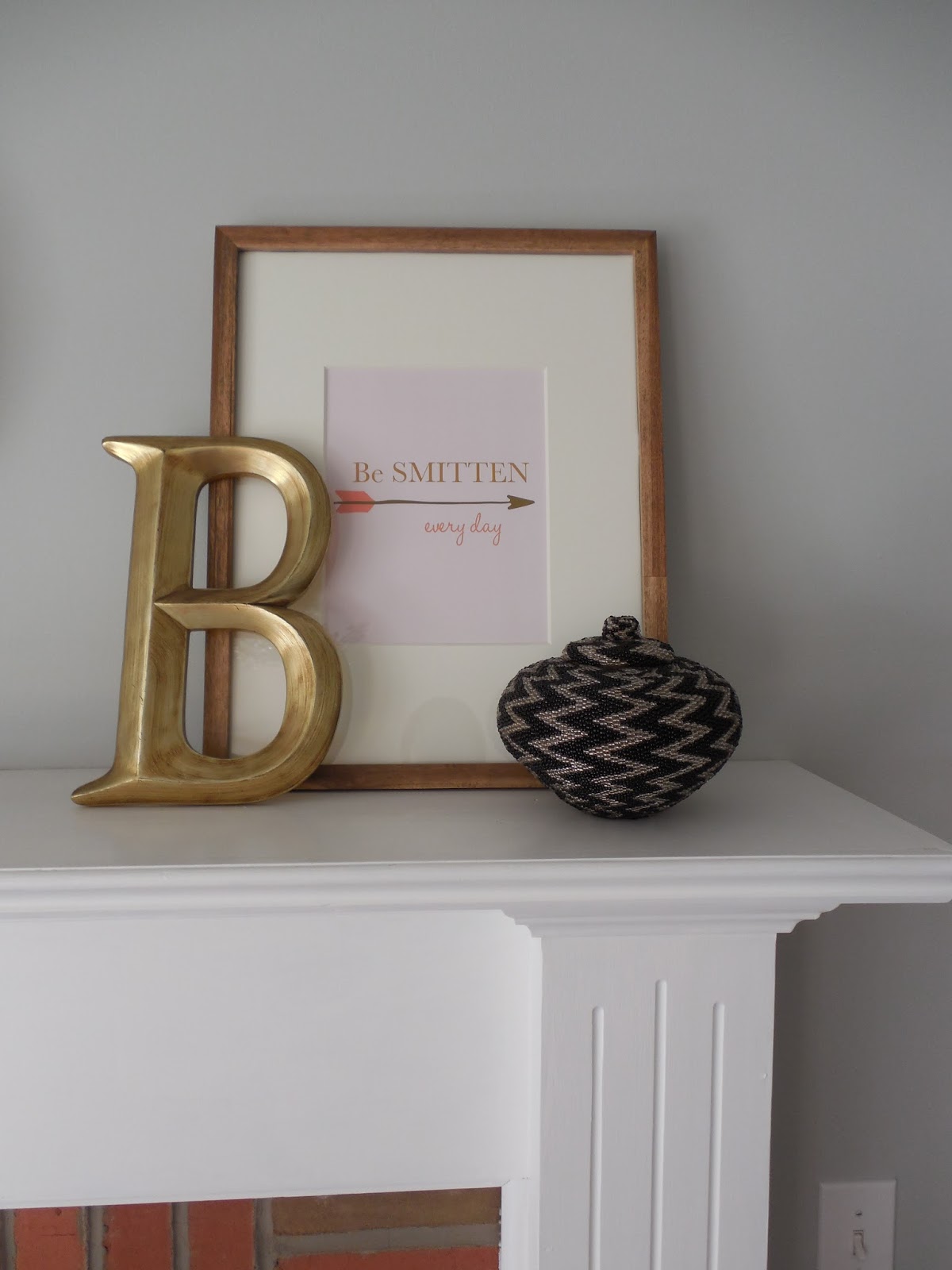
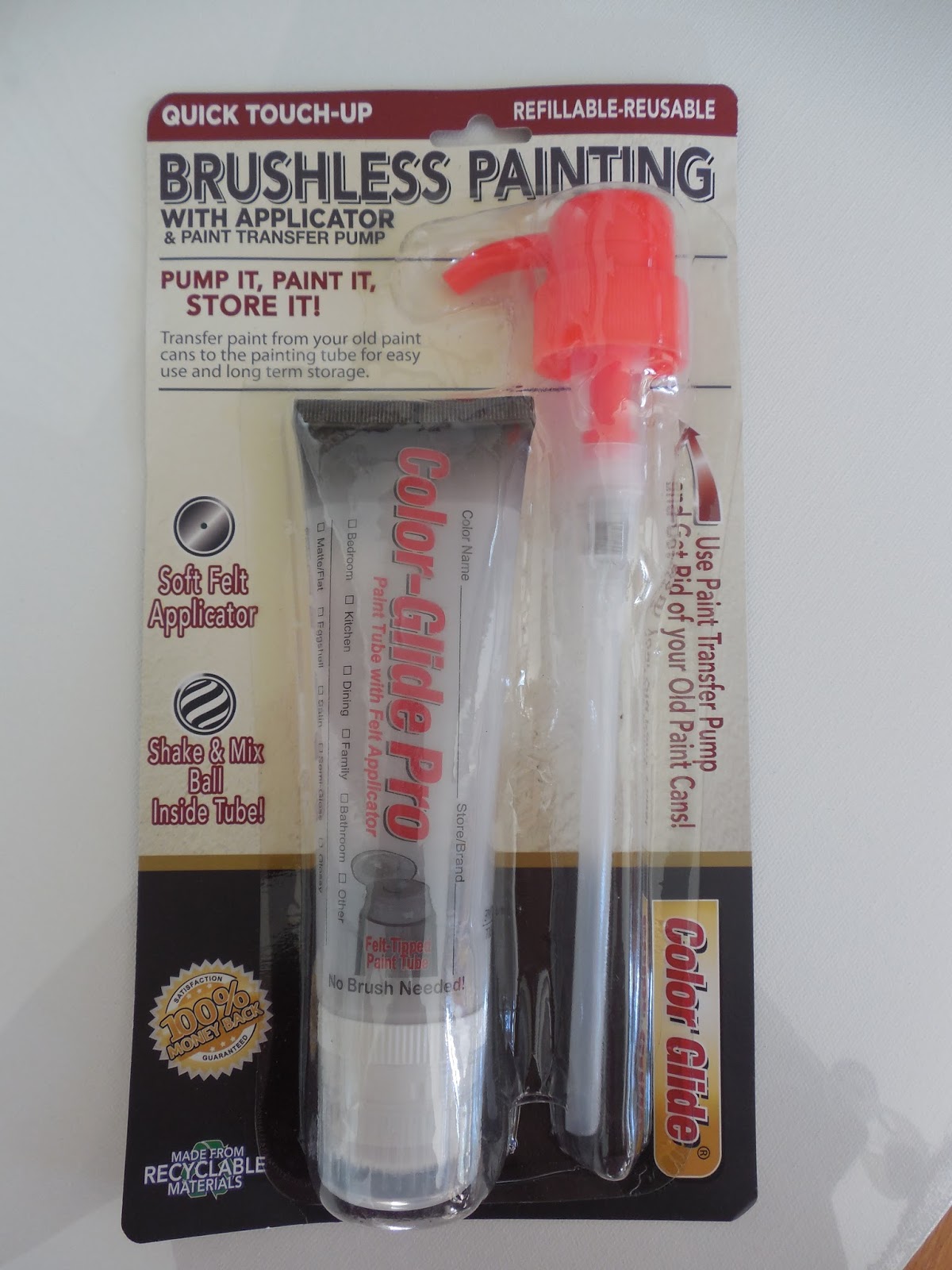
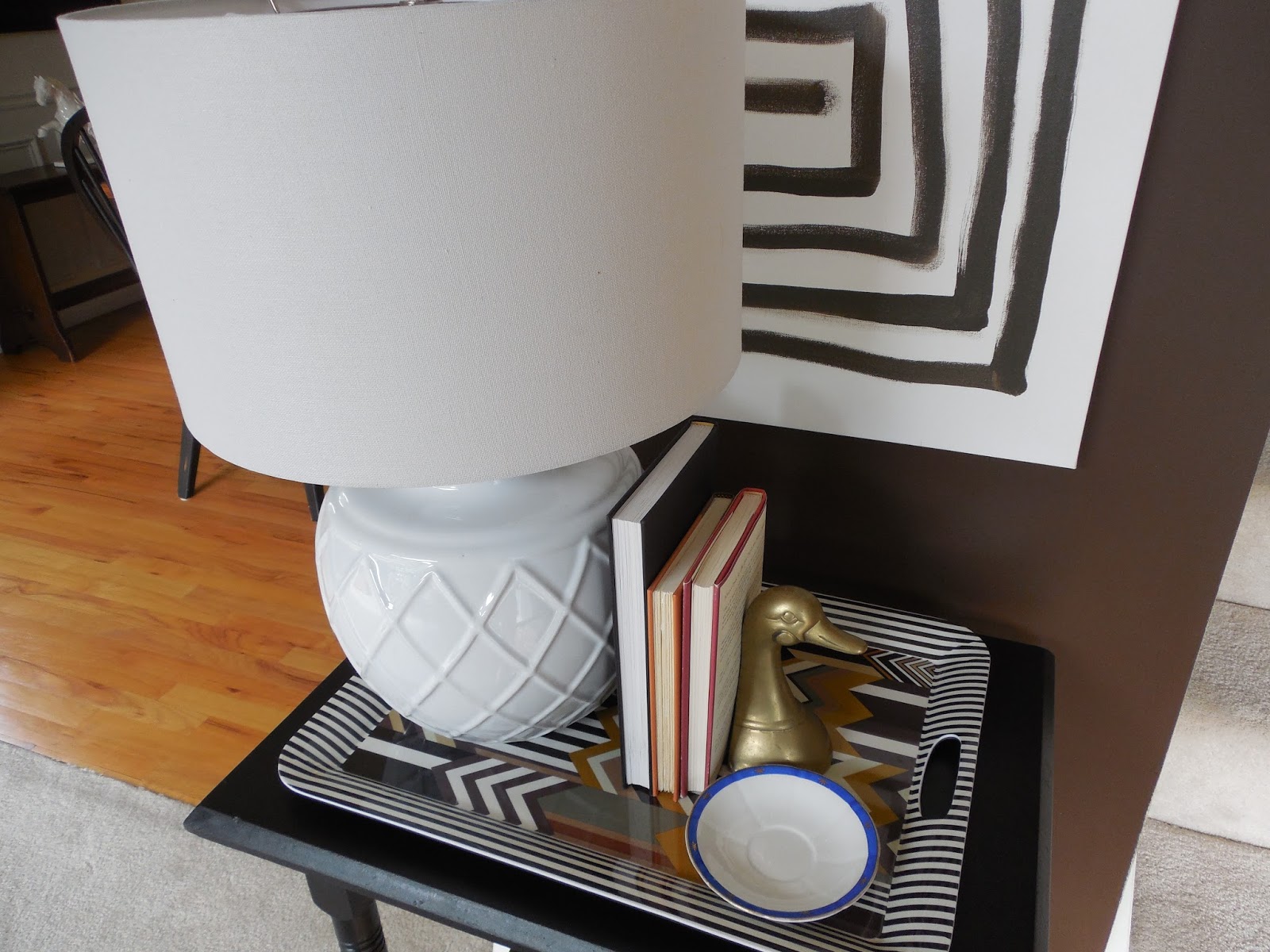
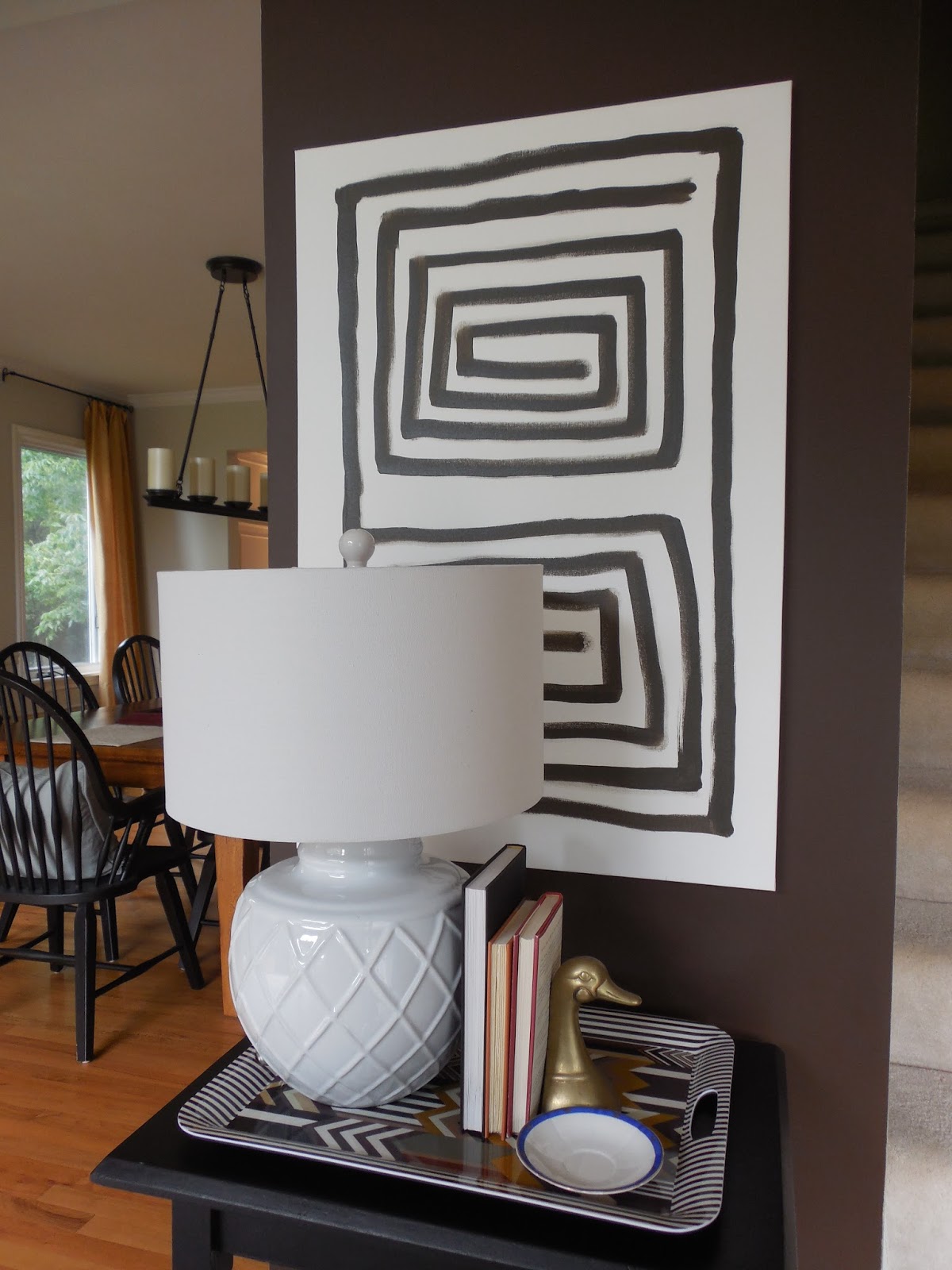
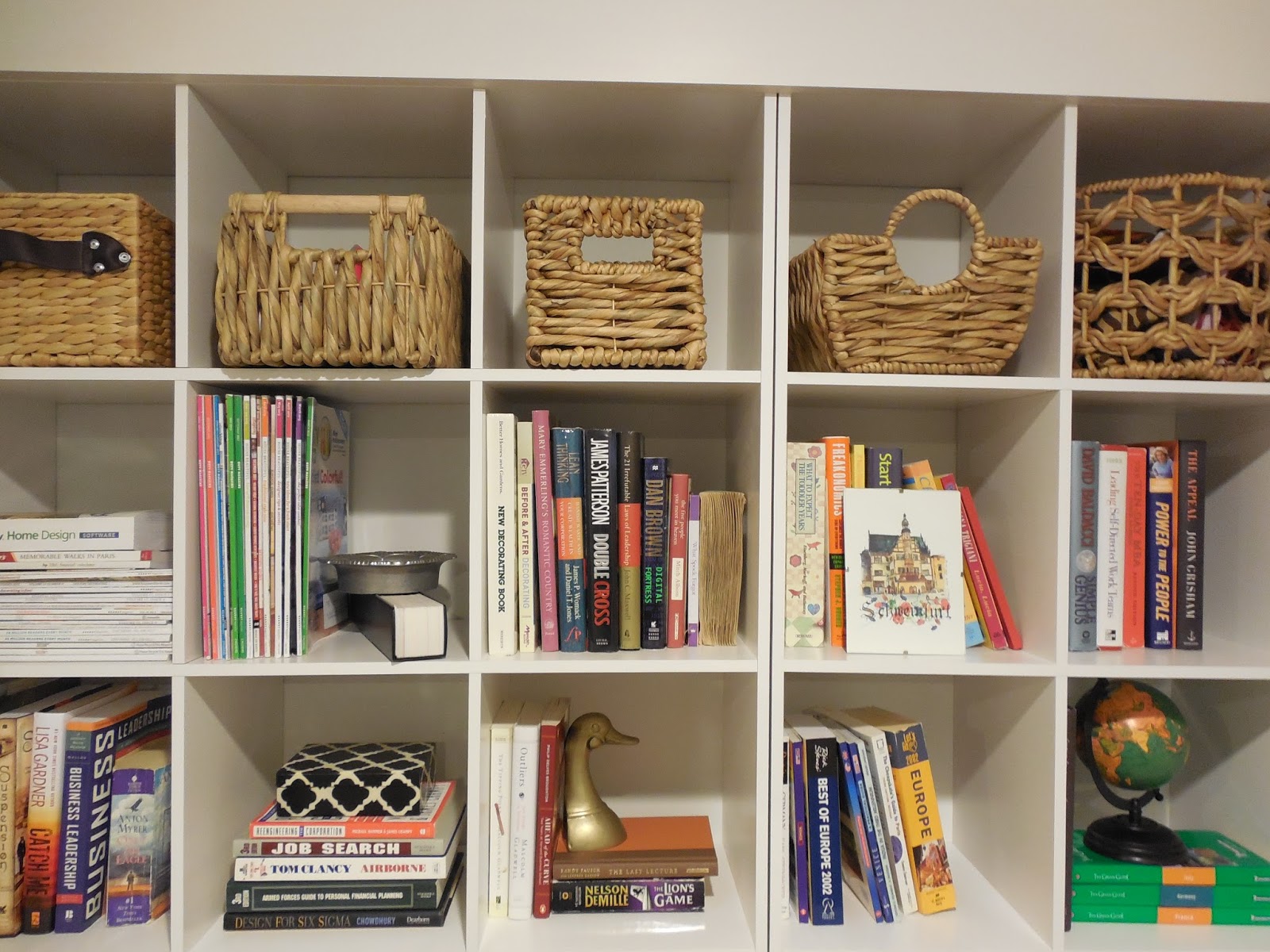
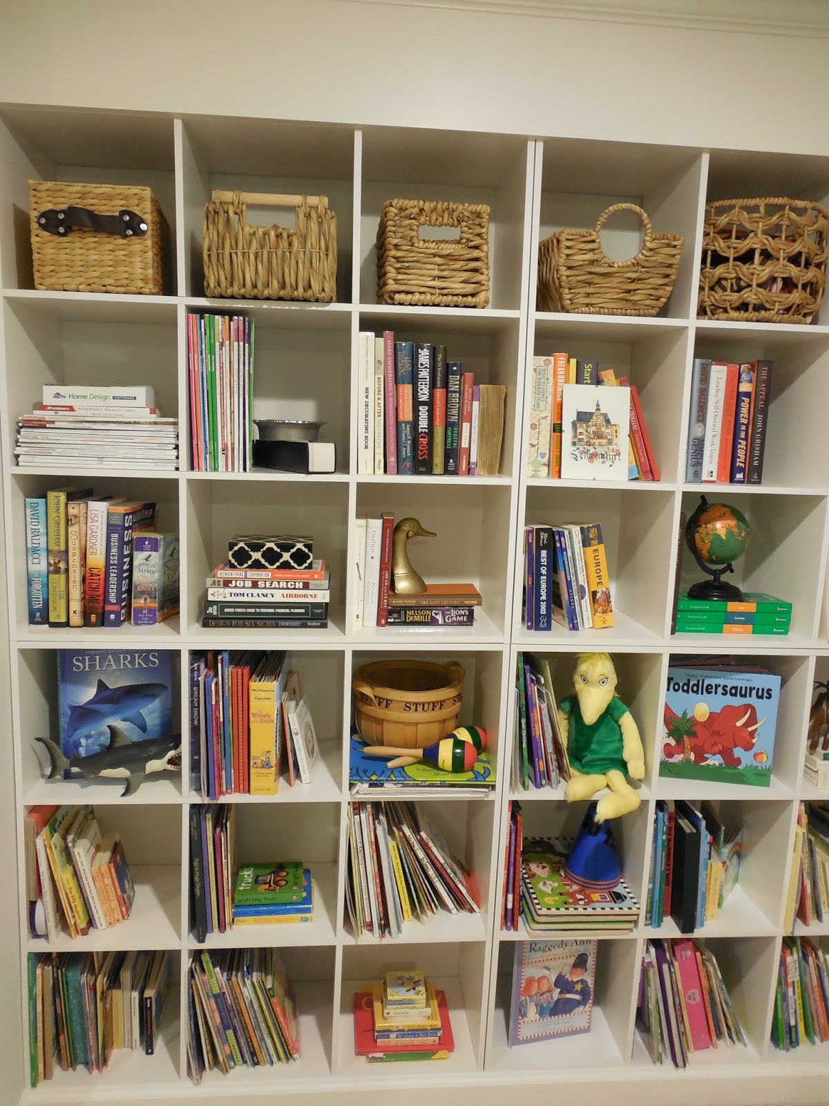
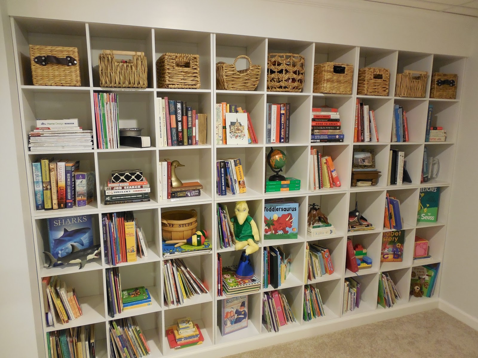
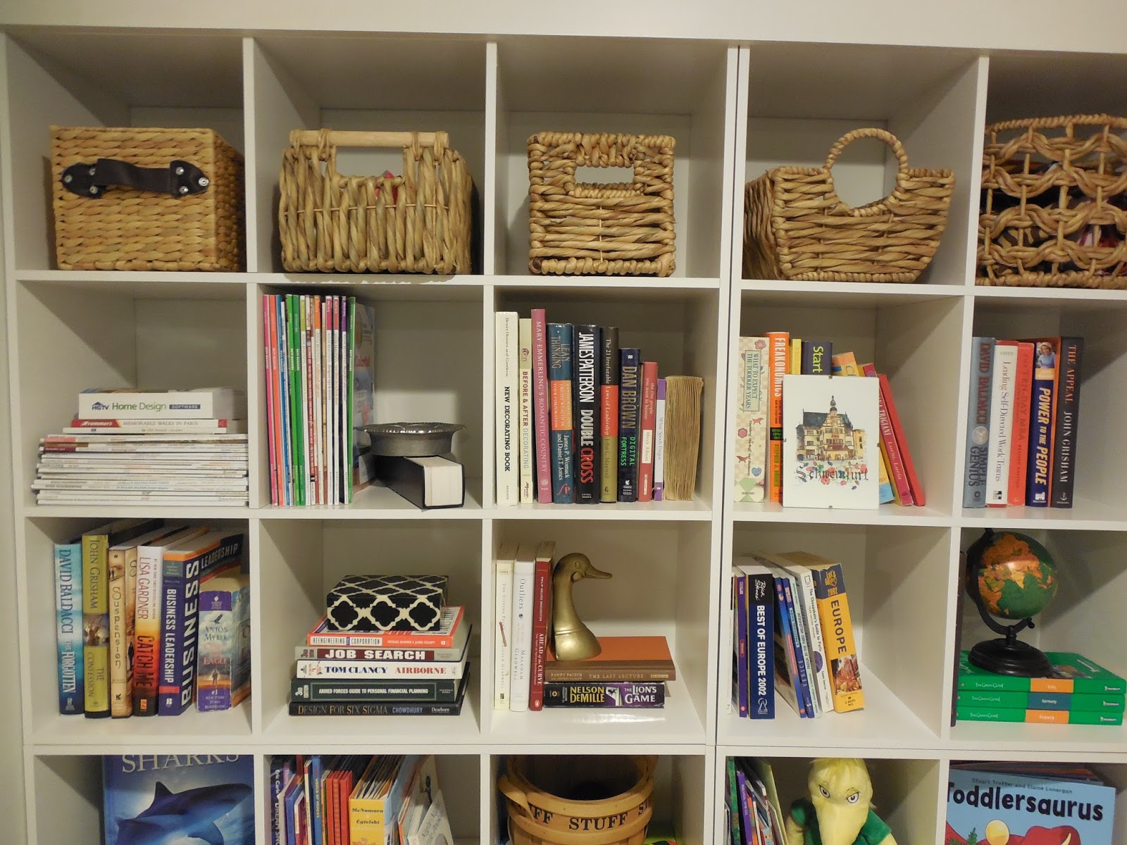
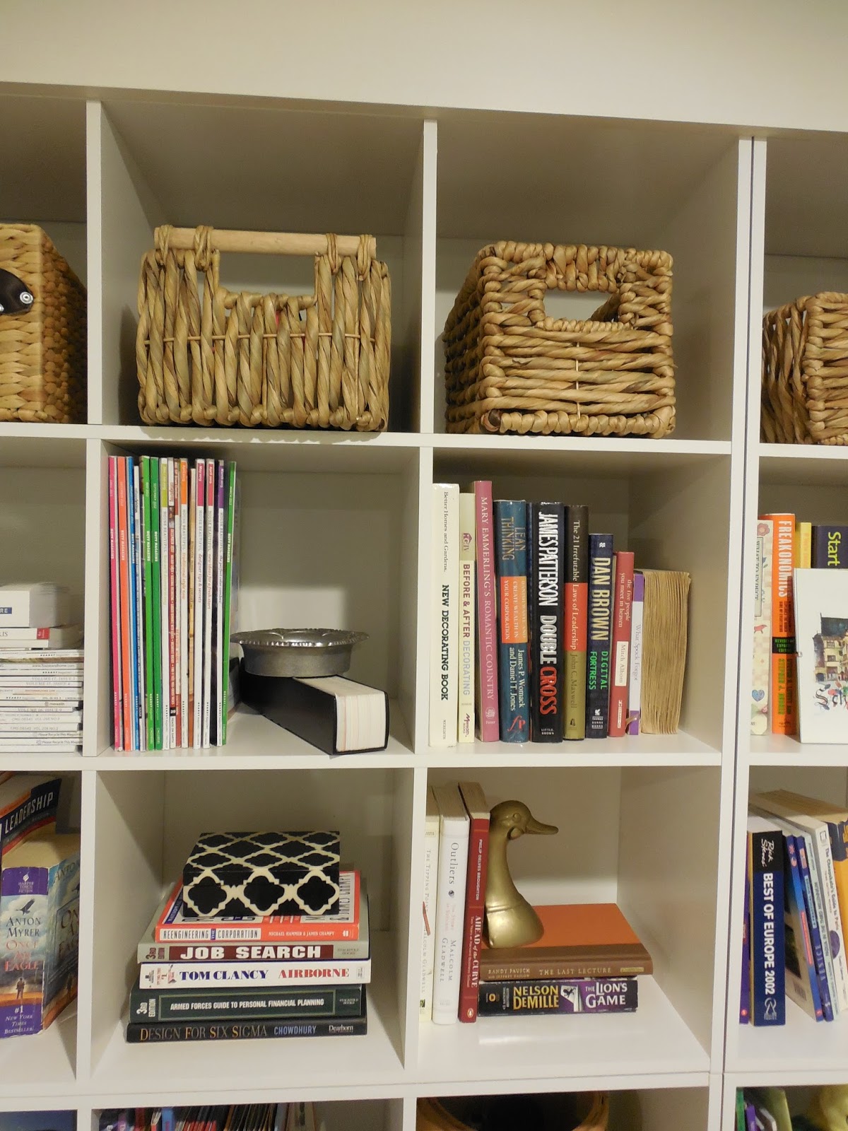
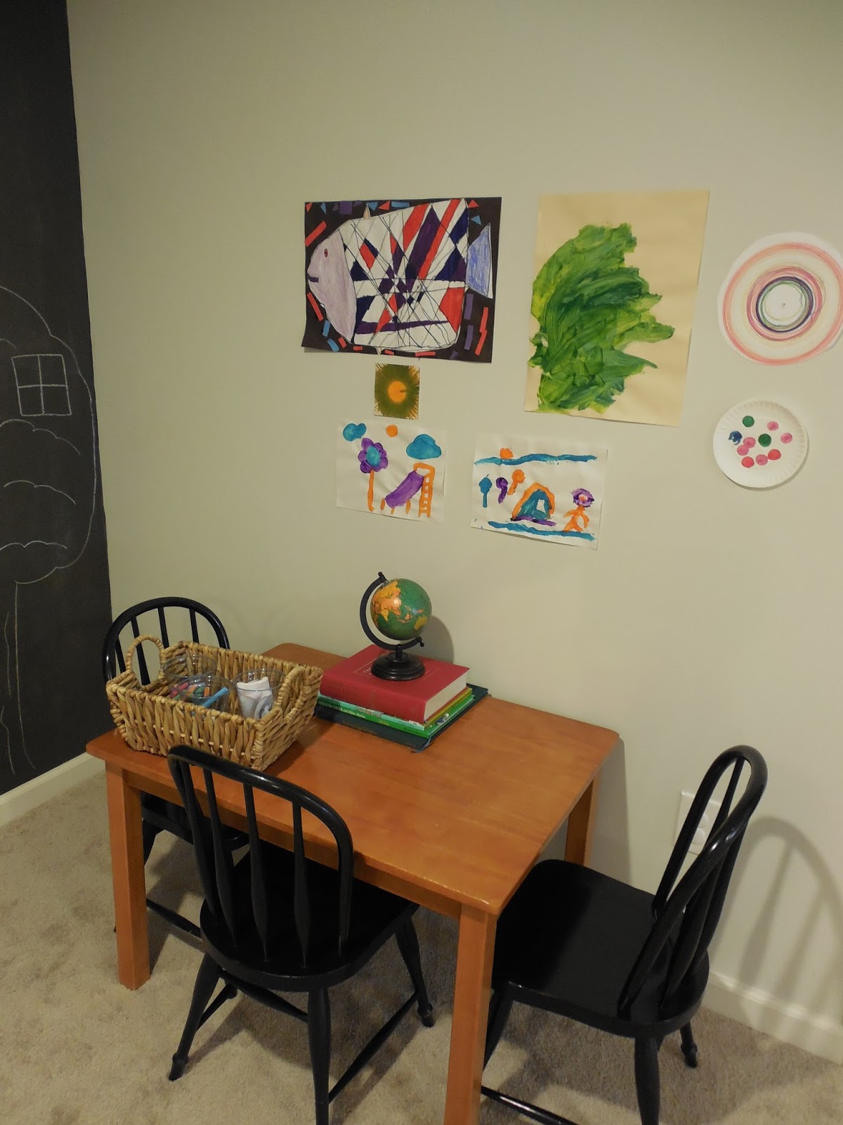
Carving out that little space in your home to escape, have some quiet time and read a great book is a special gift! When that space is also a great spot for your kids to unwind and read, it’s a win win for me! Our finished basement has a wall of open shelving and I am finally getting around to making that space feel warm and inviting. With all 54 cube shelves finally styled {phew!}, I decided to add a personal touch to the outside of the shelves by hanging one of my favorite etsy prints…

horse print via

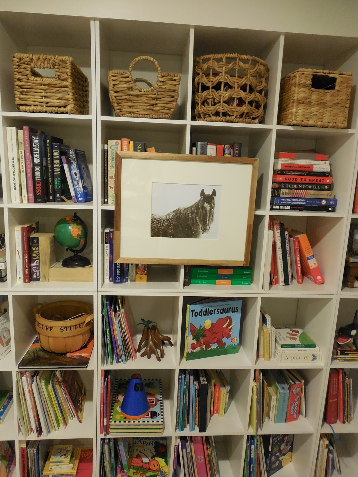
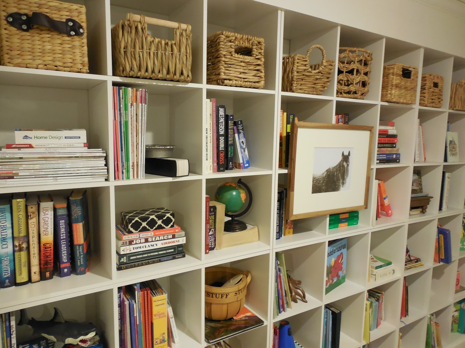
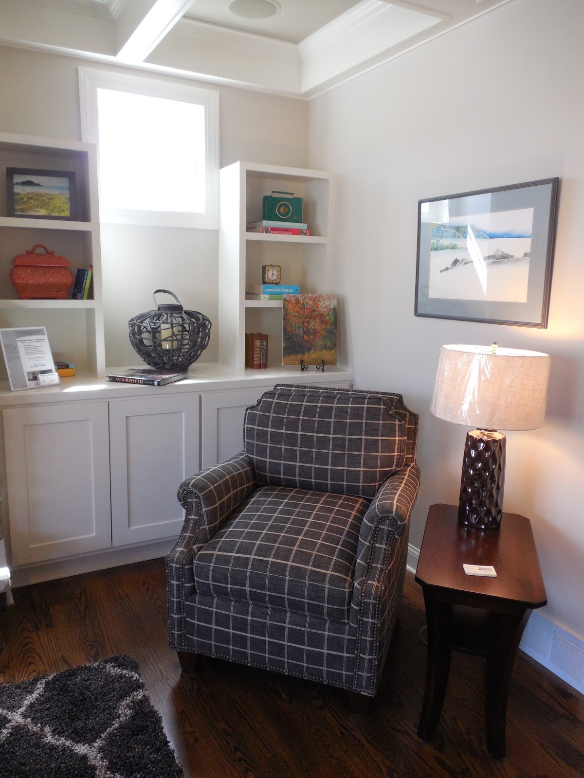
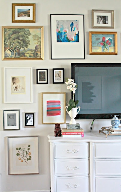
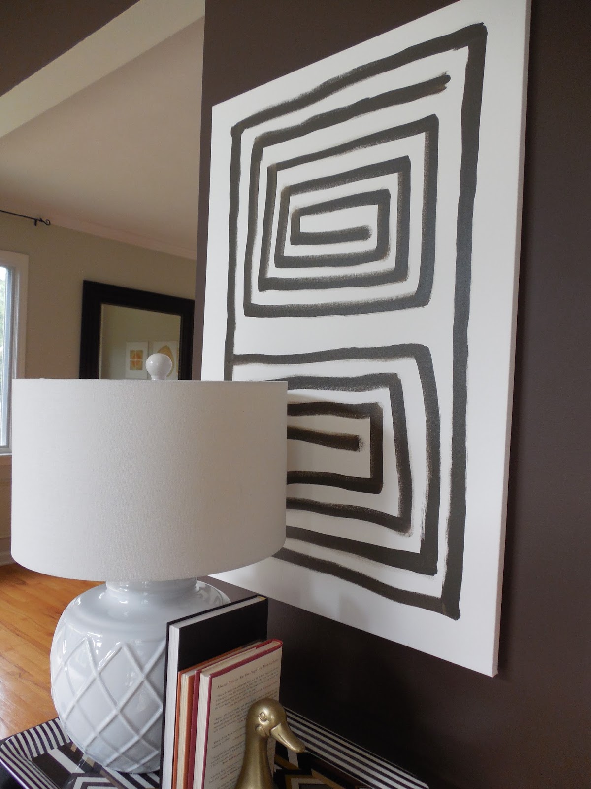
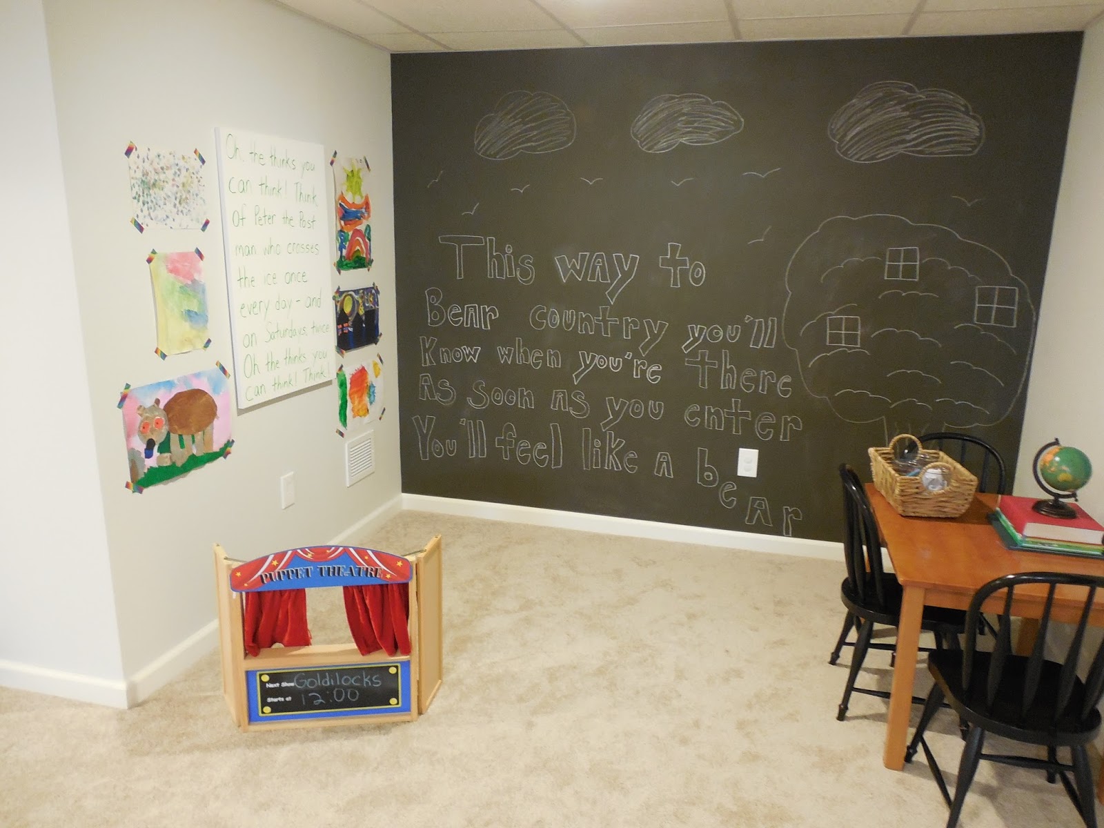
I have always loved the idea of layering your shelves and hanging mirrors and artwork to the outside of those shelves. It adds that little something extra and also provides an additional spot to hang art when space is limited in your home! When I purchased my large horse print for my family room, the etsy seller also gifted this beautiful piece. I have been waiting for the perfect spot for it, and I think I found it! In addition to fixing up the shelves, I also made this space more inviting by carving out a little seating area for the kids…

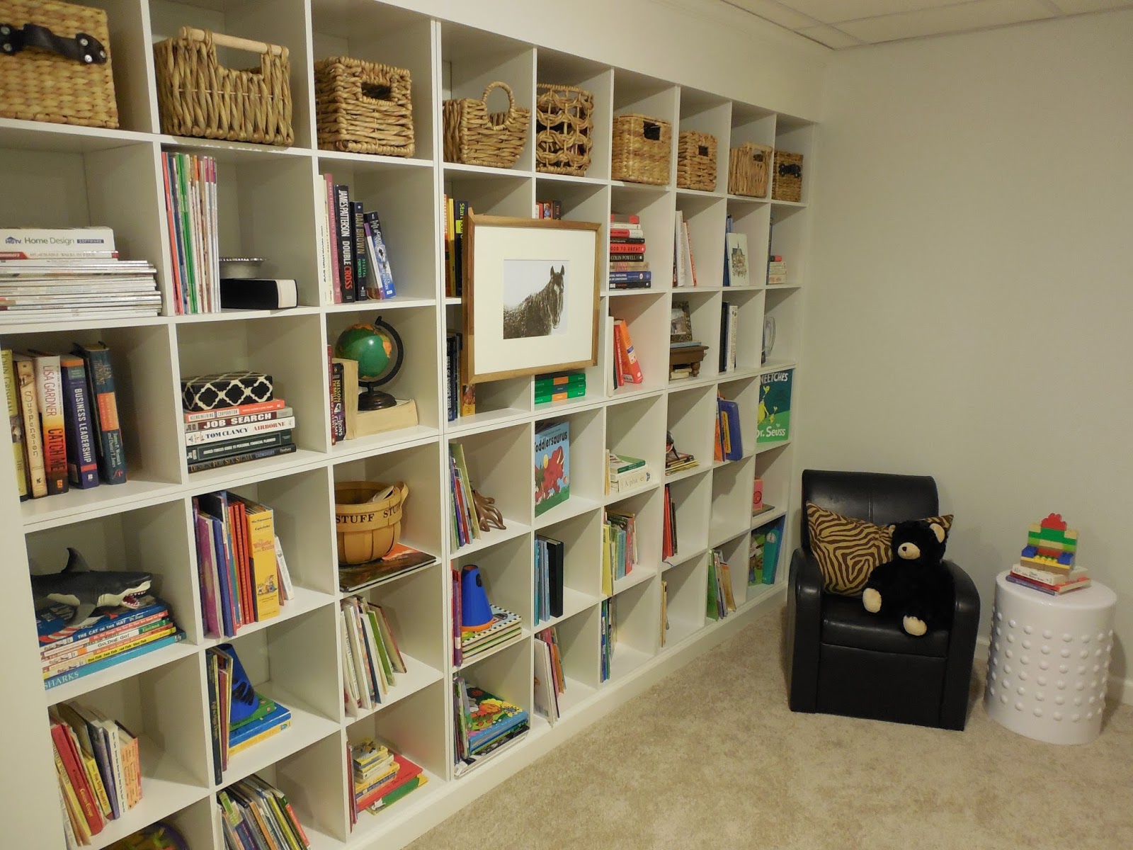
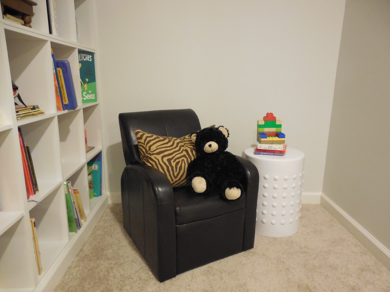
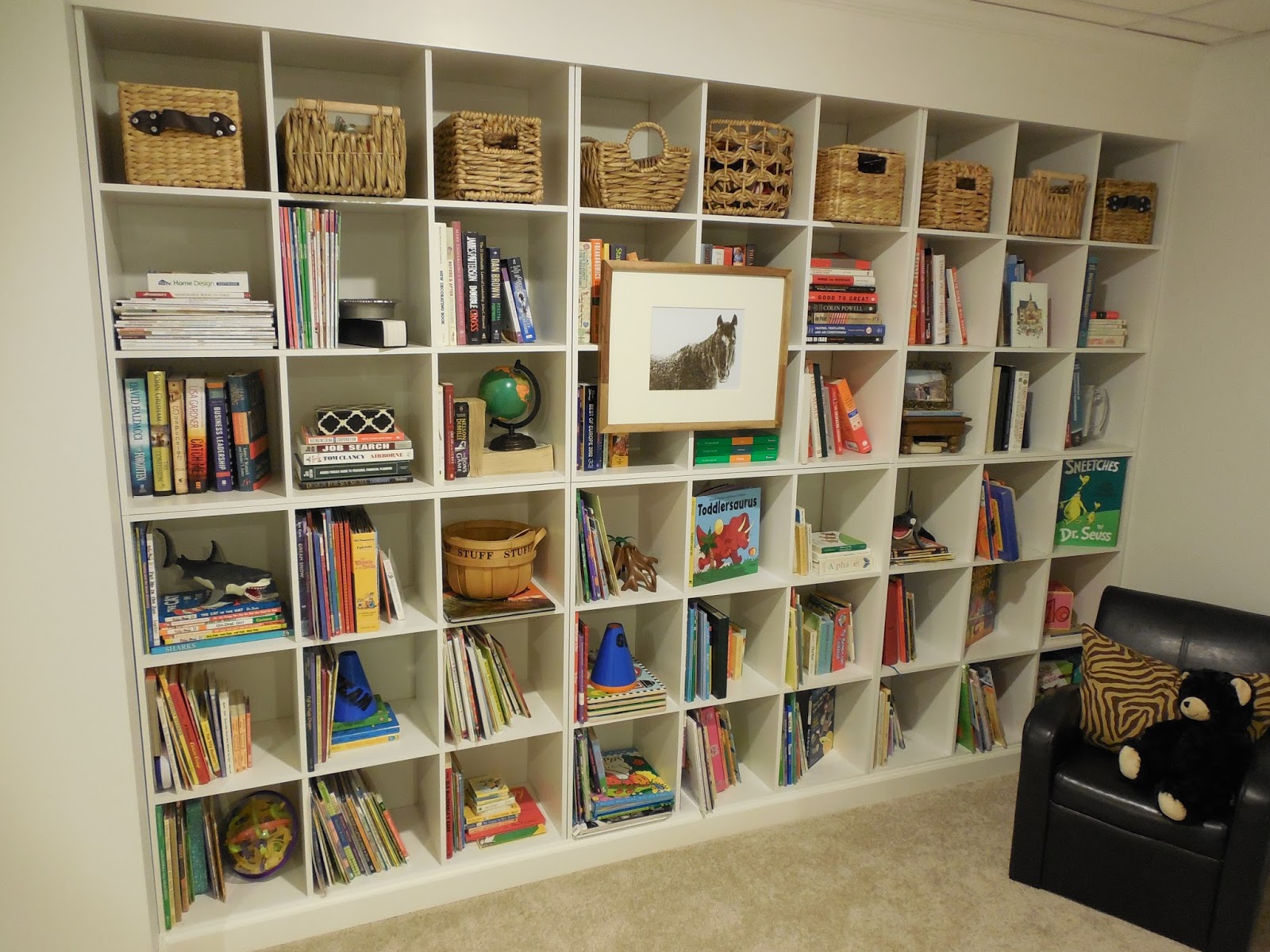
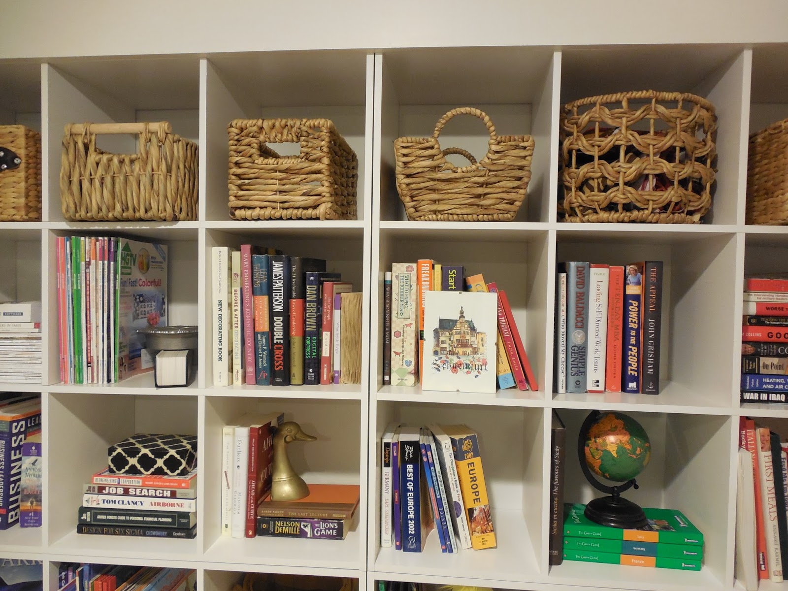
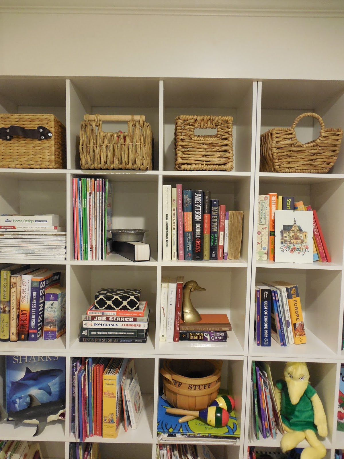
This space is not complete yet, but is off to a good start. I plan to hang a large piece of art above the chair, layer a patterned rug over the carpet and bring in some poufs for additional seating. A reading chair and ottoman to fit the adults is also an option. Since the top three rows have books for myself and my husband, this is a great spot for us all to read together! The baskets on the top row hide all of my fabrics for design projects, craft supplies and odds and ends that are not pretty enough to be shelf worthy! This small spot in our home is proof that a little getaway doesn’t have to include an entire room. One wall/nook in your home can be all you need for a quite retreat!

Do you have a little getaway space in your home to unwind??

I’m Having Tea With Sarah Richardson!!

September 15, 2013 by Amber Filed Under: blog, blog podium, design, sarah richardson


To be able to write that post title still amazes me! I am headed to blog podium at the end of the week, and this last month has been a blur! A few weeks ago, a contest was announced to have the opportunity to win a tea date with Sarah Richardson, accomplished designer, HGTV personality and all around super talent. I have watched her shows for years and cannot wait to hear her speak as this year’s key note speaker for blog podium. Little did I know, there would also be an opportunity for blog podium attendees to win a chance to meet Sarah before the event! The contest was to create your ultimate dream room on pinterest and Sarah would be the sole judge, choosing the winners she would meet for tea. I went for it and decided to design and submit a master bedroom that was inspired by the coast. I thought of it as a dream getaway, with an oceanfront view, surrounded by my favorite colors, furniture styles and accessories. I quickly got to work, pinning away. I finally entered my board, when I thought my dream room was complete. And when the winners were announced, I was amazed and super excited to see this…

image via
I was one of 10 winners chosen to meet Sarah and chat design before the conference! It will be so much fun to share this event with 9 talented, stylish bloggers. I cannot wait to meet Sarah, pick her brain and be inspired by the design experiences she has created. I have admired her work for so long! Here is just a sample of the amazing talent of Sarah Richardson…
via
via

via

Sarah is inspiring beyond words! She also has an exciting week, since her new HGTV Canada show debuts Thursday, September 19th…
Since I don’t live in Canada, it looks like I should be able to view the shows on line, HERE. Make sure you tune in, too! When I get back from blog podium, I will definitely give a detailed re cap and let you know all about new blogging tips and my tea with Sarah!

The Parade of Homes is Here!

September 10, 2013 by Amber Filed Under: design, parade of homes


My mom and I visited this year’s Parade of Homes in Central New York, and it did not disappoint. Nestled near the quaint town of Jamesville in Lafayette, this neighborhood boasts lake views and stunning new homes! My mom and I attend this event every year, as it’s a great way to get some design inspiration and see beautiful homes that have been fully decorated by local interior designers. The Parade is open through September 22nd, so there is still plenty of time to get out there and experience it yourself! Let’s get right to the homes, with some of my favorite spaces…

This first home was built by Martin Custom Homes and is ‘The Waterford’ model…

I love how this home felt so spacious. The office had that gorgeous coffered ceiling and there was plenty of room to work in the kitchen. The walk in pantry is a mom’s dream and that master bedroom closet had me at hello!

This next home was by Mark Antony Homes and is their ‘Beth Ann’ model. It had one of my favorite bathrooms of the parade!

I am always a sucker for an all white kitchen. I love the sand colored linen drapery panels in the family room, adore the high ceilings and love that half bathroom ceiling stencil! That adds such an unexpected touch to the space. {It also ended up being my highest ‘liked’ image on instagram, yet!}

This next home was unique and designed by Konrad Builders. It had a mid century modern vibe and was so different from the rest of the Parade’s homes. This home had the best windows and natural light!

Aren’t the windows amazing?? I can just imagine this home in the winter, looking out at all of the snowy trees. This home also comes with dock access and a beautiful view of the lake from the backyard! The above image of the bathroom shows the stunning floors!

This next home was one of my favorite exteriors. It had such a coastal, Nantucket vibe, with a mix of the blue and shaker style siding. It is ‘The Oakhurst’ by Sciuga Custom Builders.

I loved that farmhouse sink in the kitchen and the dining room had a large wall of built in shelving. That would be a lot of fun to dress up!

This next home was by far, the favorite of both myself and my mom. It was built by Zellar Homes and is ‘The Stewart’ model. The interior designer brought a subtle theme to her designs from the classic film, It’s a Wonderful Life. We were both ready to move right in! 


There was so much attention to detail in this home. I love that the window frames were a tan color in the family room, allowing them to pop against the walls. The kitchen was simply stunning! We were so impressed with how lived in  and warm this home felt. Well done!

The last home I’m going to show today was built by Smolen Homes and is ‘The Jonsten.’

I truly believe fabric can take a room to the next level. The drapery fabric in the family does just that and makes a stunning impression on the rest of the room. I loved the ceiling detail in the dining room and the modern art above the console!

All in all, this was a great event! My mom and I had a blast and walked away with plenty of design inspiration for our homes. To learn more about the Parade of Homes in CNY and all of this year’s builders, visit the main site HERE. Thanks so much to the Parade of Homes sponsors for this year’s tickets to the event!

To follow the Parade of Homes on facebook, visit HERE.

To follow the Home Builders of CNY on twitter, visit HERE.

And to follow the Home Builders of CNY on pinterest, visit HERE.

Which home/design feature was your favorite??
Hope you can make it this year, too!

{The First Layer} A Client E – Design Project

September 3, 2013 by Amber Filed Under: design, e-decorating, e-design, personal design style


Over the summer, I worked with a client to develop her great room into something better suited for her and her family. They love their home and so do I, but it needed to be lighter and brighter with some modern touches. Most of their interior, including the ceiling, walls and floors are wood. We needed to add some contrast and take away some of that wood overload, so that you can truly appreciate the home and its beauty. Let’s take a look at the plan…

The Plan 

This client wanted to just start with the first layer… before we even get into the furniture and accessories, she wanted to lay the initial groundwork and choose the wall color, ceiling color, floor stain, drapery panels and wood stove. They have the space for a wood burning stove, which I thought was so much fun! I got to work, selecting a more modern stove, darker stain for the floors and a lighter color palette for the walls. This board ended up looking more like some of the inspiration boards I do for clients when I want to get a feel for their style. This board helps lay the groundwork for what’s to come in the future. I chose to include interiors that spoke to their style, showed texture, layering and an overall warmth, which they were craving for their home. I proposed they paint the wood walls the top left color on the board and the window trim would be the smoky black color. The fireplace trim would be the creamy color to the right, which compliments without competing with the walls. {Just to explain, I am not against keeping some of the wood walls in their original form, throughout the rest of the home. In some spaces, I am all for staining the wood walls a darker color and working with what you have. But for this particular area, we were looking to lighten the walls. In future rooms, I can picture bedrooms or the entry way with dark stained wood walls. It would be very rustic chic!} I suggested they choose a gray toned brick around the wood stove and lay that out in a herringbone pattern. It would be a chic, subtle way to add texture. The stove surround would be a black stone and would anchor that side of the room. Owning and caring for dogs is their passion, so the brass bookends on the top right of the board gives a glimpse into future accessory pieces. The gorgeous interior on the center right side of the board was designed by Lauren and gives a great example for how we can add layering and texture to their home. I was so excited that my client loved the design! It actually made my week when she wrote and said…

The part that is so special, so validating, so meaningful, really has turned out to be your ability to see the heart & guts of our home.  — you and I are a terrific match. I was absolutely elated to go through the pictures and read your advice.

Wow, that’s really what it’s all about! I truly love what I do and when I have the opportunity to work with such special people, it makes it all worth while. I can’t wait to see how this space comes together. ๐Ÿ™‚

To help create a space together that you love, click HERE to get started!


A New ‘Smitten’ Print in My Family Room!

August 29, 2013 by Amber Filed Under: art, design, family room, mantle, personal design style, styling


I am super excited to show you an amazing new print that graces my family room mantel! I was recently contacted by a representative from Pretty Smitten, an on line stationary, home and gift shop to preview one of their gorgeous prints from their new art print line. I jumped at the chance, since I have already loved and admired their chic patterns, personalized notepads and monogrammed gifts. It was a tough decision, since they are all so fun, but this is the print I chose…

shop here
And here it is, all styled up in my family room…

The orange, coral, pink and brown from this print works so well with the room’s color scheme. I chose a driftwood style frame to balance against the chic look in the print. This room has a bit of a rustic touch, so I thought it created a nice balance. The frame has an 8×10 opening, which is a perfect size for this print. Overall, I am totally smitten with my new art piece! I already have my eye on some other great prints from her shop! If you haven’t checked out the site yet, stop over to see all of the gorgeous options at an amazing price point. Owner and creator, Elizabeth Johnson founded her shop as a creative outlet after the birth of her son. Her business quickly grew to include more gift items and after the birth of her two girls, Pretty Smitten continues to expand. This new print line is a beautiful addition to her creative, chic style! Her shop also includes trays, phone cases, personalized placemats and trays, just to name a few! 
Start your shopping HERE and have fun!

Some Pinspiration For You…

August 18, 2013 by Amber Filed Under: design, personal design style, pinterest


I have been on pinterest quite a bit lately, pinning my heart away! Every time I’m on there, I am all over the map… pinning images of beautiful bathrooms, kitchens, living rooms, ideas for clients, etc. I thought I would share some of my favorites lately! Enjoy!

Clean and simple, but so chic. I could repaint my dining chairs!

via
This dining room is soft, a bit feminine and has those gorgeous wishbone style chairs!
via
Back to back sofas would be cool in a large space! It can separate the rooms into different zones for different purposes. This room also has my favorite color palette and is designed by the very talented Christina Murphy!
via

Love this wallpaper… have to use it somewhere!
via
This kitchen is pretty much perfection in my eyes. And notice how they mix metals… brass lanterns paired with chrome faucets?!? Don’t be afraid to try and mix your metals!
via

I love this color palette and space! And notice how there is nothing on the wall above the bed? With a pretty wallpaper like this, it’s not needed!
via

A great way to style around the TV!
via
Yep, all over the map! But at least with it all on my boards, it’s organized chaos!  ; ) Follow me HERE to see some my latest favorites.

Creating My Own Art With Color Glide Pro

August 13, 2013 by Amber Filed Under: art, design, living room, personal design style


When expensive, original art is not in the budget, I am a big proponent of taking out the brush and trying it yourself! What’s the worst that can happen? When shopping at local craft stores, I have noticed that large pieces of canvas aren’t that expensive. In fact, I have been lucky to shop when they are 40% off! So, when a representative from Color Glide Pro contacted me about trying their brushless painting applicator, I thought this would be a great tool to use when creating my art. In the kit, you get a refillable, reusable paint applicator tube with a soft felt applicator and a paint transfer pump so you can easily transfer paint from your old paint can into the tube. I had a large amount of wall space upon entering our living room that needed something new and fresh. Once I got started painting, I could not believe how easy it was to use! In the future, I will definitely try it for its intended purpose, which is to touch up paint small areas, doors and trim. But, it’s also fun to think outside the box and try something new with it. Luckily, it worked!

Let’s back up, as I explain the process and give close up shots of the cool product!

What you will need for this project:

1. Paint can with your favorite paint color.
2. Paint stirrer
3. Canvas board
4. The Color Glide Pro!

Since I wanted the art to be dramatic, I went with a 24×36 canvas board, which is the same size as the basement art for our kid’s space. I wasn’t sure if it would be messy to use the pump when transferring the paint. It wasn’t at all! The applicator tube also shows the fill line spot, so you don’t overflow your tube.

This was after I shook the applicator tube, making sure it was well mixed before painting. The tube comes with a shake and mix ball inside, so I can reuse the paint and just shake it again, when ready to reapply! I went with my favorite dark color, Dragon’s Breath by Benjamin Moore. I am using this color on all of our interior doors, so I had plenty extra on hand. Plus, it works well with our home’s color pallete, so it’s a win win for the art piece! When deciding on a design for the canvas art, I knew I wanted to make it modern and graphic. I tried a sample out on a paper towel, which also helped me figure out how to use the applicator tube.

I really had my fingers crossed on this one, because I didn’t want to mess up and discard the art. Luckily, the tube was so easy to use, I just went over a line again, if it needed some extra color and thickness. And here she is again, all styled up and filling the space quite nicely!

When I’m ready to take out the applicator tube and use it again, the paint will be ready! I just give it a good shake and that’s it! It stays fresh in the airtight tube and will last for a very long time. The tube even comes with a space for you to list the paint color and brand.

The above instruction list would be a great image to pin, as it gives a clear explanation of how to use the product. Scroll over the image to pin it straight to your pinterest account. (Or any image, for that matter!)

Make sure to come back on Wednesday, if you’re interested in a kit for yourself! The lovely representatives from Color Glide Pro also gave me a set to give away and use however you like!

Will Yours be for Paint Touch Ups or a Fun, DIY Project??

One Door at a Time

August 8, 2013 by Amber Filed Under: black doors, design, kitchen


There’s nothing like having a blog with recorded posts to remind me about my very slow progress with projects! A long while back, I painted our interior foyer door black and vowed that I would do the rest of the interior doors, one at a time. Well…. flash forward a little over a year, and I have painted one more! I hope I’m not the only one who moves at a snail’s pace with my home! The best time for me to paint is at night. The house is quiet and I can concentrate on what I’m doing. But, it’s also not the best lighting! So, it probably takes me even longer, because I want to make sure I get in every crevice so that I don’t have to take the paint brush back out the next day to fix what I have missed. I literally had a flash light to the door to catch any missed spots! And anytime you are painting a very dark color over a light one, there’s always the need for at least 2-3 coats. OK, so with all of my complaining, you can now see why I waited a year to do a second door. ๐Ÿ™‚ I chose to paint our kitchen door next, which goes into our newly finished basement. After all that work, here she is…

I am really happy with how it turned out! As with the foyer, I went with Dragon’s Breath by Benjamin Moore. It’s a muddy gray/brown/black color that is so soft and neutral. I like the way it pops against our builder grade faux brass door knobs, making them feel more current. The paint is in a semi gloss finish, which will clean up nicely and gives a fun, shiny style to the door.

Hopefully, you won’t have to wait a year + to see the next door!  ๐Ÿ™‚

Our Basement Shelf Style Reveal!

August 5, 2013 by Amber Filed Under: basement, design, kids and design, shelf styling


With the previous post being about the basement, I thought I should just jump right in and write about another finished area of the space. {Don’t you just love checking projects off the list?!?} This was a big project to tackle, as I had the contractors put together a 54 cube unit bookshelf. I will reveal the secret to how this was done, later in the post! As with any home, we needed additional storage… a place for our books and mementos and a spot for all of the kiddos books and treasures. I have always been a fan of bookshelves that hold more than just books! It’s also a great place to display family photographs, art, sculptural objects, etc. So here it is…

Bookshelves Hold More Than Books…………………  


As you can see, there were a lot of shelves to fill! For a while there, I wasn’t sure we would have enough books and stuff to fill it, but I was wrong. If you look hard enough in your home, you can find it! For these shelves, the top section is for our things and the bottom half holds all of the kid stuff. I love pairing the everyday {books} with something unique {sculptural pieces, objects, etc.} It adds depth to your shelves and tells more of a story about you! I also try to use the entire shelf… layering pictures either in front or behind books. That gives the illusion of more shelf space. And I also like to lay the books both horizontally and vertically. It pleases the eye to see different heights and proportions when looking at the shelf and makes it that much more interesting. When deciding what to do with the top row of shelves, I knew I wanted to add texture with woven baskets. Since we don’t have an IKEA nearby, I knew it would be pricey to find 9 of the same size baskets. So, I went to my trusty TJ Maxx and decided to just find 9 similar baskets with different shapes. I actually think I like it better than having them all the same. Each cube measures 12×12, so I just brought along my measuring tape to the store and measured as I shopped! I definitely recommend that when looking for a particular size basket. I was surprised to see that some of the baskets were too big, when I thought they would fit perfectly. It saved me a trip to the return counter! At the beginning of this post, I said I would reveal the secret to the way these shelves were made. Well… they are just 6 sets of the Martha Stewart cube shelving from Home Depot! I had the contractors buy these shelving units, remove the backs on them and build them into the wall. They connected them together and added the baseboard and crown molding to give them a true built in look. I also plan to add a framed piece of art or mirror to one of the outside shelves. I have always loved that look!

via
What have you checked off your project list lately??

Our Basement Kid’s Nook Reveal!

August 2, 2013 by Amber Filed Under: art, basement, design, kids and design


Our basement was finished in the middle of May, and I am excited to show the first complete nook in the space! The basement was renovated primarily as a fun place for the kids to play. It’s also great for us, because all of the toys can be relocated to this floor! So, I thought it would make sense to start with one of their spaces first. We had the contractors paint an entire wall with chalkboard paint as a great place to get creative and have fun! This zone is for drawing, crafting,and anything they can imagine up!  Enjoy!

Design With Kids in Mind……………………………..

Sorry for the large amount of photos! It was a sunny day, so I went a little crazy. Our windows are not very big in the basement, so it was great to be able to have this natural light stream in. We have had a lot of fun with this chalkboard wall. I wrote this bear quote from one of our favorite book series… The Berenstein Bears! When we’re ready to erase and draw something new, we just use a white sock. To really get it cleaned, I occasionally go over the chalkboard with a wet cloth. You might be wondering if the chalk mess is an issue on the carpet. To fix that problem, we only buy dust free chalk, which my mom found at Staples. {Thanks, mom!} When they really get coloring, some chalk dust falls to the baseboard. But, it is really minimal and easy to vacuum. Much easier than regular chalk would be! We keep the chalk and sock eraser in small plastic cups in a basket. The plastic cups can easily be washed out, when needed. The Oh The Thinks You Can Think quote was done on canvas as an inexpensive, whimsical way to add some art. I wrote about the simple process, HERE. The rest of the art has come from the creative kiddos. They love that it is truly their space and feel proud to show off what they have made! We love being able to have this extra square footage in the house and the kids love it, too.

Happy Friday!!

  • « Previous Page
  • 1
  • …
  • 14
  • 15
  • 16
  • 17
  • 18
  • …
  • 26
  • Next Page »
Welcome!

Hi, I'm Amber... a wife, mom and interior decorator. I am the writer of Simple Dwellings and the designer behind Amber B Design. Blog topics are all things design, with the occasional DIY attempt! Thanks for stopping by Read more...

  • Bloglovin
  • Email
  • Instagram
  • Pinterest
  • Twitter

Blog Posts, Straight to Your Inbox

Popular Projects

A dining room with white walls and wooden table.
A black door with white curtains and a red chair
A staircase with black and white chevron pattern on the steps.

Blog Love

  • Addison’s Wonderland
  • A Thoughtful Place
  • Alison Giese Interiors
  • Amber Interiors
  • Bailey McCarthy
  • Caitlin Wilson
  • Chris Loves Julia
  • Classic Casual Home
  • Cottage and Vine
  • Design Indulgence
  • Dwell by Cheryl
  • Eddie Ross
  • Elements of Style
  • Emily A Clark
  • Emily Henderson
  • Gallery No Eight
  • Hi Sugarplum
  • House of Jade
  • Jana Bek
  • Juniper Home
  • Kate Marker Interiors
  • Lucy Williams
  • Monika Hibbs
  • Our Fifth House
  • Pencil and Paper Co
  • Rachel Parcell
  • Rambling Renovators
  • Pure Style Home
  • Sita Montgomery
  • Studio Mcgee
  • The Makerista
  • The White Buffalo Styling Co
  • the Zhush
  • Traci Zeller
  • Young House Love

Copyright Amber B Design © 2025 ยท Design by Britt Douglas