Amber B Design Studio

Interior Design & Decoration for the South Florida region

  • Home
  • About
  • Services
  • Portfolio
  • Blog
  • Press
  • Contact

Guest Posting Today Over at Jan Hales Designs

October 4, 2011 by Amber Filed Under: guest post


I am excited to be over at Jan’s blog today, sharing a little bit about myself and my blog! Jan writes a beautiful design blog, Jan Hales Designs and shares gorgeous inspiration with her readers.

I love that blog header! She has great style and I’m honored to be a part of her Blogger of the Week series. Stop on over and check it out here.

Am I Eclectic, or Just Confused?

October 3, 2011 by Amber Filed Under: personal design style


I have been thinking a lot lately about my personal design style. I admire and appreciate so many decor ideas and styles, that I sometimes wonder if I have one particular look that is, and always will be, me. One day, I might love classic style, and daydream about tufted, linen upholstery, detailed white moldings and beadboard ceilings. Then on other days, I might linger over emerald fabrics, gold accents and glossy white ceramic antlers hanging on my gallery wall. I also love preppy plaids, bold stripes and herringbone floors. I also love mid century lines, with simple furniture construction, such as the beautiful tulip table and ayers chair. My point is, I am all over the map when it comes to personal design taste. I guess one doesn’t have to choose any one style over the other. Am I more trendy than classic, more rustic than sleek- or just a blend of them all? Personal style can be a blend of everything, old and new- without the mindset that you have to pick an era or go with just one or two looks. And of course, your tastes do change over time. I know that I love modern style more now, than I did 5 years ago. When it comes to personal style- why not incorporate them all? Afterall, I guess that really brings you to your own unique, personal style. If you decorate your home based on the things you absolutely love, can you really be wrong? I don’t think so! If you adore and use everything in your home, it reflects you and nobody else! I guess the word trendy is just a personal opinion. If you love it- keep it! That’s the mindset that I am at today! I’m not ready to pin myself down- I love it all! Here is my style (depending on the day):

Source: cotedetexas.blogspot.com via Simple on Pinterest
Source: decorpad.com via Simple on Pinterest
Source: paloma81.blogspot.com via Simple on Pinterest
Source: dwellerswithoutdecorators.blogspot.com via Simple on Pinterest
Source: google.com via Simple on Pinterest
Source: homedeco2u.com via Simple on Pinterest
Source: stylishcorrespondence.com via Simple on Pinterest

All of these styles, when put together, would make a pretty fun home! When combined together, I guess I am a blend of traditional and modern, with a bold, eclectic mix!

What are your thoughts- are you all over the design map, or do you know your exact style?

Fashion Friday – Classics Edition

September 30, 2011 by Amber Filed Under: fashion friday


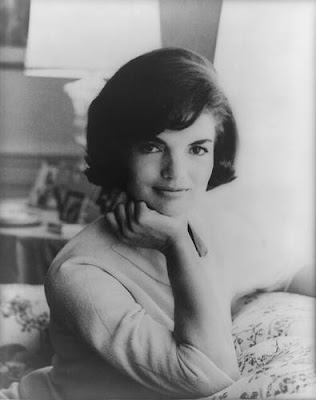
Happy Weekend and welcome to the series Fashion Friday… where I discuss my other design love! I am inspired by so many looks and styles, both in interior and fashion designs. In yesterday’s Why This Works series post, I decided to focus on classic design. I would also like to do that for today’s post! I have always loved and admired two fashion icons: Audrey Hepburn and Jackie Kennedy Onassis. They have always inspired me with their fashion and the overall way they carried themselves. They were iconic trendsetters and the epitome of class and elegance.

via
via
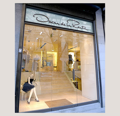
An iconic fashion designer that I have always adored is the amazing Oscar De La Renta. His gowns have always wowed and I adore his attention to detail and classic style.
via
With classic style on the brain, I thought it would be fun to put together a classic outfit for today, which is one of my favorite fashion styles. (In no way do I think I am a designer or even come near the styles of these figures!) I just love to create design boards!
So here goes- my interpretation of classic style, inspired by these 3 amazing and iconic people!
Classic Inspired

Classic Inspired by simpledwellings2
Happy Friday! What styles inspire you???

Why This Works – Classics Edition

September 29, 2011 by Amber Filed Under: why works series


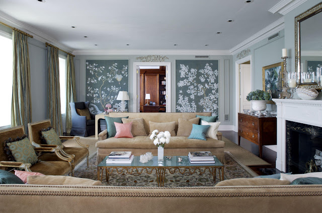
Happy Thursday and welcome to the series Why This Works… where I highlight a designed space and talk about why (I think) it’s perfection. Since I love and appreciate so many different design styles (I sometimes feel as though I’m too indecisive), I thought I would post a classic style room for today! It is one of my favorite timeless styles and this Chicago based designer pulled it off so well! This elegant living room is designed by Jessica Lagrange and was seen in Traditional Home.

Designed by Jessica Lagrange via Design Shuffle
Where do I begin with this gorgeous space? It is chic, elegant and warm. The neutral tones of the seating play off of each other so well and compliment the eye catching, wallpapered focal wall. (It might even be a hand painted mural!) The blossoms and branches of this wall design work beautifully with the elegant, traditional space and help to give the room a modern flair. The overscaled design of the wall work and sofas help to make the traditional space feel more modern. The nailhead detail and fringe work on the sofa are traditional, while the shape and scale of the pieces are more modern. The antique dresser to the left of the fireplace is stately and elegant and works well paired with the casual feel of the vase with fresh flowers. The room feels rich in history with its beautiful area rug and drapery, making the space feel as if it has been there for many years. The ornate, beautiful mirror and lighting in the space help to compliment the rich upholstery fabric on the french inspired chairs. Overall, this space works! In keeping with the Classics Edition, my Fashion Friday series tomorrow will also be classically inspired! Stop back tomorrow to see my favorite classic icons in fashion!

If My Blog Was A Room – Next Up – Mix and Chic

September 28, 2011 by Amber Filed Under: blog room series


Happy Wednesday and welcome to the series If My Blog Was A Room… where I pose the challenge to think of your blog as an actual space. What would that space look like? Today, I’m happy to have one of my favorite blog friends doing the series! Jessie from Mix and Chic writes an amazing design blog and shows so much gorgeous inspiration! With all of the design sources out there on the internet today, I am always so amazed that she shows rooms and homes that I have never seen. They are always jawdropping designs, too! Here is Jessie’s chic blog header:

And here is what she came up with:

Hi Simple Dwelling readers! I am Jessie from Mix and Chic. Thanks to Amber for inviting me to participate in her fun series ‘If My Blog Was A Room’. I had a great time imagining what my blog would look like! Overall, the room would feel fresh, chic and cheery with vibrant colors as accents. Additionally, it would also includes my favorite color, green. For instance:

Luxurious floor to ceiling curtains in a cheery color, perhaps in a salmon red shade.
via
Gorgeous fresh cut peonies in pink.
via
Plenty of green accessories such as a series of modern green artwork and a large geometric rug.
via
Whimsical and fun elements or accessories like the sheep above.
via
A beautiful green sofa or two for get togethers.
via 

A large white bookcase with a pretty accent color at the back to display my favorite finds and quirky objects.
via
There you have it. I hope you have fun checking out my imaginary room. Thank you Amber for having me over today!
Thanks so much for being here, Jessie! I love the chic, fun design elements! Fresh peonies are also one of my favorites. And I love all the gorgeous green in the spaces! Jessie is currently doing a fabulous book giveaway that ends tomorrow! Click here to enter! Or, just stop by her gorgeous blog- Mix and Chic– you’ll be so happy you did!

Changes to My Mantle

September 27, 2011 by Amber Filed Under: fall fix ups, mantle


After a few years of looking at the same set up on my mantle, I was ready for a change! I love the layered look and I know I wanted to layer some prints for added depth. I cannot believe I forgot- but I didn’t take before pictures! What kind of a blogger am I? Here is what I came up with:

Most of the pieces are sentimental and carry meaning, while a couple are just for fun and were inexpensive art solutions! Starting from the left, the mini windsor bench was a flea market find when we lived in Germany that I bought for 15 euros! I always smile when I see it and remember our fond memories living in Europe. The sketch drawing next to that was also a purchase in Germany and shows one of the fun cities we lived near. The two clocks were gifts from the hubby! I always love and cherish the gifts that were bought as a complete surprise, with no help from me. He’s got great taste! (Well helllloooo- he chose me, right! ha just kidding!) Ok, back to it- the sketch drawing on the right shows a colliseum in Italy’s beautiful city of Verona. It still stands today, and we were able to walk around inside. The framed “art” pieces behind that are actually just decorative scrapbook paper that I bought and framed as art! Scrapbook paper can be an inexpensive art solution and look pretty good when matted and framed. And the frames with matting are from wal mart for only $10 each!  (As a side note- the little rubber stoppers can be seen in these images, but not when looking at them from the floor. They are just there to hold the pictures in place!)

This is the to do list for this room:

– paint the walls Alaskan Husky by benjamin moore. It’s a very light, gray/blue color. It can almost appear white at certain times of the day. I am so excited for this project!

– add two wide horizontal stripes to this one wall and use one shade lighter on the color swatch for the stripes. I will wait a couple months after painting to add stripes, because the paint needs time to cure. If I do it right away, the painter’s tape will likely take off the new paint on the walls. (And I have no problem waiting a couple months- it takes forever for me to complete a project, anyway!)

What fall projects will you tackle???

Mood Board Monday Over at Pewter and Sage

September 26, 2011 by Amber Filed Under: linky party, wallpaper


Happy Monday! I am so excited to be participating in my first Mood Board Monday party over at the great blog, Pewter and Sage. For this link party challenge, Cathy from Room RX and Sarah from Pewter and Sage have teamed up and challenged readers to come up with a room design based around some beautiful wallpaper selections! To participate, you have to choose one of the wonderful wallpapers given and design a room around the wallpaper! I’m up for the challenge and love the idea. I chose this gorgeous lace inspired wallpaper from Layla and Grayce:

I loved this choice because it reminded me of a rustic, elegant print- and I love that design combination! The colors are also a challenge for me and gave me an opportunity to use some hues I don’t normally put together. I decided to have this wallpaper placed on one wall in a living room, as the focal wall. I picture this wallpaper placed on a fireplace wall, with a soft creamy neutral on the rest of the walls. Here is what I came up with:

The background color of this board is the wall color in the rest of the space, while the wallpaper takes center stage on a focal wall. I chose some rustic elements, such as the leather sofa, coffee table and pendant. I also thought the space would work with a nature inspired piece, like the birdcage accessory. To help balance the rustic qualities, I wanted to incorporate some delicate, pretty pieces to compliment the lace detail on the chosen wallpaper. So, I chose a wingback chair in a soft neutral color to help bring some feminine qualities to the room. I also chose shiny, silk drapery to add an extra hint of warmth to the space. The rest of the accessories and rug bring a contemporary flair to the room and help to add a touch of whimsy. Overall, the wallpaper is fun and delicate with a hint of rustic- and I hope my room reflects that!

paint color for other walls- Elmira White by Benjamin Moore
sofa- pottery barn
pillow fabrics (bottom of board)- Martha and Ash on etsy
coffee table, rug, drapery, pendant, wing chair- west elm
starburst mirror, garden stool- wisteria
hand sculpture, birdcage- z gallerie

Thanks so much to Sarah and Cathy for putting this idea together! And definitely check out their blogs- they’re great! If you would like to participate in this fun mood board challenge, stop by and link up your design here!

Fashion Friday

September 23, 2011 by Amber Filed Under: fashion friday


Happy weekend and welcome to Fashion Friday… where I discuss my other design love! Lately, I have been so inspired to see different color combinations and styles that make me think outside the box. With interior as well as fashion design, I think it’s fun to explore color in new ways and see how different color combos can relate to each other. For this edition, the focus is shades of green! After yesterday’s post, I thought about this color in different hues and how it can translate to a room as well as an outfit!

Gold and Green

Gold and Green by simpledwellings2 featuring a chain handbag

To give you a glimpse into what’s going on inside my head, I wanted to show you a gorgeous dining room that shows this color as the main attraction! I often think about how clothing can relate to decor and this space seems to get along with the outfit! This image is from pinterest and the designer used a different shade of green in an unexpected way!

Source: myfavoriteandmybest.com via Simple on Pinterest

To me, this dining room is different and fun- hopefully, like the above outfit!

What colors are you looking at for fashion and the home???

Why This Works

September 22, 2011 by Amber Filed Under: why works series


Happy Thursday and welcome to the series Why This Works… where I highlight a designed space and talk about why (I think) it’s perfection. This next family room/study comes to you via pinterest and definitely makes a bold statement!

Source: qualityrivets.blogspot.com via Simple on Pinterest

While I am a classic girl at heart, lately, I cannot seem to get my mind off of bold colors and modern style. The dramatic green and blue on the walls makes a bold statement and it works! The neutral backdrop of the furniture fabrics, lighting and area rug help to ground the room and balances well against the bold colors on the wall. The warm tones of the wood tables and chairs works well with the bright hues of the paint choices and helps to tone the wall color down. The accessories on the shelves are carefully chosen and help to tie in the blue, while also incorporating a lot of white, which helps to lighten up the room. Also, the fact that the shelves are white helps to balance all of the color in the room. The natural woven shades are a soft touch and a subtle backdrop, so the walls can take center stage. The shape of the couch and leather chair with nailhead trim are traditional and work well paired with the modern use of wall color and mid century vibe of the coffee table and console. The large, white drum chandelier is a nice, neutral touch and helps tie in the traditional and modern elements in the space. Overall, this space works! (That’s not to say that I am brave enough to paint any of my walls these bright colors, but I love the risk this designer took for a dramatic impact that works!)

What are your thoughts on this space?

If My Blog Was A Room – Next Up – Conspicuous Style

September 21, 2011 by Amber Filed Under: blog room series


Happy Wednesday and welcome to the series If My Blog Was A Room… where I pose the challenge to think of your blog as an actual space. What would that space look like? I am so excited to have Stacy here from her design blog Conspicuous Style. Her blog has amazing design inspirations with a tour of her gorgeous home- I have already bookmarked some of her beautiful design ideas for our home! Here is her great blog header:

And here is what she came up with! Take it away, Stacy!

Thank you so much, Amber, for having me.  It is a real honor and I am thrilled to be here.

My blog is different from my house.  I see it as a place to dream, and dream big.  As a lifelong believer that more is generally more, I tend to post about rooms that I may never have (because they are too expensive, not child friendly, don’t fit in with the rest of my house, etc.)   However, I do think that my blog is a reflection of me… my feelings, thoughts, desires, and things that I truly love.  So, if my blog was a room, it would be a room filled with mirrors, and might look something like this:


Because I am a dreamer and use my blog to express those dreams, it would also have a to-die-for patio and view:
And a touch of modern…maybe even more modern than I would do in real life, like black ceilings:

It would also have some big contrast, like ghost chairs and rustic stone walls, because what I’m inclined to write about can change a lot from day to day:

There would most definitely be a crystal chandelier, as my obsession with them has been renewed:


An last, but certainly not least, it would have to have dark stained floors, as I post almost weekly about how much I dislike my orange wood floors and want to change them to brown.  Actually, I was thinking that it would be difficult to fit all of my thoughts into one image, but this one is a close summary, with its dark floors, aged mirrors, modern wallpaper and crystal chandelier — throw in a  stone wall and it would be perfect:

Image Sources

Thank you again Amber.  It was a pleasure being here!
Stacy

Thanks so much for being here, Stacy! I love the elegance of these rooms, with their gorgeous mirrors, stunning chandeliers and dark wood floors! I also love to add a bit of rustic to the mix, for added interest. Thanks for the amazing eye candy! To see more beautiful images and great DIY projects, stop by Stacy’s blog– you’ll be so happy you did.

  • « Previous Page
  • 1
  • …
  • 52
  • 53
  • 54
  • 55
  • 56
  • …
  • 69
  • Next Page »
Welcome!

Hi, I'm Amber... a wife, mom and interior decorator. I am the writer of Simple Dwellings and the designer behind Amber B Design. Blog topics are all things design, with the occasional DIY attempt! Thanks for stopping by Read more...

  • Bloglovin
  • Email
  • Instagram
  • Pinterest
  • Twitter

Blog Posts, Straight to Your Inbox

Popular Projects

A dining room with white walls and wooden table.
A black door with white curtains and a red chair
A staircase with black and white chevron pattern on the steps.

Blog Love

  • Addison’s Wonderland
  • A Thoughtful Place
  • Alison Giese Interiors
  • Amber Interiors
  • Bailey McCarthy
  • Caitlin Wilson
  • Chris Loves Julia
  • Classic Casual Home
  • Cottage and Vine
  • Design Indulgence
  • Dwell by Cheryl
  • Eddie Ross
  • Elements of Style
  • Emily A Clark
  • Emily Henderson
  • Gallery No Eight
  • Hi Sugarplum
  • House of Jade
  • Jana Bek
  • Juniper Home
  • Kate Marker Interiors
  • Lucy Williams
  • Monika Hibbs
  • Our Fifth House
  • Pencil and Paper Co
  • Rachel Parcell
  • Rambling Renovators
  • Pure Style Home
  • Sita Montgomery
  • Studio Mcgee
  • The Makerista
  • The White Buffalo Styling Co
  • the Zhush
  • Traci Zeller
  • Young House Love

Copyright Amber B Design © 2025 ยท Design by Britt Douglas