Amber B Design Studio

Interior Design & Decoration for the South Florida region

  • Home
  • About
  • Services
  • Portfolio
  • Blog
  • Press
  • Contact

If My Blog Was A Room – Next Up – West Pear Avenue

October 19, 2011 by Amber Filed Under: blog room series


Happy Wednesday and welcome to the series If My Blog Was A Room… where I pose the challenge to think of your blog as an actual space. What would that space look like? I am so excited to have Holly here today, from her design blog West Pear Avenue. Holly’s blog is full of gorgeous design ideas, including her own beautiful design boards. I always smile when I read the thoughtful comments she leaves on my blog. I am happy to have met her through blogging! Here is her great blog header:

And here is what she came up with. Take it away, Holly!

Hello Simple Dwellings readers! I am always so honored when asked to do a guest post, so you can imagine my excitement when Amber asked me to stop by today. I’ve really enjoyed following Amber’s blog and always enjoy her Why This Works series. Each week when I read Amber’s If My Blog Were a Room series, I always think it’s so interesting how each blogger interprets their room. It’s fun to daydream and imagine!

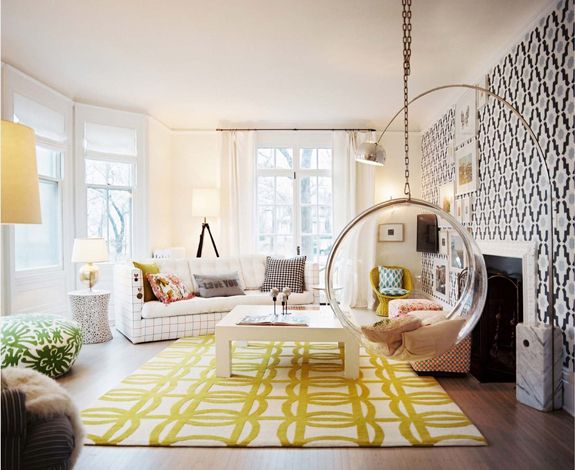
If My Blog Were a Room really got me thinking….I’ve only been blogging for about six months or so. West Pear Avenue was a name created and inspired by my family and my home. I like to think of it as an extension of my home and of me. A place where all are invited to stop in and hang out for a while. Perhaps a living area such as this one…

Interior Design by Massucco Warner Miller 

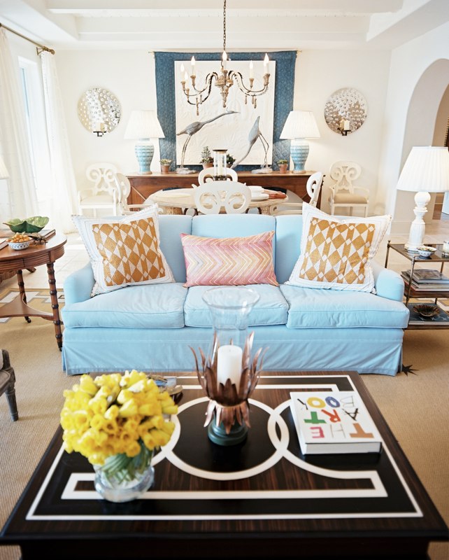
I love this bright, airy living area above. I would love to have a party with lots of appetizers and talk about anything and everything design. Lots of seating for all of us to sit and chit-chat.

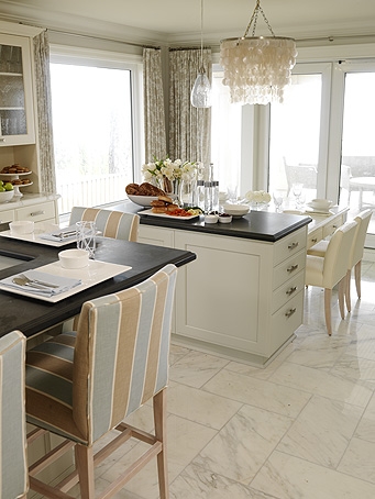
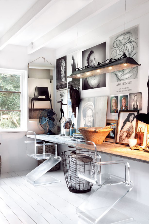
A kitchen/dining area also comes to mind when I think of my blog as a room. A space where all are invited to congregate, eat, chat, eat some more, share conversation, and hours upon hours go by and no one looks at the clock because they’re having so much fun. Who better to set the stage than Sarah Richardson…

Sarah Richardson Design
Oh Sarah, your designs make my heart skip a beat…better yet, if I’m having all of you over then I might as well invite the guest of honor Miss Sarah herself – how fun would that be!
Sarah Richardson Design
My blog is also a place where I like to share ideas and inspirations, and I always love learning from other bloggers and getting ideas on what inspires them. I’d love to collaborate with some of my favorite designers and blog buddies, it would be fun to design a room together. We could do some design work in here…

Celerie Kemble

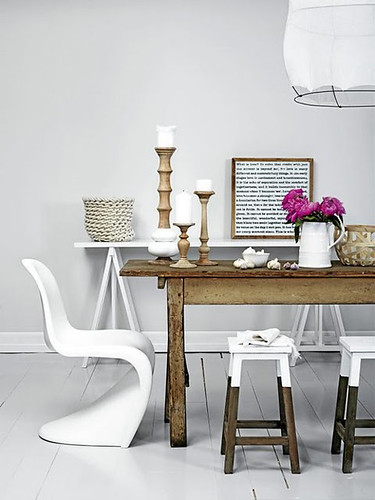
And then once all of our hard work is done, we could go relax and have a drink or snack here…

Better Homes & Gardens

 This was a fun exercise to envision my blog coming to life – I hope you enjoyed it! Thank you Amber for having me over today!

Thanks so much for being here, Holly! I also love everything Sarah Richardson does! And what a great idea to have bloggers get together and collaborate in a chic office space! Oh the fun we would have!  ๐Ÿ™‚ Definitely stop by Holly’s blog– you’ll be so happy you did!

Horizontal Stripes – Before and After!!

October 17, 2011 by Amber Filed Under: guest room


I have been talking for a while about making some changes to our guest room. I have so many ideas in my head for this space and I am super excited to cross one job off the list! I wanted to add two horizontal stripes to the bed wall, making this the focal point in the room. The space was already painted Yarmouth Blue by Benjamin Moore. While reading Sherry’s blog a while back, she added two, wide horizontal stripes to a friend’s master bedroom wall and I loved the outcome. I love a quick project with big impact, so I knew I wanted to try it! I decided to use some extra trim paint we had lying around and added two creamy white stripes to the blue wall:

My wonderful husband did all of the measuring and prep work, and I came in and painted! Our ceiling in this room is about 8 ft, so the stripes measure at about 18-19 inches wide. We wanted all of the stripes (both blue and white) to measure the same width, so that is how we came up with this number. After using a level and some painter’s tape, the stripes were ready to be painted! I ended up doing about 3 coats to cover the blue completely. After taking off the painter’s tape, there were minimal touch ups, but no big deal! I started taking off the tape while the paint was still a bit wet, so the tape wouldn’t rip off the dry paint. (It has happened to me in the past, and I learned my lesson!) So here are some before shots with the tape up:

And one with the stripes painted (only 2 coats at this point):

And a couple more afters:

I wanted the paint to completely cure and dry before putting the headboard back and the rest of the room together. The room still needs some art on the wall, throw pillows on the bed and some extra jazz in the space! Stay tuned for a completed guest room!

Oh- Simple Dwellings Interiors is finally on facebook! Check out the facebook link on my sidebar!

Fashion Friday

October 14, 2011 by Amber Filed Under: fashion friday


Happy Weekend and welcome to Fashion Friday… where I discuss my other design love! As you may know, I love to be comfortable! I also think it’s fun to cuddle up in a warm poncho on a cold day. So with fall already upon us, I thought it would be fun to put together a fall inspired look that I would definitely wear.

Fall Fashion

Fall Fashion by simpledwellings2

I love the colors of fall, so when I saw this orange shirt from Anthropologie, I loved it! And nothing says comfort like a pair of jeans and ballet flats! I also love a sweater poncho to bring it all together. Yesterday’s post showed a fun, whimsical and casual space. I loved how liveable it was and how inviting the decor made me feel. So…. why not put together the same type of outfit!

Happy Fall Weekend!!

Why This Works

October 13, 2011 by Amber Filed Under: why works series


Happy Thursday and welcome to the series Why This Works… where I show a designed space and talk about why (I think) it’s perfection. This living and dining space comes to you from Lonny and was featured in their June/July 2010 issue. The designer of this beautiful and fun space is Bunny Williams.

via Lonny Designed by Bunny Williams
This space has a great blend of traditional and modern and brings a smile to my face! The color on the sofa is fun and whimsical and pops against the white walls. The style of the sofa is traditional, but made more modern paired with the graphic design on the coffee table. The coffee table accessories are playful and fun and add a casual warmth to the space. The end tables flanking the sofa are traditional in design and works well paired with the neutral, but modern rug. The modern detail on the outside of the rug is just enough pattern and looks great with the contemporary look of the sofa pillows. The dining area is a nice balance to the space, with its aqua lamp bases that give a nod to the sofa color. The large chandelier over the dining table is grand in scale, making this traditional piece more modern. I love the layering effect that is going on by the sideboard zone. The fabric hanging above the sideboard is broken up by some art and large, beautiful bird sculptures that almost appear to be part of the art on the wall. The scale of those pieces and the wall sconces draw your eye to that part of the room, expanding the space. Overall, this space works! ï»¿

If My Blog Was A Room – Next Up – Interior Design Musings

October 12, 2011 by Amber Filed Under: blog room series


Happy Wednesday and welcome to the series If My Blog Was A Room… where I pose the challenge to think of your blog as an actual space. What would that space look like? I am so excited to have Mandi here, from her blog Interior Design Musings. Her blog is full of gorgeous spaces and beautiful ideas. She balances traditional with modern so well and I absolutely love what she came up with for this post! Without further adieu, here is what Mandi came up with!

What a treat to be here today participating in Amber’s series “If my blog were a room.”

I’ve been designing interiors for several years, but this past Spring I revamped my entire blog and launched my own interior design business here in Birmingham, Alabama.  So, I put a lot of thought into my logo design, both for my blog and interior design business.  I really wanted it to reflect my sense of style.  But, you know, . . . funny thing about graphic design – just because a logo makes you think of certain things, does not mean other people will conjure up those same thoughts.  So, for Amber to think of expressing a blog in terms of a room is simply genius!  
With that, here are my thoughts on what Interior Design Musings would look like as a room . . . 
source
Great Architectural Details
 For a room to be really special it needs some architectural details.  I like very traditional elements which help to create a timeless room.  I adore the floating staircase, the mission style newell posts, and if you look at the wall going up the staircase you can see even more trim detail.  Architecture is a great “first layer” to any space.
source
This stunning room is bold, but not fussy or overdone.  The deep crown moulding, chair rail, and amazing arched windows define the space.
source

Traditional Elements
There would be at least one fine old casement piece in Interior Design Musing’s room.  These tend to ground a space and give it a traditional foundation with a high end feel.  This chest is a stunning example.
source
That’s the thing about an antique piece, even one can make a huge statement in a room.
source
Modern Flair
Every great room includes an unexpected modern element.  This is what gives you the “wow” factor when you enter the space. This modern edge can take many different forms from lighting, accessories or artwork as seen below.   
source
It can also be incorporated in a more subtle way – like the frame of a mirror or a special accent chair.
source
Pop of Color
Add a unexpected pop of color for interest (like the orange in my logo).  This can totally change the direction of a room.  Also, if this pop is included through accents pillows and small furnishings these can be easily changed out for a fresh new look.
source
Or pick a color you LOVE, and you will never get tired of it!
source
Balancing Act
I like to think that Interior Design Musings achieves the balance.  When you have enough of both, the room feels right.
source
The goal is to achieve the balance without making it obvious.  Notice in this space the chandelier, table base and flowers feel girly while the leather chairs, wall color and artwork feel like a men’s den.  
source
I hope this has given you a glimpse into the window of my blog’s room.  It was so much fun dreaming about this!  Please come see me over at Interior Design Musings.  Thank you, Amber!  M.
Thanks so much for being here today, Mandi! I love the way you showed rooms that are traditional, but with a modern twist. I also love a space that has a pop of orange- it’s a great color! Definitely stop by Mandi’s blog… you’ll be so happy you did!

Dreamy Celebrity Spaces With Design Shuffle

October 11, 2011 by Amber Filed Under: celebrity spaces, guest post


With so much great design eye candy and chic real estate out there, I find myself (and maybe you too) very interested in how people decorate their own homes! With the premiere episode of Selling LA on HGTV this week, I thought it would be fun to peek inside some celebrity homes and see what their design style is like! Today, I have Susi here from Design Shuffle… a great web site for design professionals and enthusiasts. I was so excited to be a guest writer for their blog last week and super thrilled to have one of their talented writers here with us today, showing us how the celebrities live!

Hi, I’m Susi, a writer for Design Shuffle, a wonderful online community for design lovers and professionals around the world to share projects and inspiration. We have tens of thousands of design pics to inspire you. One of the best parts about being a writer for Design Shuffle is visiting amazing interior design blogs as a guest blogger. I’m excited to be here at Simple Dwellings writing about dreamy celebrity spaces, thanks for inviting me!

I wonder if celebrities love design blogs as much as the rest of us. Looking at these rooms, I’m guessing some do. Great for dreaming and inspiration, here are some of my favorite dreamy celebrity spaces. Which is your favorite? Mine is the last one. Enjoy!

Jessica Stam Home Design

Dreamy purple and jewel tone accents are gorgeous in the living room of model Jessica Stam. The high ceilings are highlighted by the beautiful floor to ceiling curtains.

Lindsey Buckingham Home

An incredible art collection is what makes this living room so dreamy. Love the custom upholstered sofa. The living room belongs to Lindsey Buckingham of Fleetwood Mac.

Jennifer Creel Home

On the hunt for bedroom design ideas? Add this one to the inspiration file. Love the intense colors in Jennifer Creel’s Manhattan bedroom. Dreamy patterns and monograms give this bedroom a boho-traditional look.

Julianne Moore Home

Julianne Moore’s living room shows that modern and neutral can still be dreamy and glam. Luxury textiles and classic modern design stand out in this loft style room.

Julianne More Home Design

Dreamy gray and modern lines fill this stylish living room, also designed by Julianne Moore. Love the wall lights that illuminate the sofa area. A great mix of unique and interesting accents personalizes the space.

Alexandra Wentworth Home

The bedroom of Alexandra Wentworth and her husband, George Stephanopoulos, is a calm oasis of warm neutrals and interesting textures. Soft gray blue makes a soothing accent color.

Julianne Moore Home

One of my favorite bathroom designs, this space is beyond dreamy. Fireplace? Huge soaking tub? Yes, please! It is also from Julianne Moore’s NYC home.

Meryl Streep Home

Can a kitchen be dreamy? Yes. This is Meryl Streep’s kitchen from It’s Complicated. Amazing. It feels so warm, inviting and inspiring. Love it. [ Images 1 / 2 / 3 / 4 / 5 / 6 / 7 / 8 ]

See something you may want to do in your own home? Check out Design Shuffle, where you can see talented work from a variety designers including San Francisco interior designers and Boston interior designers!

Thanks so much for being here today, Susi! My favorite might have to be Julianne Moore’s apartment. She has amazing design taste and I love that bathroom! I also love Jennifer Creel’s master retreat- the color is fun and inviting.

Which room is your favorite? Make sure to stop by and check out Design Shuffle for more decor inspiration!

DIY Fall Pumpkin Topiaries

October 10, 2011 by Amber Filed Under: fall fix ups, pumpkin topiaries


I was inspired by some painted pumpkins I saw a couple years back in an issue of Country Living, and I had to try it out! That same fall when my mom and I visited a local decor boutique, I fell in love with the way the shop owner stacked her pumpkins from small to large, creating a topiary effect. So… I combined the two ideas and voila… pumpkin topiaries were made! Here they sit on our front porch, along with some other fall decor:

And here is how to recreate these pumpkin topiaries:

– I purchased (2) small, (2) medium and (2) large orange artificial pumpkins from my local craft store.

– I used a small utility knife to cut a hole on the top and bottom of all pumpkins, except the tops of the 2 small pumpkins. Those decorative stems had to stay in tact for appearance purposes.

– I bought some spray paint and craft paint to decorate my pumpkins. I used black spray paint for the two bottom pumkins and silver and gold craft paint for the others. I wanted to give them different looks, so some had stripes applied with a brush, while others I applied polka dots with a flat, circle craft sponge. To apply the stripes and dots, I used craft paint. In order for the design to last and not wash off with the rain and harsh weather, I applied a shiny clear coat of spray paint to all pumpkins.

– To keep the pumkpins connected and not fall off, I purchased a dowel (craft stick) from the craft store and cut it to size. I wanted to make sure that the dowel would go to (at least) the middle of the smallest pumpkin, for stability and also leave room on the bottom, for the dowel to stand in the planter. I placed the dowel in a planter half filled with dirt, to stay in place. I then stacked my pumpkins in their topiary shape!

What fall ideas do you have up your sleeve??

I am linking this post up to the wonderful blog, Savvy Southern Style:

Photobucket

Some Really Cool News and Fashion Friday

October 7, 2011 by Amber Filed Under: design shuffle, fashion friday


Happy Friday! Before we get to the series post for today, I have some exciting news! I am guest posting today at Design Shuffle, a social networking site and blog for interior designers and design enthusiasts. They are a great source for finding amazing design inspiration. I will be over at their blog today, discussing a current decor trend and how to incorporate it into your home. I put a living room design together inspired by this one trendy piece. Stop by and check it out here.

And now, welcome to the series Fashion Friday… where I discuss my other design love! Yesterday’s post showed a casual, chic and eclectic living room space. I thought I would show the same type of outfit for today!

Casual Chic

Casual Chic by simpledwellings2

This outfit can easily be worn out during the day but transformed into evening attire by switching out the boots with heels and replacing this clutch with a sequinned one! It (hopefully) shows as comfortable and chic, casual and fun. I would definitely be comfortable in something like this and the hues remind me of fall. I played with color and pattern a bit here, with the striped shirt and chevron inspired clutch. It was fun to create, as jeans and comfort are my favorite words!!

Happy Weekend!!

Why This Works

October 6, 2011 by Amber Filed Under: why works series


Happy Thursday and welcome to the series Why This Works… where I highlight a designed space and talk about why (I think) it’s perfection. This gorgeous living room comes to you from Lonny and was seen in their Jan/Feb 2011 issue. The space was designed by Hillary Thomas.

via
What I love most about this space is how liveable and welcoming it appears! I bet this is the fun, popular hang out room in the house! The refreshing and chic color combination of deep plum, salmoney pinks and orange are whimsical, fun and stylish. The traditional seating works great paired with the modern art and contemporary fabric selections. The casual way the art is displayed works so well to make this space feel warm and welcoming. The neutral, light wall color is a subtle, beautiful backdrop for the amazing color in the furniture and accessories. The white cabinetry and fireplace are beautiful and practical and work well against the dark flooring in the room. The art sculptures on the floor by the fireplace are a fun and modern addition. I love that the art on the fireplace mantel is leaning against the wall- it definitely adds to the casual feel of the room. The bookshelves to the right of the fireplace showcase a fun and beautiful mix of books and accessories. Overall, this space works!

Are you more drawn to chic and casual or chic and dressy? ï»¿

If My Blog Was A Room – Next Up – Third Floor Design Studio

October 5, 2011 by Amber Filed Under: blog room series


Happy Wednesday and welcome to the series If My Blog Was A Room… where I pose the challenge to think of your blog as an actual space. What would that space look like? I am so excited to have Kimberly here, from her amazing design blog Third Floor Design Studio. Kimberly’s blog showcases fun and beautiful DIY projects and pictures of her gorgeous home. I get so much inspiration when I visit her blog! Here is her great blog header:

And here is what she came up with. Take it away, Kimberly!

If my blog was a room…. IF my blog was a room?! This question has been really fun to think about. I feel like my blog actually does a pretty good job of representing my design taste — a litte bit of eclectic, a dash of rustic, and a lot of contemporary color! Since starting this blog, I’ve definitely seen it evolve. I’ve come to realize my taste through the daily posts of inspiration I share, the DIY projects I attempt, and in the pieces I chose for our home. It’ll never stop changing {that’s for sure}, but for here and now this is what my blog would fashion if it had walls!

eclectic: when every single piece has a purpose. a hard look to achieve {ironically}.

source
source
source
source
Rustic: cozy and bold. 
source
source
stools dipped in paint
source
Contemporary & Colorful: bold patterns. mix and match. no color no fun. that includes a little pink…
source
source
source
source
source
source
source
Thanks to Amber for letting me hang out here today! Come stop by Third Floor Design Studio anytime.

Thanks so much for being here, Kimberly! The images she chose are gorgeous and remind me very much of her chic blog. I love the mix of design styles and taking it up a notch with fun color! Stop by Kimberly’s blog for some great design inspiration. And head on over there right now to enter her fabulous fall wreath giveaway with Nu and Boo. Enter HERE!

  • « Previous Page
  • 1
  • …
  • 51
  • 52
  • 53
  • 54
  • 55
  • …
  • 69
  • Next Page »
Welcome!

Hi, I'm Amber... a wife, mom and interior decorator. I am the writer of Simple Dwellings and the designer behind Amber B Design. Blog topics are all things design, with the occasional DIY attempt! Thanks for stopping by Read more...

  • Bloglovin
  • Email
  • Instagram
  • Pinterest
  • Twitter

Blog Posts, Straight to Your Inbox

Popular Projects

A dining room with white walls and wooden table.
A black door with white curtains and a red chair
A staircase with black and white chevron pattern on the steps.

Blog Love

  • Addison’s Wonderland
  • A Thoughtful Place
  • Alison Giese Interiors
  • Amber Interiors
  • Bailey McCarthy
  • Caitlin Wilson
  • Chris Loves Julia
  • Classic Casual Home
  • Cottage and Vine
  • Design Indulgence
  • Dwell by Cheryl
  • Eddie Ross
  • Elements of Style
  • Emily A Clark
  • Emily Henderson
  • Gallery No Eight
  • Hi Sugarplum
  • House of Jade
  • Jana Bek
  • Juniper Home
  • Kate Marker Interiors
  • Lucy Williams
  • Monika Hibbs
  • Our Fifth House
  • Pencil and Paper Co
  • Rachel Parcell
  • Rambling Renovators
  • Pure Style Home
  • Sita Montgomery
  • Studio Mcgee
  • The Makerista
  • The White Buffalo Styling Co
  • the Zhush
  • Traci Zeller
  • Young House Love

Copyright Amber B Design © 2025 ยท Design by Britt Douglas


Loading Comments...