Amber B Design Studio

Interior Design & Decoration for the South Florida region

  • Home
  • About
  • Services
  • Portfolio
  • Blog
  • Press
  • Contact

A Pop of Color Makes a Difference

August 20, 2012 by Amber Filed Under: design, personal design style


Every neutral palette comes alive with pops of color! Even the most monochromatic space looks completely different with the addition of just a few brightly colored accessories.  I love this look, because as your color tastes change over time, a few small changes can totally transform the space. Even if you have a very small budget to work with, a neutral backdrop can look like a different room with the addition of some color in the pillows, throw blankets and drapery panels. Take a look at these great examples of the power of color in small doses!

Just a little pink:

Caitlin Wilson Design

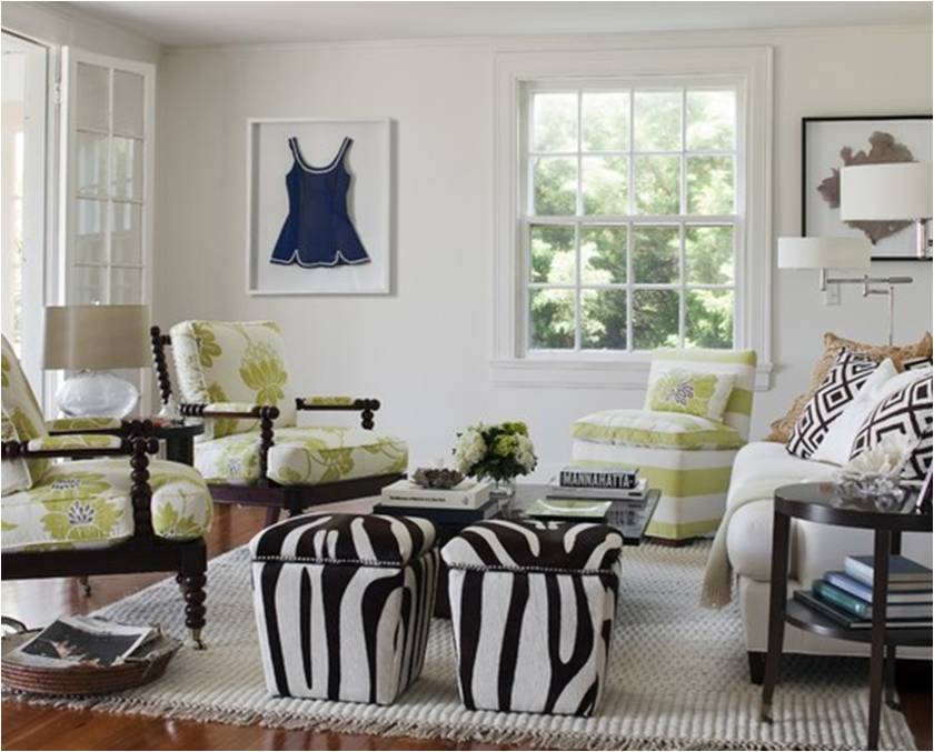
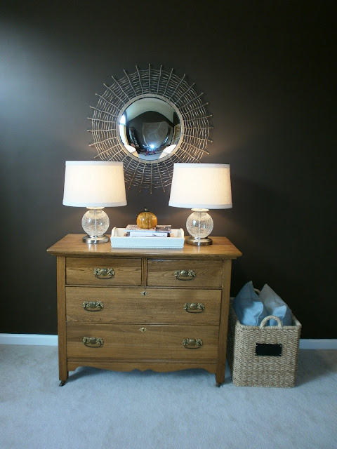
Color in the Pillows:
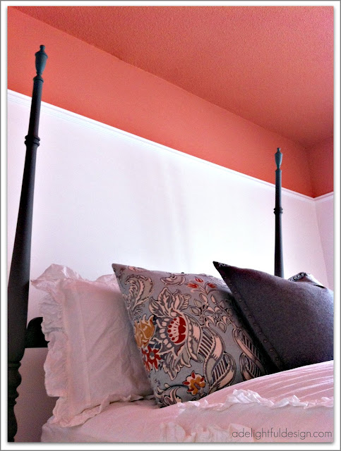
Source: homebunch.com via Amber on Pinterest

Add Some Coral:

Source: bhg.com via Amber on Pinterest

Some Red and Blue:

Source: shelterinteriordesign.blogspot.com via Amber on Pinterest

Bright, Fresh Flowers:

Source: caitlinwilsondesign.blogspot.com via Amber on Pinterest

Paint a Door a Bright Color:

Source: blogs.babble.com via Amber on Pinterest
Have you added a pop of color lately?? 

Why This Works

August 17, 2012 by Amber Filed Under: Uncategorized


Happy weekend and welcome to the series Why This Works… where I highlight a designed space and discuss what I love. Today’s classic living room was designed by Kate Jackson and is seen in Houzz. Take a look!

via
This room is part of a beach cottage home in Rhode Island and is the perfect blend of coastal living with modern chic. I love the bold mix of patterns in the space, from the throw pillows to the ottoman, to the chairs- it all works together! The creamy white walls allows the prints to take center stage and does not compete with the room’s accessories. The creamy natural fiber rug is perfect for sandy feet and adds nice texture to the room. The woven basket on the floor, the fresh flowers and books on the table, invites you to relax and stay a while. It is definitely a laid back home, with style. This home is near the beach, yet shows subtle hints of coastal decor, with the framed vintage bathing suit and coral on the side table. I love that! The modern swing floor lamps balance nicely with the traditional seating, allowing for a mix of modern with traditional. Geometric prints are paired with stripes, zebra and florals, and they all work! The designer worked with a neutral backdrop and only used a few colors to bring the room together. When colors are repeated throughout the space, mixing different patterns is a great trick to achieve depth and interest. Overall, this space works!
What are your thoughts??

An Unexpected Place for China

August 15, 2012 by Amber Filed Under: design, personal design style


When decorating, I try to add a touch of whimsy to the space. I think it speaks to your personality when you add a bit of quirkiness or yourself to your home. My mom recently gave us some espresso cups and saucers that were given as a wedding gift by her parents. I love being able to use heirloom pieces passed down from family members. It adds such a sense of history to your table setting. My husband and I have started having cups of espresso and cappucino on the weekends, and these will definitely come in handy! Here is the beautiful set:

I love the gold detail on the outside! I wanted to place them in an interesting location, so I would be able to see them all the time, while also being a little unexpected…

A great solution to a full china cabinet?? Place some dishes in an unexpected place, like this lantern! You will always be able to see it when you walk by, and enjoy it all day long!

Have you done something unexpected with your decor??

How One Change Changes Everything

August 13, 2012 by Amber Filed Under: e-decorating, e-design


I recently wrapped up a living room e-decorating project.  The client was looking for a modern, mid-centurystyled space with neutral furniture and pops of color in the accessories. She also loves graphic prints and wanted them incorporated into the design. Here is one of the boards I came up with:
(Click on design board to make larger)

 Remember my Ombre post? It was inspired by this design! The pops of gold are fun in the space. The oval gold/cream object on the left of the board is actually a dresser knob that I suggested for the media cabinet. I think it would really jazz up the piece! She really loved the design, but we went back and forth on a few options for the area rug. This ended up being a fun little project for me, because I was able to see how one change can change the whole look of the space. Let’s take a peek at replacing the ombre rug with a natural, jute option:

It definitely tones the room down and neutralizes it a bit more. I think the ombre option above might be a little more trendy and help to incorporate our accessory color. When I went with the blue rug, I decided to take out the black and white pillows, as I thought the colors would compete too much.

Which would you choose? I think I know my choice!

Why This Works

August 10, 2012 by Amber Filed Under: why works series


Happy weekend and welcome to the series Why This Works… where I highlight a designed space and discuss what I love. Today’s sitting room is from the home of Jacqui Getty and was seen in the 2011 issue of C Magazine.  Enjoy!

via
What first gets me about this space, besides the zebra ottoman, is the amazing corner gallery wall! I just recently suggested this idea for a client, because it’s a creative way to make use of the corner of a room!  The pictures are hung in a random, asymmetrical way and the frame finishes are different, making this side of the room so stylish and fun! It’s such an achieveable look, because we all have mismatched frames around our house and there is no right or wrong with this frame layout. It can be a mixture of art with family photos and it really draws your eye to that side of the room. I also love the corner table vignette, with the gold lamp and fresh flowers. Every room looks better with fresh flowers!  ๐Ÿ™‚ The gold is then seen again in the space, with a small accessory bowl on the right side of the image. A room’s accessory color always works well when the color or finish is repeated throughout the space. The gorgeous cane chair and sofa are painted black, giving them a modern edge. The wall color is a light, airy neutral, along with the seating’s upholstery and window shade, to allow for the showstopping ottoman to take center stage. I love large ottomans, so you can put your feet up and layer books. Overall, this space really works! To see more of this amazing home, visit here. 
What are your thoughts??
I first came across the idea of a corner gallery wall, when I saw my blog friend Elizabeth’s hallway! Look at her amazing framing and styling work:

via

Isn’t is beautiful?!? I have to find a corner in my home to try this. Check out Elizabeth’s blog here. Have a great weekend!  ๐Ÿ™‚


My Go- To Paint Colors

August 7, 2012 by Amber Filed Under: design, paint colors


When I’m sourcing paint colors for a client or choosing for my own home, I am drawn to a few favorites that always work! I almost always choose Benjamin Moore paints and use their line of Pure Performance, Low Odor paints. They are self priming, go on great and hardly have any odor. They are also supposed to be their green option for paints, because of the low VOC’s. So, it’s a favorite! Here are my go- to colors:

Alaskan Husky

This is a very light, blue/gray that works with so many other colors. I have used it to bring warm and cool tones together and for a light, serene backdrop. It’s also the color choice in our master bedroom, kitchen and family room.

Our Family Room
Titanium
This is a very pale gray with a subtle hint of green. I have to find a place for this in my home! I did just suggest this color for a client, and I can’t wait to see it completed!
via
Classic Gray
This is a true gray. It is a lighter shade, and will go with just about any color!

via
Queen Anne Pink
This is a beautiful shade of pink that resembles ballet slippers. I can imagine this hue paired with gray or green!

via
Hale Navy
This is a classic, deep blue great for an office, bedroom or dining room. It can be paired with white, yellow, orange or red.
via
Mink
This a deep and bold brown that almost appears black on the walls. This color looks amazing paired with coral, turquoise and gold.
Our Living Room
Dragon’s Breath
This is a great color for doors and stair railings. it’s a muddy gray/black with a hint of brown. I’m a huge fan!
Our Foyer
Coral Rock
This is a fun color in small doses. I would love it for the back of book shelves or on a door! Here, it’s used on a ceiling and part of the wall- beautiful!
via
So there you have it- my favorite paint colors! I always like to go with an eggshell finish for walls. It’s scrubbable with just a light sheen.
Do you have a favorite go – to paint color? Is is on this list??


Ombre Love

August 6, 2012 by Amber Filed Under: Uncategorized


I love the Ombre look and have definitely seen it everywhere from fashion to baking to interior design. Ombre, by definition, means shaded or graduated in tone. I am sourcing some area rugs for a client and came across this beautiful ombre rug:

via
I love it! The shades of blue are gorgeous! Here are some other great ombre looks…

Source: pin4fun7644.blogspot.com via Trang on Pinterest
Source: pin4fun4518.blogspot.com via Dwana on Pinterest
Source: gkonon.kickme.to via – on Pinterest
Source: pin2fun1959.blogspot.com via Janita on Pinterest
Source: etsy.com via Lauren on Pinterest
Source: 3.bp.blogspot.com via Cheryl on Pinterest
Do you also love this look? Would you go for it??

Why This Works

August 2, 2012 by Amber Filed Under: why works series


Welcome to the series Why This Works… where I show a designed space and discuss what I love. This gorgeous dining room belongs to the popular style blogger, Bethany Herwegh, who writes the blog The Glamorous Housewife.  Her home was feautured in Country Living magazine this spring and it is beautiful, creative and stylish. Enjoy!

Source: talesofaretromodernhousewife.blogspot.com via Amber on Pinterest

What first blew me away about this space is the wallpapered ceiling! That immediately draws your eye up and makes you take notice of the room! This bird wallpaper is perfect for a ceiling, because it reminds you of the sky. While you’re looking up, the gorgeous glass chandelier must look amazing lit up at night! This space has such a whimsical, soft feel and it makes you want to stay and linger for hours with friends and family. The Eames inspired chairs are alternating colors, making the modern style feel more cozy and playful. It is balanced well with this large, trestle table. This is a great mix of modern with rustic, and it works so well! A pop of color is seen in the gorgeous hutch with the glass front cabinets. The wall color is light and airy, allowing the hutch to take center stage. The dress form has this beautiful floral fabric which ties in the room’s color palette. Overall, this space works! To see more of her magazine feature and her blog, go here!

What are your thoughts?? 

A Quick and Easy Furniture Update

August 1, 2012 by Amber Filed Under: design


Are you like me and love high end pieces, but refuse to pay an arm and a leg for it?? I want the look, just not the cost. So an easy and inexpensive way to update a dresser in 5 minutes is by replacing the knobs! Maybe you have a dresser in need of a little refreshing or you found a great flea market piece that needs a little pick me up. The options are limitless. You can update bedroom dressers, media units or even kitchen cabinets! Here are a few of my favorites that can be adapted to any room!

Linen Flower Knob
Silvered Mirror Knob
Gleam Theory Knob
Pink Poppy Knob
Crystal Ornament Knobs
I love the last two images for a nursery! If you have a night stand with two knobs, it’s a quick $20 fix with great impact.
Have you made any quick fixes lately??

Mixing Metals and Wood Finishes

July 31, 2012 by Amber Filed Under: design, e-decorating, e-design, personal design style, style


I am putting a living room design together for a client and we’re going for a modern, mid century look. I love the idea of mixing metals and wood finishes in a space and plan on doing that here! I think sometimes, people may be afraid to mix metals in a room, thinking they all have to match. If you have a chrome lamp, that doesn’t necessarily mean every metal has to also be in chrome. Why not mix it up with a little gold for an eclectic look?? The same goes for your wood finishes. I love seeing light and dark woods in the same room, just like when mixing design styles. You can really take an everything goes approach, within reason. Here are some great examples of mixing things up…

Light woods with Dark…

Source: architecturaldigest.com via Amber on Pinterest
Source: houseofturquoise.com via Amber on Pinterest

Mixing Metals…

Source: apartment34.blogspot.com via Amber on Pinterest

Source: lampsplus.com via http://pinterest.com/jamiejojoyal/ on Pinterest


Try it out! You’ll be surpised that it actually goes together!

  • « Previous Page
  • 1
  • …
  • 34
  • 35
  • 36
  • 37
  • 38
  • …
  • 69
  • Next Page »
Welcome!

Hi, I'm Amber... a wife, mom and interior decorator. I am the writer of Simple Dwellings and the designer behind Amber B Design. Blog topics are all things design, with the occasional DIY attempt! Thanks for stopping by Read more...

  • Bloglovin
  • Email
  • Instagram
  • Pinterest
  • Twitter

Blog Posts, Straight to Your Inbox

Popular Projects

A dining room with white walls and wooden table.
A black door with white curtains and a red chair
A staircase with black and white chevron pattern on the steps.

Blog Love

  • Addison’s Wonderland
  • A Thoughtful Place
  • Alison Giese Interiors
  • Amber Interiors
  • Bailey McCarthy
  • Caitlin Wilson
  • Chris Loves Julia
  • Classic Casual Home
  • Cottage and Vine
  • Design Indulgence
  • Dwell by Cheryl
  • Eddie Ross
  • Elements of Style
  • Emily A Clark
  • Emily Henderson
  • Gallery No Eight
  • Hi Sugarplum
  • House of Jade
  • Jana Bek
  • Juniper Home
  • Kate Marker Interiors
  • Lucy Williams
  • Monika Hibbs
  • Our Fifth House
  • Pencil and Paper Co
  • Rachel Parcell
  • Rambling Renovators
  • Pure Style Home
  • Sita Montgomery
  • Studio Mcgee
  • The Makerista
  • The White Buffalo Styling Co
  • the Zhush
  • Traci Zeller
  • Young House Love

Copyright Amber B Design © 2025 ยท Design by Britt Douglas