Amber B Design Studio

Interior Design & Decoration for the South Florida region

  • Home
  • About
  • Services
  • Portfolio
  • Blog
  • Press
  • Contact

If My Blog Was A Room – Next Up – The Design Pages

July 13, 2011 by Amber Filed Under: blog room series


Happy Wednesday! It’s time for the series If My Blog Was A Room… where I pose the challenge to think of your blog as an actual space. What would that space look like? I am super excited to have Carol here from her amazing blog, The Design Pages. Carol’s design blog is packed with creative, beautiful DIY projects, beautiful design and a very talented lady! I am so happy I found Carol’s blog and that she is a part of the series! Here is her great blog header:

And here is what she came up with. Take it away, Carol!

Hi everybody.  I’m so happy to be part of Amber’s awesome series.  I love that Amber is trying to see whether there is a correlation between our blogs and the things we love in design.


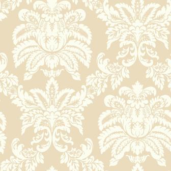
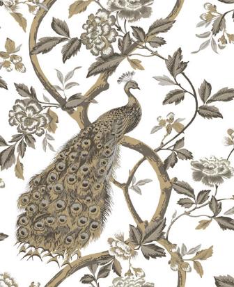
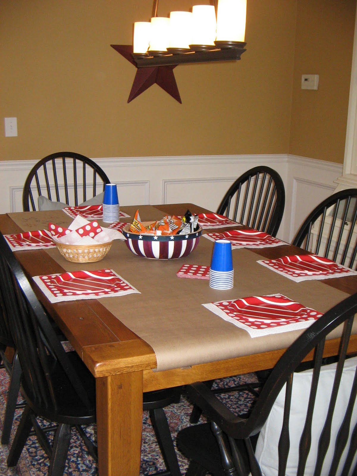
When I started looking for images I knew I had to start with the colours.  It took me a really long time to decide on the colours for my logo.  I told my graphic designer that I didn’t want blue and orange but like all good designers she was able to read between the lines and in the end that’s the one I loved the most.


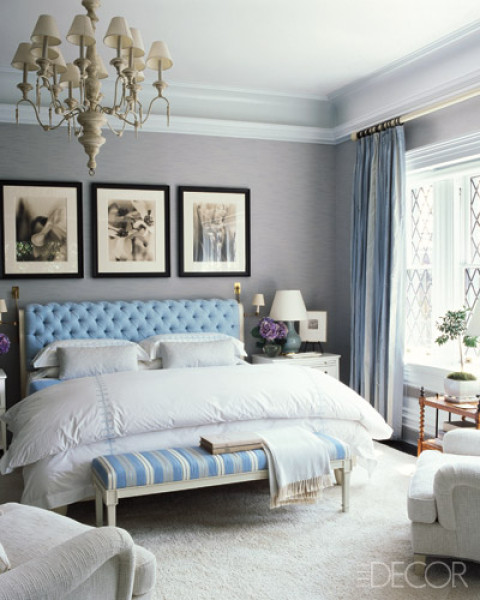
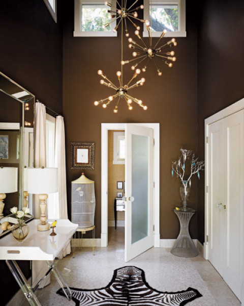
This room says simple, uncluttered, slightly retro and stylish.

via
I also love a space that has one perfectly put together object or element that says wow.
via
I love the warmth of an exposed brick wall and I really love how this homeowner mixed in some industrial elements.
via
I always go for a simpler kitchen but think the collection makes it anything but dull.
via
At the end of the day I would love to kick back with friends and family and enjoy some amazing times by the pool.
via
Thanks Amber for having me today.  It’s been really fun exploring my blog’s personality.

Thanks so much for being here today, Carol! These images are stunning- the orange runner down the stairs is so stylish. Definitely stop by and check out Carol’s blog! While you’re there, check out her DIY Projects tab- I am sure you will want to try one of her amazing projects!

Our Wallpaper Has Arrived!

July 11, 2011 by Amber Filed Under: damask wallpaper


I am so excited to be writing this post- our wallpaper is here!! I have had my eye on this wallpaper for so long. It all started almost a year ago, when my mom and I went to our area’s parade of homes. I walked into this one home and fell in love! I wish I had the home’s pictures to show you, but I wasn’t writing a blog back then and didn’t bring my camera. Can you believe that- no camera!  ๐Ÿ™‚ The showcase home had gorgeous large print damask wallpaper in the foyer, and it made such a statement! So I kept the wallpaper design in mind and knew I had to try it in my own home. I e-mailed the designer to get a quote on the exact wallpaper and found out it would be about $68 per roll! Not going to work for me- I happen to have a large foyer and need a whopping 12 rolls! So, I did my research. I found an almost exact replica for less than 1/3 of the price! And since it was my birthday recently (yay!) my wonderful husband got the wallpaper as a gift! My mom and I plan to do the work ourselves (thanks so much, mom!) I can’t wait to see the outcome! Here are some images of the wallpaper, from the main site. (I believe the wallpaper was actually purchased from http://www.wallpaperstogo.com/, which is a great, inexpensive source to purchase wallpaper!)

Our Wallpaper!!

I am so excited to get to work! Here are some other gorgeous prints they offer:

The second peacock image is a closeup of the first. I also love this paper and have been daydreaming a room design around it! E-mail me for rates, if you would like a room designed around this paper. I have so many ideas!

And here is another traditional print, but appears more modern with its dramatic large scale size.

I will post before and after pictures soon, along with a step by step process! Wish us luck!!
By the way, do you have any great wallpaper hanging tips??


Why This Works

July 8, 2011 by Amber Filed Under: why works series


Happy Friday! Welcome to the series, Why This Works… where I show a designed space and discuss why (I think) it’s perfection. Today’s room is a gorgeous room living designed by Patrick Wade and featured in House Beautiful. I could see myself relaxing in this space, as it is casual, comfortable and very chic.

Designed by Patrick Wade and seen in House Beautiful.
I am not sure what drew me to the room more- the bold printed rugs, the soft muted colors or the effortless way the room stays both chic and casual- maybe it’s a combination of it all! Patrick Wade is the designer and homeowner to this space he shares with partner Dave DeMattei. I love the pops of gold and bright orange in the space, against the more muted neutral tones. I love the traditional wingback chair paired with the more sleek lines of the sofa and occasional chair. The white, tulip style side table next to the sofa looks great with colorful flowers and fruit on top! I love the rustic simplicity of the ladder and greenery paired with the geometric, bold area rugs. (And I love the layered look of area rugs! It gives the space added texture and interest.) The task lighting is fun and modern and works so well with the creative, artist vibe in the room. Overall, this space is a blend of great design styles, it’s casual and chic, while also being so liveable!

What I Learned in Design Class part 2

July 7, 2011 by Amber Filed Under: design class


I am back today, sharing more of what I learned so far in design class. In no time at all, we were diving right in, pairing up in teams and role playing the designer/client experience! We each had to be the client and come up with a room that needed design work. Then, we switched and became the designer, giving the vision for the space. As the client, we had to give a detailed list of what the room already had and what we wanted to change. We then came up with questions for the designer and got ready to discuss our vision for the space. When I was the client, I decided to remodel our bathroom, since we really are planning that renovation. The role playing designer came up with great ideas and really listened to my suggestions. (Which is what I will always try and do for real clients. I think that part is so important.) When I was role playing the designer, the client chose her master bedroom. She has an older, historic home with wood floors and plenty of original details. The previous owners had painted the floors and now the paint is peeling. She was looking for a romantic cottage feel for the space and loved the color purple. My mind immediately started spinning with ideas! I suggested she sand and stain the floors a dark walnut brown color. This will hide any imperfections in the floor and help bring the original look back into the space. I also suggested a light purple, with gray undertones for the walls, with one wall wallpapered in a large damask print. This will act as the focal wall, and the wallpaper will go on the wall behind the bed. To neutralize the rest of the space, I suggested crisp white bedding, with accent pillows in various shades of purple. (I thought the color combination of white, gray/purple and brown was a nice combination.) This is a wordy post, isn’t it? Well, if you made it this far- thanks! Here are some pretty master bedrooms that are inspirations for the above space. Enjoy!

All images via

If you would like to transform your dwellings, please e-mail me at [email protected] and visit my design services page link above for more information. I am ready to start decorating!

What I Learned in Design Class

July 6, 2011 by Amber Filed Under: beach inspired, design class


A while back, I mentioned that I would take design classes this summer. I just wrapped up the first session of classes and plan to continue more sessions in the fall. It’s amazing what one can learn in just a few classes. I am starting to feel much more confident in the planning and drawing stages of a room’s layout. This first session taught me about drawing rooms to scale, properly using the graph paper to sketch out the room and all of its components. We even split up into teams and measured the classroom. That was definitely a challenge, as our room just happened to have so many bulkheads and odd corners. Nevertheless, I am so excited to continue and know this is the path for me! We ended this session by creating our own room design and sketch, including purpose of the room, window and door placement and choosing the room’s design style. (Of course, I chose a traditional/modern room!) We stayed about a half hour after class, picking the teacher’s brain about what it is like to have a successful design firm. That was also so informative for me! Sorry that I don’t have any pictures of class time, but I will leave you today with some amazing beach inspired spaces!

 All of the above images via
Image via

Happy Wednesday!

A Simple and Festive Table Setting

July 5, 2011 by Amber Filed Under: patriotic snacks festive table setting holiday


Happy 4th of July! We had a blast this year, entertaining and creating a simple, fun and festive atmosphere for guests! The key word for me, being simple. I am definitely not one to spend a lot of time making extravagant centerpieces, and I am far from Martha Stewart when it comes to entertaining! If it’s easy, fun and looks/tastes good- then I’m all for it! Here are some snacks that are easy to make and look very patriotic!

Patriotic Parfaits

The grocery list for this snack is simple, and you may already have most of these items at home. You will need: vanilla yogurt, blueberries, strawberries (sliced) and granola. After all materials are laid out on the counter, I started the layering: first the yogurt, then granola, then strawberries and blueberries. Then, repeat (probably one more time) with the fruit as the top layer. Voila- an easy, delicious snack for breakfast or dessert! I liked using a clear wine glass when presenting, to show off the layering work. When giving this snack to kids, just replace with clear plastic cup and spoon!

Patriotic Marshmallow Pops

These marshmallow covered treats are so fun! I found this idea from Courtney of A Thoughtful Place. I’m so glad I tried this festive snack- they were so easy and delicious! (And I love that they look like sparklers!) I borrowed the container from my mom (thanks mom!) and filled it with rice, to keep the sticks in place. I could have also used sand, but had the rice on hand. I used grilling skewer sticks for the marshmallows and cut the sharp tips off. I tested out the sticks in the rice filled container, first.

I then melted chocolate chips in a bowl and placed the red and blue sprinkles in another bowl.

After melting the chocolate in the microwave, I dipped the marshmallows in the chocolate and then in the sprinkles! They were a hit! It took about 10 minutes from start to finish. I suggest preparing the snack right before you present it. I prepared the snack about an hour before and the marshmallows were starting to slide down the stick. But, I would definitely do it again. Thanks Courtney, for the idea!

Patriotic Cookies
Not much to say about this one, since they were store bought! Yay for simple and easy- just present them on a fun plate!
Patriotic Paper Goods from Target

The polka dot placemats were just paper napkins from Target. The table runner was rolled out brown packing paper- it makes a great place for art! (Next time, I will try and find the white art paper instead- it might look a bit better with the theme.) And maybe next year, I will trace a cut our star, instead of going freehand. Oh well- I don’t think anyone noticed!
Happy 4th of July!!

Why This Works

July 1, 2011 by Amber Filed Under: why works series


Happy Friday! I am back with the series, Why This Works… where I highlight a designed space and talk about why (I think) it’s perfection. Today, I have foyers on the brain! We plan to add wallpaper to our foyer this summer, and I am so excited for the transformation it will bring! So today, I thought I would show some inspiring foyer spaces that demand attention!

 All images via Elle Decor. Image 1, Image 2, Image 3.
These foyers are showstoppers, with their perfect blend of traditional and modern, rustic and elegant, simple and over the top. The foyer is the first room you see when walking into the house, and these do not disappoint. I am now ready to work on mine! The inspiration behind this post also comes from one of my favorite bloggers, Sherry from Design Indulgence. She recently transormed her foyer, and it is gorgeous! Check it out here. 
Make sure to check back later this weekend, as I post fun, entertaining ideas for the 4th of July!

White Subway Tile- Check! Now, What Grout Color?

June 29, 2011 by Amber Filed Under: subway tile grout color


In the spring, I am excited that we will be sprucing up our master bathroom a bit! We are going to replace the counter, retile the shower, repaint the walls, and maybe replace the flooring. Good stuff- I cannot wait! We are definitely going with white subway tile in the shower, but the dilemma is the grout color! Do we go with a classic white, or switch it up and go with a dark gray/black grout? I love both looks! I recently saw on Million Dollar Decorators that one of the designers chose a dark grout for the shower he was renovating and said, the dark grout gives it a more masculine feel. That’s fine with me, because I can always compliment that with some crystal accessories and shiny chrome, to glam it up for me! It could be a nice balance for us. Then again, I am drawn to the white grout, because of it’s classic look. You can never go wrong with that timeless look. What’s a girl to do? (My husband doesn’t mind and left this detail up to me!) Now to ponder a bit more, we also plan to use the same white subway tile in our kitchen (down the road). Back to the same question again- white or dark gray/black grout? Here are some gorgeous kitchens and bathrooms that use either white or gray/black grout:

via Rue Magazine
via Elle Decor
via Lonny Magazine
via Elle Decor
via Lonny Magazine
via Lonny Magazine
I would love to hear your opinion… I’m more confused than ever!

Did you know about this site?

June 28, 2011 by Amber Filed Under: new design source


I always love to find a new source for inexpensive, beautiful home decor. I came across one last week! In the mail, I received a new catalogue from Home Decorators Collection. You can shop through their catalogue or on-line, and their selections are comparable to other more expensive retailers, but with a better price tag! I guess they are a division of Home Depot- the catalogue is great! So, I decided to create a design board using (mostly) products from their collection.
I was so impressed with their selection and prices! Everything on this design board is from the Home Decorators Collection, except for the martini side table, throw pillows and orange drapery fabric. I am impressed and will definitely use this store for future design boards for clients (or for our home)! If you are interested in having a design board created for you, please e-mail me at [email protected].

Was I the only one left out in the dark about this source?

Also, I’m over at Courtney’s blog, A Thoughtful Place today, sharing an easy, fun dessert for the 4th of July! Stop over and check it out!

Coral on the Porch

June 27, 2011 by Amber Filed Under: coral


In a previous post here, I talk about my love for coral. I received a great comment from a reader, saying she just found some pretty coral pillows for an amazing deal and they proudly sit out on her porch! I was so excited to see her finds, that I asked her to send over some pictures. It turns out, she has recently started a blog and decided to post about her porch finds here. Her name is Melissa, and her blog is The Happier Homemaker. Here are the coral pillows and pretty porch:

I love these pillows! She found them at Steinmart’s for $12 each!! The rest of her accessories also give the porch a fun summer look. You can read more about her porch here on her blog. Stop over and say hi! And thanks Melissa, for leaving your comment and sharing your beautiful porch.

What great deals have you found lately?

  • « Previous Page
  • 1
  • …
  • 57
  • 58
  • 59
  • 60
  • 61
  • …
  • 69
  • Next Page »
Welcome!

Hi, I'm Amber... a wife, mom and interior decorator. I am the writer of Simple Dwellings and the designer behind Amber B Design. Blog topics are all things design, with the occasional DIY attempt! Thanks for stopping by Read more...

  • Bloglovin
  • Email
  • Instagram
  • Pinterest
  • Twitter

Blog Posts, Straight to Your Inbox

Popular Projects

A dining room with white walls and wooden table.
A black door with white curtains and a red chair
A staircase with black and white chevron pattern on the steps.

Blog Love

  • Addison’s Wonderland
  • A Thoughtful Place
  • Alison Giese Interiors
  • Amber Interiors
  • Bailey McCarthy
  • Caitlin Wilson
  • Chris Loves Julia
  • Classic Casual Home
  • Cottage and Vine
  • Design Indulgence
  • Dwell by Cheryl
  • Eddie Ross
  • Elements of Style
  • Emily A Clark
  • Emily Henderson
  • Gallery No Eight
  • Hi Sugarplum
  • House of Jade
  • Jana Bek
  • Juniper Home
  • Kate Marker Interiors
  • Lucy Williams
  • Monika Hibbs
  • Our Fifth House
  • Pencil and Paper Co
  • Rachel Parcell
  • Rambling Renovators
  • Pure Style Home
  • Sita Montgomery
  • Studio Mcgee
  • The Makerista
  • The White Buffalo Styling Co
  • the Zhush
  • Traci Zeller
  • Young House Love

Copyright Amber B Design © 2025 ยท Design by Britt Douglas