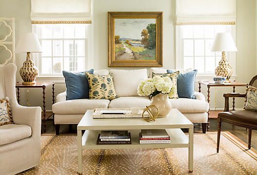
Welcome back to another installment of Why This Works… a series where I show a designed space and talk about why it works so well. Today’s living room is all about a mix of traditional, classic design with a dose of modern fun. This stunning space was seen on One Kings Lane and it was love at first sight. Take a look!

I love this space! What first gets me is the balance of formal with casual. The formality is definitely shown in the symmetry of the roman shades and table lamps. The furniture reads more traditional and then you are met with the gorgeous modern accessories, that take this room to the next level. The antelope rug is a favorite of mine and it works so well in this space, against the light furnishings. I am also a huge fan of oversized accessories and believe that a few, well chosen larger pieces works better than several smaller options. The large wall art, pillows, lamps and even the fresh flowers, allows your eye to look around the room and gives the illusion of more space. While the space is dressy, the large coffee table brings a functional aspect to the room. There is plenty of room for drinks, snacks and to rest your feet. Overall, this space works!!
What are your thoughts??? I will be back tomorrow with the final before and after from Project Classic Living… the Bathroom!
Thank you for the great lesson. I love reading about design!