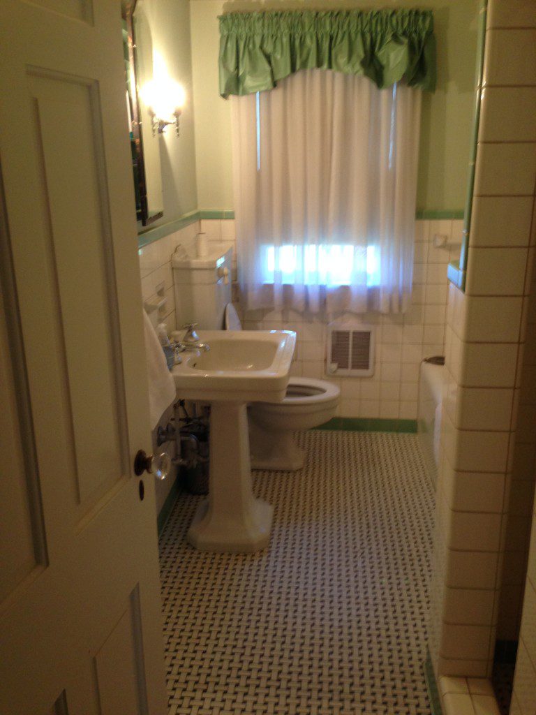
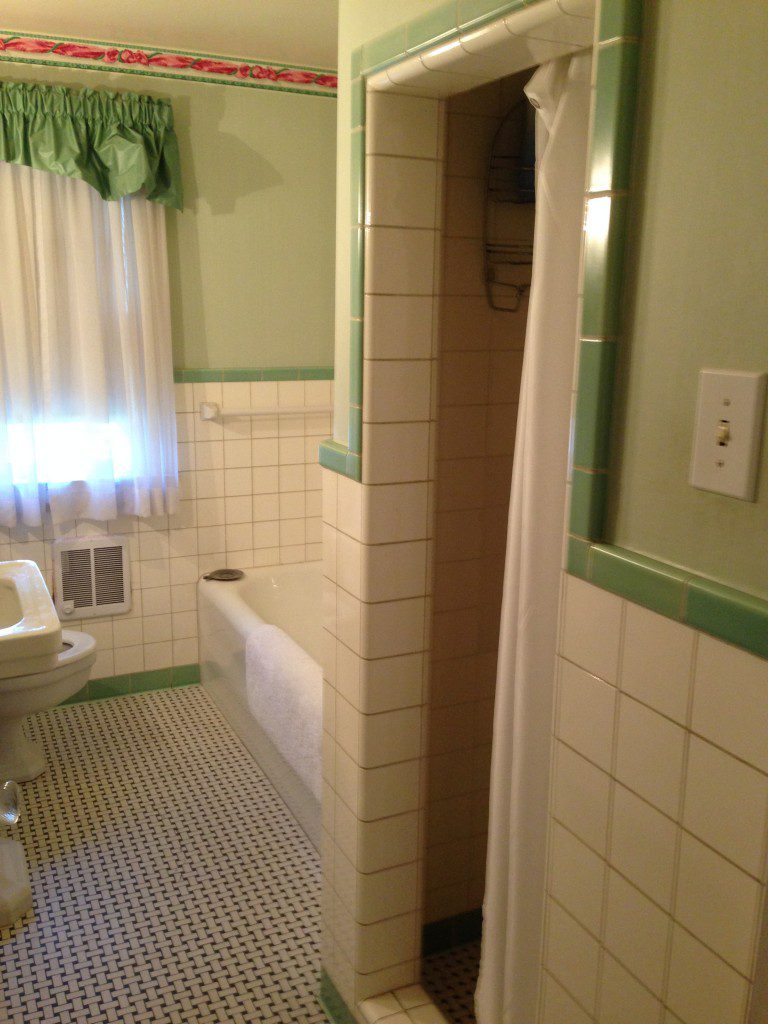
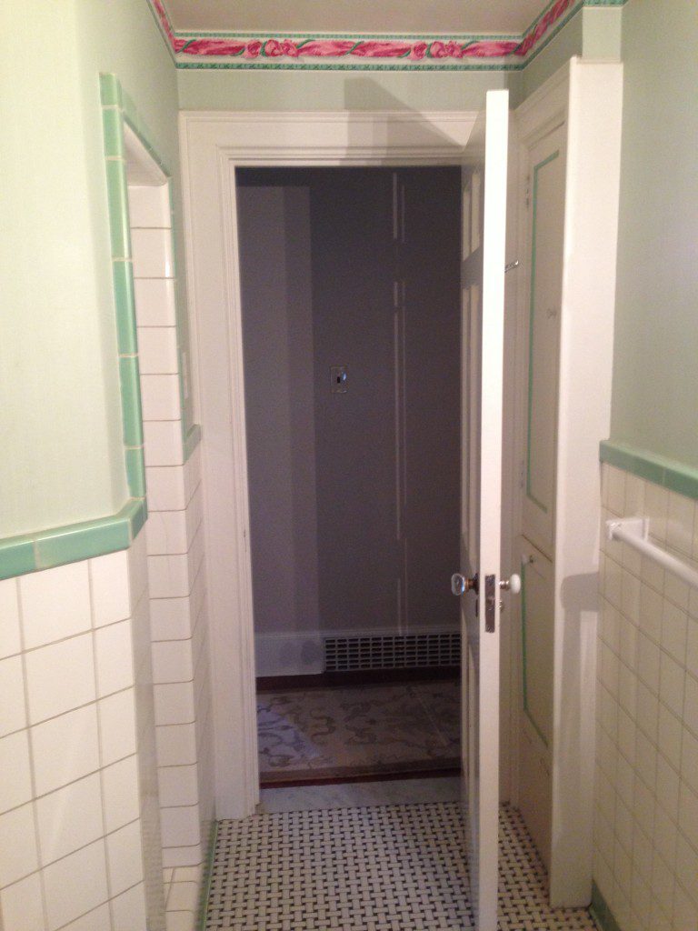
We are now at the final day of the before and after series from Project Classic Living. To catch up on all of the previous posts for this home design, visit HERE. I love this house and working with these clients. We have other future projects in the works, so this is not the end of this gorgeous home tour. My clients had already been working with a contractor for the bathroom and brought me in for the finishing touches and to bounce off ideas for the overall design aesthetic. I actually created a pinterest board for this design and you can view it HERE for comparison between inspiration and final result. We discussed a couple of different flooring options and patterns and they ultimately decided on the hexagon tiles, which work so well with the home’s traditional charm and character. There is a dramatic difference between the before and after, since plumbing was moved and the space was completely gutted. The after pictures are by the talented Sarah Heppell. Enjoy!
Before
After
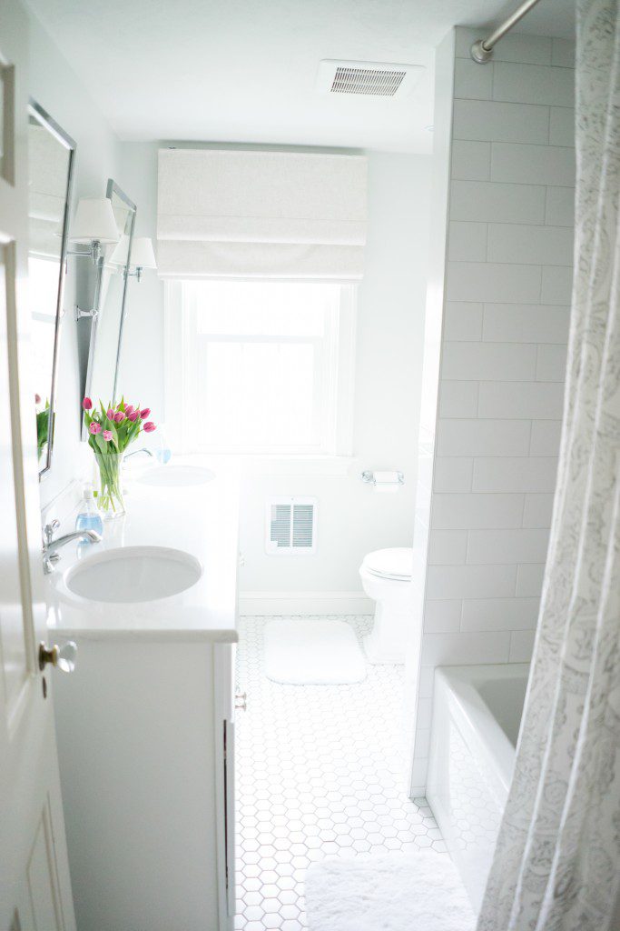
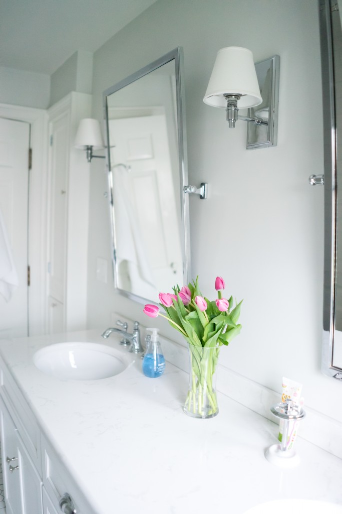
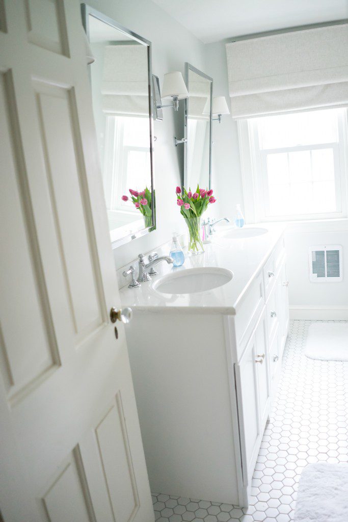
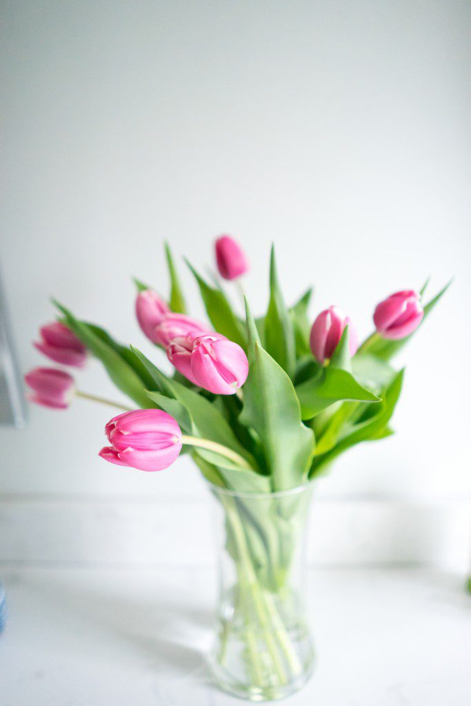
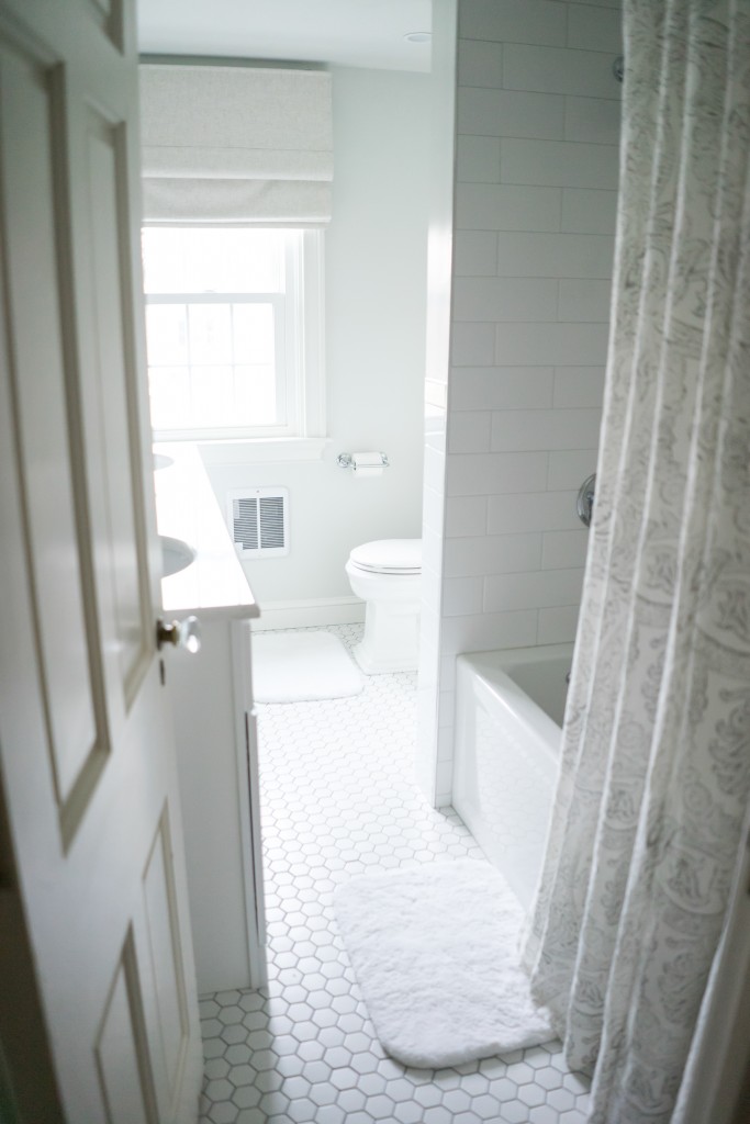
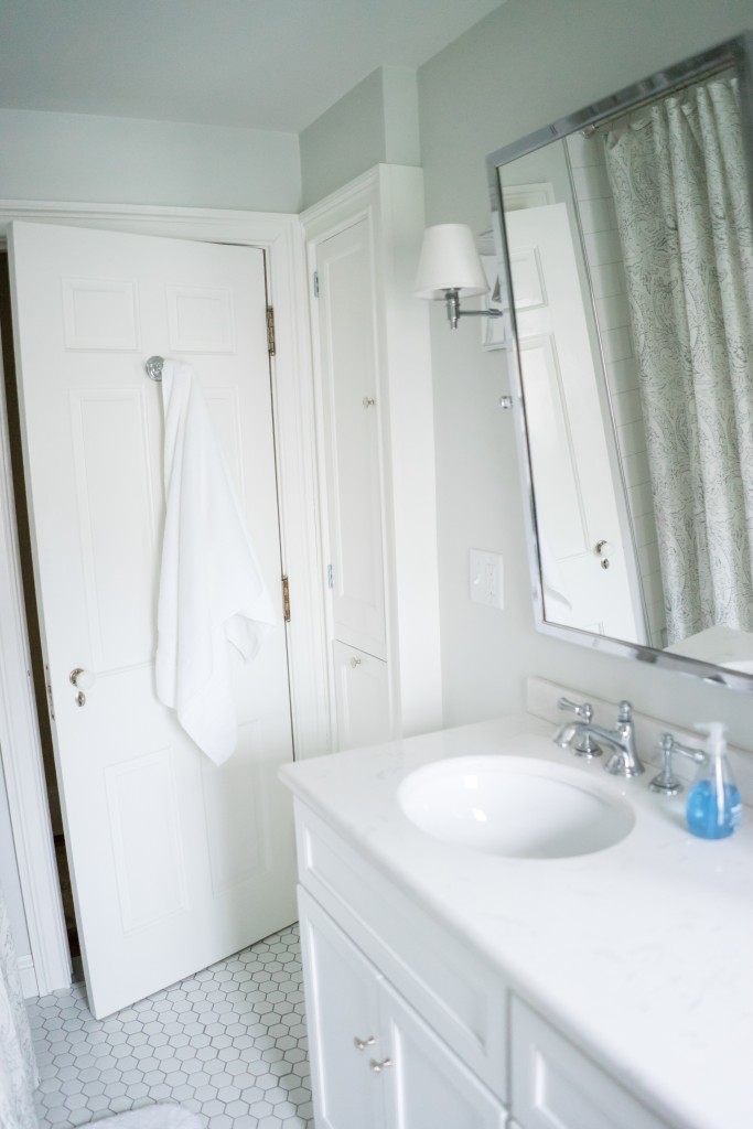
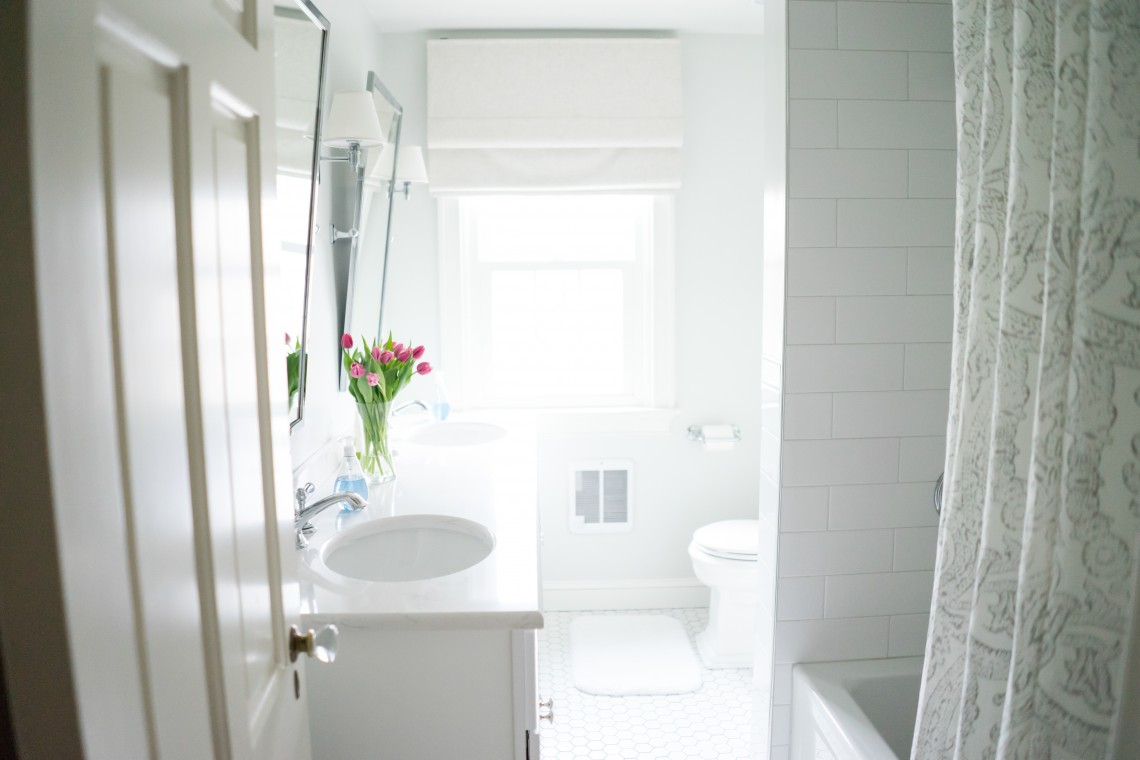
After Photos by Sarah Heppell
I hope you enjoyed the home tour and the before and after series! It was so much fun for me to look back at where we began and then how we finished. And this bathroom, even with its deeper and longer vanity, looks bigger now than before! I love when that happens. We added function and the appearance of more square footage. Win, win!!
Stunning! I appreciate that you took the shower rod up to the ceiling. Not many designers do that but it looks so much better.
Well done.
Thank you so much, Mary! It helped to make the space feel larger. It’s a fun visual trick. Have a great weekend!
Love the hexagon tiles and all white in general. Great for adding any pop of color of your choice!