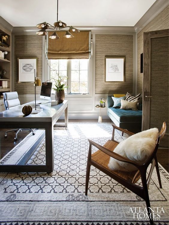
Welcome back to another installment of Why This Works… a series where I highlight a designed space and talk about what I love! Today’s office space was designed by Brian Watford and featured in Atlanta Homes and Lifestyles. Take a look!

image via
We are currently thinking about what do to our office space, so this is obviously great inspiration! I am immediately drawn to the grass cloth walls, as it instantly adds texture and warmth. The colors are soothing and include a blend of warm and cool, which is a nice balance. All of the textures in the space, from the rug to the pillows, to the leather desk chair to the woven side chair- all add depth and interest. The mixture of metals is also taking part, with the brass table lamp and ceiling fixture, to the chrome base of the desk chair. The brass wall frames have beautiful modern art in them, which I love! The room’s door has a stunning wood grain to it, which appears to be replicated in the desk base. I also love that the roman shade has a band detail, making it feel more custom. The shade is also installed as high as possible, which is one of my most favorite tricks in making a space feel larger. And I absolutely love the camel colors with that stunning teal settee. Overall, this space works!
What are your thoughts?!?
I agree with your observations, I love this space. I just feel the shade should have been extended out to the edge of the trim on each side. It looks like it shrunk!!
You know- that is a very interesting observation!! I wonder if he wanted to show more of the molding? Have a wonderful weekend, Cindy!