Amber B Design Studio

Interior Design & Decoration for the South Florida region

  • Home
  • About
  • Services
  • Portfolio
  • Blog
  • Press
  • Contact

Why This Works

August 12, 2011 by Amber Filed Under: why works series


Happy Friday and welcome to the series Why This Works… where I show a designed space and talk about why (I think) it’s perfection. I was browsing my recent new addiction (pinterest) and came across a beautiful living room space that was so worthy of this series!

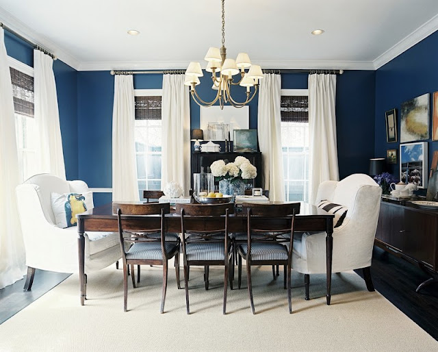
Image via Pinterest and Photographed by James Ransom. ï»¿
This room is a refreshing Traditional space, with a touch of modern. I love how the pops of green are sprinkled throughout the space and complimented against a subtle, creamy white backdrop. The traditional tufted ottoman in the center of the room is balanced with more modern drum lamp shades and trellis patterned pillows. The modern X benches in front of the fireplace are paired well with the more traditional lines of the seating and side tables. There is a refreshingly casual feel about the space, with the natural rug and fun arrangement of prints on the mantel. I love that the accessory color in the space is also brought into the shelves next to the fireplace. Books and everyday necessities are a great way to incorporate the pop of color in the room. The shades on the windows are also fun with their beautiful green fabric, making them a cohesive and thoughtful addition to the space. Overall, this space works!  

Why This Works

August 6, 2011 by Amber Filed Under: why works series


Happy Friday! Welcome to the series Why This Works… where I highlight a designed space and talk about why (I think) it’s perfection. This dining space was designed by Ashley Putman and was seen in the spring 2010 Lonny Magazine. I love this space so much, that I put it on this blog twice in one week! I love brousing through Lonny’s on line magazine- I always find so much inspiration!

This dining room is so inviting- I could stay in those comfortable wing chairs for hours! I mentioned in a previous post here that I love the color blue! There are so many gorgeous shades to this color, and this particular hue commands attention! This room will stand the test of time, with its traditional and neutral elements. The oversized, gorgeous wing chairs are made more modern with their white slipcovers and fun pillows. These traditional wing chairs are paired with more modern side chairs for an interesting, chic combination. The neutral area rug and traditional baluster leg table works well paired with the modern sideboard and chic, playful gallery wall. All of the white in the space pops even more paired with a dramatic shade of blue on the walls. The casual feel of the chadelier and fresh hydrangeas make the space feel warm and welcoming. For me, this space works!

Why This Works and the Winner Is…

July 29, 2011 by Amber Filed Under: why works series


Happy Friday!! It’s time for the series Why This Works… where I show a designed space and talk about why (I think) it’s perfection! This amazing living room space was seen in Cottage Living. I have held onto this image for so long, because there are so many fun elements that I love in this space.

Image via Cottage Living
The bright pops of color balance so well against the white walls, sofa and neutral seagrass rug. The room has great depth with the layering effect of the zebra rug and that works so well with the other black and white accessories and artwork in the space. This room also has a great balance of shapes and textures- there are round shapes in the side table and in the dramatic art over the sofa, rectangular shapes in the coffee table and picture frames and a great blend of upholstered and wood pieces to make this space eclectic and cohesive. The large art piece over the sofa frames out the seating area so well. The traditional silouette art works well placed on a more modern side table. The traditional style ottoman with nailhead trim gets a modern twist with a bold, bright upholstered fabric. To me, this space works! What are your thoughts??

And congratulations to the winner of the Olive Leaf Stencils Giveaway! I selected a winner through random.org and the winner is…

Lucky #1!! (How often does that happen?) Congratulations Anne from her wonderful blog, Hello Newman’s. I will be in contact with you today!! Anne said:

oh so fun! I just checked out her site – and don’t know how I would chose just one if I were to win. Some of the modern and damask patterns are so fun – I could totally see one of those on the wall behind bed in master bedroom! ๐Ÿ™‚

When you choose a stencil, please send the after pictures, and I’ll post them up on the blog!

Why This Works

July 22, 2011 by Amber Filed Under: why works series


Happy Friday! It is time for the series Why This Works… where I highlight a designed space and talk about why I think it’s perfection. Today, I am showing you the living room of one of my favorite design bloggers. (I am sure you already read her blog!) Her blog is a daily read for me- Kirsten of 6th Street Design School. I love her stylish approach to design and all of the wonderful etsy sources she introduces. In a guest post she wrote here, she talked about how her style has evolved and her home is now a true reflection of her design style- I love that! That thought really stuck with me, because I think it’s so important to be able to put your own stamp on your space and include your personality and personal style into your home! And she has done that so well.

This room works so well- it has a great mix of color, it’s fun, inviting and stylish! The lumbar bird pillow on the side chair helps to pull all of the wonderful colors together, and then she uses these same colors throughout the space. It all looks so effortless, but so much thought and design has gone into this room. I love the fun, modern Love art to the right of the window, mixed in with the more traditional silouette art on the left side. The beautiful pink color in the lumbar pillow and Love art is seen again in the whimsical flower on the coffee table. I love that she has kept the walls and furniture neutral, but infused pops of color in the drapery and accessories. It gives the room such a great balance. The dramatic, overscaled clock and symmetrical lamps works great with the casual feel of the coffee table books stacked on each other. And of course, personal touches always make a space- the monogrammed pillow adds a personal, family touch that makes this space feel warm, inviting and oh so stylish! To check out more of Kirsten’s home tour go here. 
Thanks for letting me share your living room, Kirsten! 
Join the party! Elizabeth from The Mustard Ceiling is hosting a linky party- join in the fun here!
And don’t forget to enter in the fabulous giveaway by Olive Leaf Stencils!! Enter HERE.

Why This Works

July 15, 2011 by Amber Filed Under: why works series


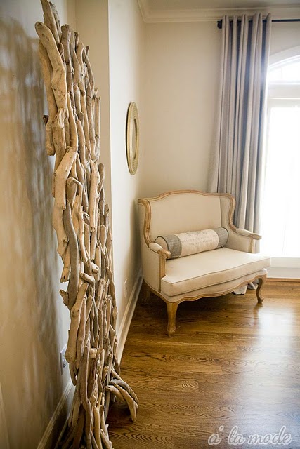
Happy Friday! Welcome to the series Why This Works… where I show a beautifully designed space and talk about why I think it’s perfection. Today, I am happy to show a gorgeous space from a fellow design blogger. Shelli from a la mode writes one of my favorite blogs and has great design taste! Today, I will share some images of her beautiful guest bedroom. (I couldn’t choose just one image because there are so many pretty spaces in this room!)

This room is stunning and works in so many ways. The light, serene color palette is a great way to style a bedroom and feel relaxed. The neutral color scheme works so well paired with the texture in the drapery and beautiful driftwood sculpture. (The sculpture was a Home goods find- I think I might make a trip there this weekend!) The rustic, coastal inspired driftwood is a great compliment to the elegant bedding and other accessories in the space. The drapery looks elegant slightly puddled on the floor, and works so well paired next to the french inspired settee. The hint of gold in the seating and accessories gives a formal touch and works great paired with the casual driftwood and whimsical bird vase. I love this space, and I’m sure her guests do too! To check out more of Shelli’s amazing home tour, go here.

Thanks to Shelli, for sharing her guest room with us today!!

Why This Works

July 8, 2011 by Amber Filed Under: why works series


Happy Friday! Welcome to the series, Why This Works… where I show a designed space and discuss why (I think) it’s perfection. Today’s room is a gorgeous room living designed by Patrick Wade and featured in House Beautiful. I could see myself relaxing in this space, as it is casual, comfortable and very chic.

Designed by Patrick Wade and seen in House Beautiful.
I am not sure what drew me to the room more- the bold printed rugs, the soft muted colors or the effortless way the room stays both chic and casual- maybe it’s a combination of it all! Patrick Wade is the designer and homeowner to this space he shares with partner Dave DeMattei. I love the pops of gold and bright orange in the space, against the more muted neutral tones. I love the traditional wingback chair paired with the more sleek lines of the sofa and occasional chair. The white, tulip style side table next to the sofa looks great with colorful flowers and fruit on top! I love the rustic simplicity of the ladder and greenery paired with the geometric, bold area rugs. (And I love the layered look of area rugs! It gives the space added texture and interest.) The task lighting is fun and modern and works so well with the creative, artist vibe in the room. Overall, this space is a blend of great design styles, it’s casual and chic, while also being so liveable!

Why This Works

July 1, 2011 by Amber Filed Under: why works series


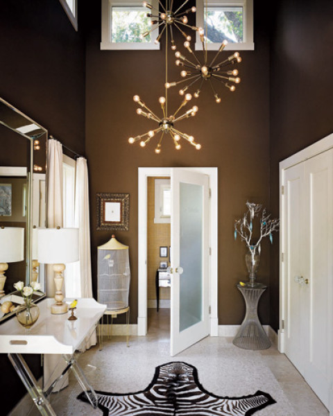
Happy Friday! I am back with the series, Why This Works… where I highlight a designed space and talk about why (I think) it’s perfection. Today, I have foyers on the brain! We plan to add wallpaper to our foyer this summer, and I am so excited for the transformation it will bring! So today, I thought I would show some inspiring foyer spaces that demand attention!

 All images via Elle Decor. Image 1, Image 2, Image 3.
These foyers are showstoppers, with their perfect blend of traditional and modern, rustic and elegant, simple and over the top. The foyer is the first room you see when walking into the house, and these do not disappoint. I am now ready to work on mine! The inspiration behind this post also comes from one of my favorite bloggers, Sherry from Design Indulgence. She recently transormed her foyer, and it is gorgeous! Check it out here. 
Make sure to check back later this weekend, as I post fun, entertaining ideas for the 4th of July!

Why This Works

June 24, 2011 by Amber Filed Under: why works series


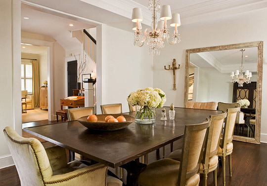
Happy Friday! I’m back with the series Why This Works… where I find a designed space and describe why (I think) it’s perfection. This week, the room of choice is a serene, chic dining space. The slightly monochromatic color scheme works well with the abundance of texture in the space. Enjoy!

 Image via Traditional Home. Designed by Paul Corrie.
This gorgeous dining space was designed by Paul Corrie, who is also the homeowner. He beautifully transformed this row home he shares with his partner, Steve Ewens. This home and dining space has a soothing, neutral color palette, yet stays very chic and stylish. In this space, the side chairs have a rustic finish, which works well against the formal, crystal chandelier. The dramatic, oversized mirror has a more casual appearance when it is leaned up against the wall. The light colored walls work well with the dark stained floors and dining table. The room appears formal with the detailed crown molding and nailhead arm chairs, yet also casual with the informal table setting of fresh picked hydrangeas and bowl of fruit. To me, this room works! It has the perfect blend of rustic elegance, traditonal with modern and chic with casual. To see the entire remodel with all of the before and afters, go here. 

Why This Works

June 10, 2011 by Amber Filed Under: why works series


Happy Friday! It’s time for the series Why This Works… where I find a designed space and describe why (I think) it’s perfection. Maybe the room feels like a relaxing getaway; maybe the colors are fun and unique, or maybe the room just makes my jaw drop when I see it!  And today’s space (in my eyes) works in so many ways! The gorgeous room for today comes from the inspiring Rue magazine.

Image via Rue Magazine.

There are so many reasons why I love this space! I could see myself on either comfortable sofa, lingering for hours with a good magazine or watching a great episode on HGTV. The space feels so warm and inviting, traditional and modern. The two sofas work nicely together, adding a traditional and modern touch to the space. I love, love, love the soft blue/gray on the window wall with the subtle pops of color in the accessories. The rustic wood floors goes well with the beautiful chandelier, combining simplicity with elegance. I love the simple, rustic feel of the logs in the fireplace with the ornate and elegant mirror above the mantle. The rustic A- shaped ladder made me smile, because it reminds me of my mom’s ladder here from her master bath. At one time, my mom had her ladder in the family room, with blankets and quilts on display. To me, this room is simple, refined, casual, elegant, traditional, rustic and a touch of modern. (All of the elements which I love!)
What elements do you like best in this space?

Why This Works

June 3, 2011 by Amber Filed Under: why works series


I’m back for take 2 of the new series, Why This Works… where I highlight a space and talk about why (I think) it’s perfection! In the May/June issue of Lonny, interior designer Caroline Robert showed us a gorgeous dining space where I would love to spend many hours, lingering and dining with friends and family. It’s her own dining room which she shares with her husband and children in New Orleans.

Image via Lonny. Designed by Caroline Robert.

There are so many elements I love about this room. Since Caroline and her children enjoy painting together, she chose durable, colorful chair cushions to accompany the beautiful lucite chairs. She paired the modern seating with a very sturdy, traditional wood table. The rustic floor layed out in a herringbone pattern, works so well against the elegant silk drapery. The natural grass cloth walls adds interesting texture to the space in a subtle way. And the show stopper in the room is the over sized, gorgeous antique chandelier, which adds a sense of grandeur to the space. And fresh flower are always a great touch! To check out the rest of Caroline’s gorgeous New Orleans home, visit the new issue of Lonny here.

  • « Previous Page
  • 1
  • …
  • 5
  • 6
  • 7
Welcome!

Hi, I'm Amber... a wife, mom and interior decorator. I am the writer of Simple Dwellings and the designer behind Amber B Design. Blog topics are all things design, with the occasional DIY attempt! Thanks for stopping by Read more...

  • Bloglovin
  • Email
  • Instagram
  • Pinterest
  • Twitter

Blog Posts, Straight to Your Inbox

Popular Projects

A dining room with white walls and wooden table.
A black door with white curtains and a red chair
A staircase with black and white chevron pattern on the steps.

Blog Love

  • Addison’s Wonderland
  • A Thoughtful Place
  • Alison Giese Interiors
  • Amber Interiors
  • Bailey McCarthy
  • Caitlin Wilson
  • Chris Loves Julia
  • Classic Casual Home
  • Cottage and Vine
  • Design Indulgence
  • Dwell by Cheryl
  • Eddie Ross
  • Elements of Style
  • Emily A Clark
  • Emily Henderson
  • Gallery No Eight
  • Hi Sugarplum
  • House of Jade
  • Jana Bek
  • Juniper Home
  • Kate Marker Interiors
  • Lucy Williams
  • Monika Hibbs
  • Our Fifth House
  • Pencil and Paper Co
  • Rachel Parcell
  • Rambling Renovators
  • Pure Style Home
  • Sita Montgomery
  • Studio Mcgee
  • The Makerista
  • The White Buffalo Styling Co
  • the Zhush
  • Traci Zeller
  • Young House Love

Copyright Amber B Design © 2025 ยท Design by Britt Douglas