Amber B Design Studio

Interior Design & Decoration for the South Florida region

  • Home
  • About
  • Services
  • Portfolio
  • Blog
  • Press
  • Contact

Why This Works

October 20, 2011 by Amber Filed Under: why works series


Happy Thursday and welcome to the series Why This Works… where I highlight a designed space and talk about why (I think) it’s perfection. This living and dining space is chic, fun and ready for entertaining!

Source: decorpad.com via Simple on Pinterest

I love the cool shade of gray as the backdrop for the walls- it really allows the white slipcovered furniture to stand out. It’s also a great wall color when incorporating pops of color for the different seasons and holidays. It’s really a great jumping off point for any color and style. For this space, they chose to keep the color scheme neutral, with chic pops of white, black and touches of gold for a dramatic impact. The large gold framed mirror by the dining area is a beautiful focal point and really stands out against the neutral backdrop. The drum shade above the dining table is a nice modern touch and works well paired with the traditional seating in the space. For the living room area, I love the patterned area rug underneath the gorgeous shiny coffee table. It adds such warmth and dimension to the room. The zebra rug gives a wow factor and adds a bit of glam to all of the white seating. The coffee table has fun and practical accessories and I love the bowl with the gold on the inside- such a pretty and thoughtful touch that plays off of the mirror in the dining space. For me, this space works!

What are your thoughts on this space?

Why This Works

October 13, 2011 by Amber Filed Under: why works series


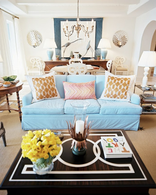
Happy Thursday and welcome to the series Why This Works… where I show a designed space and talk about why (I think) it’s perfection. This living and dining space comes to you from Lonny and was featured in their June/July 2010 issue. The designer of this beautiful and fun space is Bunny Williams.

via Lonny Designed by Bunny Williams
This space has a great blend of traditional and modern and brings a smile to my face! The color on the sofa is fun and whimsical and pops against the white walls. The style of the sofa is traditional, but made more modern paired with the graphic design on the coffee table. The coffee table accessories are playful and fun and add a casual warmth to the space. The end tables flanking the sofa are traditional in design and works well paired with the neutral, but modern rug. The modern detail on the outside of the rug is just enough pattern and looks great with the contemporary look of the sofa pillows. The dining area is a nice balance to the space, with its aqua lamp bases that give a nod to the sofa color. The large chandelier over the dining table is grand in scale, making this traditional piece more modern. I love the layering effect that is going on by the sideboard zone. The fabric hanging above the sideboard is broken up by some art and large, beautiful bird sculptures that almost appear to be part of the art on the wall. The scale of those pieces and the wall sconces draw your eye to that part of the room, expanding the space. Overall, this space works! ï»¿

Why This Works

October 6, 2011 by Amber Filed Under: why works series


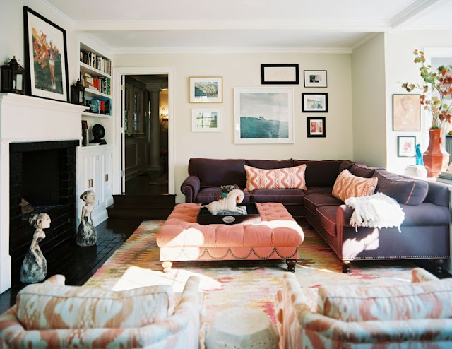
Happy Thursday and welcome to the series Why This Works… where I highlight a designed space and talk about why (I think) it’s perfection. This gorgeous living room comes to you from Lonny and was seen in their Jan/Feb 2011 issue. The space was designed by Hillary Thomas.

via
What I love most about this space is how liveable and welcoming it appears! I bet this is the fun, popular hang out room in the house! The refreshing and chic color combination of deep plum, salmoney pinks and orange are whimsical, fun and stylish. The traditional seating works great paired with the modern art and contemporary fabric selections. The casual way the art is displayed works so well to make this space feel warm and welcoming. The neutral, light wall color is a subtle, beautiful backdrop for the amazing color in the furniture and accessories. The white cabinetry and fireplace are beautiful and practical and work well against the dark flooring in the room. The art sculptures on the floor by the fireplace are a fun and modern addition. I love that the art on the fireplace mantel is leaning against the wall- it definitely adds to the casual feel of the room. The bookshelves to the right of the fireplace showcase a fun and beautiful mix of books and accessories. Overall, this space works!

Are you more drawn to chic and casual or chic and dressy? ï»¿

Why This Works – Classics Edition

September 29, 2011 by Amber Filed Under: why works series


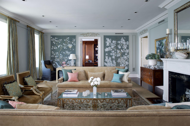
Happy Thursday and welcome to the series Why This Works… where I highlight a designed space and talk about why (I think) it’s perfection. Since I love and appreciate so many different design styles (I sometimes feel as though I’m too indecisive), I thought I would post a classic style room for today! It is one of my favorite timeless styles and this Chicago based designer pulled it off so well! This elegant living room is designed by Jessica Lagrange and was seen in Traditional Home.

Designed by Jessica Lagrange via Design Shuffle
Where do I begin with this gorgeous space? It is chic, elegant and warm. The neutral tones of the seating play off of each other so well and compliment the eye catching, wallpapered focal wall. (It might even be a hand painted mural!) The blossoms and branches of this wall design work beautifully with the elegant, traditional space and help to give the room a modern flair. The overscaled design of the wall work and sofas help to make the traditional space feel more modern. The nailhead detail and fringe work on the sofa are traditional, while the shape and scale of the pieces are more modern. The antique dresser to the left of the fireplace is stately and elegant and works well paired with the casual feel of the vase with fresh flowers. The room feels rich in history with its beautiful area rug and drapery, making the space feel as if it has been there for many years. The ornate, beautiful mirror and lighting in the space help to compliment the rich upholstery fabric on the french inspired chairs. Overall, this space works! In keeping with the Classics Edition, my Fashion Friday series tomorrow will also be classically inspired! Stop back tomorrow to see my favorite classic icons in fashion!

Why This Works

September 22, 2011 by Amber Filed Under: why works series


Happy Thursday and welcome to the series Why This Works… where I highlight a designed space and talk about why (I think) it’s perfection. This next family room/study comes to you via pinterest and definitely makes a bold statement!

Source: qualityrivets.blogspot.com via Simple on Pinterest

While I am a classic girl at heart, lately, I cannot seem to get my mind off of bold colors and modern style. The dramatic green and blue on the walls makes a bold statement and it works! The neutral backdrop of the furniture fabrics, lighting and area rug help to ground the room and balances well against the bold colors on the wall. The warm tones of the wood tables and chairs works well with the bright hues of the paint choices and helps to tone the wall color down. The accessories on the shelves are carefully chosen and help to tie in the blue, while also incorporating a lot of white, which helps to lighten up the room. Also, the fact that the shelves are white helps to balance all of the color in the room. The natural woven shades are a soft touch and a subtle backdrop, so the walls can take center stage. The shape of the couch and leather chair with nailhead trim are traditional and work well paired with the modern use of wall color and mid century vibe of the coffee table and console. The large, white drum chandelier is a nice, neutral touch and helps tie in the traditional and modern elements in the space. Overall, this space works! (That’s not to say that I am brave enough to paint any of my walls these bright colors, but I love the risk this designer took for a dramatic impact that works!)

What are your thoughts on this space?
Why This Works (On a New Day!)

September 15, 2011 by Amber Filed Under: why works series


Welcome to the series Why This Works… where I highlight a designed space and talk about why (I think) it’s perfection. If you’ve been with me for a while, you may know that I usually post this series on Fridays. Well… I have a new plan up my sleeve for Fridays! I am starting a new series tomorrow that goes in a different direction than my blog has gone so far. Stay tuned tomorrow to find out!

This beautiful living room comes to you from Pinterest and is a chic, fun space!

 
Source: bellemaison23.com via Simple on Pinterest

I instantly fell for this room for its pops of color and serene, airy backdrop. The light gray walls are a perfect jumping off point to compliment the magenta and gold hues sprinkled throughout the space. The room starts off as a traditional space with the neutral colors, drapery and wing back chairs, yet exudes modern fun with its hip suzani print chair and fresh, bold colors. The area rug seems traditional and subtle and works so well with the brightness of the modern X bench and pillows. The fresh flowers make the space feel warm and inviting and the fun, modern vibe makes this room a great place to entertain and unwind!

This space is also a hint to the direction of tomorrow’s new series! And guess what?? It’s not interior design that I will focus on tomorrow. I can’t wait!

Why This Works and A Guest Post Today!

September 9, 2011 by Amber Filed Under: guest post, why works series


Happy Friday! I am so excited to be over at Melissa’s blog ROOMS today, sharing a piece of furniture we own that desperately needs a replacement! Check out what it is and how I plan to change it!

And… welcome to the series Why This Works… where I highlight a designed space and talk about why (I think) it’s perfection. Today’s hip and gorgeous living space comes to you from Elle Decor and is designed by Steven Gambrel.

Image via Elle Decor. Designed by Steven Gambrel. Photo by Simon Upton. 
There are so many elements that I love about this space. Let’s start with the amazing color palette- the soft grays work beautifully paired with the gold/yellow color. The trend right now is going back to golds, and this space does it so well. It was actually designed in 2007 and continues to look current four years later. (In no way do I think that four years old is outdated- it’s just that this room could grace the cover of a trendy magazine today!) I think it is a timeless design blend of traditional and modern. The tufted sofas are traditional, yet have a modern flair. The gold sofa is more modern, with it’s straight, high arms and the gray sofa shown in the second image has a more traditional feel. The bold, graphic print on the area rug works well paired with the neutral seating. The space feels cohesive with the gold elements repeating throughout the room- in the drapery, lighting and modern sofa. The lighting and occasional tables in the space have an elegant, mid century modern flair and compliment the casual feel of the neutral seating and fresh flowers. The light wall color is a wonderful backdrop to the modern art, which is unique and beautiful. Overall, this space works! 
I also found out that the room’s wall color is Alaskan Husky by Benjamin Moore –  which is the paint color I was considering for our family room and kitchen. I’m sold!

Why This Works

September 2, 2011 by Amber Filed Under: why works series


Happy Friday and welcome to the series Why This Works… where I highlight a designed space and talk about why I think it’s perfection. This gorgeous dining room comes to you from Trad Home and was designed by Lauren Gold and Sasha Adler. These two Nate Berkus designers were chosen by Trad Home as two of the 20 Designers to watch!

All images via Trad Home

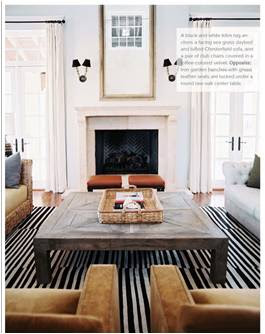
This living space opens up beautifully to the kitchen and is a relaxing place to entertain and unwind! The bold stripes and large scale of the carpet give the traditional space a modern flair. The coffee table and sofas are also large in scale, fitting beautifully in this grand living room. The scrolled arms and tufting of the cream sofa works well paired with the modern, sleek arms of the upholstered side chairs. The natural woven daybed is in the space for additional seating and gives a natural element to the living room design. The neutral wall color and drapery allow the black shades on the sconces to stand out and shine! Hanging above the fireplace is a beautiful piece of oversized art, allowing your eye to see the true height in the space. Overall, this space works, and I can see why these two talents were among the 20 designers to watch this year!

Happy long Labor Day Weekend!

Why This Works

August 26, 2011 by Amber Filed Under: why works series


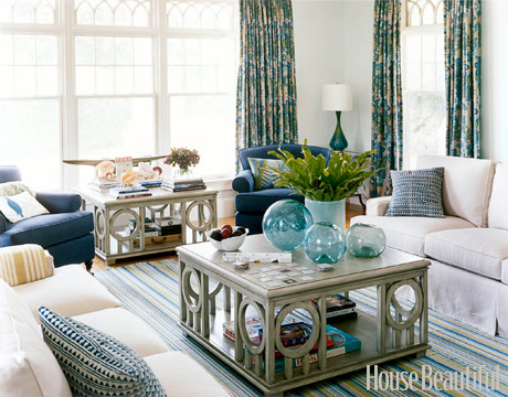
Happy Friday and welcome to the series Why This Works… where I highlight a designed space and talk about why (I think) it’s perfection. This living room comes to you from House Beautiful and is designed by Annie Selke.

Image via Houe Beautiful. Designed by Annie Selke.
This room is part of a vacation home, so Annie wanted to give them a relaxed feel and oversized tables for recreation and games. The color palette of blues, greens and pale yellows are a perfect combination when thinking about a vacation home. The serene, casual backdrop is fun paired with its colorful use of pattern. The circular shapes in the game tables are repeated in the glass accessories and lamp shade. Even the curve details of the window casings reflect and add to all of the wonderful shapes in the space. The solid color sofa is casual and practical with its slipcovers and works well with the patterns in the drapery and pillows. The space feels warm and inviting with the stacks of books and greenery on the oversized coffee table. Overall, this space works beautifully for a vacation home! I’m ready to hit the beach!    ï»¿

Why This Works

August 19, 2011 by Amber Filed Under: why works series


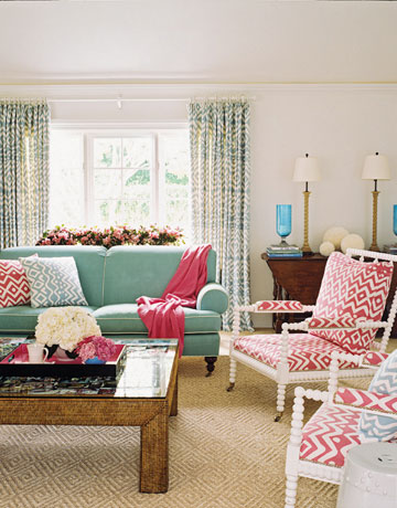
Happy Friday and welcome to the series Why This Works… where I highlight a designed space and talk about why (I think) it’s perfection. This cheerful living room space comes from House Beautiful and is designed by Jonathan Rosen. This space instantly brings a smile to my face, with its playful use of color and chic, whimsical furniture selections.

Image via House Beautiful
The natural, subtle rug and creamy white walls works great paired with the pops of pink and blue in the room’s fabrics. The candlestick lamps have the same playful curves as the fun end chairs, making the space more cohesive and thoughtful. All of the white in the space, including the garden stool, curtain rods and walls allows the color in the accessories and fabrics to really shine! I love the way the designer decided to use the same fabric, but in two different colors, bringing the whole look together. The large traditional style coffee table and sofa looks more modern with all of the bright colors and fabrics in the space. Overall, this space works!  ï»¿

  • « Previous Page
  • 1
  • …
  • 4
  • 5
  • 6
  • 7
  • Next Page »
Welcome!

Hi, I'm Amber... a wife, mom and interior decorator. I am the writer of Simple Dwellings and the designer behind Amber B Design. Blog topics are all things design, with the occasional DIY attempt! Thanks for stopping by Read more...

  • Bloglovin
  • Email
  • Instagram
  • Pinterest
  • Twitter

Blog Posts, Straight to Your Inbox

Popular Projects

A dining room with white walls and wooden table.
A black door with white curtains and a red chair
A staircase with black and white chevron pattern on the steps.

Blog Love

  • Addison’s Wonderland
  • A Thoughtful Place
  • Alison Giese Interiors
  • Amber Interiors
  • Bailey McCarthy
  • Caitlin Wilson
  • Chris Loves Julia
  • Classic Casual Home
  • Cottage and Vine
  • Design Indulgence
  • Dwell by Cheryl
  • Eddie Ross
  • Elements of Style
  • Emily A Clark
  • Emily Henderson
  • Gallery No Eight
  • Hi Sugarplum
  • House of Jade
  • Jana Bek
  • Juniper Home
  • Kate Marker Interiors
  • Lucy Williams
  • Monika Hibbs
  • Our Fifth House
  • Pencil and Paper Co
  • Rachel Parcell
  • Rambling Renovators
  • Pure Style Home
  • Sita Montgomery
  • Studio Mcgee
  • The Makerista
  • The White Buffalo Styling Co
  • the Zhush
  • Traci Zeller
  • Young House Love

Copyright Amber B Design © 2025 ยท Design by Britt Douglas