Amber B Design Studio

Interior Design & Decoration for the South Florida region

  • Home
  • About
  • Services
  • Portfolio
  • Blog
  • Press
  • Contact

Why This Works and Fashion Friday – V Day Edition!

February 10, 2012 by Amber Filed Under: fashion friday, why works series


Happy Weekend and welcome to the series combo of Why This Works and Fashion Friday all rolled into one post! With Valentine’s Day right around the corner, I thought it would be fun to find a room and outfit inspired by the whimsical colors of the holiday! With hues of pinks included in main living spaces, I can only take it in small doses. This room strikes the perfect balance for me… enjoy!

Source: homeits.com via Simple on Pinterest

When you tire of this vibrant color, it can easily be switched out in this room- the pillows, art, lamp shade and flowers can be traded out for several other colors. This space has a very versatile color palette and allows so many other choices in the future. I love that the walls, seating and area rug are very neutral and light, allowing the gold and magenta to take center stage! The black detail in the armchair, bench and coffee table ground the space so well. The small touch of chrome in the end table makes the space feel sleek and stylish, while the subtle details of stripes in the area rug and zebra on the bench add texture and interest. Overall, this space works!

What are your thoughts??
And now for the Fashion Friday post! Let’s have fun with this room and see what it would be as an outfit!
Pretty In Pink

Pretty In Pink by simpledwellings2

For this outfit, I stuck with the same color palette of gold, magenta and black. I thought it would be fun to also include an animal print blouse, since the living space had such an amazing zebra hide bench. And with the weather feeling like spring in so many places right now, why not make this a spring inspired outfit!

Why This Works

February 2, 2012 by Amber Filed Under: why works series


Happy Thursday and welcome to the series Why This Works… where I highlight a designed space and talk about what I love! I found this space on pinterest and it definitely made me smile.

Source: paloma81.blogspot.com via Simple on Pinterest

What immediately gets me is the amazing shelf styling. I love the whimsical look of organizing your books like a rainbow! It’s such a fun way to use color and your everyday items to make a statement. This can easily be achieved with the collections of books we all have. I usually think that we have too many books, but when organized like this- more is better! The rest of the space is calm and neutral, allowing the books to take center stage. This space looks like a library, with a peek into the living room. I love the white slip covered seating, natural woven rug and pops of blue. It all works so well! When looking into the next room, I love the glossy blue door- it really draws your eye into the space. In a very subtle, yet creative way, the decorator has taken the color from the books for the accessories in the space. The door, foot stool, pillow and vases all have the same beautiful hue of blue seen in the books on the shelves. The pinks and greens in the flower arrangements mimic the same hues found in the amazing book collection. I would love see more of this home! And what I love most is that this look is so achieveable- we can easily slip cover seating that may look a bit worn and arrange our books in a new and creative way. This is definitely accessible design!

What are your thoughts??

Why This Works

January 26, 2012 by Amber Filed Under: why works series


Happy Thursday and welcome to the series Why This Works… where I highlight a designed space and talk about what I love. This is one of my favorite dining spaces from Coastal Living. I have always loved it’s cheerful use of color!

Source: coastalliving.com via Simple on Pinterest

There is a lot of green in this space, but it is toned down a bit by the neutral wall color and area rug. The light sofa in the living room also helps neutralize all of the green, striking a nice balance between pops of color and serene, soft moments. Black in a room is always key and becomes a great anchor with the table lamps and fireplace surround. The rustic farmhouse table works well paired with the pretty upholstered seating and sparkly chandeliers. The tufting on the dining chairs is very traditional in style, yet the shape of the chairs is a nod to modern, sleek design. While the drapery might have bright hues, the graphic pattern of the green along with the creamy white works well together. I love the combination of green with a salmon color and you see a hint of this pretty shade with the sofa’s throw pillows. The beadboard walls makes the space feel so relaxing, as does the gorgeous waterside view outside! To me, this is the perfect lakeside space!

What are your thoughts??

Why This Works

January 19, 2012 by Amber Filed Under: why works series


Happy Thursday and welcome to the series Why This Works… where I highlight a designed space and discuss why it’s amazing! I found this amazing image from pinterest and love the subtle yet bold use of color and prints!

Source: homedeco2u.com via Simple on Pinterest

That chandelier from Jonathan Adler gets me every time! I love its unique look and have seen it used with so many different decor styles. It’s a beautiful and versatile piece. The chrome finish of the chandelier works well paired with the chrome floor lamps. The large gold mirror on the right is great in scale and also brings in a different metal finish. I always think a space feels more eclectic, unique and well designed when there is a mix of different wood and metal finishes. The soothing blue gray on the walls is the perfect backdrop for bold fabrics seen in the X benches and drapery panels. There doesn’t need to be just one bold fabric in a space- layering multiple fabrics and colors works great when it can all be subdued by  other neutral pieces. In this case, the wall color, area rug and sofa/ottoman are neutral enough to handle the bright pops of color in the accessories.

My only problem with the space is that I wish I could see more!! 

What are your thoughts??

Why This Works

January 12, 2012 by Amber Filed Under: why works series


Happy Thursday and welcome to the series Why This Works… where I highlight a designed space and talk about why I love it so much! This next living room space was found on pinterest and seamlessly blends different styles to create an overall eclectic and fun mix:

Source: noellewrightdecor.blogspot.com via Simple on Pinterest

I love the overall mix of patterns and styles in this space! The decorator was able to blend so many prints and styles together, without making the room look too full or busy- a hard thing to achieve! I love the straight lines in the sofa, upholstered in such a rich golden hue. This modern piece works well paired with the traditional houndstooth print in the wing chair, striking a nice balance. The wing chair has a dramatic, high back, making it seem more modern, yet the traditional upholstery gives a nod to a classic and timeless print. This print is seen again in a throw pillow for the sofa, which helps draw your eye around the entire space. The symmetry in the floor lamps makes the space appear more formal, yet the diverse end tables bring the space back to a more casual, eclectic vibe. The fresh flowers seen in the room also help to make the space feel lived in and casual. The layering of the area rugs gives the room added depth and interest, also tying in the colors of the houndstooth print chair. The neutral wall color is a nice backdrop to all of the color and pattern seen in the rest of the space. The overscaled mirror above the fireplace is a great focal point, adding more shape and dimension to the room. Overall, this space works!

What are your thoughts?? 

Why This Works

January 5, 2012 by Amber Filed Under: why works series


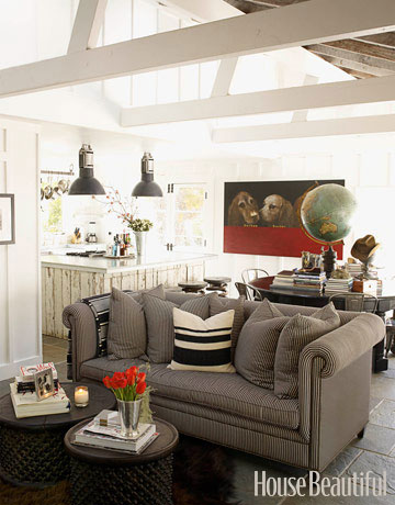
Happy Thursday and welcome to the series Why This Works… where I highlight a designed space and discuss what I love and why it works so well. This week’s great room space is a bit masculine, but I love it’s character and architectural details. It was seen in House Beautiful and was designed by Ken Fulk. Have a look!

Seen in House Beautiful. 
The size and scope of the space drew me in at first and then the details and subtle pops of color kept me interested in the design. The stone floors balance well with the soft upholstered chesterfield sofa and the soothing palette of gray, white and black add to the charm of the room. The two drum tables work well for a coffee table and can easily be moved around when needed in other areas. The sturdy material of the drum tables works great paired with the delicate red tulips, for a nice balance. The dining area doubles as a reading nook, with plentiful books and a dramatic globe as the centerpiece. I love to see unusual centerpieces and this one speaks to the personality of the space and adds a bit of whimsy. The bistro style chairs, distressed kitchen island and oversized pendants add a rustic feel to the space, while the large, modern dog art shows a pop of color and also adds another hint of whimsy and fun to the great room. When looking up, the beautiful height of the ceilings show the exposed beams and makes the space feel larger. This space/color palette is also so versatile! The red can easily be switched out with either citron, plum or coral for a totally different look. Overall, this space works!
What are your thoughts??

Why This Works – Hilary Swank’s Living Room and Fashion Friday

November 18, 2011 by Amber Filed Under: fashion friday, why works series


Welcome to the series Why This Works… where I highlight a designed space and talk about why (I think) it works so well. This week’s space is Hilary Swank’s living room and was seen in Elle Decor. The space was designed by Mark Zeff.

via
This space has a modern, casual vibe that I love! The cool colors on the wall, pillows and dining chairs works well paired with the greenery in the room. The dark wood floors are elegant and allow the neutral rug to really pop. The dramatic lamp shades on the floor lamps give a modern, sleek and industral feel, while the drapery and plants warm up the space. There is a great balance of light and dark neutrals in this space, allowing your eye to really move around the room. The tall ceilings and oversized windows allow the natural light in, giving you an amazing view! The side and coffee tables are versatile and can easily be moved in a different spot, to allow more flow when entertaining. Overall, this space works! And lately, I have been featuring more rooms with lighter walls- could this be the direction I am going?
What are your thoughts on this space?
To see more of her gorgeous home, visit here.

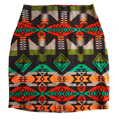
And since today is also the Fashion Friday series, I wanted to show you an outfit I put together for a recent blog challenge. Anna, from her blog A Newfound Treasure posed the challenge on her blog to design an outfit around this skirt:

Stop by her blog post here to see what I came up with, as well as many other stylish outfits!

Why This Works

November 11, 2011 by Amber Filed Under: why works series


Happy Friday and welcome to the series Why This Works… where I highlight a designed space and discuss why I think it’s amazing! Today’s living room space is worldly, modern, eclectic and traditional. It’s a great blend of some of my favorite styles. Enjoy!

Source: casatreschic.blogspot.com via Simple on Pinterest

The white walls give a neutral backdrop, allowing the unique blend of furniture and accessories to stand out. This mix of traditional and modern seating give this room a designed over time look and makes the space feel eclectic and unique to the homeowners. I think the choices in seating are very creative, pairing this large, leather chesterfield sofa with a mid century modern occasional chair. The small sofa has clean, modern lines and is covered in white, allowing the pillows and rustic side tables to take center stage. The mix of modern with rustic is one of my favorite pairings, and is done so well in this room. The dramatic world map art on the wall and globe accessories give the space a sense of history, charm and warmth, while the bold, arched floor lamp is a nod to modern design. The space also has a whimsical feel, with the vingettes behind the white sofa and to the right of the image, allowing you to feel relaxed and not make the space feel contrived. The two area rugs in the room give the space a layered look and warms up the hard surface flooring. The coffee table is large and works well paired with the dramatic seating in the space. The scale of the table flows well with entertaining, making it easy for people to find a space for their drink! Overall, this space works!

What are your thoughts???

Why This Works

November 3, 2011 by Amber Filed Under: why works series


Happy Thursday and welcome to the series Why This Works… where I highlight a designed space and talk about why I love it so much! I found today’s dining room from pinterest and fell in love. This space was decorated by Tobi Fairley and was also seen in House Beautiful.

Source: google.com via Simple on Pinterest

This space is so chic, fun, whimsical and just lovely! The design combines modern with traditional so well and I truly appreciate the attention to detail and subtle pops of color. The room’s walls and drapery are a soothing neutral, which allows the gorgeous chandelier, beautiful painted floors and bowl of fruit to really pop in the space! The traditional dining table was given a modern twist by painting it two different colors and adding a subtle painted detail to the legs. The table is accessorized with a bowl of fruit in a simple, but beautiful white bowl, giving the room a casual touch. The table is surrounded by four gorgeous chairs, with whimsical claw detail on the bottom and a glossy white paint on the legs. The upholstery fabric on the chairs is a nice graphic touch and works well paired with the creamy walls and drapery. The chandelier is one of the showstoppers in the room, drawing your eye up and giving the space the perfect pop of color. The next showstopper for me are the gorgeous painted floors! The striped detailing is a traditional nod to the room and made more modern with its playful choice in color. Overall, this space works! (I just wish I could see more of the space- it’s that amazing!) To see more of this beautiful home that Tobi decorated, visit here.

What are your thoughts??

Why This Works

October 27, 2011 by Amber Filed Under: why works series


Happy Thursday and welcome to the series Why This Works… where I highlight a designed space and talk about why I think it’s perfection. This living room is rustic, chic and appeals to my love of casual comfort!

Source: None via Simple on Pinterest

The color used in this space is the perfect amount for me- I love that the walls are a soft white, allowing beautiful accessory fabrics to take the center stage. Look at the fabric on that ottoman! It is the showstopper for me in this room! It is large in scale, which helps make the space feel more grand and serves its purpose of being both gorgeous and functional. I love seeing some pillows tucked underneath, ready to be pulled out when more guests arrive. The brown, armless occasional chairs are chic and the slight touch of gold works so well with the dramatic mirror over the fireplace. The rustic columns are stately and beautiful and work well paired against the modern seating. The overall layout of the seating makes for great conversation and gives a casual, yet balanced feel. The roll up bamboo shades on the windows gives the right amount of texture and lets the sun shine in, so you can see the beautiful view outside. The slight touches of black in the space, with the sconces, lampshades and ottoman legs grounds the room and adds a bit of glam. Overall, this space works!

What are your thoughts??

  • « Previous Page
  • 1
  • …
  • 3
  • 4
  • 5
  • 6
  • 7
  • Next Page »
Welcome!

Hi, I'm Amber... a wife, mom and interior decorator. I am the writer of Simple Dwellings and the designer behind Amber B Design. Blog topics are all things design, with the occasional DIY attempt! Thanks for stopping by Read more...

  • Bloglovin
  • Email
  • Instagram
  • Pinterest
  • Twitter

Blog Posts, Straight to Your Inbox

Popular Projects

A dining room with white walls and wooden table.
A black door with white curtains and a red chair
A staircase with black and white chevron pattern on the steps.

Blog Love

  • Addison’s Wonderland
  • A Thoughtful Place
  • Alison Giese Interiors
  • Amber Interiors
  • Bailey McCarthy
  • Caitlin Wilson
  • Chris Loves Julia
  • Classic Casual Home
  • Cottage and Vine
  • Design Indulgence
  • Dwell by Cheryl
  • Eddie Ross
  • Elements of Style
  • Emily A Clark
  • Emily Henderson
  • Gallery No Eight
  • Hi Sugarplum
  • House of Jade
  • Jana Bek
  • Juniper Home
  • Kate Marker Interiors
  • Lucy Williams
  • Monika Hibbs
  • Our Fifth House
  • Pencil and Paper Co
  • Rachel Parcell
  • Rambling Renovators
  • Pure Style Home
  • Sita Montgomery
  • Studio Mcgee
  • The Makerista
  • The White Buffalo Styling Co
  • the Zhush
  • Traci Zeller
  • Young House Love

Copyright Amber B Design © 2025 ยท Design by Britt Douglas