Amber B Design Studio

Interior Design & Decoration for the South Florida region

  • Home
  • About
  • Services
  • Portfolio
  • Blog
  • Press
  • Contact

Why This Works

August 10, 2012 by Amber Filed Under: why works series


Happy weekend and welcome to the series Why This Works… where I highlight a designed space and discuss what I love. Today’s sitting room is from the home of Jacqui Getty and was seen in the 2011 issue of C Magazine.  Enjoy!

via
What first gets me about this space, besides the zebra ottoman, is the amazing corner gallery wall! I just recently suggested this idea for a client, because it’s a creative way to make use of the corner of a room!  The pictures are hung in a random, asymmetrical way and the frame finishes are different, making this side of the room so stylish and fun! It’s such an achieveable look, because we all have mismatched frames around our house and there is no right or wrong with this frame layout. It can be a mixture of art with family photos and it really draws your eye to that side of the room. I also love the corner table vignette, with the gold lamp and fresh flowers. Every room looks better with fresh flowers!  ๐Ÿ™‚ The gold is then seen again in the space, with a small accessory bowl on the right side of the image. A room’s accessory color always works well when the color or finish is repeated throughout the space. The gorgeous cane chair and sofa are painted black, giving them a modern edge. The wall color is a light, airy neutral, along with the seating’s upholstery and window shade, to allow for the showstopping ottoman to take center stage. I love large ottomans, so you can put your feet up and layer books. Overall, this space really works! To see more of this amazing home, visit here. 
What are your thoughts??
I first came across the idea of a corner gallery wall, when I saw my blog friend Elizabeth’s hallway! Look at her amazing framing and styling work:

via

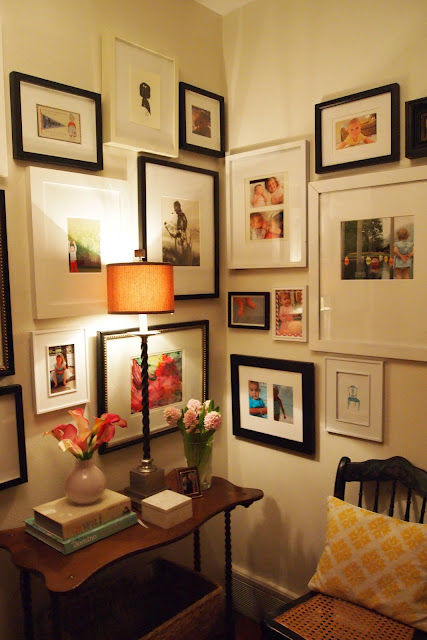
Isn’t is beautiful?!? I have to find a corner in my home to try this. Check out Elizabeth’s blog here. Have a great weekend!  ๐Ÿ™‚


Why This Works

August 2, 2012 by Amber Filed Under: why works series


Welcome to the series Why This Works… where I show a designed space and discuss what I love. This gorgeous dining room belongs to the popular style blogger, Bethany Herwegh, who writes the blog The Glamorous Housewife.  Her home was feautured in Country Living magazine this spring and it is beautiful, creative and stylish. Enjoy!

Source: talesofaretromodernhousewife.blogspot.com via Amber on Pinterest

What first blew me away about this space is the wallpapered ceiling! That immediately draws your eye up and makes you take notice of the room! This bird wallpaper is perfect for a ceiling, because it reminds you of the sky. While you’re looking up, the gorgeous glass chandelier must look amazing lit up at night! This space has such a whimsical, soft feel and it makes you want to stay and linger for hours with friends and family. The Eames inspired chairs are alternating colors, making the modern style feel more cozy and playful. It is balanced well with this large, trestle table. This is a great mix of modern with rustic, and it works so well! A pop of color is seen in the gorgeous hutch with the glass front cabinets. The wall color is light and airy, allowing the hutch to take center stage. The dress form has this beautiful floral fabric which ties in the room’s color palette. Overall, this space works! To see more of her magazine feature and her blog, go here!

What are your thoughts?? 

Why This Works

July 21, 2012 by Amber Filed Under: why works series


Happy weekend and welcome to the series Why This Works… where I highlight a designed space and discuss what I love. Today’s living room space has the perfect shade of orange and does a great job of mixing patterns. Enjoy!

Source: amandacarolathome.com via Amber on Pinterest

What first got me about this space was the amazing striped drapery. Stripes are definitely a hot item in decor and fashion these days. I have always been a fan of stripes for clothes as well as in rooms. They are a great mix of modern and traditional, which I love. These curtain panels are the showstopper in this space. They immediately draw your eye up and visually makes the room feel taller. I love that curtain panel trick of hanging them towards the ceiling. This is such a perfect example of why that works so well! Two bold patterns are mixed into this space and look amazing. The large area rug also makes you stop and take notice. The graphic print is a beautiful shade of navy and really draws you into the room. The slip covered sofas and traditional tufted ottoman work well paired with the modern rug. The pale shade of ivory/gray on the walls is subtle and doesn’t try to compete with the drapery and rug. The orange accessory color is seen again in throw pillows, giving repetition and purpose. The warm wood tones, gold accented art and beautiful orchid invite you to stay and give a warm, friendly feel to the room. Overall, this space works!

What are your thoughts??

Why This Works

July 12, 2012 by Amber Filed Under: why works series


Happy Thursday and welcome to the series Why This Works… where I highlight a designed space and discuss what I love. Today’s living room was featured in Architectural Digest and is the home of Brooke Shields. This modern and traditional space was designed by David Flint Wood. Enjoy!

Source: fieldstonehilldesign.com via Amber on Pinterest

I think the designer did a great job of mixing design styles, giving the space an eclectic and warm look. The dark charcoal walls and modern pendant is juxtaposed (love that word!) with a traditional seating arrangement and natural woven rug. The doors are striking and give a graphic feel with the square moldings. This room is a perfect example that well edited pieces and large furniture can fit in smaller spaces and actually make the room feel larger. The accessories are chosen carefully and not overdone, overall making the space feel open and airy. The light upholstered furniture pieces work well against the dark walls, floor and stained door, creating a nice balance. The lucite table serves its functional purpose, yet also doesn’t take up any visual space and is a beautiful, chic addition to the room. I love the pops of orange and gold in the space, especially the gorgeous X bench under the console table. The designer chose not to include wall treatments, allowing the mill work to take center stage. I think that works well in this space, because all of the light coming in helps to balance against the dark walls. And to top it all off, fresh flowers on the coffee table makes the space feel inviting! Overall, this space works!

What are your thoughts??
Are you looking to make simple and beautiful changes to your home? Click on the ‘design services’ link at the top of my blog to get started!

Why This Works

July 5, 2012 by Amber Filed Under: why works series


Happy Thursday and welcome to the series Why This Works… where I highlight a designed space and discuss what I love. Today’s space is a first for this series, since I never wrote about kitchens. Kitchens, as we all know, are the heart of the home. It’s where we all congregate, chat and linger for hours. And when the space is eclectic, inspiring and fun- all the better! This gorgeous kitchen was done by designer Jennifer Dyer of Jeneration Interiors. I have spoken about her work on this blog before. I love how she uses warm and cool tones together in a space and eloquently mixes traditional with modern. I am currently working on an e-design with a similar style, so her site is great inspiration. And here is the kitchen… enjoy!

images via
What’s not to love about this space? Let’s start with the beautiful trellis graphic on the wall. I love that it is done in black and white. It adds such drama to the space. The white is then seen again in the gorgeous cabinetry, backsplash and island countertop. Warmer woods are then brought in to soften the space and give it a more eclectic feel. I love that the island is a different color than the rest of the kitchen cabinets. It makes it feel as if it’s a piece of furniture. The seating area also has warm wood tones, with its gorgeous armoire. The eye catching accessory in the space are the boxwood plants on top of the armoire. I love this shade of green against the black and white wall. The green is then repeated in the kitchen area with fresh fruit and on the ottoman mixed in with beautiful hydrangeas. The sitting area is made more cozy and intimate with its upholstered seating and tufted ottoman. The white pleated trim detail on the ottoman doesn’t go unnoticed on these eyes. I love it! I adore the hints of graphic print in this room, as in the wall and the kitchen area rug. It’s just the right amount and is balanced out by all of the white and solid upholstery. Overall, this space works! To see more of Jennifer’s work, visit here.
What are your thoughts??
If you’re looking to make decor changes this summer, click on the ‘design services’ link at the top of my blog to get started! 

Why This Works

June 28, 2012 by Amber Filed Under: why works series


Happy Thursday and welcome to the series Why This Works… where I highlight a designed space and discuss what I love. Today’s design comes to you from Tobi Fairley, an accomplished interior designer who is known for her creative use of color. Take a look!

images via
I know I have seen that gorgeous first image before, but was amazed to find out that it was actually a master bedroom! I always thought this was a living room design, with its attention to detail. Tobi is known for color for a reason- her use of bold hues with subtle neutrals make a perfect combination in this serene retreat. The aqua and orange are beautiful when paired together and color is sprinkled throughout the space in just the right dose. The classic houndstooth print on the sofa pillow is made more modern with its aqua hue and when paired with more streamlined, modern pieces. The clean and contemporary bed is softened with the gorgeous drapery. I love that extra attention was added to the trim on the panels, grounding that side of the room. Bedding in classic white is taken up a notch with bright orange throw pillows and aqua stools at the foot of the bed. In the sitting area, I love seeing two starburst mirrors above the sofa for an added touch of whimsy and the unexpected. The coffee table books and fresh flowers makes the space feel cozy, inviting you to linger with a great book. The straight lines in the room are softened with the additon of more circular shapes, such as the mirrors, lighting and end table design. Overall, this space works!
What are your thoughts??
There is still time to enter my e-design giveaway! Click HERE to enter.

Why This Works

June 21, 2012 by Amber Filed Under: why works series


Happy Thursday and welcome to the series Why This Works… where I highlight a designed space and discuss what I love. This living room was designed by Mallory Mathison for the 2009 Georgia Idea House for Southern Living Magazine. I love the room’s bold use of prints and color to make this living room inviting and fun! Take a look!

image via
What first caught my eye are the amazing wingback chairs in a fun, whimsical print. This floral pattern brings together so many great colors that can be sprinkled around the space. I love that the neutral gray in the fabric was pulled out for the area rug, grounding the space. All of the color is offset by the neutral grasscloth walls and white moldings and cabinetry. The circular shape of the patterned florals is then repeated in the coffee table design, which is a great way to bring continuity to a room. I also love the touch of gold in the table! The gold is then seen again in the dramatic chandelier, which you get a glimpse of in this image. The hues in the wingback fabric are shown again in the art and vases above the fireplace. The wall sconces and fireplace surround are in black, grounding the space and giving it depth. Overall, this space works! And to see more of this gorgeous idea home, go here.
What are your thoughts??
Summer is a great time to make design changes to your home! Click on the ‘design services’ link at the top of this blog to get started!

Why This Works

June 14, 2012 by Amber Filed Under: why works series


Hello and welcome to the series Why This Works… where I highlight a designed space and discuss what I love. This gorgeous and glam office space was designed by Abbe Fenimore of Studio Ten 25. Take a look!

Source: houzz.com via Nicole on Pinterest

There is so much to love in this space! Let’s start with the beautiful, moody color on the walls. This deep black is great for an office space, because it immediately invites you in and feels cozy. She then balances all of the dark wall color so well with the white pieces of furniture and accessories in the room. The dramatic, gorgeous drum pendant draws your eye up and makes a bold statement in the space. I love that the white shade has a hint of black trim detail, giving the shade added depth and interest. The pops of yellow make the space and enliven the senses! The greek key rug and herringbone wood floors add graphic punches to the room. More patterns are shown in the throw pillow and fabric lined armoire. Overall, this fun space works!

What are your thoughts??
As a side note, there have been some changes on my blog, including new page links and social buttons. Hopefully, this will help navigate through my blog a little easier. Take a look around!

Why This Works

June 7, 2012 by Amber Filed Under: why works series


Happy Thursday and welcome to the series Why This Works… where I show a designed space and discuss what I love. The design work of Ali Schwarz is simply amazing. A while back, I saved this image I had found and knew at some point, I would write about her creative design work. This stylish kid’s room is fun, colorful and just plain cool.

designed by Ali Schwarz
Let’s start with the amazing canopy fabric. I love how she brought it all the way up to the top of the walls, creating the illusion of a higher ceiling. She also grounded the room by using the same fabric on the bedskirts, tying it all together. The simple color palette of blues, yellow and cream is repeated throughout the space for interest and drama. And those wall stripes! I love how they are more random, as opposed to all the same size. It makes for a fun, whimsical conversation piece in a kid’s space. In between the twin beds is this oversized, beautiful sunburst mirror. I love the scale and will also serve as a functional piece. Below the mirror is this gorgeous nailhead trimmed bookshelf. It’s very practical for that part of the room, because it also works as a nightstand for the two beds. The upholstered beds is also a great idea for kids and will make a great reading spot. The subtle print on the carpet brings another dimension, yet doesn’t compete with the wall stripes and canopy fabric. I think this space would be great for an teen looking for a more grown up space.
(As a side note, I could also point out that this space would work well for a guest room too! It’s so tailored and could easily be converted. And although I think the styling is a bit sparse for a kid’s room, I’m sure it was loaded with their actual stuff and posters on the wall, after the shoot! This is the perfect shot for a portfolio, don’t you think?) Overall, this space works!
What are your thoughts??
Are you ready to decorate your life? Click on the ‘design services’ link to get started!

Why This Works

May 31, 2012 by Amber Filed Under: why works series


Happy Thursday and welcome to the series Why This Works… where I highlight a designed space and talk about what I love. Today’s office space comes to you from one of my favorite designers- Sarah Richardson. I have loved following her shows and seeing all of her unique, creative ideas on design. She is one of those designers that I would let go wild in my home, without worry.

images via
Lately, I have definitely embraced bold color and am drawn to rooms with pops of fun color. This beautiful hue of yellow is perfect for this time of year and awakens this office space. I love that it’s tastefully carried onto the drapery, pillows and even coffee table books, yet the furniture stays a creamy neutral for balance. It’s just the right amount of color for this space. The soft touches of gold in the coffee table, reading lamp and chandelier also work well and pop against the creamy white on the walls and furniture. That chandelier makes the space and draws your eye up! I also love that Sarah hung the drapery rods several inches above the window casing, also helping the eye look up. This is a great trick to make your windows and walls appear taller! Every room also needs some black for grounding, and the chair legs, side table and frames do a great job of anchoring the space and giving it depth. I have also been drawn to sectionals and modern frames like you see here, which I think brings a great balance of traditional with modern and adds a touch of functionality to the office. (Sometimes, you just want to relax with your laptop or a decorating magazine on a comfy piece of furniture!) The flowers on the coffee table make the space feel warm and inviting, which is what you need to want to enter and get work done! Overall, this space works!
What are your thoughts?? 
Are you ready to decorate your life? Click on the ‘design services’ link at the top of my blog to get started today!

  • « Previous Page
  • 1
  • 2
  • 3
  • 4
  • 5
  • …
  • 7
  • Next Page »
Welcome!

Hi, I'm Amber... a wife, mom and interior decorator. I am the writer of Simple Dwellings and the designer behind Amber B Design. Blog topics are all things design, with the occasional DIY attempt! Thanks for stopping by Read more...

  • Bloglovin
  • Email
  • Instagram
  • Pinterest
  • Twitter

Blog Posts, Straight to Your Inbox

Popular Projects

A dining room with white walls and wooden table.
A black door with white curtains and a red chair
A staircase with black and white chevron pattern on the steps.

Blog Love

  • Addison’s Wonderland
  • A Thoughtful Place
  • Alison Giese Interiors
  • Amber Interiors
  • Bailey McCarthy
  • Caitlin Wilson
  • Chris Loves Julia
  • Classic Casual Home
  • Cottage and Vine
  • Design Indulgence
  • Dwell by Cheryl
  • Eddie Ross
  • Elements of Style
  • Emily A Clark
  • Emily Henderson
  • Gallery No Eight
  • Hi Sugarplum
  • House of Jade
  • Jana Bek
  • Juniper Home
  • Kate Marker Interiors
  • Lucy Williams
  • Monika Hibbs
  • Our Fifth House
  • Pencil and Paper Co
  • Rachel Parcell
  • Rambling Renovators
  • Pure Style Home
  • Sita Montgomery
  • Studio Mcgee
  • The Makerista
  • The White Buffalo Styling Co
  • the Zhush
  • Traci Zeller
  • Young House Love

Copyright Amber B Design © 2025 ยท Design by Britt Douglas