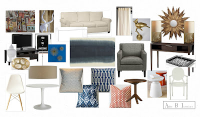
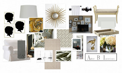
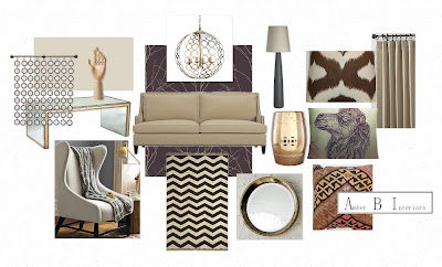
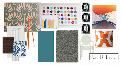
Remember my Ombre post? It was inspired by this design! The pops of gold are fun in the space. The oval gold/cream object on the left of the board is actually a dresser knob that I suggested for the media cabinet. I think it would really jazz up the piece! She really loved the design, but we went back and forth on a few options for the area rug. This ended up being a fun little project for me, because I was able to see how one change can change the whole look of the space. Let’s take a peek at replacing the ombre rug with a natural, jute option:
It definitely tones the room down and neutralizes it a bit more. I think the ombre option above might be a little more trendy and help to incorporate our accessory color. When I went with the blue rug, I decided to take out the black and white pillows, as I thought the colors would compete too much.
