Amber B Design Studio

Interior Design & Decoration for the South Florida region

  • Home
  • About
  • Services
  • Portfolio
  • Blog
  • Press
  • Contact

Why This Works

January 26, 2012 by Amber Filed Under: why works series


Happy Thursday and welcome to the series Why This Works… where I highlight a designed space and talk about what I love. This is one of my favorite dining spaces from Coastal Living. I have always loved it’s cheerful use of color!

Source: coastalliving.com via Simple on Pinterest

There is a lot of green in this space, but it is toned down a bit by the neutral wall color and area rug. The light sofa in the living room also helps neutralize all of the green, striking a nice balance between pops of color and serene, soft moments. Black in a room is always key and becomes a great anchor with the table lamps and fireplace surround. The rustic farmhouse table works well paired with the pretty upholstered seating and sparkly chandeliers. The tufting on the dining chairs is very traditional in style, yet the shape of the chairs is a nod to modern, sleek design. While the drapery might have bright hues, the graphic pattern of the green along with the creamy white works well together. I love the combination of green with a salmon color and you see a hint of this pretty shade with the sofa’s throw pillows. The beadboard walls makes the space feel so relaxing, as does the gorgeous waterside view outside! To me, this is the perfect lakeside space!

What are your thoughts??

If My Blog Was A Room – Next Up – Primitive and Proper

January 25, 2012 by Amber Filed Under: blog room series


Happy Wednesday and welcome to the series If My Blog Was A Room… where I pose the challenge to think of your blog as an actual space. What would that space look like? I’m sure most of you already know this next amazing blogger! Today, I am super excited to have Cassie here, from her design blog Primitive and Proper. Cassie’s blog showcases her creativity and DIY projects on a budget. She loves to mix modern with vintage- which, in my opinion, is a wonderful combination! Let’s see what she came up with!

Hi!  I am Cassie from Primitive and Proper, and I am so excited to be here on Amber’s fabulous blog today!  I just love Amber’s style, and was so happy when she asked me to be a part of this series as I have been admiring the other bloggers and their posts!
As you can see from my header, gray and aqua are kind of my go-to colors… I love the soothing combination!
Primitive & Proper
In my own home (we just moved into it in October!) I have used this combination in my living room and dining room, and will most likely use that combo in my kitchen and master bedroom when those rooms are redone.  Here is a little glimpse of the combo in my dining room…

If my own blog were a room it would certainly have those colors in it, but on my blog, I love whimsy, and I love bright pops of color!  I love to redo furniture pieces in almost every color under the sun!  I also like to bring in a modern edge often, and gravitate towards the mix of rustic with a touch of modern.

So while the palette might be soothing, it would have some zing.  The room would invite you in with its cozy, hand crafted, “someone really lives here” kind of feel, but it would give you something bright and fun to look at, too…  These rooms all give me that kind of feeling- I want to sit there, and relax, but there is something bright and happy for my eyes to view, and they have that little bit of modern edginess to them….

Pinned Image

Pinned Image

Pinned Image

Pinned Image

Pinned Image
These rooms are all pretty, have my favorite colors, host a mix of vintage and modern styles, and have pops of fun color as well!  They also feel very inviting, lived in, cozy and open!  When you come to my blog, I want you to feel like you are visiting an old friend. ๐Ÿ™‚


If my blog were a child’s room though, it would look like this… I love everything about this room!  So so fun!
Pinned Image
My blog gets a little crafty now and again, too, so its craft nook might look like this…
Pinned Image

(All images found via Pinterest, and all original sources can be found via my pinboard, “Pretty Rooms”)

Thank you so much, Amber, for allowing me to share with your readers a little more about me and my blog!  I hope you will come on over- be prepared to stay, relax, have a cup of coffee (or a glass of wine!) with me and chat like we’ve known each other for ever.

Thanks so much for being here, Cassie! I really do feel like I’m chatting with a great friend when I stop by your blog!
I love that Cassie showed spaces that are beautiful, but also warm and inviting. I love that! Definitely stop by Cassie’s blog and say hello!

Can You Tell What’s On My Mind??

January 24, 2012 by Amber Filed Under: driftwood


These amazing images might give a hint:

Source: creativeorganizing.typepad.com via Simple on Pinterest
Source: houzz.com via Kim on Pinterest
Source: storageandglee.blogspot.com via RCC on Pinterest
Source: google.com via Noelani on Pinterest
Source: myinspirationlounge.squarespace.com via Christina on Pinterest

I’m sure you guessed… I want to incorporate driftwood into my home! In our foyer, there is a large space above our bench just begging for a large rectangular mirror. And I have now decided (and become determined) to find one! Here is the space I am working with:

The mirror would go above black bench. 

This is before we had the bench. You can see a bit of our old red coat rack.

The first image I showed is almost exactly what I am looking for. The price I had in mind was under $70. The reason I am set on that price is because in the past, I have found great mirror deals at TJ Maxx and Home Goods at that price point and lower. The dimensions would need to be about 24″ x 40.” This might be a tough task, but I am up for the challenge! There are driftwood mirrors on the market, but are pretty pricey. I have even thought about buying a large, plain mirror and embellishing my own driftwood. (By the way, where could I find small pieces of driftwood???)

I would love to hear your ideas!

For now, I will either think about making my own or continue to scour Home Goods! Wish me luck…

My Theories on Design (So Far)

January 23, 2012 by Amber Filed Under: design theories


I have been thinking about this topic for a while. With some design classes under my belt, starting an e-decor business, this blog, and all of the inspiration from you- I have a few go to theories on interior design that have stuck with me so far. This past year, so much of what I have learned comes from your amazing blogs. The daily inspirations, the DIY projects and the wonderful sites like Houzz and Pinterest… there is so much design knowledge out there! You all continue to truly amaze me! So here we go- my design theories thus far:

1. To give a space an eclectic, well designed look- mix up design styles, wood and metal finishes! There is no one rule- have fun with your personal style.

Source: apartmenttherapy.com via Simple on Pinterest

2. Accessories bring a space together! This is a constant work in progress for me- I have definitely come to realize the importance of the accessories in a space. It can take a lot of editing and stepping back to see what’s in front of you. I have found pinterest (yet again) a great source for this!

Source: houzz.com via Simple on Pinterest
Source: simplyseductive.blogspot.com via Simple on Pinterest
Our Family Room
3. Dark walls don’t make a space feel smaller…. but lots of small furniture pieces does. A small room (even with dark walls) looks bigger with a few larger furniture pieces, as opposed to many smaller pieces. When we first bought our house, I thought I had to fill every nook and cranny with pictures on the walls, and tables and chairs everywhere. When I took a step back and only kept the things that were necessary in the space, traded out the several pieces for a few larger scale ones, the rooms felt more spacious!
Source: shelterinteriordesign.blogspot.com via Simple on Pinterest
Source: madebygirl.blogspot.com via Simple on Pinterest
4. Monochromatic doesn’t mean boring. Layering different textures, finishes and shades of the same color actually show tons of depth and creativity!
Source: housebeautiful.com via Simple on Pinterest
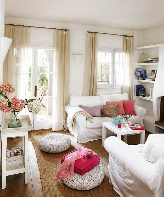
5. On the flip side, I also believe pops of color can awaken a room and bring life to the space! For me, I like to use bold color in small doses, keeping the overall look fairly neutral. This way, when I am loving a new color, it can be easily traded in to the room!
Source: thedecorista.tumblr.com via Simple on Pinterest
6. While we’re on the topic of color, paint on the walls can completely change the look of your space! For not too much money, your room can go from ok to wow with the right paint color, stencil or paint treatment!
Source: thedesignerpad.com via Simple on Pinterest
And last but not least… have fun! Your space doesn’t have to look like someone else’s space- it just has to make you smile!
And thanks to all of you for helping me create this list… you are all so inspiring and I love learning from all of you!
Do you have any go to design theories??

Fashion Friday

January 20, 2012 by Amber Filed Under: fashion friday


Happy weekend and welcome to Fashion Friday… where I discuss my other design love! Today’s glitzy outfit was inspired by yesterday’s glamourous and shiny room. I thought yesterday’s space was fun and full of life. This outfit is definitely over the top, yet fun!

Glitz and Glamour

Glitz and Glamour by simpledwellings2

The girl who wears this is ready for a glamourous night of cocktails! I love this faux fur coat by Michael Kors. It definitely sets the bar high for a beautiful outfit to follow. This sequined dress and clutch are fun and sparkly and are toned down by simple black pumps. The jewelry is a mix of restrained and glamourous, trying to create a balance of classic with over the top glam.

Here’s to a simple and glamourous weekend, whatever you do!  

Why This Works

January 19, 2012 by Amber Filed Under: why works series


Happy Thursday and welcome to the series Why This Works… where I highlight a designed space and discuss why it’s amazing! I found this amazing image from pinterest and love the subtle yet bold use of color and prints!

Source: homedeco2u.com via Simple on Pinterest

That chandelier from Jonathan Adler gets me every time! I love its unique look and have seen it used with so many different decor styles. It’s a beautiful and versatile piece. The chrome finish of the chandelier works well paired with the chrome floor lamps. The large gold mirror on the right is great in scale and also brings in a different metal finish. I always think a space feels more eclectic, unique and well designed when there is a mix of different wood and metal finishes. The soothing blue gray on the walls is the perfect backdrop for bold fabrics seen in the X benches and drapery panels. There doesn’t need to be just one bold fabric in a space- layering multiple fabrics and colors works great when it can all be subdued by  other neutral pieces. In this case, the wall color, area rug and sofa/ottoman are neutral enough to handle the bright pops of color in the accessories.

My only problem with the space is that I wish I could see more!! 

What are your thoughts??

If My Blog Was A Room – Next Up – Michaela Noelle Designs

January 18, 2012 by Amber Filed Under: blog room series


Happy Wednesday and welcome to the series If My Blog Was A Room… where I pose the challenge to think of your blog as an actual space. What would that space look like? Today, I’m excited to have Michaela here from her design blog Michaela Noelle Designs. I have followed Michaela’s blog for a while, and I always love her cheerful, sweet personality and great eye for design. Here’s what she came up with for you all today:

Hello to all of Amber’s readers! I’m Michaela and I blog about all things design over at Michaela Noelle Designs.

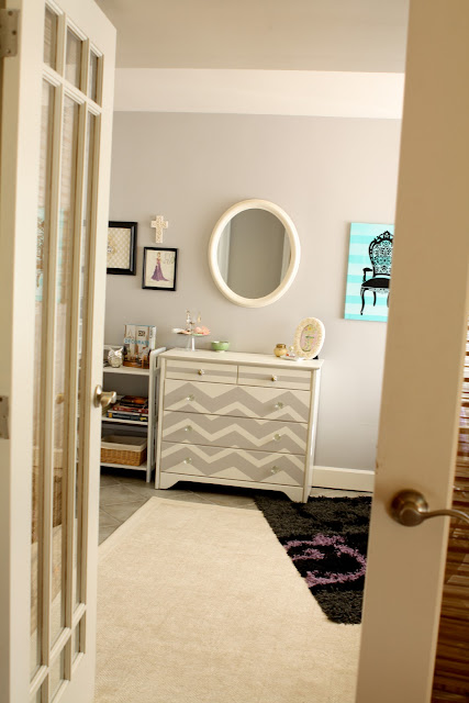
I’m so excited to be here today dishin’ on what my blog would look like if it was a room.  The funny thing is, my new bedroom {that I just renovated top to bottom} actually does look exactly like my blog! I didn’t plan it that way on purpose…in fact, it just sort of came out in my design decisions. See?

What a coincidence! Luckily if I ever forget what my blog looks like, I just take a peek at my room ๐Ÿ˜‰

To really answer the question, though, I hope my blog-room would be an eclectic mixture of shabby chic, contemporary, playful, and romantic design elements. I’m definitely drawn to the cooler color hues.  I would also hope my room would reflect who lives there {or writes there!} Next, I’d like my blog-room to be organized and easy on the eyes, so the people inhabiting the space can really feel the joy of the room without being overwhelmed! Finally, I hope it would be a place that was inspired and continues to inspire others when they are there. I would hope it’d look feel something like this:

via
via
via
via
via

So, there you have it! Michaela Noelle Designs as a room ๐Ÿ™‚ Thank you for having me, Amber! It’s been a blast pondering this question and stopping by your blog today.
xoxo
Photobucket

Thanks so much for being here today, Micaela! I love the images you came up with- they remind me so much of your blog! And it’s amazing to see your room look so much like it already!
Definitely stop by Michaela’s blog today and say hello!

Our Foyer Reveal – Let There Be Light!

January 17, 2012 by Amber Filed Under: foyer


I started making some changes to our foyer last year, with the new wallpaper, and I’m at it again! Ever since I saw this image on pinterest, I knew I had found the right style of light for our space:

Source: decorpad.com via Simple on Pinterest

I have loved that image for so long and it has been in the back of my mind when I went out on a new light hunt! I love the look of large drum shades and thought it looked great as a ceiling pendant. The light we had before was a mission style, stain glass pendant. It was nice, but never fit the scale of the space. (It was a rookie mistake of mine to not look at the measurements before the purchase!)
Our new light, is double in size and fits the scale of the space much better. Here it is in its new home:

This is a light fixture from Lowe’s and it is actually one of their energy efficient fixtures. I was a little weary at first, because I don’t usually like the glow from energy efficient bulbs. I am happy to say that these bulbs cast a soft, natural glow and I’m pleased with the result!

Have you had any luck with energy efficient bulbs??

DIY – Adding Fabric Trim to Lamp Shade

January 16, 2012 by Amber Filed Under: DIY, guest room


With the holidays behind us, it’s always fun to change up some things around the home with simple and quick projects! I recently added some new grosgrain trim to my lamp shade, giving a little pizazz to our guest room corner.

Here are the quick and easy steps:

1. The only materials I needed for this project are grosgrain ribbon and fabric glue.

2. Before cutting the trim, I placed it around the shade, making sure I left a little extra to work with. (I could always cut the extra ribbon later.)

3. At first, I applied the glue to the trim, but ultimately ended up appyling right on the shade. It worked out better that way.

4. I continued to make my way around the shade, pulling the trim tight while also pressing firmly on the shade.

5. With one ream, I had enough trim for the top and bottom of the shade, with some left over! And here are some more afters:

This tacky glue is very strong and stays really well, even on this overlapping fabric shade. If you look really close, you might see some waves, but it’s pretty secure. I hope this simple project inspires you to add some trim to your lamp shade!

Will you be tackling any projects at the start of the New Year??

Fashion Friday

January 13, 2012 by Amber Filed Under: fashion friday


Happy weekend and welcome to Fashion Friday… where I discuss my other design love. Yesterday’s room was fun, eclectic and had a lot of pattern and interest. So today’s outfit is no different. Enjoy!

Eclectic Inspired

Eclectic Inspired by simpledwellings2

With this outfit, the overall color palette is neutral- yet with different patterns and textures, I wanted to create a layered, eclectic look. The soft textures in the blouse and cardigan play off of the rugged leather jacket. The print on the ballet flats is paired with another print in the clutch, yet the colors are neutral, keeping the outfit from being too busy. The jewlery is layered, giving an eclectic and acquired over time look. Yesterday’s room was a mix of different styles and pattern, and an outfit can be the same way!

Happy Weekend!

  • « Previous Page
  • 1
  • …
  • 45
  • 46
  • 47
  • 48
  • 49
  • …
  • 69
  • Next Page »
Welcome!

Hi, I'm Amber... a wife, mom and interior decorator. I am the writer of Simple Dwellings and the designer behind Amber B Design. Blog topics are all things design, with the occasional DIY attempt! Thanks for stopping by Read more...

  • Bloglovin
  • Email
  • Instagram
  • Pinterest
  • Twitter

Blog Posts, Straight to Your Inbox

Popular Projects

A dining room with white walls and wooden table.
A black door with white curtains and a red chair
A staircase with black and white chevron pattern on the steps.

Blog Love

  • Addison’s Wonderland
  • A Thoughtful Place
  • Alison Giese Interiors
  • Amber Interiors
  • Bailey McCarthy
  • Caitlin Wilson
  • Chris Loves Julia
  • Classic Casual Home
  • Cottage and Vine
  • Design Indulgence
  • Dwell by Cheryl
  • Eddie Ross
  • Elements of Style
  • Emily A Clark
  • Emily Henderson
  • Gallery No Eight
  • Hi Sugarplum
  • House of Jade
  • Jana Bek
  • Juniper Home
  • Kate Marker Interiors
  • Lucy Williams
  • Monika Hibbs
  • Our Fifth House
  • Pencil and Paper Co
  • Rachel Parcell
  • Rambling Renovators
  • Pure Style Home
  • Sita Montgomery
  • Studio Mcgee
  • The Makerista
  • The White Buffalo Styling Co
  • the Zhush
  • Traci Zeller
  • Young House Love

Copyright Amber B Design © 2025 ยท Design by Britt Douglas