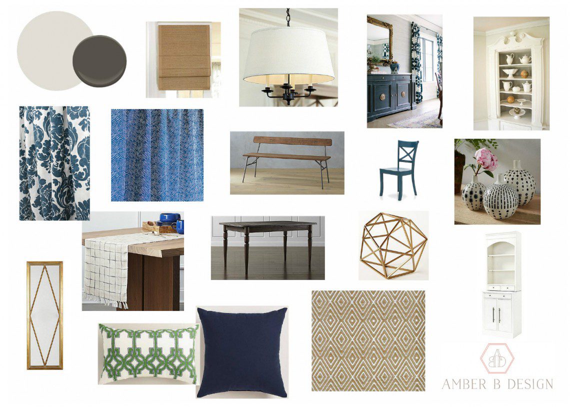
Sorry for my lack of posts lately! Once I take a week or two away from blogging, it becomes easier and easier to take the post writing out of the schedule. But I love checking in here, so you can be sure to find new blog posts {hopefully more often, from now on.} I have missed it!! Today, I have a completed e-design to show you. I have been working with these wonderful clients throughout their home and it has been so much fun. They are undergoing some renovations to the kitchen and bathroom and I have been helping to marry the renovated spaces with the design style from the rest of the home. The dining room, directly off of the renovated kitchen, is getting an overhaul with new furniture, lighting, rug and window treatments. They are taking down half of the wall between the two spaces, to create an open feel. Here is the design plan…
The Design Plan

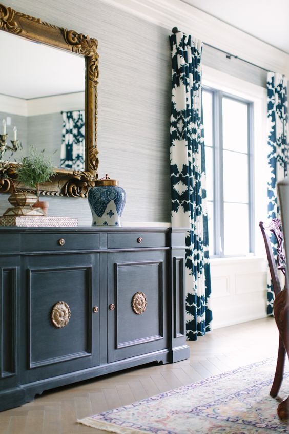
I love that the plan will be able to include colorful patterns, a neutral backdrop and upholstery mixed with wood and metal. My inspiration was this dining space by Kate Marker Interiors:

My clients were looking for more floor space in their dining area, so we moved the table and seating over towards the large window, creating a banquette/window seat look. This dining area is their main eating space, so I wanted to make sure it was durable with their young kids. The banquette pillows are made of an indoor/outdoor fabric, so they can easily be washed and are soil resistant. The area rug is also indoor/outdoor, so it can handle the spills it will encounter.
I hope you enjoyed the peek into this new design! I promise there won’t be this much time before my next post. 😉
Great insight into this design. Thank you!
Thank you so much, Charlotte! I’m glad you liked the post. I hope I will get into the pattern of writing more often. 🙂