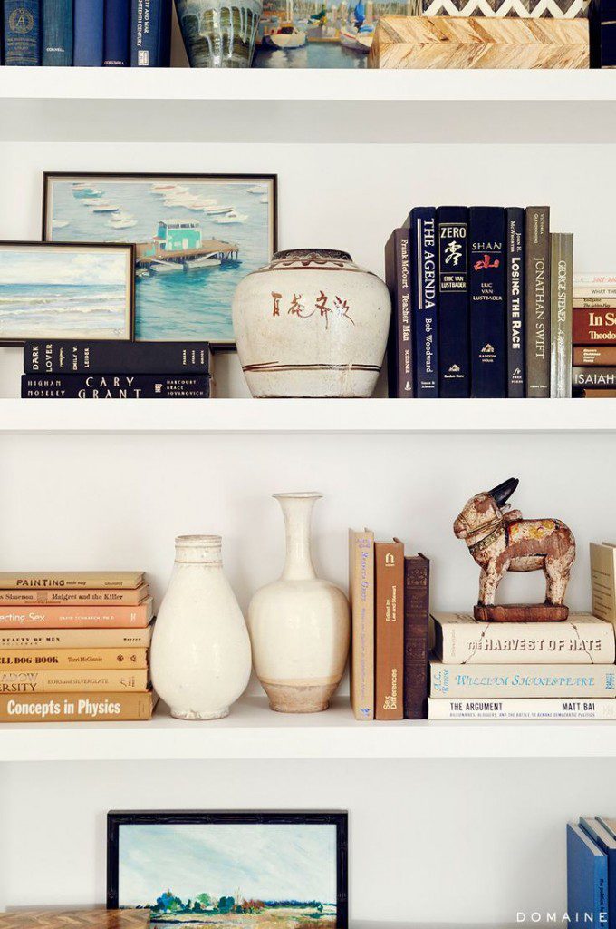
Welcome back to another edition of Why This Works… a weekly series where I show a designed space and discuss why it’s great. Today, it’s all about one particular aspect in design and that’s styling shelves. In the new year, I hope to organize much better and these well kept shelves are making me think just that! This Pasadena home was featured in Domaine and is designed by LA design firm, Burnham Design. Take a look!

image via
What I love most about these shelves is the effortless way they appear to be styled. They definitely have that collected over time vibe, which I love. These accessories look as if they have a history and meaning to the homeowners. I love when shelves are a mix of books, art and sculptural accessories and these have all three! Bookshelves have much more depth and interest when there is layering going on… it can even give the illusion of a deeper shelf. To achieve this layering effect at home, start with an empty bookshelf and slowly add a couple of books and accessories at a time. Step back every now and then, snap some pictures and evaluate how you would like to go further. That’s what I always like to do when styling shelves. It does take some time and patience, but the reward is a treat for the eyes! Here, you get a glimpse of the top shelf with bone inlay boxes, neutral book covers and art prints. The next shelf has books laid both vertically and horizontally, with an everyday vase used as a bookend. I love thinking outside the box and using non traditional book ends. The books are subtly organized in a color block format, keeping similar hues together. Pieces collected from travels adorns the shelves and memories can instantly be remembered when those accessories are out on display. Book shelves are used for much more than just books and this design shows that to perfection!
What are your thoughts?!?