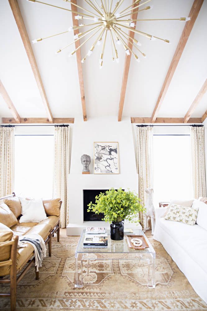
Welcome back to my Wednesday series, Why This Works, where I highlight a designed space and talk about why {I think} it’s amazing. Today, it’s the former living room of interior designer, Lauren Liess. She has recently moved and is blogging about her new home’s renovations HERE. This space featured today, also underwent a major renovation to make it reflect her and her family. This space is warm, inviting and definitely Lauren’s signature style…

image via
The earth tones and blending of modern with vintage, gets me right away. I love using warm colors in design and then balancing that with clean, crisp and modern elements. I think it’s such a great combination! The warm leather chairs and patterned rug is paired with a crisp white slipcovered sofa and modern acrylic coffee table, to achieve that collected over time style that Lauren loves and I always appreciate. She loves to use natural elements, so it is very fitting to see her home styled with botanical inspired fabrics from her fabric line and fresh greenery on the table. The warm wood beams on the ceiling pair so well with the modern brass sputnik chandelier and clean lined windows. Although ceiling beams can appear traditional in origin, Lauren has installed them with a thin, more clean beam style. The books on the coffee table, tray with beads and fresh greenery all invite you to stay and linger for a while. I cannot wait to see what she comes up with for her new home! It will be nothing short of amazing. Her new book is also out this week. I hope to show you a picture soon, with how I have styled my table with her new book!
What are your thoughts on this space?