Welcome back to a Wednesday series I used to write and finally bringing back! Why This Works is a weekly series where I select a room and describe why {I think} it works! Make sure to check back every Wednesday {or every Wednesday I get my act together to write the post} to see what space is next on the list! Up today, a lovely, stylish, stops you in your tracks master bedroom! This is the bedroom of talented designer Erin Gates, from Elements of Style blog.


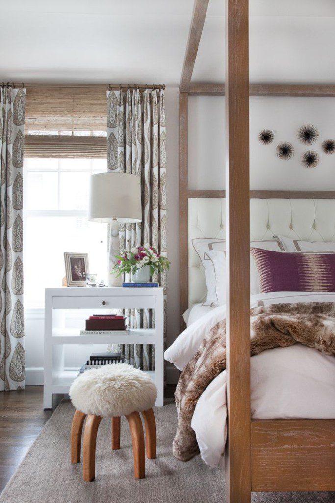
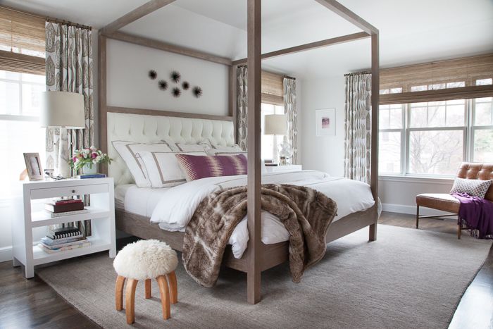
This space doesn’t need much explanation of why it works. I was immediately smitten with it when I saw it. I love it when master bedrooms have that calm, serene vibe. It makes you feel as if you are on a vacation, right in your own home. I love the crisp white bordered duvet and shams and the way it balances so well with the warm wood bed. I always fall for a four poster bed of any kind and this has the ability to be transformed, just by adding fabric to the posts. The neutral bedding and area rug allows for bold, patterned drapes. But when they are done in neutral, almost tone on tone colors, the large print paisley fabric still reads calming. I also love symmetry in bedrooms and the pair of night stands and bedside lamps does just that. But then, Erin balances that with a whimsical, asymmetrical art piece above the bed. {And by the way, if you are a reader of her blog, she bought those sunburst art sculptures at Target!!} A love a great high/low design story! Lets also discuss the way the drapery panels and shades are hung on the walls. High and wide is the important topic for this installation. Erin hung the drapery rods and shades higher and wider than the window frame, drawing your eye up and giving the illusion of more space and a larger window. I love that trick and think it’s so important in any space! I just presented to clients yesterday, where we discussed this same topic. We will be installing both the shades and drapery rods as high as we can on the wall. It’s such a great visual trick. And last but not least, nightstand styling would not be complete without a formula similar to Erin’s… small stacks of books, sculptural accessories and personal mementos/picture frames. And of course, a fresh vase of flowers!
So what do you think? Does this space work for you? Erin also has a NY Times best selling book out and it also happens to be the first design book I have read from cover to cover! Check out her blog and read about her book HERE.