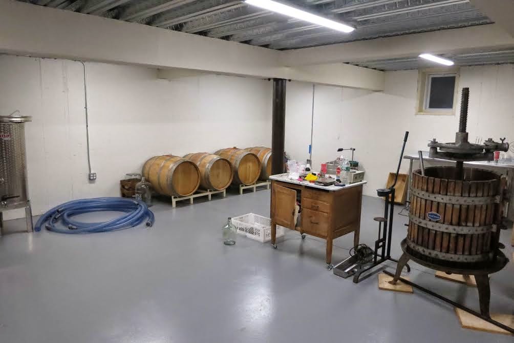
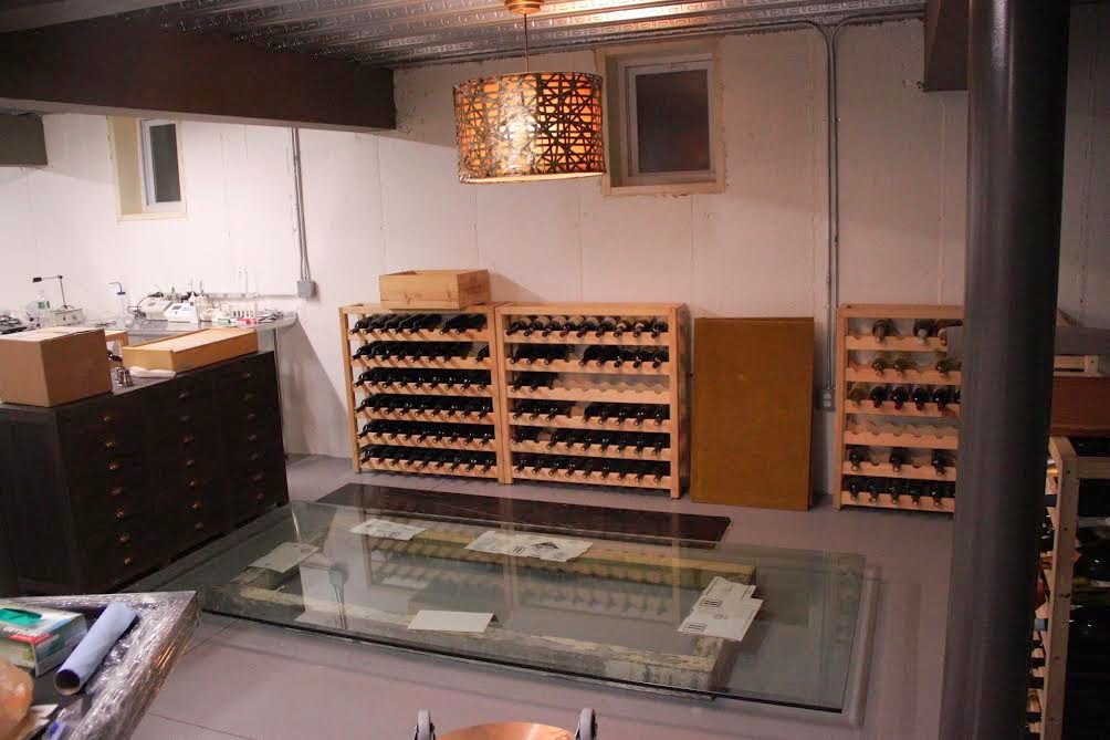
A little while back, you may have remembered my post here where I hinted at my first commercial e-design project… a wine cellar in Long Island, NY! This wonderful couple that I am working with, has embarked on this amazing journey to start their own business in the wine making industry! I look forward to giving you a full reveal of their business and facility in the future, but today- I have a crazy cool sneak peek for you. We primarily worked on the wine tasting area, which shares a large space with the actual wine production facility. I think it is so special and unique that customers will be able to get a glimpse into the actual business of wine making, while sampling the delicious wines they offer. We wanted to make all spaces flow together and maintain an open concept, but also have the ability to close off the production areas when needed. The area is a renovated cellar in a small town on the North Shore of Long Island. It’s a quaint town outside of those windows and we wanted to keep the natural light throughout. Here are some before pictures of the cellar…
Before
My clients wanted to keep a neutral color palette of whites, blacks and grays. Here is the design board I came up with…
They were on board with the plans and got right to work with the design ideas. I am so proud of their progress. The sneak peek I am about to show you is of the wine tasting room, which is pictured in the first before pic, above.
Amazing Progress
Spectacular progress, right?!? We added the new indoor/outdoor rug under the table and the chic bar cart on the right. I love the way the brass from the bar cart adds a chic quality to the space. The wine racks on the right (which the husband made) have been painted, reinforced and stacked on top of each other for a dramatic area for wine display. The concrete wall in the back has been covered with board and batten and painted the same dark color as the wine racks. The best thing about this paint is that it is covered in a chalkboard finish. Now, they can write their wine names directly on the racks and board and batten! When they want to move wines around, they can easily wipe off the chalk and start over. The small window also blends right into the design! At first glance, I didn’t even notice it was still there, yet helps bring in natural light. They hung their antique windows above the buffet on the left and two gourd lamps will sit on the buffet, for soft task lighting. Hanging the antique windows there, helps to conceal some of the wine barrels and necessary equipment. The chandelier will be replaced with the black fixture you see in the top center of the design board. They have made such stunning progress so far and it is a real treat to be a part of this journey with them! I cannot wait to see their business grow and thrive! Here is a before and in progress comparison again, of this wine tasting room.
Before
In Progress
I look forward to showing more, as my clients complete the space. A big thank you to my clients for allowing me to share the progress of their journey!


Looks so fab and stylish! I can't wait to see the full reveal!
Jessie
http://www.mixandchic.com
This comment has been removed by the author.
Such great ideas in a blog – thank you very much for the ideas. Paints in Nepal
are quite good as the Paints in Nepal . The designs and patterns outlines here quite good, they will inspiration for anyone looking good Shades in Nepal
Thanks for sharing this great and valuable post I really like this very much and waiting for new update here.
Wine Tasting long island tours