You may have read some of my previous posts about my love for gallery walls… especially asymmetrical layouts around a television. Not only does it allow you to bring in color and pattern to a space, it’s also a great trick of the eye to help conceal the TV. One of my wonderful e-design clients recently completed an arrangement on her media wall and I can’t wait to show you the impact it made! Here is the before picture of the television wall…
Before…
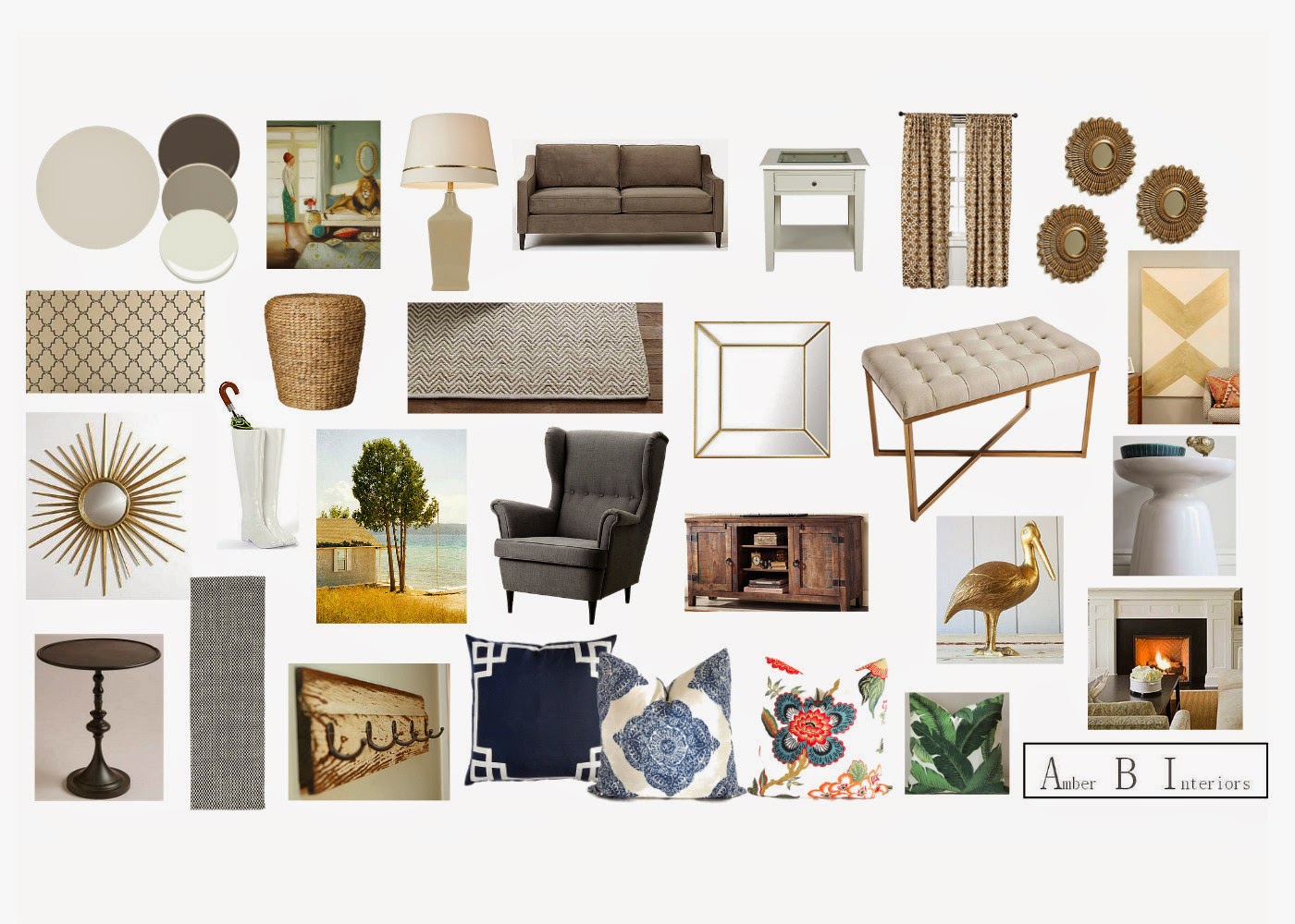
Here is the design plan I came up with for the whole space…
And here is the media wall mock up I made for the gallery wall…
We incorporated her taxidermy art and her lamp, but added some fun new art pieces and a hint of brass in the mirrors. Here is the after…
After
I am so proud of the progress she has made!! You can even see a glimpse into her foyer on the left, with the gorgeous wall stencil. The boot umbrella stand, shown on the right side of the last picture, will go in the foyer. She is almost finished with the spaces, so there will be another reveal coming in the future. Thank you so much to my amazing client for allowing me to share these pictures here. She always has the sweetest things to say and it has been my pleasure helping her enjoy her spaces that much more! We also recently wrapped up her kitchen and dining space, so more designs to show, soon.


Love how it turned out!
Hi there, I was really encouraged to uncover this internet site. The purpose becoming that this is these kinds of an useful submit.
Genuinely great blog keep it up.
Colour Nepal
Color Nepal
Colour Nepal
If you maintain publishing well prepared posts just like this then I will always preserve returning back to your website. Truly great content.
Colour Nepal
Color Nepal
Colour Nepal