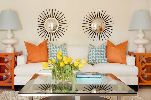
Happy Thursday and welcome to the series Why This Works… where I highlight a designed space and discuss what I love. Today’s design comes to you from Tobi Fairley, an accomplished interior designer who is known for her creative use of color. Take a look!
images via
I know I have seen that gorgeous first image before, but was amazed to find out that it was actually a master bedroom! I always thought this was a living room design, with its attention to detail. Tobi is known for color for a reason- her use of bold hues with subtle neutrals make a perfect combination in this serene retreat. The aqua and orange are beautiful when paired together and color is sprinkled throughout the space in just the right dose. The classic houndstooth print on the sofa pillow is made more modern with its aqua hue and when paired with more streamlined, modern pieces. The clean and contemporary bed is softened with the gorgeous drapery. I love that extra attention was added to the trim on the panels, grounding that side of the room. Bedding in classic white is taken up a notch with bright orange throw pillows and aqua stools at the foot of the bed. In the sitting area, I love seeing two starburst mirrors above the sofa for an added touch of whimsy and the unexpected. The coffee table books and fresh flowers makes the space feel cozy, inviting you to linger with a great book. The straight lines in the room are softened with the additon of more circular shapes, such as the mirrors, lighting and end table design. Overall, this space works!
What are your thoughts??
There is still time to enter my e-design giveaway! Click HERE to enter.

