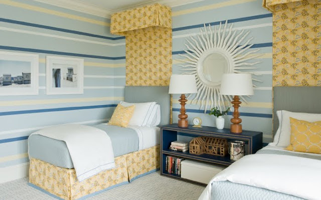
Happy Thursday and welcome to the series Why This Works… where I show a designed space and discuss what I love. The design work of Ali Schwarz is simply amazing. A while back, I saved this image I had found and knew at some point, I would write about her creative design work. This stylish kid’s room is fun, colorful and just plain cool.
designed by Ali Schwarz
Let’s start with the amazing canopy fabric. I love how she brought it all the way up to the top of the walls, creating the illusion of a higher ceiling. She also grounded the room by using the same fabric on the bedskirts, tying it all together. The simple color palette of blues, yellow and cream is repeated throughout the space for interest and drama. And those wall stripes! I love how they are more random, as opposed to all the same size. It makes for a fun, whimsical conversation piece in a kid’s space. In between the twin beds is this oversized, beautiful sunburst mirror. I love the scale and will also serve as a functional piece. Below the mirror is this gorgeous nailhead trimmed bookshelf. It’s very practical for that part of the room, because it also works as a nightstand for the two beds. The upholstered beds is also a great idea for kids and will make a great reading spot. The subtle print on the carpet brings another dimension, yet doesn’t compete with the wall stripes and canopy fabric. I think this space would be great for an teen looking for a more grown up space.
(As a side note, I could also point out that this space would work well for a guest room too! It’s so tailored and could easily be converted. And although I think the styling is a bit sparse for a kid’s room, I’m sure it was loaded with their actual stuff and posters on the wall, after the shoot! This is the perfect shot for a portfolio, don’t you think?) Overall, this space works!
(As a side note, I could also point out that this space would work well for a guest room too! It’s so tailored and could easily be converted. And although I think the styling is a bit sparse for a kid’s room, I’m sure it was loaded with their actual stuff and posters on the wall, after the shoot! This is the perfect shot for a portfolio, don’t you think?) Overall, this space works!
What are your thoughts??
Are you ready to decorate your life? Click on the ‘design services’ link to get started!
