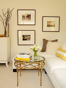
Happy Thursday and welcome to the series Why This Works… where I highlight a designed space and talk about what I love. Today’s office space comes to you from one of my favorite designers- Sarah Richardson. I have loved following her shows and seeing all of her unique, creative ideas on design. She is one of those designers that I would let go wild in my home, without worry.
images via
Lately, I have definitely embraced bold color and am drawn to rooms with pops of fun color. This beautiful hue of yellow is perfect for this time of year and awakens this office space. I love that it’s tastefully carried onto the drapery, pillows and even coffee table books, yet the furniture stays a creamy neutral for balance. It’s just the right amount of color for this space. The soft touches of gold in the coffee table, reading lamp and chandelier also work well and pop against the creamy white on the walls and furniture. That chandelier makes the space and draws your eye up! I also love that Sarah hung the drapery rods several inches above the window casing, also helping the eye look up. This is a great trick to make your windows and walls appear taller! Every room also needs some black for grounding, and the chair legs, side table and frames do a great job of anchoring the space and giving it depth. I have also been drawn to sectionals and modern frames like you see here, which I think brings a great balance of traditional with modern and adds a touch of functionality to the office. (Sometimes, you just want to relax with your laptop or a decorating magazine on a comfy piece of furniture!) The flowers on the coffee table make the space feel warm and inviting, which is what you need to want to enter and get work done! Overall, this space works!
What are your thoughts??
Are you ready to decorate your life? Click on the ‘design services’ link at the top of my blog to get started today!

