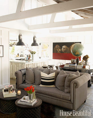
Happy Thursday and welcome to the series Why This Works… where I highlight a designed space and discuss what I love and why it works so well. This week’s great room space is a bit masculine, but I love it’s character and architectural details. It was seen in House Beautiful and was designed by Ken Fulk. Have a look!
Seen in House Beautiful. 
The size and scope of the space drew me in at first and then the details and subtle pops of color kept me interested in the design. The stone floors balance well with the soft upholstered chesterfield sofa and the soothing palette of gray, white and black add to the charm of the room. The two drum tables work well for a coffee table and can easily be moved around when needed in other areas. The sturdy material of the drum tables works great paired with the delicate red tulips, for a nice balance. The dining area doubles as a reading nook, with plentiful books and a dramatic globe as the centerpiece. I love to see unusual centerpieces and this one speaks to the personality of the space and adds a bit of whimsy. The bistro style chairs, distressed kitchen island and oversized pendants add a rustic feel to the space, while the large, modern dog art shows a pop of color and also adds another hint of whimsy and fun to the great room. When looking up, the beautiful height of the ceilings show the exposed beams and makes the space feel larger. This space/color palette is also so versatile! The red can easily be switched out with either citron, plum or coral for a totally different look. Overall, this space works!
What are your thoughts??
