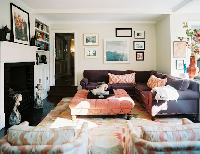
Happy Thursday and welcome to the series Why This Works… where I highlight a designed space and talk about why (I think) it’s perfection. This gorgeous living room comes to you from Lonny and was seen in their Jan/Feb 2011 issue. The space was designed by Hillary Thomas.
via
What I love most about this space is how liveable and welcoming it appears! I bet this is the fun, popular hang out room in the house! The refreshing and chic color combination of deep plum, salmoney pinks and orange are whimsical, fun and stylish. The traditional seating works great paired with the modern art and contemporary fabric selections. The casual way the art is displayed works so well to make this space feel warm and welcoming. The neutral, light wall color is a subtle, beautiful backdrop for the amazing color in the furniture and accessories. The white cabinetry and fireplace are beautiful and practical and work well against the dark flooring in the room. The art sculptures on the floor by the fireplace are a fun and modern addition. I love that the art on the fireplace mantel is leaning against the wall- it definitely adds to the casual feel of the room. The bookshelves to the right of the fireplace showcase a fun and beautiful mix of books and accessories. Overall, this space works!
Are you more drawn to chic and casual or chic and dressy? 
