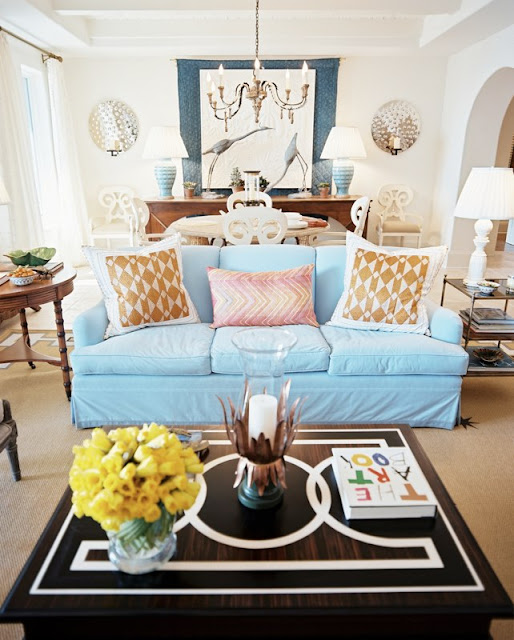
Happy Thursday and welcome to the series Why This Works… where I show a designed space and talk about why (I think) it’s perfection. This living and dining space comes to you from Lonny and was featured in their June/July 2010 issue. The designer of this beautiful and fun space is Bunny Williams.
via Lonny Designed by Bunny Williams
This space has a great blend of traditional and modern and brings a smile to my face! The color on the sofa is fun and whimsical and pops against the white walls. The style of the sofa is traditional, but made more modern paired with the graphic design on the coffee table. The coffee table accessories are playful and fun and add a casual warmth to the space. The end tables flanking the sofa are traditional in design and works well paired with the neutral, but modern rug. The modern detail on the outside of the rug is just enough pattern and looks great with the contemporary look of the sofa pillows. The dining area is a nice balance to the space, with its aqua lamp bases that give a nod to the sofa color. The large chandelier over the dining table is grand in scale, making this traditional piece more modern. I love the layering effect that is going on by the sideboard zone. The fabric hanging above the sideboard is broken up by some art and large, beautiful bird sculptures that almost appear to be part of the art on the wall. The scale of those pieces and the wall sconces draw your eye to that part of the room, expanding the space. Overall, this space works! 

