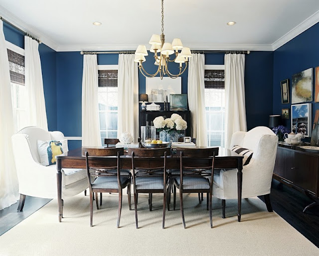
Happy Friday! Welcome to the series Why This Works… where I highlight a designed space and talk about why (I think) it’s perfection. This dining space was designed by Ashley Putman and was seen in the spring 2010 Lonny Magazine. I love this space so much, that I put it on this blog twice in one week! I love brousing through Lonny’s on line magazine- I always find so much inspiration!
This dining room is so inviting- I could stay in those comfortable wing chairs for hours! I mentioned in a previous post here that I love the color blue! There are so many gorgeous shades to this color, and this particular hue commands attention! This room will stand the test of time, with its traditional and neutral elements. The oversized, gorgeous wing chairs are made more modern with their white slipcovers and fun pillows. These traditional wing chairs are paired with more modern side chairs for an interesting, chic combination. The neutral area rug and traditional baluster leg table works well paired with the modern sideboard and chic, playful gallery wall. All of the white in the space pops even more paired with a dramatic shade of blue on the walls. The casual feel of the chadelier and fresh hydrangeas make the space feel warm and welcoming. For me, this space works!
