Amber B Design Studio

Interior Design & Decoration for the South Florida region

  • Home
  • About
  • Services
  • Portfolio
  • Blog
  • Press
  • Contact

A Quick, Simple Way to Tackle Painting Projects

February 24, 2014 by Amber Filed Under: blog review, painting, painting tips


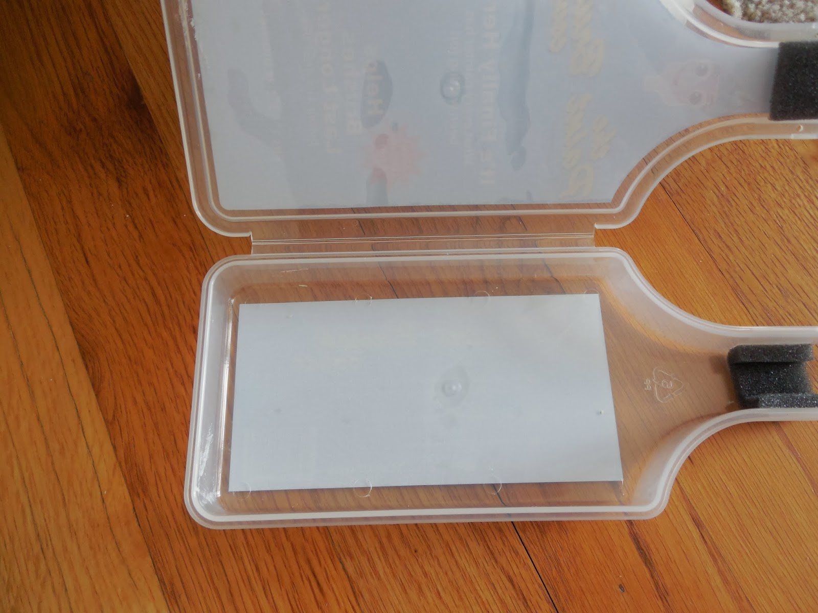
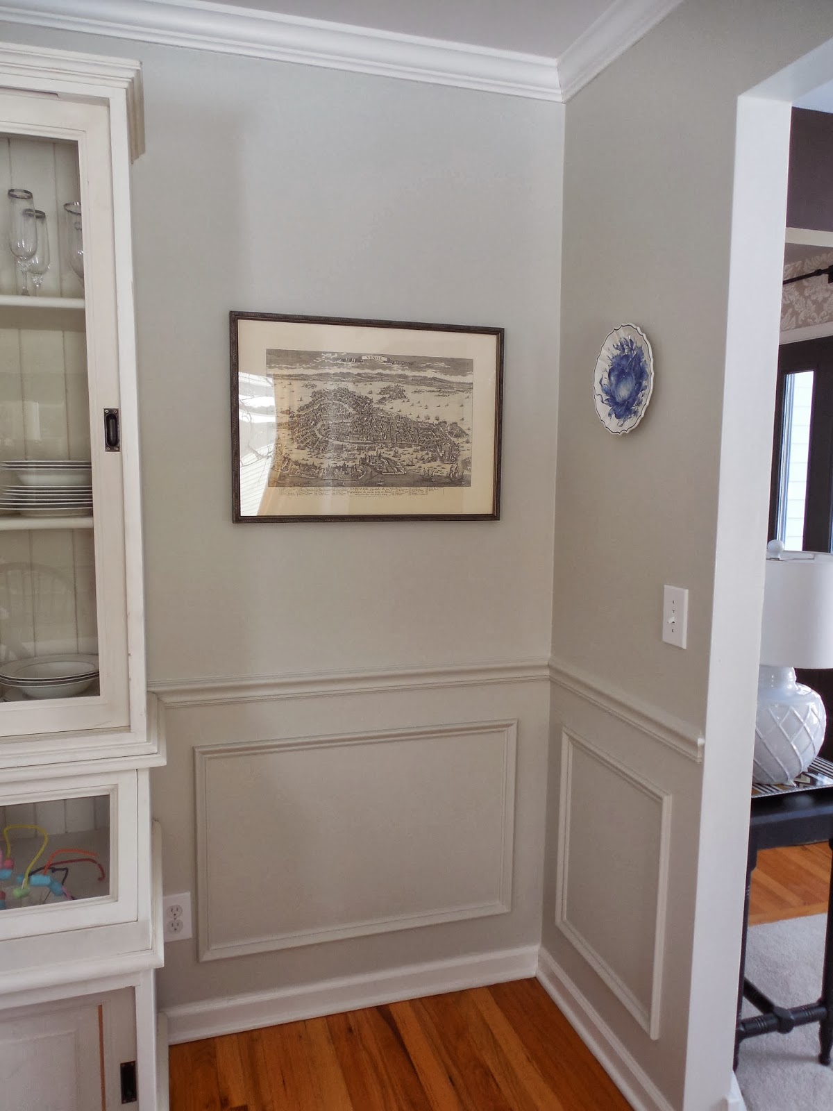
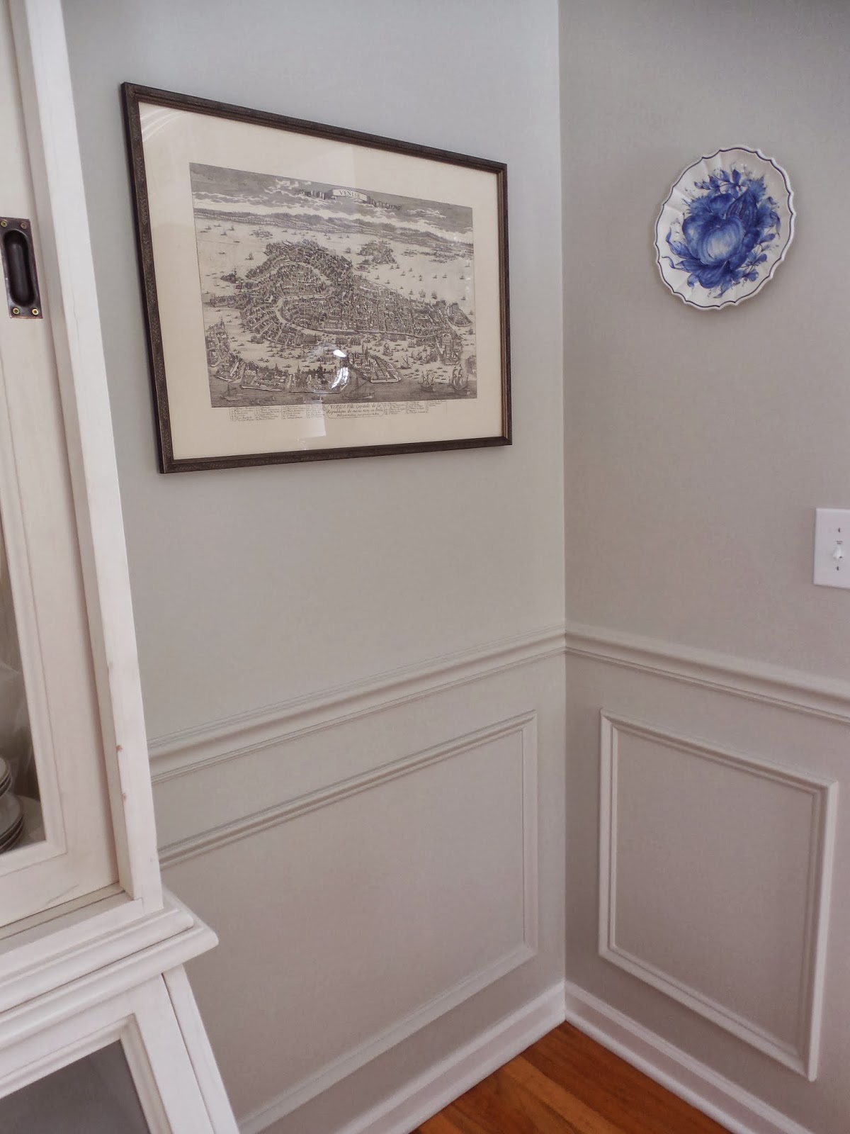
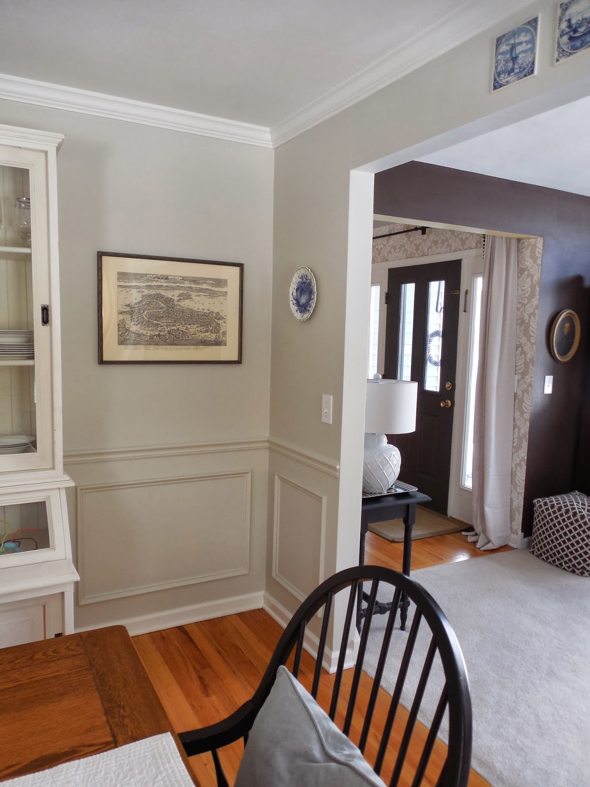
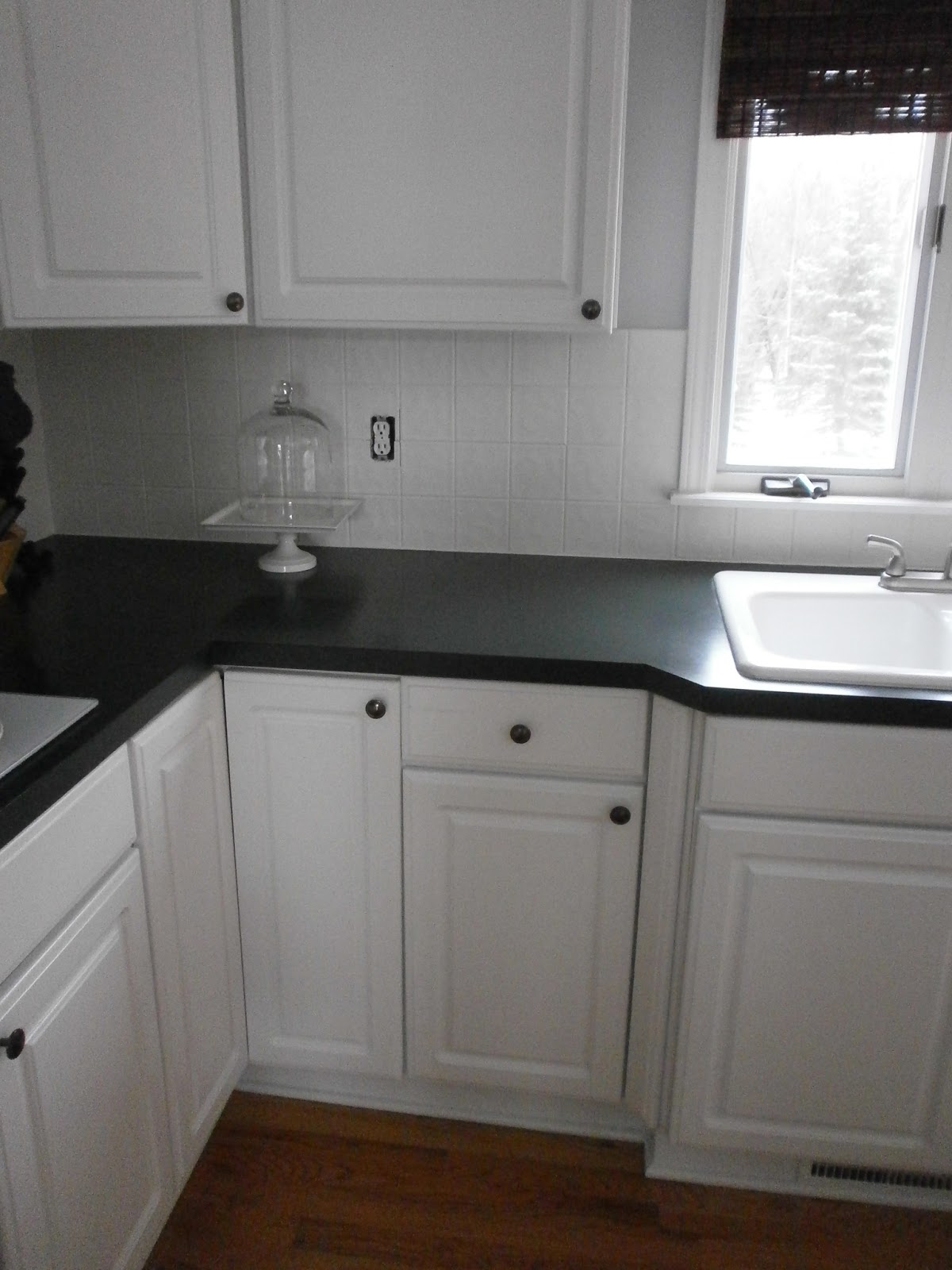
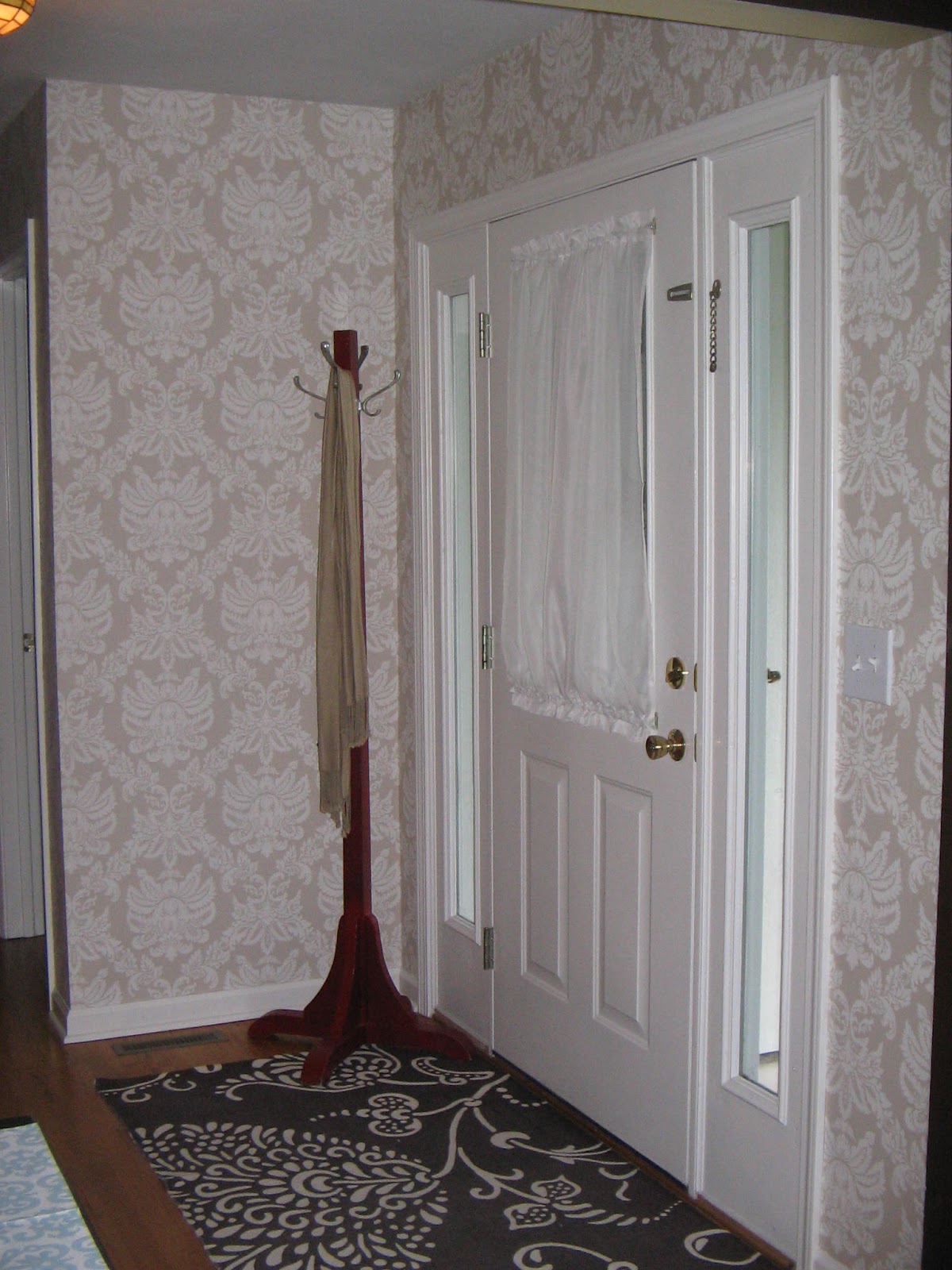
My motivation to complete house projects comes when I get ready to entertain. I will be hosting a house full of friends soon and that is the perfect way for me to finally tackle some much needed projects around the house. So when a representative from the Paint Brush Cover contacted me to review their product, I was on board! I had some walls that needed retouching around the home, but knowing me, I never finish a painting project in one sitting. I might do one wall one day and then move on to the next wall a few days later. But, I always dread washing out the paint brushes! Sometimes, they are still wet when I am ready to start painting again. But luckily, I don’t have to worry about that any longer! The Paint Brush Cover allows you to keep your paint filled brush safe in an airtight container for days, even weeks! Made of a clear, durable plastic, it ensures that your paint brush stays safe and ready to use, no matter how much it’s tossed around.

I had to try this out for myself and I started on our dining room wall…

Lovely wall scuff marks!


The product says it fits most 1-3″ brushes and my 2 1/2″ brush fit like a charm! As you can see from my paint can, I don’t finish in one day!  ๐Ÿ™‚ So when I was done for the afternoon, I tried placing my paint filled brush in the cover to see what would happen…
Days later, I was so excited to still see the paint brush wet and ready for the project! I could even see wet paint on the inside of the brush cover, proving that this really works.
I like that the cover is clear, so you can do a quick look to see what paint you used last. Perfect for the avid painter! The inside of the cover wipes clean with just a wet paper towel…
And now, a room/wall set for entertaining!

I will definitely use this product for future painting adventures! Anything that makes my life easier is a thumbs up in my book! To order your very own and make painting easier, order HERE.

DIY: Painting A Ceramic Tile Backsplash

January 17, 2013 by Amber Filed Under: design, painting, painting a tile backsplash, painting ceramic tile, painting grout, painting tips


Well, the project is complete! I know you might be wondering if this was worth it and if I’m glad I did it… the answer is yes!! I was so excited to modernize my tiles a bit and go for a cleaner, more updated look.  My tiles were white, which was great, but they had flowers scattered throughout the backsplash.

Before

 (This is an old picture with our previous wall color.)
And here is the tile, all painted and flowerless!
After

I can’t even remember which tiles had the flowers! Here is a breakdown of the materials needed and some helpful tips:
– Scouring pad to lightly sand the tiles and smooth out the flower design. The flower tiles were a little bumpy where the design was, so I just used a Scotch Brite green scouring pad, and it worked fine.
– Microfiber dust cloth to remove the dust from the tiles after sanding.
– Blue painter’s tape and drop cloths to protect your counters. I made sure to tape after the grout, so I could paint the grout that met the counter. That way, it’s all uniform and looks realistic.
– 2″ paint brush (Don’t go cheap with this! Choose the best!)
– Small roller brush (Choose one that doesn’t shed and has a small pile. You don’t want to get paint trapped inside a fuzzy roller, causing a messy paint job.)
– A special bonding primer that bonds to glossy, special surfaces. The clerk at the paint store said this was the best option. (I always use Benjamin Moore paints for all of my projects!) Here is a close up picture of the primer:
Once you have two coats of this primer, your paint will stick very well. It will also be long lasting. My mom said it best:  With this primer on, you’re on the same playing field as your walls. Well said! Now, my paint will be washable, scrubbable, like any wall! 
– Color Matched Paint with a sheen.
To get the exact color match, I took one of my cabinet drawers to the paint store. They can color match it exactly. As we all know and I have learned the hard way in the past, there are a million different shades of white paint! The clerk mixed my color with this paint.
Helpful Tips:
– Once your counters are protected and materials are out, start with the paint brush and prime the grout, first. Use a little paint on the brush, to make sure you don’t full in the grout lines too much. It’s better to do thin layers a couple of times, rather than one goopey layer. (Is goopey even a word? Spell check says no!) In the end, you want to make sure your backsplash still looks like tile and not fiberboard, trying to be tile.
– Wait 24 hours before applying the actual paint. This is important, because the bonding primer needs to fully dry and cure. I was so tempted to just finish in one day, since all of the materials were out. But, patience will pay off.
– When you start your painting the next day, lightly sand the tile again with the scotch brite pad. For some reason, my primer made little bubble marks on some of the tiles. I was so nervous about that! Don’t worry, the sanding will help that and now- no bubbles!
– All in all, make sure you do at least 2 coats of primer and 2 of the paint. It’s a pain in the neck and can be tedious, but then you’re done!
Wow, this is a novel! It was a lot of work, but worthwhile projects always are.  ๐Ÿ™‚
Total cost for this project… $48.00! In the future, I’m sure we’ll replace it with something different, but I will enjoy this for a long time.
So how about you… would you try it??
I am linking this project up to Savvy Southern Style:

Creating Contrast in Your Rooms

January 14, 2013 by Amber Filed Under: design, paint colors, painting, painting tips, personal design style


I received an e-mail recently from a reader, asking about my dining room transformations and how to choose the best color in your space. I thought it would be a great post to present on the blog and open up the discussion with all of you! My original paint color in the dining room was Bungalow Gold by Eddie Bauer. While I enjoyed the color for a while {7 years, to be exact!}, I needed a change. So, I decided to stencil one wall, after receiving a free stencil for a product review.

While the stencil was fun and something new, I still wasn’t feeling it. I realized the main reason why, was because there was not enough contrast in the room. The oak floors blended with the table, which blended with the walls. I have been meaning to make some of my spaces lighter and brighter, and I knew this was the room to start! This space did not need another warm tone… it had too many, already. What this space needed was some contrast. It needed a cooler color in the blue/gray/green family. Fast forward to my decision… and we have Halo, by Benjamin Moore. I love that it appears almost white when the sun is shining, yet provides that cool tone of gray/green that this room needed. I know I have already shown the dining room reveal here, but I thought it was also worth mentioning why this color was chosen and how to achieve contrast in your home. Here is the new paint color:

For me, adding a cooler color helped to break up all the similar tones, and I am so much happier. The paint brush can be put down, for now!

How about you, do you like more of a contrast, or similar tones throughout?

One Door Down…

July 1, 2012 by Amber Filed Under: design, foyer, painting tips


I am excited to show you a recent change we made in our foyer! I have been thinking about painting our interior doors black for quite a while. I love this look and believe it can work with many different design styles. It sounds like a dramatic change, but truly adds depth and character to any space. There are some blog posts, images on pinterest or magazines that just help me make decisions and go for it! (Does that ever happen to you too?) I am very confident when making decisions for client spaces but sometimes indecisive when it comes to my own home. When I recently saw Emily’s post from her blog, A Well Dressed Home, I knew that I had found the right color for our doors. I immediately got to work and here is the after…

After…

The paint color is Dragon’s Breath by Benjamin Moore, and I am in love. It’s a muddy, gray/black that shows very soft in person. I went with an eggshell finish to avoid a very glossy look. I knew when going with a dark color, the glossier it gets, the more imperfections it shows. This door did have some dents, but doesn’t show at all with this finish. I also like the way the brass knob and locks show against the black. A useful tip when painting doors, is to use a fine tip artist brush when going around molding and window openings. It allowed me to get into the crevices without a lot of clean up and painter’s tape! I know we all love a little before and after, so let’s take you back to how it looked before…

Before…

And after…

Sorry about the lighting on some of these pictures. The sunshine changes everything! Besides the door color, a lot has changed since the ‘before’ shot. We have replaced the coat rack with a bench, pillow and driftwood mirror. Our fun ceramic horse is on display and we replaced the ceiling fixture with a more dramatic drum shade light. I have also decided to take out the sheers on the door’s windows for good. I think it updates the entrance a bit more.

So like I said in the title of the post… one door down! I plan on painting most of our interior doors this color and also move on to finishing our railings.

Is there a design idea you’ve been wanting to try but haven’t?
What’s holding you back?
Are you looking to make changes to your space and have a home that reflects you and your style? Click on the ‘design services’ link at the top of my blog to get started!

Black Trim Beauties

March 21, 2012 by Amber Filed Under: painting tips


Little changes in home decor tend to yield the biggest results. Just a change of paint color can dramatically transform a room from ok to wow. That always makes me feel happy, because dramatic changes can also be easy on the wallet! Recently, I have began to love the look of black trim on the windows. I think it adds a bit of glam to the space. It really makes you take notice! Lately, I have even started looking at beautiful rooms and thinking, this space would be perfect with black trim on the windows. Here are some gorgeous images of rooms that have taken the plunge with black trim:

Source: inspireandcharm.blogspot.com via Simple on Pinterest
Source: bhg.com via Simple on Pinterest
Source: Uploaded by user via Simple on Pinterest
Source: mydalydesigns.blogspot.com via Simple on Pinterest
Source: remodelingguy.net via Simple on Pinterest
Source: paloma81.blogspot.com via Simple on Pinterest
Source: Uploaded by user via Simple on Pinterest
Source: habituallychic.blogspot.com via Simple on Pinterest

I love all of the different examples of how black trim can be used. And what I love best, is that it can work with a super traditional space or ultra modern! This spring, I will definitely be adding some black paint to some of our interior doors and trim!

How about you???

My Painting Tips and More After Photos

February 15, 2012 by Amber Filed Under: painting tips


I am so happy that our room painting is complete! It was a huge task with lots of walls and brush cutting around doorways and windows. And since wall painting is not one of my favorite tasks, I had to approach this project in a way that I could manage! Here are some more after photos of our kitchen and family rooms:

And here are my tips for a manageable painting experience (for those of us who don’t like it!)

1. Set aside time that is quiet and all to yourself. It allows you to not get distracted and really focus. I had the tv on to HGTV for some background inspiration!

2. Start painting on a full stomach, so you are energized to go and off to a great start.

3. For me, this step was key: work on only one wall a day! Since I was painting over dark walls, I knew I needed 2-3 coats to get the look just right. There was no way I was going to paint a bunch of walls this way in one night. So, I just focused on perfecting one wall a day. This way, I didn’t get tired and sloppy with the paint job and the end was always in sight! Also, try not to stop in the middle of a wall- the sheen might look different when going back to it another day. When you stop in a corner or at the end of a wall, you would never know the difference!

4. Make sure you buy enough paint in one visit to the store! (I have made this mistake before and it cost me!) When you go back to the store to get more of the same color made, it might not be exact. A different employer might add a drop more of a color when mixing, causing the color to be a tad different. So if you’re still working on the same wall, you might see a difference!

5. And last but not least, buy quality rollers, brushes and paint! If you ever need to clean your walls, make sure you go with an eggshell finish or paint that can be wiped down and scrubbed! And great rollers and brushes speed up your finish time, give a great paint job and resist splatter!

These were my go to tips that got me through! I don’t feel too burned out and actually might start another room soon! More to follow on that…..

Welcome!

Hi, I'm Amber... a wife, mom and interior decorator. I am the writer of Simple Dwellings and the designer behind Amber B Design. Blog topics are all things design, with the occasional DIY attempt! Thanks for stopping by Read more...

  • Bloglovin
  • Email
  • Instagram
  • Pinterest
  • Twitter

Blog Posts, Straight to Your Inbox

Popular Projects

A dining room with white walls and wooden table.
A black door with white curtains and a red chair
A staircase with black and white chevron pattern on the steps.

Blog Love

  • Addison’s Wonderland
  • A Thoughtful Place
  • Alison Giese Interiors
  • Amber Interiors
  • Bailey McCarthy
  • Caitlin Wilson
  • Chris Loves Julia
  • Classic Casual Home
  • Cottage and Vine
  • Design Indulgence
  • Dwell by Cheryl
  • Eddie Ross
  • Elements of Style
  • Emily A Clark
  • Emily Henderson
  • Gallery No Eight
  • Hi Sugarplum
  • House of Jade
  • Jana Bek
  • Juniper Home
  • Kate Marker Interiors
  • Lucy Williams
  • Monika Hibbs
  • Our Fifth House
  • Pencil and Paper Co
  • Rachel Parcell
  • Rambling Renovators
  • Pure Style Home
  • Sita Montgomery
  • Studio Mcgee
  • The Makerista
  • The White Buffalo Styling Co
  • the Zhush
  • Traci Zeller
  • Young House Love

Copyright Amber B Design © 2025 ยท Design by Britt Douglas